November 23, 2022
Urban Design – Can graphic designers live in harmony with architecture?
Share this article
Can well-harmoniously designed public spaces and architecture co-exist with the endless desire of companies to show more of themself? Let’s find out in our essay on urban design.
The solution is probably not just to strip architecture completely of signs and leave the ‘boxes’ alone. As Venturi and Brown pointed out in ‘Learning from Las Vegas’ the complete absence of symbolism makes it difficult for people to identify with a space, so we simply cannot go without some degree of symbolism or ornament in architecture. However, there is plenty of evidence that we have probably gone a step too far in ‘decorating’ spaces with advertising.
However, there are several examples that it is possible to create harmony between a good space and the exposure of the institution in that space. And we shall try to describe those examples by showing some tools that designers often forget about and some projects that rely on these tools. We are going to mention a lot of urban design examples, so to make them more digestible, we divided them into four categories:
The most obvious medium for the physical representation of graphic design seems to be print. However, there are many possible solutions for how to apply graphic solutions in spaces and a great deal of inspiration for this can be found in the world of architecture and design. Let’s explore some examples of design that go much further than just print.
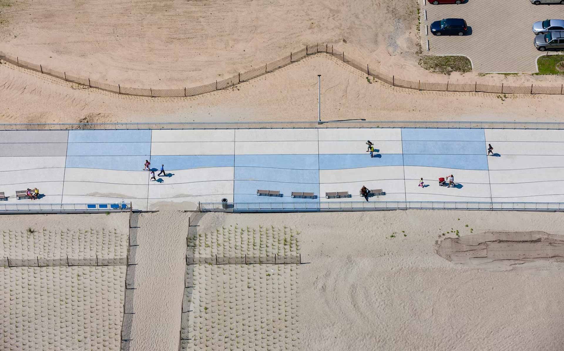
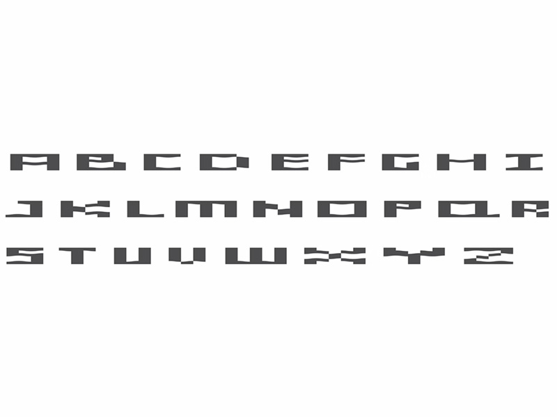
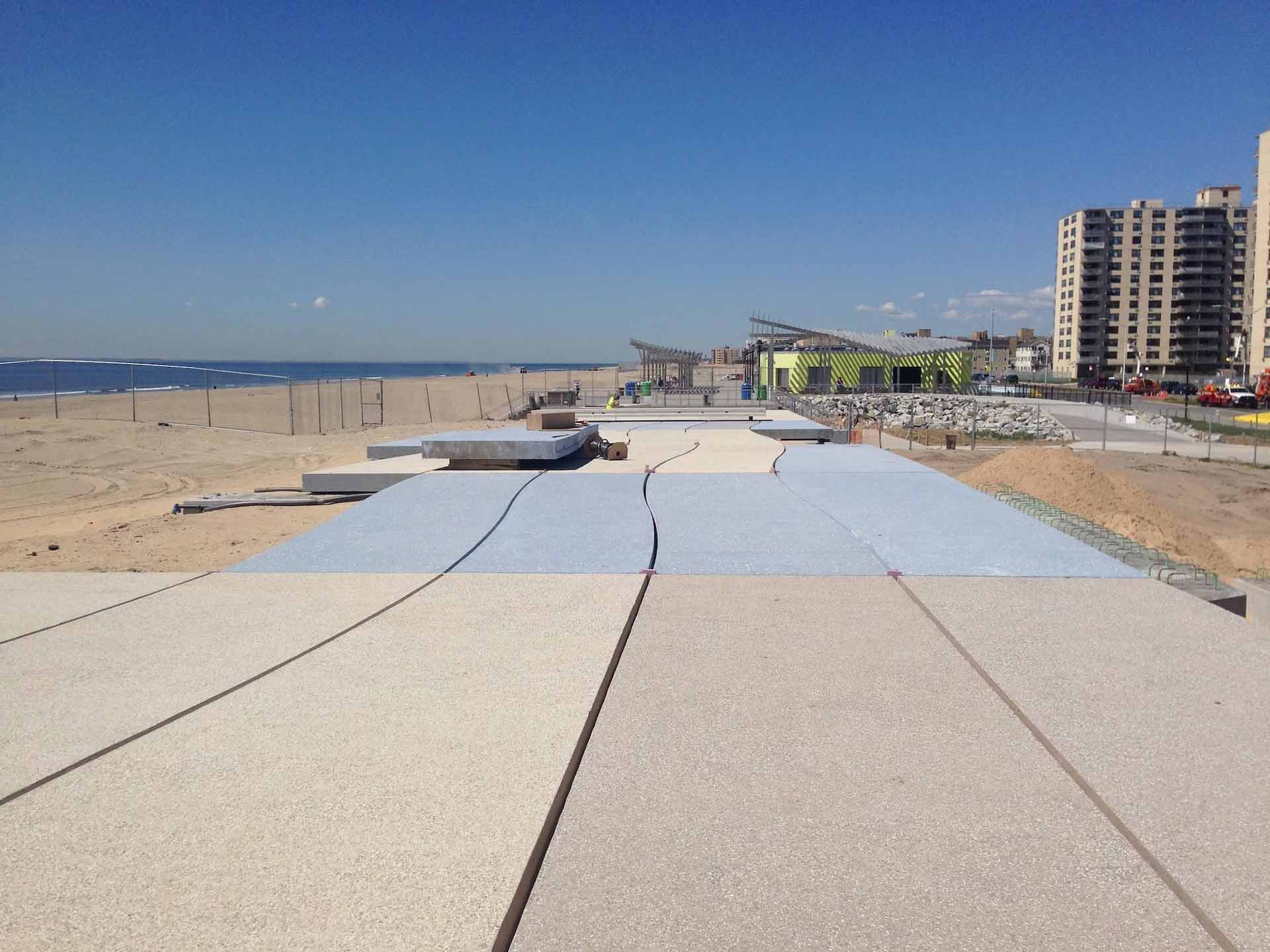
Paula Scher from Pentagram studio, in collaboration with architects from the WXY studio and engineers from CH2M, created a design for a pedestrian promenade stretching over one and a half kilometers, which was previously destroyed in 2012 by Hurricane Sandy. The planks traditional to American beach promenades were replaced with concrete slabs, much more resistant to natural disasters. The division of the slabs allowed Paula Scher’s team to create a large-scale inscription, where the shape of the letters follows directly from the division of the slabs.
From a human level, the letters form an interesting mosaic making the very long and monotonous promenade visually attractive. From a bird’s eye view, it forms an inscription with the name of the pedestrian route.
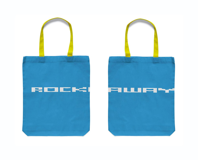
The shape of the letters decorating the slabs of the promenade was then translated into the design of the various visual identification materials for Rockaway Beach, which ultimately created an original and distinctive visual language. In this project, the concrete slabs were the direct composition material for the typographic signs.
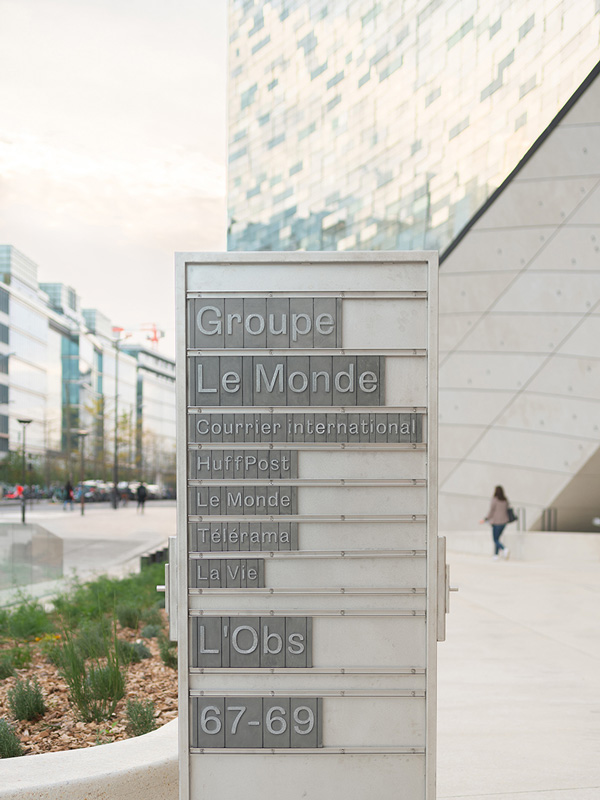
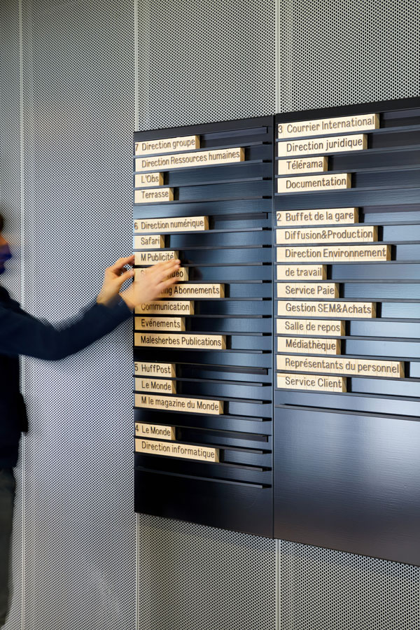
The designers creating the visual information system for Le Monde Group’s headquarters based their vision on a completely different material and inspiration source. The project was a collaboration between art directors from Le Monde magazine and architects from the Norwegian architectural firm Snøhetta (which has also seen an increase in the number of their wayfinding projects).
The design was inspired by the look of the wooden glyphs (used in letterpress printing) that were originally used to print the newspaper, before the era of digital design and printing. Wooden (or metal on the outside) blocks with individual letters inserted into specially created boards with prepared profiles offer the possibility of composing messages freely.
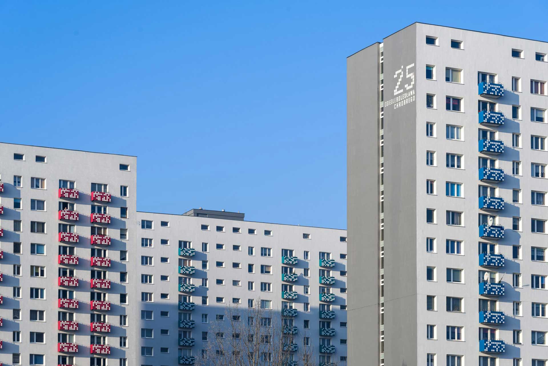
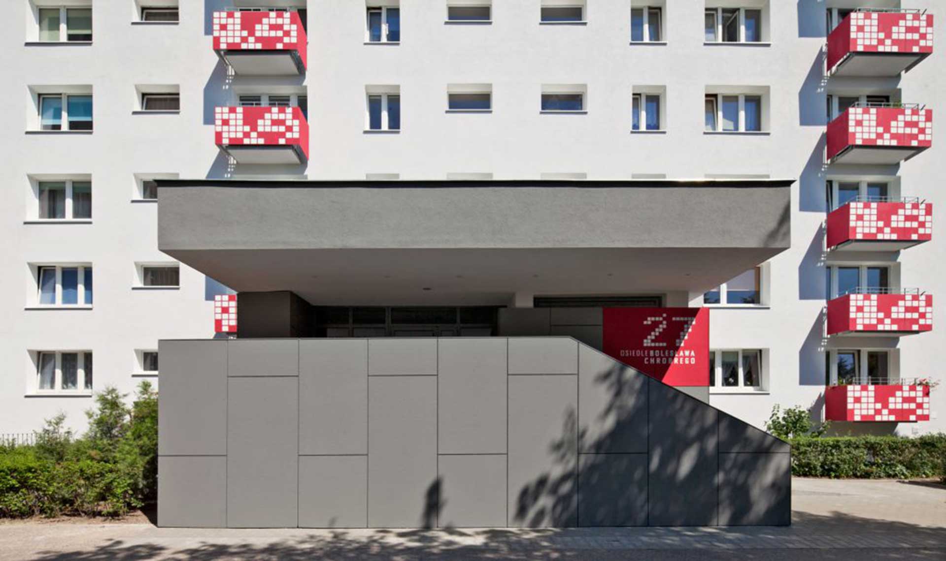
Sometimes, architects also do some graphic design and it can work out well. The Poznań-based architectural studio Ultra Architekci carried out an interesting project in 2012 to revitalize blocks of flats on the Bolesława Chrobrego estate in Poznań (Poland).
The buildings from the 1970s, which underwent thermal modernization, were insulated and, repainted, and the entrances and stairwells were revitalized. New graphic elements were added, mainly on the fronts of the balconies.
The architects were inspired by the mosaic from which certain architectural elements were originally made. The enclosures of the balconies were made from a cheap material called Minerit. When this material was cut, there was considerable waste left over, which the creators decided to use to create the mosaic modules.
Residents were additionally involved in creating the mosaic. In an organized lottery, which was directly inspired by the project of artist Ryszard Winiarski, the residents contributed to the layout of the mosaic design on the individual balconies.
The result of the whole process was a design that enriched the buildings, expressionless until the renovation, with distinctive elements that also allowed their inhabitants to identify with this architecture.
Architects very often play with form. Especially in buildings associated with a kind of spectacle, such as cultural facilities, or when it is important for the developer to stand out, such as the headquarters of global companies. In these particular projects, the creators challenge themselves by trying to create something out of the box and, new, that showcase other ways of thinking.
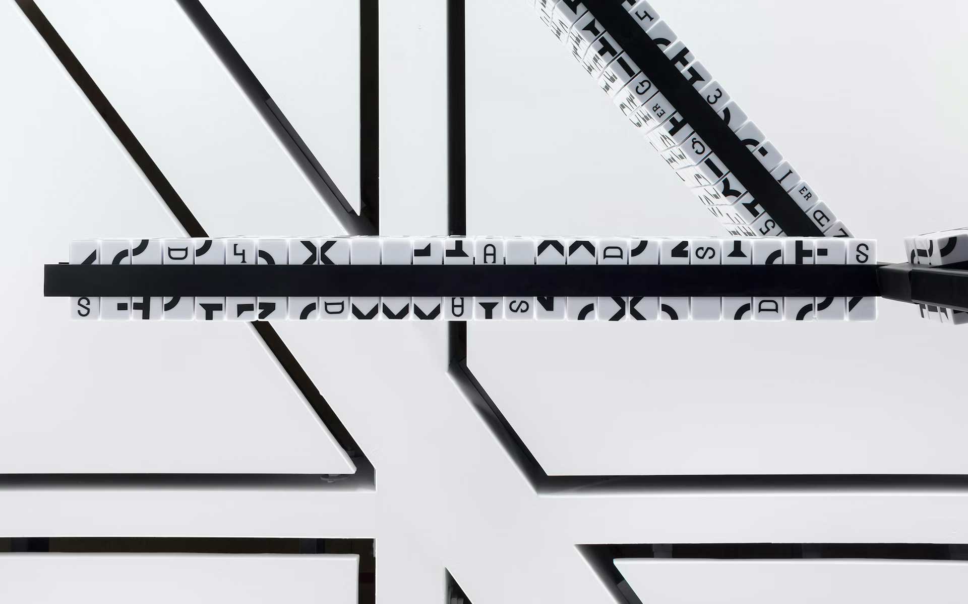
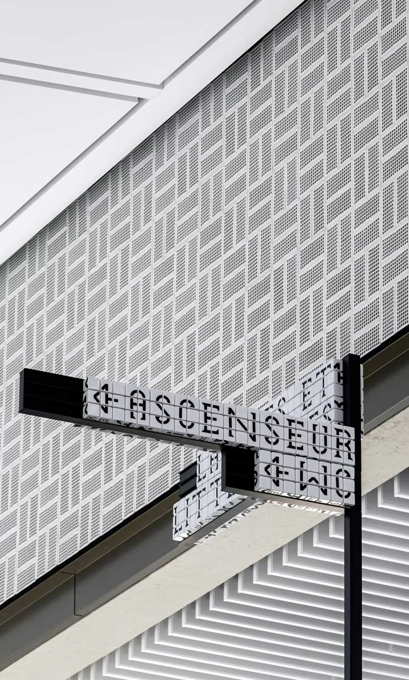
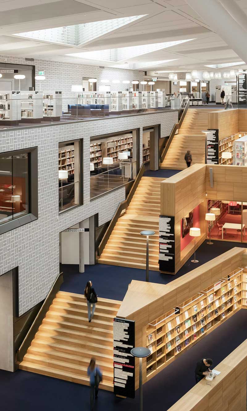
Let’s start with an example of the signage and wayfinding system designed for the Bibliothèque Nationale du Luxembourg (BnL) by Sascha Lobe, the partner at the Pentagram studio mentioned before. Lobe himself, an architect by training, often collaborates with renowned architectural offices in his projects and seems to understand the world of architecture very well.
The basic idea of the project for the library in Luxembourg was to create cubes that are both a sign system and resin tiles. The developed typeface Bibliothèque found on the cubes relates directly to the architecture of the building. Signs in four sizes are placed on different sides of the cubes, making it possible to compose legible content from different distances.
Signs visible from afar, placed on special poles in the open space of the library, allow visitors to quickly find their way around the space, while smaller signs placed on the walls provide more detailed information. The cubes’ robust and highly durable material was intended to further emphasize the timeless character of the library and its long history.
Another example is the design of The New School in New York created by Ruedi Baur’s firm Intégral.
The building of an institution that has been training designers for more than 100 years needed a new wayfinding system.
The designers used the Irma font in the design. By playing with the light and black variations of this font, the effect of three-dimensional letters seen from different perspectives was achieved. The effect created, as in previous examples, refers to the architecture of the building and the characteristic three-dimensional folds on the façade.
This treatment is used in the space of the building both flat (by applying graphics to the wall) large 3D compositions in representative places. These from the outside of the building may appear more like small architectural objects than signage signs.
The different perspectives of the letters, the use of different compositions that fill the entire wall or are just single three-dimensional letters, the rich colouring as well as the play with fillings and the contours themselves create a very complex graphic language, enriching the entire space of the school.
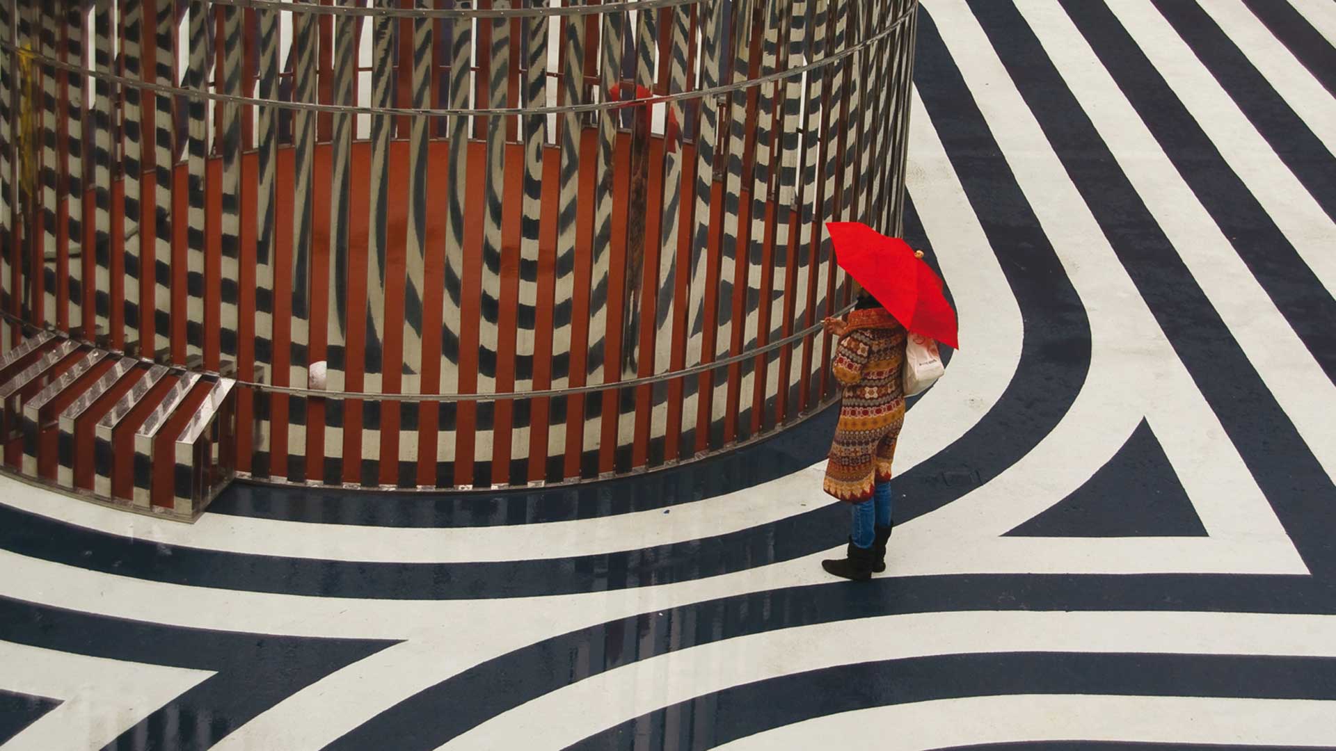
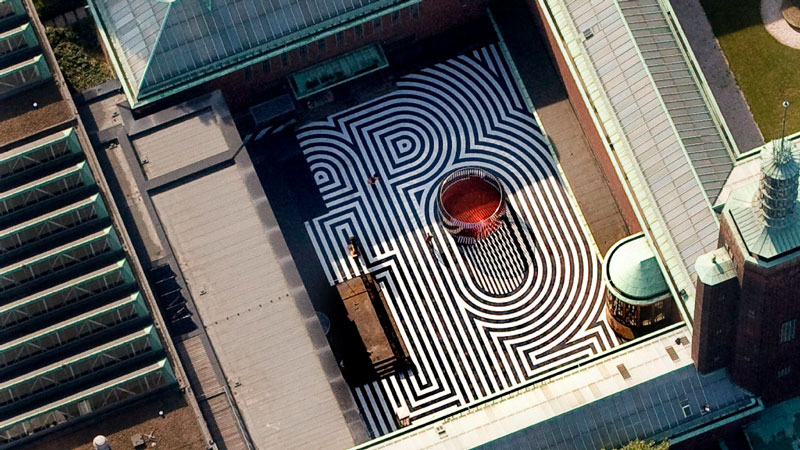
Sometimes, we can also encounter the opposite approach. For example, one of the basic graphic elements – the line, can be transferred to a space. Designers from the Dutch studio Thonik have created a visual identity for Museum Boijmans Van Beuningen in Rotterdam.
In the identity, the museum’s name is written in a very simple and classic font, without creating a particularly original logo. However, they have created a special typeface in the form of three parallel lines (inspired by Lance Wyman’s visual identity of the 1968 Mexico City Olympics), the use of which characterises all of the museum’s graphic material. These triple lines are used to draw simplified symbols or slogans, creating a very distinctive identification.
The same effect was used in 2009 to fill the floor of the museum’s courtyard. The designers from the Thonik studio, in collaboration with the artist Olaf Nicolai, created a mosaic based on their identity. As it turned out, such a simple yet visually powerful effect also worked well in the public space (urban design). As in the Rockaway Beach project, the whole concept is unrecognisable from the human level, although the characteristic stripes, which blend in very well with the museum’s architecture, immediately bring to mind the familiar motif of the museum’s graphics.
Reaching for three-dimensional forms seems to be straightforward. However, graphic designers are often used to thinking flat. This is what they are taught in the course of their education so, even in their later projects they rarely use 3D tools (which is a huge drawback when it comes to urban design).
If they do, it usually remains in digital form, but not in a physical one (the exception may be wayfinding or signage, but this is only a small part of the work of branding companies, and often selected companies specialise in it). In urban design, operating with 3D forms can definitely make a design more attractive, more visible, and fit in better with the surrounding forms.
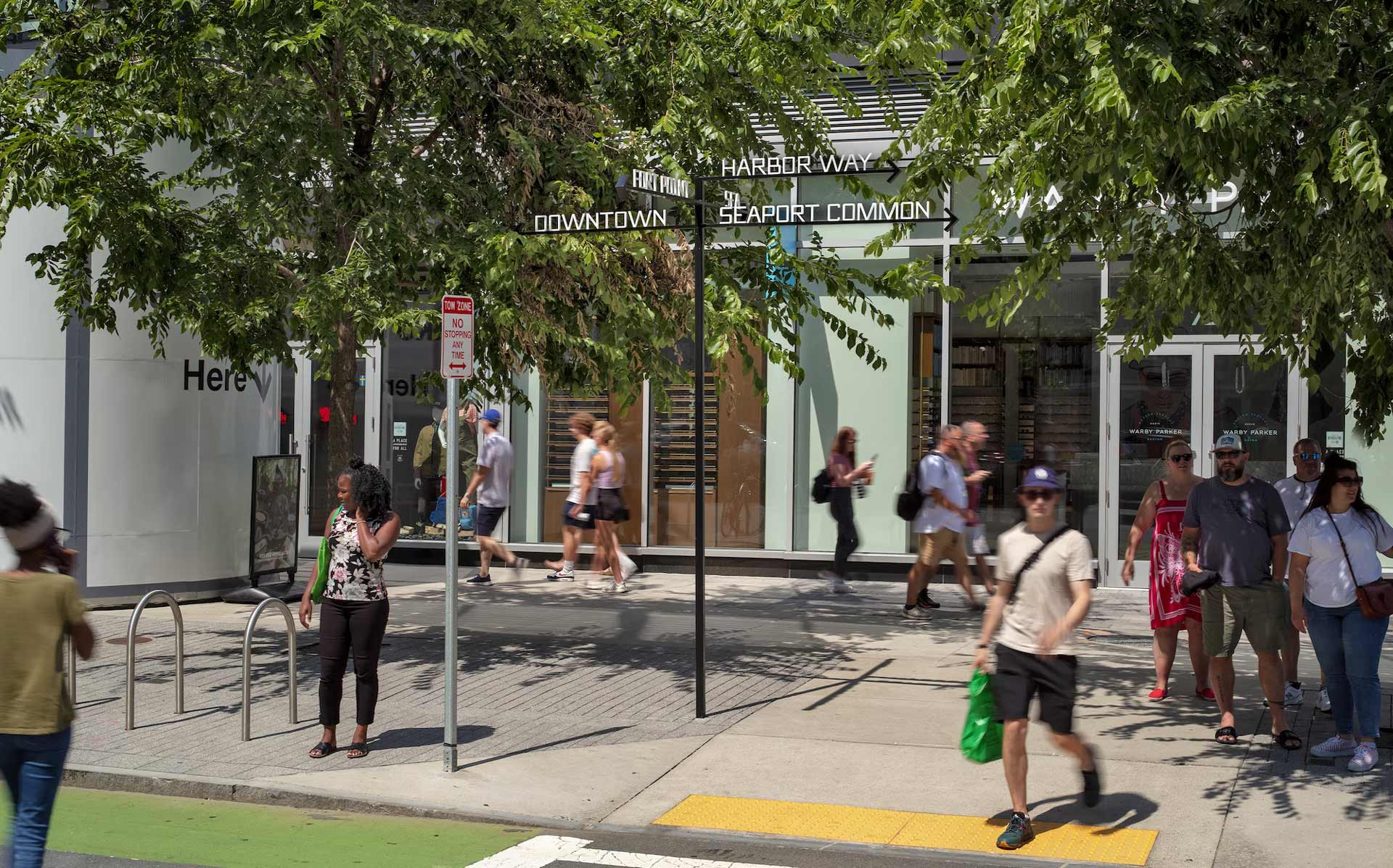
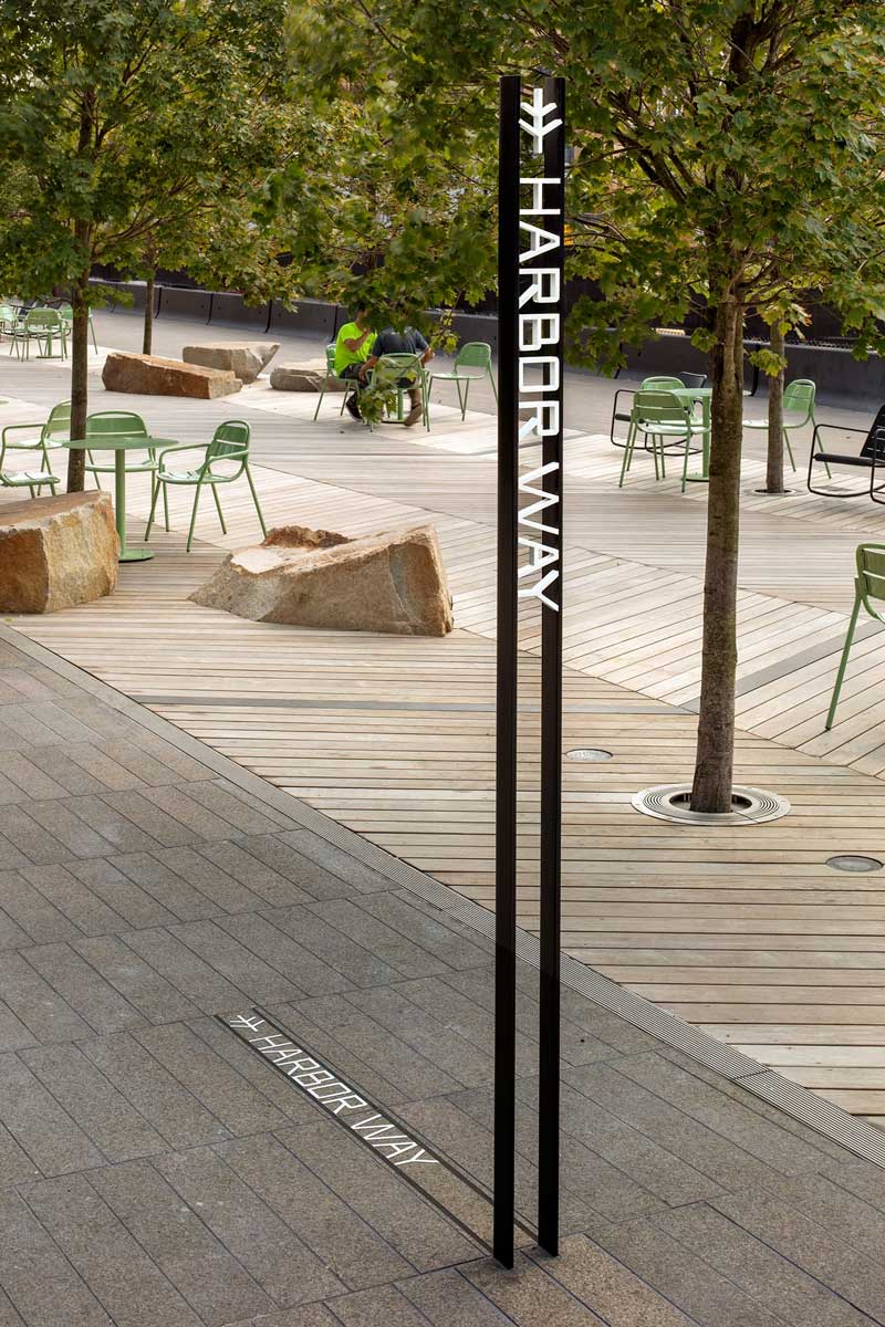
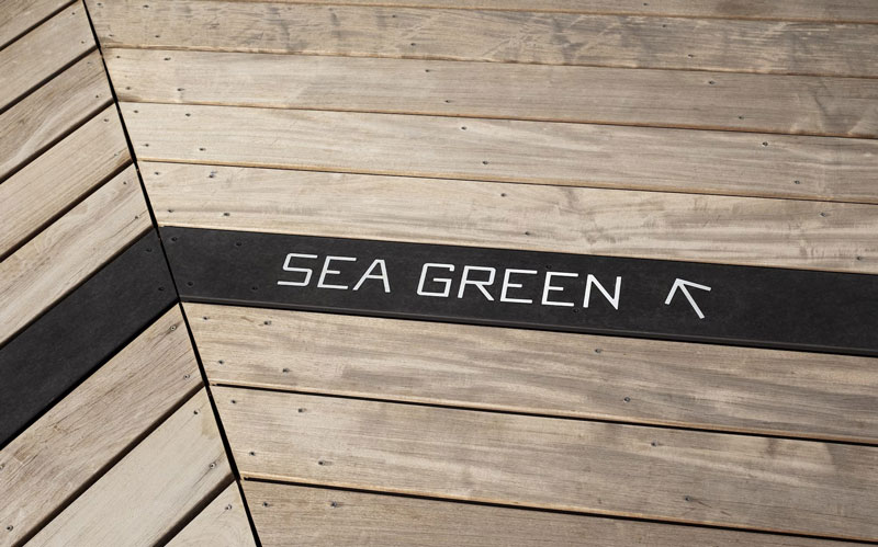
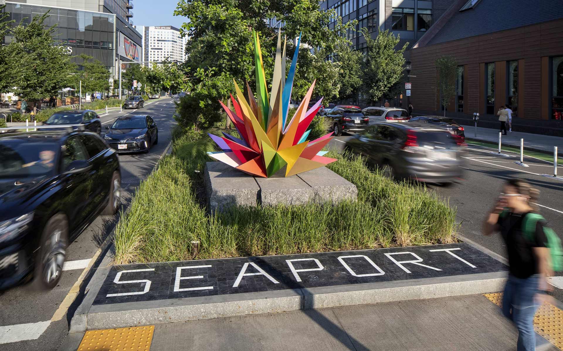
From the beginning of their work on the identity design for Harbor Way, the team of Paula Scher, already referred to here, thought and designed in 3D.
The revitalisation of Boston’s urban harbour area is a massive project to transform a former industrial coastal zone into a resident-centered area that is a park and boardwalk filled with various functions to serve visitors. The logo, designed by the Pentagram team, refers to the chevron shape of the promenade planks and to the trees growing in the park zone and also emphasises the centrality of the promenade in the whole area.
The whole wayfinding – made mostly of powder-coated steel elements – refers to the industrial character of the area. It is also intended to give the impression of having existed here for a long time. The proposed, original, simple typography, is also mostly made of linear profiles, and complements this character. Some elements of the system are also inscribed directly into the planks on the promenade, or laid in the paving blocks found in the revitalised area.
Such treatments further emphasise the uniqueness and belonging of this project to the specific site. The designers achieved this by going beyond thinking in terms of flat planes and using three-dimensional elements that are normally, associated with industrial constructions or elements of small architecture.
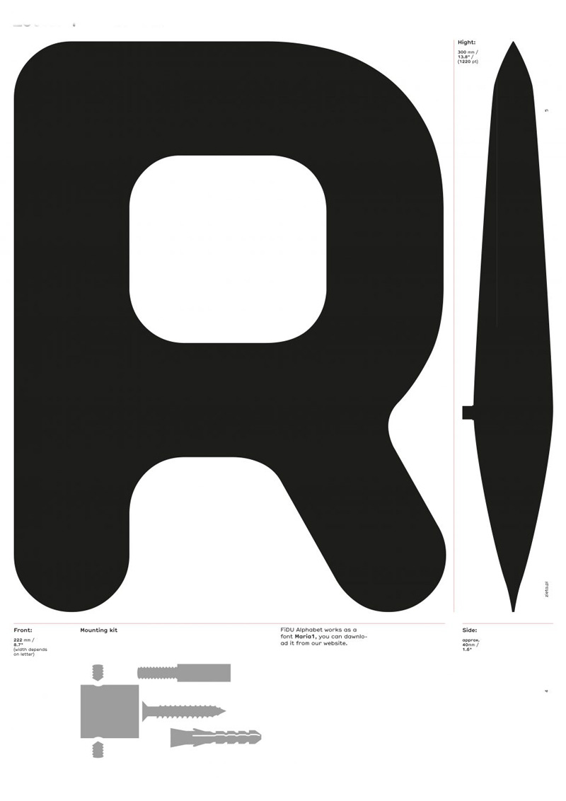
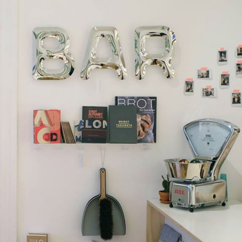
Another project, not related to a specific urban design space but very well suited to it, is the design of a font created from Fidu – the technology, developed by Polish designer Oskar Zięta during his PhD at the ETH in Zurich. This technology allows welded thin sheets to be inflated under high pressure to create a lightweight and very rigid structure.
A technology normally used in the design of spatial installations or furniture was used here to create an alphabet of 3D letters, or 2.5D, as some prefer. Font Maria, created by Marian Misiak in collaboration with Oskar Zięta’s studio, is a very interesting example of collaboration and exchange of experience from different fields of design.
On the one hand, the typographer had to consider the limitations associated with the technology of producing physical metal objects. In contrast, the industrial designer had to adapt his technology to the requirements that a fully functional typeface must meet. The final shapes of the letters and the characteristic curves are a direct result of the conditions of the Fidu technology. In this case, the typographer created a very interesting and original design dedicated to wayfinding and signage, directly following the constraints of the material used.
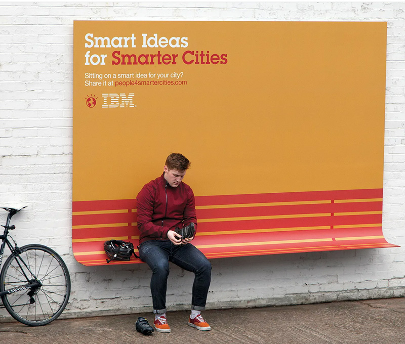
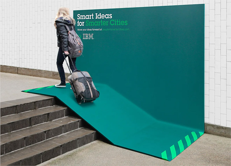
In 2013, unusual billboards could be seen on the streets of Paris. One of the things that were atypical about them was the form, namely that something literally stood out from each of these billboards. They were not the typical flat panels hung on poles or walls. IBM’s ‘Smarter Cities’ campaign, created in collaboration with agency Ogilvy France, was intended to show the approach of the well-known US Silicon Valley company to designing new solutions.
One headline read that “IBM makes outdoor ads useful in smarter cities campaign” As the designers themselves say, they achieved this by adding just one fold. In doing so, they created new functions for the ads. One was a shelter from the rain. Another was bent from the top to create a canopy, while another was a bench – bent at the bottom at the height of a standard seat, and yet another created a ramp on a staircase.
All the billboards additionally suggested their function by means of simple printed coloured symbols. In addition to this, they were simply covered with full colour and contained one short slogan with a link to the campaign website. In this clever way, IBM demonstrated that it can be smart in a way that is truly functional.
No project exists in a void. We are surrounded by other graphic designs and, above all, by other visual contexts. There are also different audiences in the public space (urban design), with different tastes, and different perceptions. Sometimes, in order to create a good design, you don’t have to try to be original, you just have to look around, use simple means and refer to the context.
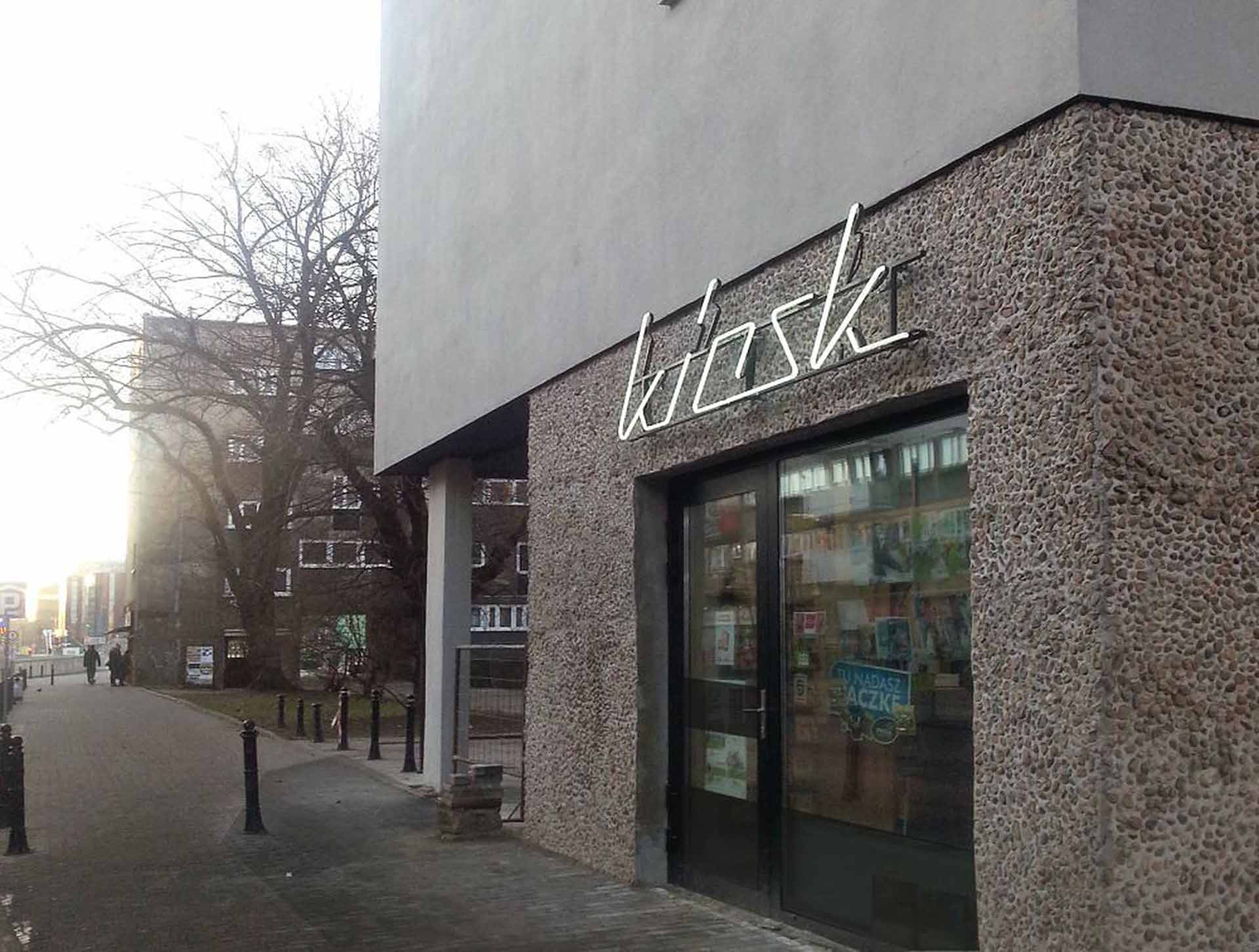
During the revitalisation of a group of residential buildings from the 1950s and 1960s, the architects from Vroa architectural company were faced with the challenge of proposing a sign for the kiosk operating on the ground floor of one of the buildings. Neither the tenant nor the investor was interested in hiring a company specialising in such projects, so the architects undertook this task on their own. Making reference to the neon sign, traditional at the time of the creation of buildings, they created a simple sign.
This very modest project demonstrates how architecture can be made more attractive by simple things, without competing with it, while at the same time fulfilling the function expected of signage – informing people about the activity located in a given place. It is, after all, just a few lines, plus, as the creators admit, created in CAD, a program normally used for engineering or architectural projects, which does not have the functions to facilitate the graphic or typographic design.
This project, so small in scale and scope, has attracted a great deal of interest from the media and residents of Wrocław, showing it to be a positive example of change.
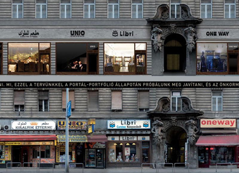
This project attracted huge media attention in Hungary. Utcahossz’ project (which means ‘length of street’ in Hungarian) was created by the duo Zoltán Csordás and Gergely Fodor, and was mainly about reducing rather than adding new elements
The designers set themselves an ambitious goal of controlling the visual chaos on one of Budapest’s most important thoroughfares – Lajos Kossuth Street: a place where the vast majority of premises on the ground floors are house shops. Each of these shops advertises its business in its own way and designs its shop windows.
The designers were able to create a coherent image for the entire street without killing the character of the individual businesses. They did that by using quite simple measures such as limiting the colour palette and keeping similar proportions of the visual signs.
This project has led to many discussions in the city, involving both city officials and professionals who care about the quality of public space (urban design) on a daily basis, and has allowed the development of some model solutions to be made available to new commercial tenants.
Keep in mind that the very forms of typography should already be visible in the context of flat and simple building blocks. We do not always have to make them blink, shine or glow in neon colours.
We all share our spatial environment. Both graphic designers can learn a lot from architects and architects from graphic designers. There are many examples of how drawing on each other’s means of expression can lead to original urban designs. It is important that, while ensuring originality and responding to the needs of the client, we do not stay blind to the world around us and, above all, the recipients of our work.
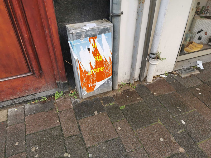
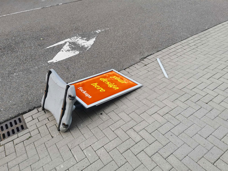
Finally, to sober up our romanticised visions of design (often presented in the context of idealised mockups), let’s take a look at an ironic project by Dutch designer and art director Wytze Hoogslag. In his “Fockups”, he shows what the works of graphic designers look like in a real life context. The eight mockups he has made make it easier to imagine our designs in a real spatial context. Brutally real.
It may be worth considering, especially nowadays when we are being overwhelmed by marketing messages screaming at us from every corner. So let’s take a deep breath, think for a minute, and reflect on whether our work is not going to be just another “fockup”.