Brandometr is an article series created by our Senior Graphic Designer, Andrzej Leraczyk, in which he rates and discusses the visual identity of startups chosen by himself. The first two episodes (Brandometr and Brandometr pt. 2) can be found on Admind’s blog and below you can find a set of five further startups.
Covariant
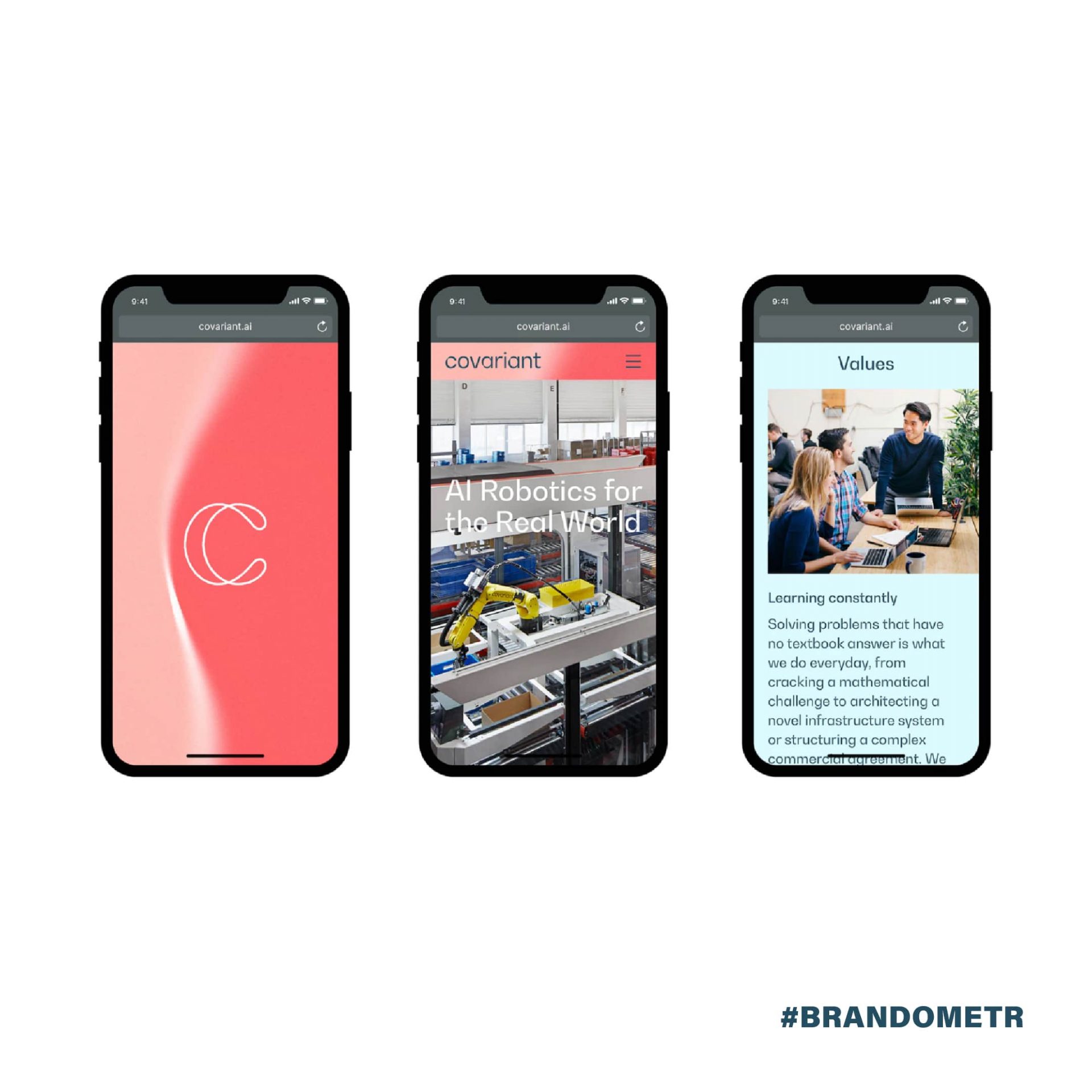
Working on an artificial intelligence (AI) project entails being as flexible as the technology itself. A good example of this is the visual identity designed by Pentagram for the American technology prodigy, Covariant. Probably not only us, but also Pentagram’s designers were unable to say what exactly Covariant does and what their competitive advantage is. ⠀
As the designers themselves admit, they had to learn quite a lot before starting their design work: ‘We start with research and try to understand the topic as deeply as possible’. This process invariably leads us to the various essential technical and theoretical aspects of the project that precede aesthetic solutions.
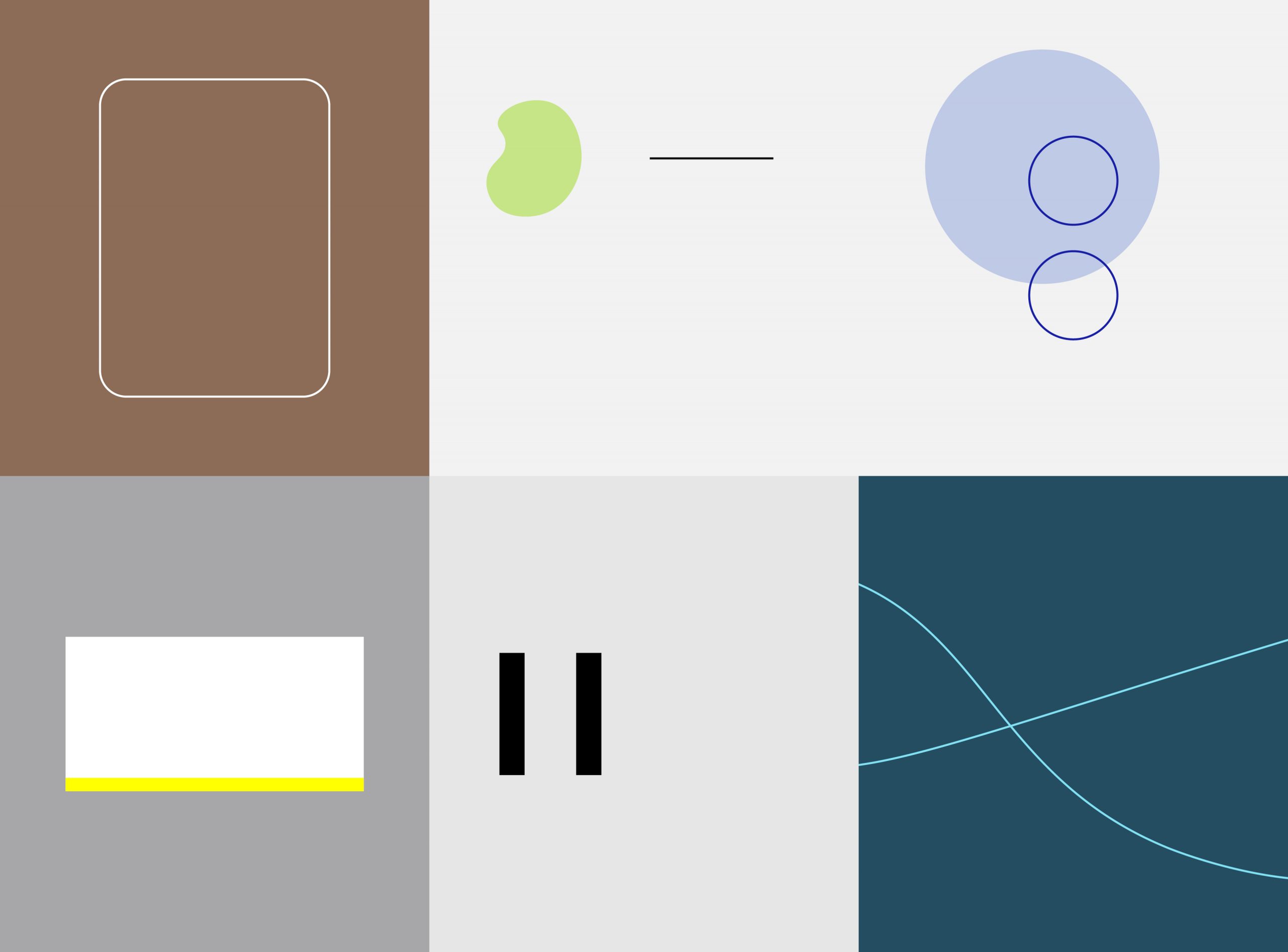
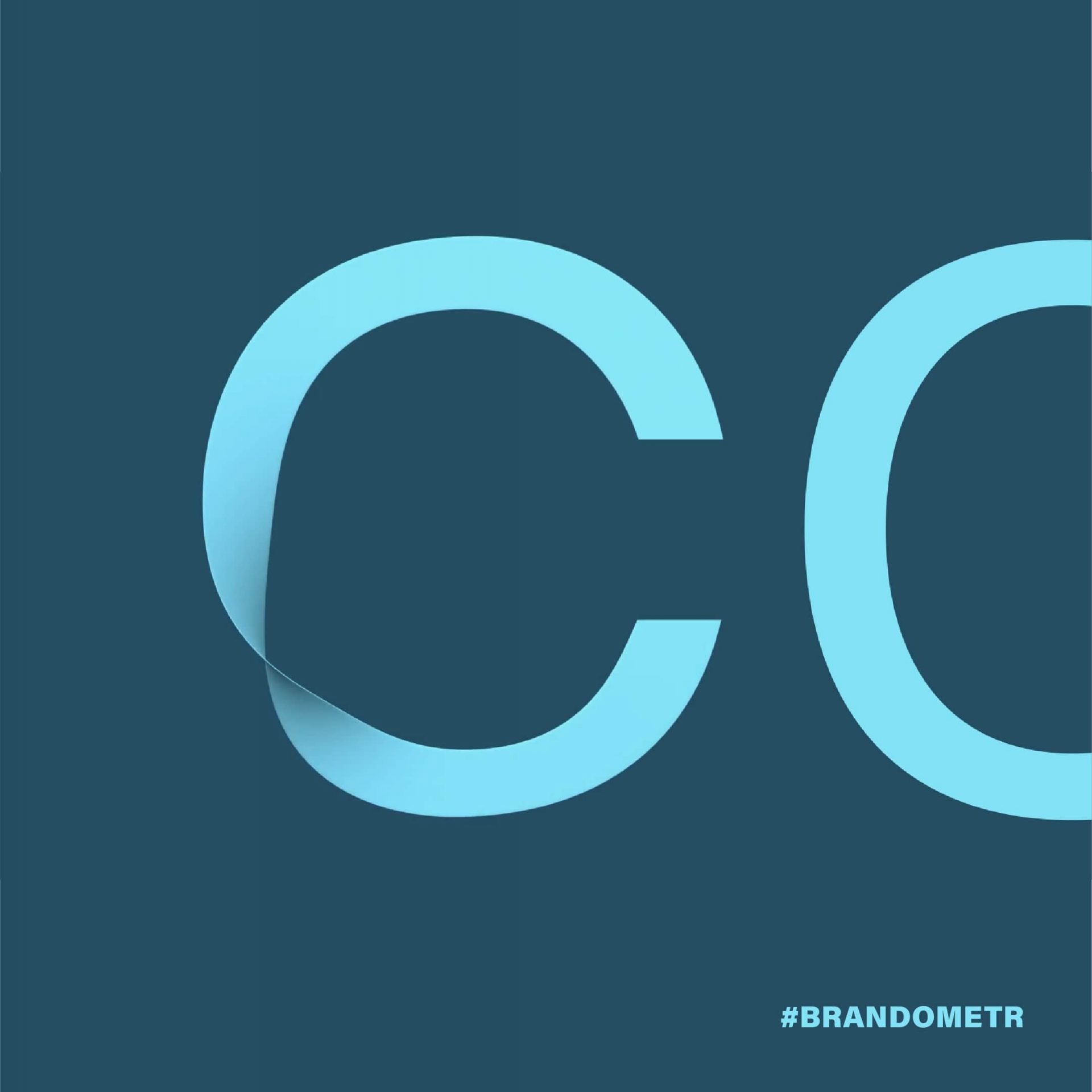
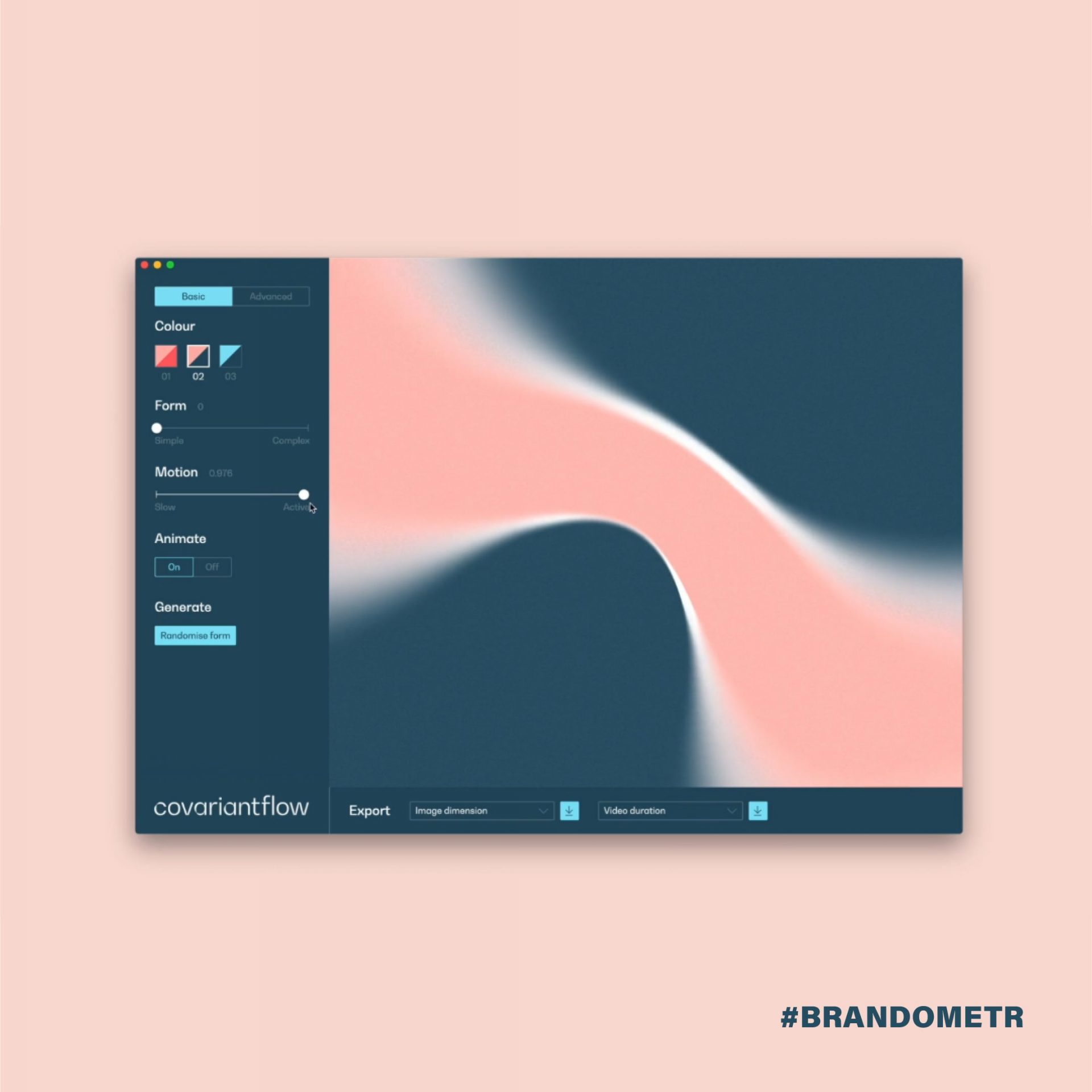
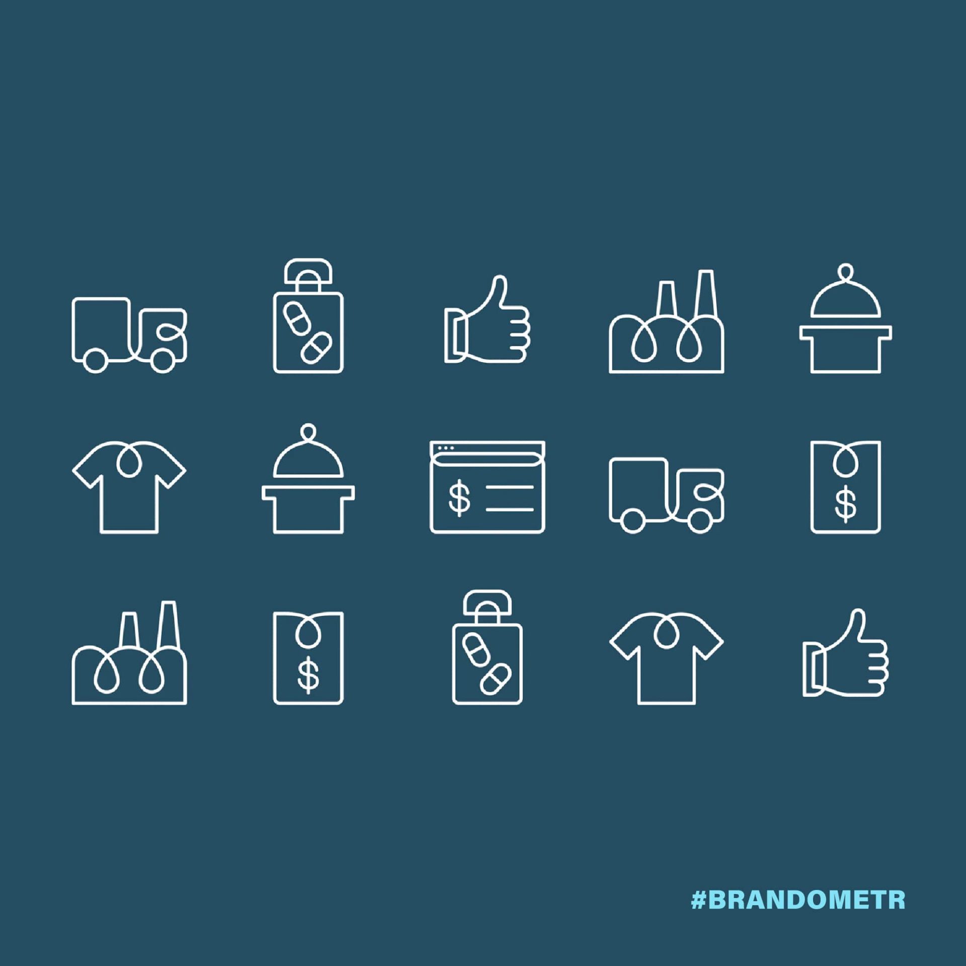
The result of this work is a dynamic and subtle branding that comes as a real shock to many accustomed to the engineering dryness of the industry! These pastel, spilling blobs and the fluidity also emphasised in the lettering, create a harmonious structure that captures the essence of AI. The designers are aware of this, as they emphasise they have made a conscious effort to find a new place for the brand’s identity. ⠀
‘When creating branding for technology companies, we often try to compress the large and potentially complex ideas behind these ventures into one condensed idea’, explain Jody Hudson Powell and Luke Powell, the two Pentagram partners leading the project. ‘In the case of Covariant, we wanted to showcase the adaptability, learning capabilities and intelligence of robots in particular’. ⠀

Huel
Huel is one of a number of companies (along with, for example, Soylent and Mana) offering a new approach to nutrition to the Western world. It was founded 4 years ago in the USA by Julian Hearn, whose business idea was to produce and deliver to the consumer nothing but fuel (hence the name: a combination of the words ‘human’ and ‘fuel’). It is in opposition to the overloaded culinary culture and to oversaturation, excess and overproduction that Huel wants to provide only the essentials.
Hearn believes that the result of this excess (including excess taste!) is an addiction to food and its further consequences. ‘I believe that our goal is to remove unnecessary additives, flavours, packaging and preparation. The consequence of this is the minimalist aesthetic seen in many brands of this type of product’. ⠀
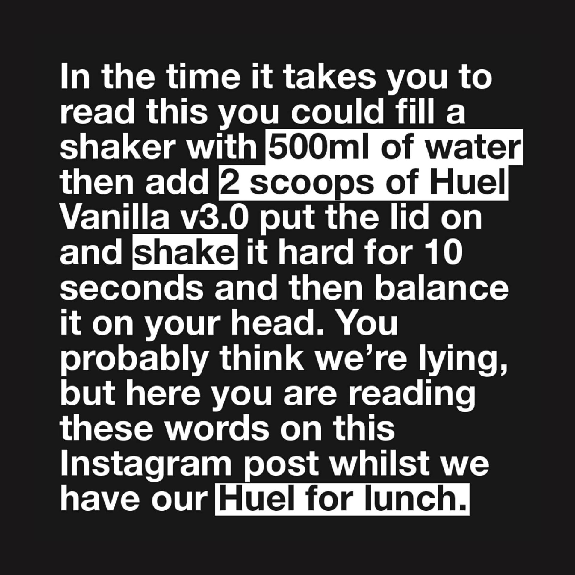
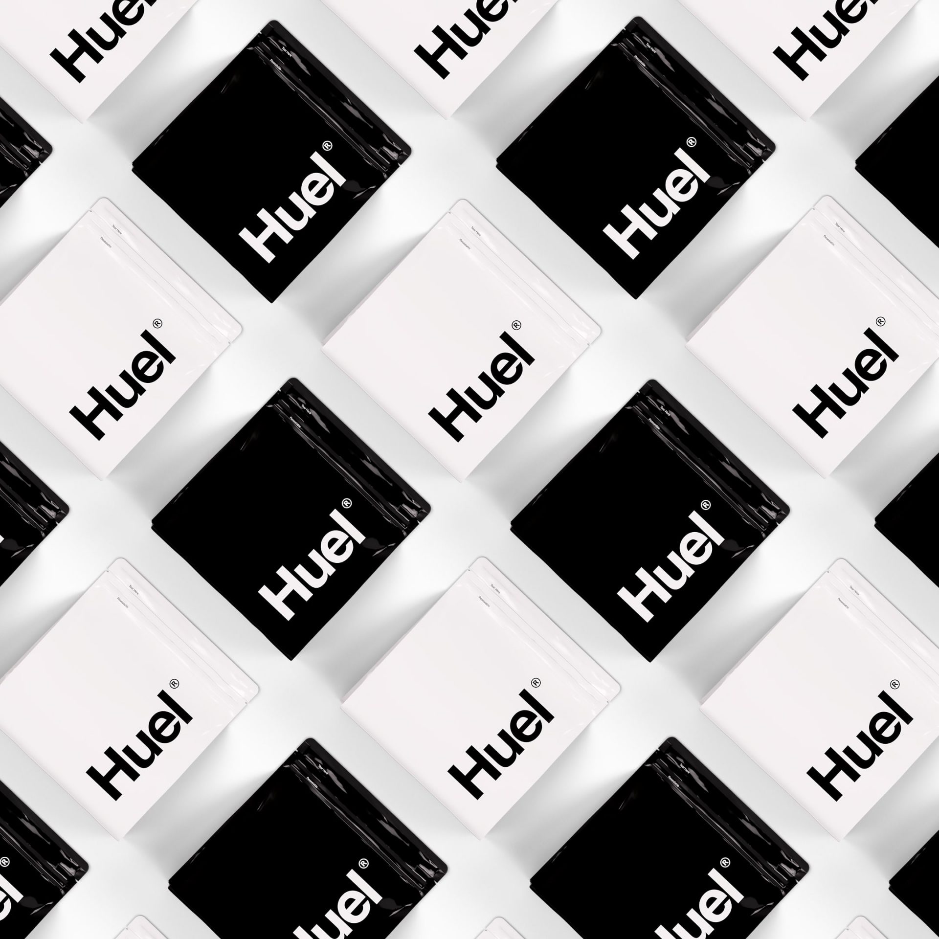
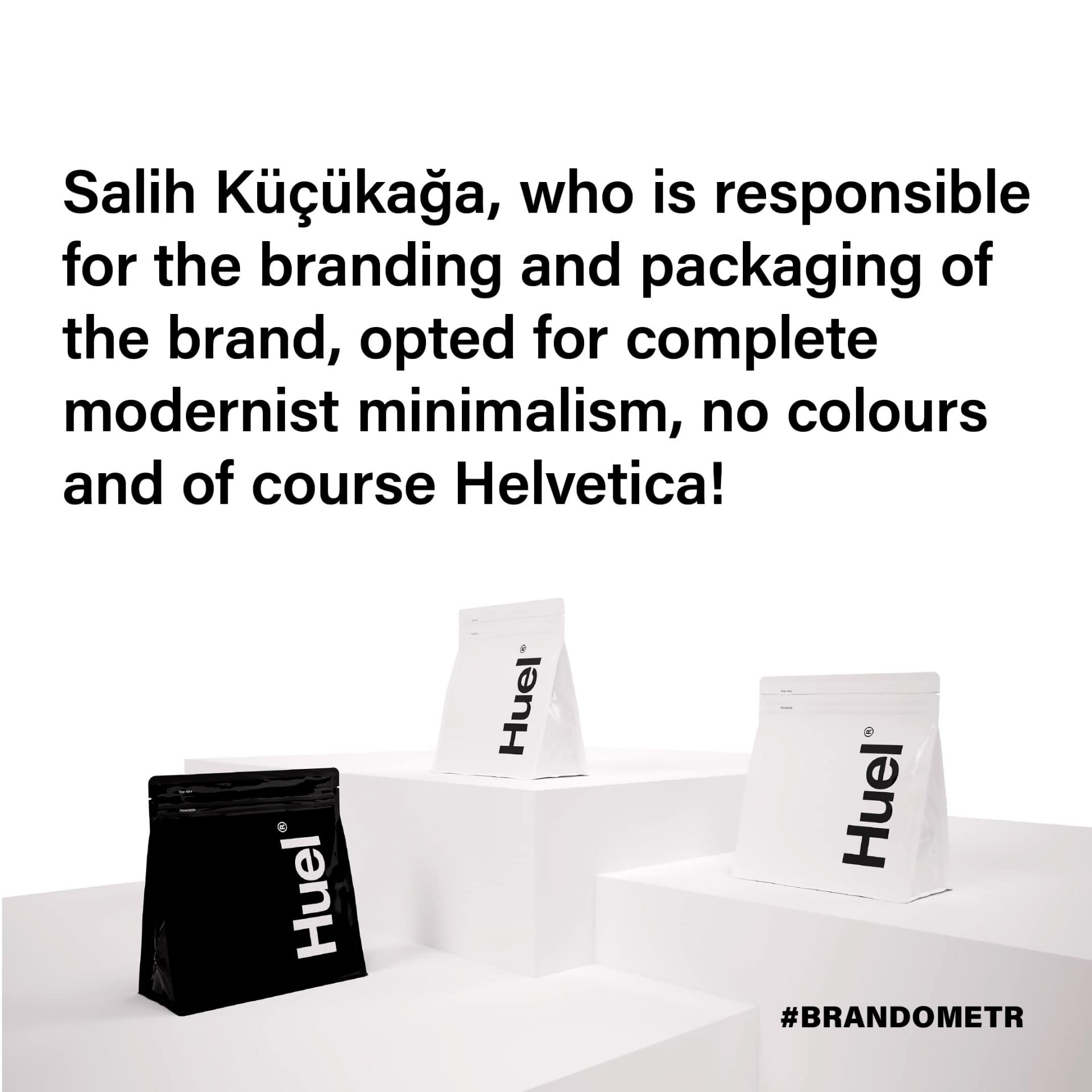
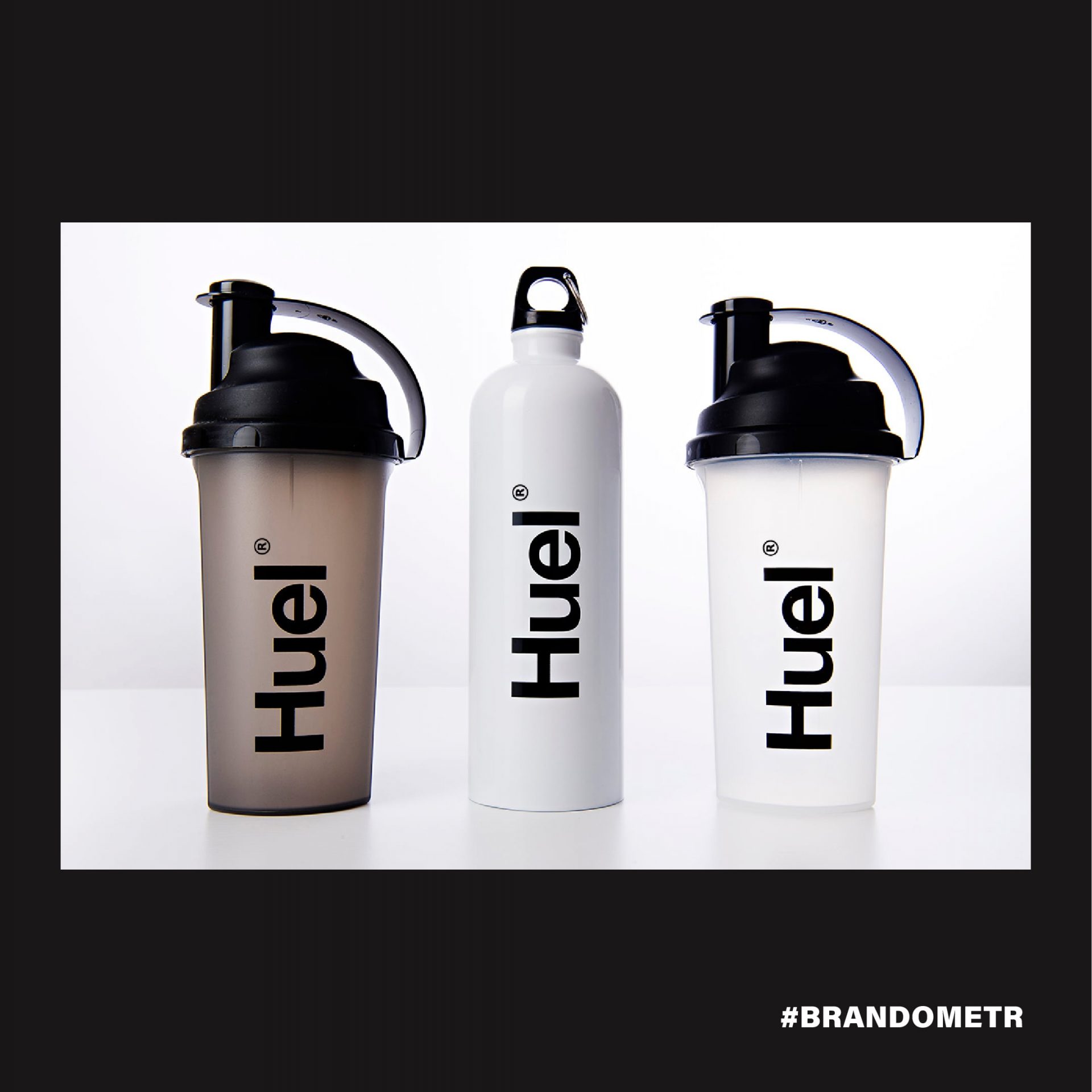
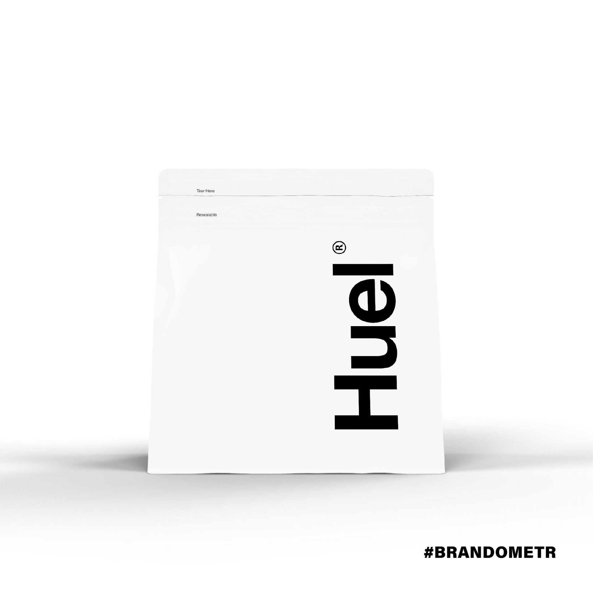
Salih Kucukaga, who is responsible for the branding and packaging of the brand, opted for complete modernist minimalism, no colours and of course Helvetica! The large, overscaled brand name and the abandonment of other graphic elements besides typography perfectly fulfil the task set before the designer. Admittedly, the implemented product is minimally different from the designer’s proposal, but still Huel tries to be as far as possible from the existing habits (and superstitions!) associated with food brands. ⠀
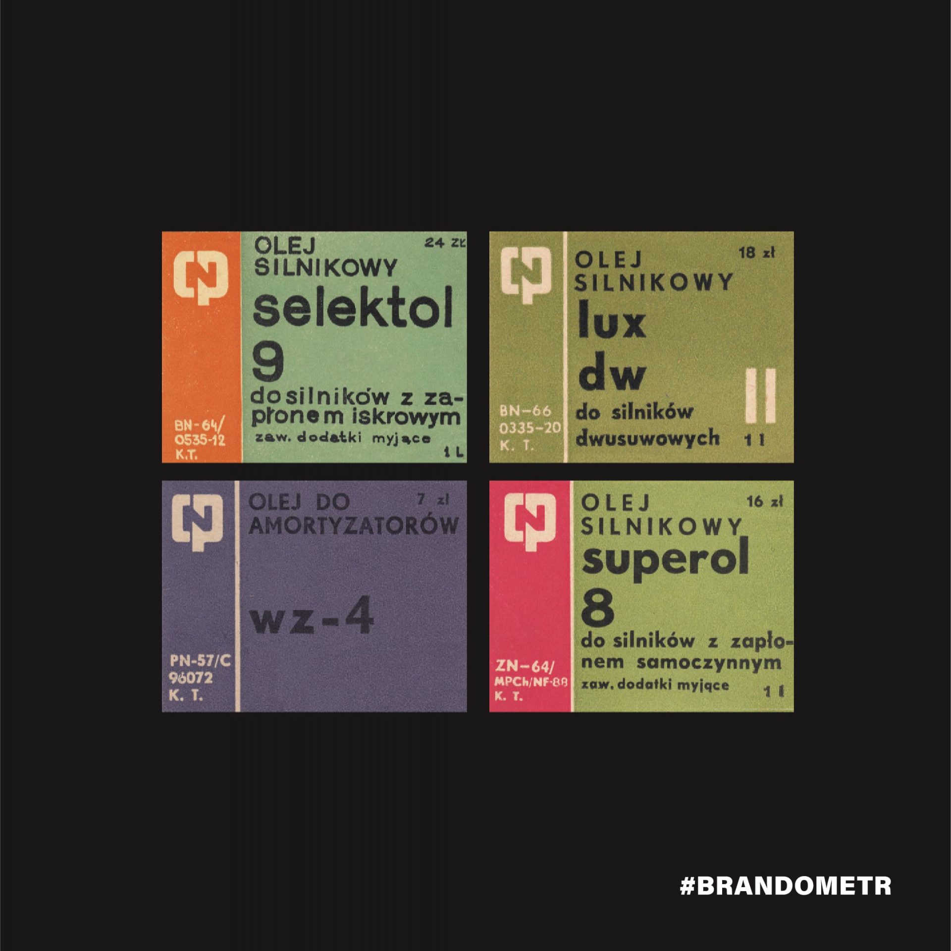
‘New food’ is more the result of the work of laboratories, it is a product of the chemical industry, which is probably why its branding reminds me so much of a project older by almost 50 years, prepared for Centrala Produktów Naftowych (a former Polish oil company) The authors of this identification were Ryszard Bojar, Stefan Solik and Jerzy Słowikowski. They also used Helvetica! (the last illustration comes from Patryk Hardziej’s book ‘CPN znak identyfikacja historia’).
Accelpoint
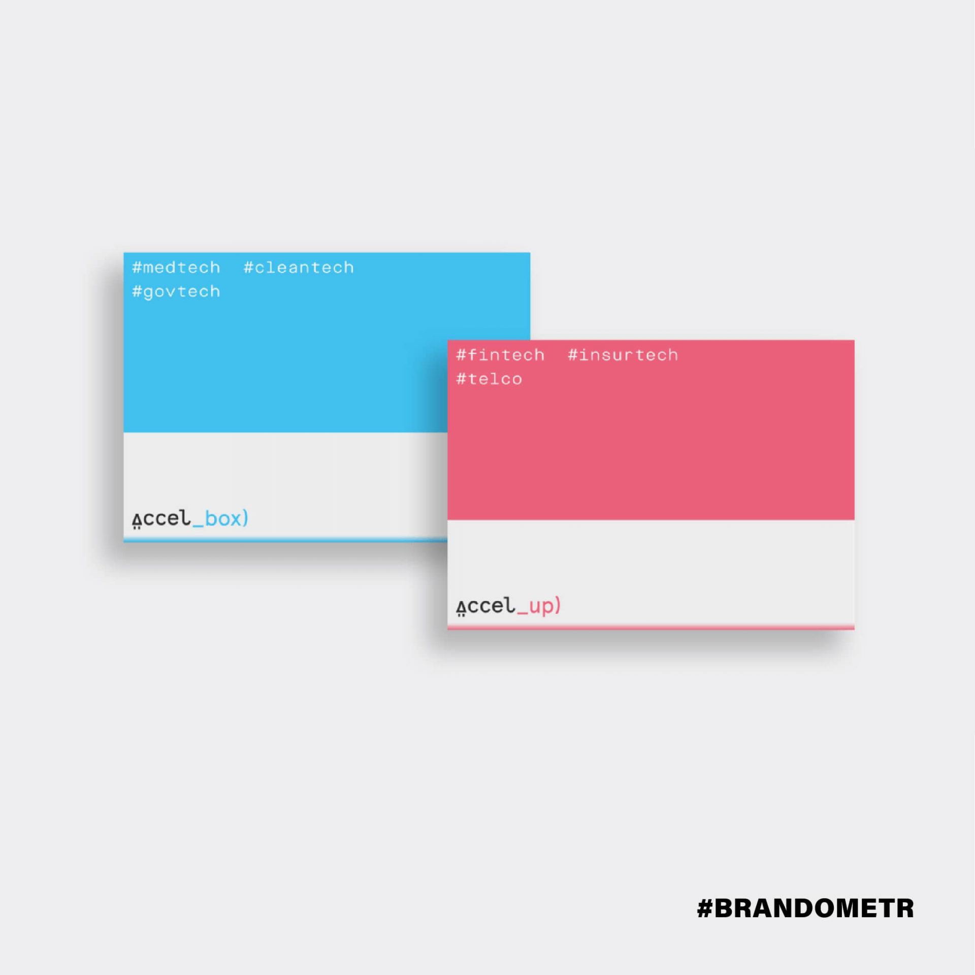
I once saw this cartoon joke by Kaamran Hafeez, in which a guy at a bar says to a girl: ‘I’m starting with a startup that will help startups get started’. I don’t know if the founders of Accelpoint saw the drawing, but they did just that. They support new entities at the beginning of their development, while being a startup themselves. ⠀
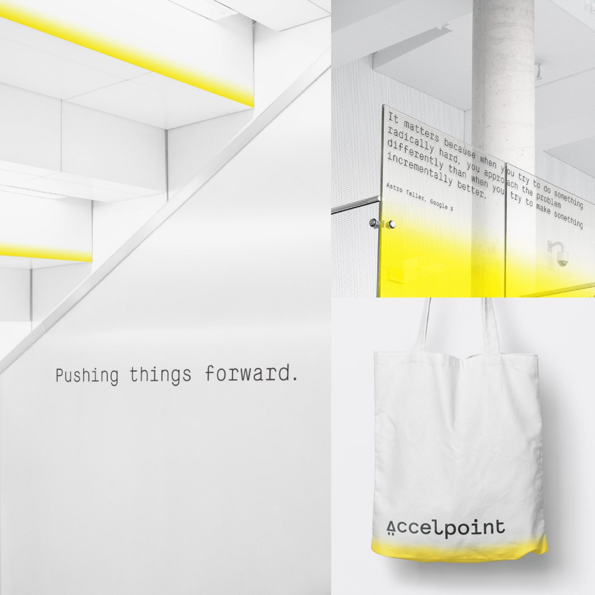
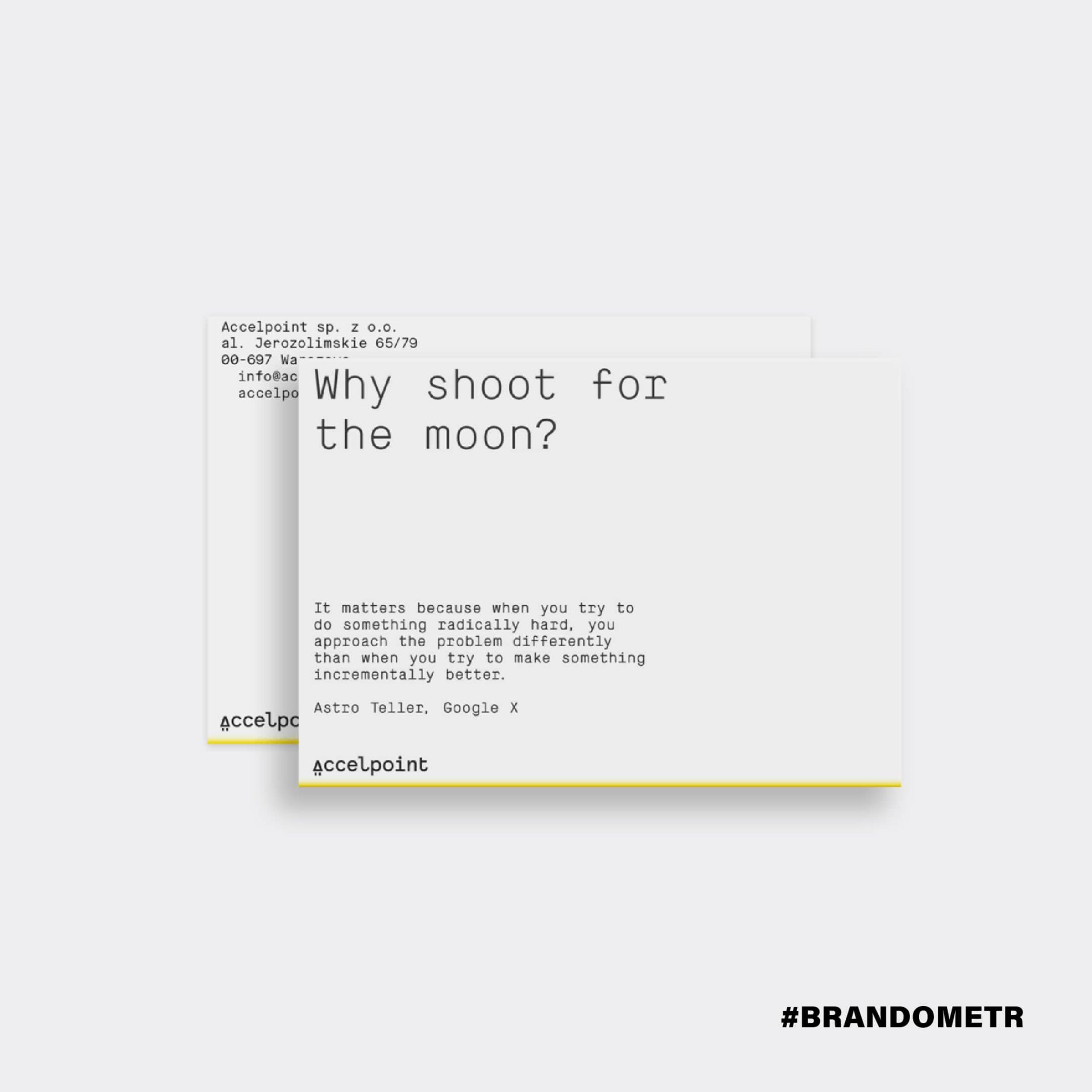
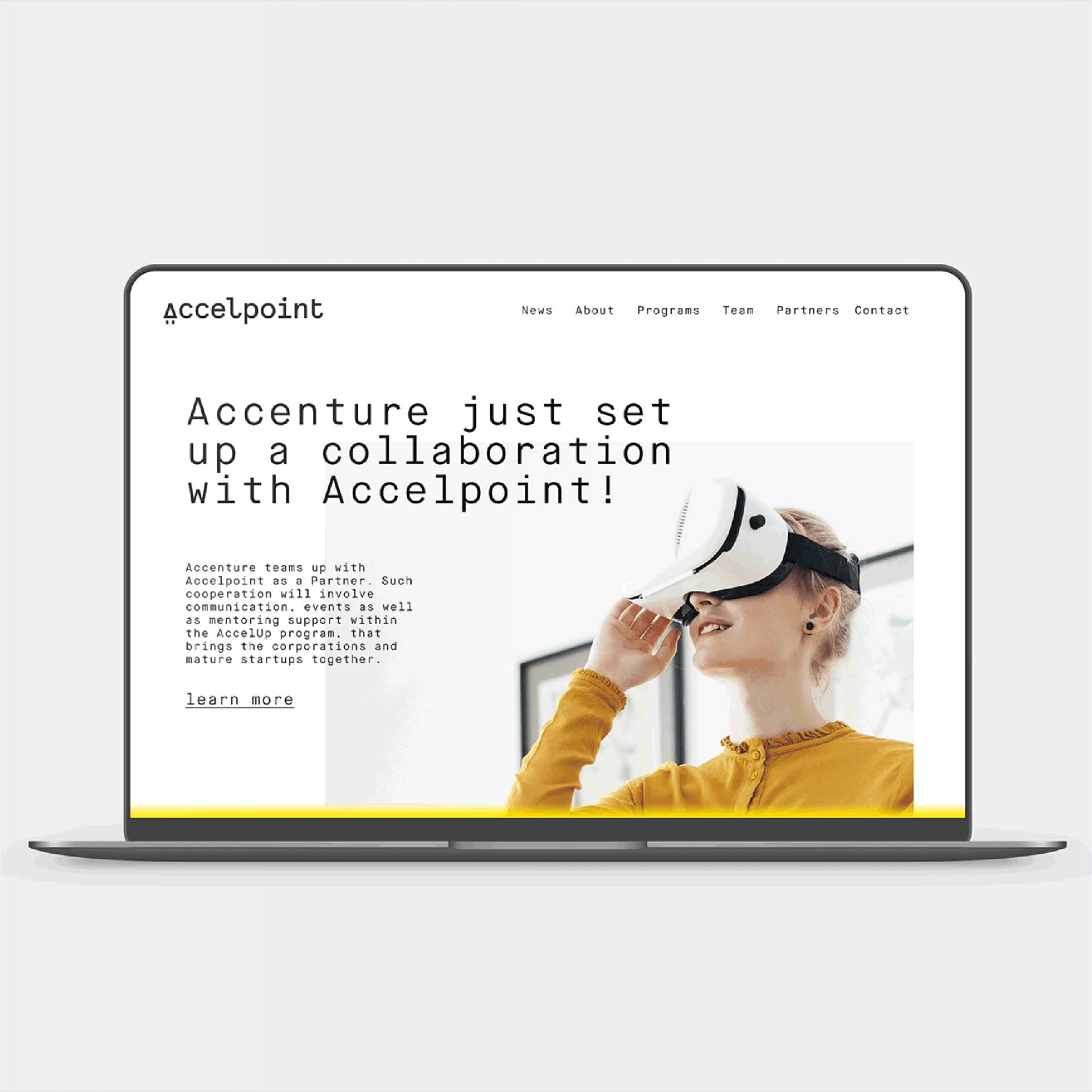
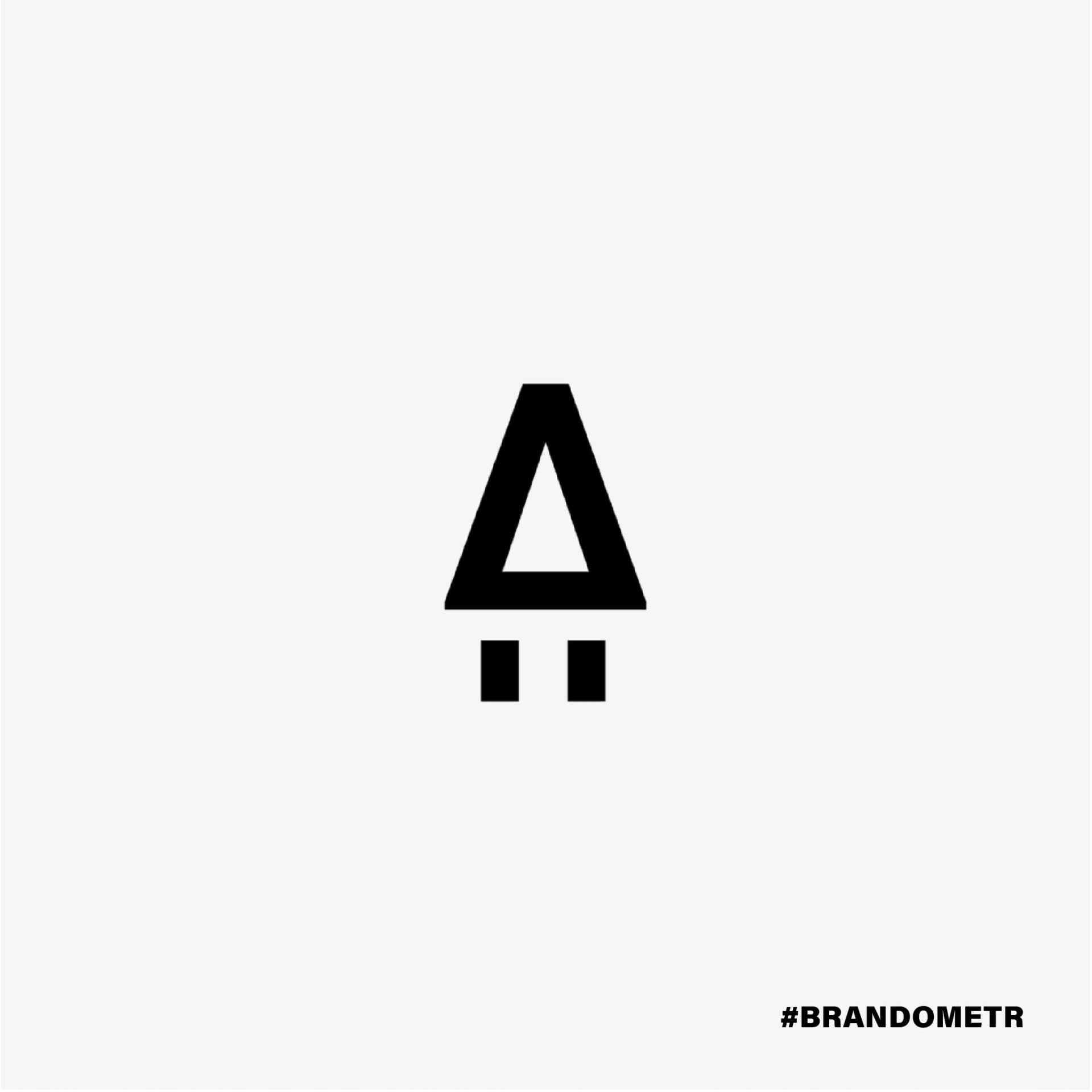
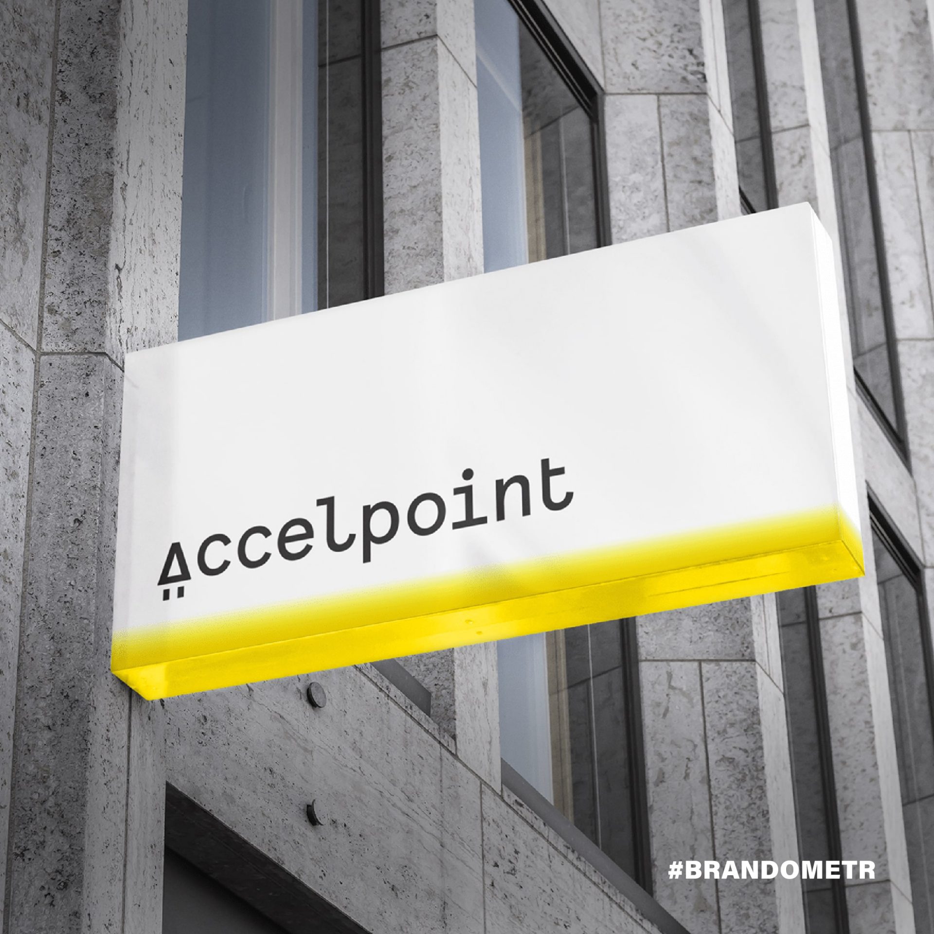
They entrusted the work on their brand to designers from redkroft, a dynamic studio from Warsaw. As Grzegorz Derlukiewicz, one of the partners at Redkroft, emphasises, when creating this ascetic branding, it was important to understand the industry and to convince the customer. Accelpoint’s visual identity consists of three very simple and distinctive elements: Firstly the logo / signet which is the letter ‘A’ that is at the same time the symbol of a rocket taking off, the typography and a very narrow colour scheme.
All these elements harmonise with each other, form an almost hermetic whole. The designers used simple, almost banal graphic solutions (simple, ‘machine’ lettering or strong, most powerful contrast between black and yellow) but they did it their own way. ⠀ ⠀
As Derlukiewicz accurately observes: ‘A good minimalist design should be backed up by arguments confirming that the chosen direction corresponds with the brand’s assumptions. We planned to create an identity rooted in the startup environment and technology-related projects’. And it is this rooting that determines the strength of this project. Simply a rocket!
Golem
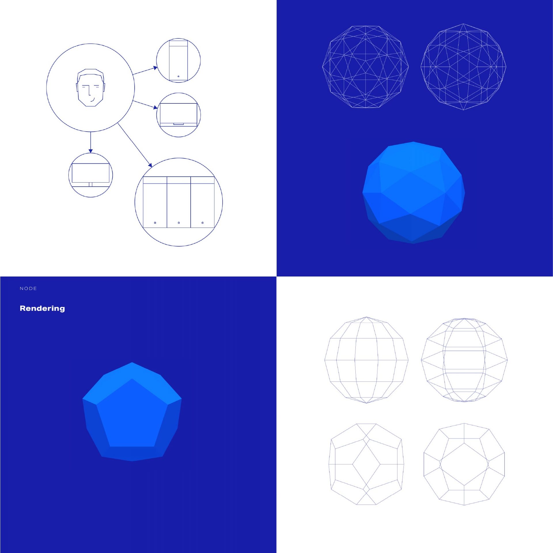
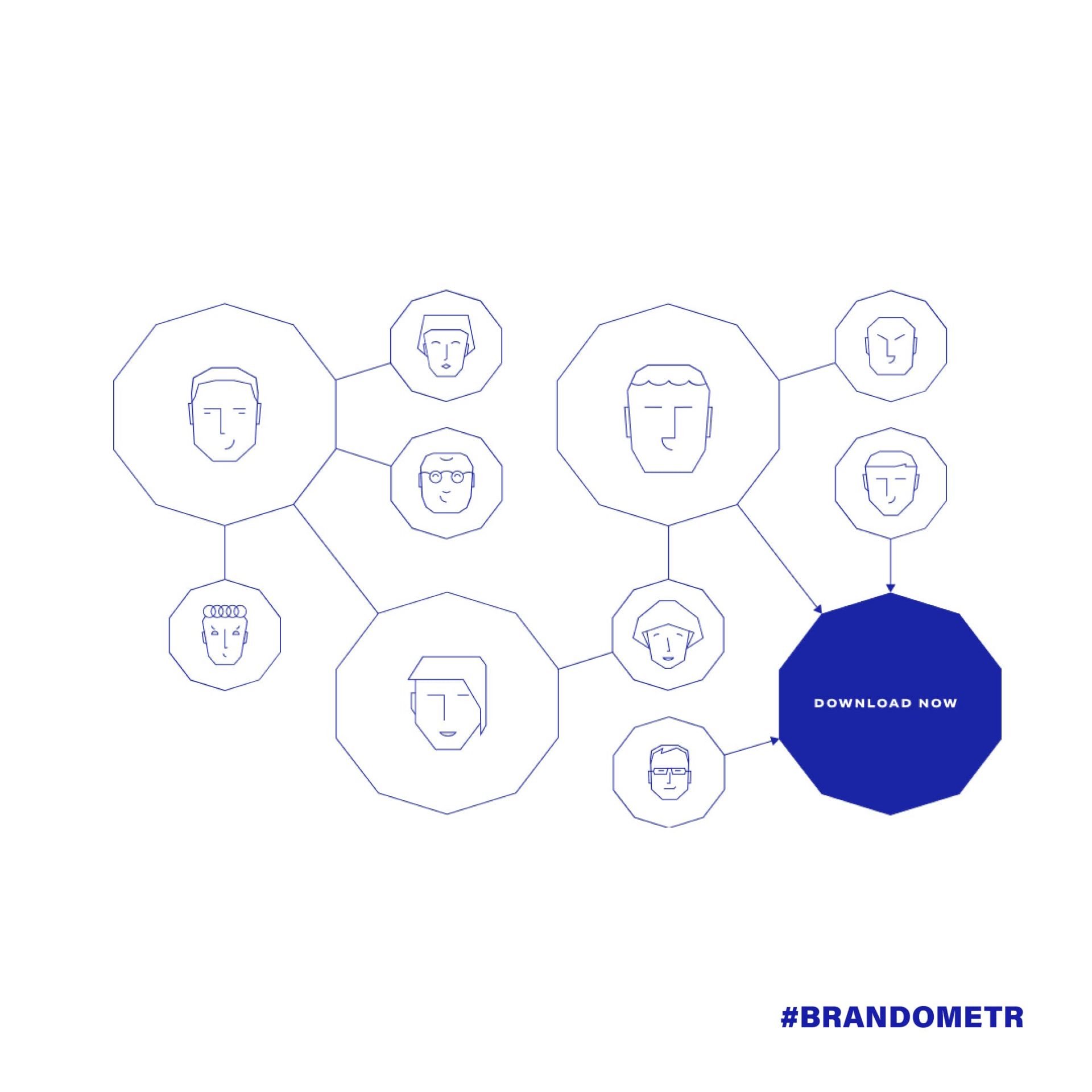
According to legend, the golem is a clay giant with superhuman strength, boundlessly obedient to its creator. One version of the story says that in order to bring the golem to life, a scroll with a written text had to be placed in its mouth. The giant needed data! It’s hard to find a better name for a tech startup dealing with operations on gigantic amounts of data, where computing power is obtained by connecting private users.
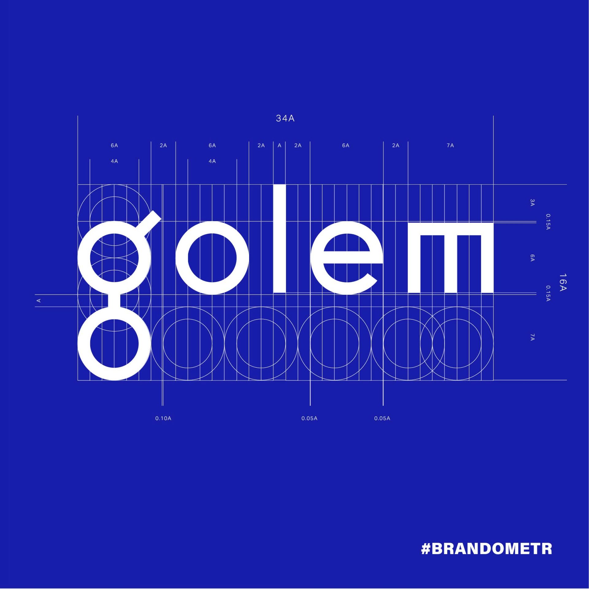
Since the beginning of Golem’s existence, its image has been created by the unfortunately no longer existing Wroclaw-based design studio The Codeine . Work on the image began in 2015, when at the very beginning of Golem’s existence it was not only extremely mysterious and ambitious, but also a completely unpredictable project. It was then that the first, sleek and brownish version of the brand was created.
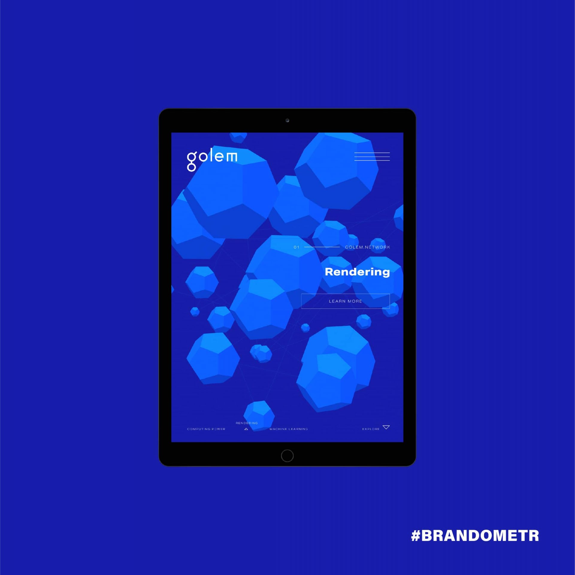
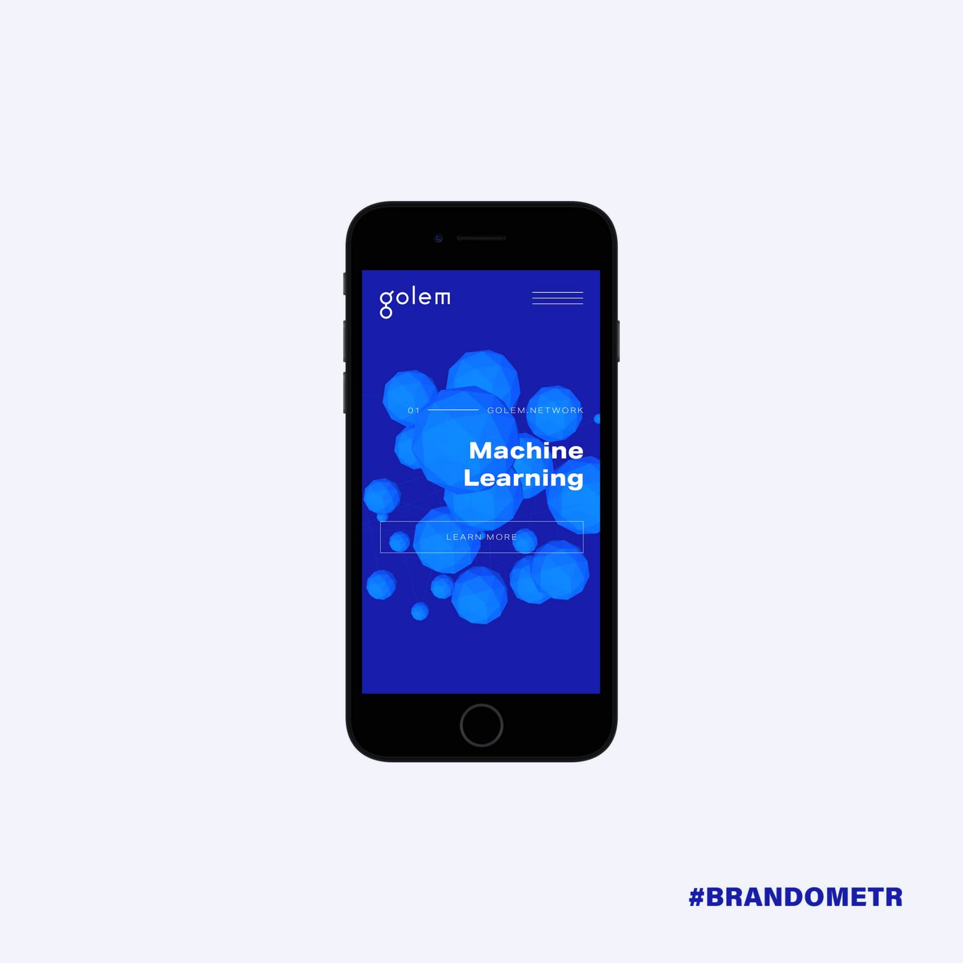
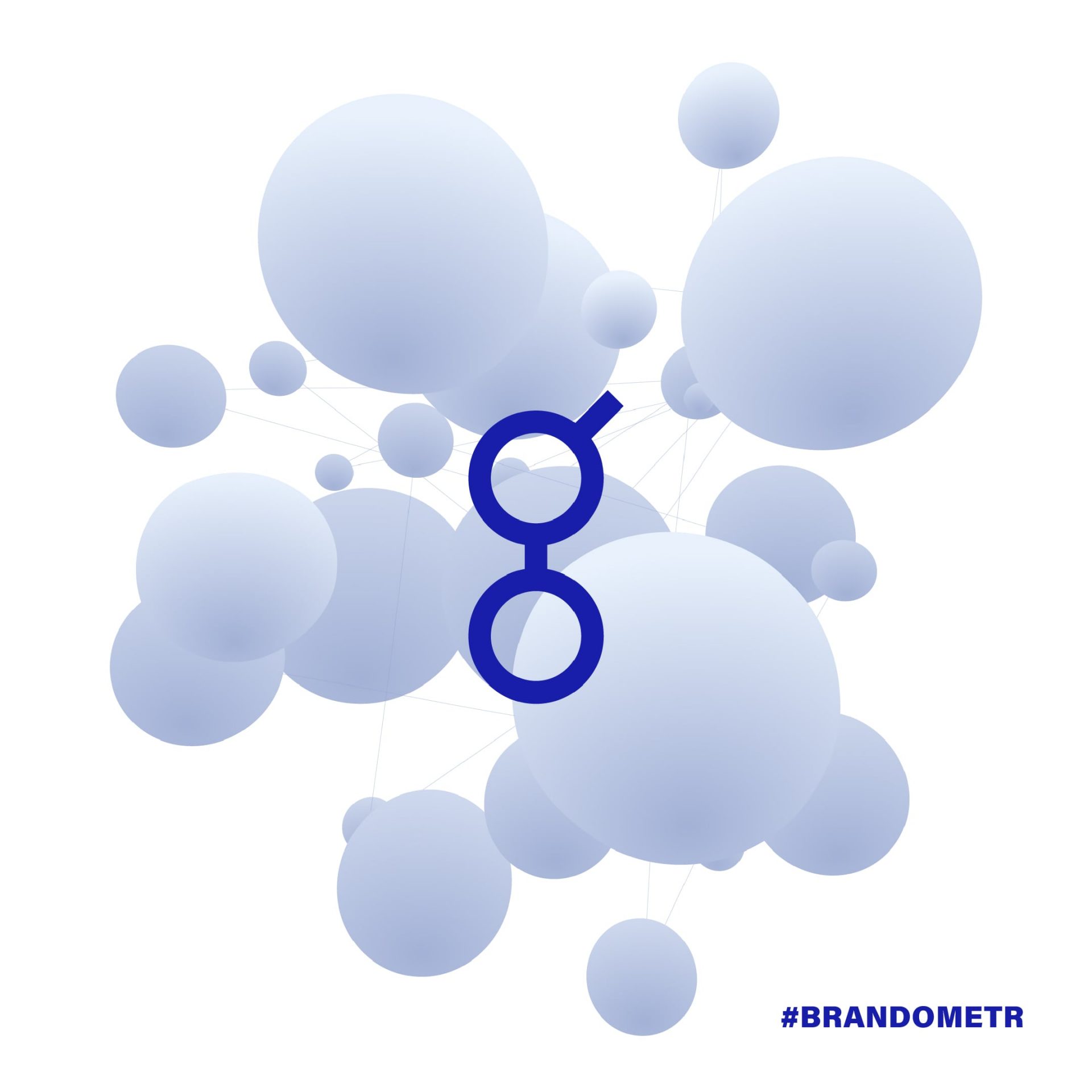
The next stage in the development of the brand and its branding was 2018, the year of a global debut related to the launch of crowdfunding. As Grzegorz Łotysz, one of the founders of the studio, recalls: ‘In this instance, Golem approached us with a request for some minor modification of the identity that would change the underground, steam-punk character of the brand to something a bit more commercial. That’s when the blue colour came in’. The turn of 2018-2019 saw another iteration of the branding. This time, with the launch of the working Golem, the designers strengthened the logotype itself and introduced a third dimension in the graphic elements of the identity.
The result of the designers’ actions is the creation of a brand whose strength is minimalist maximalism and the discipline and limitations of formal means create the strength of Golem. The technological fairy tale created by the Codeine combines the digital world with a large dose of mysterious melancholy. This brand is not a colossus with feet of clay! ⠀
Infarm
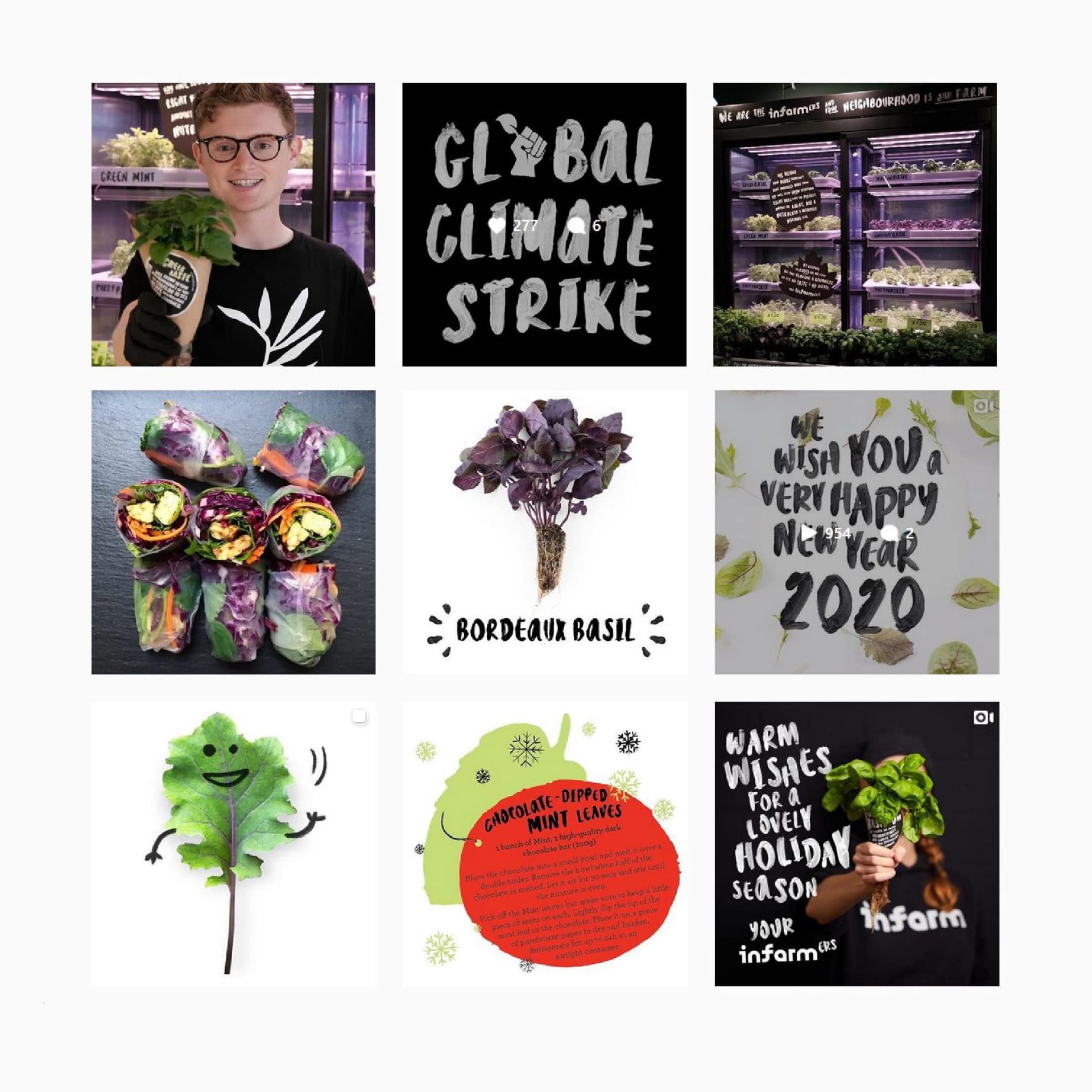
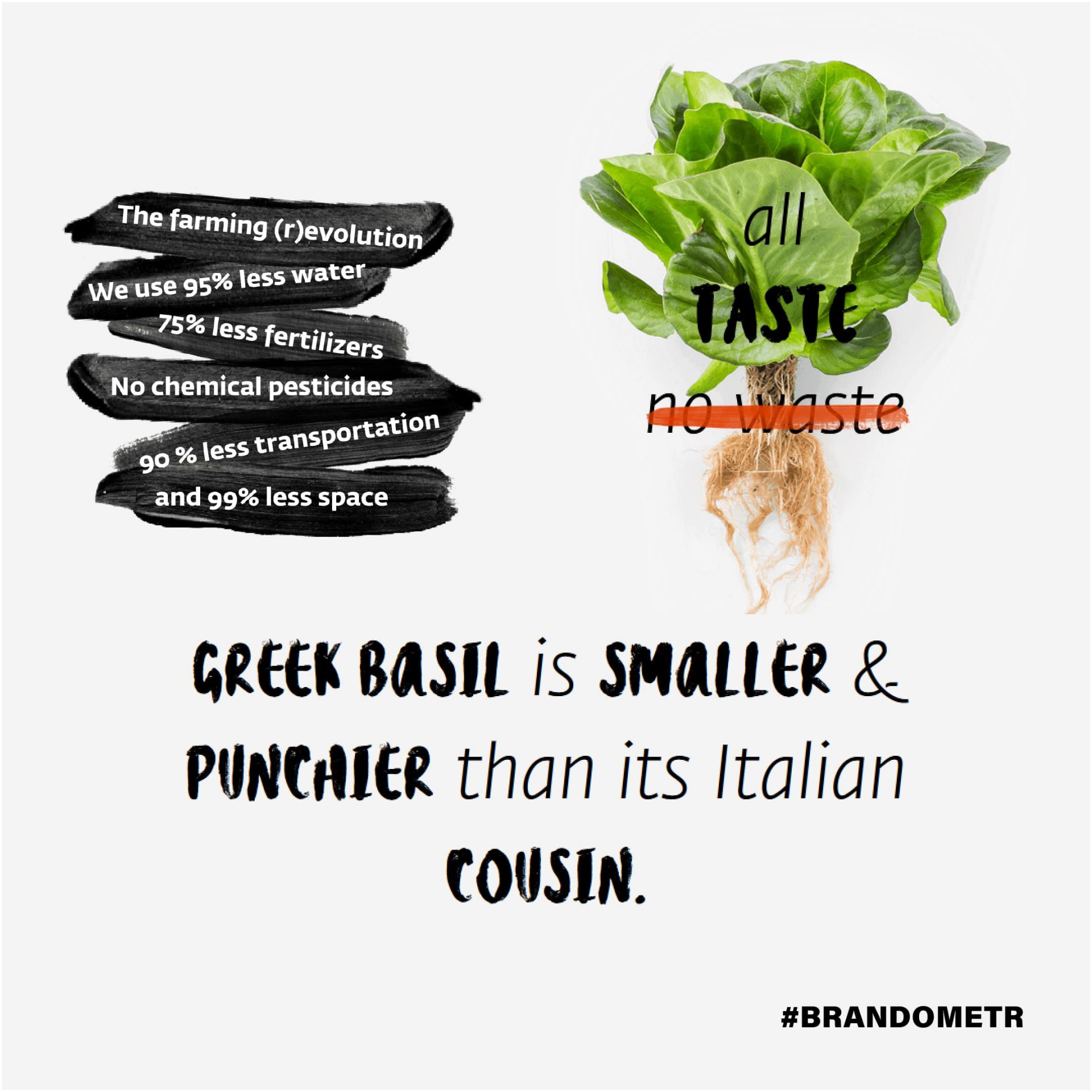
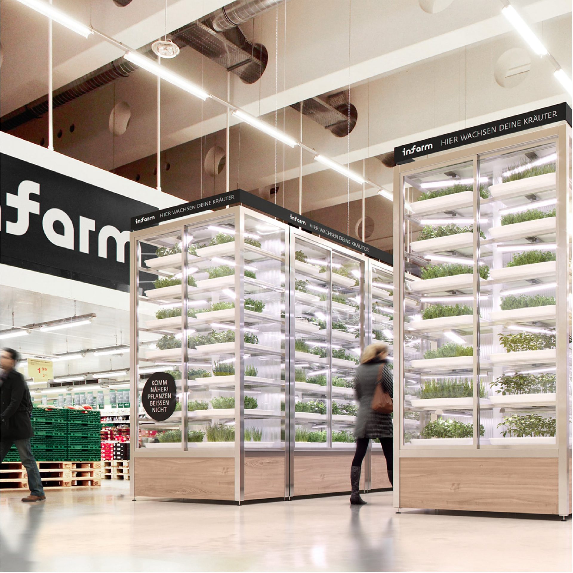
Let’s start with the numbers. 2019 was a good year for infarm. Their food production idea has thrived, as they themselves write, harvesting on average more than 200,000 of their plants per month, while saving 3.5 million litres of water and 1.7 million kilometres in transport.
This year will also be very good for the Berlin-based startup. They have just announced that they have raised $170 million from investors in the latest tranche. As announced by Erez Galonska, CEO of Infarm, they plan to increase their crops by as much as 10 times in the next 5 years!
Regardless of how we look at these numbers and the message they contain, it is worth looking at how this undertaking was branded. Infarm as a brand tries to combine two worlds. On the one hand, it is a food producer using the latest scientific achievements on a huge scale. At the same time it is a revolutionary start-up turning the industrial approach to production, logistics and the sale of fresh food upside down.⠀
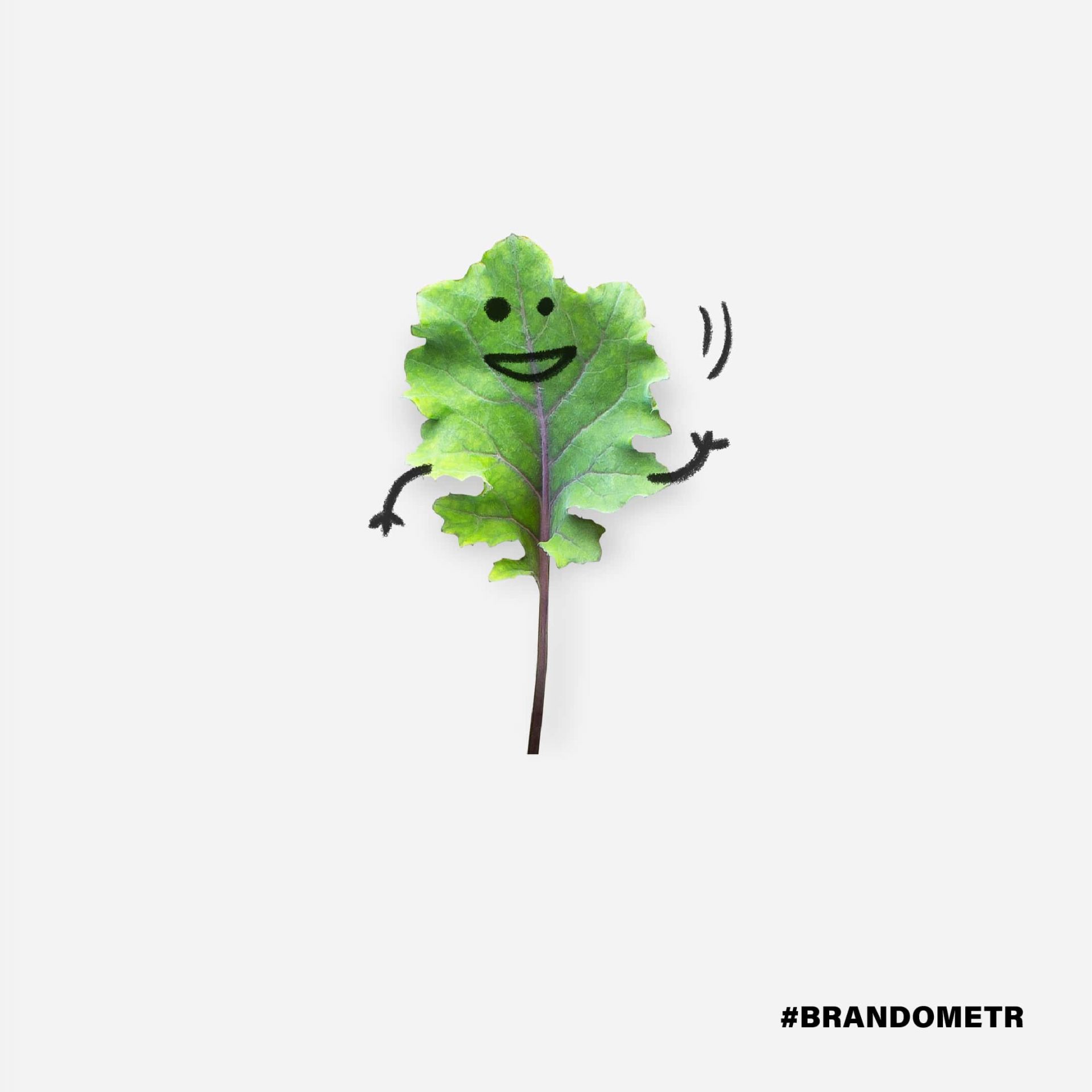
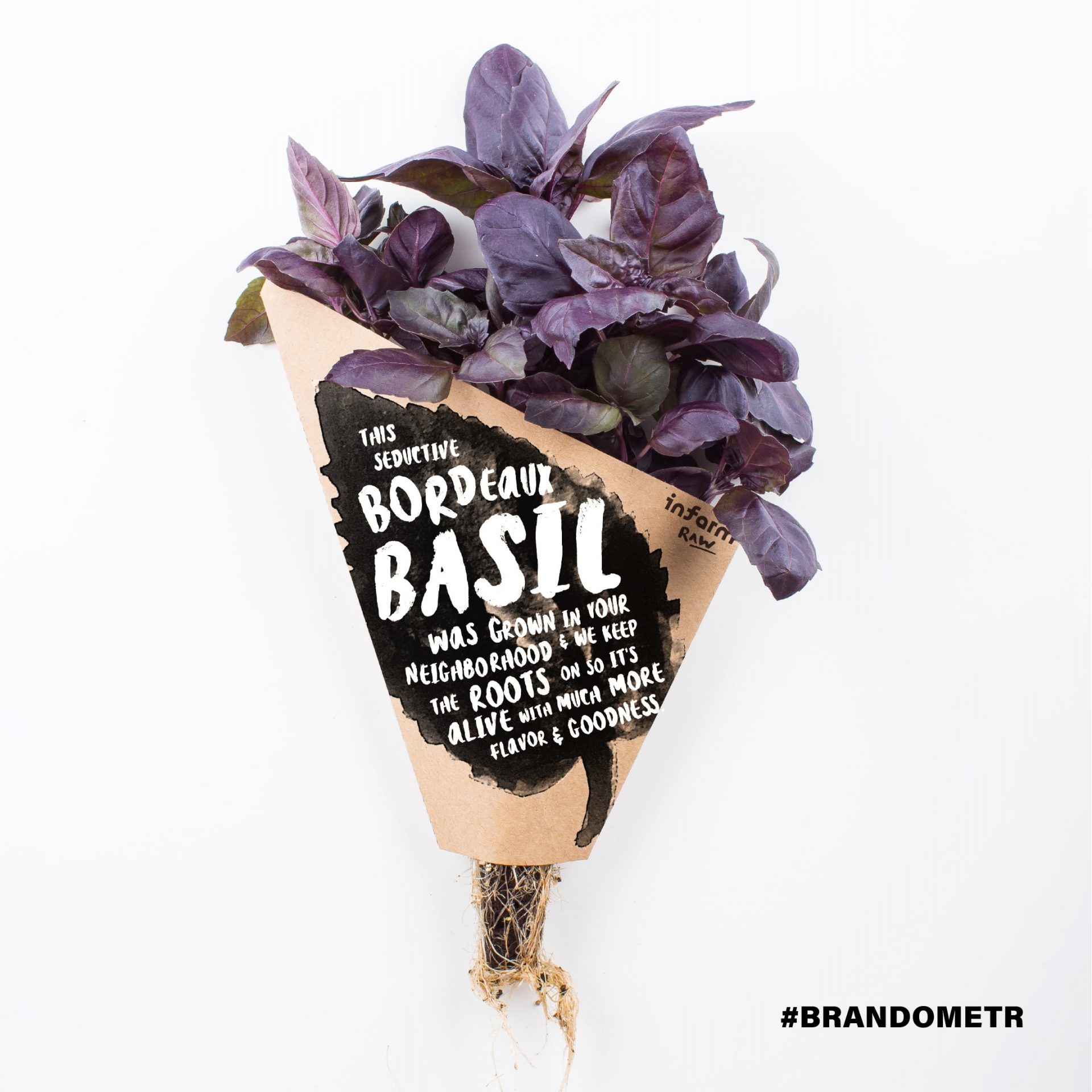
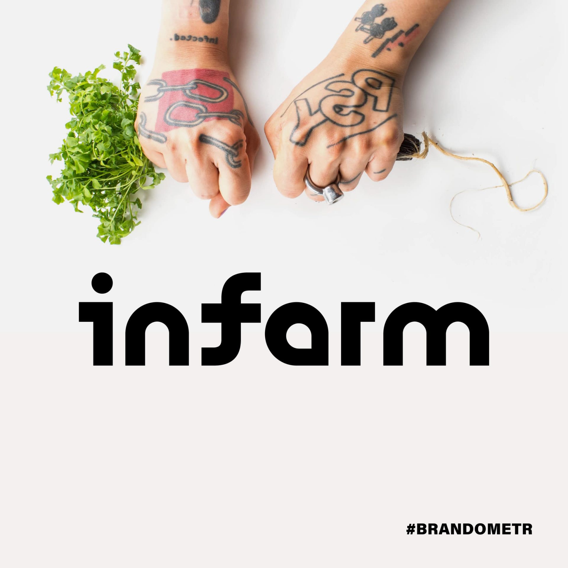
The world of technology is represented by the logotype. Its geometric construction and almost laboratory character are to inspire confidence. The lack of colours and simplicity clearly communicates that we are not dealing with merry eco-farmers from the suburbs. In this case, the logo is just a base on which a completely different brand message is built. When you enter the product page, the first thing that catches your eye are the tattooed, clenched fists (by the way, these are the hands of one of the designers from the Berlin headquarters).
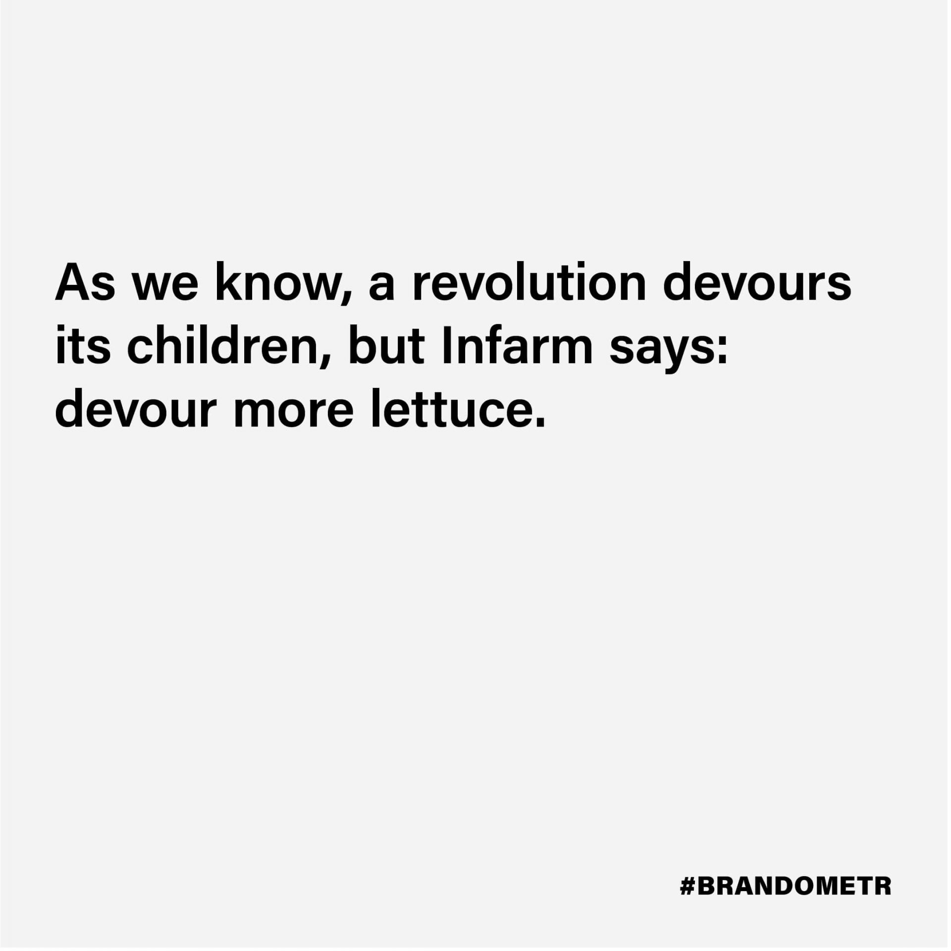
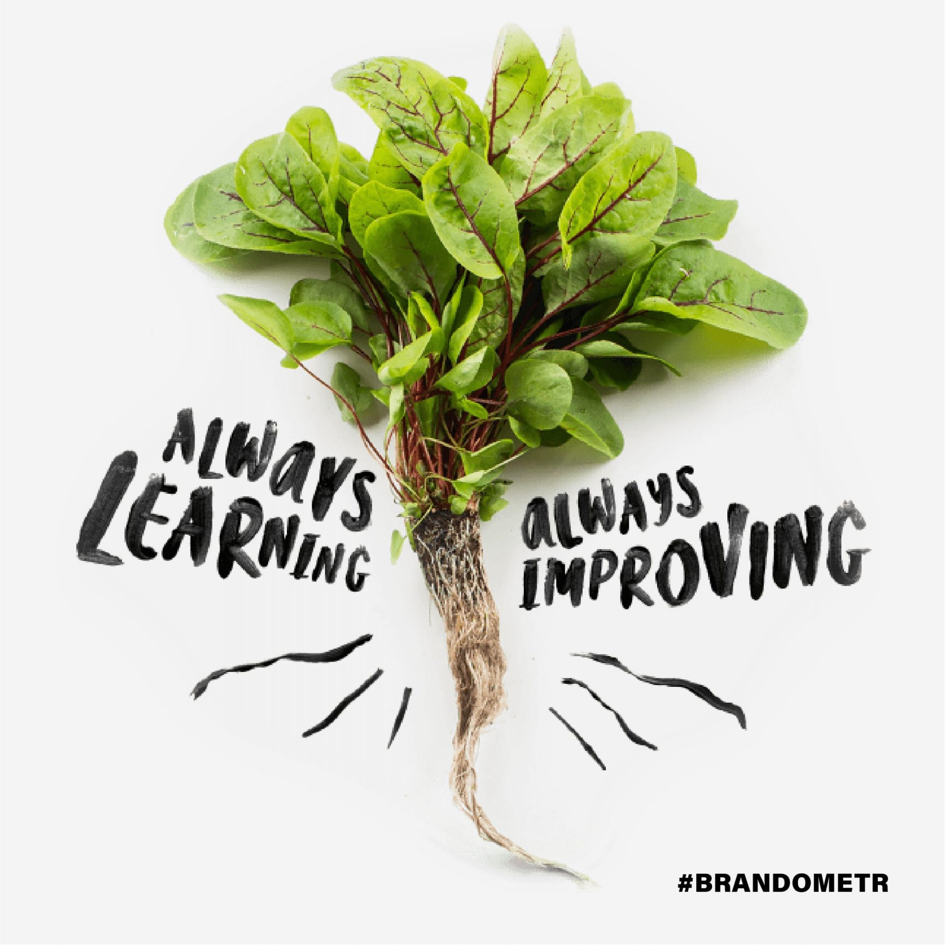
There is no doubt that Infarm wants a revolution! They want to reach recipients with their message in a pop punk aesthetic of all materials. The handwritten typography and careless, slightly chaotic design of, for example, the packaging shortens the distance between the recipients and the brand. As we know, a revolution devours its children, but Infarm says: devour more lettuce.
Brandless
When starting to build a strong brand, we often reach for those elements in our business that make us stand out. They make us different, maybe better, and we try to build a story about our new brand on them. Building our own identity in opposition to the existing situation has a strong tradition, it is a good but risky idea. When thinking about what makes a brand unique, the first thing that comes to mind is its visual identity. So trying to give that up is extremely risky.
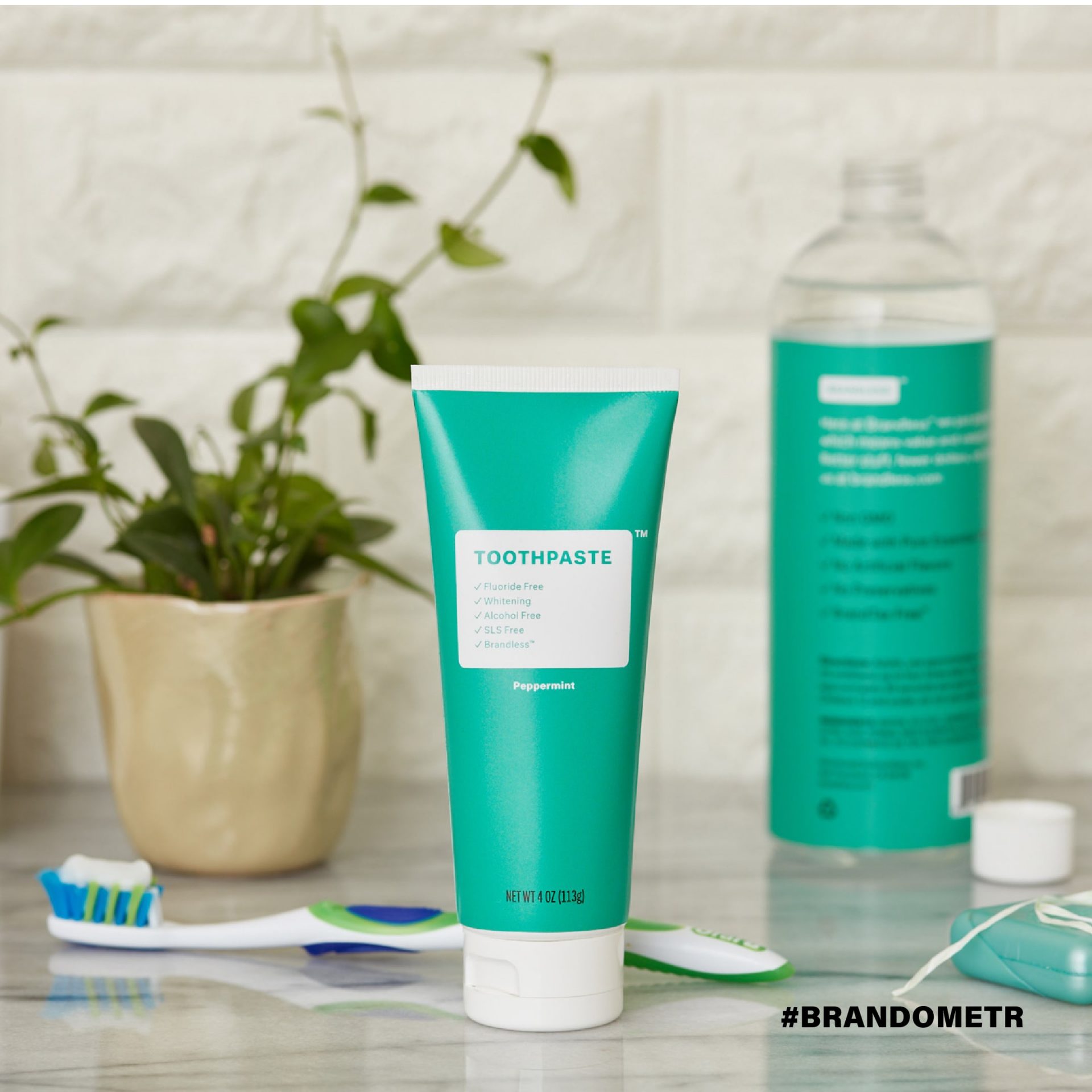
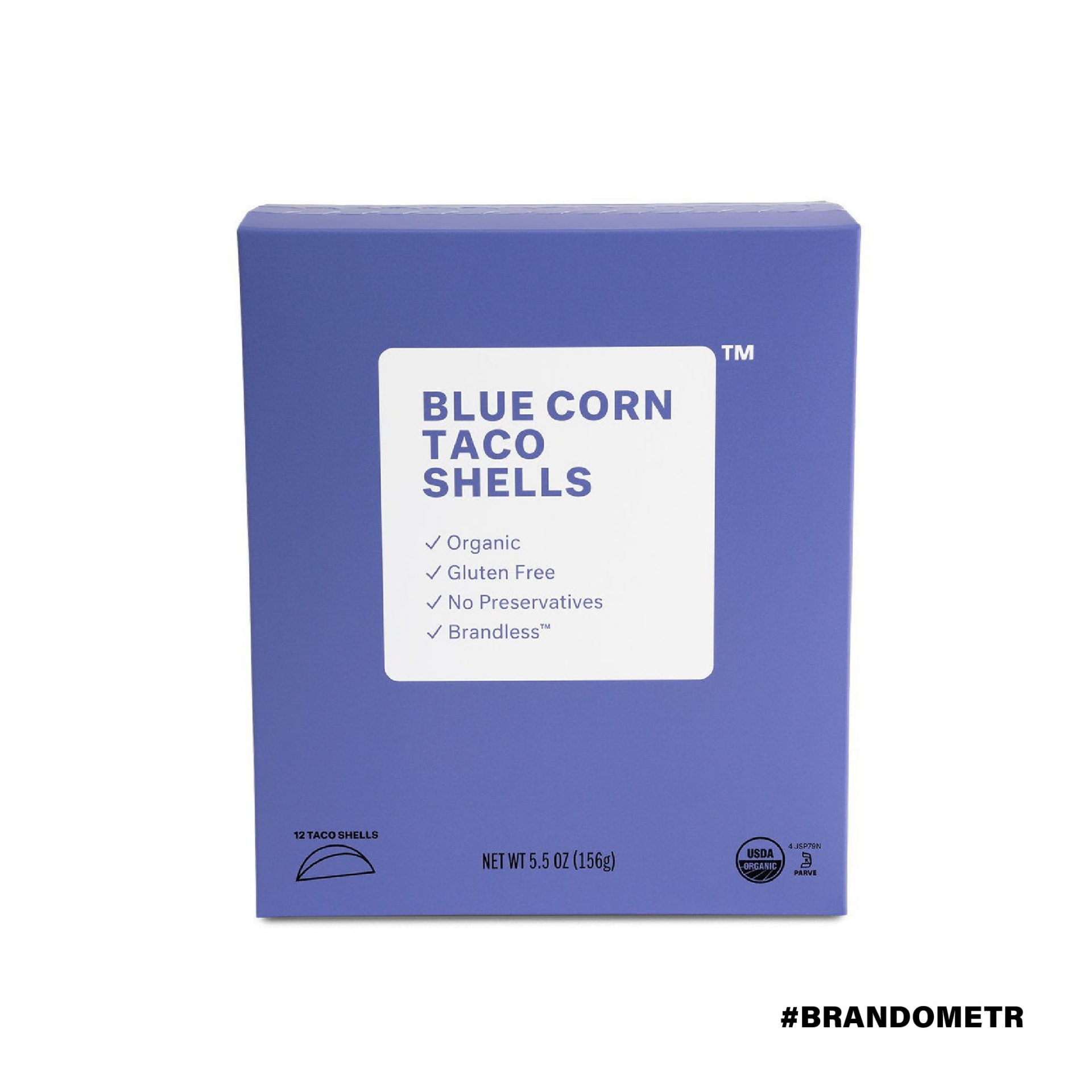
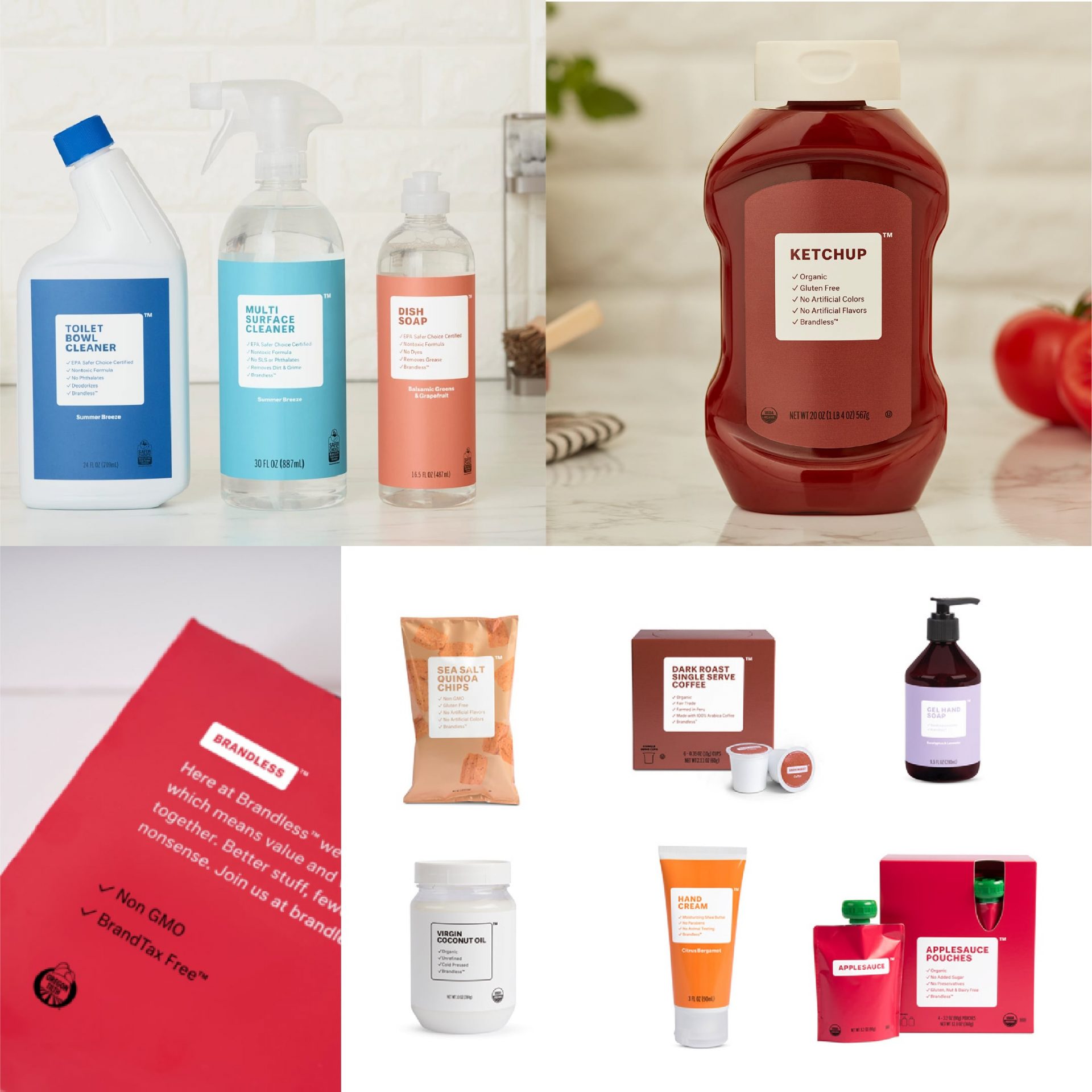
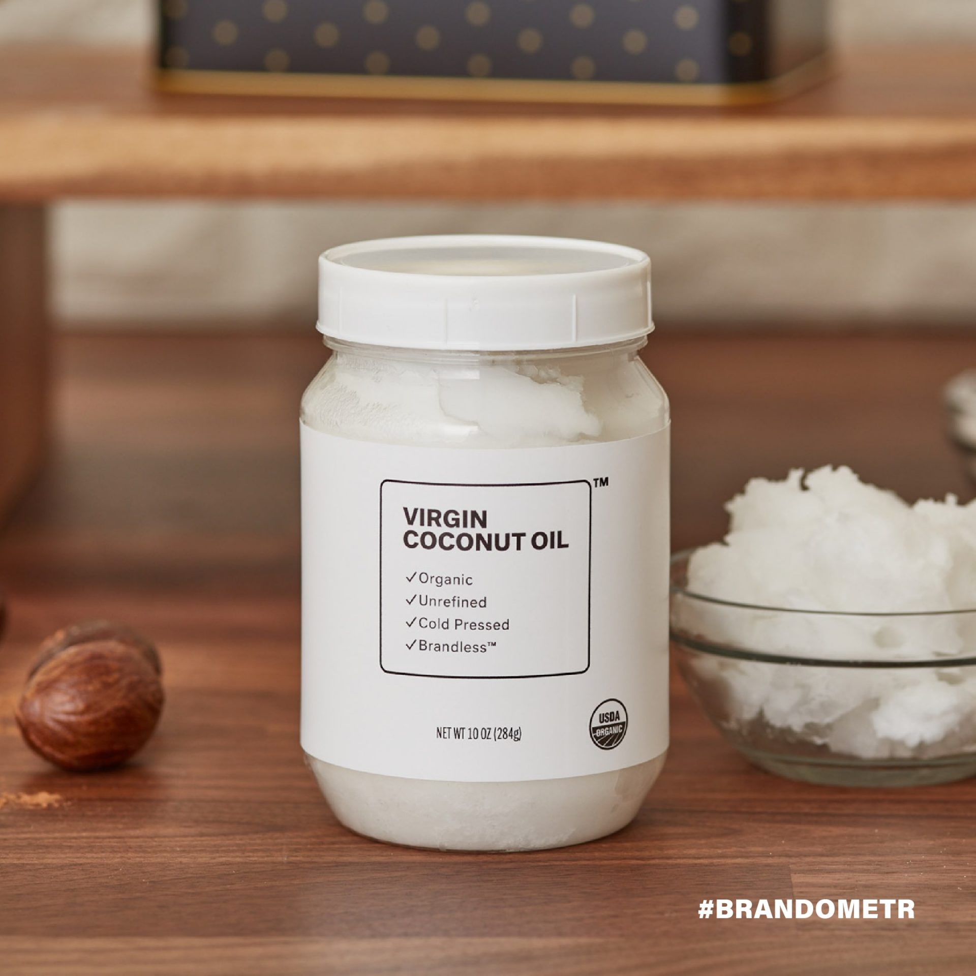
One company that tries to build its brand on the lack of branding is ‘Brandless’ an American startup selling healthy and organic products for home. The message is simple: we just sell the product without all that branding, which only unnecessarily increases costs. The company tries to convince us that they have stripped their business of its visual identity, of all unnecessary elements. They even created a term for it (‘BrandTax free™’).
Everything seems clear, but there is little sincerity in it, in fact the message is false and the brand, builds its image very much as a brand, with strong, good, thoughtful branding and packaging designed by the Red Antler agency from New York. Additionally, this unbranded brand has applied to the U.S. Patent and Trademark Office to trademark elements of its brand.
A greengrocer’s opposite our office may be truly brandless. Although not really, because customers call it a ‘green booth’, because it literally is a green booth and the strength of this brand are the ladies who work there and have been building their brand image continuously for over 20 years.
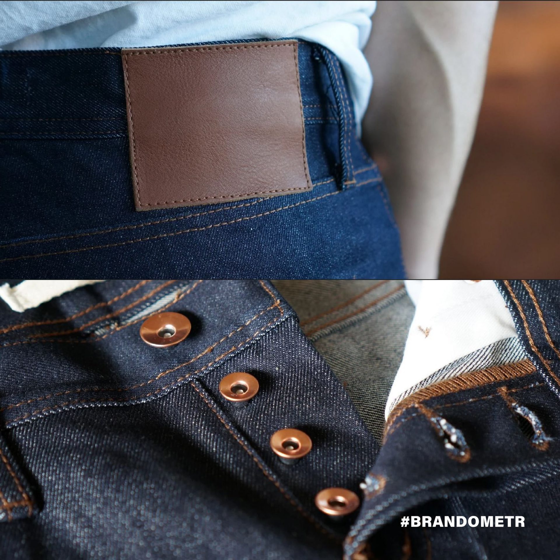
The approach of a clothing brand with a very similar name seems fairer. The Unbranded Brand, which sells jeans, does not pretend not to be a brand, but has given up on placing any brand markings on their clothes.
We hope that you enjoyed this article. If you did, have a look at previous articles published in this series:
- Brandometr part 1 (WeTransfer, Huddly, Open Signal, Aktia, Airbnb)
- Brandometr part 2 (Frøpt, Campus, Zendesk, Atolla, Napoleon Cat)

