November 09, 2022
Meta design of album covers
Share this article

The album cover, like any other packaging, is meant to encourage, seduce and lead to a purchase (hearing). However, with the development of the popular music market, new ways of attracting the attention of the audience began to be looked for.
At some point, it was the packaging which was sparking interest. Designers started to treat covers as a part of the discussion on what packaging is (or even broader – what graphic design actually is). They started asking questions about its meaning, content and form. And they started having a great time doing it in various ways – by quoting, confusing tracks, and modelling their designs on something else.
Something that, in a nutshell, can be called meta-design started. Designers took up criticism and discussion on the design by using the design itself in doing so.
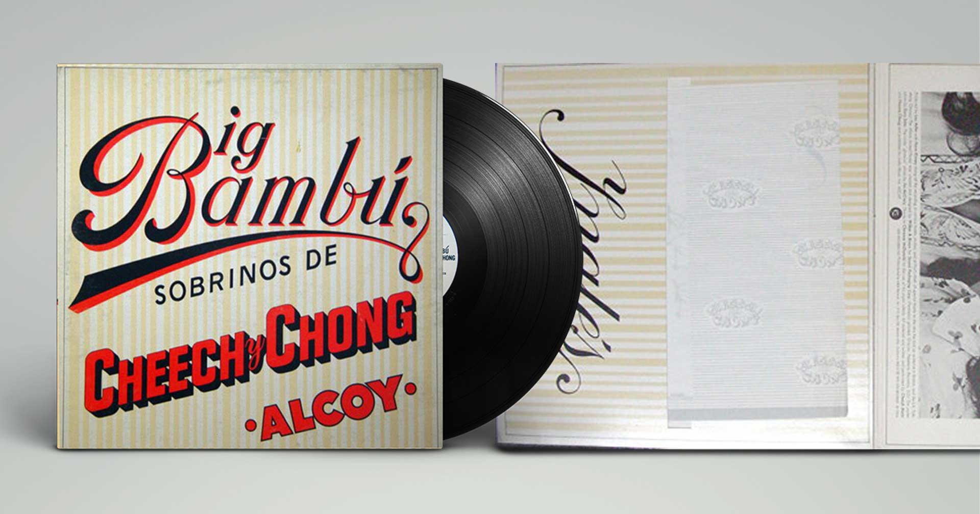
In the early 1970s, Tom Wilkes and Craig Braun tried to “disguise” the LP as a completely different product. Allegedly, it was one of the ideas for the Rolling Stone’s “Sticky Fingers”, which Jagger didn’t like. The comedy duo Cheech&Chong used it in 1972 for the cover of their album Big Bambú.
The coverlooks like a rescaled package of rolling paper for preparing your own cigarettes. If you take out the poster attached to the album in the exact same way, you also take out the rolling paper. This way, it was possible to honour this trivial object and its unquestionable influence on cultural development.
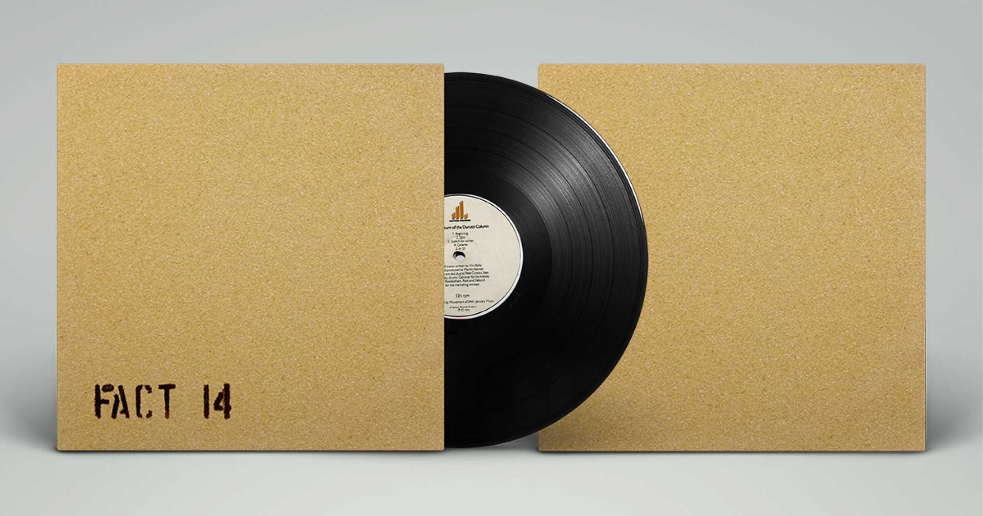
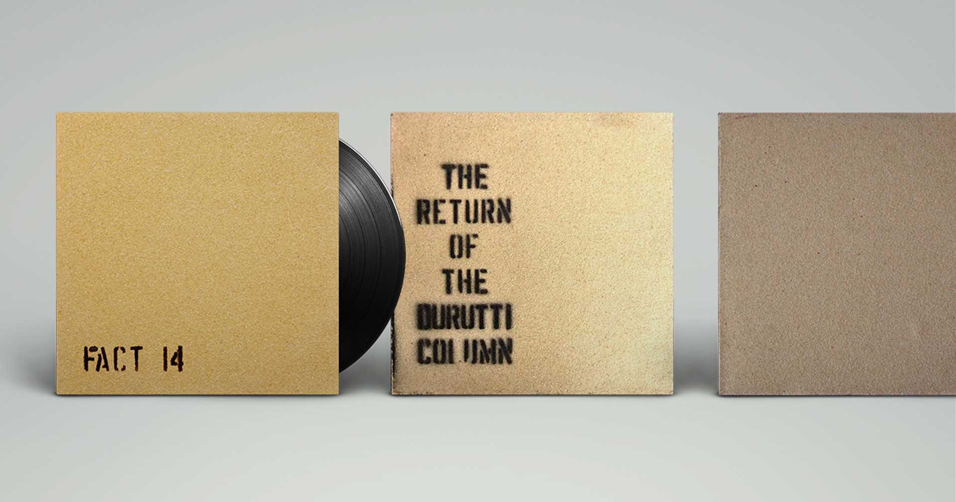
„The Return Of The Durutti Column”, the album of The Durutti Column published in 1980, was overtly anti-consumer in its design. The first, now classic, edition was wrapped in sandpaper, which was intended to scratch (destroy) other LPs’ covers next to it on a shop shelf. The inspiration for this design was a culture book published in 1959 titled: “Mémoires” by situationists Asger Jorn and Guy Debord, was also bound this way.
The album publisher, the Manchester record label Factory, forced to wrap the LPs by hand, and made their performers do it, incl. musicians like Joy Division. Legend has it that only Ian Curtis buckled down to the task, and the other members of the band preferred watching porn in the next room! There were four versions of the cover, with the name of the album on it or without it. This way, only a few thousand copies of this album were produced as shops didn’t want them on their shelves anyway, for obvious reasons.
Along with the development of large retail chains, the packaging of the so-called fast-moving consumer goods became one of the key elements in guaranteeing sales success. In times of widespread overabundance, seduction with graphic design became a must. Products appeared whose main (and often the only) asset was a low price. Since they stood in opposition to other products, also in terms of graphics, they represented a completely different world.
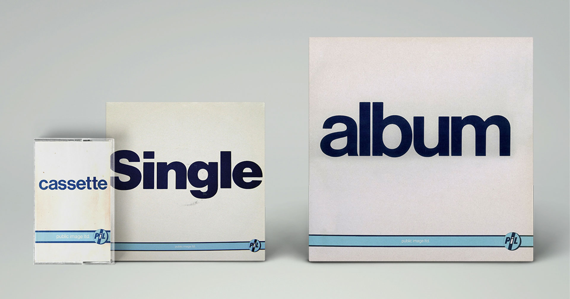
They often used one consistent layout for all products, regardless of category (milk, dog food, or toothpaste all looked the same). Public Image Ltd. (the band formed by John Lydon, the former singer of Sex Pistols), following the example of ‘unbranded’ supermarket products popular in the 1980s, developed the whole marketing communication of his album from 1985 as this generic product (no brand, no illustration, almost no colour). Depending on the media, the product was called “Album” (released on vinyl), or “Cassette”, and later “Compact Disc”. The packaging of the first single was called “Single”, etc. The publisher was consistent to the point of keeping the same “generic” design with products promoting a concert tour, such as posters and t-shirts.
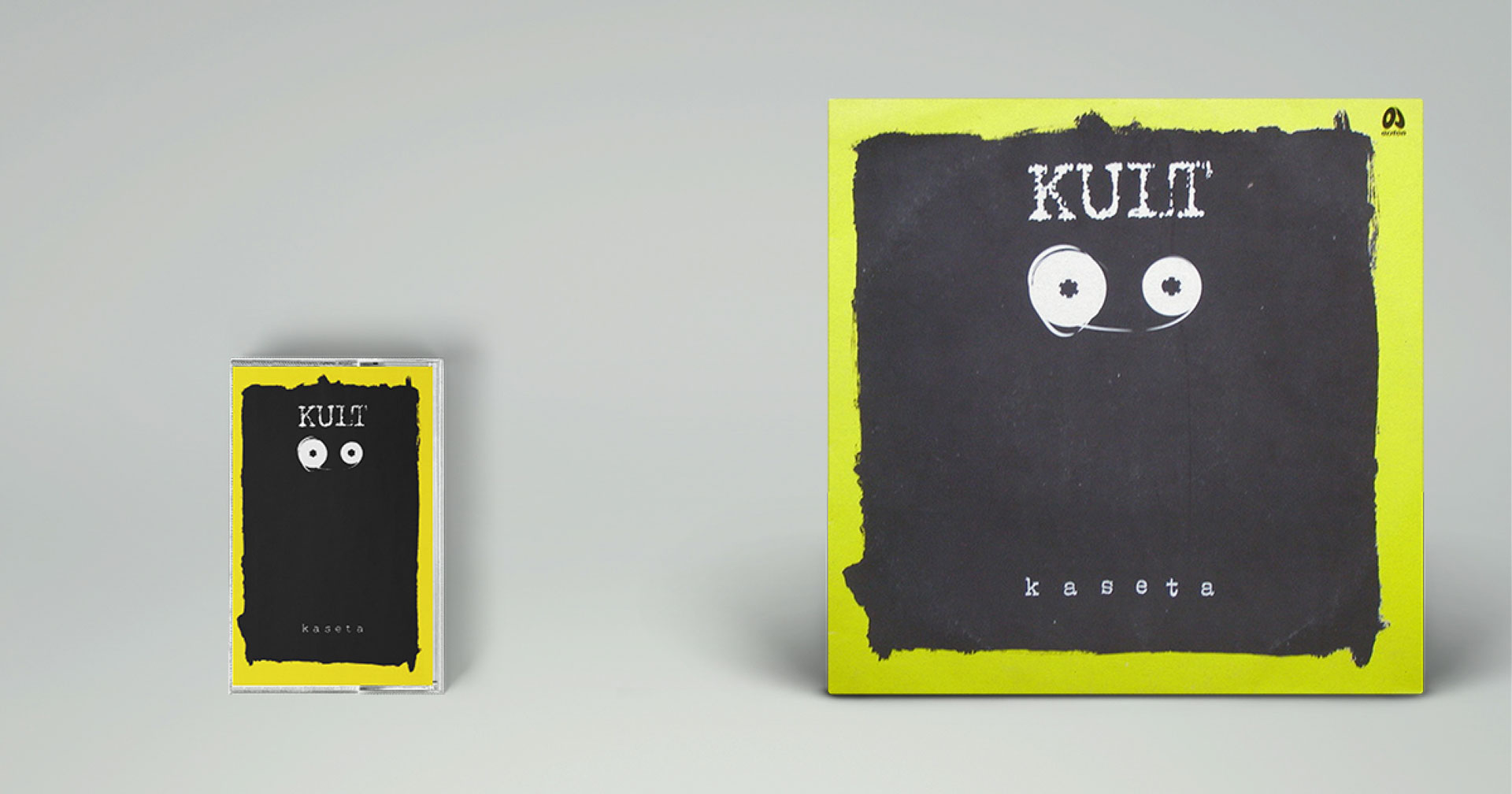
When I first saw Kult’s cassette in 1989 called “Cassette”, I thought Kazik Staszewski and Mirosław Makowski (the author of the cover) translated PIL’s idea into Polish conditions. Unfortunately, it was not the case. The name of the album is simply the name of one of the songs from Kult’s previous album.
It is Mirosław Makowski, who is the author of one of the most “meta” covers in Polish rock music. On the seventh album by Voo Voo, titled “Zespół Gitar Elektrycznych”, instead of the design, there is a description clumsily put together, starting with the words: “it is not the cover design. Cover designs make no sense…”. Further in his manifesto, the author mentions Wilhelm Ockham, a medieval philosopher and theologian!
The design, or maybe anti-design, is full of additions and supplements, underlining its changeability and its disagreement with being closed once and for all in one definitive form. A great distance to himself and a sense of humor can also be seen here; the sense of humor which might sometimes be clear only to other designers. The author underlines his reluctance to make the final design decision, but he is aware that his attempt is merely an intellectual exercise, because, as he points it out himself, “but let’s not exaggerate. These LPs must be wrapped in something…”.
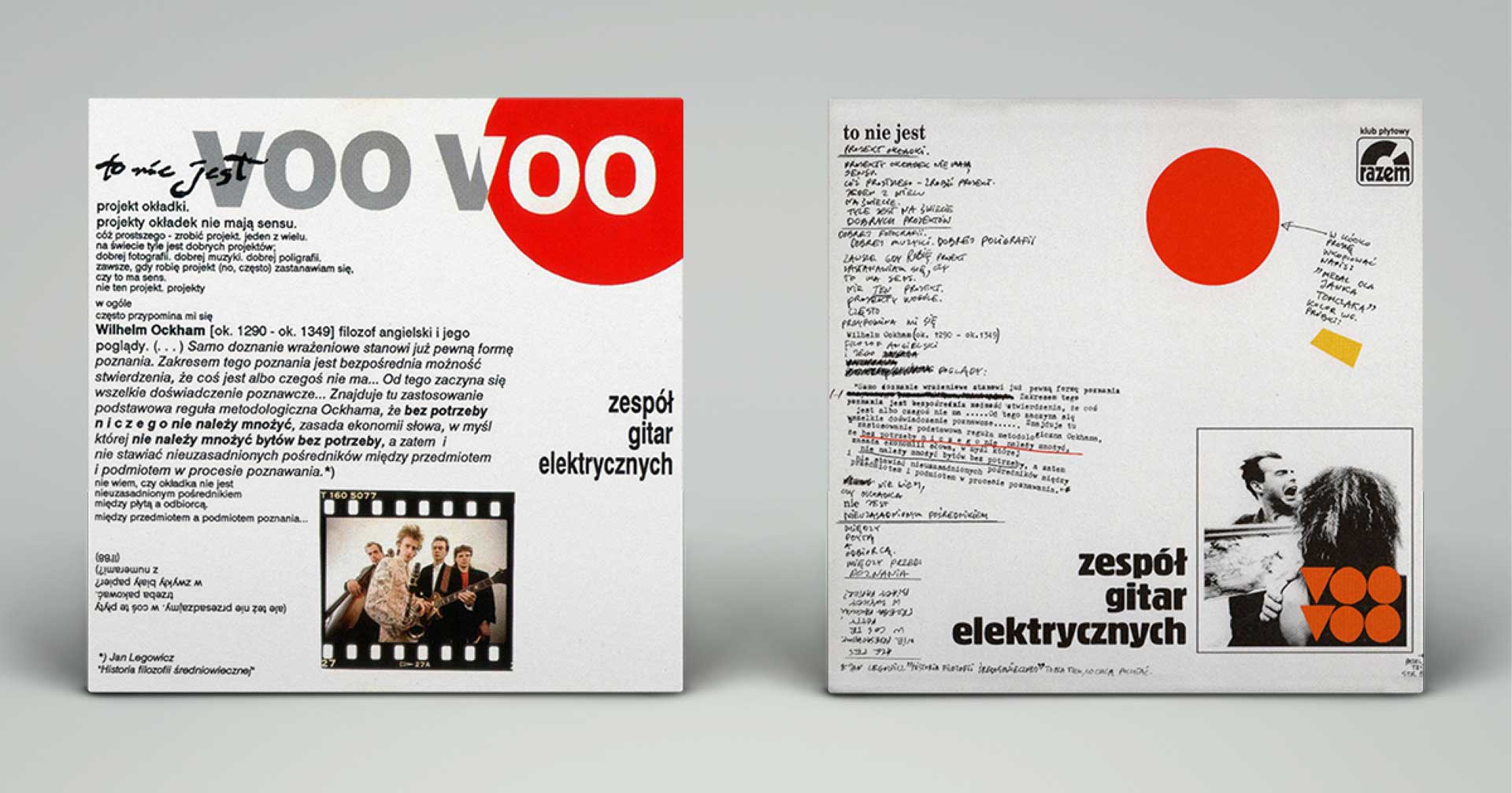
The first (published) version of the cover from 1991 has the charm of a Word file, and the first hard steps in the cooperation of the designer with a computer. Probably unintentionally, it seems to neatly comment on the character of its times, when Poland, a bit clumsily and naively, was dressing up in the neoliberal robes of capitalism.
Prepared earlier (but never published on vinyl), the version of the cover presented a purely post-punk graphic manifesto, which heavily draws on the tradition of first DIY posters, leaflets and zines of the second half of the 1970s. A combination of handwriting, a typewriter and different kinds of crossing-outs gives a fantastic effect. In this version, we have even more humour, and it is a shame that this cover did not appear in a full-size vinyl record format.

A similar idea, but in a definitely less radical form, could be seen on the cover of “Małomiasteczkowy” by Dawid Podsiadło from 2018. The cover made by Bartłomiej Walczuk (OsomStudios) is a mainstream development of Makowski’s idea. In this case, we have some text (description), which is a dominant part of the design. It is not the designer who speaks to the recipient, but the performer, who speaks/writes, “It is my third (3.) album…”.
The designer didn’t abandon the idea of putting the singer on the cover, using the photo by Jacek Kołodziejski, but in doing so, the designer shows him with his back turned to the recipient. And, similarly to the Voo Voo cover, the design is full of surreptitious jokes directed to a well-versed recipient.
The whole marketing and graphic design of this artist is based on this idea and was painfully consistent till the end. From start to finish, the artist managed to maintain brand consistency in its message, and watching the following elements of this puzzle was a great pleasure.
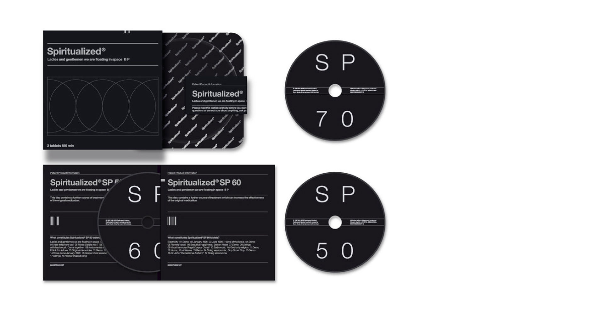
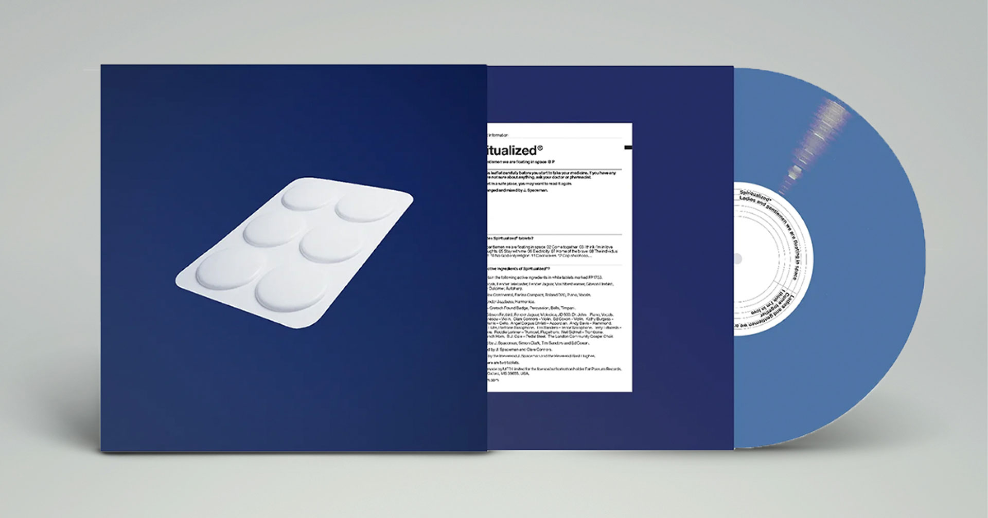
They say music is a remedy. Mark Farrow and Jason Pierce (www.farrowdesign.com) decided to take it seriously and design the cover of “Ladies And Gentlemen We Are Floating In Space” by Spiritualized as if it was a medicine, what’s more – a prescribed one.
A design of the CD, published in 1997, is medical packaging translated into the language of CD covers in detail, including a leaflet on how it works and a compact disc sealed in a large blister (just like a pill). The subsequent reissues of the album continued to develop this idea, and the edition from 2009 looks particularly interesting, which is a set of 12 mini discs/pills.
The reissue in September 2021 was wrapped with a simple illustration presenting a white blister of pills. It feels like the designers were trying to say, ok, maybe music has a therapeutic effect, but does not heal in a way medicine does, and a pill is just a metaphor.
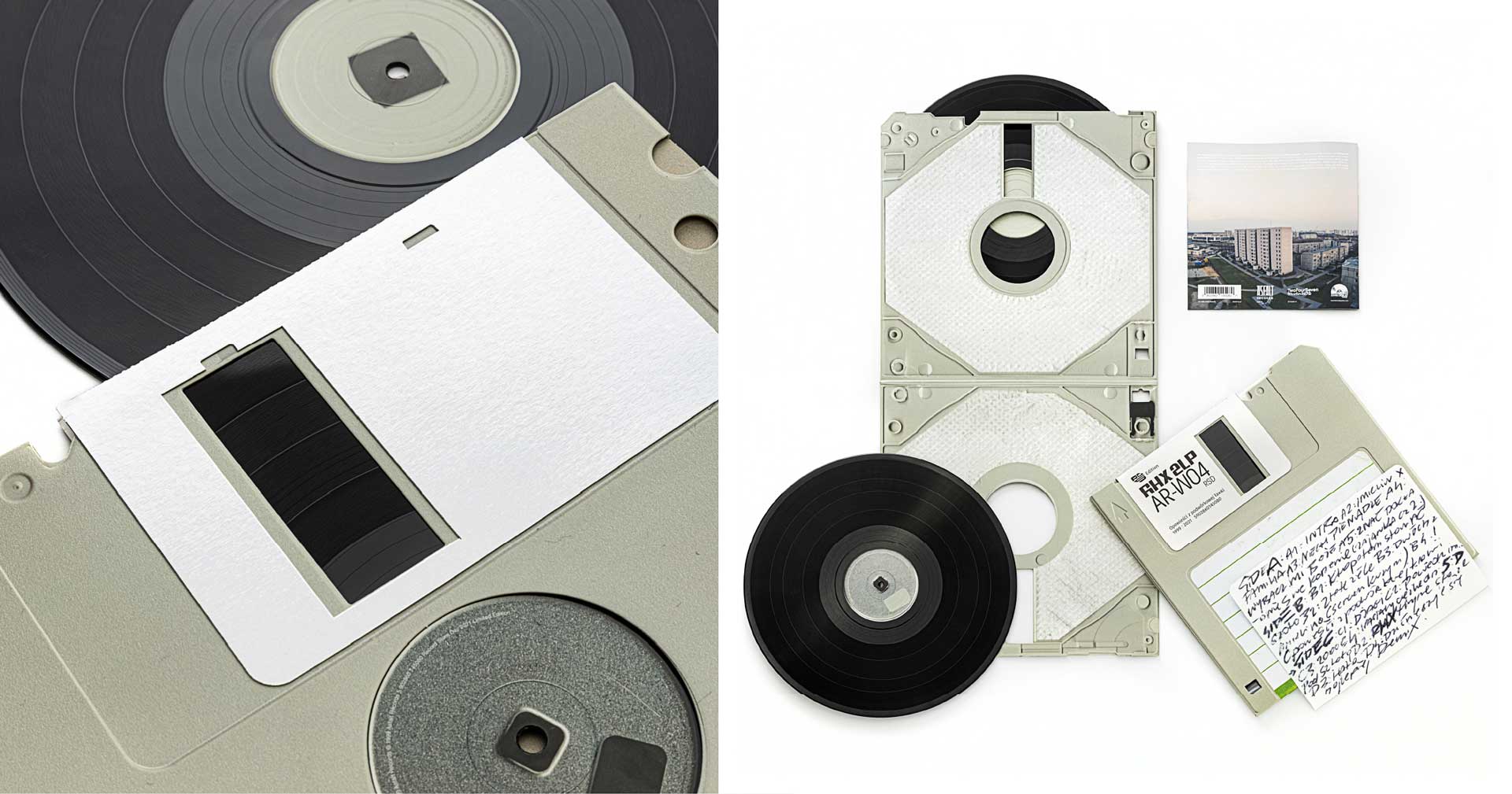
One recent national example of a “meta” approach to design is, published as a part of Record Store Day in 2021, a reissue of the 1999 album “Opowieści z podwórkowej ławki” by RHX collective. It is a kind of tribute to those times and a floppy disk, which was used to record hip-hop productions in the 1990s. Studio 247 (247studio.co), which prepared the cover, stands behind this amazing design.
Before the publisher got its final form, the first idea was to relate to the original cover, whose author was Tytus (Marcin Grabski, the founder of Asfalt Records). He really wished that the reissue related to the first edition, not only for sales purposes, but also for sentimental ones. Oskar Podolski (Studio 247) recollects it as follows:
“I wanted to use serif typography, which would be a connection, a link to the original design and create it in a super minimalist style. So, the old material was shown only in white, in a cosmically new, technological style, but we agreed it would be more mine than theirs…”
Designers decided to think about it differently, as to capture the spirit of that time in a different way by hiding their distinctive style and looking for less obvious relations to the beginnings of Polish hip-hop and Asfalt.
Reproduced in fine detail and a rescaled 3.5-inch floppy disk hiding within a vinyl, it is a double twist of meaning. The packaging pretends to be a historic medium within which there is an old-fashioned (for some people) vinyl. The booklet inside was created by Jacek Rudzki (Znajomygrafik). As he recalls, the work on this design was a sentimental journey to the times of primary school and the music he then listened to. His part of the project is a direct link between the first edition of the album and the current one.
It is one of few examples of the “old” album reissues, where designers managed to show the spirit of those times in a mischievous way. I feel like anybody who remembers those times smiled when they looked at this giant floppy disk. At the same time, the design is far from “audiophile” reissues, which artificially try to make the album an object of worship and an unhealthy manifestation of the designer’s and the packaging producer’s potential.
The designer, in his work, may not always say more than what the client expects from him. The designer works in services. However, they should take every chance to say something in their own voice. It is good, when working on branding, cover, illustration or any other project, to be aware of what we are doing and what sort of impact it may have on our environment.
It is good to know our place in this world, where much more is happening than what we see on our tablets. It is great to speak, comment or respond with what we are best at. With design.
Did you enjoy this article? Check out more of our content about album covers: Run The Jewels and banana album cover of Velvet Underground’s debut.