
In late March 2022, Skanska, a Swedish construction and development company, announced a new brand strategy and graphic identity. The changes, they claim, will help the company better meet customer needs and expectations and operate more effectively in the digital landscape. Today, we want to take a closer look at Skanska rebranding and show you what it was all about.
This article starts a new series in which we will comment for you on the rebranding examples of famous brands – Brand on Stand.
On our blog, we frequently emphasize that rebranding is an advanced process. It needs careful consideration and a well-thought-out brand migration strategy. Companies go through this process to adjust to changing market reality and customer expectations. That’s what Skanska did. They wanted a new identity that would reflect their “strong values, professional skills, know-how and a sense of responsibility”. As a result, Skanska developed a new way of thinking about their company and its role in the modern world. That’s how the new slogan (“Shaping the way we live”) was born.
Skanska is one of the global leaders in the construction and development sector. The company’s history spans 135 years, and they hire over 30,000 employees. Therefore, each step along the way needed to be analyzed thoroughly. And in fact, gathering customer insight and brand analysis from all their markets and business streams were in the middle of it.
What has changed?
Skanska’s rebranding was a long-term and complex process. The first result was presented internally back in December 2021. About three months later, the company revealed to the world its new brand identity. First off, take a look at their new logo and see how it differs from the previous one:
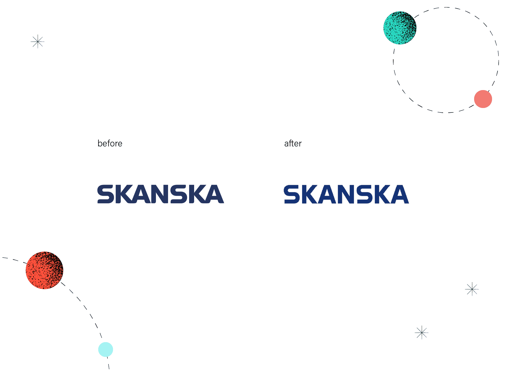
Perhaps, you noticed two tiny but substantial changes:
- The new logo is less curved
- It got a new, a bit lighter color (called Skanska Blue)
The goal was to create an optimistic, forward-looking identity. The new logo was adapted for optimal readability in the digital environment. According to NORD ID, a Swedish branding agency behind this project, this new identity focuses on construction, shapes, precision, innovation, and distinct architectural references.
The agency also published a short animation showing how their client’s logo was modified.
Skanska’s brand new (pun intended) identity will be shortly used in all of their marketing and digital materials, but also on their construction sites. NORD ID was responsible for creating:
- A new logotype
- Typography
- Imagery
- Icons
- Brand color palette (Skanska Blue and Skanska Gray)
- New business cards
- Design for Skanska vehicles and modular buildings
- Website
Our expert’s opinion
SKANSKA as one of the leading building companies, known for prioritizing the customer experience, went for solid and simple forms in which typography and imagery are the main heroes. All in all, their values speak about ‘shaping the way we live’. Resized letters working as a creative motive in this identity express that idea quite accurately. A concept with ‘Zoomed in’ glyphs that no longer recall letters from the logo, but more of construction elements – gives us an impression of architectural joints and an urbanistic feel.
One of the significant reasons for these changes was to establish company services more into the digital realm and, what goes with that, changing typography. However, I feel like the choice for identity font wasn’t fortunate as new Skanska’s ‘Shape Sans’ has more IT / Samsung vibes and loses architectural references that are at the core of the brand. Nevertheless, thanks to designers’ thrifty approach, now identity works more as a backdrop for what’s next to come. It also has a huge potential to be expanded in the digital landscape.
It often happens that most of the significant aspects of rebranding are hidden at the first glance. It’s no different in this case. For example, the logo with fixed letter spacing losing some roundness is a huge improvement in terms of online adaptation. The same is with the refreshed colour palette. Now ‘Skanska Blue’ is not that dull and goes well with the accountable company profile.
Rebranding of well-known brands isn’t the easiest thing to do. Once the rebranding announcement is made, it’s very quickly put to the test of public opinion and can quite often deviate from the initial goal thanks to that. Especially when it comes to the implementation – to see some results in communication shifts that Skanska planned, we need to give it a bit of time. Overall, what the Nord ID studio proposed is not revolutionary in any way, some may even think it’s expressionless – but in fact, design-wise – it’s a very scrumptious and technical ’heavy lifting’. The attraction in this particular case comes from transparency which gives the brand a lot of space to express itself in various ways. Another solid example of Scandinavian graphic design. Well done.
Interested in more examples? See also our article on the new Buick logo, Škoda rebranding, Pepsi’s new logo, and examples of rebranding.