November 29, 2022
7 rebranding examples that are worth your attention
Share this article
Facebook, KIA, Pringles and Keystone Light – these are just four of many brands that have recently gone through the rebranding process. In this article, we list seven interesting rebranding examples. Why are they worth your attention? What has changed? Let’s have a look.
Rebranding is always a huge milestone in a company’s history. It can help you redefine your business vision and open it to new areas and opportunities, gain more customers and keep your company relevant in dynamic market conditions. On the other hand, rebranding is not always successful. Just take a look at these five rebranding examples of unsuccesful rebrandings. And what about companies you can read about below? Let’s see the new versions of Facebook, KIA, Volkswagen, Pringles, Doritos, Victoria’s Secret and Keystone Light.
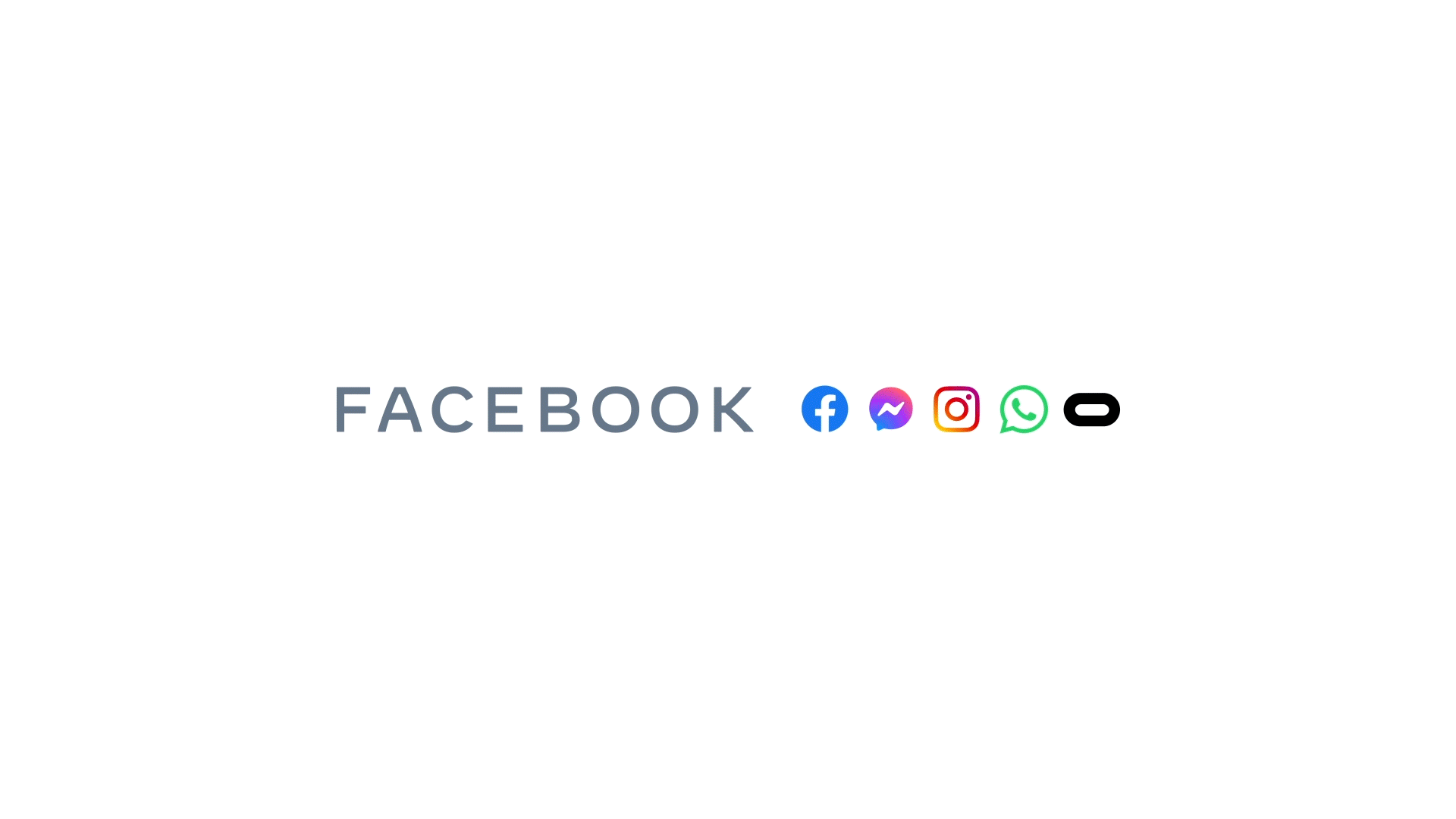
In October 2021, Mark Zuckerberg’s company announced their first major rebranding. Now, the company behind Facebook, WhatsApp, Messenger, Instagram and several other products is known as Meta. As you can see in the animation below, Facebook changed pretty much everything about its brand. It now has a different name, logo and typeface. There is also a new website for this parent brand behind Facebook – Meta.com.
As the company puts it, this rebranding will help it “better encompass what it does, as it broadens reach beyond social media”. Meta doesn’t hide that its interest in other areas (especially metaverse, AR and VR) was the main reason for this transition. As Meta, Zuckerberg’s company will be able to grow within different business areas as they move “beyond 2D screens toward immersive experiences”.
In fact, that’s a common reason for the rebranding – the company’s vision has changed, so it needs to update its brand identity to match it.
In 2021, this Korean carmaker decided to go for what’s been called a “dramatically different logo”. The slogan was also changed (now it’s “Movement that inspires”), as well as the company’s name (KIA ditched the word “motors” from the name to show a full-on transition into electric mobility). As the company’s CEO, Ho Sung Song, put it:
“Kia’s new logo represents the company’s commitment to becoming an icon for change and innovation.”
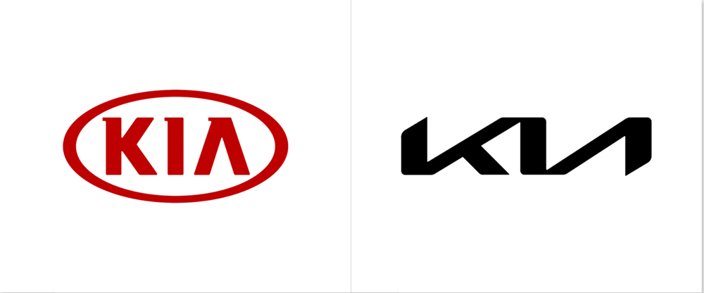
Along with the rebranding, KIA has also changed its approach to car design. In the past, Kias were considered conservative in design (not to say “boring”). Now, they are bold, good-looking cars that surely can attract attention on the street.
KIA’s new logo resembles a handwritten signature, and the angled letters K and A immediately catch everyone’s eyes. Kia says this new logo demonstrates confidence and the company’s high ambitions. And speaking of high aspirations, just take a look at the event that Kia organised in Seoul, South Korea, to celebrate the first such extensive rebranding:
You have to know that almost every car marker has just conducted the rebranding or will in the near future. All because of the global revolution in this sector, which, of course, is electric mobility. It’s a good occasion to adjust to this new reality and show the world that you keep up with the pace. That’s what KIA and Volkswagen, our next example, did.
Volkswagen announced its new logo with a flat two-dimensional design back in September 2019 during the International Motor Show in Frankfurt. At the same time, VW presented their new full-electric ID.3 car. It was all part of a bigger rebranding announcement campaign called “New Volkswagen”.
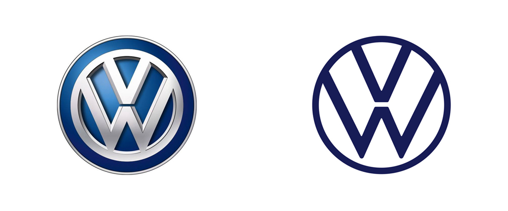
The main reason for rebranding is, again, the electric mobility revolution. VW has the ambition to become the no. 1 electric car brand by 2025, with more than 20 electric cars on their offer and 1 million electric vehicles sold. And thanks to the new “Volkswagen We” digital ecosystem, they want their cars to become fully connected smart devices, mobile service providers and even living rooms[5].
According to the company itself, this rebranding introduces “the new Volkswagen world, where digitalization and connectivity will make customer communications more data-driven, more personalized and much more individual”.
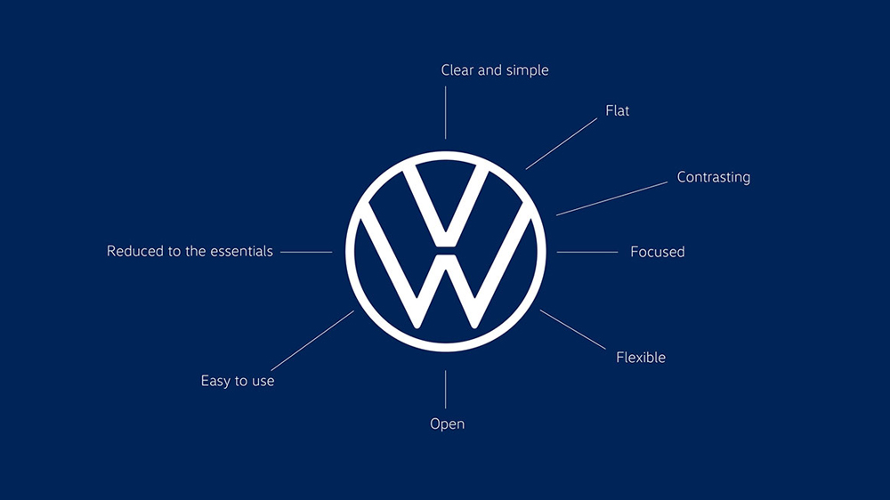
VW’s new logo has retained just the essential elements so that it’s more flexible and easier to use in digital space:
With the rebranding, VW added new blue tone to their colour range and allowed more colour variants of the logo (e.g., GTI models will get a red logo for the first time).
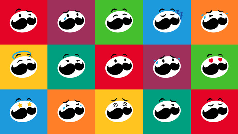
The iconic moustache man known as Mr P probably rings a bell for everyone. Pringles are world-famous chips known for being sold in tubes and not bags. Did you know that the last significant rebranding of the Pringles brand was quite a long time ago – back in 2002? Until now, their logo stayed almost exactly the same (there was a refresh in 2009, but nothing major). Let’s see what changed in 2021:
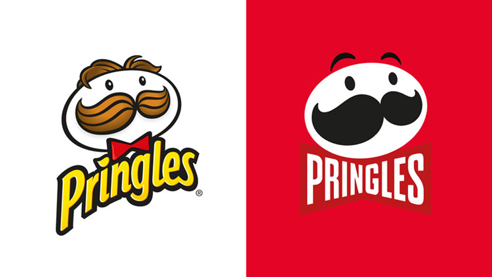
The redesign was timed for the 30th anniversary of the brand’s launch in the UK. The first thing that you probably noticed is that Mr P is now hairless. The logo has also lost some colours, and now it’s almost exclusively black and white (the only exception is Mr P got an oversized red bow tie). Moreover, for a better presence in the digital world, the logo is now flat.
JKR, the agency that designed this new look of Mr P, wanted to bring him to life by allowing him to display different emotions:
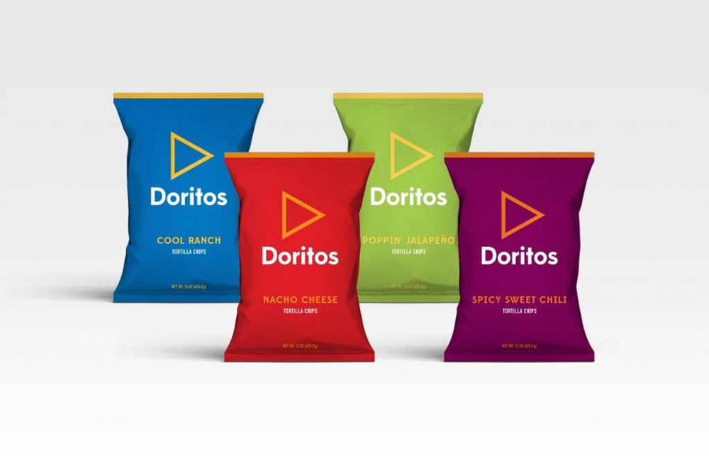
With our next example, we stay in the FMCG sector. In 2019, Doritos officially changed their iconic tagline ‘For the Bold’ by launching a campaign focused on igniting consumers to take what they love to ‘Another Level’. They even released an “anti-ad”:
With this campaign, Doritos temporarily removed the brand’s logo from all advertising and social content and instead started building a brand with its iconic triangle design and the words’ Logo Goes Here’. Today, the logo is back when it was, but the “Another Level” approach stayed, and the brand announced it would have other themes of “Another Level” in the future.
PS. Perhaps you’ve seen this creation:
In 2021 someone created this vision of what the Doritos brand should look like in a minimalistic version free from all the extreme elements. However, it was nothing more than a vision that went viral.
This rebranding is a bit different than the previous ones. For one thing, the visual identity is still the same. However, in August 2021, Victoria’s Secret announced their transition from famous supermodel angels to the VS Collective, composed of ten women of different skin colours, ages and shapes.
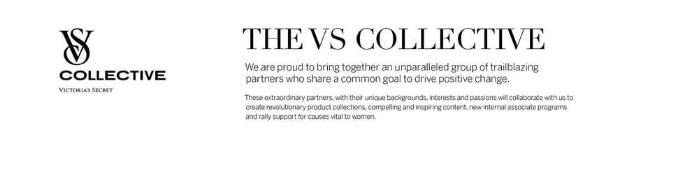
Victoria’s Secret wants to send a “diverse, inclusive message for the new generation” with this new approach. This new image should help the brand to create new associate programs, evolutionary product collections, inspiring content and show support for causes vital to women all over the world. As Martha Pease, the company’s CMO, put it: “We are creating a platform that will build new, deeper relationships with all women”.
VS wants to get away from its previous image that, in the eyes of many, was sexist and strictly for the younger audience. However, it is worth noting that this new image also has some opposers[9], and some think it’s utilitarian and just boring. Do you agree?
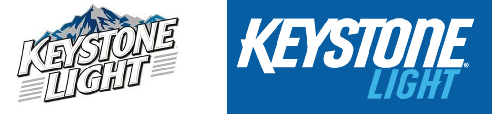
Image sources: https://logos.fandom.com/wiki/Keystone_Light; https://www.keystonelight.com/
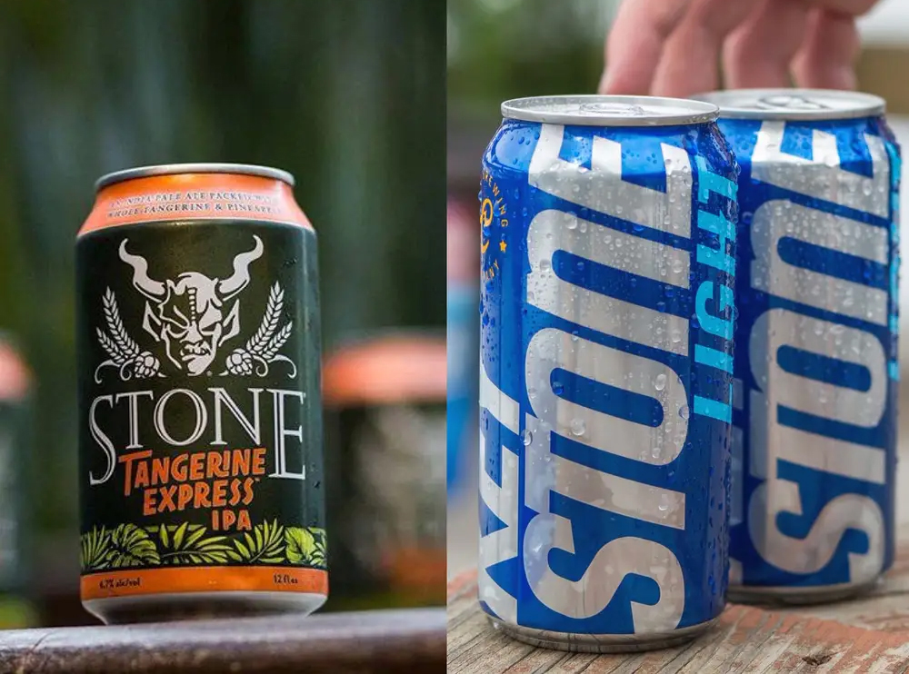
It’s an American beer introduced for the first time back in 1989. Currently, Keystone Light is owned by Coors Brewing Company. The brand was recently redesigned, but this rebranding is famous for just one reason – a huge trademark battle that started earlier in 2018. The whole conflict stems from the rebranded Keystone Light cans that were emphasising the word “STONE” as if it was a standalone word from the “Key”. According to Stone Brewing Co, a competitive Californian brewery, this fact was triggering brand confusion between Keystone Light and the Stone brand.
Below, you can take a look at these two products.
Today, to avoid any conflicts and confusion, Keystone uses this design:
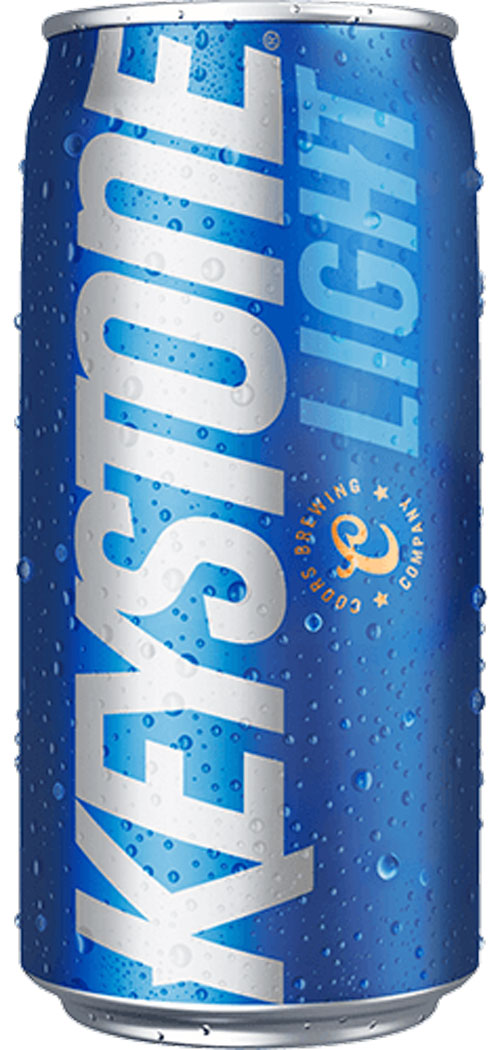
What has changed during the rebranding? For one thing, Keystone Light lost mountains from the logo, just like Mr P lost his hair. The font is different, the logo design is flat, and now we have a typical logotype (it contains no icons or graphic elements). Such a design is surely better for digital purposes – the VW, KIA and Pringles brands went the same way. The only thing that stayed the same was the name.
What has changed during the rebranding? For one thing, Keystone Light lost mountains from the logo, just like Mr P lost his hair. The font is different, the logo design is flat, and now we have a typical logotype (it contains no icons or graphic elements). Such a design is surely better for digital purposes – the VW, KIA and Pringles brands went the same way. The only thing that stayed the same was the name.
What do you think about these rebranding examples? It’s almost impossible to create a brand that’s appealing to everyone, but truth be told, that’s rarely a goal. Companies going through rebranding want to resonate with people who are interested in their products and services, i.e., potential customers.
It is worth examining new brands and their creations from time to time. This way, you can find inspiration for your brand, and that’s a good starting point.
See also our articles on what is rebranding, brand portal, and Frontify. If you are interested in refreshing your brand make sure to download our Rebranding Checklist to find out whether it’s the right time for your brand.