September 22, 2022
Brand on Stand: Buick’s new logo
Share this article

There aren’t many industries where logos plays as important a role as in the motor industry. When people see a golden bull or a trident – their connotations are immediate and explicit. That’s why car makers are very serious about their branding – because cars aren’t just ordinary products. They reflect who their drivers are and what’s important to them. Buick understands that, too. And they’ve just started a major rebranding process; the first one in over 30 years.
In 2023, Buick, an American car maker, will start putting a new tri-shield logo on their vehicles. This rebranding is not just a marketing exercise; Buick wants to become an electric-only automaker, and its new logo will help them enter a new chapter of the company’s history.
Buick is a car company that was started by automotive pioneer David Dunbar Buick back in 1899. Today, Buick has six cars on their offer, and they are all SUVs. Although it’s an American brand, Buicks are especially appreciated in China, where they are considered luxury vehicles. Nowadays, Buick is a part of General Motors, and the company is on the verge of a major rebranding. Up to this moment, the company has had several different logos, all of which are showcased below:
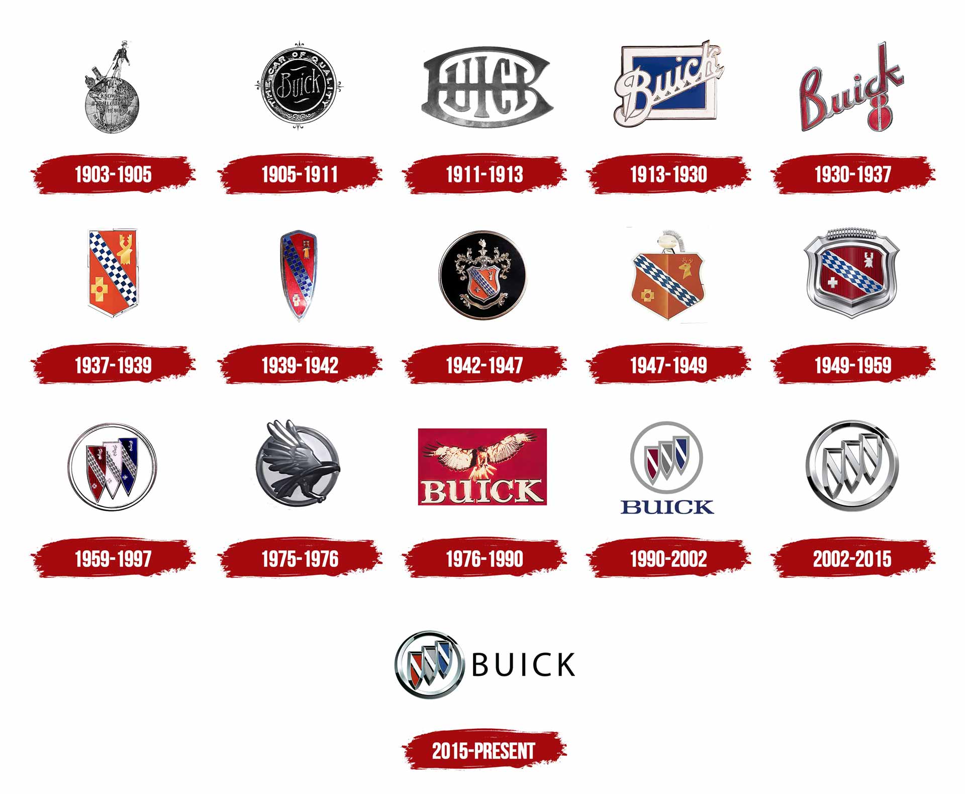
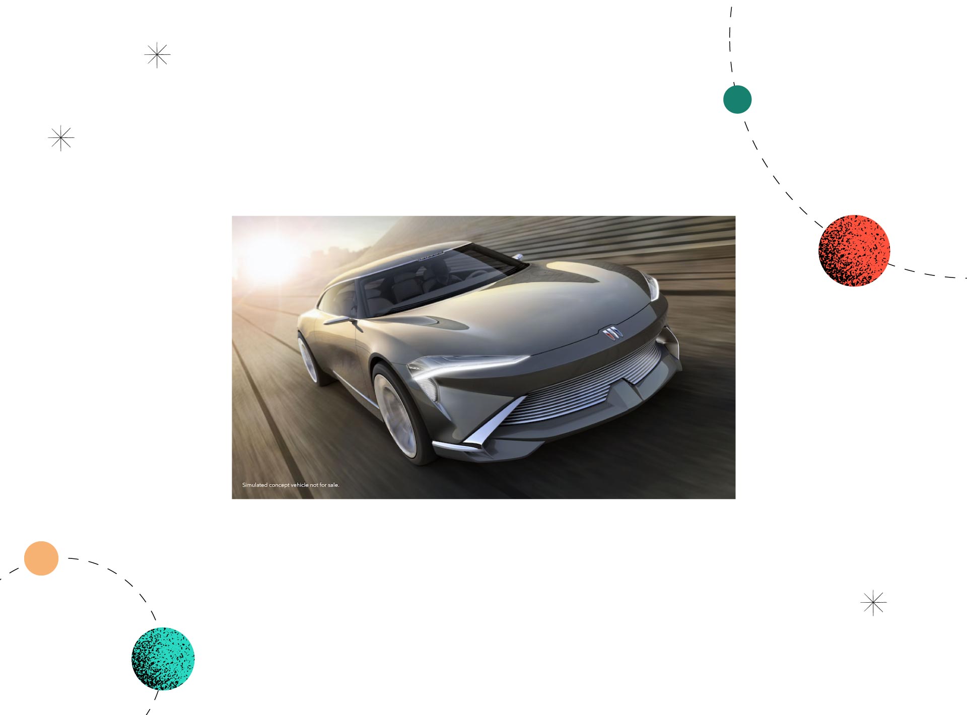
As you can see, Buick’s logo’s last major change happened in 1990. For the last 32 years, their logo stayed pretty much the same (with a bit of a brand refresh in 2002 and 2015). Now, though, with the electrification of the car world, Buick wants to change their logo once again. And the aforementioned electrification is the main reason for the upcoming rebranding. Buick has the ambition to become an electric-only car maker. The company’s goal is to present its first electric vehicle in 2024 and become an electric car maker by the end of this decade. And they have a concept announcing their bold plans.
As we can read on Buick’s website: “[This concept] is a leap forward that builds on our legacy of innovation, as well as expressing a vision of Buick’s new design direction and pointing to its all-electric future. With its poised, ready-to-pounce stance plus its design for advanced artificial intelligence and biometric technology, the Wildcat EV Concept is efficiency and innovation in a head-turning package.”
Significant is the fact that at the end of last year, Buick filed to trademark the “Buick Electra” nameplate. Does it mean we will shortly see a new car named this way? Probably so!
In 2023, Buick will start using a new logo that looks like that:
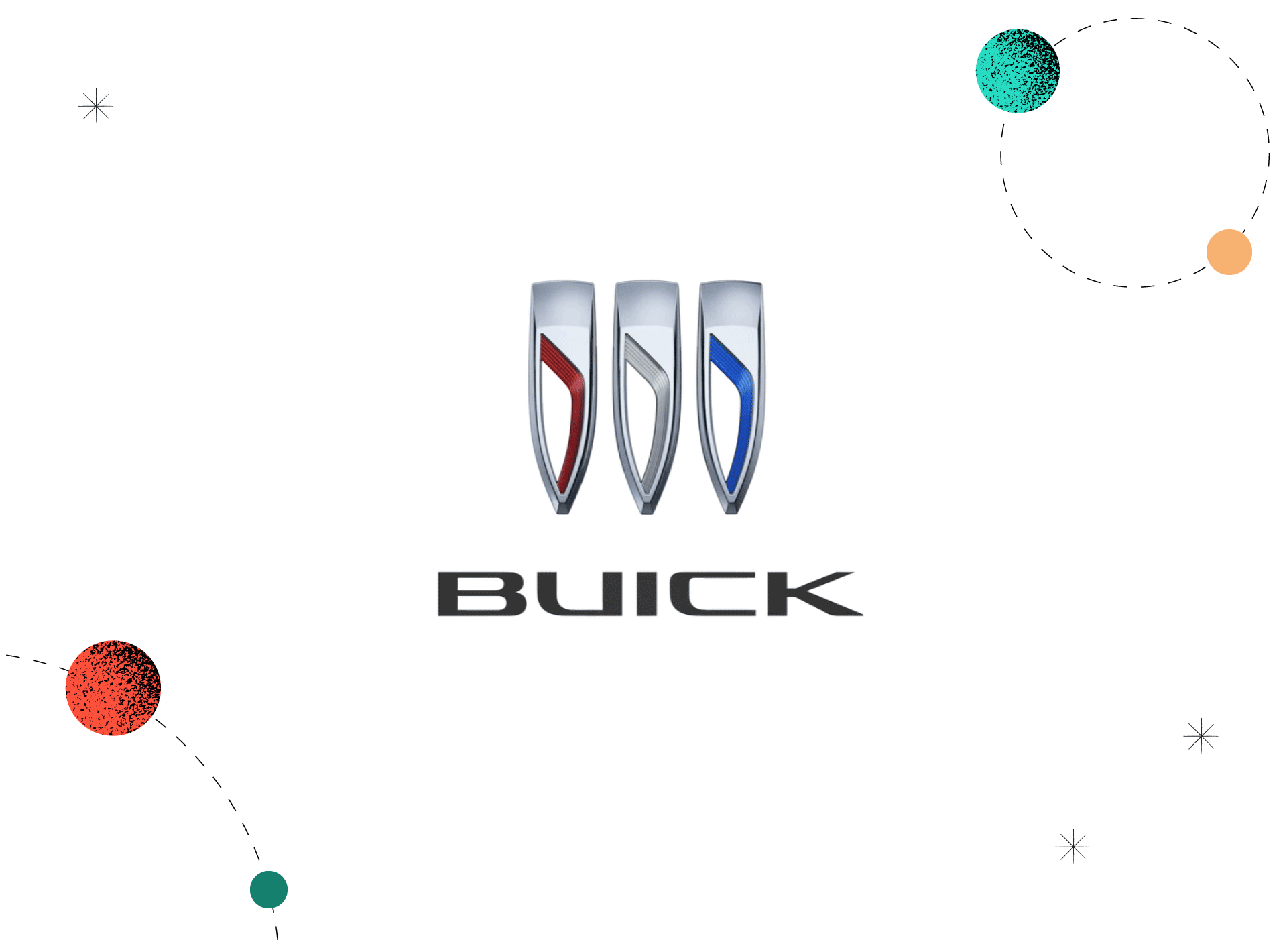
What will change compared to the previous logo? For starters, the company ditches the circular outer ring in favour of a body-mounted horizontal display. Secondly, Buick’s famous three shields will be horizontally aligned instead of diagonally. And thirdly, the diagonal stripe inside each shield has also been removed, and now we have a downward-swooping line.
Although the new logo has already been published on Buick’s website and it has three colours, there are still voices saying the new 2023 logo can be, in fact, monochromatic. As it happens, the trademark application for Buick’s new logo specifically states that GM didn’t claim colour as a feature of the mark. Moreover, these uncertainties are related to another GM brand’s recent rebranding. Last year, Cadillac introduced a new black-and-white logo for their electric cars. Will Buick go the same way? Time will tell.

As the base elements were kept intact, the biggest change seems to be with the hierarchy of the shields themselves and their positioning. What might be intentional here is the decision to keep the 3d textures of the symbol, while most of the ongoing re-brandings in the automotive industry are avoiding it (such as Skoda rebranding with their change to a flat logo).
Getting rid of the circle makes the Buick’s new logo lose its heaviness. The proportions also work much better as the lines in shields seem to be more smooth and have more reminiscence of an electric charger, rather than being a diagonal straight line.
It’s cleaner and simpler, but this rebranding is not revolutionary in any way. A slight change in the logo might not be noticeable to everyone. Going electric, however, might bring a lot of recognition in the future and be a good reason to rediscover the brand.
Found this article insightful? You might be also interested in Skanska rebranding or Pepsi’s new logo.