November 24, 2022
Brand on Stand: Škoda rebranding
Share this article

The car industry is now going through a major revolution, marked by two letters – EV. Almost every car maker is trying to adjust and moves to electric mobility – the solution that’s more eco-friendly and effective. This means that there are quite a few rebrandings waiting in line. Last time, we talked about the new Buick logo. Now, it’s time for Skoda rebranding.
Conducting the rebranding of a company that’s been around for almost 100 years is always a huge challenge. On the other hand, with the electric revolution in the entire industry, it seems necessary. Let’s see what Skoda has in store regarding the future of this Czech brand that started in 1925.
Skoda, as a company, started in 1925. However, before that, in 1894, Václav Klement and Václav Laurin founded their first bicycle repair shop. Shortly after, they started making motorcycles as well. Their first Slavia motorcycle made its debut back in 1899. A bit later, the company went through the first name change. The new name was a tribute to the owners – Laurin & Klement.
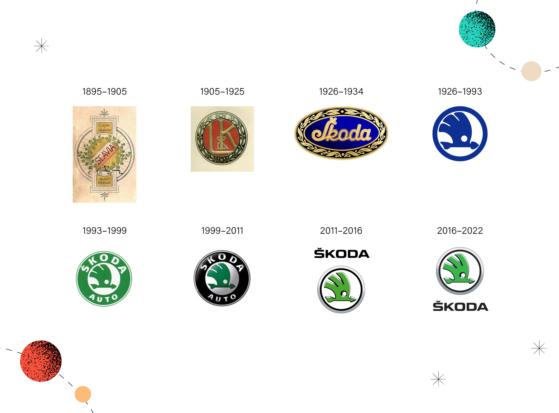
In 1925, the world saw the birth of a new car company – Skoda Auto. A brand that was destined to become a common sight across Europe (over 130,000 cars sold in Germany alone in 20211). Today, Skoda is a brand that’s fully under control of the Volkswagen Group. Their current logo almost hasn’t changed since 1933. Every car enthusiast perfectly recognises the green-winged arrow with three feathers.
On 30 August, Skoda published their new brand identity that will soon embellish their every new vehicle (the plans are to start using this new identity in 2024). The goal is to introduce the Czech brand to a digital and electric future.
First off, let’s see what hasn’t changed:
The first thing that comes to mind is the wordmark. Skoda’s new logotype uses all-new typography that’s based on symmetry and a combination of round shapes. The new wordmark is easier to recognise and identify. Although the Czech letter “Š” (with this specific element in the upper part of the letter that’s known as caron or háček) is now differently written and is fully integrated into the letter. And although Skoda still uses green, with their latest rebranding, they introduced two new green hues in their colour scheme:
According to Skoda, these colours are frequently associated with ecology, sustainability and electromobility.
And what about the picturemark? Skoda ditched the 3D design, which is in full compliance with modern design trends:

Skoda claims their new logo is more flexible – it can be easily integrated into different formats and works better with mobile devices and the digital space in general.
As Martin Jahn, Skoda’s board member for sales and marketing, puts it: “Our new CI underlines the modern and distinctive design and clearly shows our digital-first approach.”
What’s especially interesting, Skoda took this project very seriously. The whole rebranding took them over a year. Initially, the team had 165 different proposals. Next, they shortlisted just three designs from the initial list. The next step involved testing with over 2,000 respondents from six countries – they were asked which design was the best. The design you’re reading about right now was the winner of those tests.
The new brand identity will be introduced gradually. It will first be published in Skoda’s communication materials and cars’ infotainment systems. New cars will get the new logo as soon as 2024.
Just like Buick, Skoda, along with their new identity, introduces a new car design language. ŠKODA VISION 7S combines robustness, functionality and authenticity. This new concept car (needless to say, electric) is made with sustainable materials and interactive surfaces. A matt body colour is also a novelty in the Czech manufacturer’s offer.

All of that is a part of Skoda’s larger project. The “Next Level” Škoda strategy for 2030 assumes the brand will become one of the top five best-selling car brands in Europe2. The way to get there? With affordable cars and a whole range of new all-electric cars.

Prepared by Strichpunkt Design, Skoda rebranding is part of a larger whole called NEXT LEVEL ŠKODA STRATEGY 2030. In a nutshell, it can be said that the whole change is based on obvious and boring elements. All the elements of a new brand system that you would expect and that have appeared before in the case of competitors appear here.
Skoda has long promoted its brand using green as its flagship colour. Therefore it is difficult to claim that Skoda is jumping on the bandwagon of green trends (and mere greenwashing). The use of a set of two greens (light and dark) makes a good impression – perhaps it’s a little boring – but not awful. The introduction of diagonal divisions in the graphic language verges on the banal. A solid design job that was not intended to create a new quality in branding tactics but rather to adapt Skoda to what is happening now.
It is quite different to look at what has been proposed in the new brand logo, which the creators intended to replace the existing logo on the new Czech car models. At the very least, the existing symbol (an arrow with a plume) is disappearing from the vehicle badging. A simplified version will probably still appear on printed materials. The logotype itself consists of strong, well-defined letters.
Attention is drawn to the way in which the designers managed to solve the issue of the caron (háček), which is both visually and phonetically important for the character of the brand. In the new logotype, this diacritic mark has been hidden, and integrated into the letter ‘S’. It may lose its legibility, but this procedure manages to add dynamism and graphic coherence to the letters.
However, it is worrying, looking at the materials provided by the manufacturer, that this mark has yet to have the spacing between the letters. This may be due to the fact that the design is probably not yet completed.