January 13, 2022
The most iconic album cover designs: Run The Jewels
Share this article

Four albums, two rappers, and one story. Unusual consistency, some kitschy drawings, and cotton wool as smoke from the tyres of drifting cars. Here is how Andrzej Leraczyk is talking about the best album covers.
A good brand needs a story. A well-told one builds a brand. These two sentences are probably the main principle that gives direction to storytelling, one of the tools of modern branding services. And this helped to build the best album covers in history.
Back in 2013, when El-Producto and Killer Mike decided to make their first album available for free online, they knew they would need a strong graphic message to stand out from the mass of other online releases. They were looking for a distinctive emblem for their cover. As El-P recalls, they had in mind the distinctive “W” of the Wu-Tang Clan, the collective whose music they grew up on. The Run the Jewels symbol was intended to be more than just a sign (although El-P refers to it as a “logo”). The artists wanted their story behind the graphic.
By the way, the gents from Run the Jewels boldly played with rap clichés. On the cover of their debut, they didn’t show themselves hanging in gold or menacing poses. They even gave up any information about the artist and the album title.
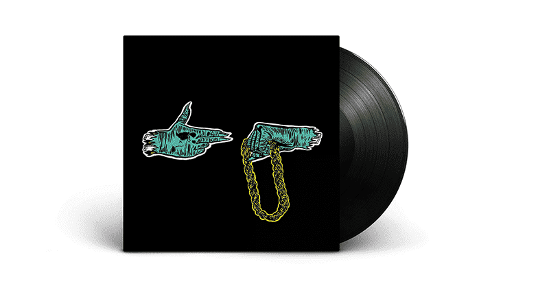
In such circumstances, a simple illustration was created – a gun and a fist. This is the beginning of the story that RTJ has been spinning since their first album. The whole graphic design of the covers, i.e. also the illustrations appearing inside, creatively connects with what is happening directly in the recordings. We may feel we are accompanying the protagonists on an escape (or chase). Moreover, we take part in an epic adventure, full of crazy driving and unexpected twists. And it’s definitely hip-hop because fast and expensive cars are an inseparable part of the culture’s trademark staffage.
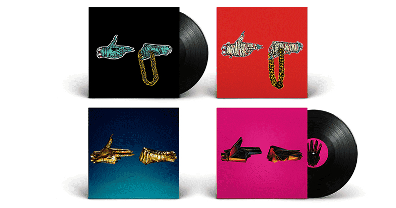
The illustrations for the band’s debut album (Run the Jewels, 2013) were created, together with El-P, by Nick Gazin (illustrator, comic and culture book writer and art editor of Vice magazine). He is responsible for the kitschy style of the album. His characteristic, naive, and intentionally a bit clumsy line is combined with the reflective colour scheme. It creates a surprisingly strong effect. The absurd depiction of two chopped-off hands of (presumably) zombies with white pieces of bone sticking out, is a great start to the story. The crew begins their journey with a socio-political commitment. A lot of questions and riddles here, a lot of mystery and no answers. In an interview, El-P stated that in the beginning the gun and the fist holding the chain simply meant “Give me your fucking chain!”.
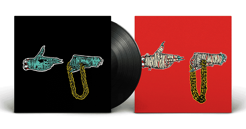
The second album (Run the Jewels 2, 2014), released a year after the debut, is visually a continuation of the previous release. This time, the distinctive hands on a red background are covered by bloody bandages – a clear signal that the journey is not painless. The band wants to show in this way what they’ve been through. The mutilation is the result of the greater emotional openness they’ve decided on while recording this album.
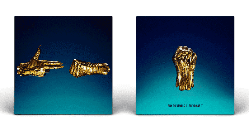
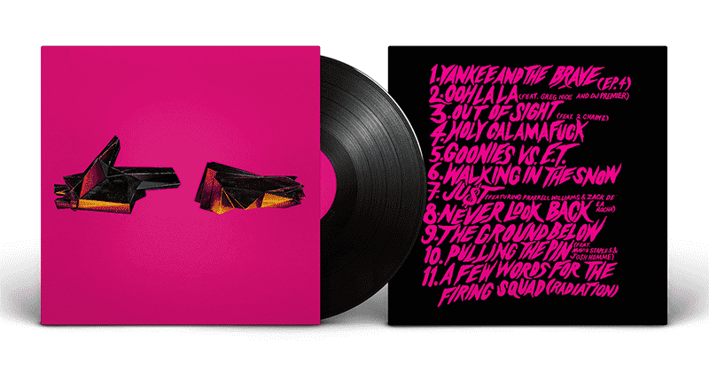
The next stage of the journey is the duo’s third album (Run the Jewels 3, 2016). On its cover, there is a graphic revolution. Only “hands” still consistently appear (this time without the chain), but the style and graphic meaning change. Gazin’s cartoonish drawings are replaced by hands cast in gold. El-P’s collaborating photographer and art director, Timothy Saccenti, is responsible for this change and transition from cartoon illustration to a more graphically elaborate image. The new hands look like fragments of a statue. Indeed they were sculpted, each weighing over 4kg. Saccenti then photographed them to highlight every last detail of the cast. The absence of the chain, which has appeared on previous covers, El-P explains his desire to make his viewers aware that true jewels or true value cannot be found on the outside. They can only be found within oneself.
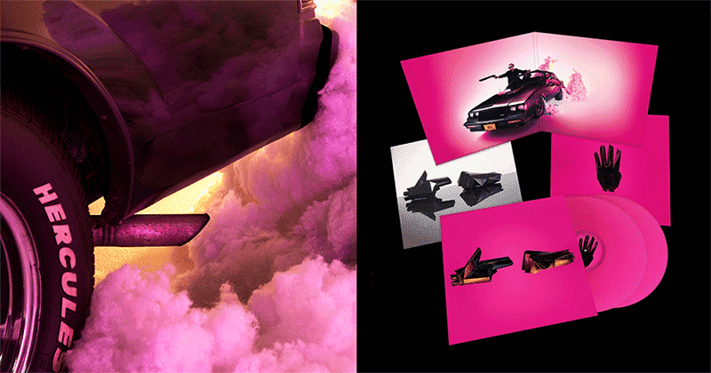
The latest album (RTJ4, 2020) is a political manifesto. It leaves no doubt which side Killer Mike and El-P are on. It’s an objection to and a loud commentary on the events leading up to the album’s release. The cover artwork is a strong and decisive development of the duo’s previous idea of image. This time the “hands” may bring to mind a science fiction fantasy from the 1980s. The polyhedral hand shape is made of dark futuristic material. It signifies a departure into the future, but from the past – and therefore into our present. What was still ahead in the past has already happened. Not only what Mike writes and shouts, but also the whole graphic atmosphere of this one of the best album covers seems to ask: “Is this the future we wanted?”.
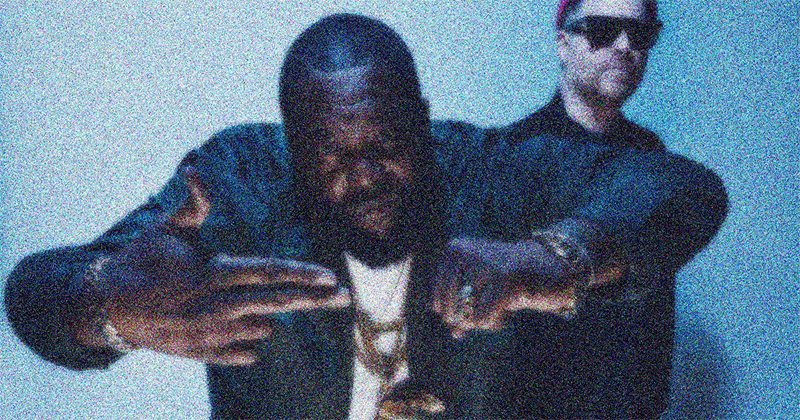
Illustrations for previous albums depicted crazy car chases starring a Buick Regal Grand National. It’s Killer Mike’s favourite model of a car, who some time ago posted pictures of resoraks on his profile on Instagram. To imitate drifting cars, he placed pieces of cotton wool so that they looked like smoke coming out from under the wheels. Timothy Saccenti had the idea to replicate this on a larger scale. Photographing the duo in a car, he used a material similar to cotton wool. The whole thing may seem too refined and polished. It has lost the rawness of the first releases – but is this a bad thing? Not necessarily. RTJ is developing and adding another chapter to an amazing story.
In conclusion, this is not the end of the story. There will probably be a continuation, which I look forward to with curiosity. I don’t know if Run the Jewels will consistently maintain their graphic image – we’ll see. For now, they managed to draw me into their world. Even though I don’t usually listen to this kind of music. By the way: in one of the videos from the latest album, RTJ4 (Ooh LA LA LA, feat. Greg Nice & DJ Premier), Killer Mike appears in a jacket with a huge scaled-down print featuring artwork from Joy Division’s first album. But that’s a whole other story.
One thing is clear: when reading about best album covers you also need to check our other articles – about the legenedary banana cover album, mayhem album cover and meta design of album covers.