September 19, 2022
5 examples of unsuccessful rebranding. Learn from mistakes
Share this article

Millions of dollars in losses, consumer boycotts and image damages – these are the effects of unsuccessful rebranding of well-known brands. Learn from their examples to avoid making similar mistakes.
Almost every month brings us the launch of a new logo and image for a widely recognised brand. However, companies are not always aware of what are the risks of rebranding. Curiously, the agencies responsible for the rebranding are also at risk, as you will learn from one of the examples below. Interested? Keep reading, then.
The rebranding process is often mistakenly seen as a remedy for all brand communication problems. Brand managers often forget that rebranding is complex, demanding, expensive and risky. Therefore, it is always important to prepare for it carefully by:
Addressing these points helps to mitigate the big risks that rebranding brings to a brand. What happens when rebranding is carried out without preparation? Meet the five examples of the most unsuccessful rebrands in history….
On 6 October 2010, clothing brand GAP unveiled its new logo. This was preceded by a slump in sales in the wake of the 2008 crisis. Many brands then struggled with similar difficulties. However, GAP decided that a rebranding could be the solution to their problem. Unfortunately, the new logo turned out to be a flop.
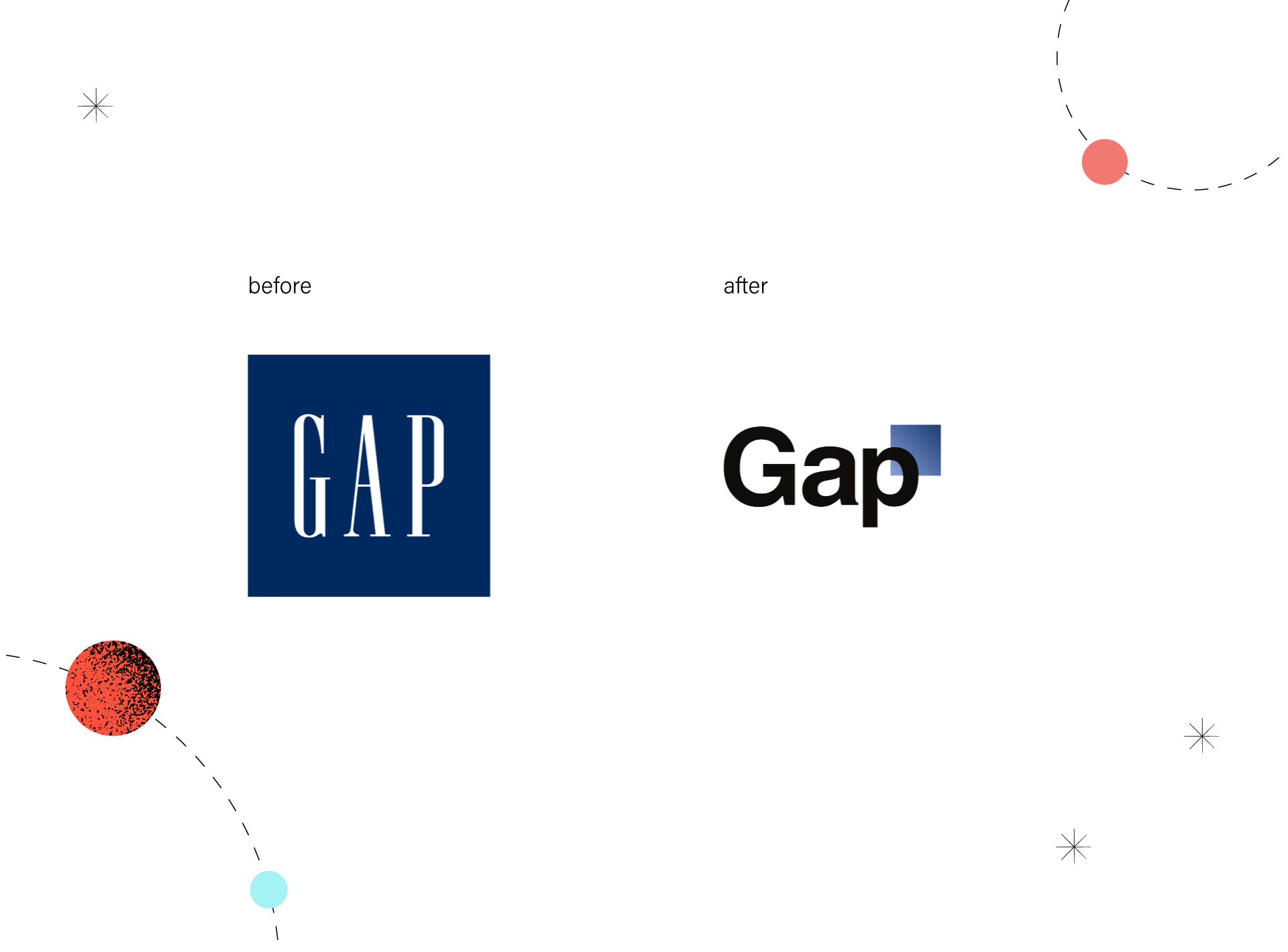
Apart from the fact that it used the Helvetica font, already considered generic at the time, it bore little resemblance to the old logo. Seeing it, consumers could be unsure whether it was the same brand. However, the biggest mistake, which proved to be the nail in the coffin, was the lack of a proper rebranding announcement accompanying the logo change. The company did not tell the public why they were changing, what direction they were taking or what the big idea behind the rebranding was. GAP also neither changed anything in its stores (except logos) nor introduced any new production line simultaneously.
Not surprisingly, the brand’s rebranding met with backlash from the public, as well as an endless series of online mockery. Consequently, the brand decided to revert to the original logo after just six days!
The cost of the entire rebranding was estimated at $100m.
Mistakes made:
In 2009, the collaboration between the popular juice brand Tropicana and the respected agency Arnell ended in what we can describe as a ‘lose-lose’ situation. Driven by a desire to refresh its image and bring it in line with contemporary trends, the juice manufacturer – refreshed the packaging of its premium product. The company invested $35 million in advertising campaigns that promoted the new carton design. Within the first 2 months of its launch, Tropicana experienced a 20% drop in sales, resulting in a loss of $30 million. Arnell went out of business a few years later.
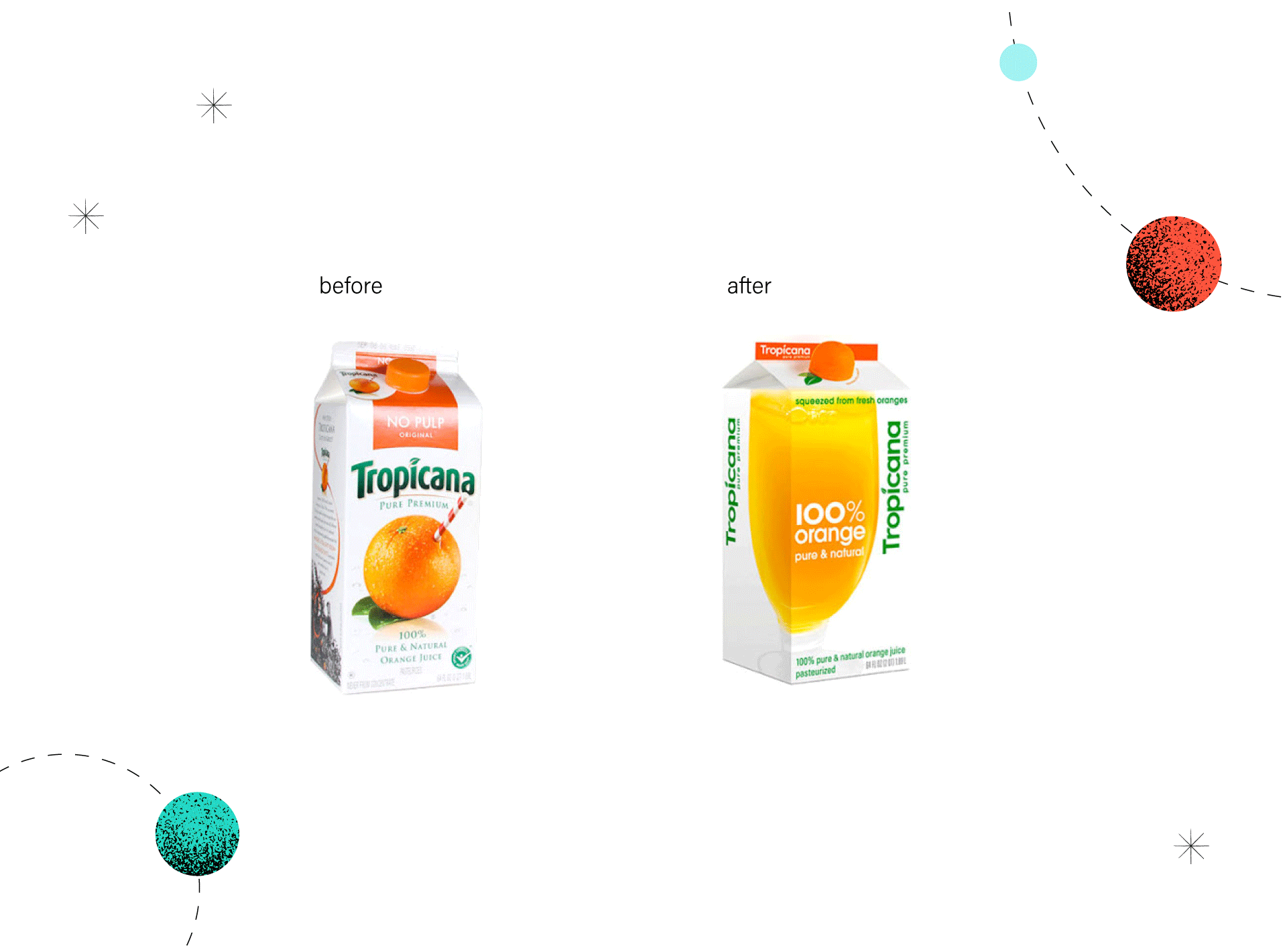
Of course, it is a matter of taste and someone may like the new packaging. However, it is not difficult to point out the fundamental flaws that contributed to the failure. Firstly, the logo, which was easily visible from a distance in the original version, has been slimmed down and positioned vertically instead of horizontally in the new one. Secondly, the large, garish message at the top of the packaging ‘NO PULP’, which communicated the uniqueness of the product, has disappeared.
A third mistake – the agency designed the packaging so that the image representing a glass of juice is visible on two sides of it: the front and the side. Although the packaging shown at a 45-degree angle looks nice in the graphics, the designers did not anticipate that juices usually stand side by side on shop shelves, so consumers only see them from the front.
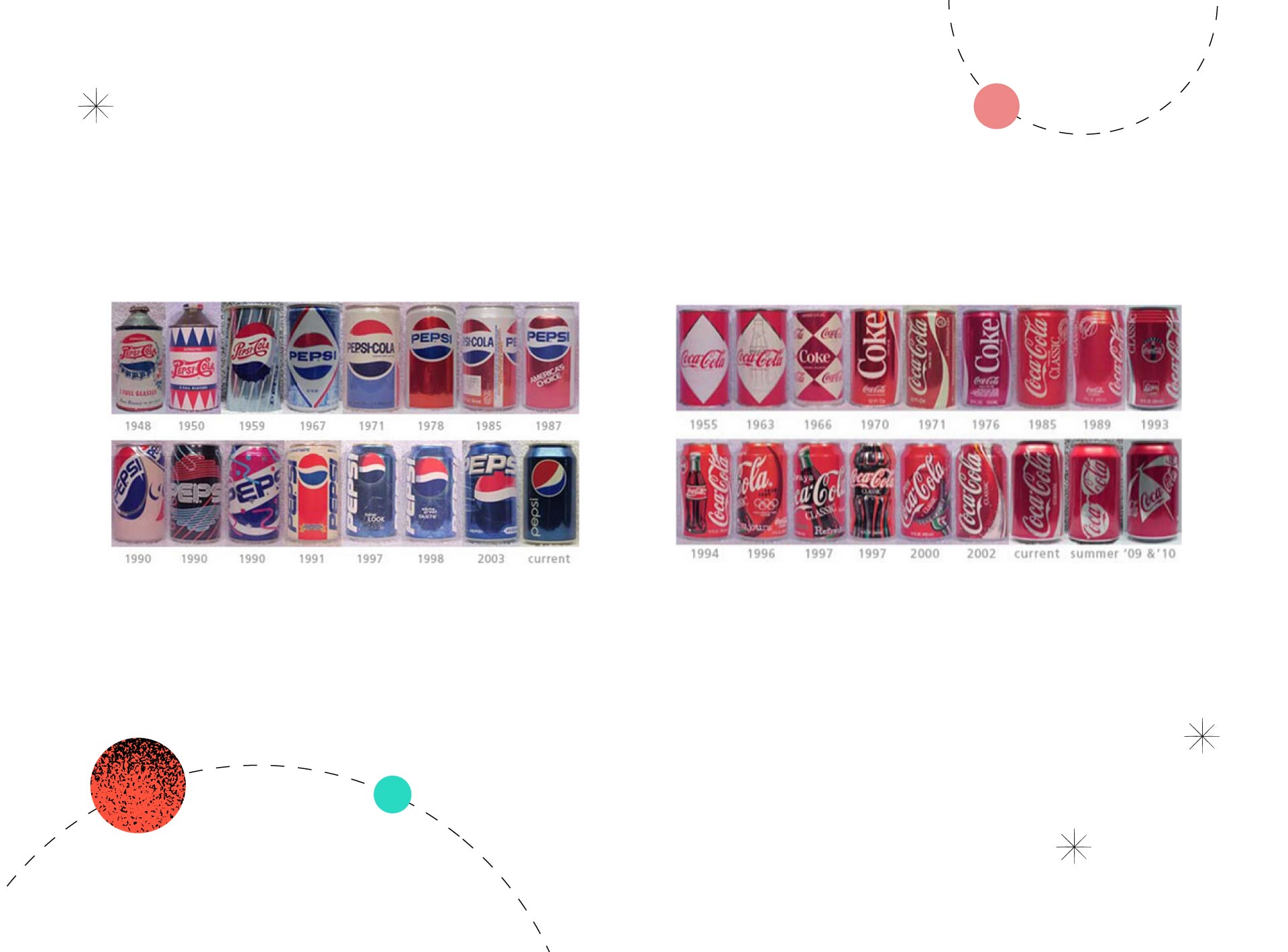
However, the biggest mistake was that the company opted for an overall drastic change instead of making a gentle facelift of the packaging. More than likely, that new logo, image, typography, and slogan may have contributed to a situation where a red light went on for consumers – is this the same product they knew and bought before? For comparison, it is worth looking at how gently the packaging of Pepsi or Coca-Cola has changed over the years.
Mistakes made:
By the way, we encourage you to read our latest article about Pepsi’s new logo and visual identity.
Another interesting example of unsuccessful rebranding. In early 2001, UK postal operator Royal Mail decided to change its name to Consignia. The brand no longer wanted to be associated solely with sending and receiving parcels. It also had logistics and customer call centre operations and was planning several acquisitions abroad. The company wanted a new name to reflect the company’s ambitious growth plans and bring together all wings of the company under one umbrella. The introduction of the new name alone cost £1.5 million.
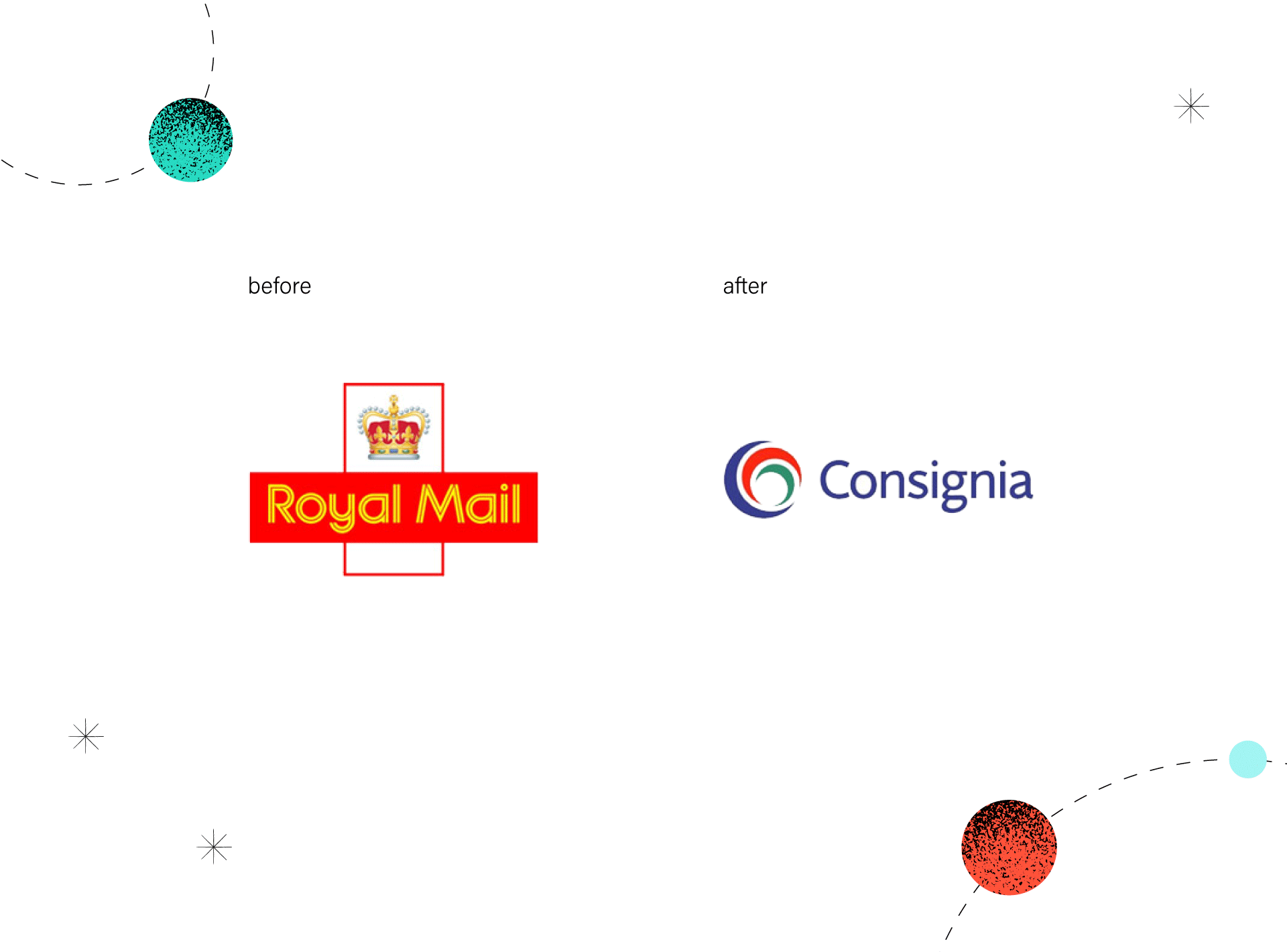
Unfortunately, the public and the media saw this rebranding as slander that eradicated the company’s five-hundred-year tradition. The new name was neuter and did not reflect the fact that the company was a state institution. After a wave of criticism lasting more than a year, the company has reverted to its original name. The re-rebranding to Royal Mail cost the company a further £1 million.
Mistakes made:
Another example where an emotional branding connection was a clue. On 24 January 2018, Leeds United unveiled the club’s new crest to celebrate its centenary. In theory, everything seemed logical. The new crest was the result of six months of research involving 10,000 people. On top of this, the club prepared the communication activities accompanying the rebranding quite well. The change was also justified – its purpose was to bring the club into the new century. Despite this, the club faced massive criticism from fans. More than 77,000 people have signed a petition to boycott the rebranding.
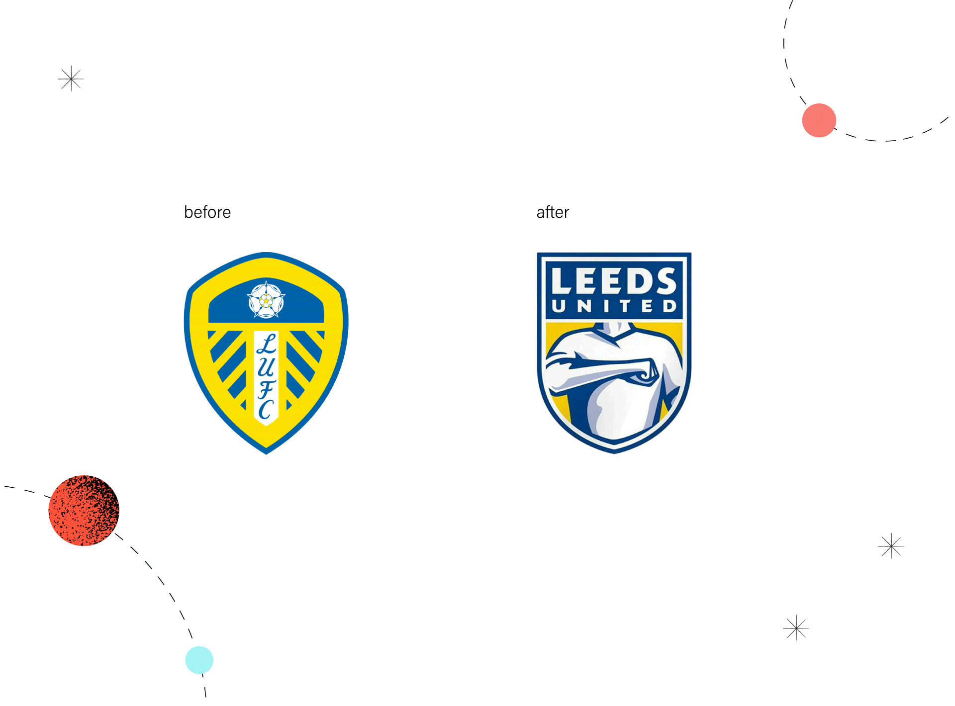
So, what went wrong? Well, once again, the club underestimated connection to the crest. In this case, it is significant because the bond that connects fans to their beloved football club is much stronger than the one that connects people to a company or product. The club probably surveyed the wrong users it should have, although reaching fans if only through social media, does not seem very complicated.
The club’s authorities decided to withdraw their decision to introduce a new crest. The cost of the rebranding was never officially announced, but it is estimated that it could have been as much as £1 million.
Mistakes made:
It’s worth mentioning here another rebranding that has been widely reported in recent years. Juventus in 2017 became the first of the well-known football clubs to replace the crest with a logo. The change has been successful and has resulted in increases in the market. This shows that anything can be done, you just have to do it in a thoughtful way.
If something is effective, don’t touch it because people simply do not like change. In 2006, Mastercard, despite having one of the most recognisable logos worldwide, decided to ‘improve’ its mark by adding new elements. The company wanted a new logo to communicate the brand values of advancing relationships, insight and commerce more prominently.
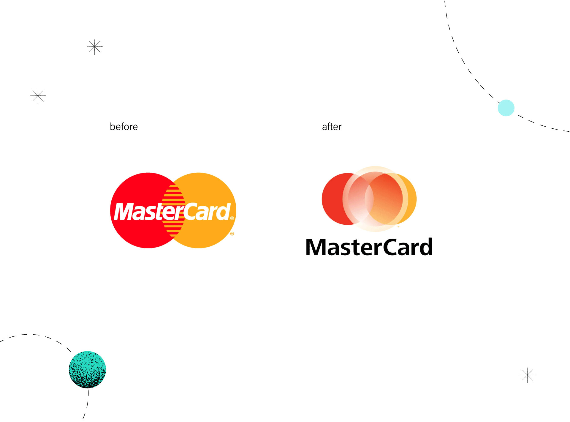
Unfortunately, the rebranding process excluded audience consideration and was driven by board-level business decisions. The controversial mark quickly met with harsh criticism, so MasterCard decided to use the old logo for payment cards while designating the new one for corporate communications. In 2016, the company did another logo refresh and made its brand communication more consistent. The new logo cost Mastercard $1.5 million.
Mistakes made:
With these five examples of unsuccessful rebranding, we can really learn a lot. Here are the key points as a reminder:
While the above examples of unsuccessful rebranding may be discouraging, remember that the majority of rebrands have remarkable results. Sometimes a company just needs a smaller or bigger change, sometimes more comprehensive rebranding services. If you think it’s time for your brand to be rebranded, we invite you to get in touch. We’ll be happy to identify your needs, create a strategy and smoothly guide you through the process.
Read also our articles with rebranding examples and brand positioning examples.