February marks another year since the large-scale invasion of Ukraine, a time of unimaginable hardship and resilience. While the war continues to cast its shadow, the creative industry in Ukraine refuses to be silenced. Designers, branding experts, and digital creatives persist in their craft, proving that creativity is not just a profession—it’s a force of resistance, a means of storytelling, and a testament to an unbreakable spirit.
We stand in solidarity with our colleagues in Ukraine. Today, we celebrate their incredible work by showcasing some of the most remarkable branding and creative projects that have emerged from Ukraine in recent years.
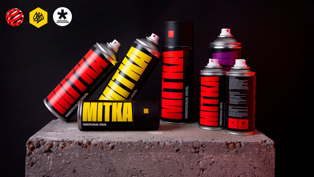
1. MadCats Agency – MITKA
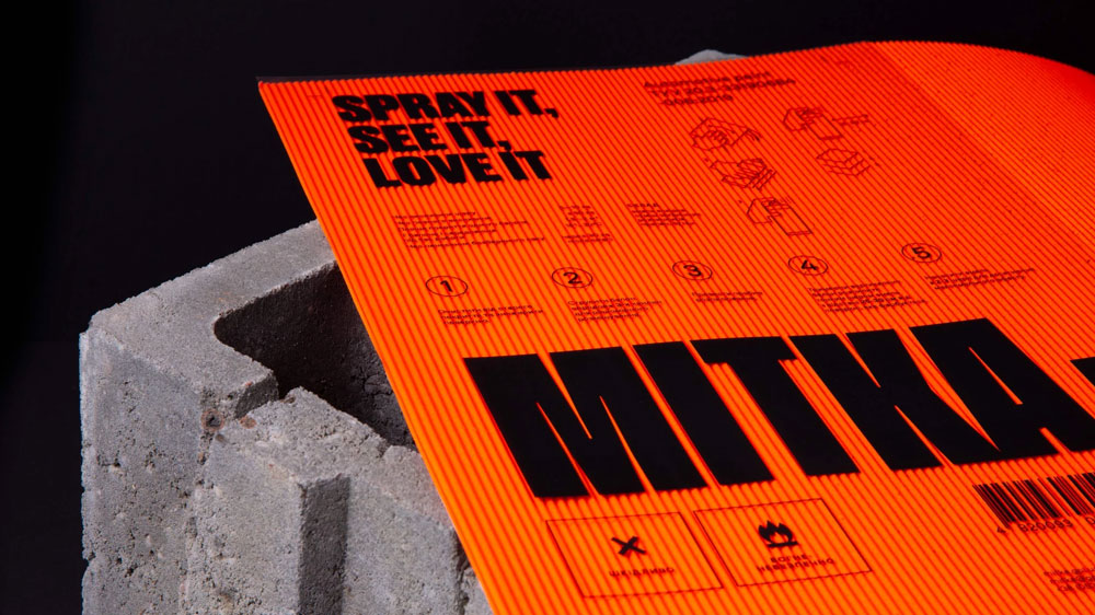
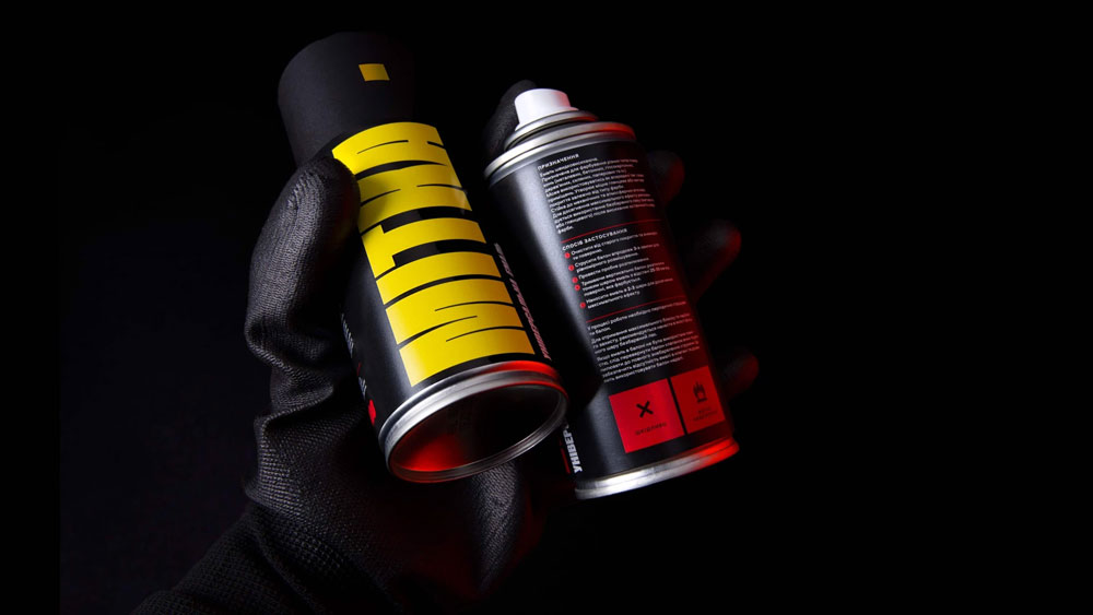
MITKA is a spray-paint brand from Poltava, Ukraine, developed by Madcats Agency with a fresh and unconventional approach to branding. Unlike most spray-paint brands found on Ukrainian store shelves—often overloaded with chaotic designs and weak typography—MITKA was created to be simple, striking, and functional.
The name MITKA comes from the Ukrainian word for “mark” or “sign”, a nod to the childhood experience of leaving one’s mark on fresh cement, garage doors, or walls. This idea of “leaving a trace in history” became the foundation for the brand identity.
MITKA’s branding is a playful yet practical solution to traditional spray-paint packaging. The logo itself is an abstract cylinder, mimicking the shape of a spray can. The bold, oversized typography ensures the product stands out on the shelf, while the colour system makes it easy to identify the right shade at a glance.
Source: MadCats website
The identity embraces a straightforward, no-nonsense personality. As the agency describes it:
“I’m just a paint. I’m not talking about Impressionism or Salvador Dalí. With me, you can paint the fence, fridge, and hilt of your favorite katana. Nothing else, but I can do it perfectly. I’m a paint, not an android.”
MITKA’s design has been widely recognized in the creative industry, earning multiple prestigious awards:
- D&AD Yellow Pencil (2021)
- Red Dot Design Award Winner (2020)
- European Design Award, Shortlist (2020)
- Epica Award, Shortlist (2020)
MITKA redefines what industrial product branding can be, proving that even in a traditionally overlooked category like spray paint, good design matters. The project perfectly embodies Madcats Agency’s approach—combining humor, bold visuals, and strategic thinking to create a brand that is both highly practical and deeply engaging.
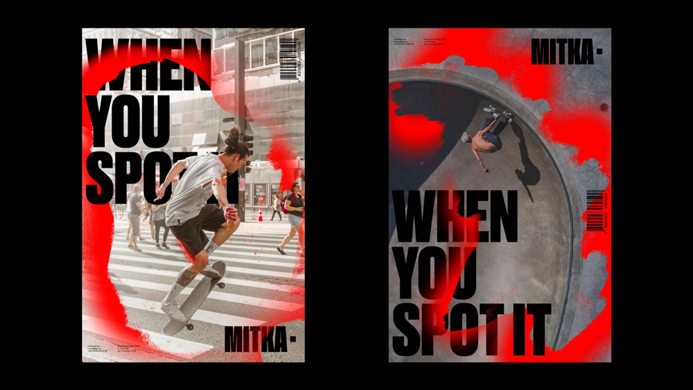
Source: MadCats website
Madcats’ ability to merge cultural depth with cutting-edge design has earned them recognition far beyond Ukraine. Their work demonstrates that, even during wartime, Ukrainian creativity can thrive and captivate global audiences.
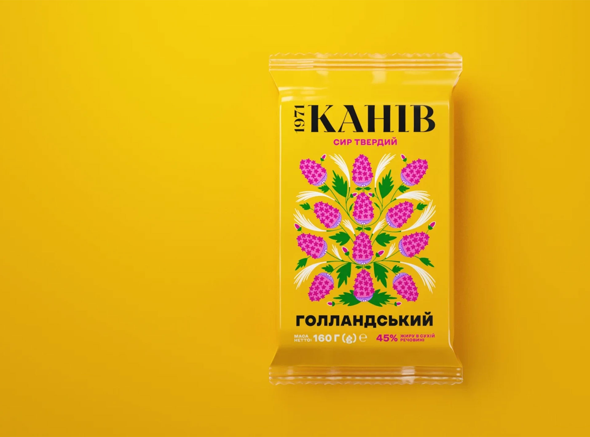
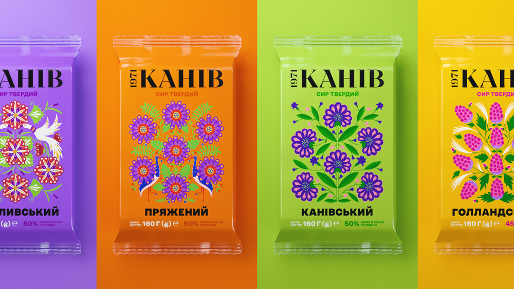
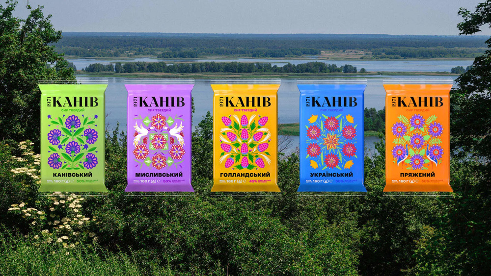
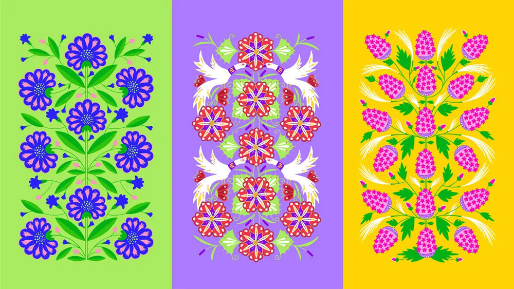
2. Grape Agency – Kaniv 1971
Kaniv 1971 is not just a cheese brand—it’s a story of Ukrainian heritage, nature, and artistry. Designed by Grape Agency, the branding and packaging reflect the picturesque region of Kaniv, where the cheese is produced, and the Kaniv Nature Reserve, a sanctuary for endangered species.
To capture the essence of Kaniv’s rich cultural and natural heritage, Grape Agency turned to the distinctive style of Maria Prymachenko, one of Ukraine’s most celebrated folk artists. Her work, deeply rooted in folklore, fairy tales, and everyday life, is known for its vivid colours, dynamic forms, and symbolic storytelling. The designers infused these elements into the cheese packaging, creating a bold, artistic identity that instantly stands out on store shelves.
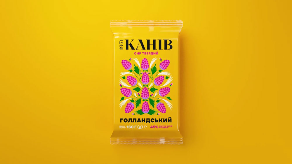
Source: Grape Agency website
Source: Under Consideration
Beyond aesthetics, Kaniv 1971’s packaging serves an important environmental purpose. Each of the five cheese variants features a different set of endangered birds and plants from the Ukrainian Red Book, raising awareness about species at risk and encouraging consumers to protect Ukraine’s natural beauty.
The illustrations are not just decorative—they tell a story of preservation and respect for nature, aligning the brand with a broader mission of sustainability.
The result is a packaging concept that feels both traditional and modern, deeply connected to Ukrainian culture while being highly relevant in today’s market. The bright colors, hand-drawn elements, and storytelling approach make Kaniv 1971 cheese more than just a household staple—it becomes a symbol of cultural pride and ecological awareness.
Source: Packaging of the world
Grape Agency is one of Ukraine’s leading creative agencies, known for its bold, idea-driven branding and advertising campaigns. Specializing in design, strategy, and digital solutions, the agency has worked with local and international brands, consistently delivering projects that blend cultural insight, innovation, and strong visual identity. Their work has been recognized for its unique storytelling approach, proving that great branding can inspire, educate, and make an impact beyond commerce.
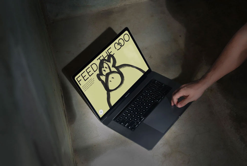
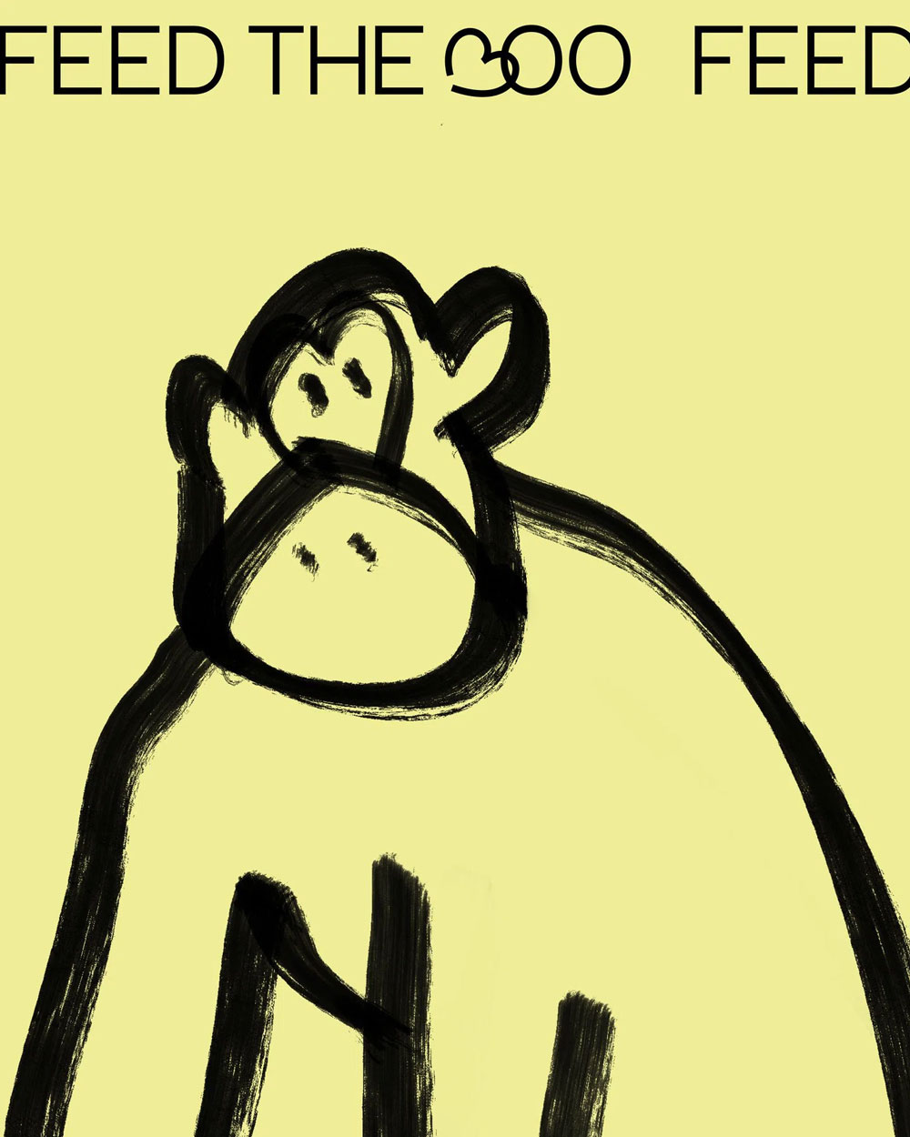
3. Anonymous designers – 3OO
3OO was a powerful digital project that emerged in response to the war in Ukraine. Designed by two anonymous creatives originally from Russia, this illustrated website became a crucial tool for supporting Ukrainian zoos, many of which were struggling to feed and care for animals due to the conflict.
When Russia invaded Ukraine, many cities—including Mykolaiv, Kharkiv, and Kyiv—were under fire, forcing zoos to close their doors. With no visitors, these institutions lost their primary source of income, leaving zoo workers desperate for funds to buy food, medicine, and arrange safe transportation for the animals.
Source: It’s nice that
The designers behind 3OO initially noticed an Instagram initiative asking users to buy tickets to Mykolaiv Zoo as a form of donation. However, they quickly realized that many donation links were getting lost, misdirected, or buried under the constant flow of wartime social media content. Additionally, this problem wasn’t just affecting Mykolaiv—zoos across Ukraine were struggling to survive.
In response, they created 3OO, a centralized, easy-to-use website that compiles donation links and online ticket purchases for multiple Ukrainian zoos. Built in just two days, the platform served as a “Link in Bio” hub, ensuring that all support efforts are easily accessible.
Given the urgent nature of the project, the design had to be fast and effective. However, the team also wanted to create something that evoked emotion and urgency, while remaining warm and hopeful.
The website’s illustrations were intentionally naive and childlike, resembling quick, calligraphic sketches. The illustrator, who astonishingly had no prior experience with digital illustration, developed the visuals using a rapid and rough drawing style. This approach allowed for quick updates and additions as new zoos and shelters were added to the database.
The initial color palette was inspired by the Ukrainian flag, but was later expanded to reflect the diversity of animals and workers in need. The illustrations feature gentle, expressive animations, created using a simple frame loop tool in Procreate, making the experience engaging yet straightforward.
To reinforce the platform’s Ukrainian identity, the designers used fonts by Ukrainian type designer Ivan Tsanko, who provided his typefaces for anti-military and humanitarian initiatives.
The 3OO team kept the technical execution as simple and cost-effective as possible. The website was built using Readymag, a no-code web design tool, and launched on a domain that cost just $4.50—the only monetary investment in the project. Despite its minimal budget, 3OO became a crucial digital resource that allowed people from around the world to support Ukrainian zoos with just a few clicks.
Beyond the designers themselves, the initiative received support from Angry Agency, which had also begun working on a similar idea but chose to merge efforts rather than divide focus on such a critical cause.
3OO proved that simple, well-executed ideas can have an immediate and tangible impact, even in the face of war.
By combining digital accessibility, strong visual storytelling, and an urgent call to action, the project served as a reminder that creativity can be a force for resilience, empathy, and meaningful change.
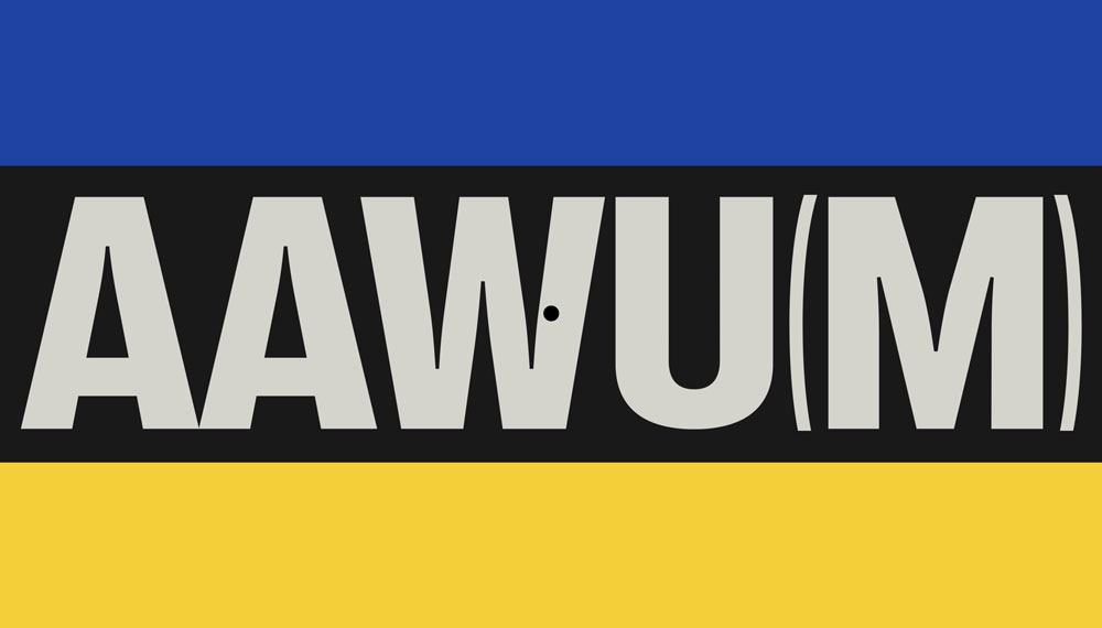
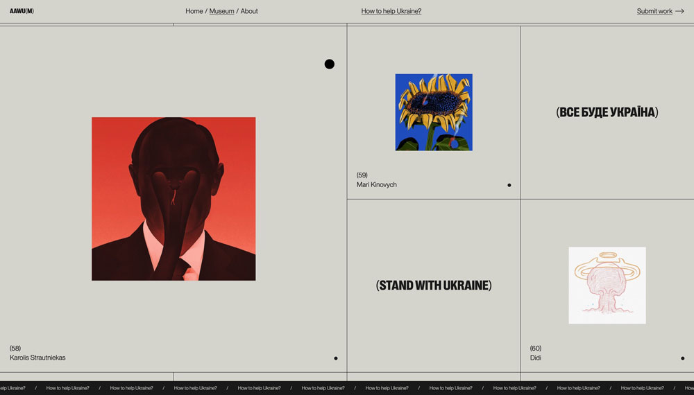
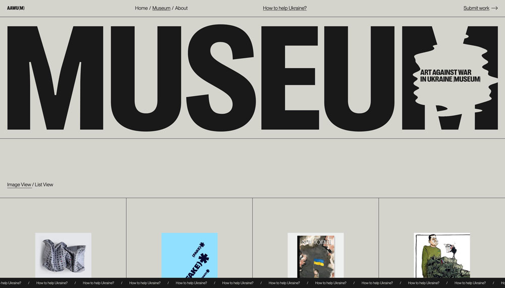
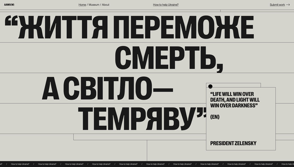
4. Obys Agency – AAWU(M)
The Art Against War in Ukraine Museum (AAWU(M)) was a unique digital space that showcases a growing collection of art, fashion, graphic design, 3D, NFT, motion design, and other creative works inspired by or responding to the war in Ukraine. The project served as both an artistic archive and a call to action, preserving powerful visual narratives created in the face of conflict.
Developed by Obys Agency, AAWU(M) was more than just an online exhibition—it was a living, evolving digital museum that reflected the emotional, political, and cultural realities of wartime Ukraine. The platform curated works from artists and designers worldwide, uniting them under one powerful theme: resistance through creativity.
Source: Behance
The war in Ukraine has ignited a wave of artistic expression, with creators using their skills to document the human cost of war, the resilience of Ukrainians, and the global response to the conflict. AAWU(M) provided a dedicated space for these works, ensuring they are preserved, amplified, and accessible to audiences worldwide. The museum featured a diverse range of pieces, from emotionally charged posters and conceptual fashion pieces to immersive digital art and motion graphics.
One of the standout aspects of the project was its ability to blend traditional and digital art forms. In addition to 2D works, AAWU(M) embraced NFTs, 3D art, and interactive experiences, reflecting the growing influence of digital media in contemporary storytelling.
To create a cohesive and impactful visual identity, Obys Agency utilized a strong typographic system that balances modernity with emotional weight. The Right Grotesk typeface is used for the museum’s logo and headlines, while Neue Montreal is applied to body text and menu items. Both fonts, available from Pangram Pangram, contributed to the site’s clean, structured, and authoritative aesthetic.
Source: Behance
The website’s design was minimalist and immersive, allowing the artwork to take center stage. Dark, muted backgrounds contrast with vibrant visuals, drawing the viewer’s attention to the raw emotion and complexity of the pieces displayed. Smooth transitions and interactive elements enhanced the user experience, making navigation intuitive and engaging.
Through art, design, and digital innovation, AAWU(M) transformed creative expression into a form of resistance—proving that even in times of destruction, creativity continues to thrive.
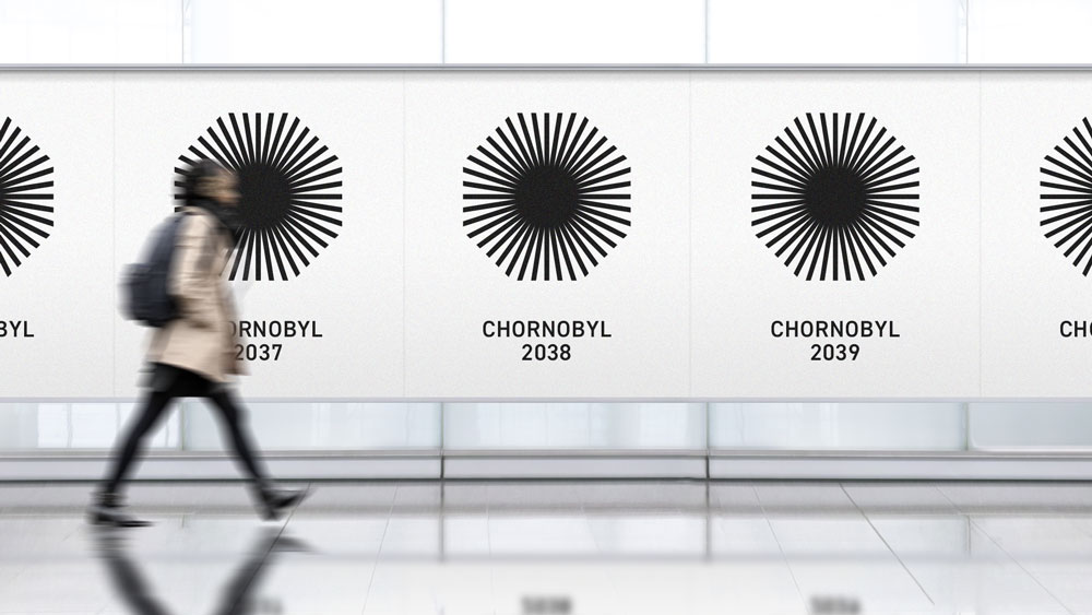
5. Banda Agency – Chornobyl
A powerful example of branding as storytelling is the Chornobyl identity created by Banda Agency. The project, titled “Chornobyl: The Branding of Disappearance,” reflects the slow fading of the Exclusion Zone, with a logo that erodes over time, symbolizing both radioactive decay and the passage of history.
Source: Banda Agency
More than just a visual identity, this project redefines Chornobyl as a place of remembrance and reflection, proving that branding can preserve cultural narratives. To learn more, read our full breakdown: Chornobyl: The Branding of Disappearance.
The power of creativity in times of crisis
These projects are more than just impressive design work—some of them are statements of resilience, identity, and hope. Ukrainian branding studios and creative agencies continue to push forward, not only maintaining their professional standards but also using design as a way to document, inspire, and uplift.
At Admind, we are honoured to spotlight the work of these talented individuals. Their commitment to their craft, even under the most difficult circumstances, is a reminder that creativity knows no borders, and even in times of crisis, the power of design endures.

Get the exclusive industry insights
Sign up to our newsletter