November 22, 2021
Brandometr – the visual identity of startups part 2
Share this article
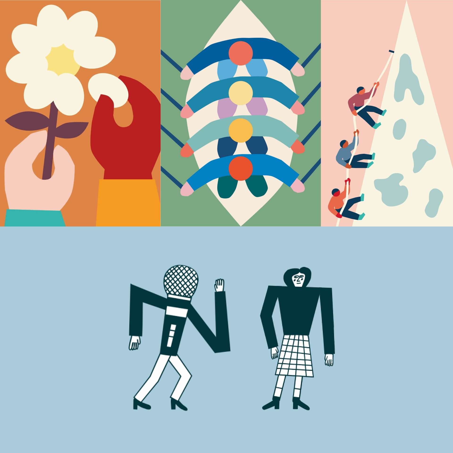
Brandometr is an article series created by our Senior Graphic Designer, Andrzej Leraczyk, in which he rates and discusses the visual identity of startups chosen by himself. The first episode of Brandometr can be found on Admind’s blog and below you can find a set of five further examples of visual identity of startups.
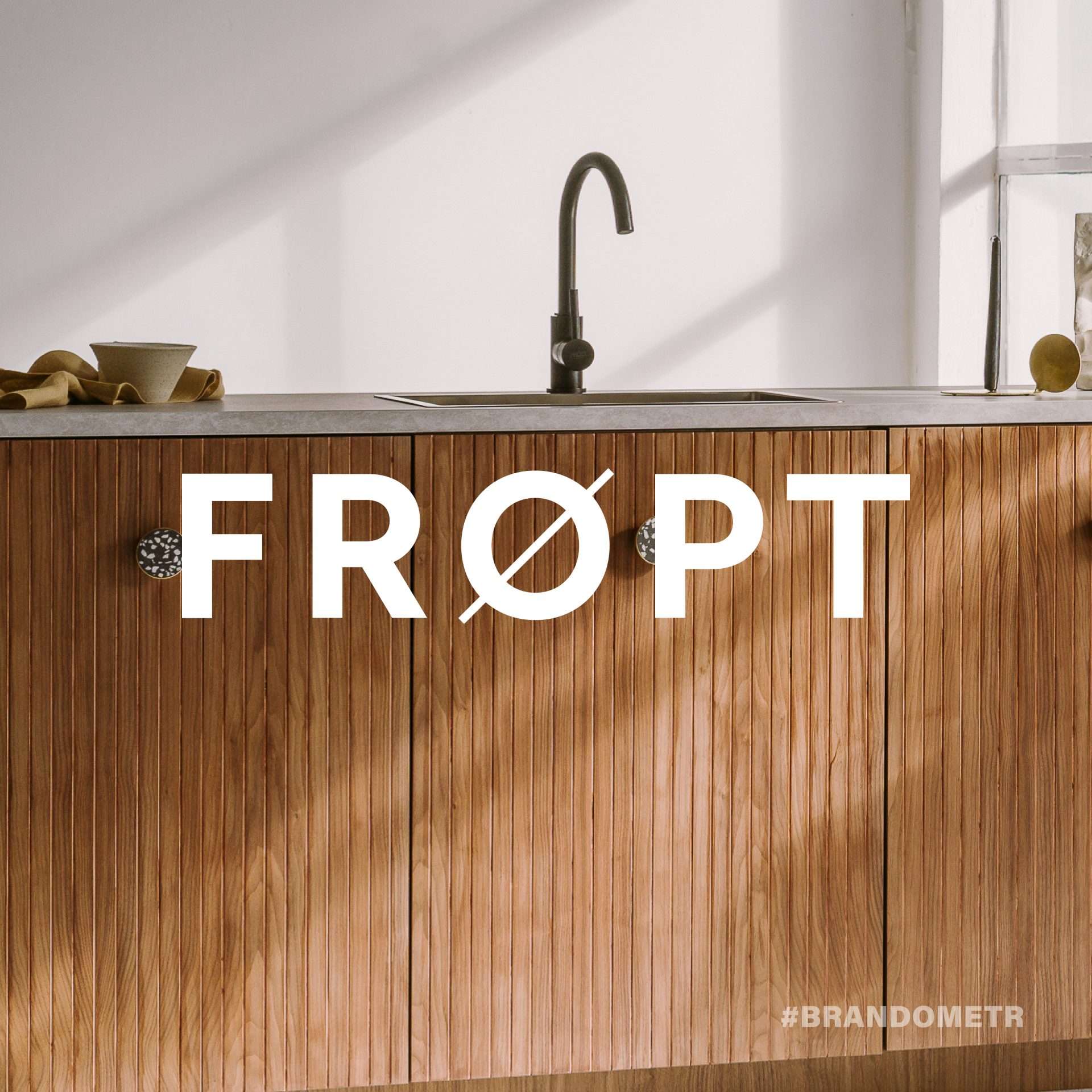
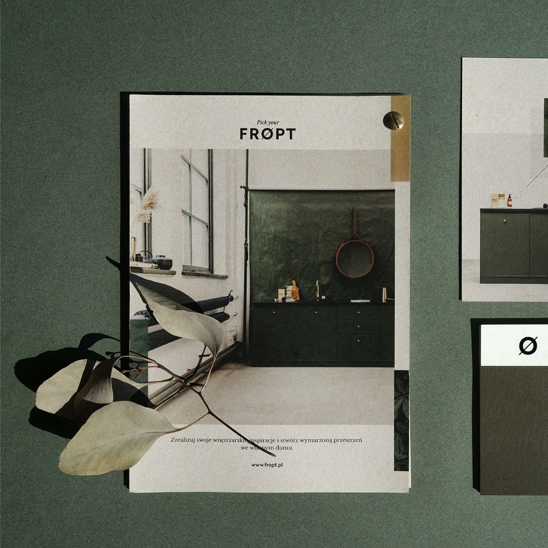
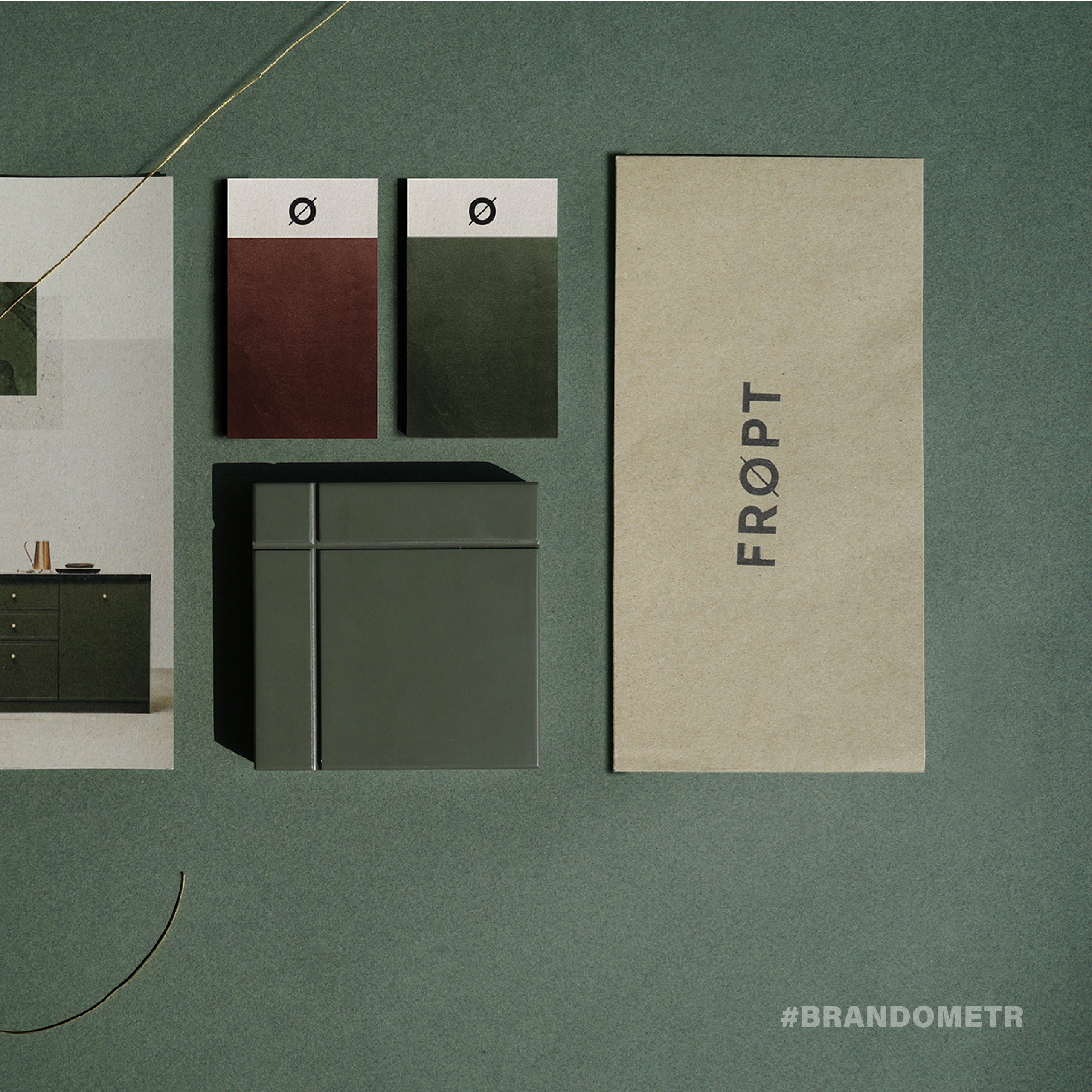
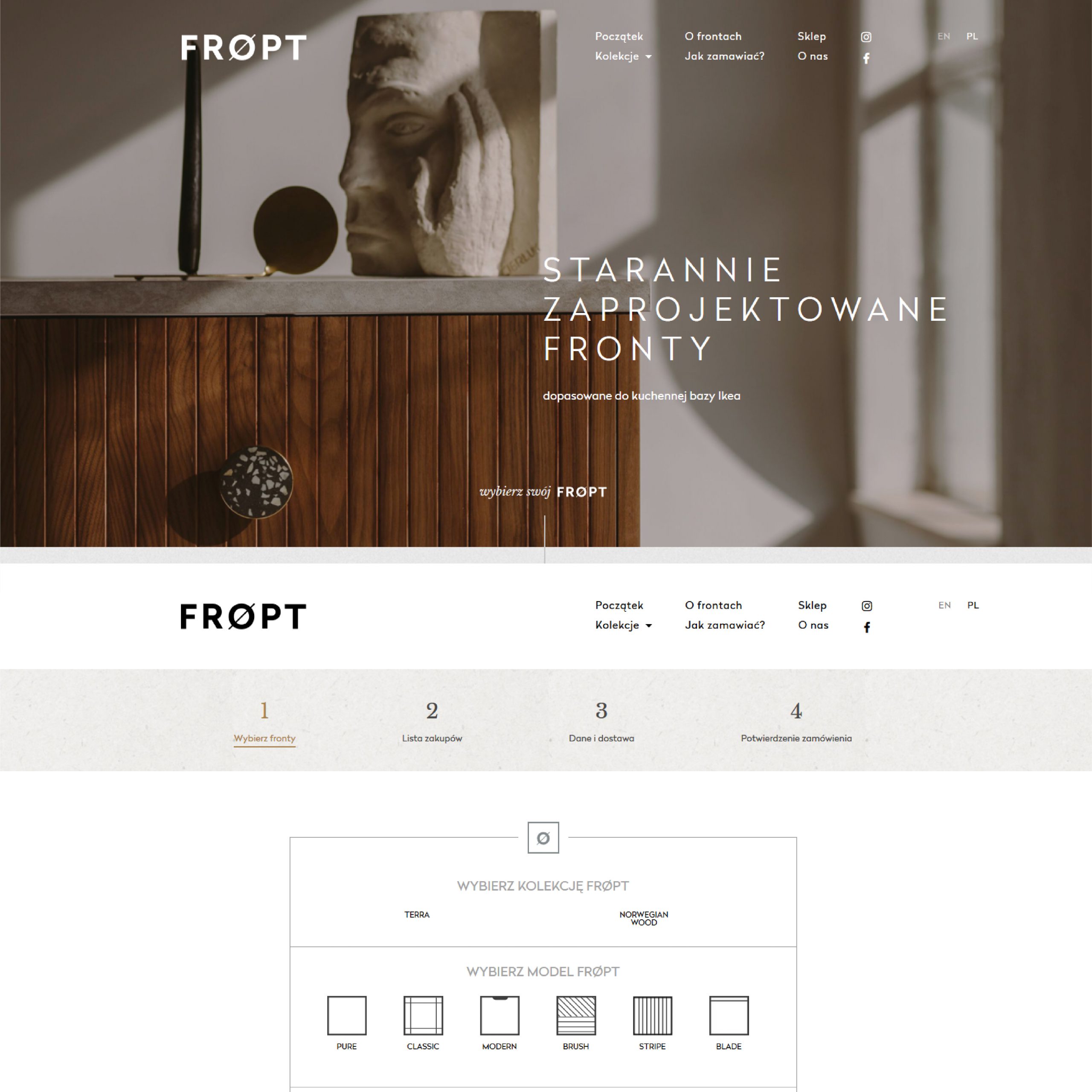
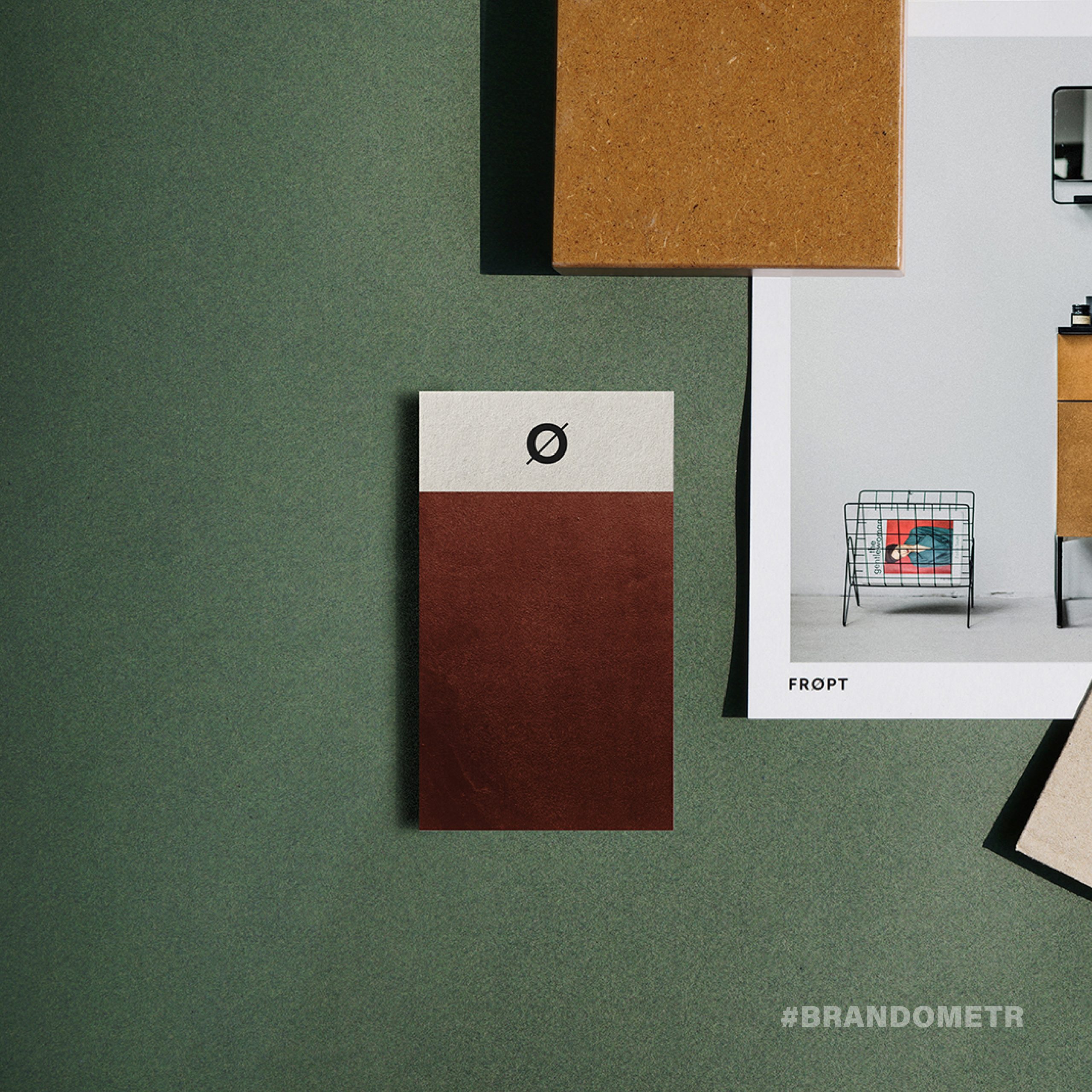
The first Polish brand in Brandometr. A brand that hacks Ikea and does it very well. Frøpt produces and sells high-quality fronts for the standard kitchens of the Swedish giant. They are a kind of polypore-brand that tunes the kitchens of the Method System. ⠀
⠀
The entire brand concept is characterized by a unique and almost exemplary coherence. Starting with the name (a neologism, which is a loose combination of the words ‘front’ and ‘option’) with the Scandinavian ‘ø’, all the way to the website and social media. All the graphic materials have been designed in an extremely streamlined way; one can feel the spirit and influence of design from the north. Both the simplicity of the visual identity by Anna Nogalska and the intuitive and easy-to-use website and photos by Pion Studio, emphasize the high quality that is important to the creators of Frøpt. ⠀
When asked what was most important in creating a cohesive brand, Kasia Kurowska-Loedl (one of the brand’s founders) replied: ‘We know very well that people, especially those we want to reach, buy with their eyes, and in fact with their hearts. Therefore, it was important for us to create a brand, not just a product. A brand that tells a concrete, true story, has its own opinions and brand values and responds flexibly to what’s happening in the world – whether it’s our customers, design, or sustainability.
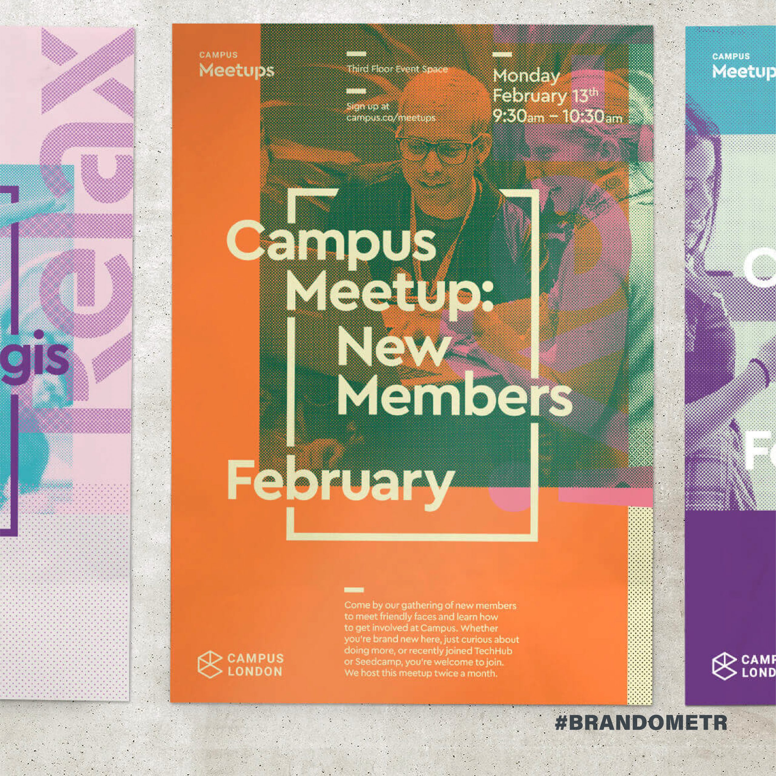
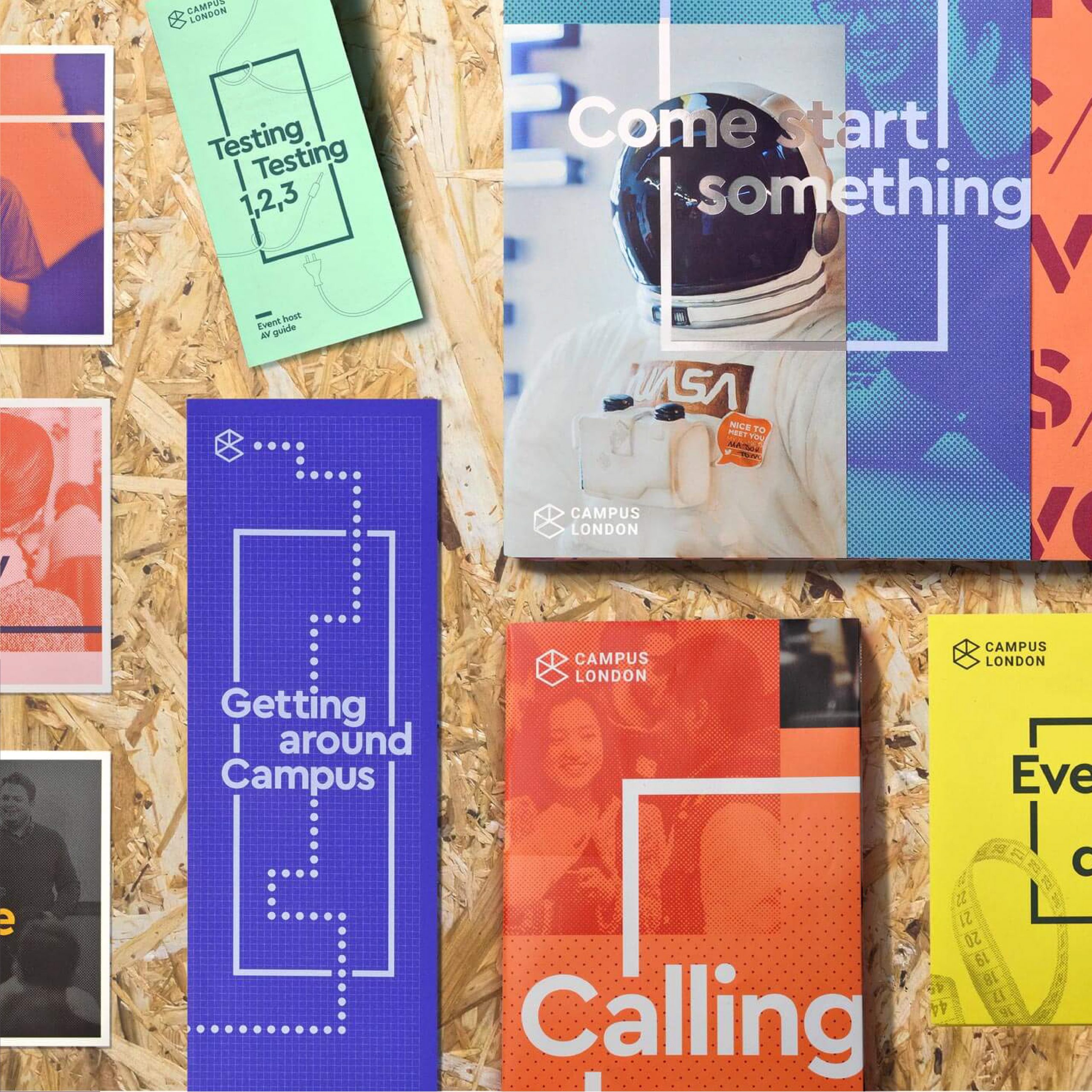
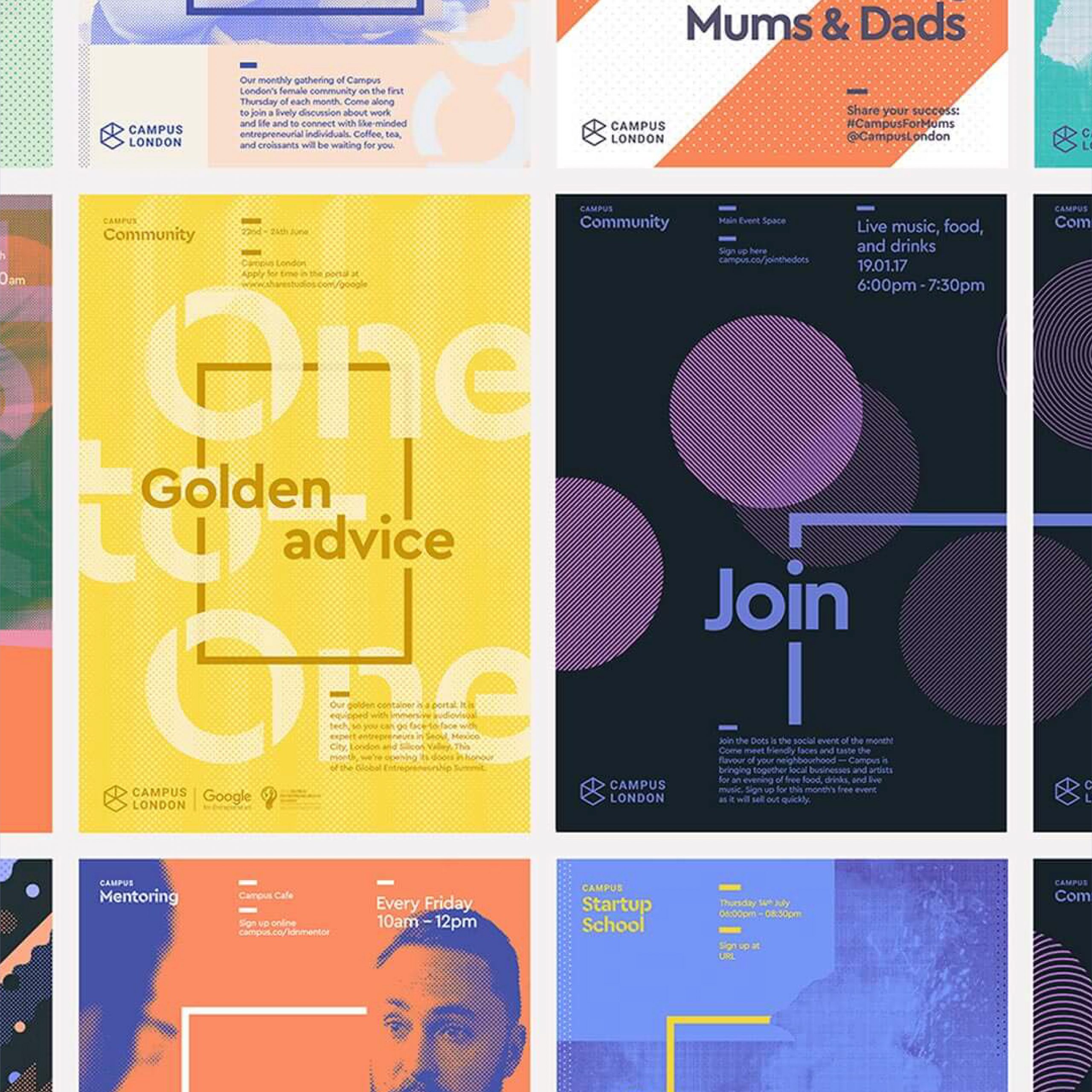
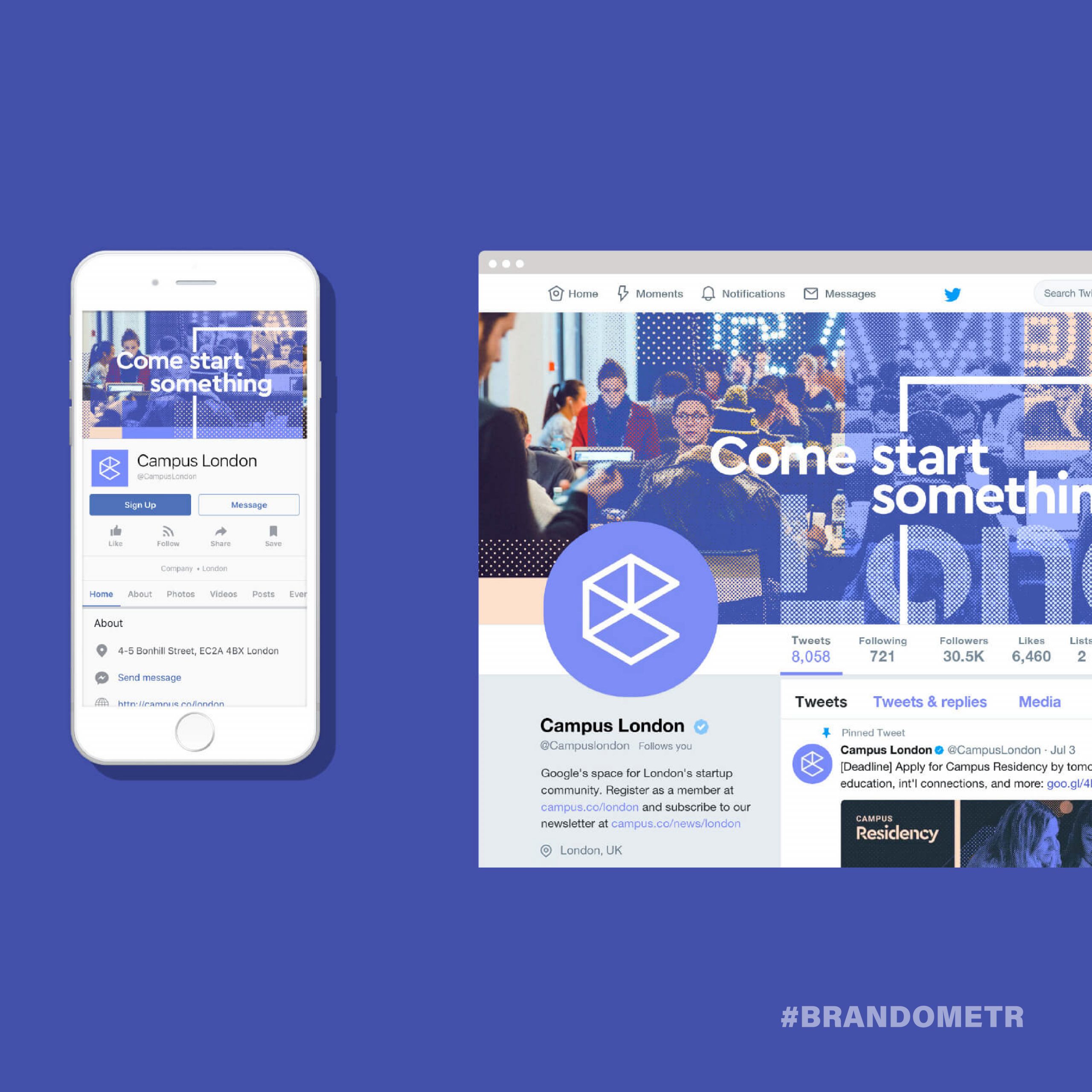
Campus is a Google initiative targeted at startups. Established in 2012 in London, it is a network of coworking spaces enabling beginners to work and develop. Managed by ‘Google for Entrepreneurs’, the network currently has offices in 6 locations around the world (including Warsaw). Campus branding shows what the ‘startup spirit’ is, what is the perception of being this type of organization. ⠀
The first version of the design was prepared by the Orlando-based studio Instrument. They developed a reliable branding based on a static logotype consisting of an icon/illustration of an isometric cubic forming the letter ‘C’ and a solid sans serif name. ⠀
The London-based MultiAdaptor is behind the 2017 brand refresh. They made minor changes to the logo itself, with the new variant of the letter ‘C’ becoming much lighter by opening up the cubicle and leaving only its outline. They also kept the colours characteristic for particular locations (London in navy blue, Warsaw in yellow…) However, the essence of this project (as it often happens) is not the logotype itself. The main image-related emphasis is placed on the construction of all graphic materials of the brand. The great freedom in creating the image was limited by the system based on a flexible frame, a range of colours, and a grid. Thanks to a kind of ‘self-limiting freedom’ Campus has become an extremely dynamic, open, and friendly brand.
In 2007, things were happening fast in Silicon Valley. New ideas and new companies were born and often flopped on the same day. When you saw your chance, you had to act immediately. There was no time for reflection and a thoughtful concept. This is how the first start-ups created their identification projects – fast, based on the first, not always well-thought-out ideas.
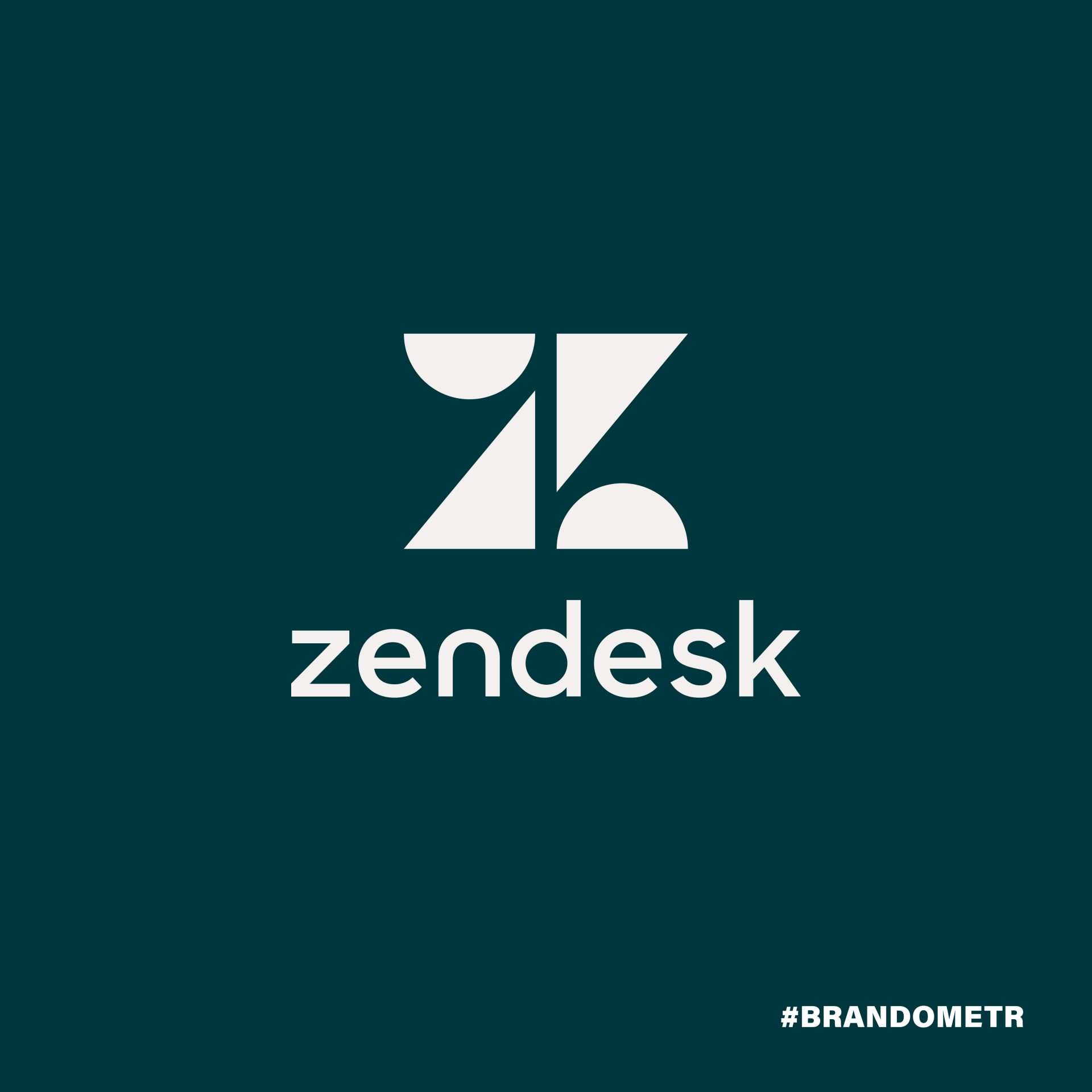
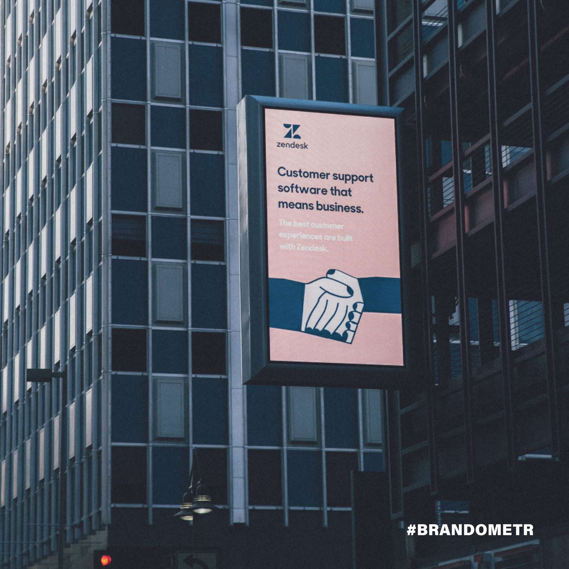
A good example of this is the branding of Zendesk – a company that provides tools for better and more satisfying (for both sides) customer experience. Alexander Aghassipour (founder of Zendesk) called his buddy Toke Nygaard to ask him to design a logo and ‘some cool mascot’ for his new startup. And this is how the logo was created – a characteristic Buddha with a headset on his head. And they got stuck with it. Buddha was everywhere, on all company materials, advertisements, T-shirts, at parties … He was recognizable and liked, but he was also infantile and, above all, turned out to be a limitation. The owners knew that Zendesk had come a long way in those almost 10 years. They knew there was a challenge ahead of them.
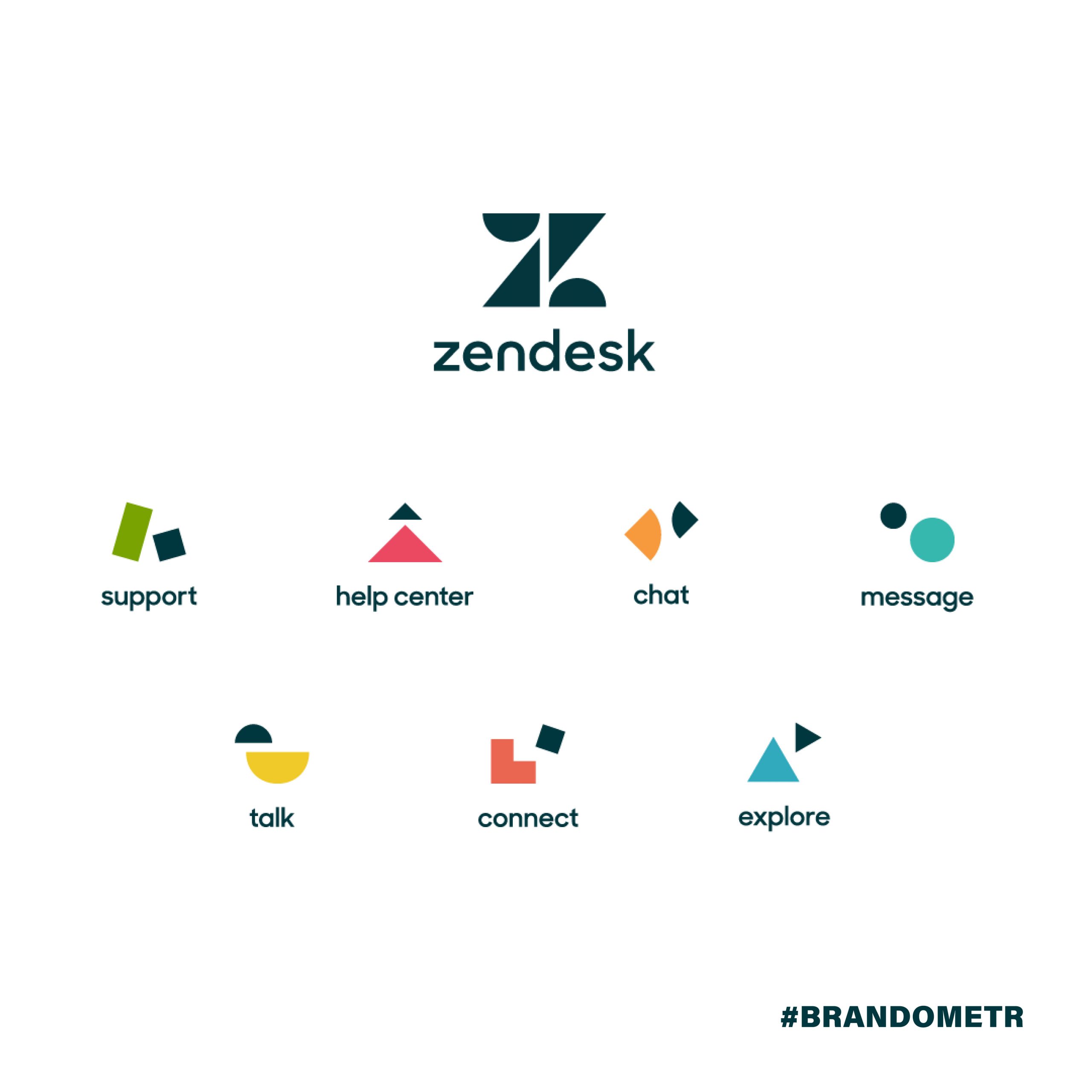
As Toke Nygaard (Zendesk Creative Director since 2011) stated: ‘This is not a cosmetic redesign. It’s an internal cultural revolution that resets and rebuilds the brand. It’s our battle cry. The company decided to do the entire rebranding in-house. This was probably the decisive factor in the success of the project. The mascot was abandoned, a new logo was introduced with a characteristic, strong ‘Z’ and a completely new, non-obvious colour scheme.
It was also decided to introduce sub-brands for individual products. In addition, an absolute ban on the use of stock photos was introduced, and a large role in building a new image was put in cooperation with illustrators. All in all, the revolution has succeeded and (for now) is not devouring its own children. ⠀
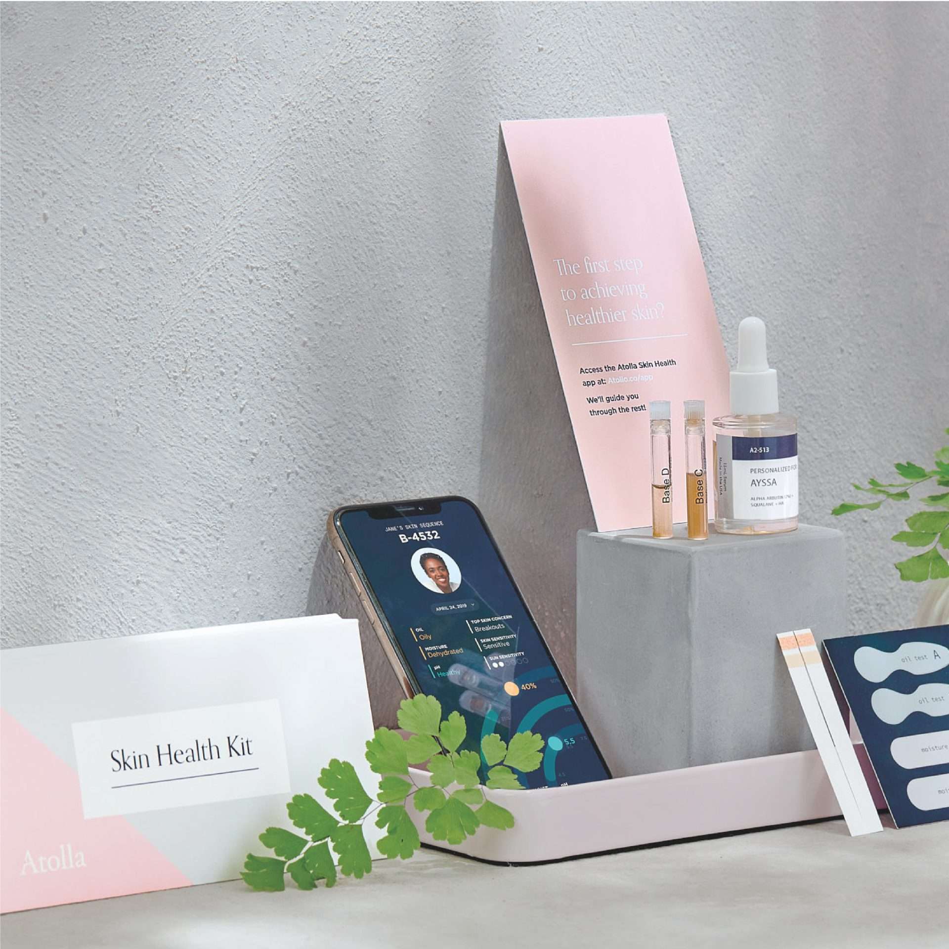
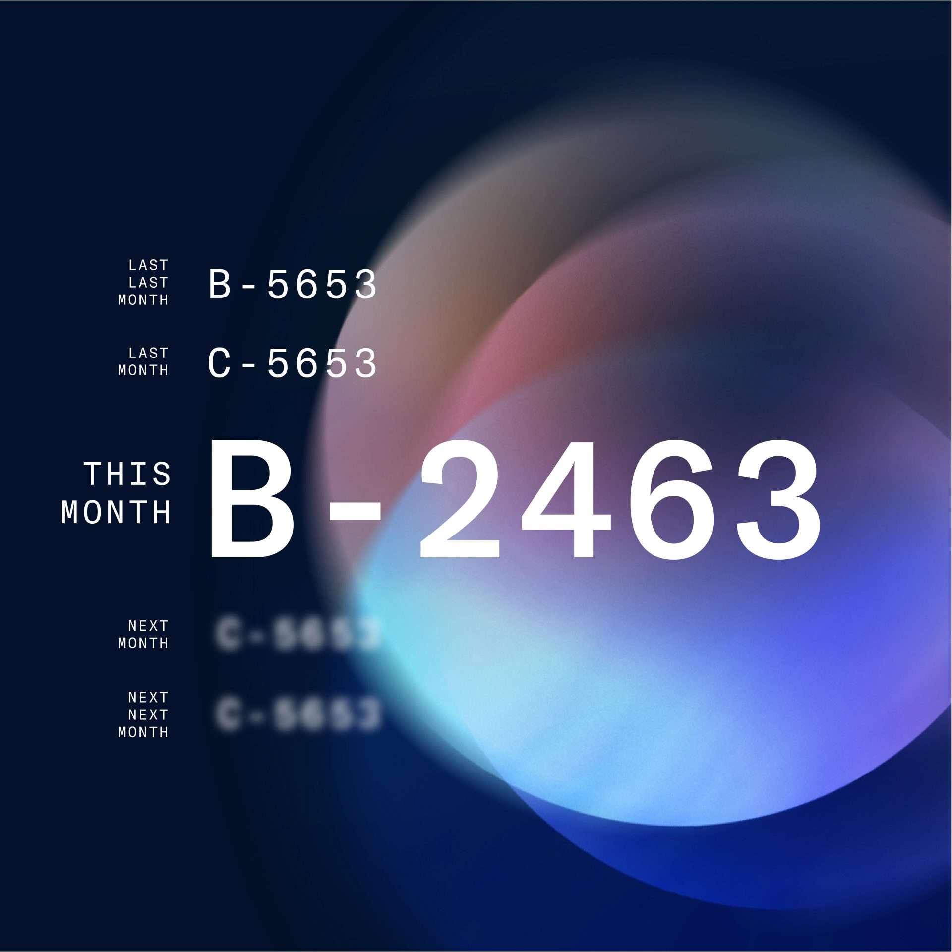
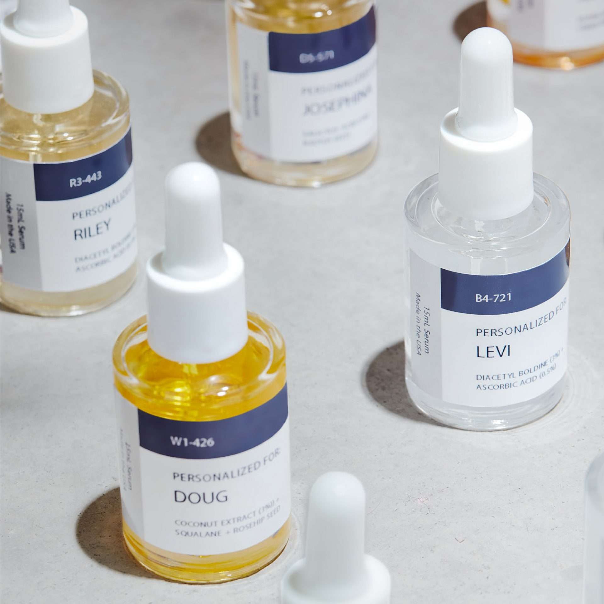
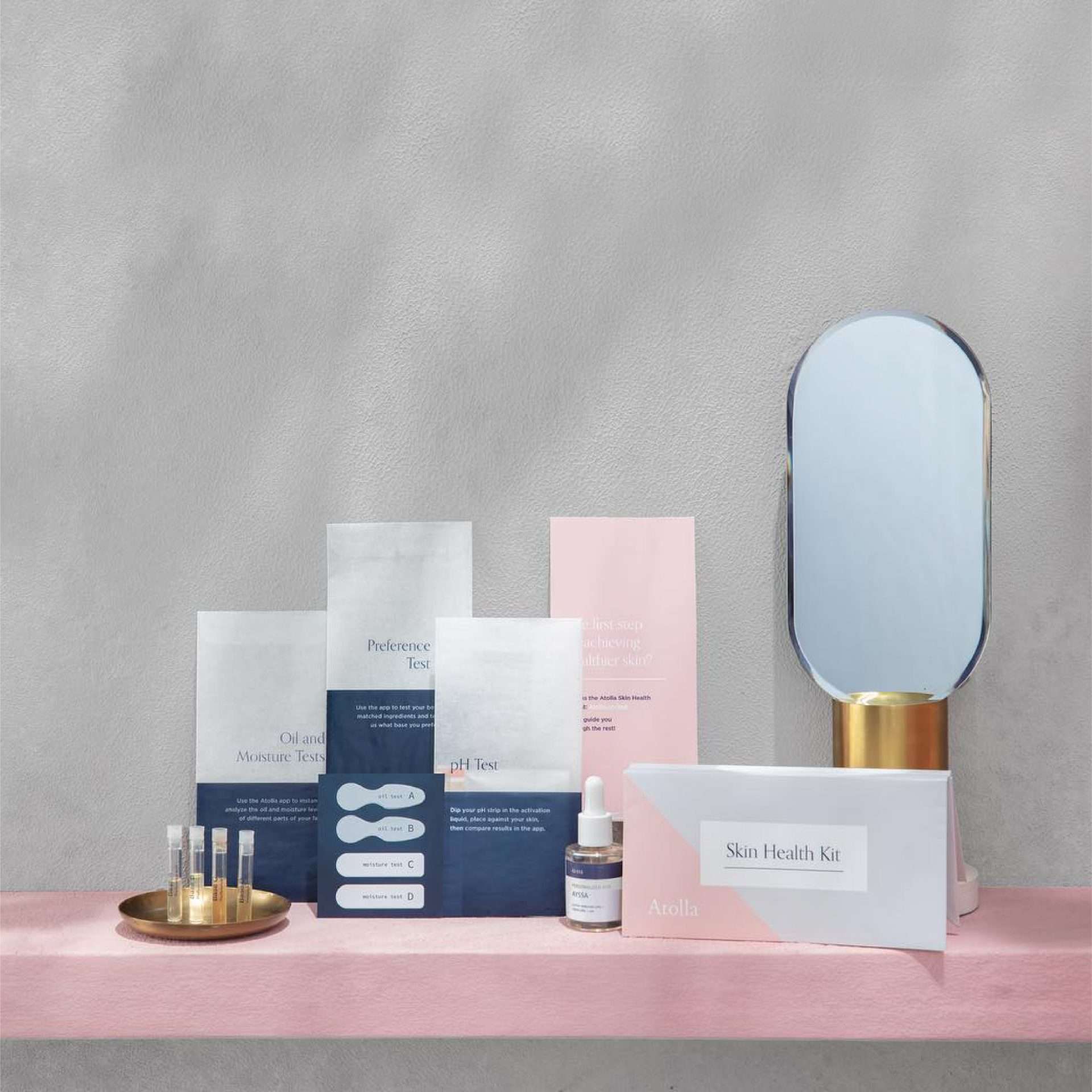
The cosmetics industry is a powerful branch of the global economy. One only has to look at the number of advertisements promoting cosmetic products to understand how much influence it has on the daily habits of the recipients. A product that tries to go completely against the grain is Atolla, an American cosmetics startup. Atolla offers extremely personalized skincare cosmetics. Every month, Atolla users receive a skincare serum made of natural ingredients. The product is prepared on the basis of a quick and simple test, the results of which are sent via an app.
In its branding, the company harmoniously combines the world of science, cosmetics and design. It seems that the scientific aspect of the image is particularly well balanced. This ‘scientific’ aspect is not overwhelming or discouraging. It is presented in an accessible way and becomes a certain guarantee, a certificate for the brand. This is important because it is not only about the credibility of the product itself, but also about the credibility of its creators, MIT graduates, high-class specialists in their field. All the elements of branding, from typography and colours (very cosmetic) to the packaging (more medical) create a coherent and credible whole.
Interestingly, Meghan Maupin, one of the founders of Atolla, whose design experience is an important part of brand building, is responsible for the graphic aspect of the project. When asked about the main design assumptions, she pointed to science and availability. A precise and appropriate Customer Experience has been designed. The path the recipient takes from knowing about and first thinking about Atolla through to purchase and subscription is surprisingly easy. The whole system developed, at each stage, has been designed to prove that breaking with current habits (buying another cream at the pharmacy) is possible.
When creating a new brand, we should generally start with a good (in every respect) name. A good name is not only one that we like and with which we can identify. It is one thanks to which our recipients will be able to find us, distinguish us from others and identify us. ⠀ ⠀
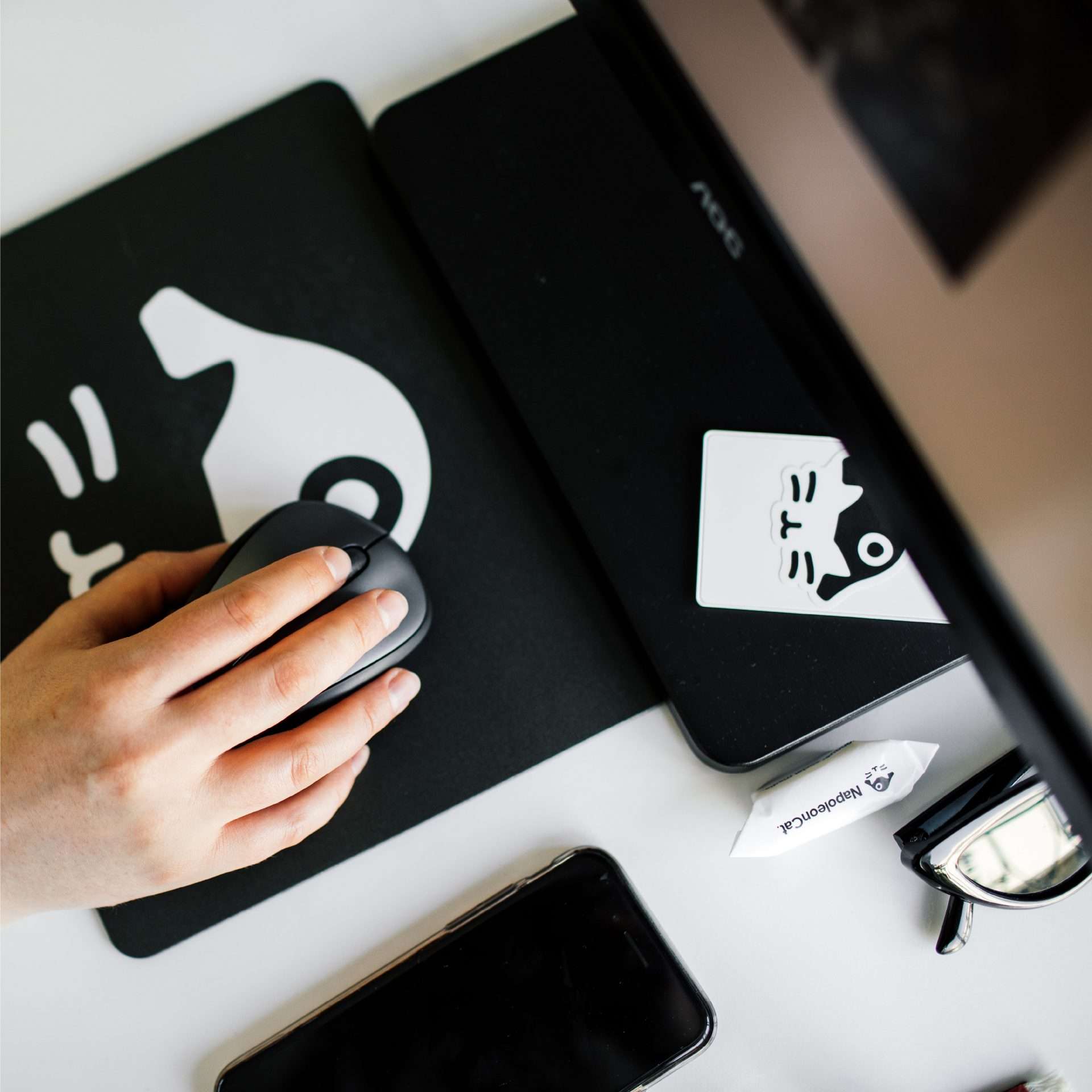
A Polish brand whose name has defined the whole branding is NapoleonCat. The startup, established in 2010, deals with creating apps for managing marketing communication in social media. As recalled by Grzegorz Berezowski, the creator and the head of NapoleonCat, creating the name in the team was a dynamic process that, however, did not produce any spectacular results. After many struggles to find the right name, the team finally decided on a name related to cat nomenclature. While searching among breeds, they came across the Napoleon cat, which was associated with fighting and success, something extremely important for the new brand. ⠀
Originally the creators planned to call themselves simply Napoleon, but it was connected with a few inconveniences, for example, regardless of their actions, they were always beaten by a certain Frenchman in the search results:). That’s why in the end they chose NapoleonCat, which turned out to be a good move, providing great functional and branding possibilities. ⠀
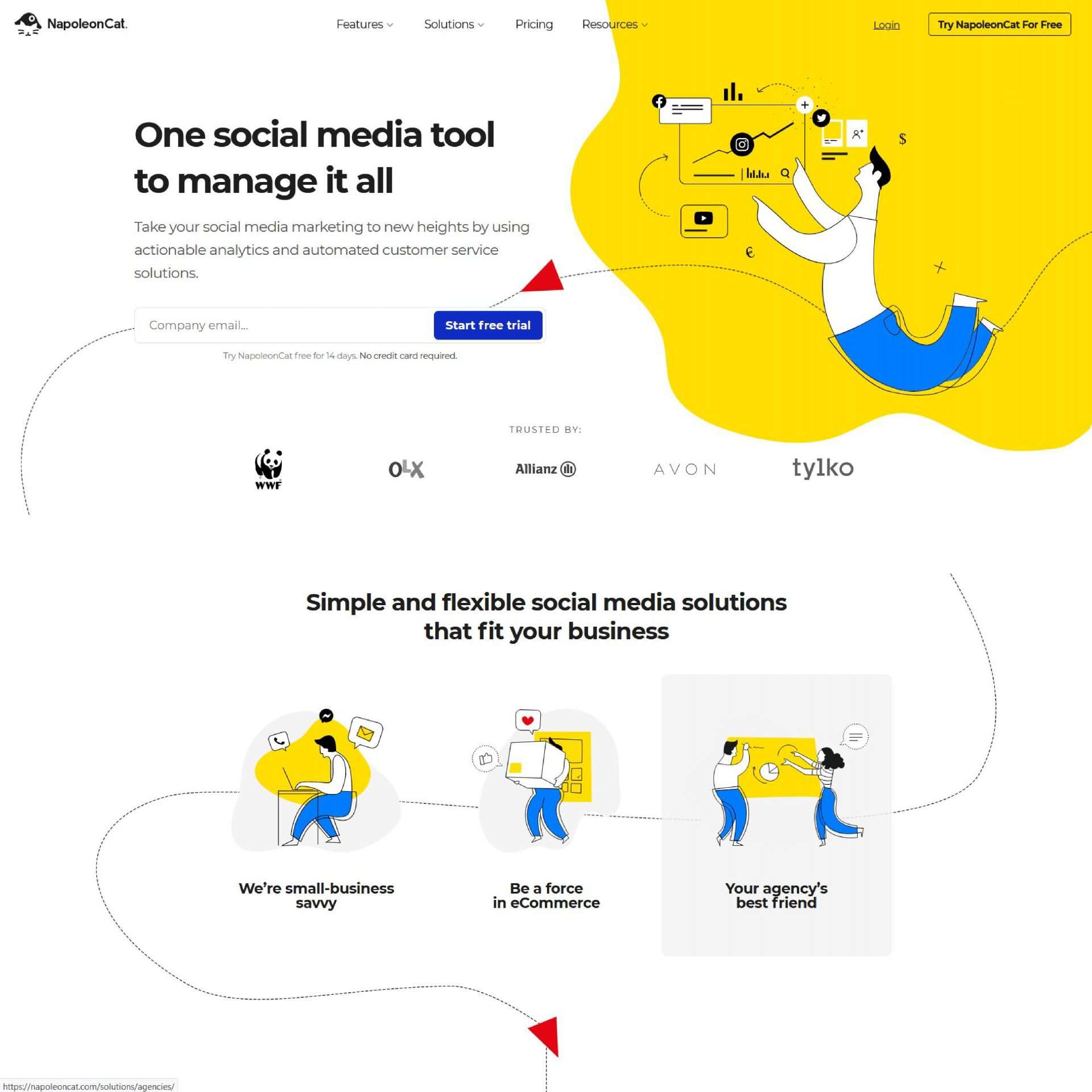
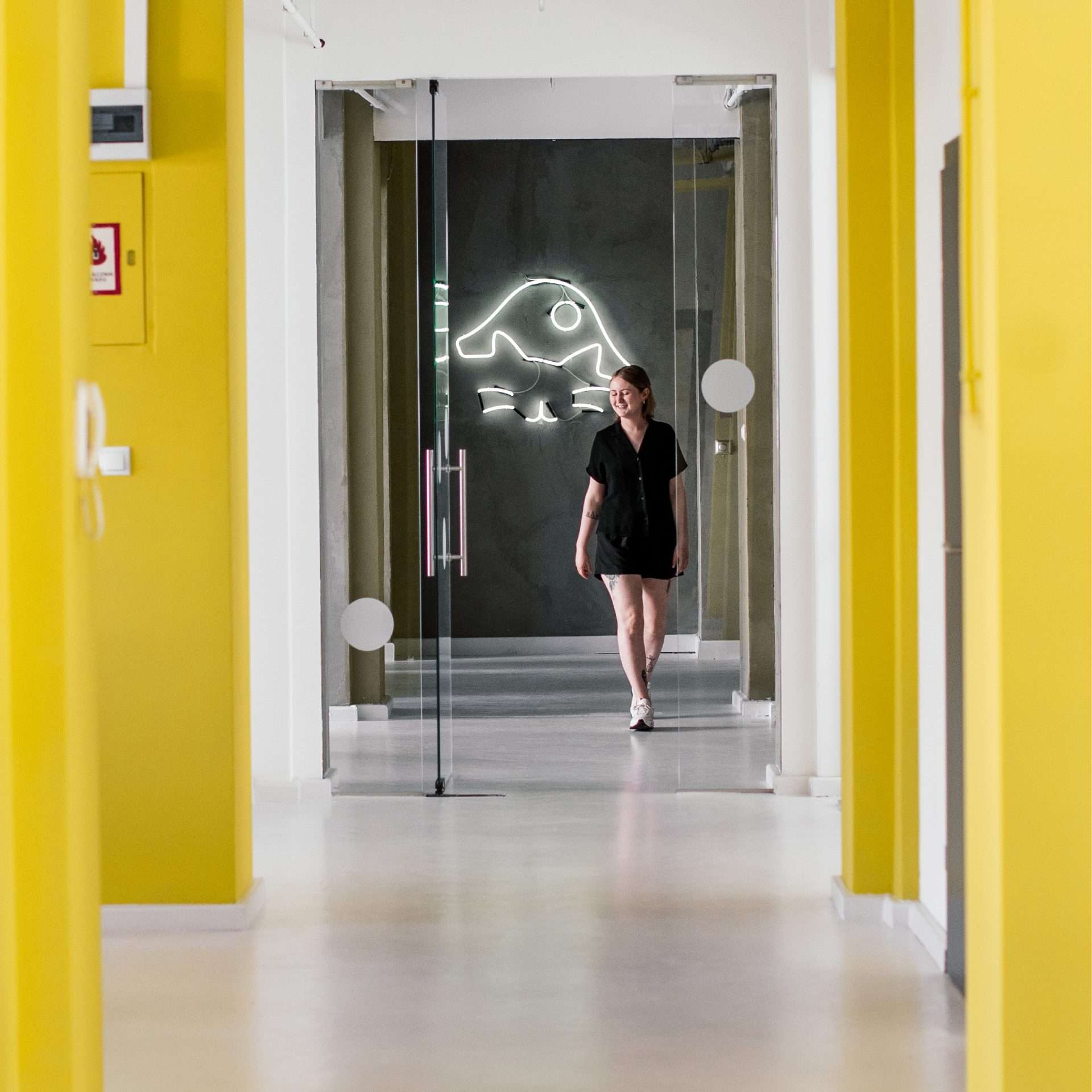
The new Napoleon Cat logo created in 2017 was designed by Mariusz Czepiec. Its simple, black logotype with a distinctive icon fully reflects the character of the brand and perfectly fits in with the trends dominating the SaaS industry. The colours used to add energy, lightness and freshness to the brand. An integral part of Napoleon’s image is its website, the last version of which appeared last summer. Anna Makowska is responsible for the illustrations, and other graphic designs are created by the company’s own team.