September 28, 2021
Brandometr – the visual identity of startups
Share this article
Brandometr is an article series by our Senior Graphic Designer, Andrzej Leraczyk, in which he rates and discusses the visual identity of startups chosen by himself. Below you can find the first episode with a set of five different startups.
When Wetransfer unveiled its new website in 2016, along with a relatively minor change to its visual identity, it was clear that it knew exactly what it wanted to achieve. Removing the word ‘Transfer’ from the logotype meant that now ‘We’ was the most essential part of the brand.
⠀ ⠀
Founded in 2009, the file transfer service has become an important part of the creative market worldwide. Not only thanks to its service (the elegant interface and above all the 2GB of free transfer do their job!)
⠀ ⠀
By creating its platform to promote relevant cultural phenomena, WePresent, and by making its ‘wallpaper’ available to designers and illustrators from all over the world, WeTransfer has built a community and a strong, recognizable brand. Thomas Schrijer, Paul van der Laan, Laszlito Kovacs and Weronika Siwiec. are responsible for the new image.
⠀ ⠀
And the logo itself? Well, it’s not bad, but it’s definitely not the strongest point of this branding.
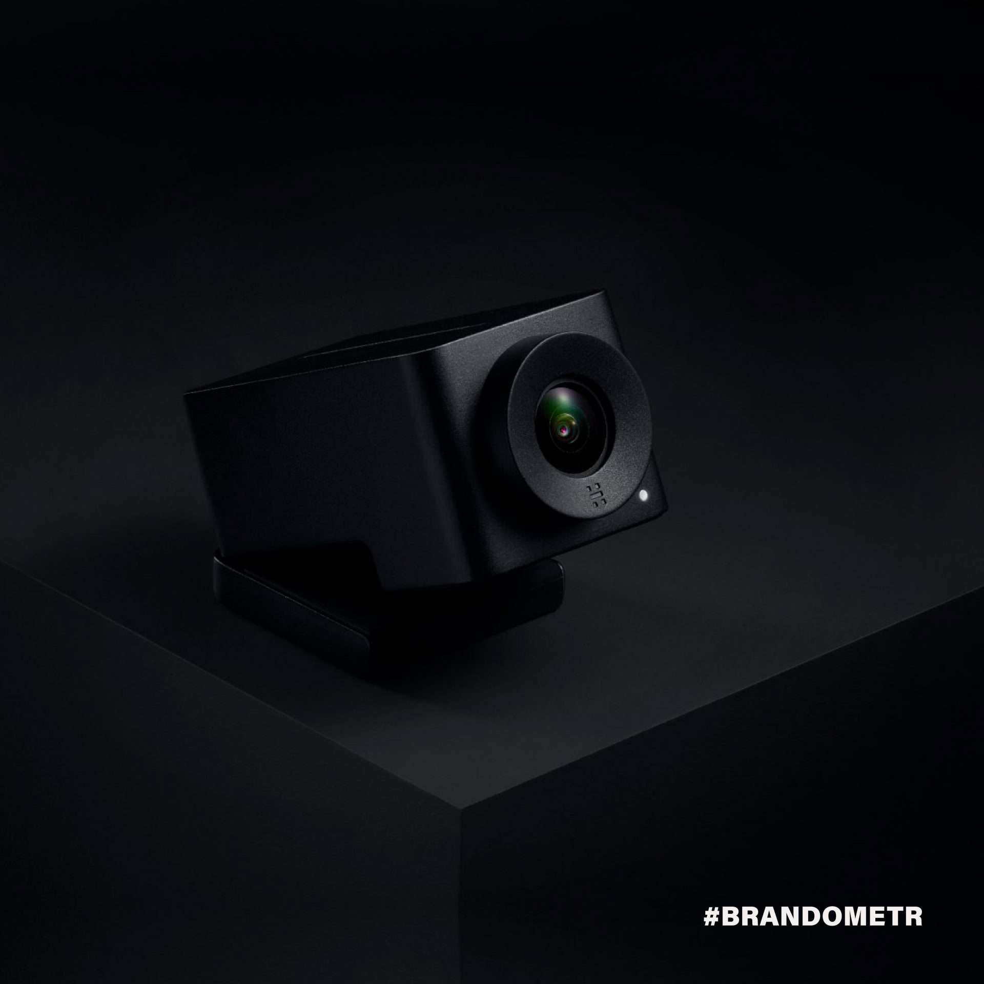
In 2017, the Norwegian-American startup introducing technologically advanced solutions for video communication to the market presented its visual identity together with its flagship product (GO). The great Oslo-based studio Heydays is responsible for the design.
⠀
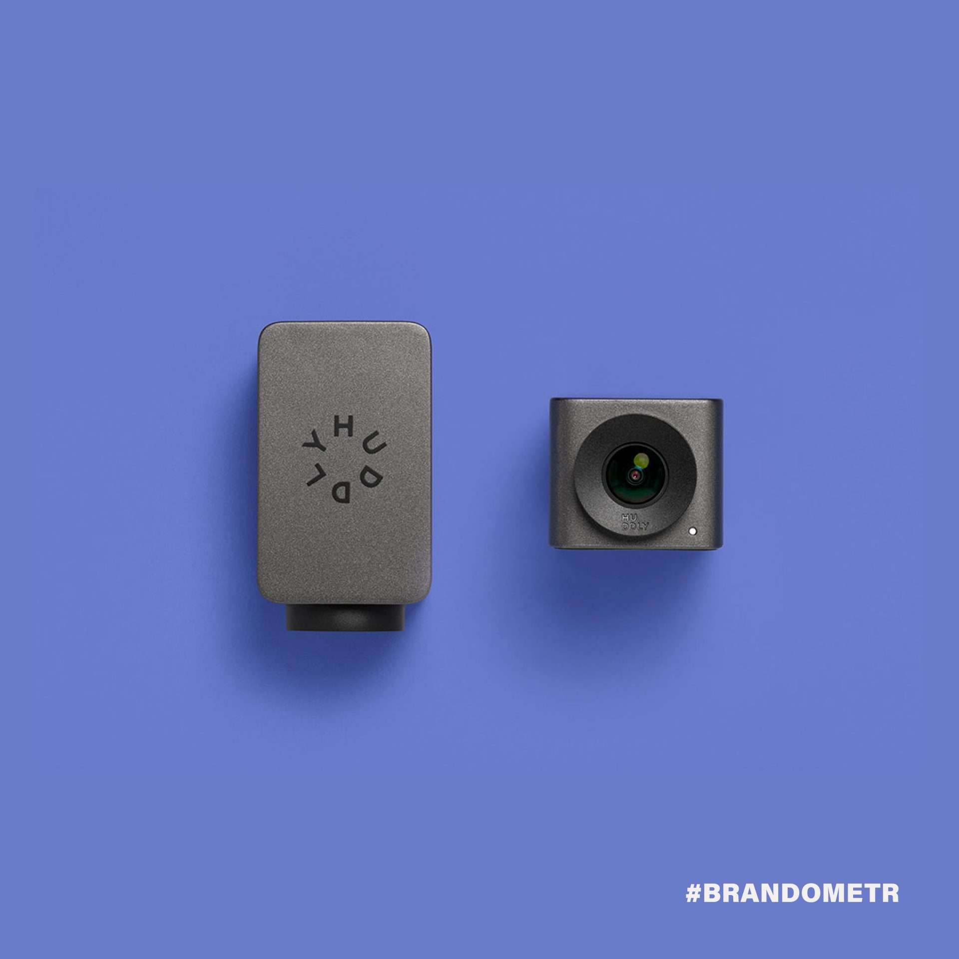
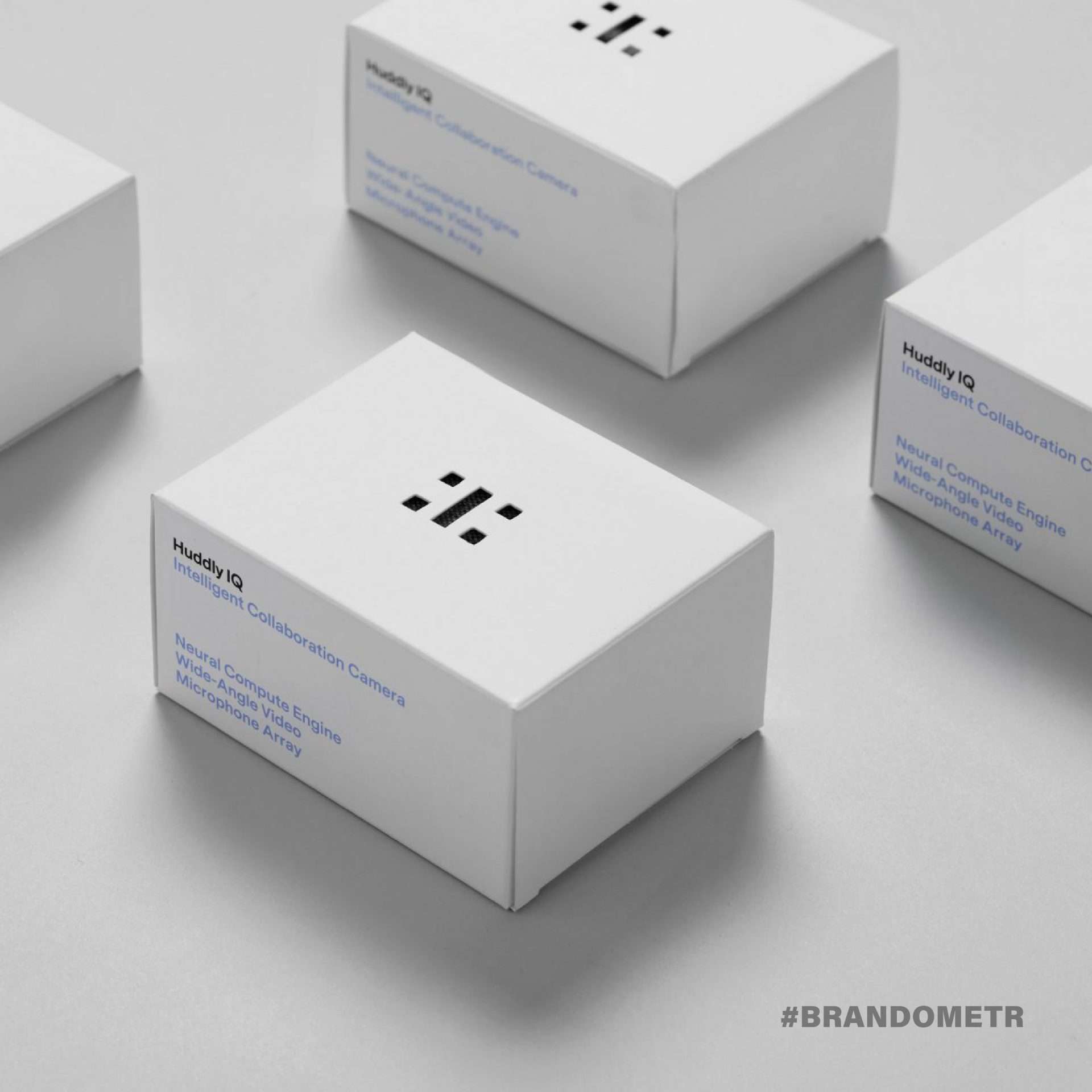
The whole branding was based on dynamic logo variants with changing lettering and a simple and elegant interface. But that wasn’t enough. The whole slick and undoubtedly carefully designed look had only one weakness. It did not hold up in application on really small Huddly products. So, two years (!) after the branding was introduced, the company decided to make a change. Clearly, everyone has learned their lesson and this time Heydays has come up with a super minimalist logo. The logo works great even when applied to the smallest product elements.
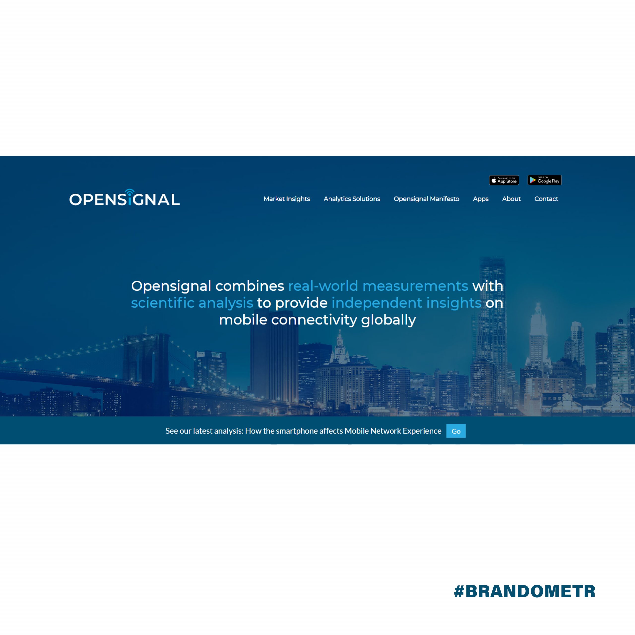
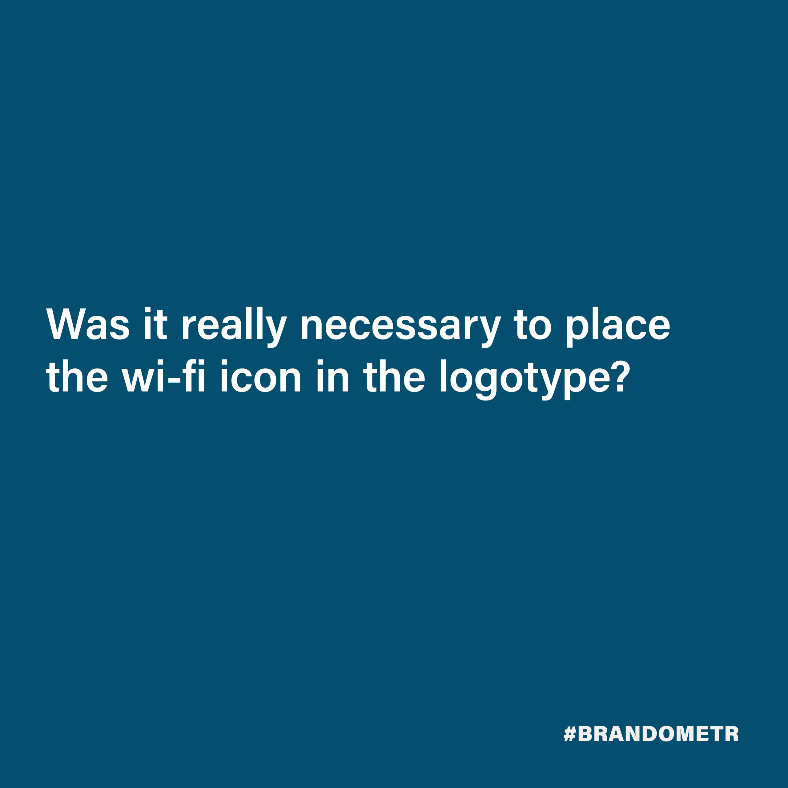
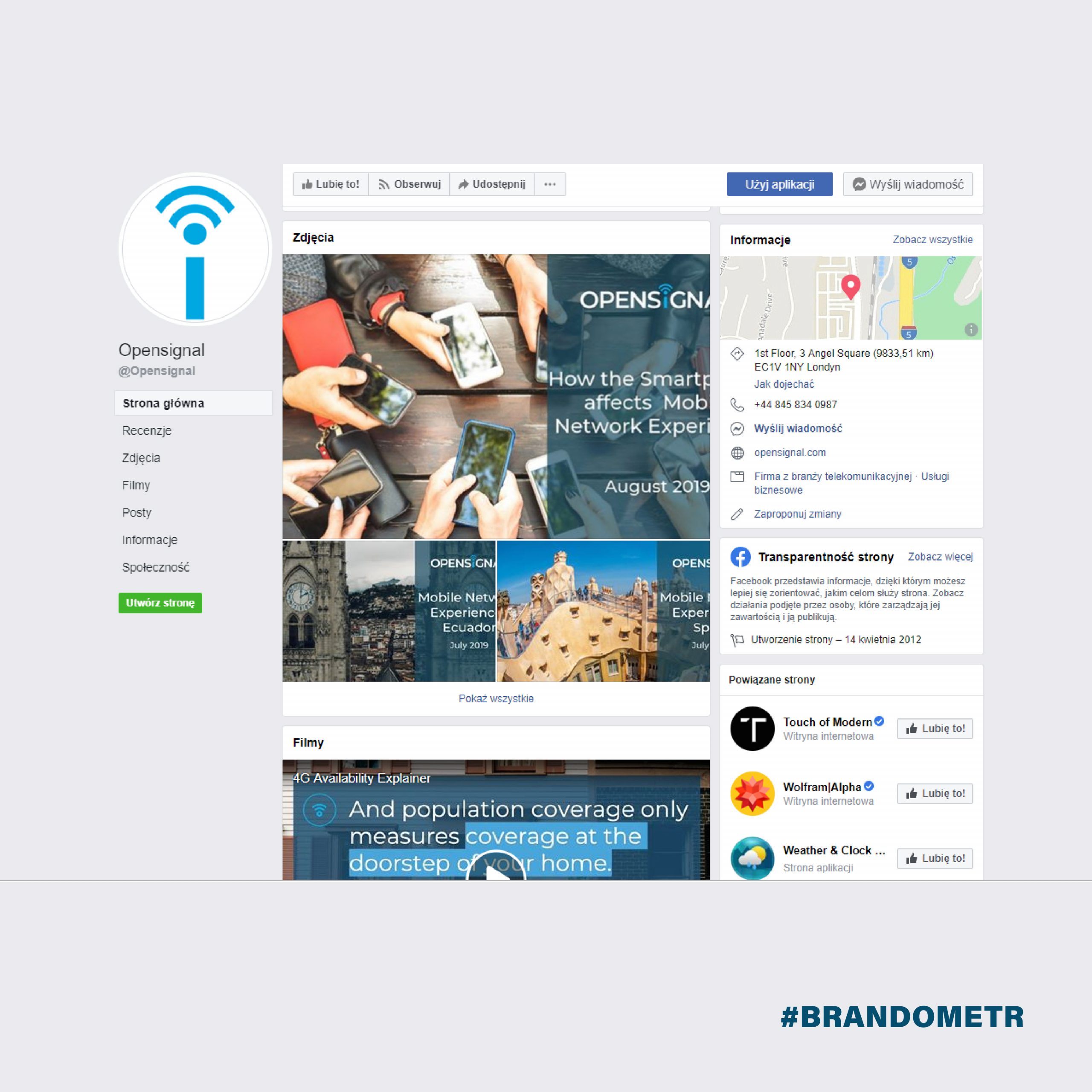
Dear London team, you need to forgive us. You guys are definitely cool and doing something exciting, but your image, your brand, and the way you present yourself is a bit…. boring. ⠀
We think you are very predictable. Was it really necessary to place the wi-fi icon in the logotype? Who told you that navy blue in the shade of rotten algae is the colour of new technologies, trust, and professionalism? You are in the top 100 of the most promising startups in Europe and your website begs to be buried in the darkest depths of the darknet. It is obvious that you like blurry stock photos. For example, I like Edelweiss, but I don’t see any reason to brag about it. ⠀
Maybe you thought there was still plenty of time for proper branding. If that’s the case, believe me – the time has come!
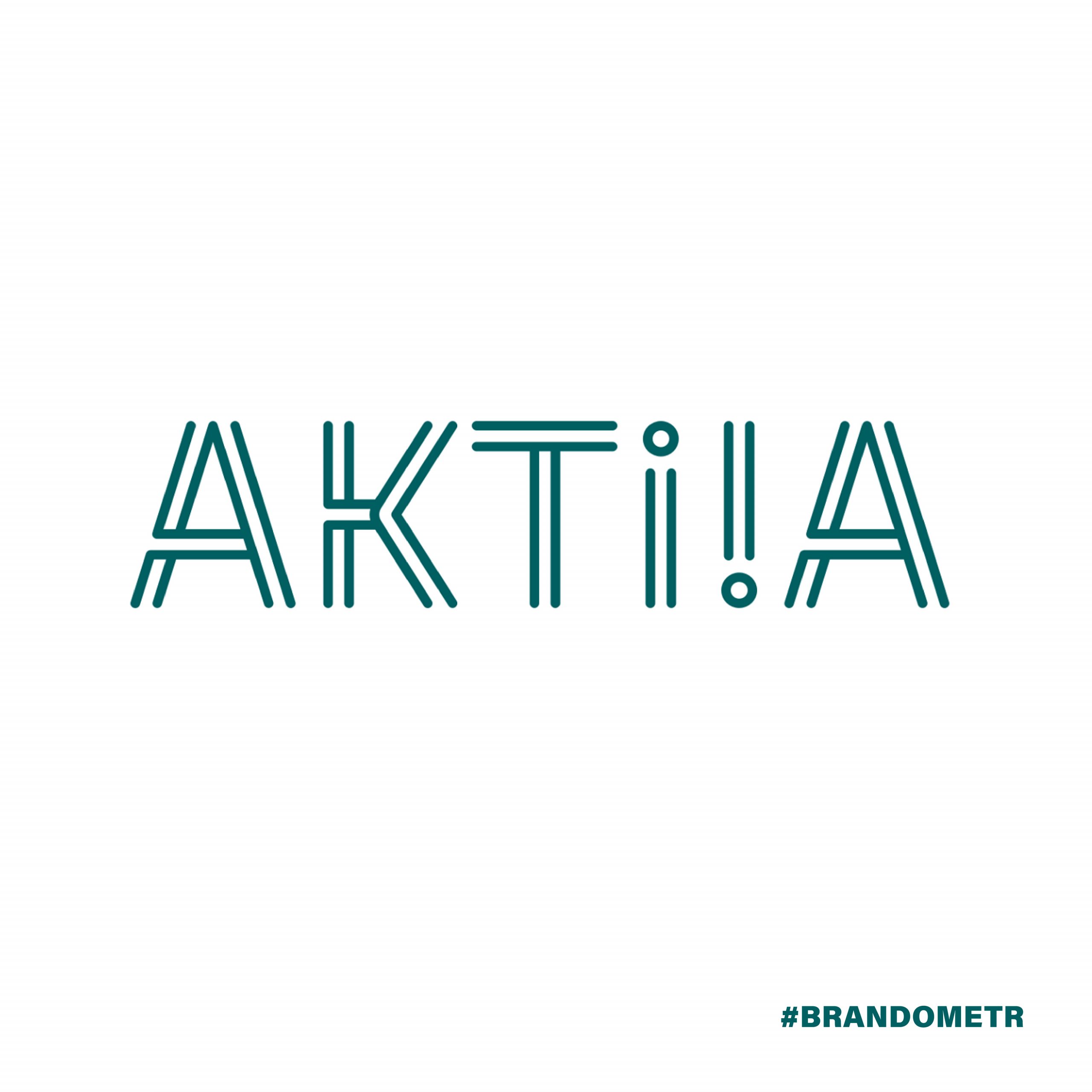
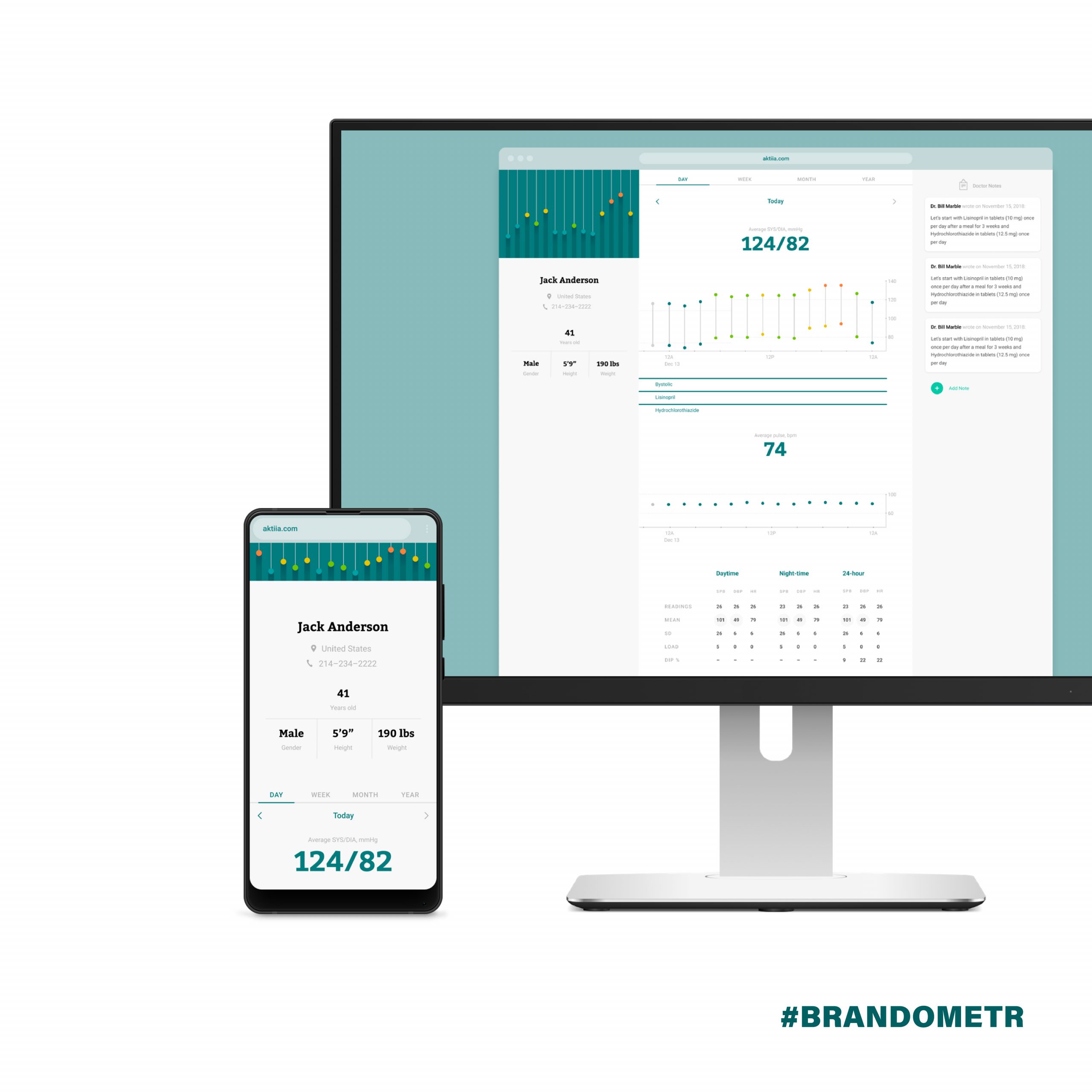
Since the demise of Elizabeth Holmes and her magic box called ‘Edison’, medical startups have not had it easy. Especially after this year’s documentary ‘The Inventor: Out for blood in Silicon Valley’, the world is looking more carefully and less trustingly at such ventures. The plans of the Swiss company Aktiia are not as ambitious, which probably makes them more realistic. The scientists responsible for this project want to market a system that monitors blood pressure in real-time.
In this case, brand consistency is formed not only of visual identification but also (or rather primarily) of the product, i.e. a bracelet/device collecting data from our wrist and a functional interface of the application processing this data. The Montreal-based Pearl Studios is responsible for the whole project.
The Canadians are still in the process of designing and do not want to or cannot show everything, but it is clear that they treat the project as a coherent and inseparable whole.
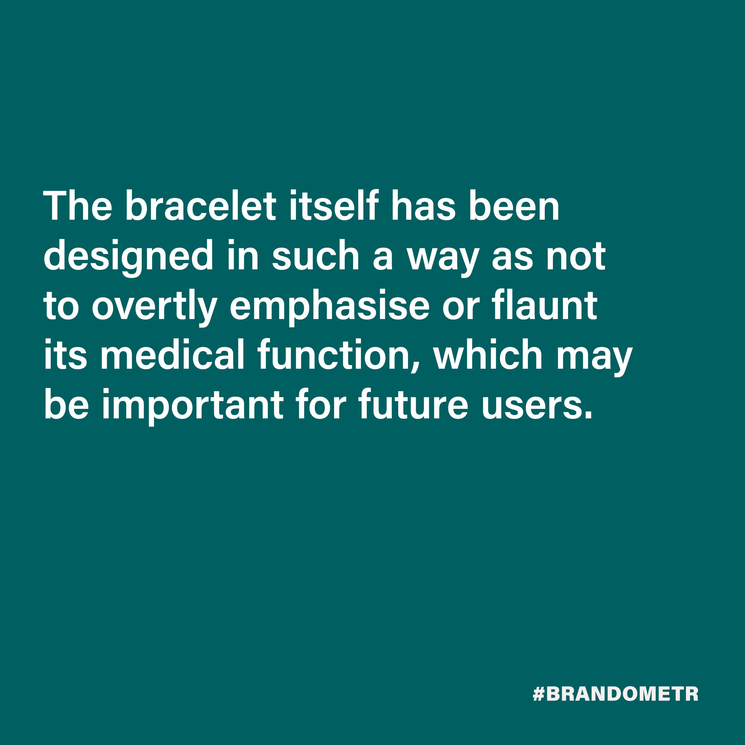
The bracelet itself has been designed in such a way as not to overtly emphasize or flaunt its medical function, which may be important for future users. On the other hand, the remaining graphic elements inspire confidence with their professional character. They do not play with easy flashiness. Not only the surgical green dominant in the project, but also the intelligent illustration of the upper and lower pressure in the logotype (two letters ‘i’) emphasize that it is not just another redundant gadget, but an intelligent medical device.
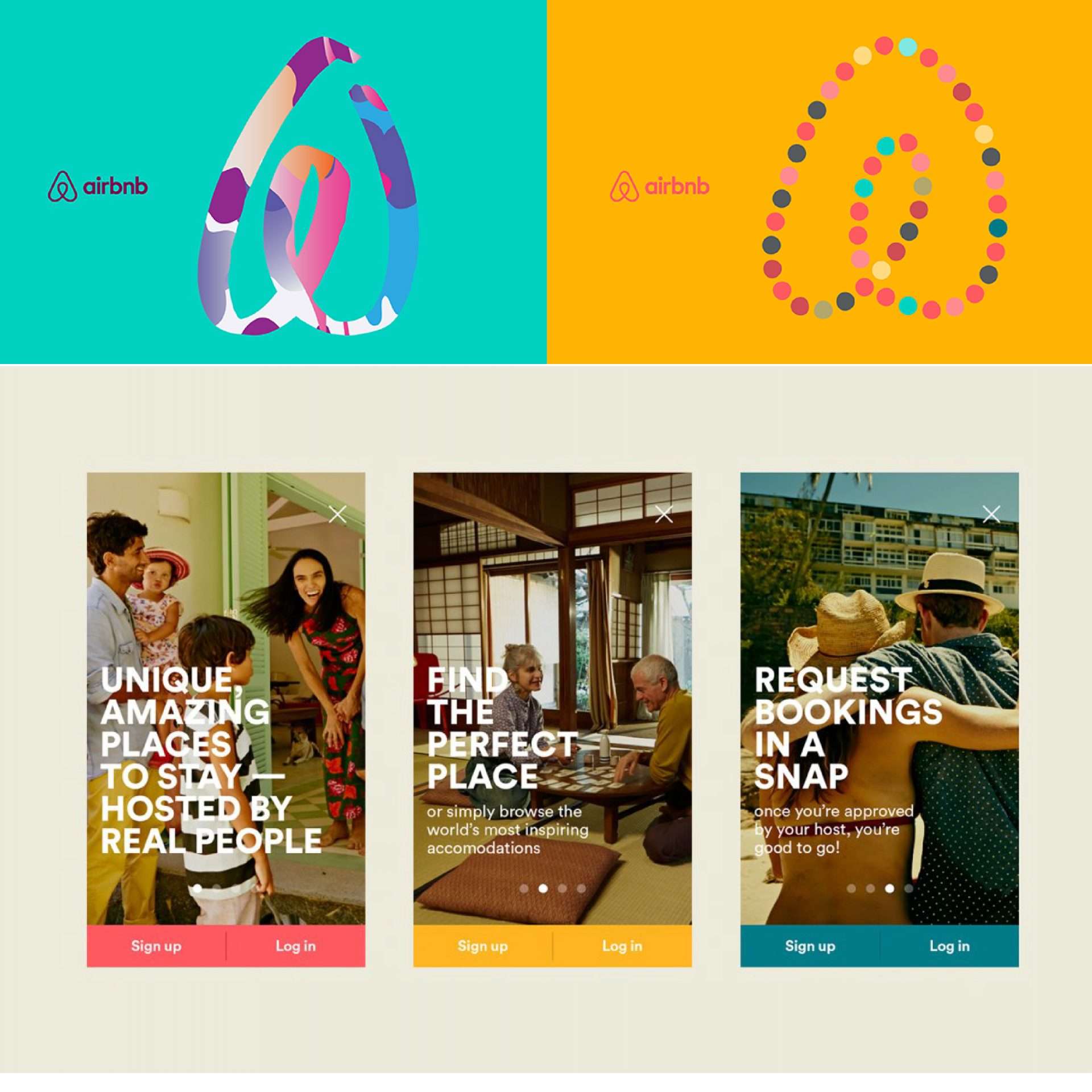
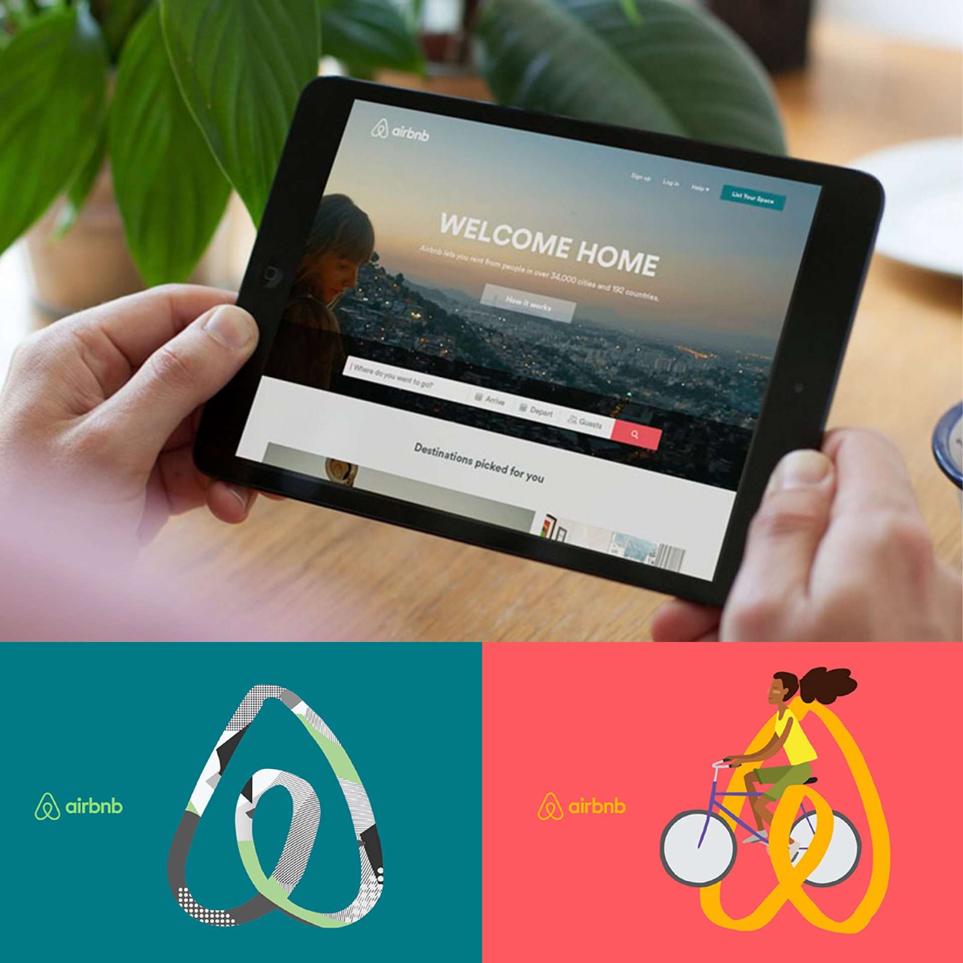
Time for the “old startup”. The new branding of the holiday tycoon has been one of the more discussed changes in recent years. Some praised it for its consistency and boldness. Others criticized it for being somewhat derivative (or even accused it of plagiarism) and for having sexual connotations (really?), especially when it came to the logo itself.
In any case, the rebranding carried out by DesignStudio in 2014 led to a revolution in brand perception. A company that at the beginning of its journey promoted itself with hand-glued (by its founders!) packages of Barack Obama’s and Senator McCain’s fake breakfast cereals and a typical ‘internet’ logo. With its image change, it wants to be seen as a community.
Whether we can, believe it or not, Airbnb does not want to be just another service provider. It tries to show that people and belonging are the most important thing. The very slogan promoting the brand (‘Belong anywhere’) expresses this notion. The icon name is also adequately the Belo’. Everything in this identity tries to convey what one of the founders, Brian Chesky, said – that they are more than just a platform for booking accommodation. ⠀
⠀
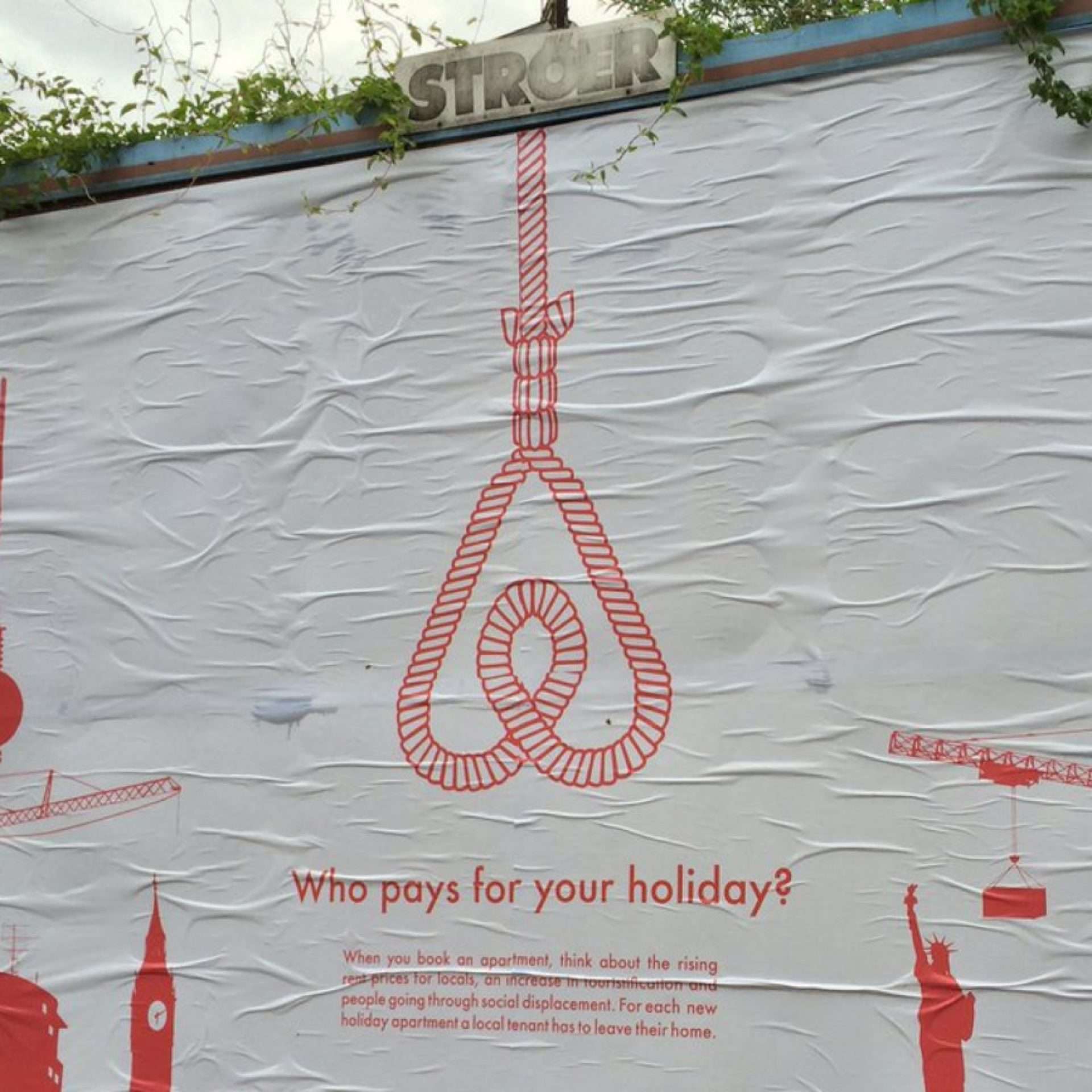
Design Studio did a tremendous job, they carried every step in a very deliberate, responsible, and grandiose manner. The effect of their work proved successful, and after five years the brand continues to develop. For example, the ‘premium’ brand Plus was established. The strength of the brand is also evidenced by the fact that it has been somehow taken over and interpreted by the company’s opponents protesting all over the world.