ABB × Admind – Transforming a Global Brand
Share this article
- Filter Name
-
Client
ABB
-
Industry
Engineering
Executive Summary
In the context of the Fourth Industrial Revolution, ABB faced the need to redefine its brand to reflect a strategic shift toward digital automation and electrification. The company required a future-ready identity capable of supporting business transformation, cultural change and global perception shift.
Admind joined an international network of partners to co-create and implement ABB’s new visual and verbal identity across 100+ markets. The work combined creative system design with global brand governance and scalable implementation tools.
The result was a cohesive, technology-first brand platform that repositioned ABB from heavy industry perception to a leader in digital innovation and industrial transformation.
Client & Context
ABB operates in more than 100 countries and is one of the world’s leading technology companies in electrification, robotics, automation and motion.
Before the rebranding, ABB faced increasing fragmentation in brand execution. Different regions interpreted corporate identity standards inconsistently. The organization was evolving strategically, but the brand did not fully reflect its new direction.
The rebrand was not cosmetic.
It was a strategic transformation aligned with business evolution.
Admind collaborated with ABB’s Global Management Team and international partners including MetaDesign, GlobeOne, ServicePlan, Straightline and Dalton Maag.
Business Challenge
ABB faced four interconnected challenges:
- Mindset shift – moving from product-centric narratives to synergy-driven, experience-focused thinking.
- Global unification – eliminating inconsistencies across markets and business units.
- Perception transformation – repositioning ABB from heavy industry to digital innovation.
- Future positioning – presenting ABB as an active driver of technological change.
The main challenge was to build a brand system capable of driving organizational transformation while remaining operationally scalable.
Without structured governance and implementation tools, global consistency would not be achievable.
Objectives & Success Metrics
Objectives
- Create a future-ready brand platform aligned with ABB’s strategic direction.
- Establish governance systems ensuring global consistency.
- Develop scalable tools enabling daily brand use across markets.
- Shift global perception toward innovation and digital leadership.
Success Verification
- Consistent global rollout across 100+ countries.
- Clear alignment between brand expression and digital-first positioning.
- Increased internal engagement with the new brand promise.
- Improved operational efficiency through structured brand governance.

Strategic Approach
Rebranding as Organizational Transformation
The rebranding was executed as a phased, agile process reflecting ABB’s global scale.
At the core of the new brand stood the promise:
“Let’s write the future. Together.”
This statement emphasized collaboration, innovation and long-term impact across industries and societies.
Admind contributed to translating this promise into tangible systems: visual language, illustration style, brand tools architecture and implementation guidelines.
Three strategic pillars defined the approach:
- Brand Governance — rules, processes and tools ensuring consistent global application.
- Creative Execution — modern, digital-first aesthetic aligned with technological leadership.
- Scalability — adaptable systems applicable across markets, channels and business units.
Solution
1. Global Visual System (Co-Creation)
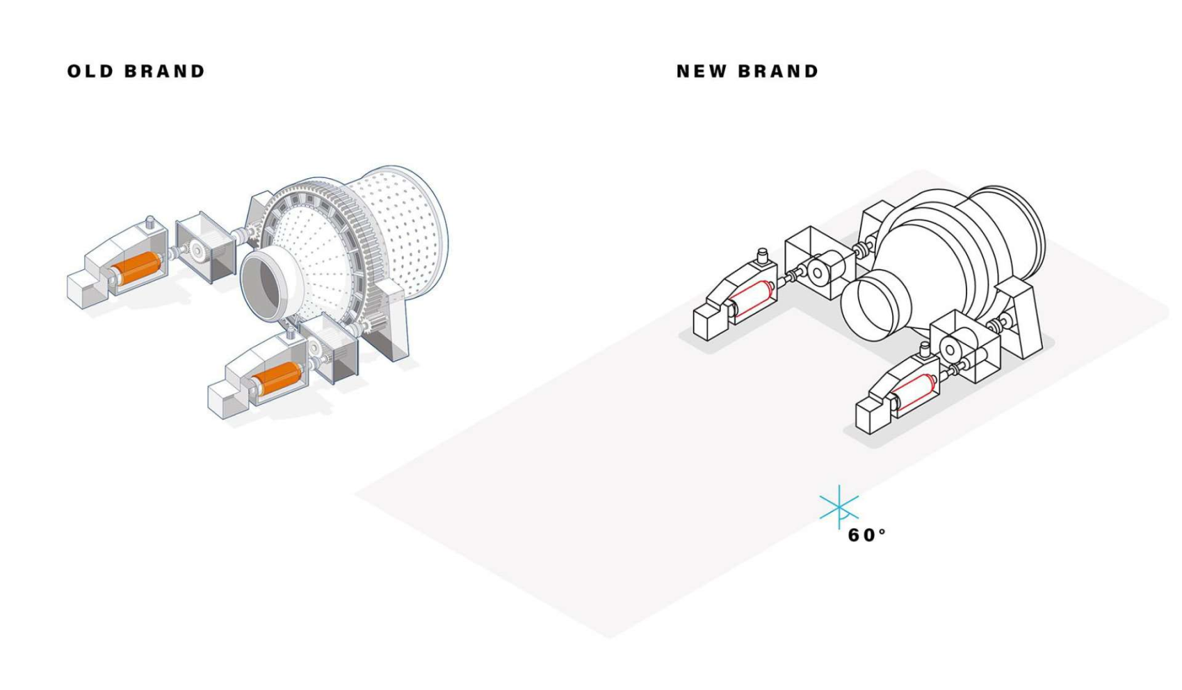
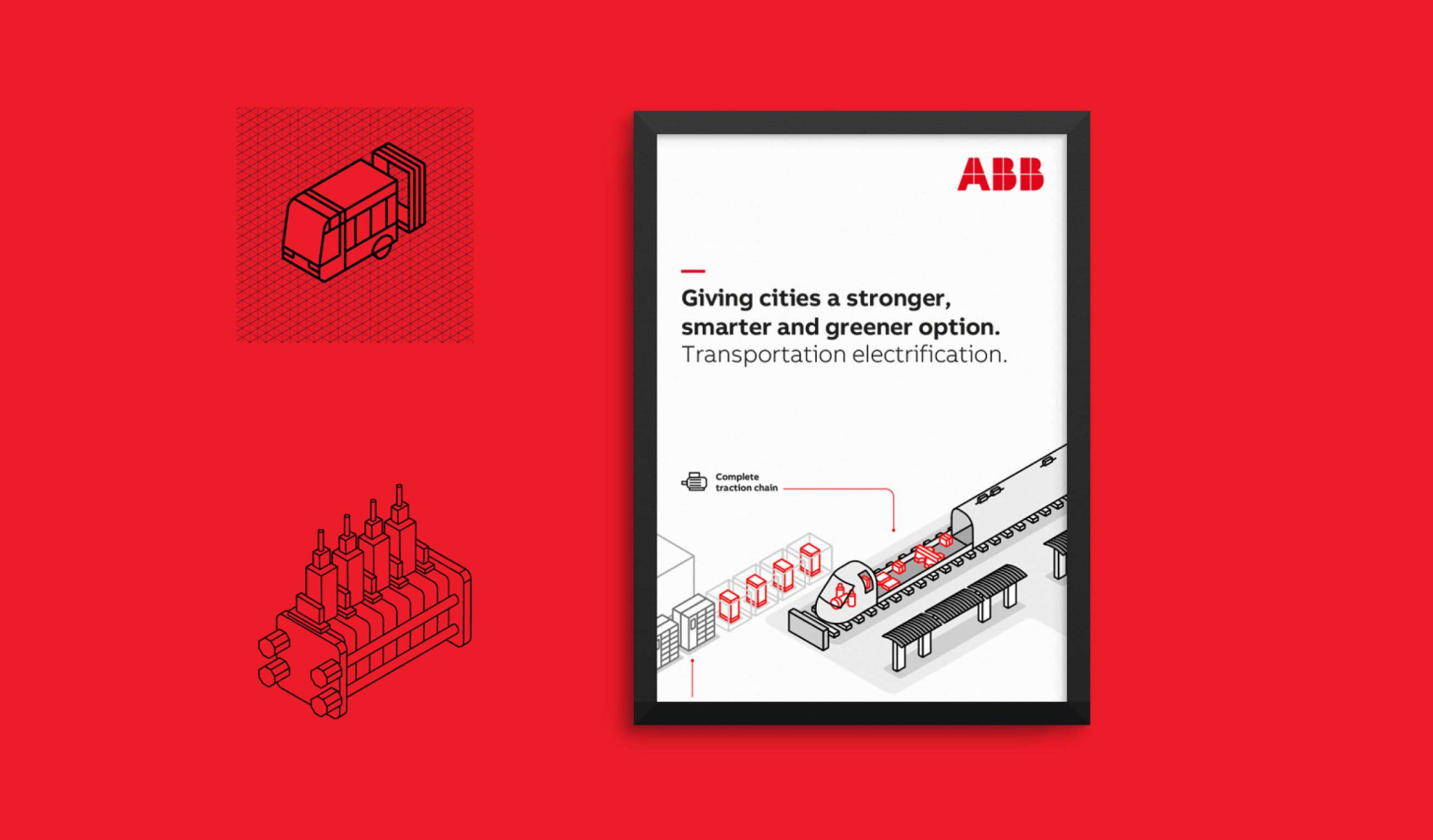
Admind co-created key components of ABB’s new visual identity, including the illustration system that became a defining feature of global communication.
The system combined:
- engineering precision,
- simplified geometric forms,
- a human-tech character reinforcing accessibility,
- strong digital adaptability.
This visual language became the foundation for marketing, product and corporate communication worldwide.
2. Brand Governance & Tools
A critical element of the transformation was operational enablement.
Admind played a key role in designing and developing the ABB Brand Portal — a centralized platform providing access to:
- graphic component libraries,
- illustration systems,
- implementation guidelines,
- training materials,
- brand architecture documentation.
This ensured predictable, high-quality execution across global markets and partners.
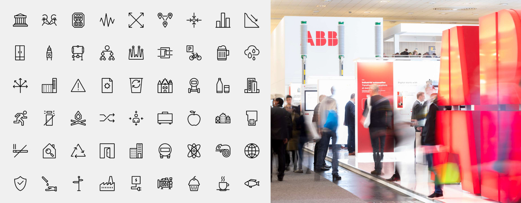
3. Global Event Branding
At Hannover Messe, one of ABB’s most significant industry platforms, Admind delivered comprehensive event branding including:
- spatial design and navigation systems,
- digital communication environments,
- multimedia content,
- presentation and layout systems.
The event activation demonstrated how the new identity performed in large-scale physical environments.
4. Cross-Agency Collaboration
The transformation required high-level international collaboration.
Admind worked closely with ABB’s Global Management Team and leading brand agencies to ensure alignment from strategy to execution.
The multi-agency structure strengthened quality control, coherence and implementation precision.
Results
ABB’s global rebranding remains an evolving process, but its impact is already measurable.
Key outcomes include:
- cohesive global identity across 100+ markets,
- clear perception shift toward digital innovation and technology leadership,
- stronger employee engagement around the new brand promise,
- operational efficiency through centralized governance tools,
- scalable system enabling consistent daily brand execution.
The transformation positioned ABB not as a passive observer of technological change, but as an active architect of the future.
Learnings & Transferability
Large-scale corporate rebranding must be treated as business transformation, not visual redesign. Governance, tools and cultural alignment are as critical as creative direction.
For global B2B organizations, scalable systems determine whether strategic repositioning becomes operational reality.
This approach is particularly relevant for technology and industrial companies undergoing digital evolution.

