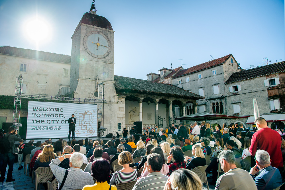
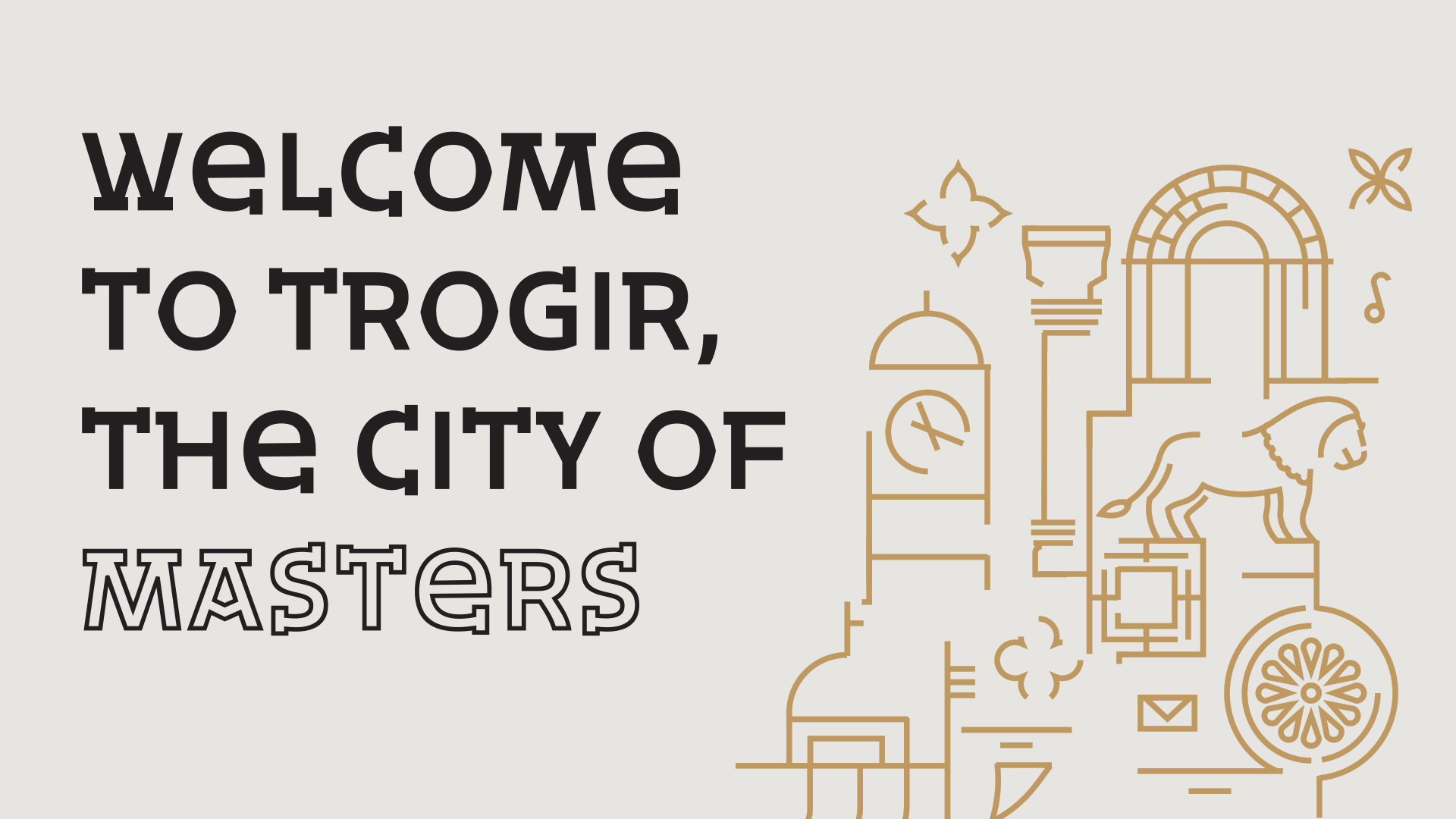
Trogir, a UNESCO World Heritage Site, recently underwent a branding transformation led by the Zagreb-based Fabular agency. With a strategy rooted in the city’s rich historical heritage, Fabular created the slogan “Marked by Masters” to highlight the personal imprints left by its medieval craftsmen. This rebranding effort, which includes a new visual identity and logo, aims to not only attract more tourists but also foster local pride, resulting in significant increases in tourism. The project showcases how thoughtful branding can breathe new life into a city’s narrative.
A maze of history and beauty
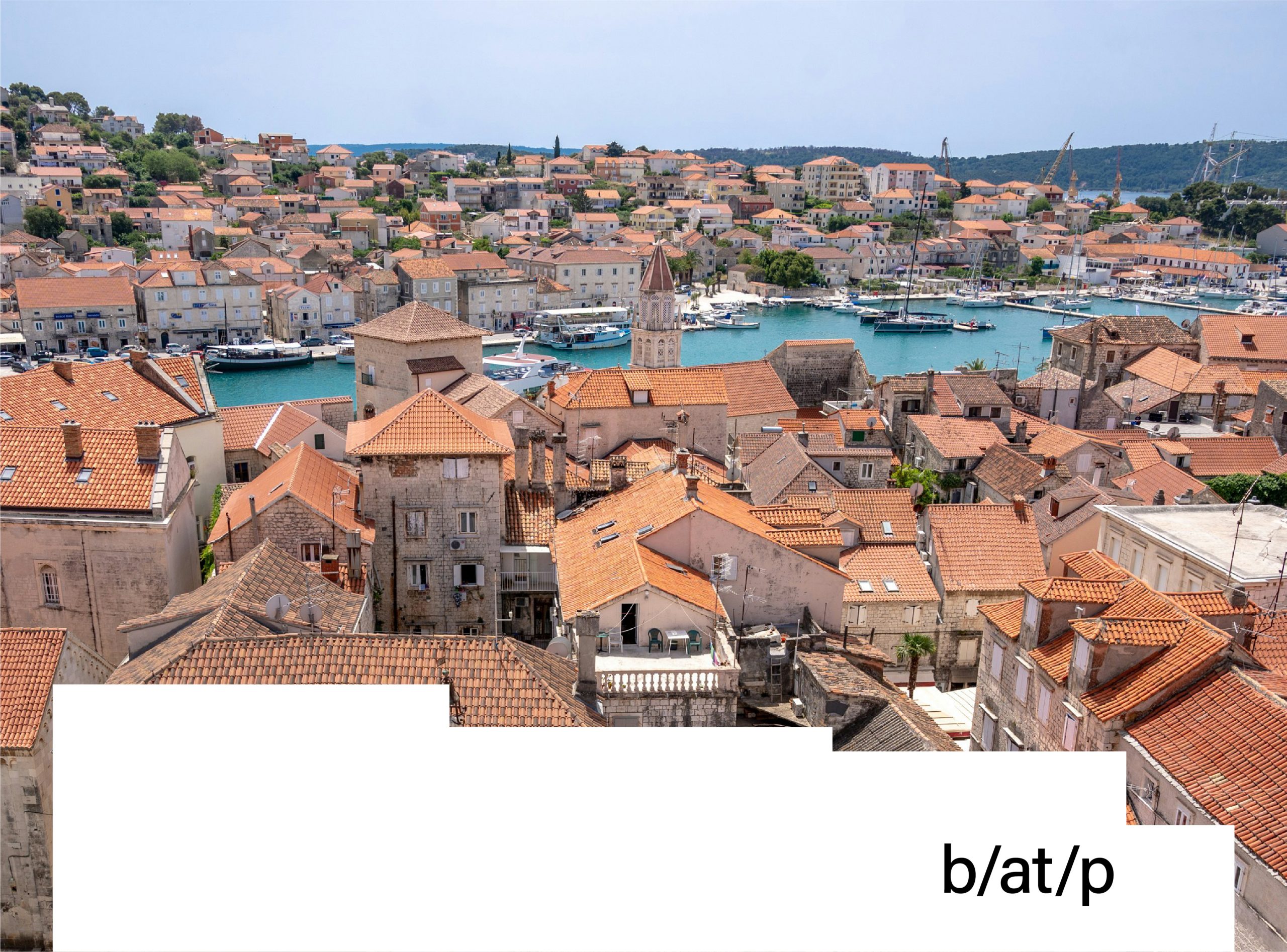
I adore Trogir. The heart of the town feels like a city in a box, with a labyrinth at its centre. A maze of narrow, truly narrow streets that eventually lead you to either the promenade or the main square. It’s a labyrinth I’ve never learned to navigate, but one I’ve enjoyed getting lost in after just twenty steps, only to find my way again after twenty more.
With a history dating back to the ancient Greeks, this city is awe-inspiring in size and beauty. Venetian in form and character, it buzzes with tourists but quiets at midnight and politely goes to sleep. In 2019, Trogir’s authorities unveiled a new promotional strategy, coupled with changes to its visual identity, to present the town as a contemporary community of residents deeply rooted in a rich history – not just a tourist attraction. Trogir hasn’t had to compete for visitors for a long time. The town centre, declared a UNESCO World Heritage Site in 1997, is one of the main attractions in this part of Dalmatia.
The winning strategy: Fabular’s approach
The Fabular agency from Zagreb won the tender. The strategy they prepared, written over twenty years ago, convinced the city authorities to entrust the agency with work on the new branding. As Petra Despot Domljanović (Senior Brand Consultant at Fabular) told me, the team started with a solid analysis of similar projects developed in Europe. Particularly inspiring for Fabular were, among other things, realisations for Eindhoven, Glasgow, and Leeuwarden.
The project lasted over a year and included visits to the city, during which Fabular’s designers held numerous meetings with local authorities and the promotion office. The project also included consultations with historians, museum staff and residents. Fabular characterised the aim of the project as follows: “Our mission was to put Trogir’s rich past and heritage in a contemporary context while creating a compelling story that would attract tourists, enticing them to spend more and stay longer, but above all, our goal was to evoke the pride of the residents and bring life back to the old town throughout the year.”
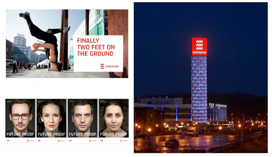
Photo: Merk Eidenhoven
Masters of the past: Leaving their mark
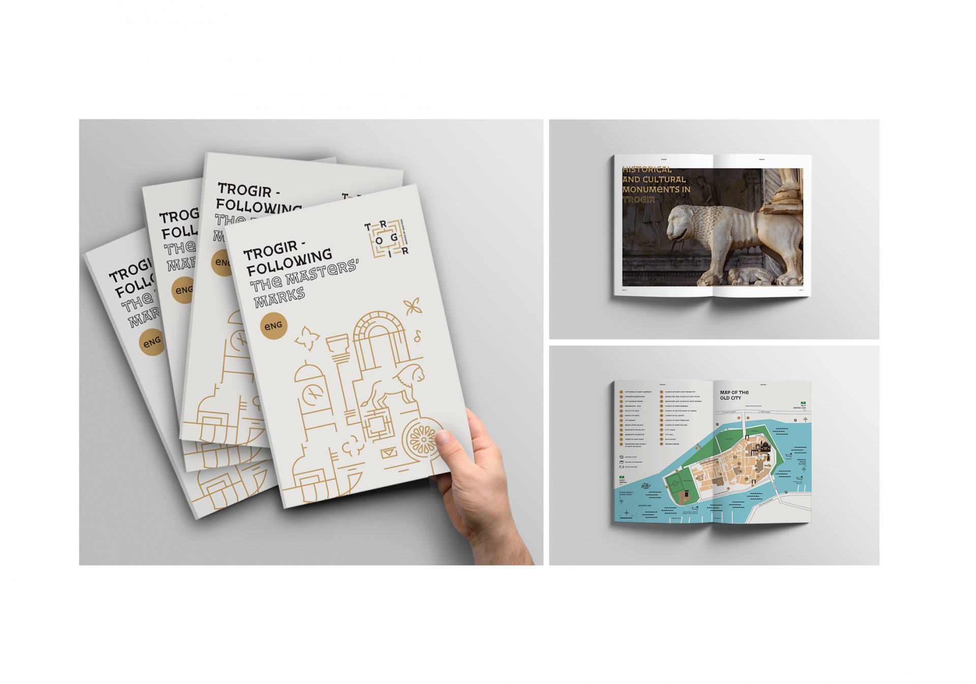
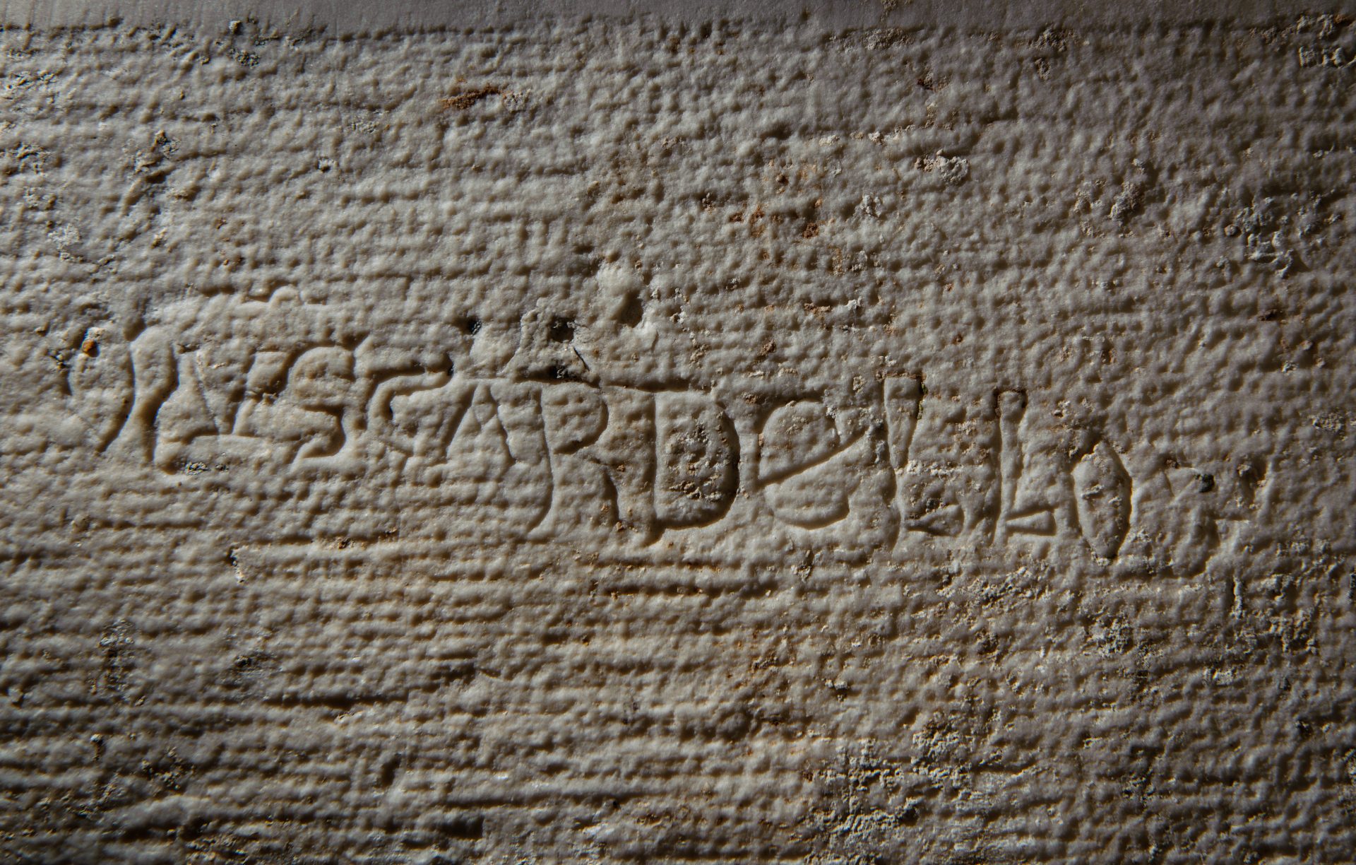
Medieval and Renaissance architecture in Trogir is not only about perfect harmony and coherence. It’s also, or more importantly, about the masters behind these masterpieces. Many of them, including Master Radovan, Nikola Firentinac, Muscardello, Andrea Alessi and Ivan Duknović, left their “signatures” on the city walls as they built the city’s temples and buildings.
Walking through the narrow streets of Trogir, you can discover many such marks – small traces left by artists. Lines, dots, hexagons, initials, and even simple but meaningful designs bear witness to the daily lives of their creators. These subtle elements, often imperceptible at first glance, give the buildings a human, individual character and remind us that behind these monumental works, there are real people, with their prayers, resolutions and moments of leisure that made their hard work more enjoyable and personal.
“Marked by Masters”: A slogan with a promise
This focus on the personal, even private, aspect of the masters’ work became a key element in the town’s branding project, linking the past with the present. Trogir is not only its material heritage but, perhaps above all, the people who live there and continue to shape its unique character. One could say that just as the craftsmen left their mark on the town’s history (and its stones), Trogir has the power to leave its mark on the memories and experiences of its visitors.
Therefore, a really strong element of the Fabular concept is the slogan ‘Marked by Masters’, which is not only meant to promote the place but also describes it well. It shows its unique quality and becomes a promise and a commitment to the city and its authorities not to lose—not to forget—this ‘master touch’.
Source: Fabular
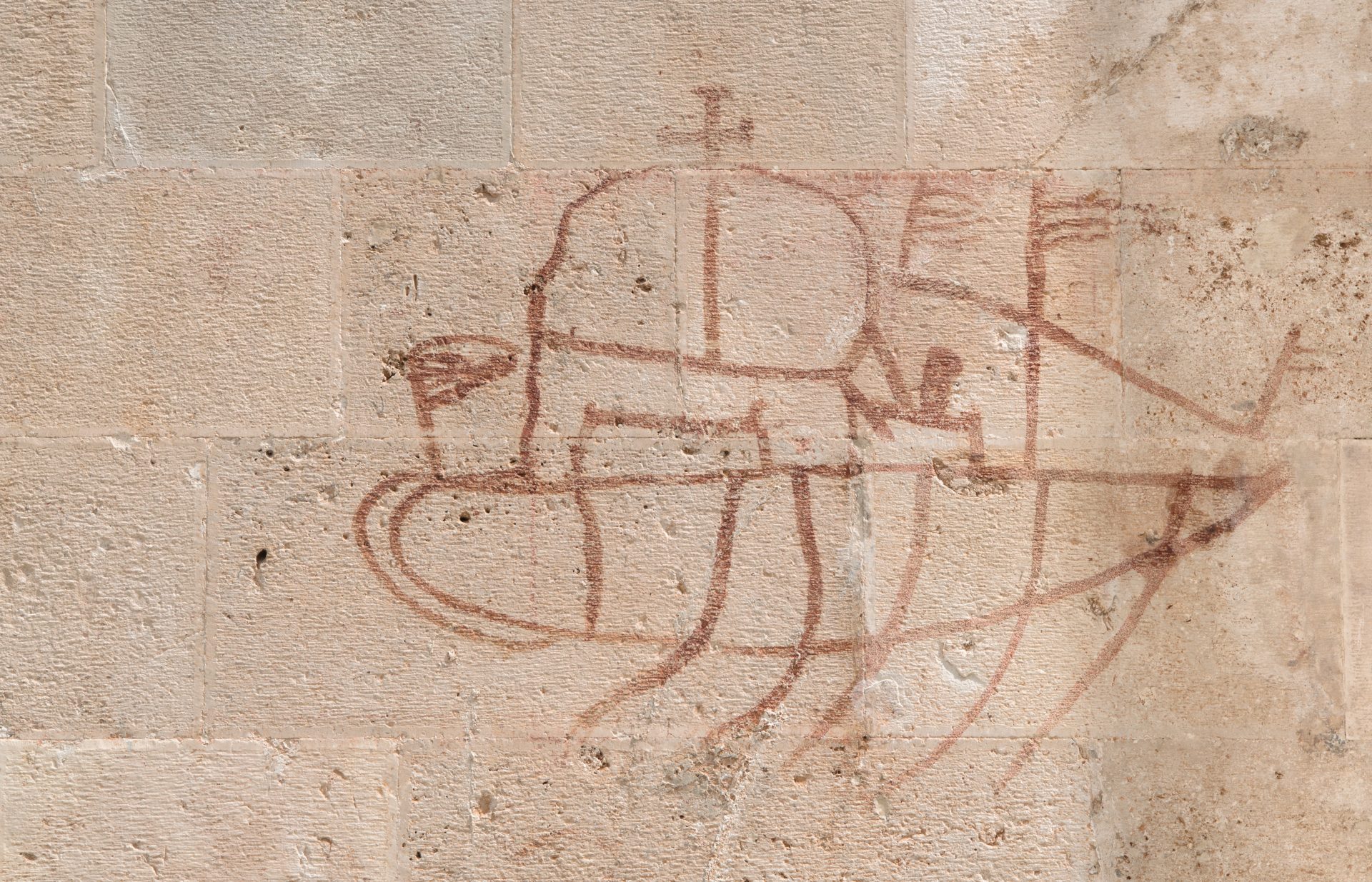
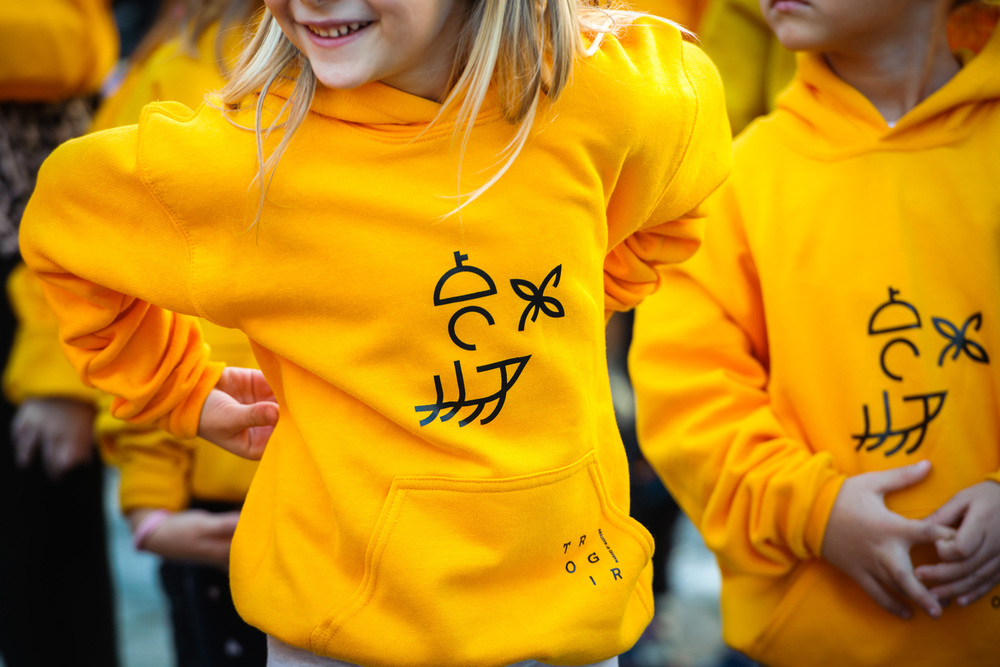
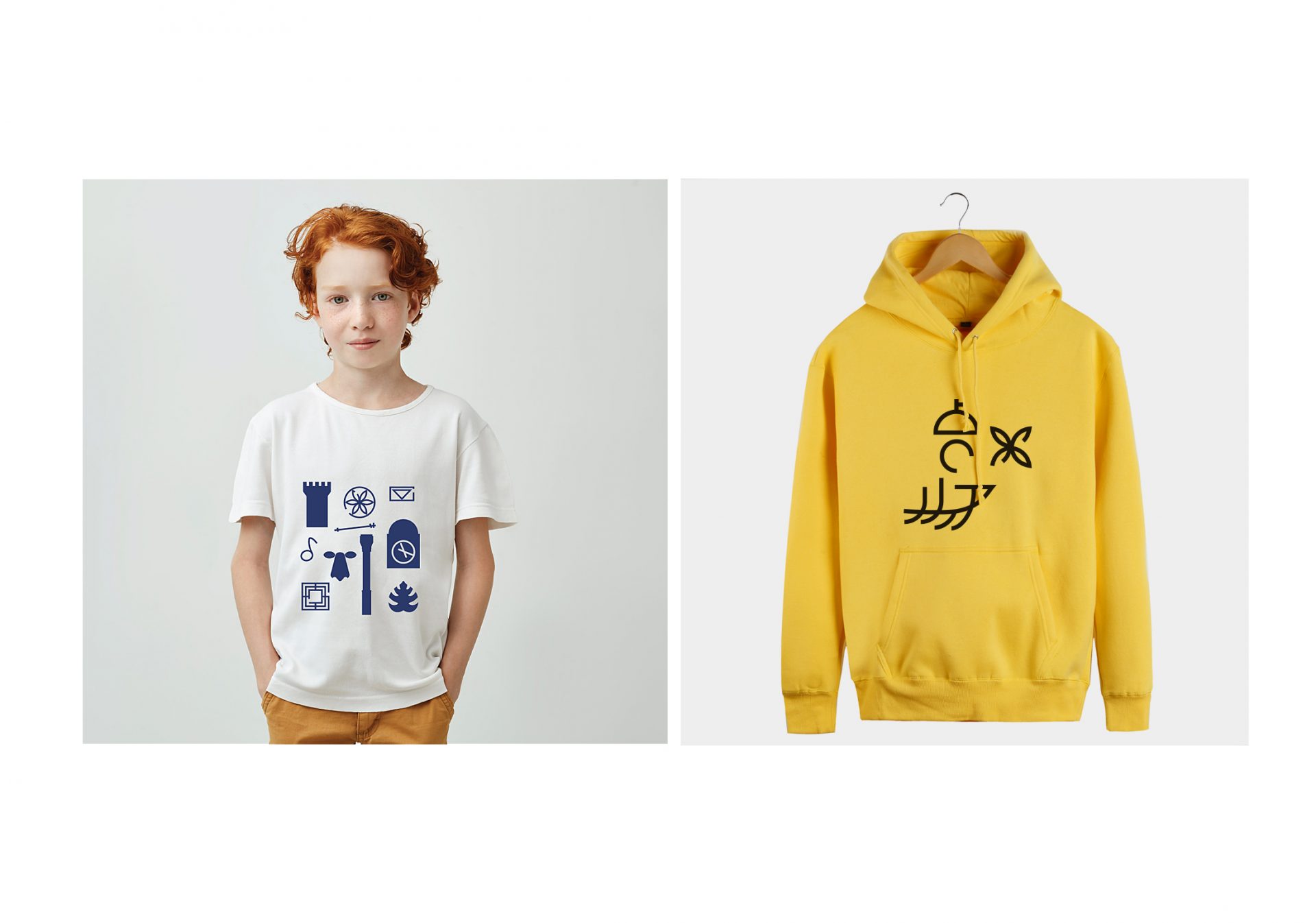
One of the starting points for the city’s new visual identity was a drawing of a boat preserved on the walls of St. Lawrence’s Cathedral. What looks like graffiti, or simply an act of vandalism, is probably a covenant prayer by an unknown 17th-century author. (This distinctive image later appeared on T-shirts designed by Fabular). Maja Bagić Barić is the author of the new logo and the entire identity system (including pictograms and publications), as well as many promotional materials.
Source: Fabular
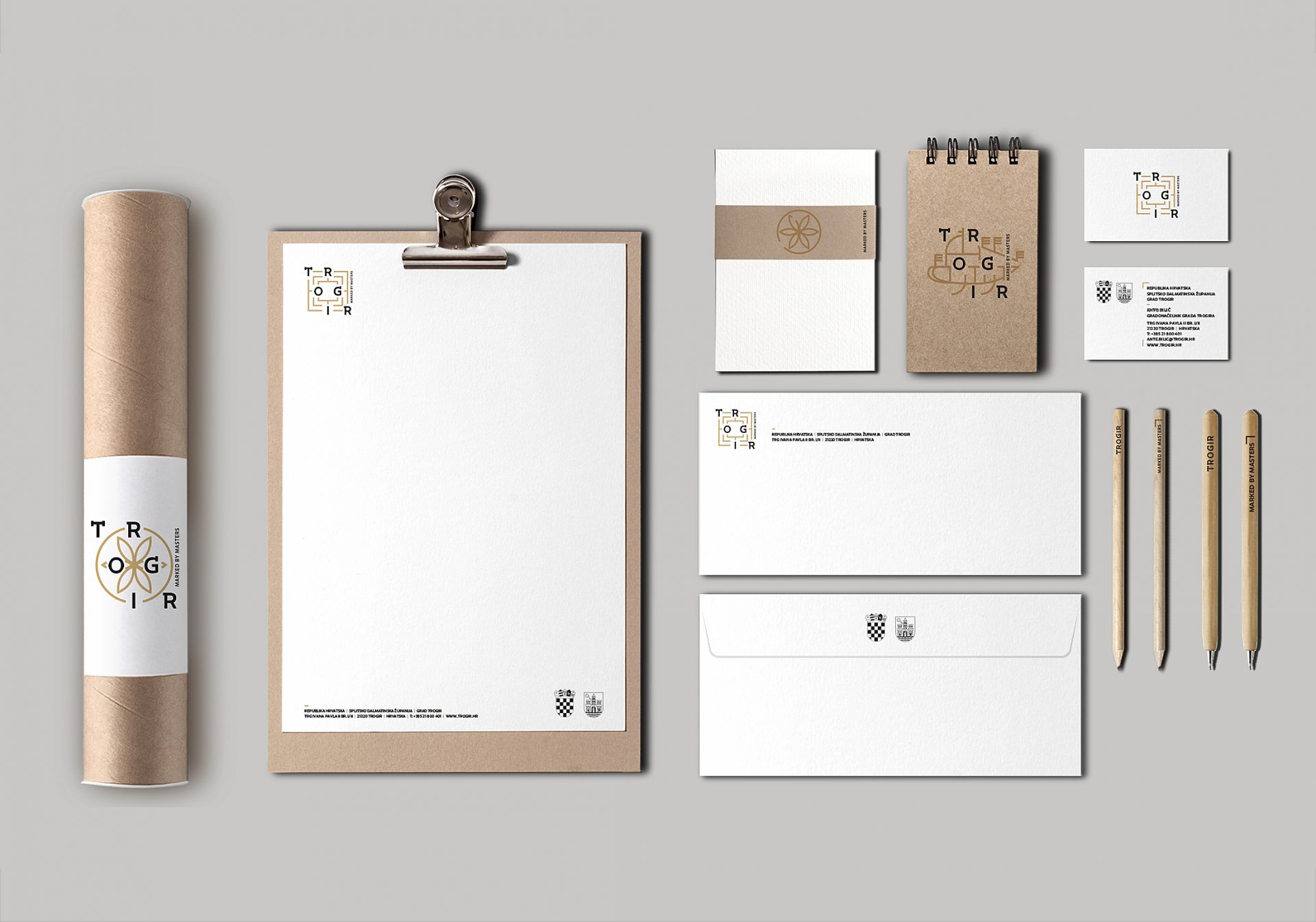
The aforementioned mill, a board game known as far back as the Bronze Age, was also a popular pastime among construction workers working in medieval Trogir. 😉 This is evidenced by the game ‘boards’ carved in a few places. They can be found on the walls of both the Cathedral and the Church of St John the Baptist. It is this distinctive shape that has found its way into the city’s logo: a simple, geometric drawing with the name inscribed captures the idea of branding well. One can probably have minor reservations about the composition of the logo. The whole thing gives the impression of a not entirely stable scaffolding on which the letters are stretched. But in combination with the other elements of the identity, it creates a coherent system that works well in the Dalmatian reality.
Source: Fabular
Typography: A nod to history with a modern twist
A particularly strong and important design element of the project is the typography created for the brand. The typeface, by Nikola Đurek (associated with Typotheque), successfully combines contemporary sans serifs with ‘random’ serifs. It was inspired by Muscardello’s signature on the front of the cathedral.
Source: Fabular
As Nikola told me, “the new typeface family was not an attempt to resurrect old typography. Rather, it is a contemporary reinterpretation to which I have added some details that appear in medieval inscriptions. The family consists of three typeface variants and provides designers an excellent tool for creating visually appealing typographic layouts.
The results: A brand that resonates
At the end of the brief conversation, Nikola stressed that “working with Fabular was amazing because they are a professional, creative and, above all, very positive team”. Meanwhile, the agency itself recently summed up the effect of its work as follows: “After the rebranding, the number of tourists visiting Trogir increased by 41%, the number of tourist nights by 28% and the number of arrivals in December by 27%. It is probably debatable whether these increases are due to the branding alone. I suspect that they result from an interplay of many factors, including those over which no one, not even the designers, has control. However, I am sure that a well-designed project, together with a strategy that sets clear objectives, will help to develop the brand and focus it on what is most important to it (in this case, the city). This kind of branding is exactly the right answer to a well-asked question.

Get the exclusive industry insights
Sign up to our newsletter