May 26, 2023
Road sign design – how road signs got their branding and why it is good to know
Share this article
The road sign design may seem simple. Yet the stakes are high – the safety of drivers. See how signs are created to make them visible and legible from a distance.
Signs are everywhere. Even in the word “Design”, we have a hint that what we actually do, is work with signs. But what is a sign?* A sign was invented by people quite a long time ago to signify something, that is not already and evidently there. Charles Peirce, known for his ability to make simple things more complex, famously stated, that when you see “something that stands for something, to someone in some capacity”, then it is probably a sign. To stand for something, there is a relation between the sign and the object it is in relation with. And Peirce was so kind as to identify 3 types of signs! We have icons, which signify something by relation of similarity between sign and the object. So the icon is a sign, that is simply similar to what it represents.
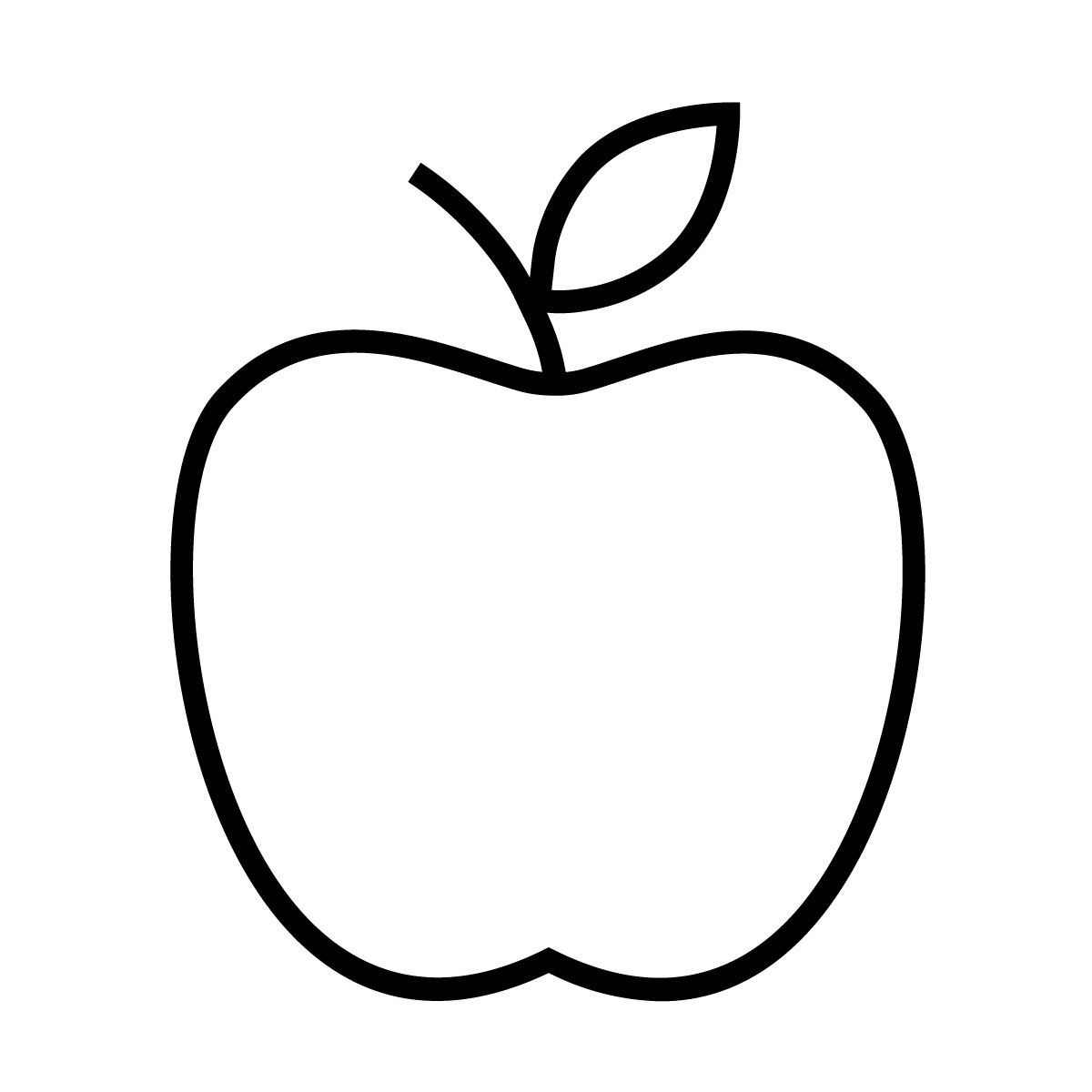
This is an icon, because it is similar to an object it represents, in this case, a delicious apple.
Another type of a sign is an index. Index is a sign that is in direct (or natural) relation (e.g. a causal relation) with an object: smoke is an index of fire, sneezing is an index of having a cold.
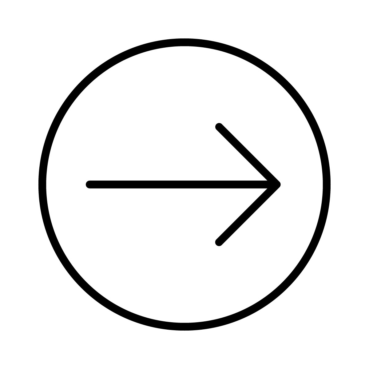
Indexes are useful, because, by means of this “natural” relation, they can point out to something else, like here: instead of looking all the time at the sign, we are “naturally” directed to look right, because the sign points there.
Symbols, my favourite kind of signs are a little more complex, because the relation between the sign and the object is neither direct (icon), nor “natural” or causal (index). They mean something because we, as users of such signs have agreed, by laws, conventions, or simply by long discussions, that they mean something else! Almost everything we do in language is symbolic by nature, because, there is hardly any other, than conventional, connection between the word “fork” and an object on the table, usable, when you want to eat in a polite and cultural manner.
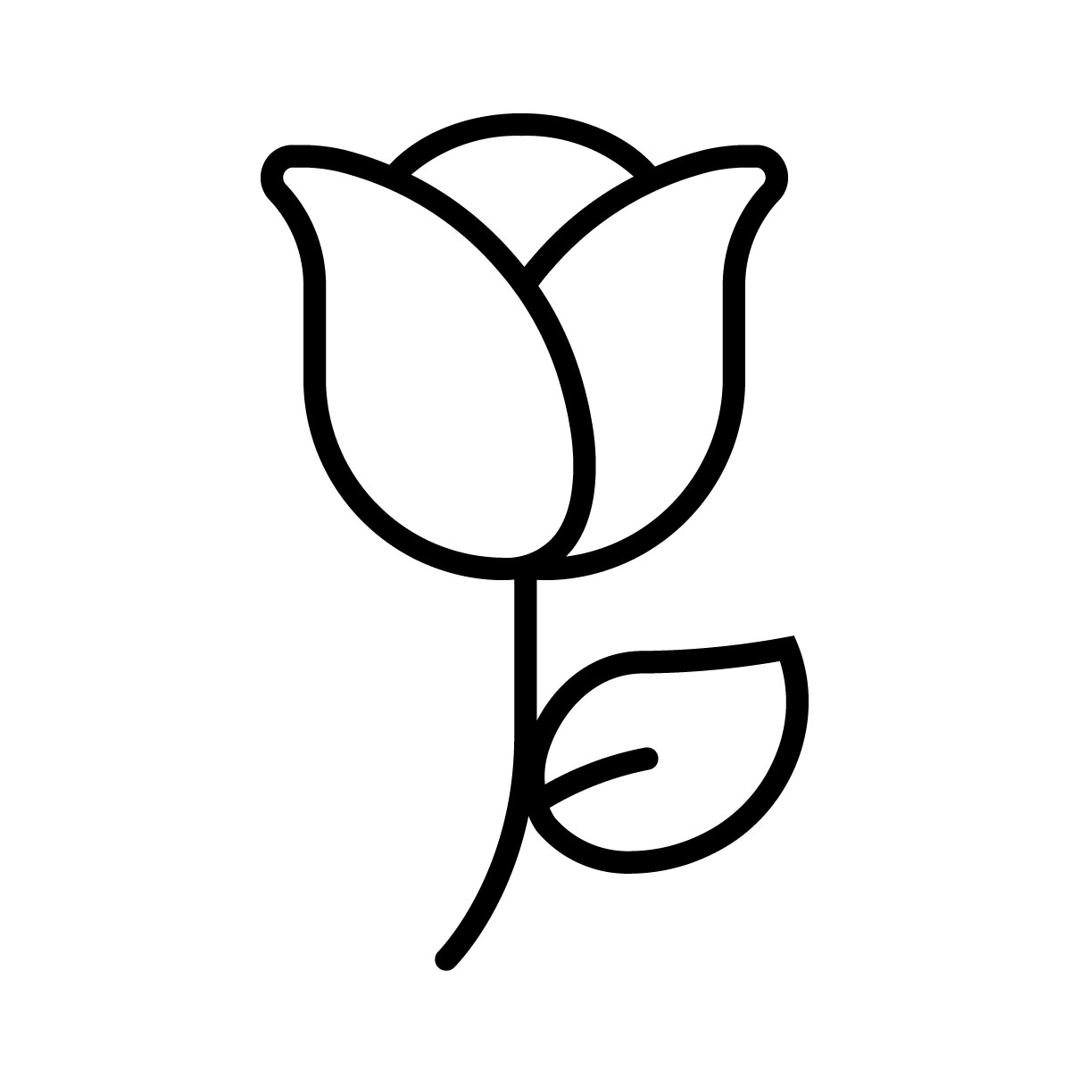
The sign above is to most of us not an index, nor an icon, because it has a conventional, symbolic connotation: Adding it to a message, the recipient will understand that it relates to emotions (like love), even though there is no direct relation between a rose and this feeling.
A designer is a person, who knows quite a lot of stuff about signs. And just to give you an example of how designing signs work, I would like to focus on a single designer, who, one day, received a very interesting task: knowing all you know about signs – someone might have said – could you design signs, that will be used on roads, like… throughout the whole country?
Graphic designer Herbert Spencer published a series of photos of road signs in his magazine Typographica in 1961. Spencer drove from London to Heathrow Airport and took pictures of every single road sign he saw along the way. There was no visual consistency at all, and his photos showed how confusing signs were – each one used different typefaces, different icons, indexes, symbols and colours.
Thankfully, even before that, in 1957 Jock Kinneir hired Margaret Calvert to design signs, that will be simple, understandable, visible and will help drivers communicate very important information regarding anything they need to know, while driving on a road. Now, the problem with signs is that, once you, thanks to Peirce already know the basics (index, icon, symbol), it seems easy at first. But is it?
The first problem with road signs is that they have to be well visible. And the second problem is, that there is a very limited amount of time you can spend to acknowledge their presence. And the third problem is, that virtually everyone, not only trained drivers, should understand signs.
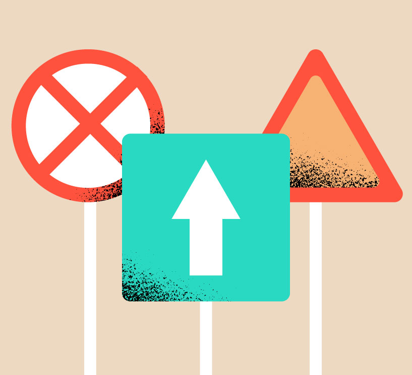
The first part of the work with signs was purely symbolic: Colours Shapes of signs also have a meaning. It was decided in 1949 Geneva Protocol that triangular signs will always relate to a warning. And to strengthen the emotional aspect of warning, thick, red border of triangular signs was applied, because, symbolically, red is a colour warning of a possible danger or hazard. When a sign is in a circle, it is a direct command to the person seeing the sign to do something. And when the sign is a rectangle, it conveys some useful information, that is not related to hazard** or commanding something. So the shape of the sign itself is already a message: be warned, do something, you mind find useful that…
What about colours? Well, we noticed already that red (and yellow) are for warning, which seems a sound choice: fire is red and yellow, in nature is commonly used by animals to warn other animals, that eating them will be a huge mistake. More importantly, these colours are well visible in nature and in the context of background which usually contains a lot of blue and green**. Having such a solid foundation for sign symbolics, designers still needed to contain quite a lot of information on the signs, that could not be mistaken with any other information. And here designers like Margaret Calvert, did come out to shine.
Before standardization of signs, some information to drivers and other road users was conveyed by language communication: signs simply said: “Caution, road narrows”. This, however assumes, that the person can read and knows the language in which information is given. The similar effect can be achieved by a sign, an act of communication, directed to the user without means of words:
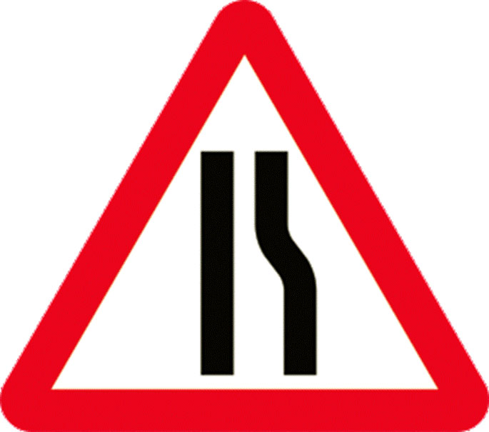
The additional aspect of using a very simple drawing is that we instantly know, which part of the road will get narrower, without spending much time on analysis of the sign. Knowing the code, we also know, that this is a warning and we can recognize the message, even when travelling fast, from quite far away. Calvert had to transform a lot of information into communicative acts, sometimes using, as a reference, her own experience. For example, this warning sign:
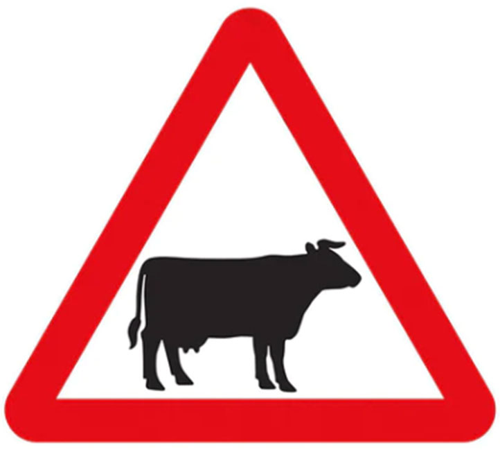
Was inspired by a genuine cow, called Patience, Calvert met in her relatives’ farm in Warwickshire. The icon is very simple, but instantly sends out a clear message to the user: slow down, cows may be wandering around. With the current huge and important trend of usability and inclusive design, we may also easily identify Calvert as one of the early enthusiasts of these ideas. When designing a warning sign for children crosswalk, she used her own childhood photograph as a reference:
“I wanted it to look more inclusive so you couldn’t tell if it was secondary modern or grammar. And I wanted it to be more caring – so I made the little girl lead the little boy. But it needed to have something urgent about it (…) I wanted them to be more human, figurative. I think they have more personality.”
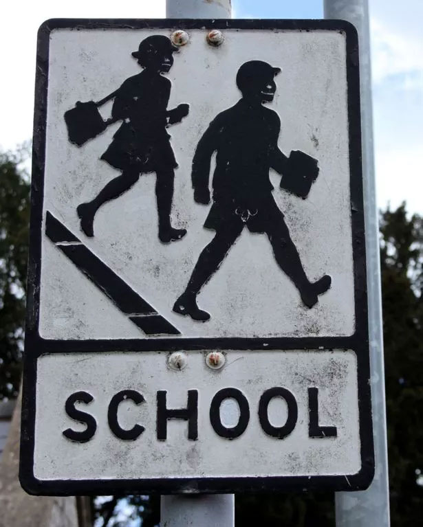
There was a lot of culture embedded in the old sign, and it showed no relation of care between the boy and the girl. With time, it would certainly not age well, as the iconized clothes of children look old fashioned to a 21-century eye. Calvert made the sign much more universal, and emphatic:
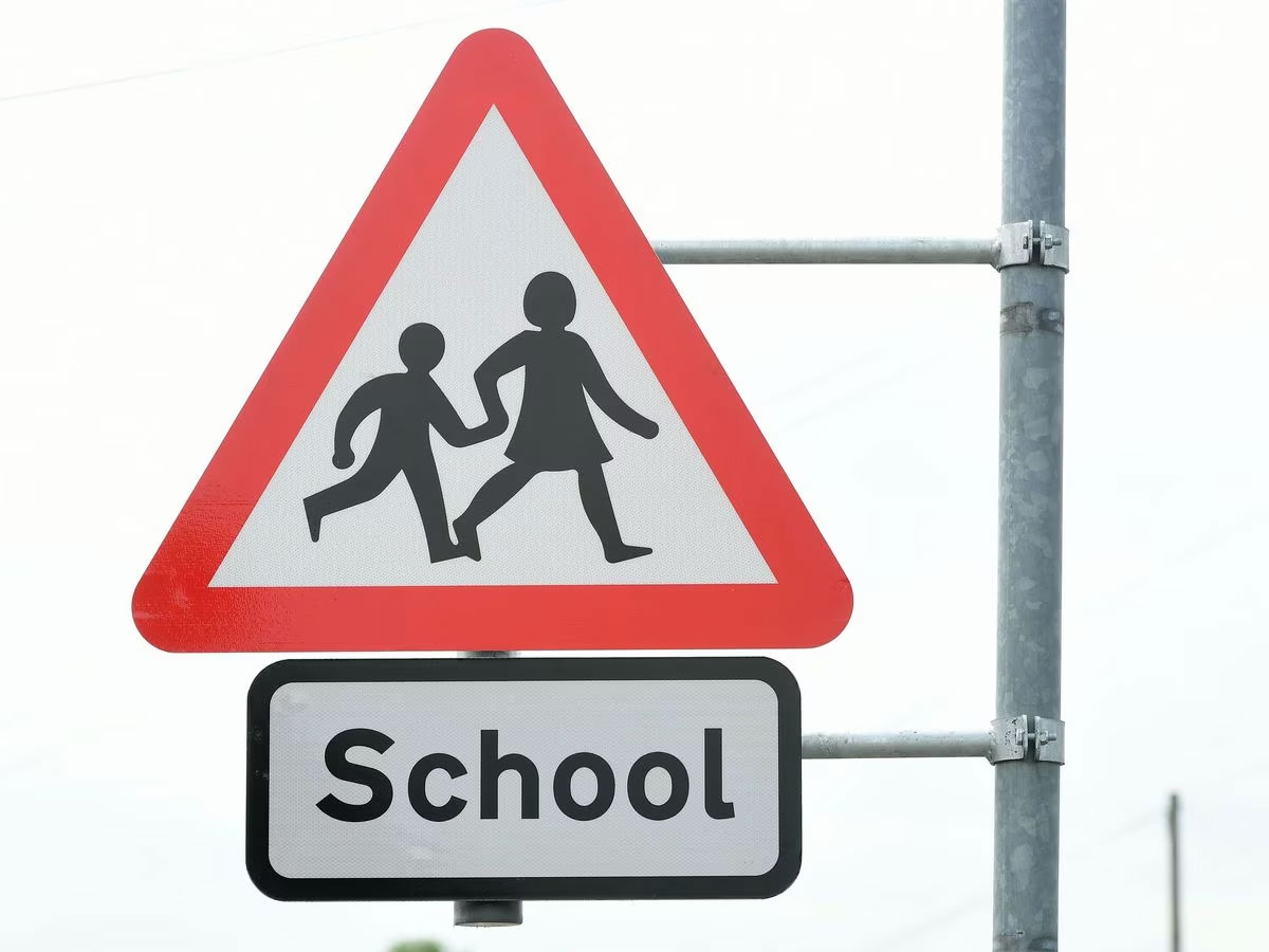
By connecting the two figures we have a reference scale, we see that one is taking care of the other, sending us a message, that the boy is young and might not be able to cross the road by his own, that he might be vulnerable. And this communicative act probably works well with the receiver.
Road sign design, thanks to Calvert, became what it should have been from the start: simple, inclusive, easily digestible by receiver and visible in the context of roadways and their surroundings. But what about language communication? After all, sometimes You have to write, e.g. how far a city is?
Kinneir and Calvert designed Motorway typeface to use on all signs. We all know them from road signs e.g. with names of cities and distances. Both mix upper and lower-case letters which helps people recognise words faster than when they are written using only capital letters. The letters were designed by trying to understand the needs of the driver, moving quickly and having a limited amount of time to understand the sign.
When explaining why upper and lower case letters were used, Calvert explained, that what they had found out is, that it is much easier to read names of towns and cities starting with capital letters: “They give a shape to a place, as opposed to caps, which don’t: you just read the length of the caps”. So every time You see something written on a highway sign, you’ll know why the names are capitalised but not all in uppercase!
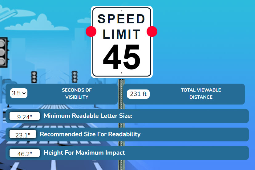
What is more, research was done to estimate how big the letters should be so that all people, regardless of their sight quality, could read them from a distance: and a fun fact is, that presentation designers, like me, use these estimations and calculations today, to estimate, what font size to use, when something is to be presented to the audience. Another element, taken into consideration is speed: How fast someone is going past a sign is an important visibility factor. According to research, if the speed limit is 50 km/h, the message should be visible for three seconds by passing drivers. This affects the size of letters, and impacts the recommended size of font, as in the example below:
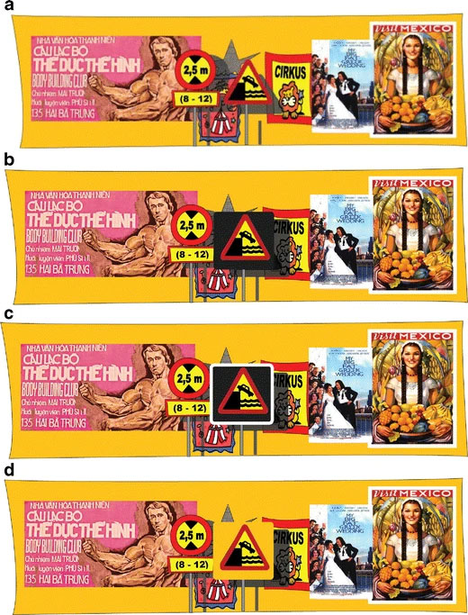
Is the road sign design final? Not at all. Changes are being discussed, researched and tested, for example, because the surrounding of the road signs has significantly changed. What worked well, when tested when the background was monochromatic, might not work well nowadays, with many advertisements combatting for attention of the driver. Below you can see, that when the context is taken into account, additional ways of “bracketing out” signs from colourful background might be required:
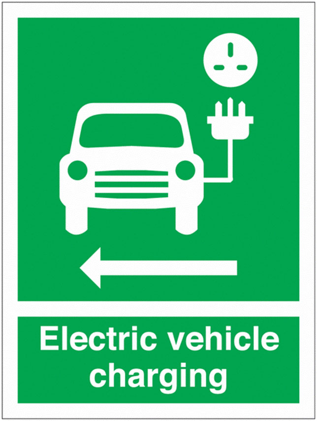
The context also is changing, because the civilization is changing, and new signs need to be designed to help us get information about new phenomena:
*This is blog post is inclusive and emphatic, so we have italicized anything related to philosophy. If you hate philosophy, have bad memories related to 90 minute lectures about being, or simply would like to copy and read the philosophical part for sleepless evenings, you will know which part are especially theoretical, obsolete and will never help you in solving life dilemmas.
** Yes, I am aware that landscapes can have other colours, like desert yellow, but the fact is, that it seems quite difficult not to notice a sign on a desert.
Bravo, you made it to the end! If so, you might also be interested in this article on Wayfinding.