June 16, 2026
What football kit branding and club identity teach us about desire?
Share this article
In January 2018, Nike launched a football shirt. Within hours, their website crashed. Within days, every size had sold out worldwide. By the end of the week, resale listings had appeared at three times the retail price. The club in question was not Real Madrid or Manchester United. It was the Nigerian national team, who had not yet qualified for the tournament for which the shirt had been made. Nevertheless, three million people had pre-ordered it.
A football shirt is the smallest possible canvas for some of the biggest stories in the world. In just ninety square centimetres of embroidered thread, clubs can carry centuries of history, immigrant dreams, political resistance and civic pride. And, as the Nigerian disaster demonstrated, they increasingly carry the kind of cultural desire that most commercial brands spend decades and billions of dollars trying to manufacture and rarely achieve.
This is the story of how football kit branding became one of the most interesting objects in contemporary sports brand identity. There are two chapters. The first is about identity: the clubs whose crests and colours carry so much accumulated meaning that they function less like logos and more like flags. The second chapter is about desire: the designers, studios and clubs that have discovered how to transform a shirt into a cultural phenomenon. The thread connecting them is the same in both cases. It is about what happens when design genuinely serves something that matters.
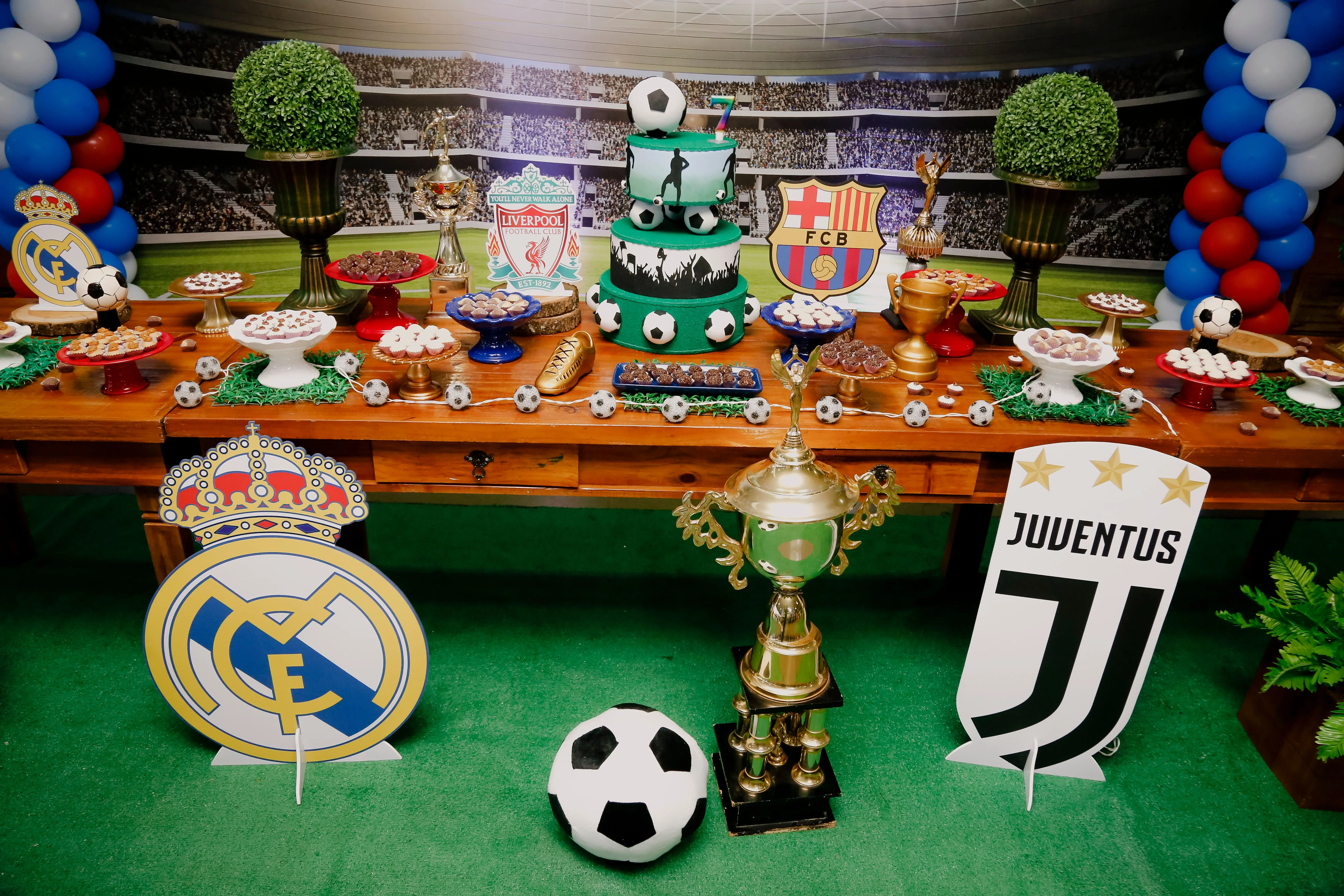
Photo by Vidal Balielo Jr.: https://www.pexels.com/photo/soccer-themed-dessert-table-4005310/
The African Cup of Nations has always been as much a cultural festival as a sporting competition, showcasing colour, music, national identity and diasporic pride as it travels from host city to host city. Jerseys matter in a way that transcends merchandise. Ghana’s kente-inspired patterns, Cameroon’s sleeveless Puma jerseys in 2002, South Africa’s gold and green colours since the end of apartheid, the elephant symbolism of the Ivory Coast, and Morocco’s blend of Arab, Amazigh, and African identity are not just aesthetic flourishes added by marketing departments. They are visual declarations of history and belonging.
Governments and football federations understand this symbolic power well. African nations often fund large travelling supporter groups, drum ensembles and fan delegations to tournaments, not just to support the team, but also to project a national image and presence on the global stage, a form of soft power expressed through noise, colour and visibility.
This phenomenon reached another level during Morocco’s extraordinary run to the semi-finals of the 2022 World Cup in Qatar, when the Atlas Lions became a symbol not just of Morocco, but also of Arab and African representation at the highest level of world football. Their red-and-green shirts flooded stadiums from Doha to Casablanca, and demand for them surged globally as the team advanced, with replicas selling out across multiple retailers. In moments like this, what a nation wears is inseparable from what it is saying.
For the 2010 World Cup in South Africa, Puma had already grasped this dynamic with the remarkable Africa Unity Kit – the first “continental football kit” ever created. Instead of designing separate third shirts for each federation, Puma produced a single template for its African national teams, including Cameroon, Ghana, the Ivory Coast, Algeria and Morocco. The concept was explicitly pan-African: the brown colour of the shirt was created by blending soil samples from four of those nations and fading into sky blue to symbolise ‘soil to sky’, while the yellow detailing represented the African sun. The kit was a marketing campaign, a political statement and a cultural manifesto all in one an attempt to portray African football not as a collection of underdog nations, but as a unified cultural force entering the heart of the football world during the continent’s first World Cup.
Even though the shirts were rarely worn in competitive matches, the symbolism mattered. In retrospect, the Africa Unity project feels like an early blueprint for the future of football fashion: identity-driven, story-rich, politically aware and culturally ambitious, extending far beyond the pitch. Cameroon’s earlier Puma experiments (from the sleeveless 2002 Africa Cup of Nations shirts to the controversial one-piece kit in 2004) had already demonstrated that African federations were often the arena in which football kit design history became the most daring. The Nigeria 2018 sensation did not come from nowhere. It came from a continent that had been making this kind of statement for years.
The Ajax Amsterdam crest is one of the most elegant and quietly brilliant pieces of sports identity design ever created. The face of Ajax, the Greek warrior hero from Homer’s ‘Iliad’, is rendered in pure line art: bold, minimal and instantly recognisable. However, it is the fact that the face is drawn using exactly eleven lines that elevates it from logo to legend. The number of players on a football team.
This was no accident. Introduced when the crest was redesigned in 1990, the eleven-line convention transforms what could have been a generic classical motif into a symbol with internal meaning – one that rewards those who know the story. The crest does not need to announce its own significance. It simply carries it, quietly, for those who look closely enough.
Founded in Amsterdam in 1900 by young men who wanted their club to embody classical excellence, Ajax reached for mythology. Ajax was the greatest warrior in the Greek army, brave, powerful and principled. This aspiration was embedded in a visual symbol that has remained essentially unchanged for over three decades, through league titles, Champions League triumphs and global expansion.
The best brands do not just represent who you are today. They make a claim about who you intend to be and then hold you to it.
The Ajax crest is a masterclass in what designers call ‘earned simplicity’: a mark that looks uncomplicated precisely because every unnecessary element has been removed, leaving only what matters. In a world where visual identity is often cluttered with gradients, drop shadows and other distractions, the Ajax badge is a subtle argument for restraint.
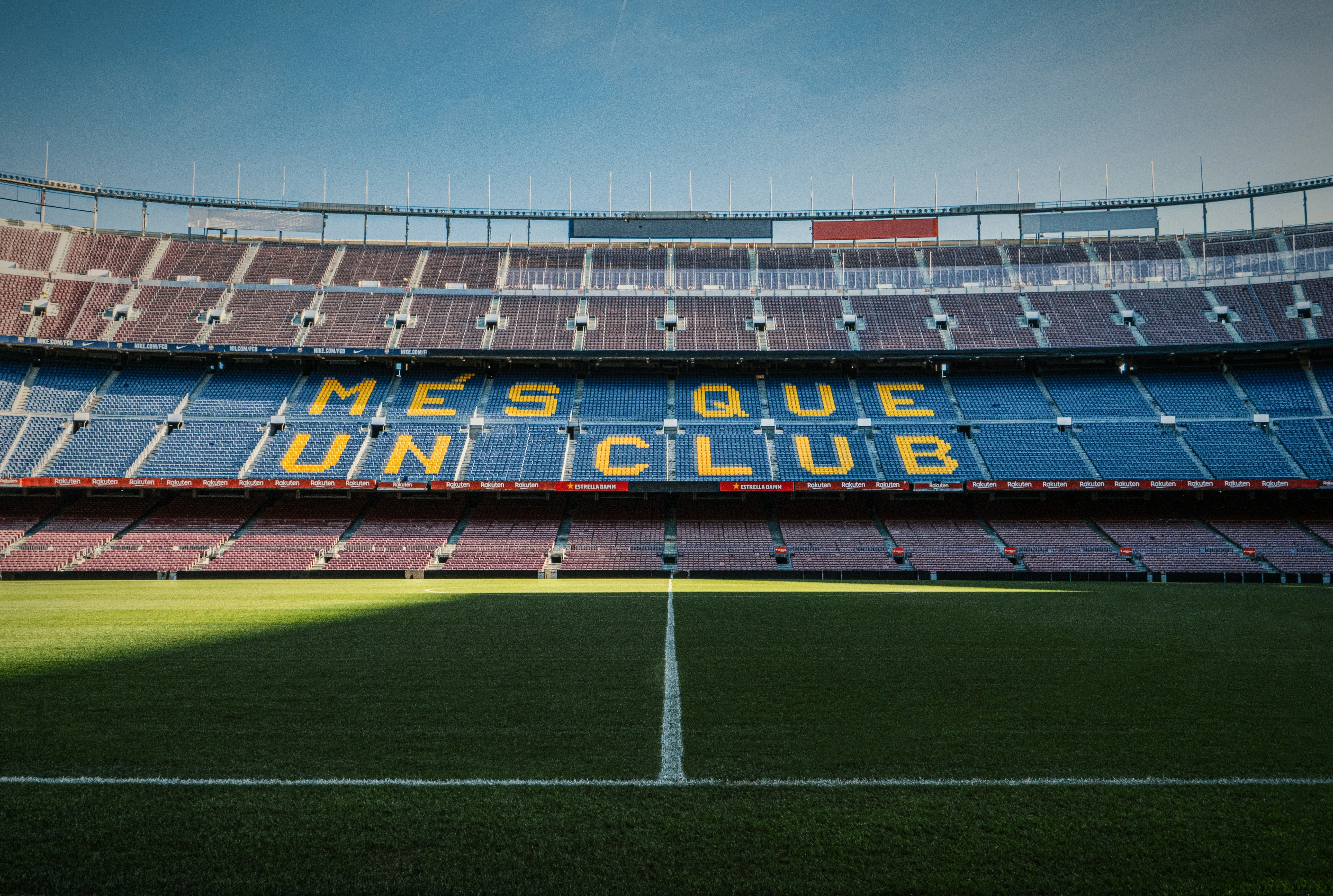
Most football clubs have crests. FC Barcelona has a flag. This difference matters.
The Barcelona shield features two sets of stripes: the red and yellow of the Catalan flag (the Senyera) on the left and the Cross of Saint George, the patron saint of Catalonia, at the top. These are not just decorative choices. They are a declaration of cultural identity that endured through decades of suppression, most notably under Francisco Franco’s dictatorship, when the Catalan language was banned and the club became a symbol of resistance.
The club’s entire cultural architecture reinforces that identity. FC Barcelona’s anthem, ‘El Cant del Barça’, is sung in Catalan, a deliberate choice made at a time when expressing oneself publicly in Catalan carried real political risk.
During the Franco era, the stadium itself became one of the few places where tens of thousands of people could publicly speak and sing in Catalan together. Even the club’s visual language consistently features Catalan symbolism: the Senyera appears not only in the crest, but also on alternate kits, captain’s armbands, stadium mosaics and club campaigns. Barcelona’s relationship with Johan Cruyff is also intertwined with Catalan identity; his advocacy of attacking, expressive football aligns with the club’s self-image as modern, democratic and distinct from the centralised power traditionally associated with Madrid. The club’s renowned youth academy, La Masia, is frequently discussed not only as a football institution, but also as a cultural one, producing players moulded in a distinctively “Barcelona” manner, both stylistically and philosophically. The power of the Barça identity lies in the fact that every aspect of the brand ( the crest, language, anthem, playing style, stadium rituals and tactical philosophy) points back to the same idea: Catalonia as a culture that insists on being seen.
‘Mes que un club‘ (‘more than a club’) is arguably the most famous brand positioning statement in sporting history. However, it was not invented in a boardroom as a marketing slogan. Rather, it is a description of something that was already true: a football club that had become a vessel for the political and cultural aspirations of a stateless people. The brand did not create the meaning. The meaning created the brand. The crest simply gave it shape.
Photo by Tim Roosjen on Unsplash
The lesson for brand builders is an important one: you do not always get to choose what your brand comes to mean. Sometimes a community chooses it for you, and the wisest thing you can do is honour that meaning rather than replace it with something more controlled.
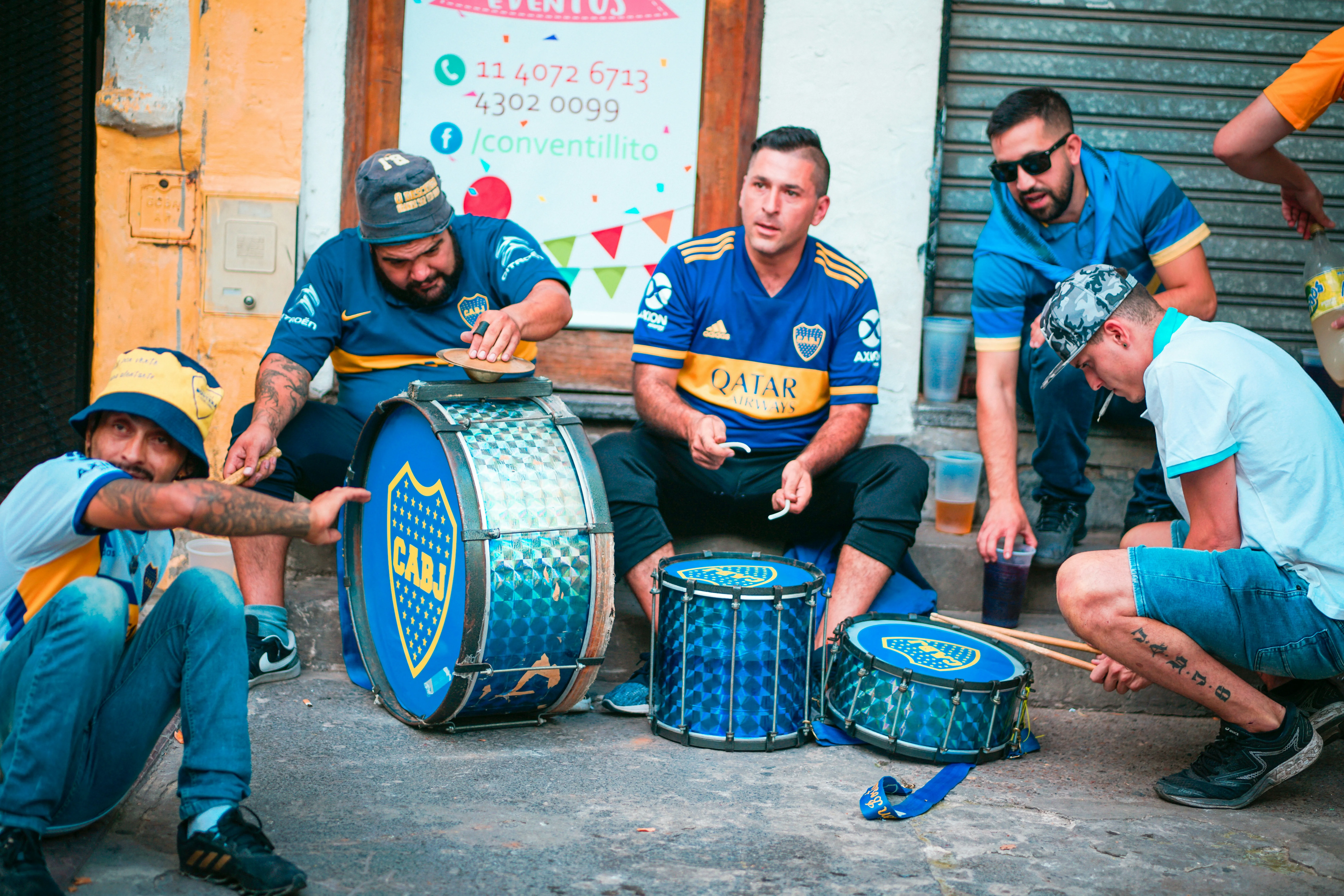
The story of how Boca Juniors came to wear blue and yellow is one of the most extraordinary origin myths in football, and the fact that it’s true makes it even better.
In 1906, the club was struggling to agree on a definitive kit colour. A suggestion was made: the colours of the next ship to sail into the port of La Boca, the Buenos Aires dockland neighbourhood where the club was founded by Italian immigrants, would be Boca’s colours. The ship that arrived was the Drottning Sophia, a Swedish vessel flying the blue and yellow of the Swedish flag.
Thus, a club founded by Genoese immigrants in an Argentine neighbourhood adopted Scandinavian colours, which became one of the most recognisable combinations in South American football over the following century. The diagonal gold sash on a royal blue shirt has remained essentially unchanged since 1913.
Photo by Barbara Zandoval on Unsplash
Boca demonstrates something that brand theorists rarely admit: origin stories matter more than rational logic. The colours are objectively arbitrary. Tthey were chosen by a ship that arrived at a port. However, the story of how they were chosen has become inextricably linked to the club’s identity, and by extension, the city’s. The arbitrariness of the origin does not diminish the meaning. In fact, it enhances it. It makes the identity feel like fate.
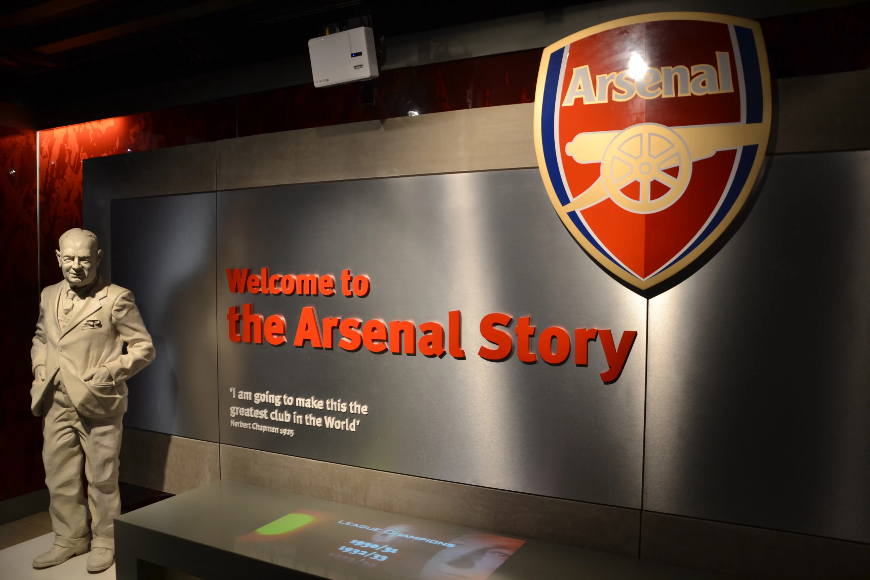
Herbert Chapman is primarily remembered as one of the greatest football managers of the 20th century. He is less often remembered for his work as a brand designer. He should be remembered for both.
When he arrived at Arsenal in 1925, the club wore a plain dark red shirt. Legend has it that he either spotted a man at the ground wearing a red sleeveless jumper over a white shirt or played golf with a cartoonist who wore something similar. Whatever the origin, this observation led to one of the most influential kit redesigns in football history: a red shirt with white sleeves that created a silhouette so distinct that Arsenal players could be identified at a distance, even in the foggy winters of 1930s London.
Source: Wikimedia
Chapman’s reasoning was functional: the white sleeves made players easier for their teammates to identify. However, this functional design had an aesthetic consequence that proved permanent. The red and white sleeves, introduced for the 1933–34 season, still form the basis of the Arsenal kit nearly a century later. Chapman also introduced an Art Deco–style badge and applied visual identity thinking systematically across Highbury Stadium, one of the earliest examples of a coherent brand environment in English football. He understood, long before the discipline existed by that name, that a club’s visual presence should be as intentional as its tactical formation.
Arsenal’s identity became closely associated with North London. Not just geographically, but emotionally too. Highbury, with its Art Deco East Stand and marble halls, was one of the most architecturally distinctive stadiums in English football. Its visual language shaped the club’s sense of elegance and modernity for generations. Even after moving to the Emirates Stadium in 2006, the club invested heavily in preserving this continuity, with statues of legendary players outside the stadium, recreated Highbury iconography and references to Herbert Chapman throughout the architecture. The red-and-white Arsenal silhouette was also deliberately retained as an unbroken visual thread between eras. Supporter culture reinforced the same connection. Chants such as ‘North London Forever’, adapted from Louis Dunford’s song and adopted by fans in recent years, reflect how Arsenal is increasingly positioning itself not just as a football club in North London, but as an embodiment of the area’s identity, memory and working-class history. Like the best football brands, Arsenal works because the club feels inseparable from the place that produced it.
Sometimes the most enduring design decisions are not made in response to a brief, but when someone notices something and asks, ‘What if?’
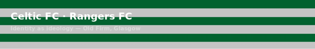
The Old Firm derby between Celtic and Rangers is, among other things, a clash of two of the most ideologically charged visual identities in world sport. The colours worn by both clubs have meanings that extend far beyond the football pitch, touching on religion, politics, immigration and national identity.
Founded in 1888 by Irish immigrants in Glasgow’s East End, Celtic wear green and white hoops, the green of which carries associations with Ireland and the Irish Catholic community that established the club. For generations of Glasgow’s Irish diaspora, wearing the club’s colours was a statement of belonging to a community, a faith and a set of political sympathies. Founded two decades earlier in 1872, Rangers wear royal blue, a colour associated with Protestant traditions and British unionism. Their political positioning has always been explicit rather than implied.
What the Old Firm illustrates with unusual clarity is a truth that applies to almost all powerful football club identities: their colours and symbols are effective because they are meaningful to a specific community, not because they are designed to appeal to the widest possible audience. The willingness to stand for something specific, even if it causes division, often creates the deepest loyalty. Inclusive design is a virtue in many contexts. In identity design, however, precision is usually more powerful than breadth.
The strength of these identities is not just theoretical. In Glasgow, the colours of Celtic and Rangers have historically served as powerful social signals that shape behaviour far beyond the stadium. On Old Firm matchdays in particular, wearing the wrong team’s colours in the wrong part of the city has long been considered unwise, not because football kits are inherently provocative, but because they serve as visible symbols of community loyalty in a rivalry that is intertwined with religion, politics, class and national identity. Few other brands in the world carry that level of encoded meaning in everyday life. A Rangers or Celtic shirt is not just sportswear. In certain contexts, it is read almost like a declaration of belonging. This intensity helps to explain why the visual identities of both clubs have remained so consistent for generations, when symbols become this culturally loaded, changing them feels like an attempt to rewrite social history itself.
Before we explore the designers and studios that are reshaping the visual culture of football, it is worth considering three cases that shed light on the fundamental relationship between clubs and their communities, and on the question of what brands can learn from football.
In 2012, Cardiff City‘s owner, Vincent Tan, changed the club’s primary colour from blue to red and replaced the bluebird in the crest with a dragon. His reasoning was partly superstitious and partly commercial. The club had worn blue since 1908. They were literally called the Bluebirds. Supporters responded with sustained, organised resistance, including protest marches and relentless public pressure. In 2015, the club reversed every change. The bluebird returned.
Then, in 2018, Leeds United unveiled a new crest featuring a stylised figure performing what was called the ‘Leeds Salute’. Within days of the unveiling, more than 77,000 people had signed a petition opposing it. The crest was never adopted.
Everton experienced a similar backlash in 2013 when they unveiled a simplified crest that removed key heritage elements, including the club motto Nil Satis Nisi Optimum (‘Nothing but the best is good enough’), and replaced the traditional tower illustration with a cleaner, flatter design. Over 20,000 fans signed petitions opposing the redesign, criticising it for being generic and disconnected from the club’s identity. Within a year, Everton had reversed their decision and introduced a revised crest that restored many of the traditional elements. This episode revealed that football supporters are not simply resistant to change for its own sake. They are highly sensitive to whether a redesign is grounded in a genuine understanding of the club’s cultural heritage. In football, audiences can instantly detect the difference between evolution and erasure.
In the excitement of a rebrand, it’s easy to lose sight of the fact that, in football, the brand does not belong to the club’s ownership. It belongs to the community. Fans are not consumers of a brand. They are its custodians. And when provoked, custodians can be formidable. This dynamic is not unique to football for any brand with a genuinely loyal community. The stronger the emotional connection, the less freedom the organisation has to change things without the community’s consent. This constraint is the price of loyalty. Most brands would gladly pay it if they could generate that level of connection in the first place.
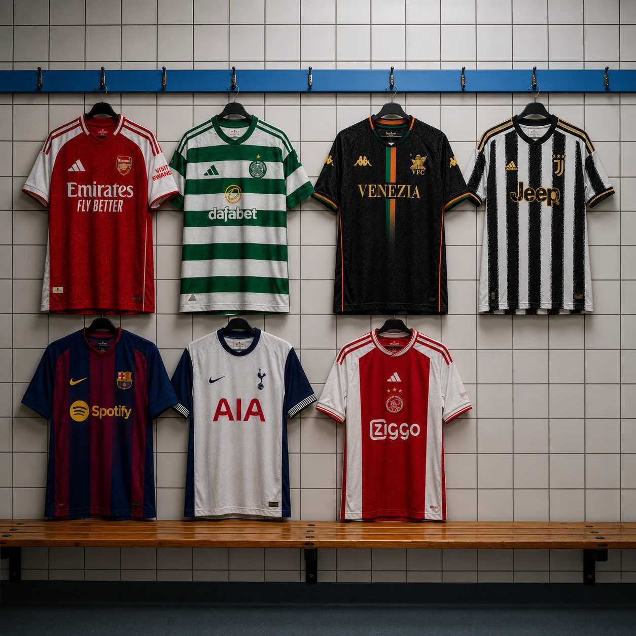
Not every rebranding exercise turns into a cautionary tale. The most successful football club rebrands tend to understand a subtle principle: supporters will often embrace simplification if it feels like clarification rather than replacement.
Tottenham Hotspur‘s rebrand is a good example of this. Over successive redesigns, the club steadily refined its famous cockerel emblem, removing shields, decorative flourishes and secondary elements until only the bird standing on the ball remained. The modern mark feels contemporary and highly adaptable in digital, fashion and commercial contexts, yet still preserves the silhouette that supporters have recognised for decades.
In 2018, Lille OSC followed a similar path, replacing a more literal heraldic crest with a geometric stylisation of the club’s mastiff symbol. The redesign was cleaner, sharper and unmistakably modern, yet crucially retained the core iconography and regional references with which supporters identified the club. These cases both illustrate an important distinction in football branding: fans are usually willing to accept evolution when they can still recognise themselves in it. The problem is rarely modernisation itself. Rather, it is the feeling that history has been discarded rather than translated.
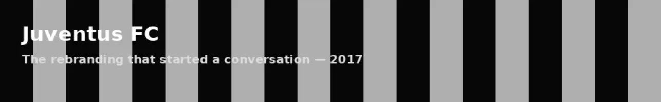
In January 2017, Juventus replaced their traditional heraldic crest, which featured black-and-white stripes, a bull representing Turin and a star, with a stark, geometric double ‘J’ in black and white. Fans reacted immediately and largely negatively. Many felt that the new logo stripped away decades of visual heritage in favour of something that resembled a fashion label more than a football club.
However, Juventus was explicit about its intentions, and its reasoning was coherent. The club wanted to move beyond football and become a lifestyle brand, competing in streetwear, fashion collaborations and digital culture. A complex heraldic crest is not suitable for the back of a luxury hoodie or as an app icon on a lock screen. A bold, geometric wordmark does.
In retrospect, the controversy turned out to be a preview of a much larger shift. Two years later, Juventus collaborated with Palace Skateboards and Adidas on a fourth kit and lifestyle collection featuring neon green Palace accents on the iconic black-and-white stripes. This collection sold out within hours of its release and appeared on resale platforms at multiples of the retail price on the same day. The brand that had seemed to be abandoning football was actually redefining what a ‘football brand’ could be.
The Juventus case is an example of the tension at the heart of contemporary sports branding, balancing serving the fans who built the club with attracting the audiences who will sustain it commercially. There is no clean resolution. It’s a matter of choosing which tension you are willing to live with and being able to articulate your reasons clearly.
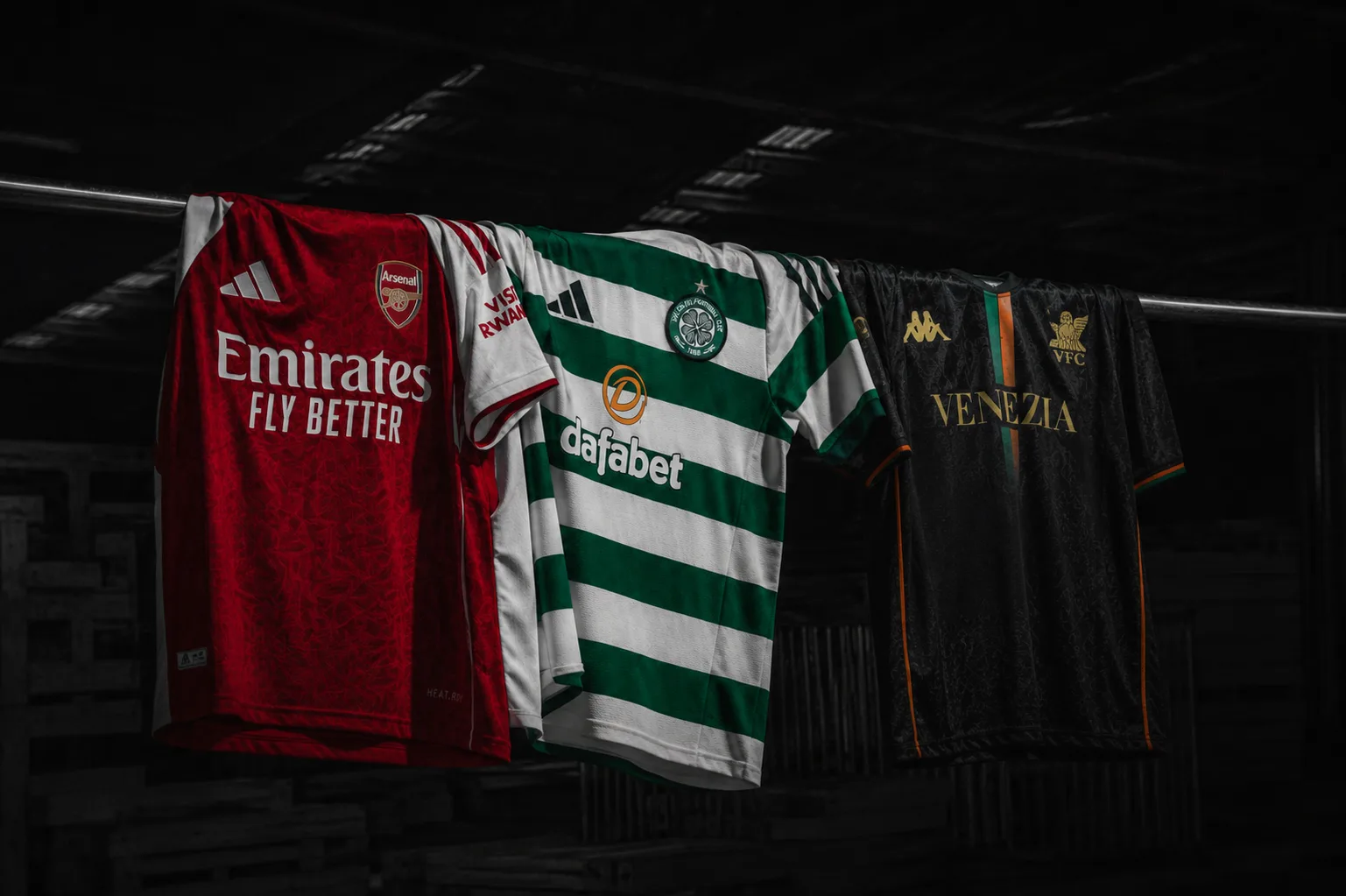
While the Juventus rebranding was provocative, what happened at Venezia FC from 2020 onwards was even more radical: a small second-tier Italian football club explicitly deciding to compete on aesthetic rather than sporting terms.
When the club was taken over, Ted Philipakos was appointed Chief Marketing Officer with a remit that would have seemed absurd at most clubs: to rebuild the brand around identity and cultural positioning rather than results. Philipakos appointed the New York-based studio Fly Nowhere as the creative agency of record and decided to take the kit design away from Kappa’s in-house template system, commissioning it as an independent creative project instead.
The palette was already extraordinary: black, orange and deep green – Venice’s historic colours. The question was what to do with them. From 2021 onwards, the answer was kits unlike anything else in football. They referenced Venetian history, the winged lion of Saint Mark, the prow of the gondola and the gold that runs through the city’s visual DNA, without ever seeming like a heritage pastiche. They were modern, considered and genuinely beautiful.
In 2022, the club furthered their creative partnership by collaborating with Bureau Borsche, a Munich studio led by Mirko Borsche whose clients include Adidas and Gucci, as well as cultural institutions beyond the world of sport. Bureau Borsche redesigned the club’s crest, returning the winged lion to its original gold and redrawing its abstract wing to reference the ferro da proa, the iron prow of the Venetian gondola. Every element had a purpose. Nothing was decorative without being meaningful.
GQ called Venezia “the world’s most fashionable football club“. The kits appeared in the feeds of fashion editors who had never previously followed Serie A, and were worn at fashion weeks in Milan and Paris. They were also endorsed by Maneskin, The Libertines and Italian cinema legend Franco Nero. Limited editions were treated as collectibles on the secondary market.
Venezia did not try to beat Juventus at football. It became more interesting than Juventus in the world of fashion. That is no consolation prize. It’s a strategy.
Venezia’s success demonstrates that, in the attention economy, cultural relevance and sporting results can be entirely separate. A club can play in the second tier of Italian football while simultaneously being one of the sport’s most widely discussed brands. The shirt is the product. Identity is what creates value.
The Nigerian kit and the PSG x Jordan collaboration were both released in 2018, marking a turning point in the cultural status of the football shirt.
We have already seen the impact of the Nigeria kit: three million pre-orders, crashed servers and queues forming for resale before most people had even woken up. Equally important is understanding why. Nike’s design for the Super Eagles reimagined the geometric pattern of Nigeria’s celebrated 1994 World Cup shirt for a new generation: it was bold, unapologetically African and completely unlike anything else in international football. It did not try to appeal to everyone. Instead, it spoke with precision to a particular cultural identity and, in doing so, became irresistible to a far wider audience who recognised its authenticity. In an era of algorithmic homogeneity, specificity is its own form of differentiation.
PSG x Jordan operated on a different logic, but came to a similar conclusion. The Jumpman logo on PSG’s Champions League kits was not just a sponsorship badge; it was a declaration that the two brands shared the same cultural space: elite performance, urban cool and aspirational swagger. The resulting kits existed simultaneously in the worlds of sportswear, streetwear and fashion. They were worn to nightclubs as readily as to the Parc des Princes stadium. They demonstrated what Nike had been showing in basketball for three decades: that sports uniforms can be cultural objects with value far beyond the arena.
Both cases point to the same shift. The football shirt had ceased to be a secondary product , a souvenir or replica merchandise. Instead, it had become the primary cultural output for certain clubs and national teams. More people owned a Nigeria 2018 shirt than watched Nigeria play in 2018. This inversion is a new phenomenon. It changes everything about how football brands should think about design.
1. The best brands have stories that predate their design.
Ajax’s eleven lines, Boca’s Swedish ship and Barcelona’s Catalan stripes are not the result of decisions made in a brand workshop. They are the result of history, chance and the accumulation of a community. The design team’s job is to identify what is already true and give it shape. The most enduring brand identities are excavations, not inventions.
2. Colour is the most powerful and dangerous tool.
The Cardiff City crisis was not about a logo. It was about a colour. When the club changed from blue to red, supporters felt as though a different club was wearing their name. Colour triggers emotional responses faster than any other visual element and changes to it are experienced more intensely than changes to typography, layout or form. Handle with proportionate care.
3. Simplicity is subtraction with memory.
Ajax’s minimalist logo, Arsenal’s uncluttered silhouette, Tottenham’s refined rooster and Lille’s geometric mastiff all demonstrate the same principle: simplification only works when the core identity remains intact. The best redesigns do not erase history — they distil it. Fans are often far more open to modernisation than executives assume, provided they can still recognise themselves in the symbol. Simplicity is not about removing meaning. It is about removing everything that obscures it.
4. Whether you like it or not, the audience owns the brand.
Cardiff, Leeds and Everton are examples of communities that have successfully claimed ownership of their brands. Ultimately, the community’s claim is stronger. Fans will tolerate evolution when it feels respectful, but they will revolt if it feels careless, generic or imposed from above. This is the price of loyalty. Most brands would gladly pay it.
5. Cultural specificity beats universal appeal.
Nigeria 2018 worked because it was not designed for everyone. The same was true of Puma’s Africa Unity project, Morocco’s World Cup iconography in Qatar and Venezia’s hyper-local Venetian aesthetic. In an era of algorithmic sameness, specificity is spectacular. Brands that travel furthest culturally are often the ones least afraid to be identifiable as coming from somewhere specific.
6. The product is the communication
Venezia does not spend heavily on traditional advertising. The kit is the campaign. When a shirt is so beautiful that fashion editors want to photograph it and musicians want to wear it, it generates a level of cultural distribution that no media budget could buy. Investing in the product itself rather than communication about it is a principle worth considering in every category.
7. Scarcity is not a supply chain failure; it is a feature.
The most coveted kits of recent years have all been difficult to obtain to varying degrees. When scarcity is attached to genuine quality and cultural resonance, it generates desire rather than frustration. Brands that understand this view distribution as part of their identity, not just logistics.
8. Collaborations work when both parties bring something genuine to the table.
Take Palace x Juventus, Jordan x PSG and Bureau Borsche x Venezia, for example. These collaborations work not because they combine two large audiences, but because they combine two genuine creative identities, creating productive friction. The question for any partnership should be “What can we make together that neither of us could make alone?” rather than “How big is their audience?”
9. Small brands can have an outsized cultural presence.
Venezia is, by any conventional football metric, a small club. Culturally, however, it punches far above its weight — because it made a deliberate choice to compete on aesthetic terms rather than sporting ones. The path to relevance is often not to compete on the incumbents’ terms, but to redefine the nature of the competition.
10. Meaning accrues; it cannot be applied.
Perhaps the most important lesson from football kit culture is the most uncomfortable one for anyone in the branding business: the deepest brand meaning is not created in a studio. It develops over decades through the experiences of communities, such as victories and relegations, generational transmission and the unique atmosphere of a stadium on a cold Tuesday night. Designers can create structures that allow meaning to accumulate. They cannot manufacture the meaning itself. That part belongs to the people.
11. Identity is strongest when it exists beyond sport.
Barcelona’s Catalan symbolism, the Old Firm’s religious and political dimension, Morocco’s World Cup run and Arsenal’s North London identity all reveal the same truth: football brands become powerful when they stop functioning merely as sporting entities and start acting as cultural containers. Shirts matter because they carry language, geography, memory, politics, migration, class and religion. The deeper the connection to life outside of football, the more durable the identity becomes emotionally.
Every season, football clubs around the world release new kits. Most are forgotten within months. However, a few, perhaps one or two per generation, manage to transcend their status as mere merchandise and become cultural artefacts that carry part of who you are.
The Nigeria 2018 kit. The Venezia black-and-gold. The Barcelona ‘blaugrana’ worn under a dictatorship. The Ajax badge with its eleven lines. The Boca Juniors sash, chosen by a ship. These are not examples of great marketing. They are examples of design genuinely serving something that matters: a community, a city, a history or a moment.
Ultimately, that is what the most powerful branding is all about. It’s not just a beautiful surface applied to an empty object. Rather, it is a shape given to something that was already real.
The question for any brand, whether they make football shirts or anything else, is not ‘How do we make people want this?’ It is: what is already true about us that is worth making visible?