June 15, 2026
CSR That Actually Delivers: A Design Sprint for Two Purpose-Driven Organisations
Share this article
What happens when a branding agency spends a day doing design work for organisations that genuinely need it? During a focused creative sprint, two Admind teams worked in parallel: one with Kooperatywa Spożywcza “Dobrze”, Warsaw’s pioneering food cooperative; and one with ŻyWa Pracownia, a Krakow-based social enterprise that combines craft, community and inclusion.
The sprint began long before any design work started, with an open call within Admind. Everyone at the agency was invited to nominate organisations that they thought deserved professional design support, including: NGOs, social enterprises, cooperatives and community initiatives. The only requirements were that the organisation had a genuine need and a clear mission.
Nominations were submitted, and then the team voted. It was a democratic process: anyone at Admind could contribute, and the two organisations with the most votes progressed to the sprint. Kooperatywa Spożywcza “Dobrze” and ŻyWa Pracownia ended up on the list in this way.
This origin matters. When a project is chosen by the people who will actually do the work, rather than being assigned from above, the level of commitment is different from the outset.
The workshop brought together two organisations that were both purpose-driven and under-resourced in the design department, but which both had a strong sense of who they are. One was based in Warsaw and the other in Kraków. Each organisation was assigned a dedicated design team and a specific project brief. This article looks at both organisations.
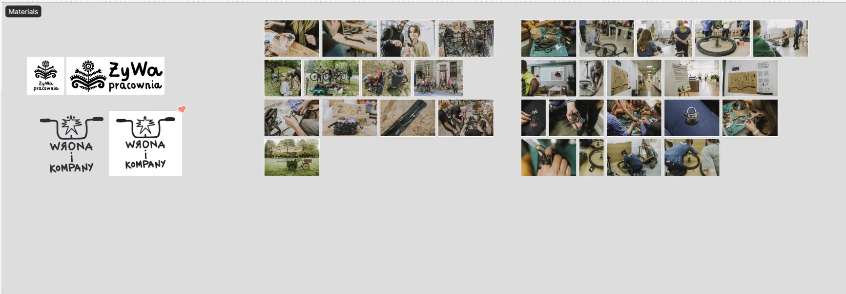
ŻyWa Pracownia (ul. Celna 5, Kraków) is an interdisciplinary studio that has been combining craft, design, architecture and urban gardening for over 13 years. Operating as a social enterprise, it reinvests all income into its public benefit activities, with inclusion at the heart of everything it does. This includes running workshops for people experiencing homelessness, people with disabilities, refugees, seniors, and children.
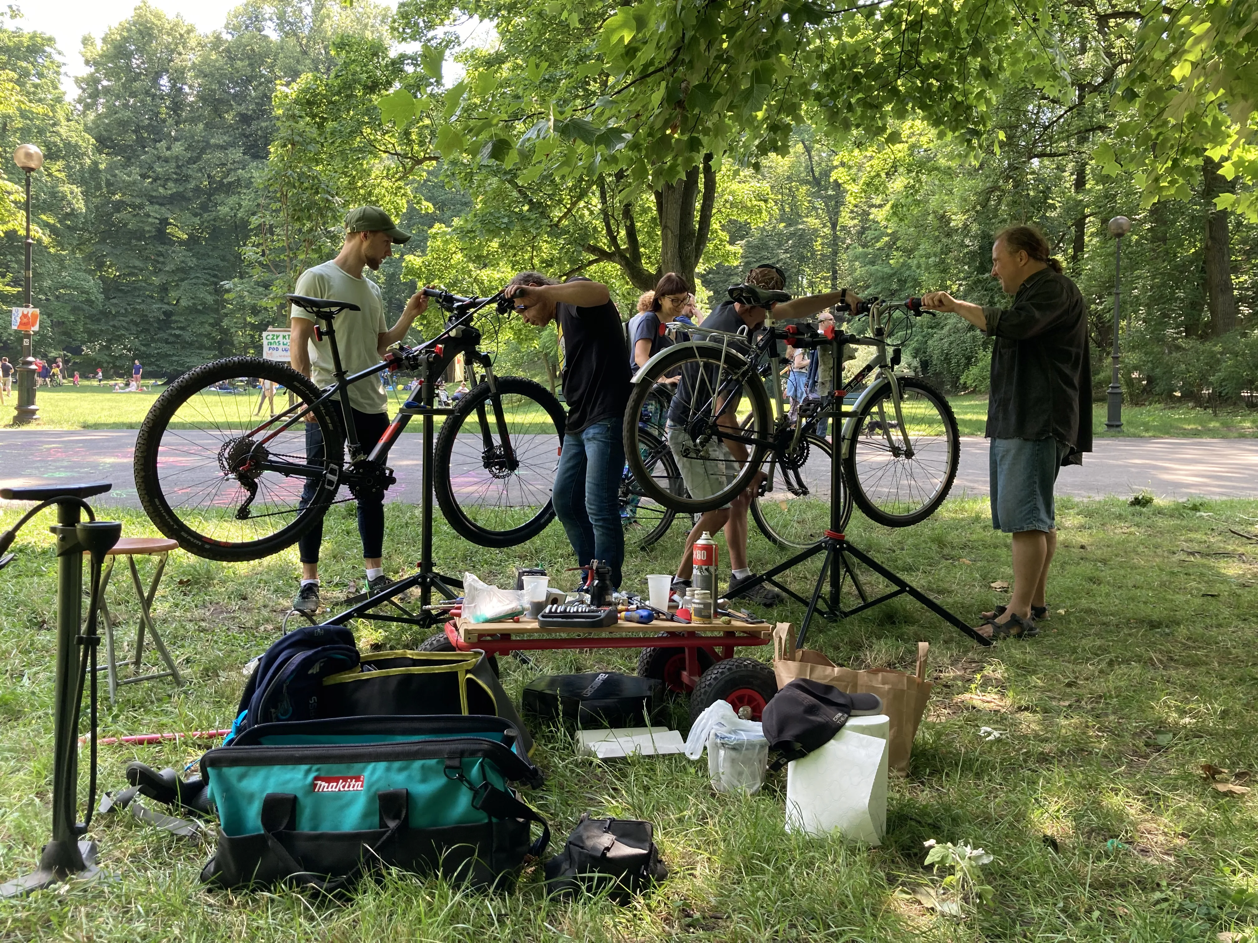
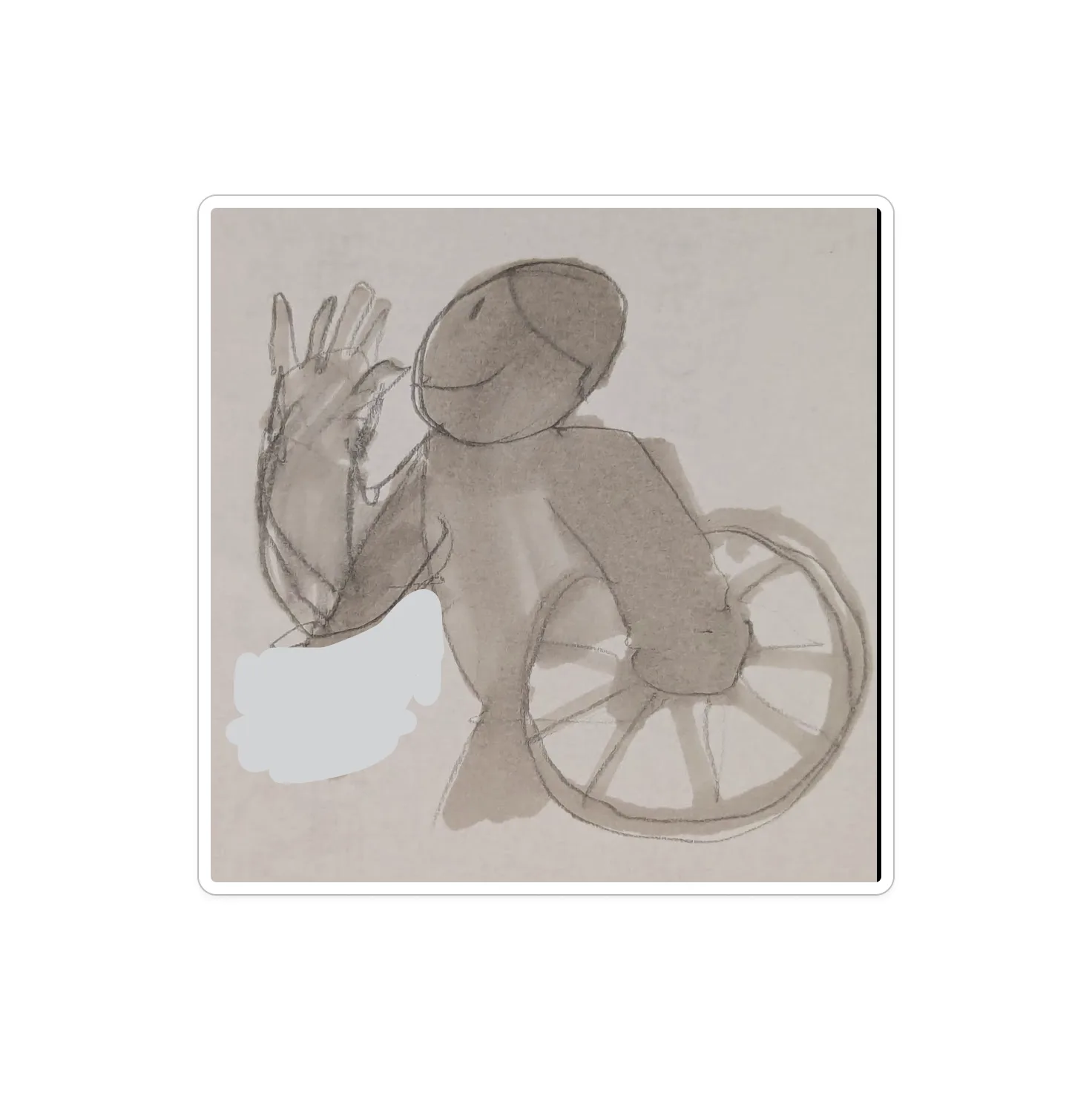
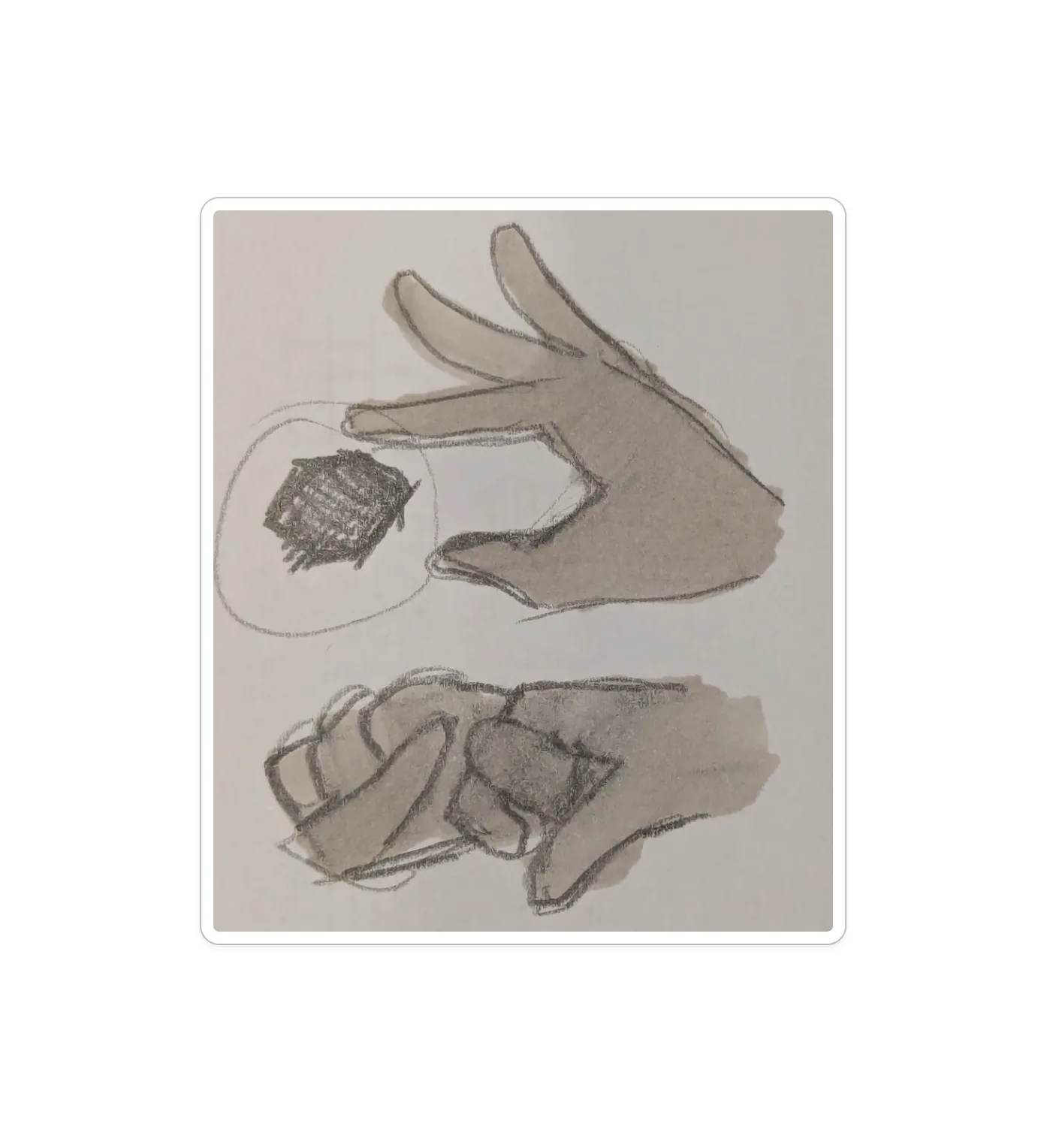
During the sprint, the focus was on a specific and very tangible initiative: a bicycle repair programme designed to support people in the process of vocational activation. ŻyWa Pracownia had already gathered a stock of donated bicycles in need of repair, and participants from the programme — people rebuilding their footing in the labour market — would take part in fixing them as part of their skills development. The communication challenge was threefold: recruiting volunteers with practical repair skills, raising funds to cover the cost of new parts, and telling the human story behind the initiative in a way that felt dignified and real rather than charity-adjacent.
The team’s task was not to create finished assets, but to establish a visual direction and a set of implementation proposals — a creative foundation that ŻyWa Pracownia could continue building on. The output included concept-level layouts for Facebook and Instagram posts across three communication modes (recruitment, fundraising and storytelling), a colour and typography direction rooted in ŻyWa’s existing identity, and guidance on how to adapt the materials over time without losing coherence. The brief explicitly ruled out stock photography and AI-generated imagery — everything had to feel as authentic as the initiative itself.
The team of Arek Haratym, Wiktor Skawski, Jędrzej Chojnacki and Karolina Dubaj brought both sensitivity to the social context and a clear visual instinct to a brief that required both. Working with an organisation whose visual DNA is rooted in handcraft and human presence, they developed proposals that felt like ŻyWa — not like a campaign imposed from the outside.
Kooperatywa Spożywcza “Dobrze” is Warsaw’s pioneering a member-run cooperative with several locations across Warsaw (including Andersa 27, Polna 18/20 and Mińska 25C) that sources seasonal vegetables, fruit, dairy products, bread and dry goods directly from farmers and small-scale producers. The cooperative is fully transparent about the origin of each product. As the first cooperative of its kind in Poland to open a proper shopfront, ‘Dobrze’ has become a reference point for the ethical food movement in the country.
Alongside the shops, the cooperative runs a registered association focused on education, offering workshops on sustainable food systems, ethical supply chains, food waste and economic inclusion, and bringing together urban and rural communities, seniors, migrants and families with young children.
In short, this is a genuine community organisation with a social mission, not a trendy organic brand with a marketing budget.
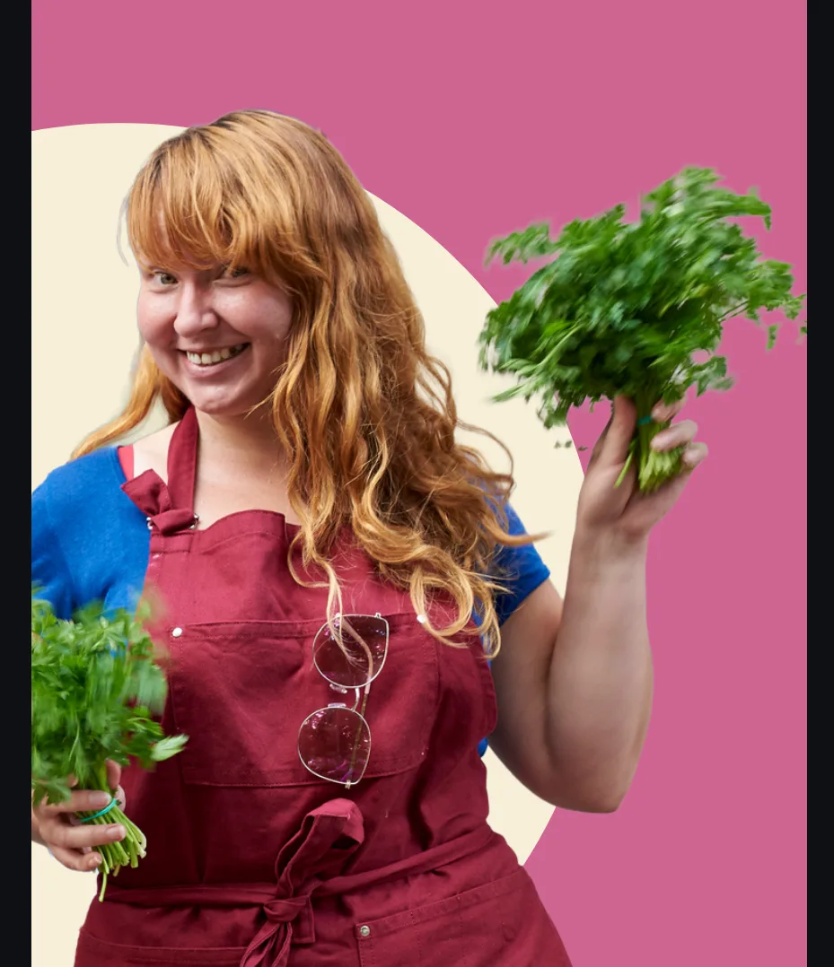
Kasia, the Marketing & External Communication Coordinator at “Dobrze”, is responsible for almost all communication. This involves writing copy, sourcing photos, creating graphics and posting, usually in Canva, on top of everything else. The cooperative has a strong visual identity, including a logo, colours and fonts, as well as a rich archive of authentic photographs from its own sessions and from suppliers. It also has a genuinely warm and honest voice. However, they lacked a system, a set of clear content pillars, each with a defined visual language, to enable them to create posts quickly and consistently without starting from scratch every time.
There were two specific constraints that shaped the entire design brief:
Yes. The key is to do the hard structural thinking at the outset, so that the person responsible for execution doesn’t have to reinvent the wheel every time.
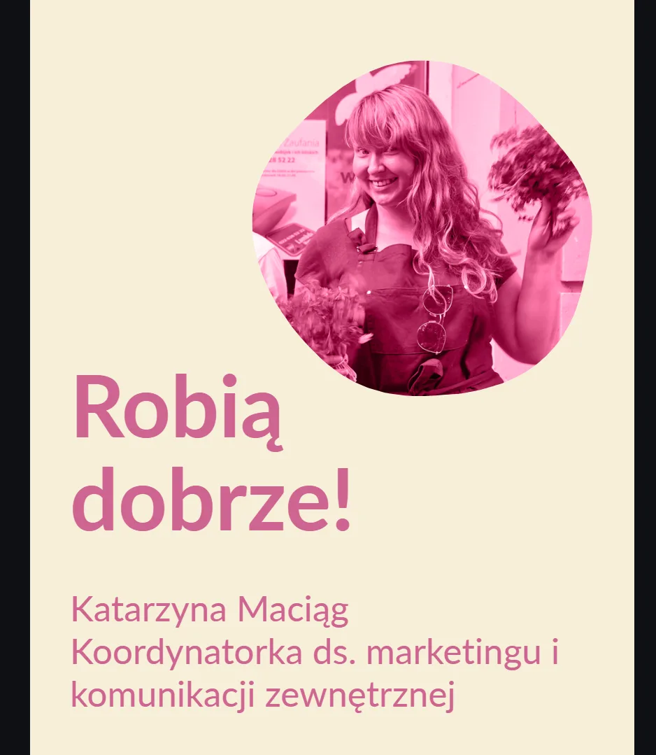
The Admind team approached this as a visual architecture problem rather than just a “make it pretty” exercise. Before creating any layouts, they categorised the cooperative’s content into five thematic pillars, each representing a distinct communication need and assigned to a specific brand colour and short, punchy claim.
Each claim plays on the name of the cooperative (‘dobrze’ means ‘well’ or ‘good’ in Polish) making the family instantly recognisable while enabling content types to be differentiated at a glance.
Each pillar had its own post template, all of which were built around the same logic: a strong, circular logo element in the pillar colour; a short body of text; and a thematic claim as a visual anchor at the bottom. The layouts are modular — photos can be displayed full-bleed or in circular crops, for example. Text zones are clearly defined, so it’s clear where headlines, body copy or CTAs should go.
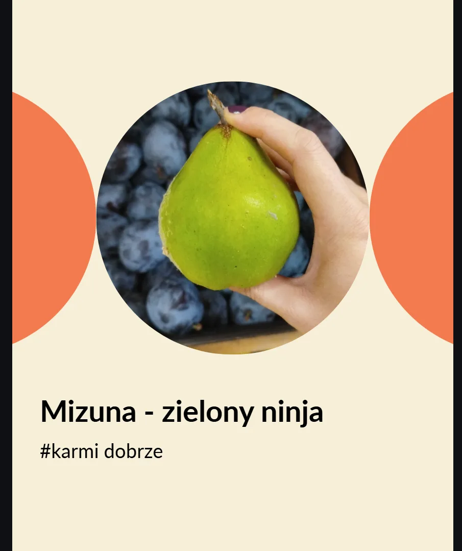
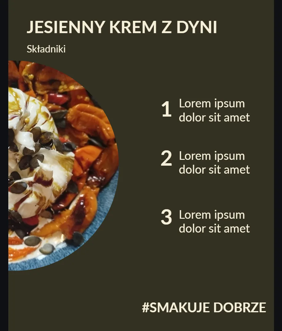
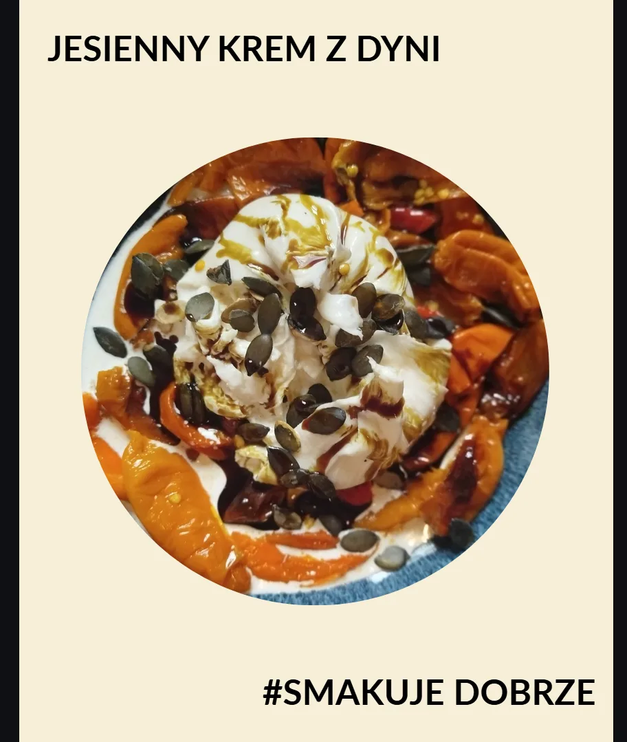
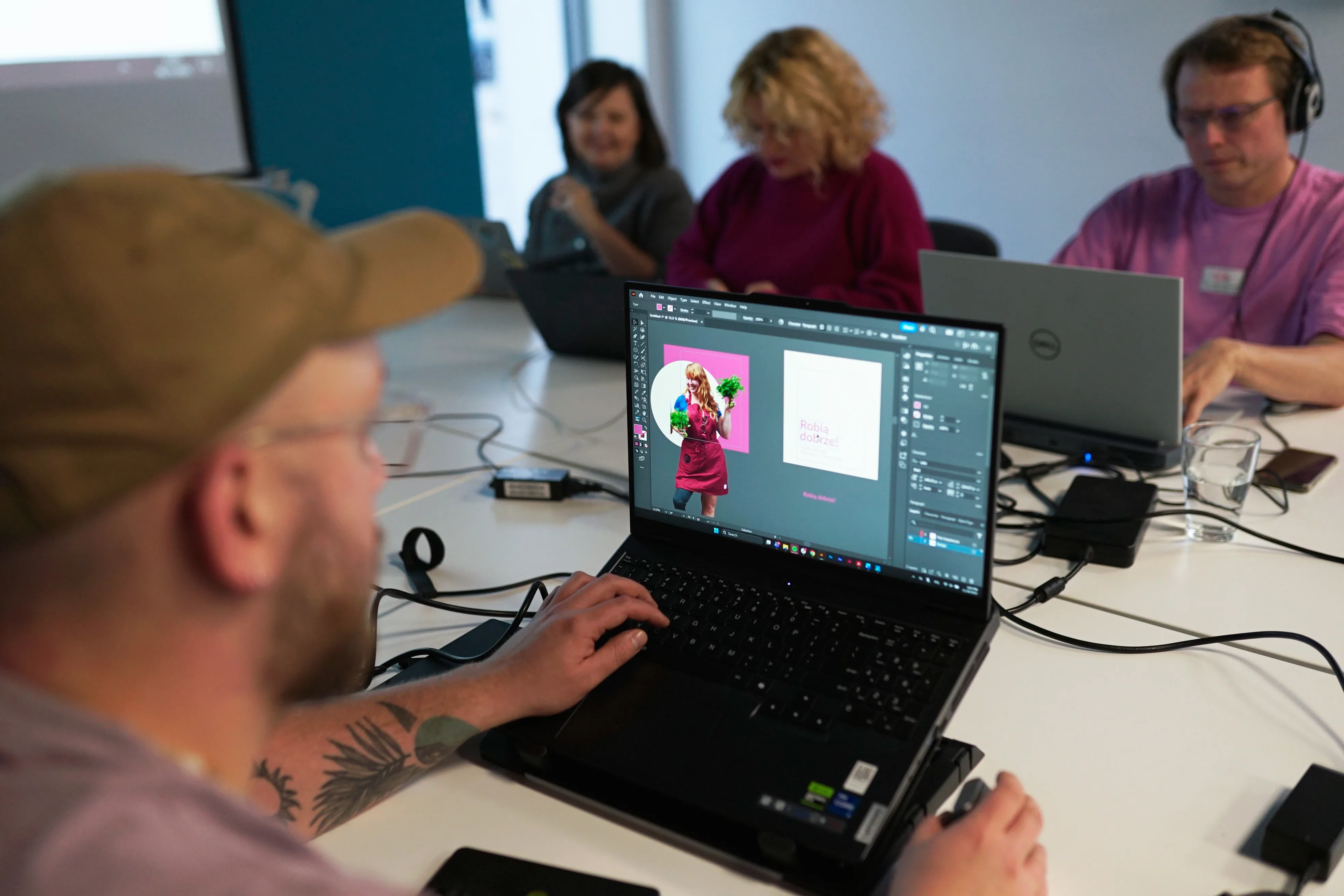
For example, the ‘People of the Cooperative’ template (pink, ‘Robią Dobrze!’) was designed to showcase the people behind the scenes: the team, cooperative members and volunteers. Kasia herself appears in the first mock-up: her photo is cut out against the cooperative’s cream background and framed by a pink circle. Her role is clearly listed below. This looks polished, yet it only takes a few minutes to replicate with a new person and a new photo.
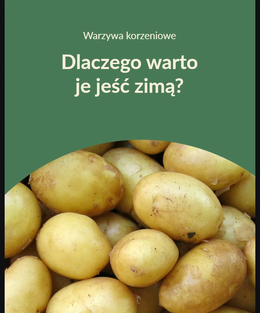
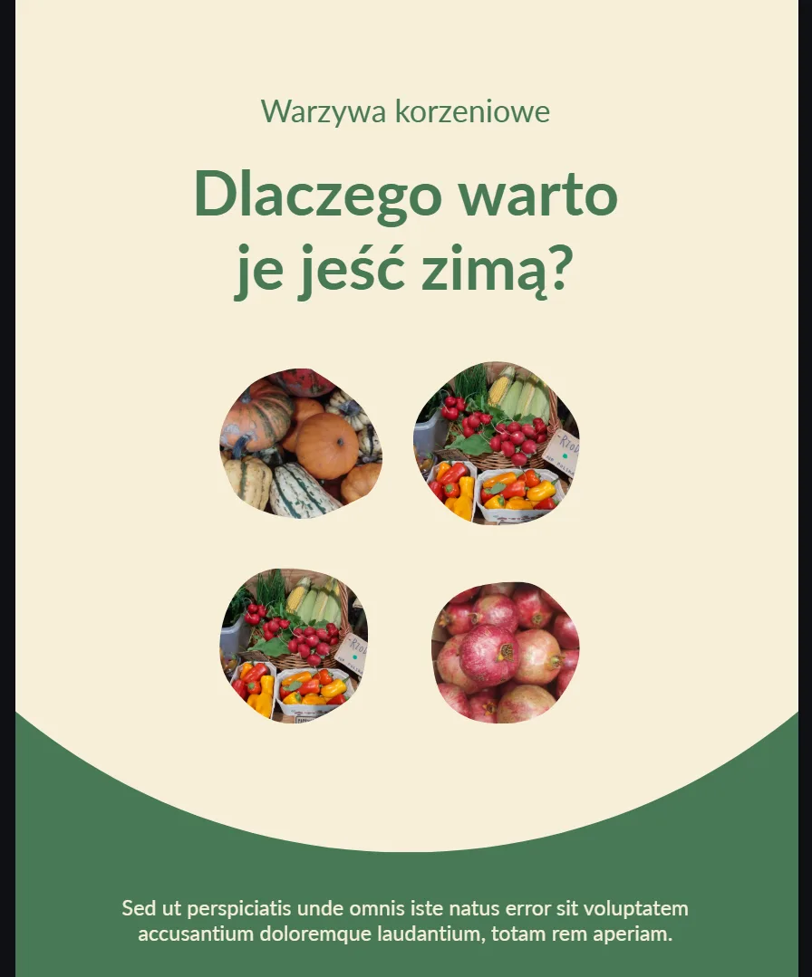
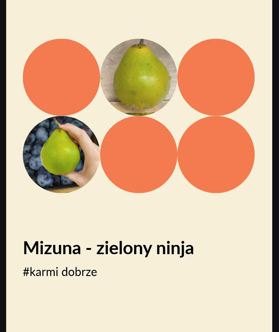
For infographic posts (green, ‘Uczy Dobrze!’), the layout fits four circular photo crops alongside a two-part heading (a category label at the top and a question headline below) as well as a text strip at the base for a short explanatory line. The post practically tells the editor what to fill in.
One quick fix you can apply right now is to start by naming your content types if you’re running social media for a mission-driven organisation and feeling overwhelmed. Even just three clear categories (‘product’, ‘education’, ‘people’) with a consistent visual cue for each category will dramatically reduce the cognitive load of posting and make your feed look intentional rather than improvised.
It does, and it’s important to be clear about one caveat: templates are not a substitute for strategy, but they can be a powerful enabler of it. Dobrze already had a clear sense of who they are and what they stand for. The workshop didn’t change that; it simply gave their voice a visual grammar.
Organisations lacking strategic clarity and visual systems will find that templates alone do not solve the problem. In those cases, the stage of defining the pillars (what are we actually saying, and to whom?) is even more important than the subsequent design work.
That said, the fit was close to ideal for Kooperatywa “Dobrze”: they have a strong identity, authentic content and a willing and capable communicator in Kasia, as well as a concrete ask. The design sprint worked because the brief was honest about constraints, and the team took these seriously rather than designing around them.
The workshop was conceived and led by Magdalena Rymarczuk and Karolina Pospischil, with project management support from Marta Filarowska, Marta Plichta and Ania Rejkowicz.
The design team working on Kooperatywa “Dobrze” comprised Wojciech Piróg, Kinga Gluch, Oliwia Głód and Paulina Krynicka – led by Michał Łukasiewicz, who took the project well beyond what a sprint normally demands. After the workshop itself, Michał put in significant hours to bring the templates to a level of finish that Kasia could use immediately, without needing to interpret or adapt anything. That kind of commitment — the refusal to deliver “good enough” when “actually useful” was within reach — is what transforms a workshop output from a folder of documents into something that gets used the next morning.
The ŻyWa Pracownia team — Arek Haratym, Wiktor Skawski, Jędrzej Chojnacki and Karolina Dubaj — approached their brief with a genuine understanding of the social stakes involved. Designing for an initiative rooted in homelessness and vocational reintegration requires a particular kind of care: the visual proposals they developed were grounded in dignity and warmth, never slipping into the aesthetics of charity campaigns. Their work gave ŻyWa Pracownia a credible, extensible starting point — not a finished product, but a clear direction to build from.
The completed work was presented to both organisations and handed over in full, with warm feedback from everyone involved.
The cooperative model, with its principles of shared ownership, transparent sourcing and community accountability, is growing in popularity across Poland and Europe. According to the World Co-operative Monitor by Euricse, the cooperative sector globally employs over 10% of the world’s working population, and it continues to expand in the food and retail sectors, particularly among younger consumers who are driven by their values.
For organisations like Kooperatywa “Dobrze”, professional design support carries a specific responsibility: not making them look like someone they’re not. The brief explicitly ruled out overly polished, aspirational aesthetics — and that was the right decision. The workshop produced templates that reflect Dobrze’s identity: warm, grounded, playful and genuine.
When design serves authenticity rather than working against it, the result is something both the organisation and its audience can trust. This is a better outcome than an award-winning visual system that the team cannot sustain.
This article was written based on Admind’s direct experience running the creative workshop sprint for Kooperatywa Spożywcza “Dobrze” in Warsaw. Statistics on the cooperative sector are drawn from the Euricse / ICA World Co-operative Monitor (monitor.coop).