Stalco – tools reimagined
Share this article
- Filter Name
-
Client
Stalco
-
Industry
Construction
Challenge
Admind has been chosen as Stalco’s partner in their rebranding journey. The main goal for Admind was to create a new coherent visual communication for all Stalco’s groups of products. Here is how we helped Stalco get a new, professional and dynamic look and feel.
For the first step, we provided a complex analysis of the Client’s portfolio, to determine their existing brand personas and product lines.
Step two was focused around incorporating the Client’s products into the new Stalco lines we came up with, and making sure we created a new appealing name and logo for each.
Thirdly, we proposed rebranding of all existing Stalco materials by introducing a new brand guide, creating new key visuals and brand elements for digital and print communication.
Solution 1: Brand consistency
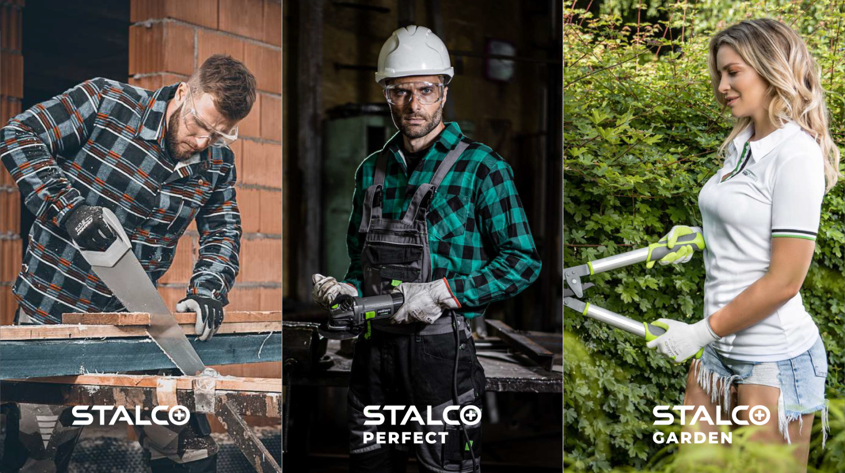
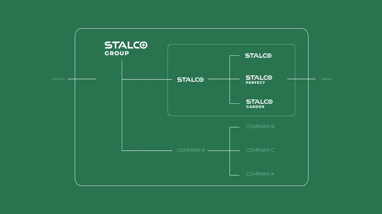
The portfolio analysis we provided resulted in 3 brand personas that led us into creating 3 new product lines and logos. From now on, the Stalco umbrella brand (now as Stalco Group) has been divided into 3 lines (brands):
- Stalco (for everyday needs),
- Stalco Perfect (for professional use),
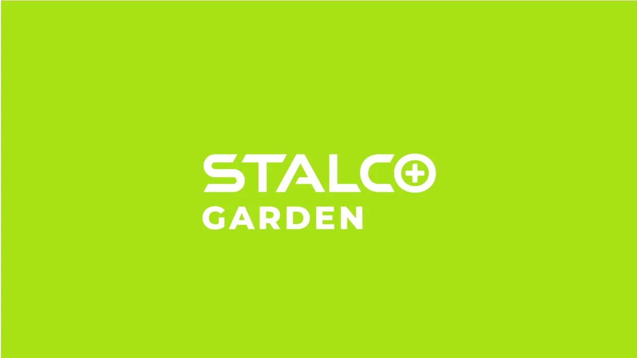
- Stalco Garden (related only to gardening).
To make sure the newly chosen brand colors are always resembling the one presented in the new Staloco brand guideline, we dedicated a significant amount of time for choosing ideally corresponding colors in PANTONE and RAL. We knew that matching the exact shades for all sorts of types of materials that the print will go on is a real challange. Each surface needs to be tested and the agency needs to make sure it works. As a result, we provided the Client with a large amount of print proofs and product samples – this way we made sure that there is no discrepancies among colors, which is often an issue while printing on many different surfaces.
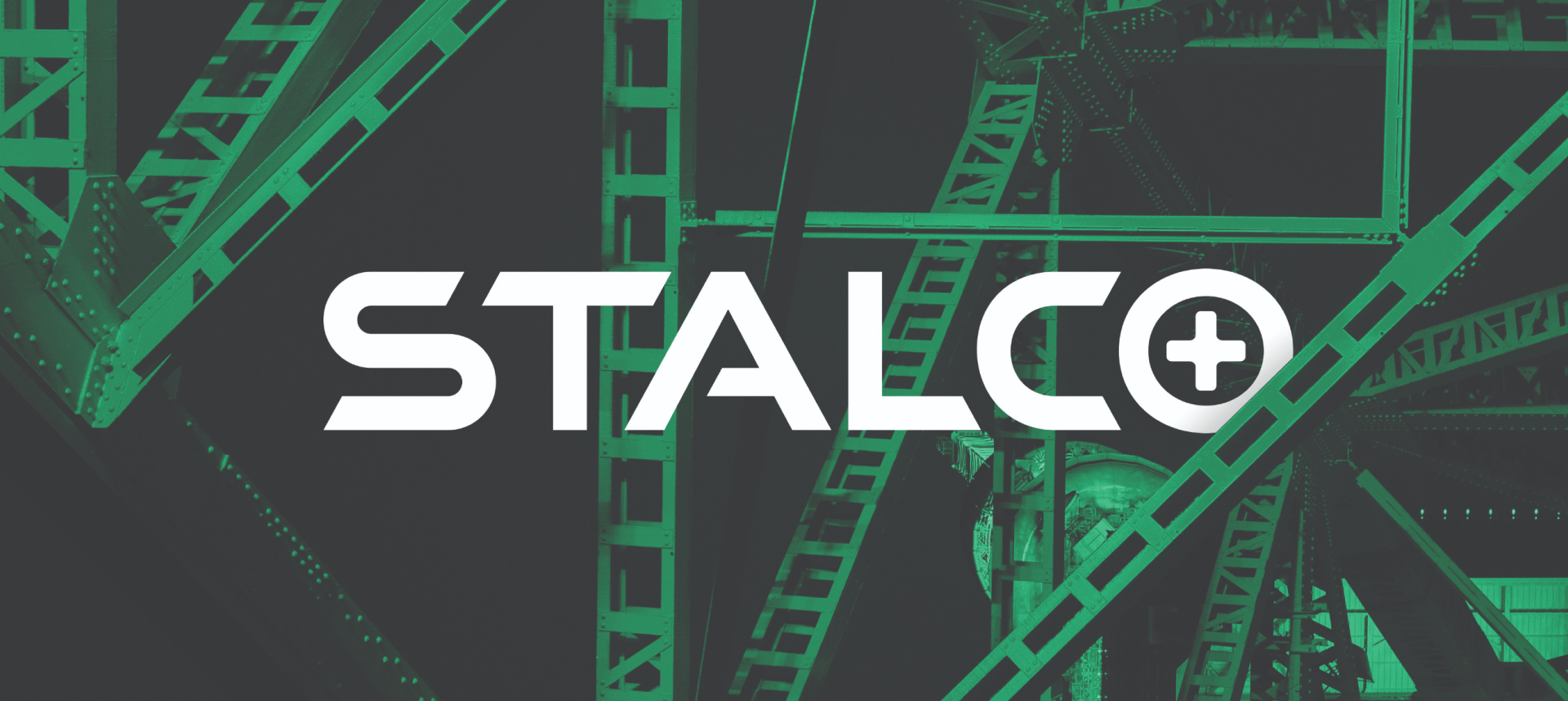
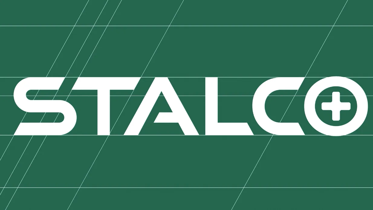
Based on the new brand colors, we refreshed the already exsiting Stalco logo, and created another two for the new lines we established.
We decided to change the look and feel of the umbrella logo to the more dynamic. The inspiration was a slanted edge. We changed it from soft and round to a more sharp shape. We adjusted lightning on the letters to make sure it corresponds with the new approach.
On the top of the new Stalco logo, we also created logos for the other lines: Stalco Pefect and Stalco Garden. Both of them has been created according to the brand new look and feel.
To make sure all the new brand elements and guidelines are easy to implement in fruther projects, we provide all of our clients with a brandbook. It’s a comprehensive brand manual that guides the Client and their team through all brand elements and communication strategy, morover it includes creative directions for all further brand deliverables.
Here it is what we included in Stalco’s brandbook.
Solution 2: creative motif
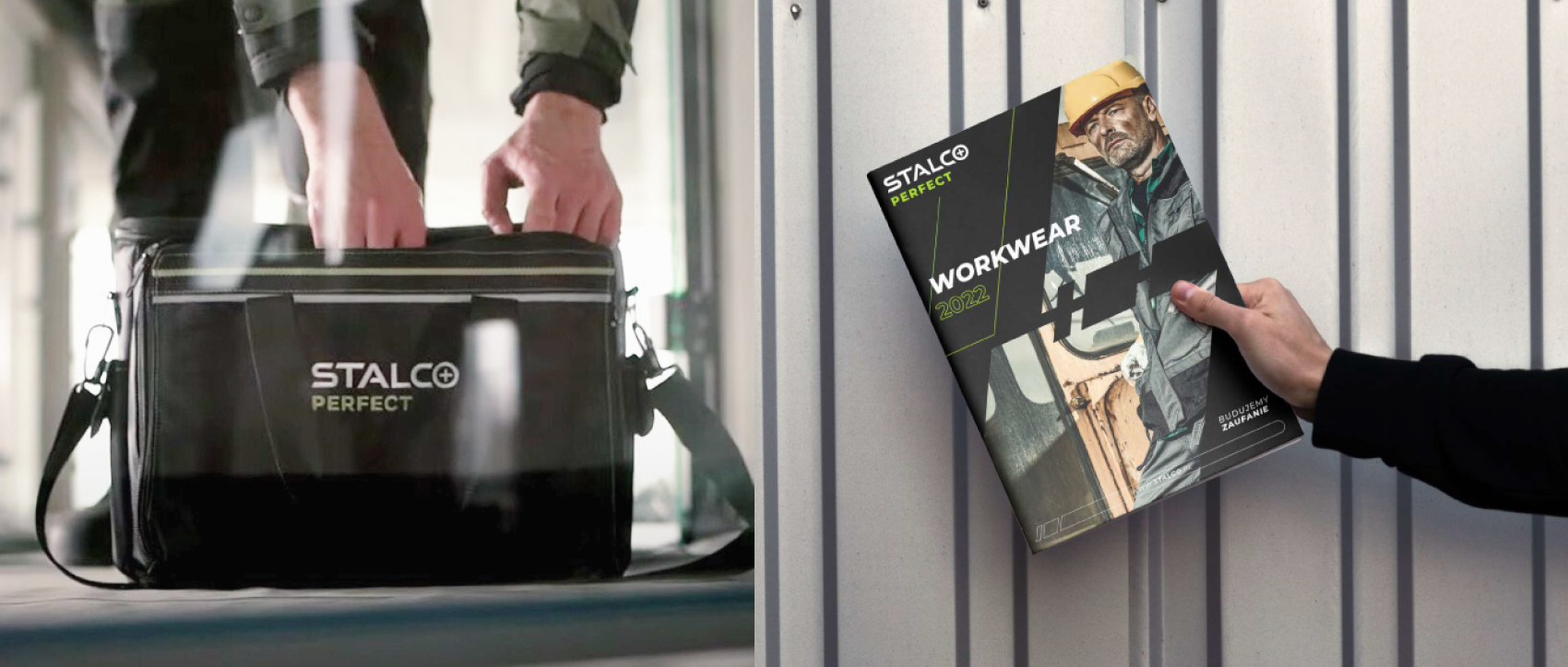
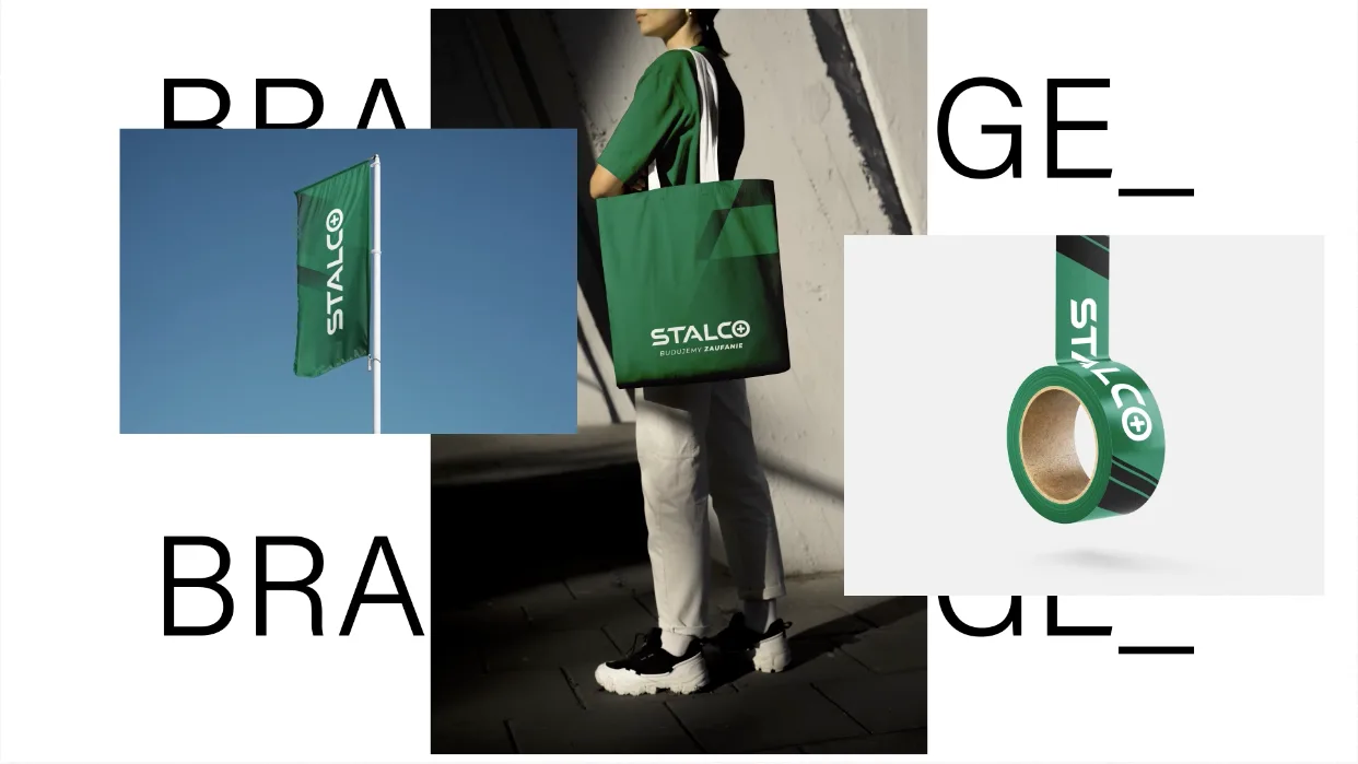
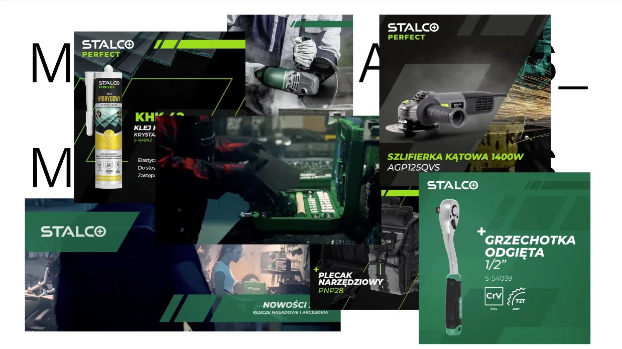
We made sure that Stalco brand manual contains not only chosen Key visual in all possible formats for the communication purposes, but also mock-ups of their products with the new logos and new branding elements and colors. In this way, Client was able to see how their new visual strategy placed on real products, and what are the indications for placing it. In the brandbook you will find mock-ups examples of merchandising, packaging and communication materials.
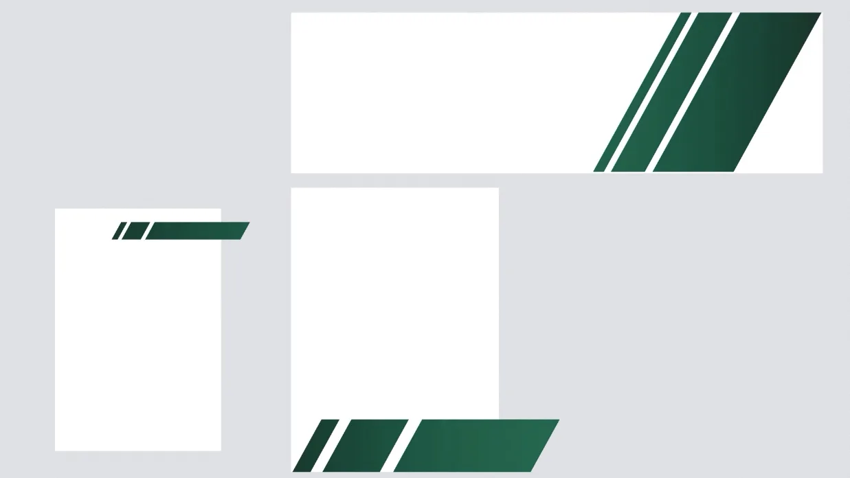
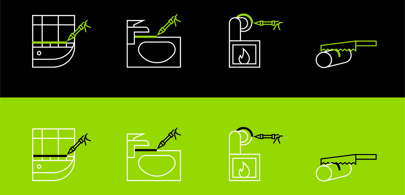
Slanted edges used in the Stalco logo became a unique brand element and the inspiration for all further designs. The chevron pattern brought an additional value of visual communication and the new color palette by giving a dynamic and strong look that embodies trust. This kind of shape is perfect for industrial brands focused around precision and professionalism.
We took the slanted edge to another level and used this shape in various combinations creating lots of possible ways of using it on Stalco products and advertising materials. It is a great example that a simple design motif can become a hero element in design, by being unique yet possibe to amplify.
There was nothing more rewarding than seeing Client inspired by our work and getting out of their comfort zone. Altough we proposed various ways of using Stalco’s new brand elements, we were pleased to see that their marketing team was encouraged to use it in many new and different ways. One of our main goals was to help Stalco improve their communication strategy, and there was no better way to do it than by creating a new look and feel that constantly inspires their marketing team to creating new deliverables.
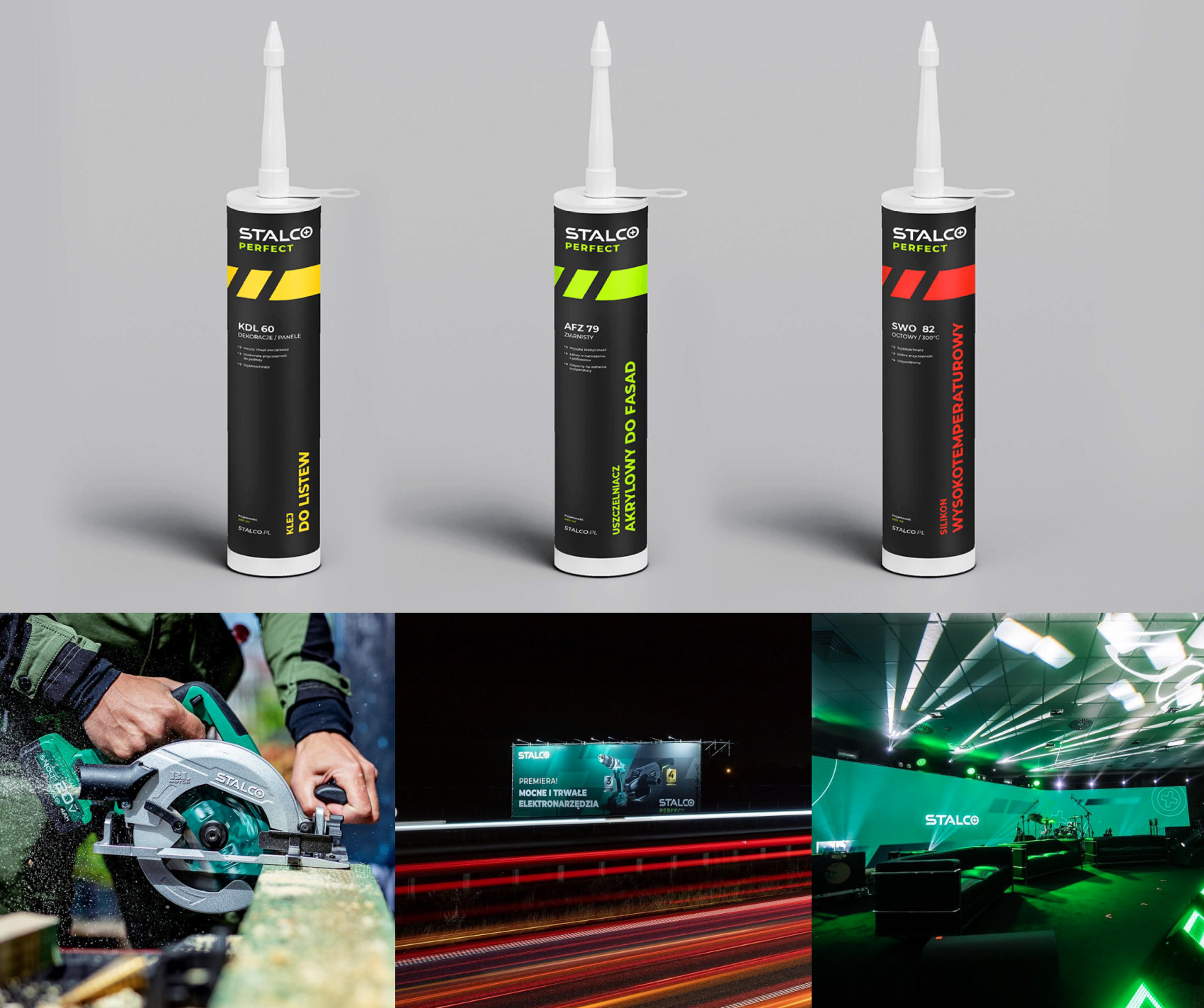
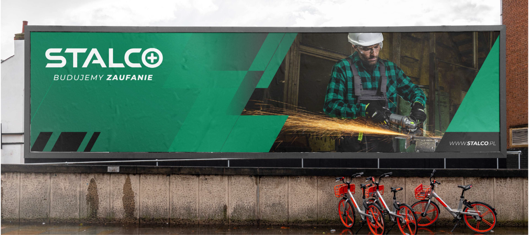
We achieved our goal of improving Stalco’s image and brand recognition not only internally, but also for all their customers. The new look and feel of the brand, supported by the eye-cacthing visual communication, is now present not only in digital and print materials, but also outdoors in their highly visible OOH communication. All these actions significantly raised their brand awareness. The new product categorization and their new fresh logos helps customers better understand Stalco’s offer. Searching for a desired item is now more intuitive and transparent. And last but not least, our proposed visual strategy resulted in an increased number of inquires, and that is the best outcome we could wish to each Client seeking our expertise. Eager to know more about the project?
Watch the interview with Marek Brol, our Design Lead, to get some valuable insights.
Let's talk!