Copernicus Festival – branding science and culture
Share this article
- Filter Name
-
Client
Copernicus Festival
-
Industry
Culture, Events, Education
Copernicus Festival concept
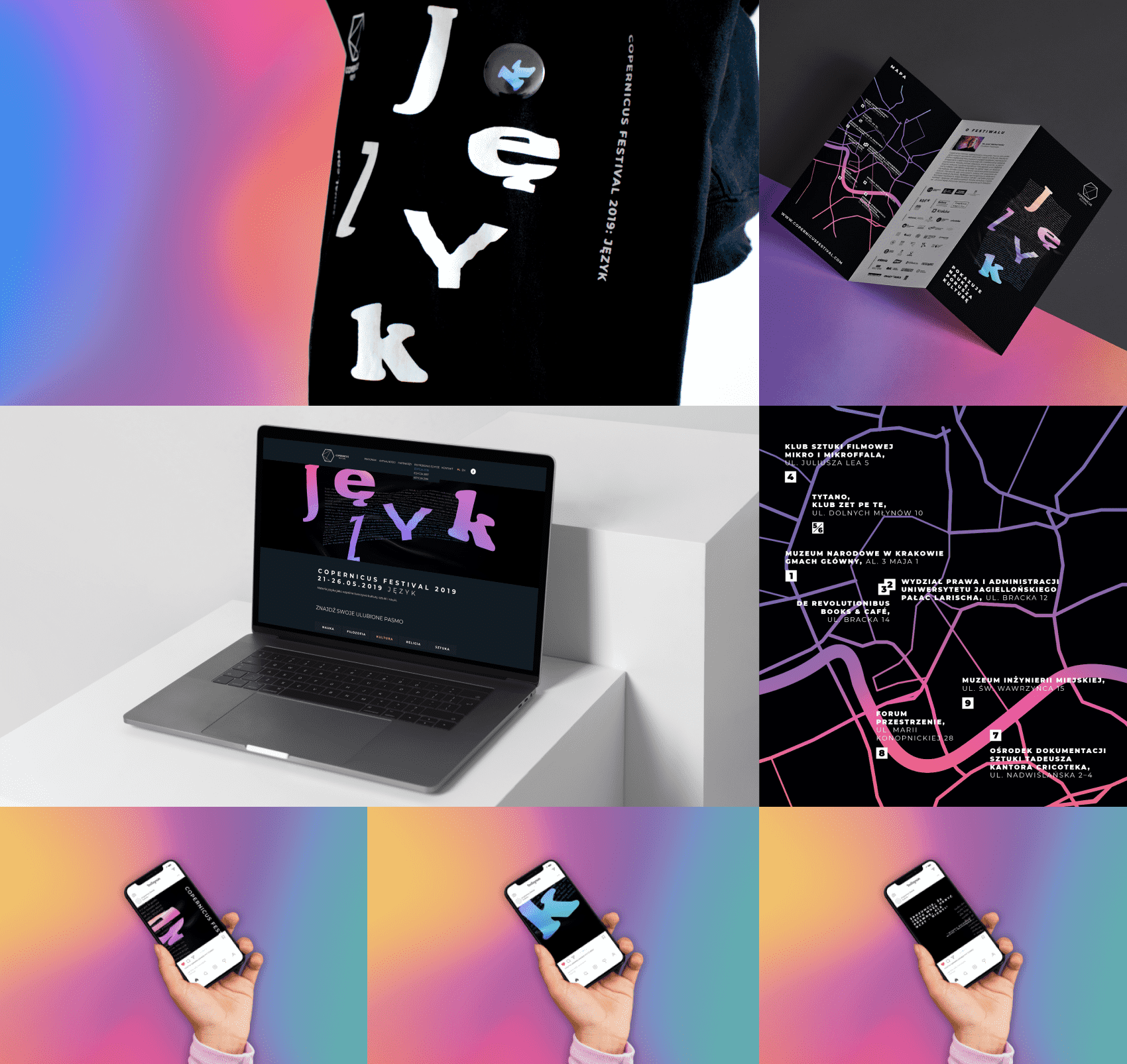
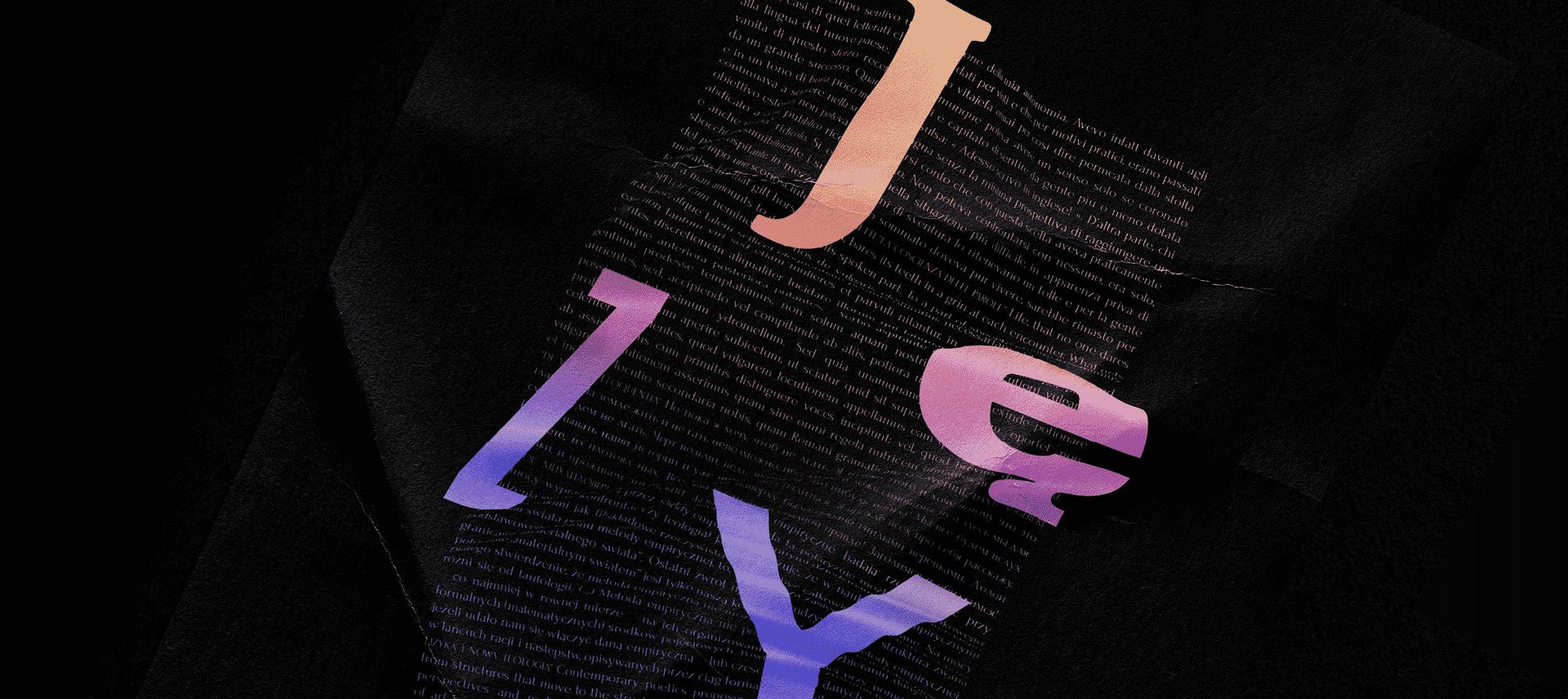
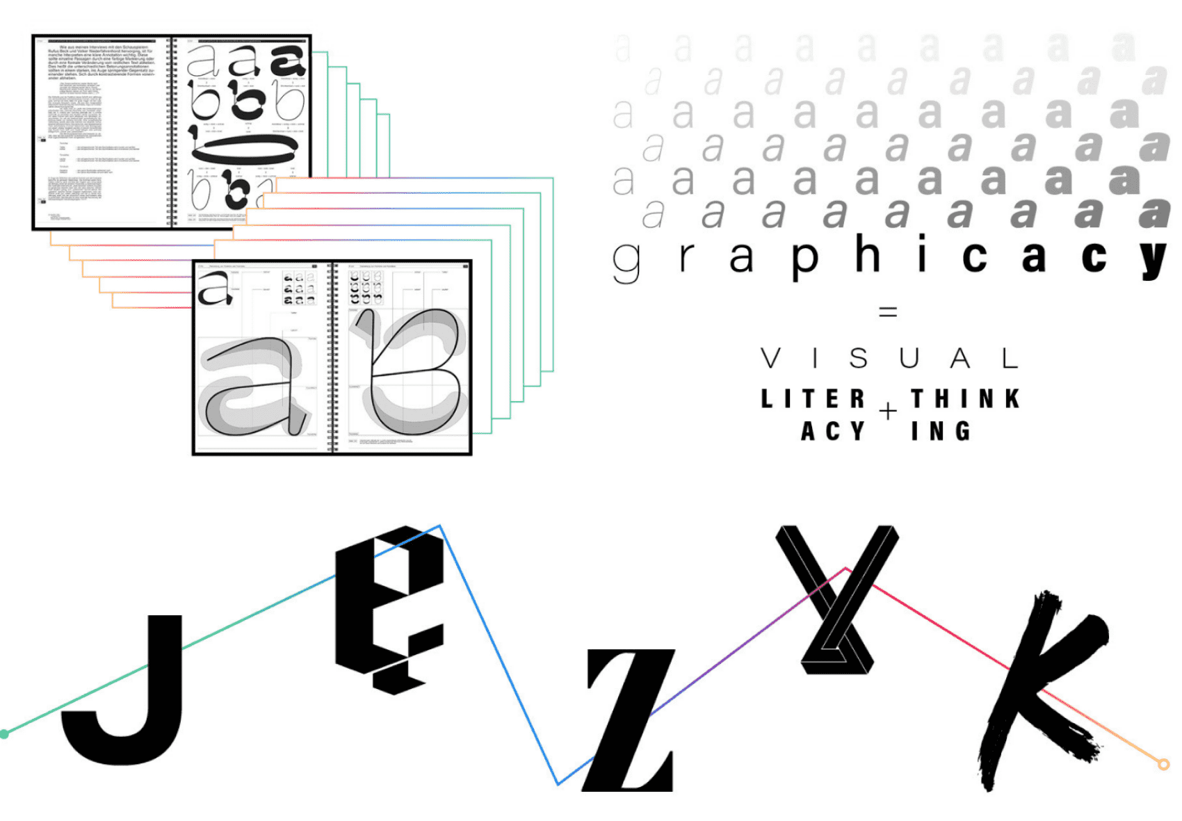
The project’s starting point was to show different aspects of language, based on five divisions present at the festival: science, religion, philosophy, art, and culture. Inspired by Max Lüscher’s color psychology theory we decided to assign different colors to each area of the festival. We have also designed original lettering, which function was to strengthen the main concept of the festival’s visual identity by using different letters in the word “język” (the word means “language” in Polish) to symbolize distinct fields of study which form it.
Problem & solution
Using different forms and shapes of the letters negatively affects the readability of the word bearing in mind that the layout of the word is not standard. In the end, we mixed existing typefaces, as the eye of the viewer assimilates better what it already has seen before. A distortion appears on the surface of the project. It takes the shape of an acoustic wave, which is a visual notation of the word JĘZYK.
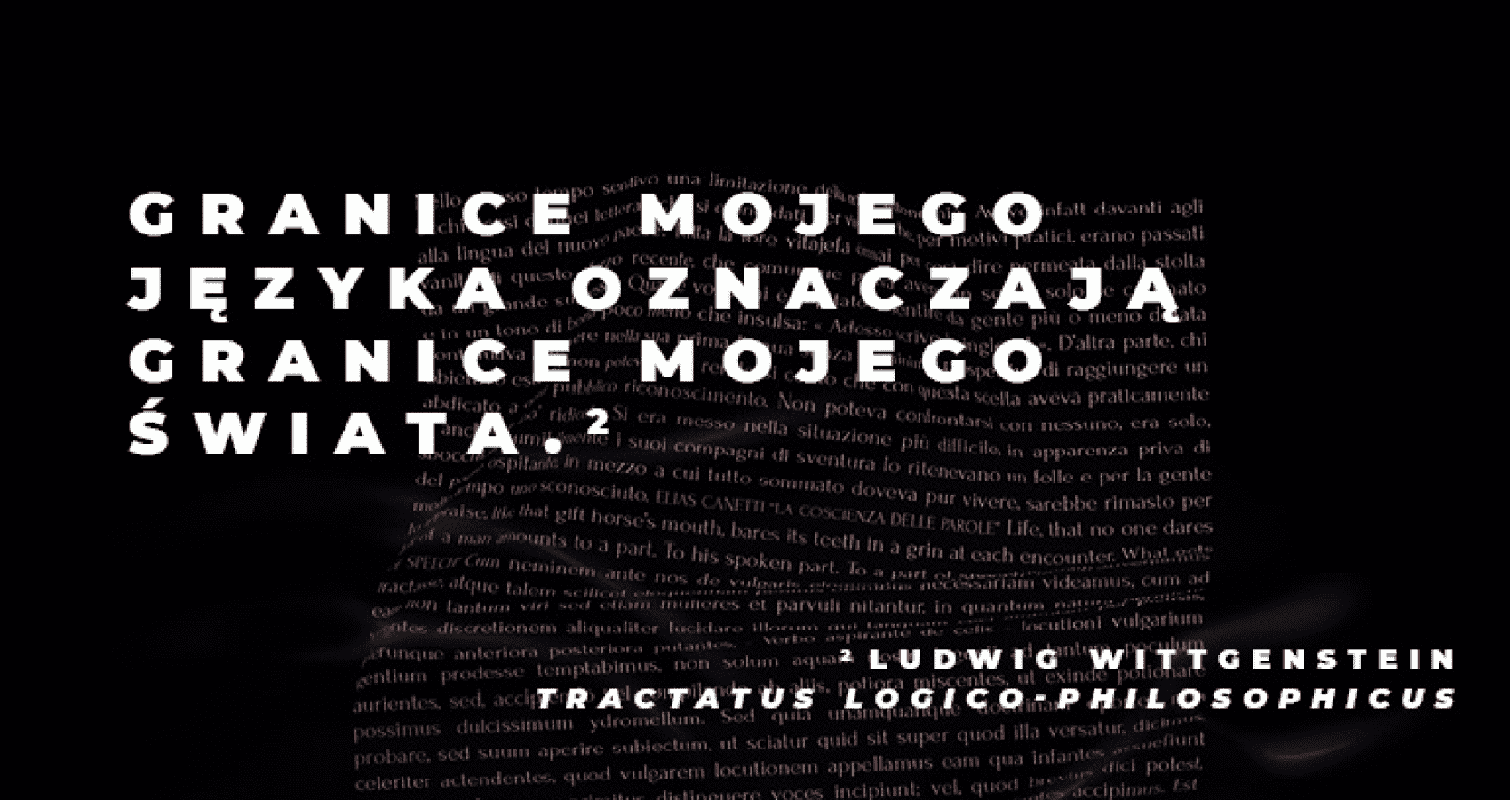
In the background, you can see fragments of classic books by Dante Alighieri, Fyodor Dostoyevsky, Joseph Brodsky, and Umberto Eco. Each one of them wrote about different aspects of language, which corresponds with our idea about the project.
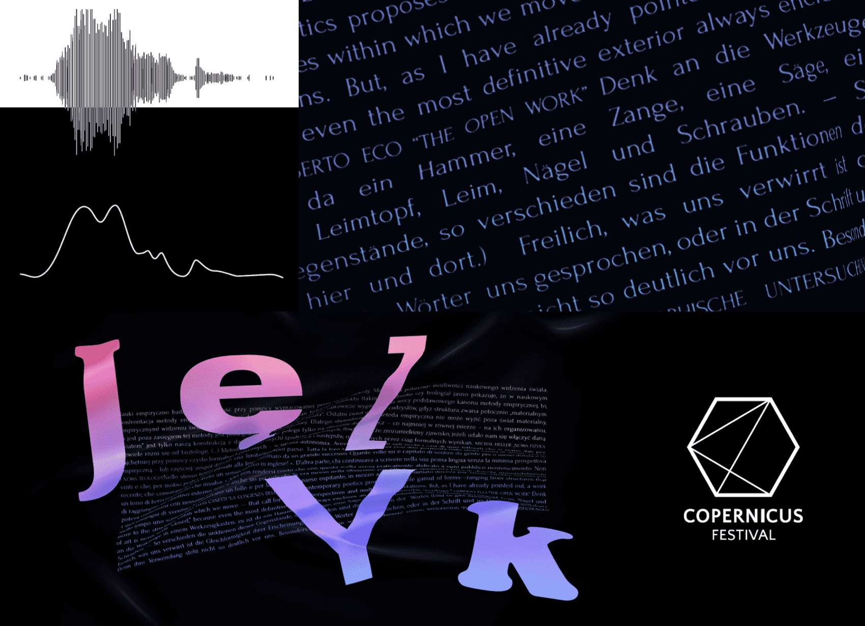
Developing the whole concept
Our work for the client included both print and digital materials. We’ve developed a new website for the festival from scratch and created graphics for social media channels. Apart from more traditional print forms such as posters, banners, and roll-ups we have also been responsible for developing a line of gadgets and other visual materials for the festival such as identity cards, lanyards, and branded walls. The gadgets were meant to be typographical fun, so we could showcase the capabilities of the key visual.
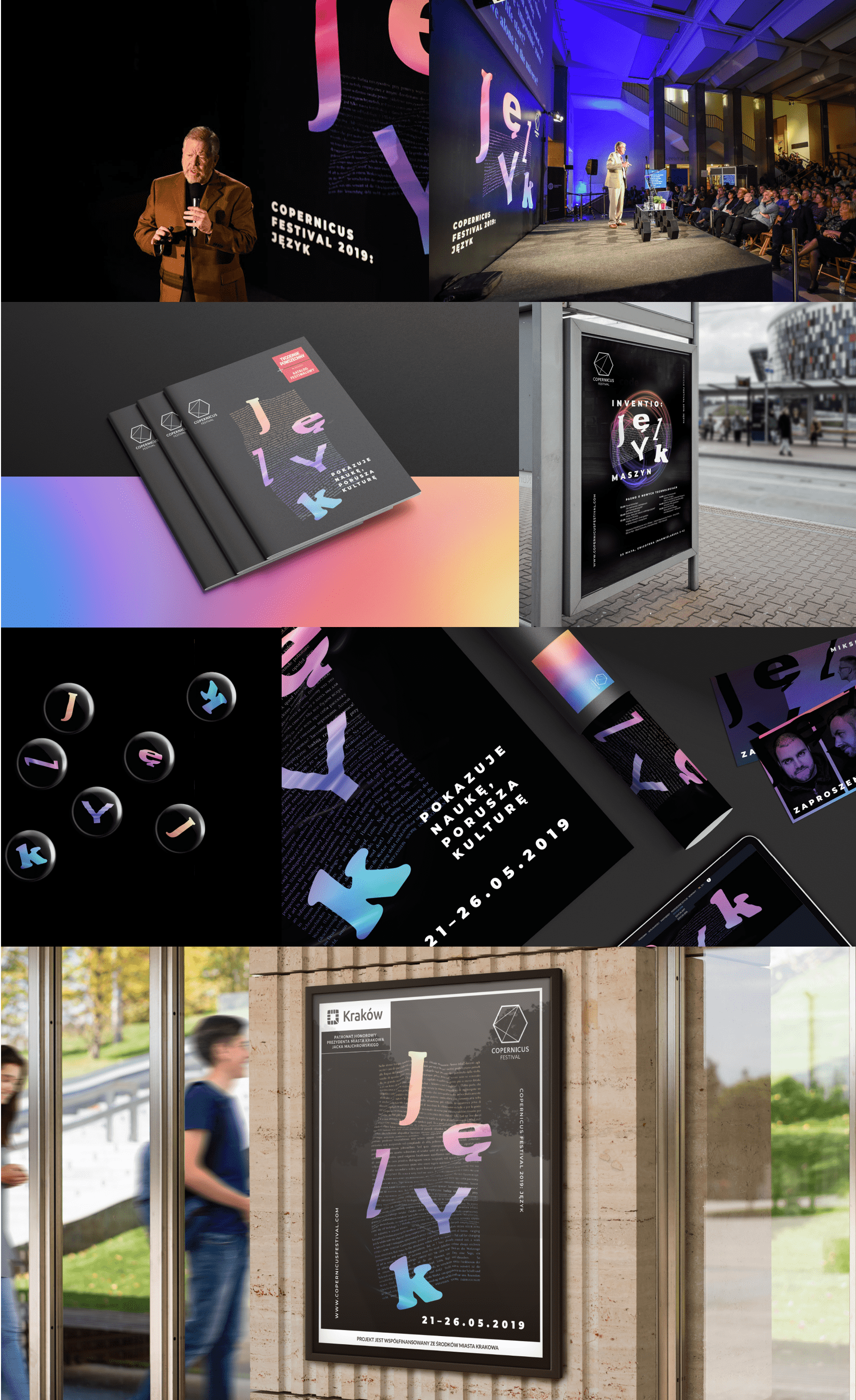
The lecture
We were also invited to help form the program of the festival by running a lecture, during which we talked about how graphic and visual messages changed over the years.
