August 20, 2024
The colour of branding: More than just a shade
Share this article

Imagine walking down a busy street. In the sea of advertisements, shop windows and billboards, certain colours immediately catch your eye. You spot a bright red that screams Coca-Cola, a rich green that evokes Starbucks and a muted purple that recalls Milka. These colours don’t just stand out; they evoke emotions and memories, creating an instant connection with the brands they represent.
Colour is one of the most powerful branding tools. It’s often the first thing consumers notice about a brand, leading to quick identification. But the magic of colour goes beyond recognition; it awakens emotions, conveys messages and even influences consumer behaviour. For example, blue tends to evoke feelings of trust and professionalism, which is why it is used by many financial institutions and technology companies. Green, on the other hand, is associated with health and nature, making it a popular choice for brands focused on wellness and sustainability. Red evokes passion and urgency, perfect for brands looking to make a bold statement. Yellow conveys happiness and warmth, while purple suggests luxury and creativity.
These emotional cues play a crucial role in defining a brand’s personality. They help communicate whether a brand is fun and playful, serious and reliable, innovative or traditional. Consider a brand like LEGO, whose bright primary colours convey fun and creativity. In contrast, a brand like Rolex uses black and gold to convey luxury and sophistication.
Cultural considerations also play an important role in the choice of colours. Colours can have different meanings in different parts of the world. For example, white is often associated with purity in Western cultures but can signify mourning in some Eastern cultures. Brands targeting a global market must carefully navigate these nuances to avoid miscommunication.
Colour is often the first thing consumers notice about a brand, leading to quick identification. For example, the red of Coca-Cola, the green of Starbucks and the blue of Facebook are instantly recognisable and strongly associated with their respective brands.
Colours evoke specific emotions and can significantly influence consumer behaviour. Different colours are associated with different feelings and qualities e.g.:
Colours help define a brand’s identity and values, communicating whether a brand is fun, serious, innovative or traditional.
The strategic use of colour can help a brand stand out from competitors in the same industry.
The use of consistent colours across all brand touchpoints strengthens brand recognition and awareness.
Research suggests that 60-90% of a person’s initial judgement of a product is based on colour alone.
Colour meanings can vary between cultures, so it’s important to consider the target audience and potential international markets when choosing brand colours.
Some brands have mastered the art of using colour to such an extent that their colours alone are often enough for instant recognition. These brands have created strong associations between their colours and their identities, allowing consumers to identify them without seeing a logo or name. Here are some prime examples:
Coca-Cola: The iconic bright red of Coca-Cola is recognised around the world. Even without the logo or name, this particular shade of red immediately brings the brand to mind, symbolising its long history and the enjoyment associated with its products.
Source: Wikimedia Commons
Tiffany & Co.: The distinctive “Tiffany Blue” has become synonymous with luxury and elegance. This unique shade of blue evokes the brand itself, often seen in its exquisite packaging and marketing materials, creating an instant association with high-end jewellery.
Source: Wikimedia Commons
McDonald’s: The combination of bright red and yellow is unmistakably McDonald’s. These colours are consistently used in restaurants, packaging, and advertising, making the brand easily recognisable even without the golden arches.
Source: Unsplash
UPS: UPS’s brown colour has become a strong identifier for the shipping company. Their trucks, uniforms and packaging all feature this distinctive brown, making them easily identifiable on the road or at delivery points.
Source: Wikimedia Commons
Facebook: The specific shade of blue used by Facebook is widely recognised as ‘Facebook Blue’. This colour is a core element of their brand identity and is used consistently across their platform and marketing materials.
Source: Wikimedia Commons
Starbucks: The green colour, particularly prominent on their cups and straws, is often enough to identify Starbucks. This green evokes the brand’s connection to nature and its focus on sustainability and quality coffee.
Source: Wikimedia Commons
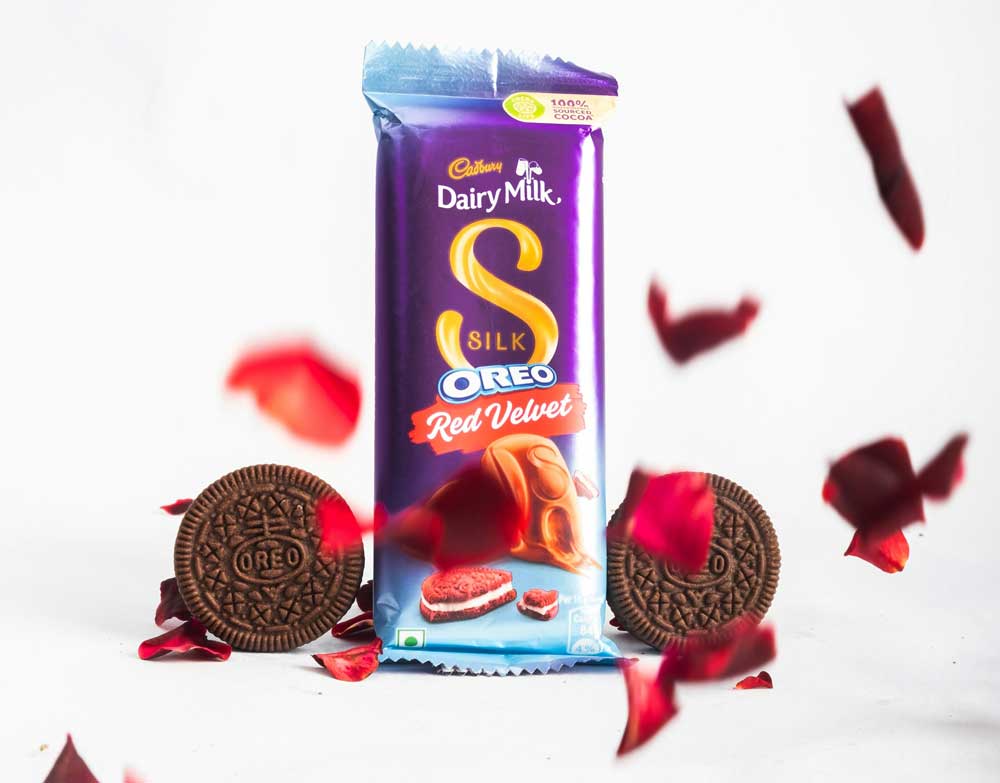
Cadbury: The rich purple colour associated with Cadbury is instantly recognisable. This colour signifies the chocolate brand’s commitment to luxury and indulgence, creating a strong visual identity.
Source: Unsplash
T-Mobile: The vibrant colour magenta is closely associated with T-Mobile. This bold choice helps the telecoms brand stand out in a crowded marketplace, making its stores and advertising easily recognisable.
Source: Wikimedia Commons
John Deere: The combination of green and yellow is iconic for John Deere. This colour scheme is synonymous with agricultural machinery and equipment, creating a strong and immediate brand association.
Source: Unsplash
These companies have consistently used their signature colours across all brand touchpoints, combining them with other brand elements such as logos, typography and overall design to create a comprehensive and memorable brand identity. Colour serves as a powerful shorthand for the brand, but it’s part of a larger branding strategy that ensures consistency and recognition across media and contexts.
Relying on colour alone to build a strong brand is like trying to paint a masterpiece with a single brush. Colour needs to be part of a larger, cohesive visual identity system. It must work in harmony with other elements, such as logos, symbols, typography, and overall design, to create a comprehensive and memorable brand identity.
Take Apple, for example. While its clean, minimalist aesthetic is enhanced by the use of sleek silver and white tones, it’s the combination of these colours with the iconic Apple logo and modern typography that really sets the brand apart. It is this synergy that makes Apple instantly recognisable and memorable.
Consistency is key to branding. Using the same colours across all brand touchpoints – from packaging and advertising to the website and social media – strengthens brand recognition and builds trust. Imagine if McDonald’s decided to paint its golden arches a different colour in each country. The brand identity would become fragmented and confusing.
Furthermore, in a crowded marketplace, colour alone may not be enough to differentiate a brand. Many brands may use similar colours, making it difficult to stand out based on hue alone. Legal restrictions also come into play, as securing a colour trademark can be difficult, adding another layer of complexity to building a colour-based brand identity.
Finally, accessibility issues are critical. An over-reliance on colour can exclude people with visual impairments, such as colour blindness, from fully engaging with a brand. That’s why it’s important to ensure that other elements, such as text and shapes, convey the brand’s message effectively.
While colour is critical, it must be combined with other brand elements such as logos, symbols, typography and overall design to create a complete brand identity.
Colours gain meaning when associated with a brand’s values, messaging and overall identity. The meaning behind the colour choice is as important as the colour itself.
In crowded markets, multiple brands may use similar colours, making it difficult to rely on colour alone for recognition.
Colour trademarks are difficult to obtain and protect, making it risky to base an entire brand identity on colour alone.
Over-reliance on colour can exclude colourblind or visually impaired people from fully engaging with the brand.
Choosing the right colours for your brand is more than just a creative decision – it is a strategic move that can significantly influence brand recognition and consumer perception. However, many brands stumble into common pitfalls that can undermine their efforts. Let’s look at some of these common mistakes and how to avoid them.
Imagine you’re launching a new brand. You’re excited, and the creative juices are flowing. You pick your favourite colours, confident that they will resonate with your audience. But here’s the rub: what appeals to you personally may not have the same effect on your target market. One of the most common mistakes in brand colour selection is putting personal preference ahead of strategy. The colours you choose should resonate with your target audience and align with your brand’s values, not just reflect the taste of the owner or designer.
Next, imagine a brand with a rainbow of colours in its logo and marketing materials. While it may seem vibrant and eye-catching, using too many colours can dilute your brand’s strength and make it less memorable. A focused approach is more effective: stick to one or two main colours, a few accent colours, and neutral tones for backgrounds. This simplicity increases brand recognition and creates a cohesive look.
Another pitfall is ignoring colour psychology and industry standards. Colours evoke specific emotions and carry cultural meanings. For example, blue is often associated with trust and professionalism, making it a popular choice in the technology and financial sectors. Ignoring these associations can lead to a disconnect between your brand image and its message. It’s important to consider the psychological impact of colours and how they relate to your industry.
Now think about your competitors. If you’re not aware of their colour schemes, your brand could blend into the marketplace rather than stand out. Researching your competitors’ choices will ensure that your brand’s colours are distinctive, helping you to stand out from others in your industry.
Equally important is the practical application of your chosen colours. Visualise how your colours will work in different media – packaging, websites, clothing and marketing materials. Consider factors such as visibility, legibility and how colours appear in print versus digital formats. Neglecting these practical aspects can result in a brand that looks great in theory but falls short in execution.
Avoiding these common pitfalls requires a blend of creativity and strategy. By focusing on colours that resonate with your target audience, simplifying your colour palette, considering colour psychology and industry standards, being aware of competitors’ choices and thinking about practical applications, you can create a strong and memorable brand identity.
Building strong brand recognition requires a thoughtful and strategic approach. It starts with choosing colours that reflect the brand’s personality and values, but it doesn’t end there. Developing a cohesive visual identity that includes a well-designed logo, consistent typography, and other graphic elements is essential. Maintaining consistency across all touchpoints and considering cultural implications ensures that the brand resonates with a global audience.
To build strong brand recognition, it’s essential to:
For me, colours are vital to understanding and interacting with my surroundings. Professionally speaking, they are undoubtedly an extremely powerful element in branding (maybe even more so than people give them credit for). They are the perfect blend of a strategic approach and important responsibility in design.
In my work as a Brand Strategist, colours can play both a leading and supportive role. Whenever they are in a project as a deliverable (or part of it), I like to consider a couple of factors before making any final recommendation. Understanding the brand’s environment would be the first step – general colour trends, competitors’ choices, benchmark campaigns, or brands. Simultaneously, I look at the brand’s audience and consider what’s around them (in terms of brands or responsiveness to trends). Then, the grand finale – what would the client like to communicate, preferably through the lens of a short-term and a long-term result? Having all that, I feel confident I can propose a direction that may be of actual use.
Whenever colours are not in the spotlight of the project, I try to incorporate them into my workflow. The beauty (and the beast) of brand strategy is that it’s primarily based on concepts that can be more or less abstract. That’s where colour may come into play. Through mood boards that include colour combinations or presenting imagery with a specific tonality, I can create a clearer image of the concept that I propose to the client. Even in day-to-day work, such as creating a workshop framework, I try to use colour as an information differentiator.
From a broader perspective – the current role of colours in branding, something that I have seen recently in brand strategy, is how colour is put at the forefront of communication. Of course, it may be the good old cycle of looping design trends, but this time around, it looks like it’s bolder and bigger and seems like, in some shape or form, it may stay around for a bit longer. A good example of this is last year’s communication campaign around the premiere of the Barbie movie (forever from that point intertwined with Oppenheimer). The fact that even before any planned communication, the production of the movie emptied the world’s supply of pink in the market instantly gave me the impression that the branding and worldwide marketing campaign specialists would respond to that. And so did people. Countless crowds dressed in pink going to screenings worldwide provided a strong brand messaging (followed by the “Hi, Barbie” phrase). A mix of that and the black colour that, in contrast, guided Oppenheimer’s communication delivered a global marketing success (for both movies).
Flash forward to this year, and the same mechanism applies. This time around, the omnipresent lime green represents a branding phenomenon – Brat Summer. The hyper-pop Charli XCX’s record, with its simple yet powerful visuals focused on Pantone lime green colour, made masses incorporate it in their lives, global brands to use Brat’s brutalist visual language as a form of real-time marketing and even the US vice-president to be (more or less willingly) a part of the conversation in the news.
Looking into the future of colours in branding, there are a couple of things that I can notice already or would like to see more of:
Lastly, for colour enthusiasts out there, here are more or less topic-related books, tools, and content:
In conclusion, while colour is a powerful and essential component of branding, it is most effective when used in conjunction with other elements. A well-designed symbol or logo, combined with strategic colour choices, provides the strongest foundation for building lasting brand recognition. By thoughtfully integrating colour into a broader visual identity, brands can create a memorable and distinctive presence that resonates deeply with their audiences.