Melbourne’s bold “M”
Share this article
Branding cities, towns, and even entire regions is no easy task. In Poland, only a few well-executed branding initiatives stand out, while many others would have been better left undone. A new place identity almost always sparks controversy—both locally and within the industry. Recent examples of Poznań’s branding mishap and the heated debate surrounding the Łódź region’s new identity highlight just how complex and challenging these projects are, not only for designers but also for the institutions commissioning them.
The project described below, from Australia, also faced significant criticism at first—perhaps because it was ahead of its time.
There are moments in design, architecture, and probably many other creative fields when everything feels stagnant. It’s as if nothing truly new is being created—at least not in an exciting, postmodern way. Every new project seems competent yet uninspired, following a formula rather than breaking new ground.
This was precisely how branding felt to me in the early 2000s. The industry seemed stuck in an endless loop of “logo, application, manual.” While there were some interesting ideas, I felt something was missing. Then, suddenly, Landor unveiled a new visual identity for Melbourne. It was a revelation. Like hearing OK Computer by Radiohead for the first time. Like the first shout of a revolution. Or at least like opening a window to let fresh air into a stuffy room.
Projects like this don’t emerge in a vacuum. Landor’s work for Melbourne was a major step in the evolution of what would soon be called dynamic branding. Before that, one of the most significant milestones was the branding for the London 2012 Olympics, created by Wolff Olins. That design shocked the world because it completely broke away from the conventional aesthetic of sports branding. The departure was so radical that, like many others, I initially found it incomprehensible—especially the typography. But whether one liked it or not, it was unforgettable.
If London 2012 was an early sign of change, Landor’s Melbourne project was dynamic branding in its fully developed form. Fifteen years after its launch, Jason Little—then Creative Director at Landor’s Australian office—and Jefton Sungkar, one of the designers, shared their insights into how it all came together.
Melbourne is Australia’s second-largest city, its first capital, and a cultural epicenter. Frequently ranked among the world’s most livable cities, it topped the Economist Intelligence Unit’s Global Liveability Index for seven consecutive years starting in 2011.
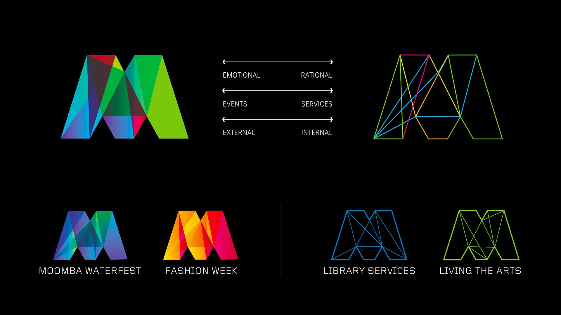
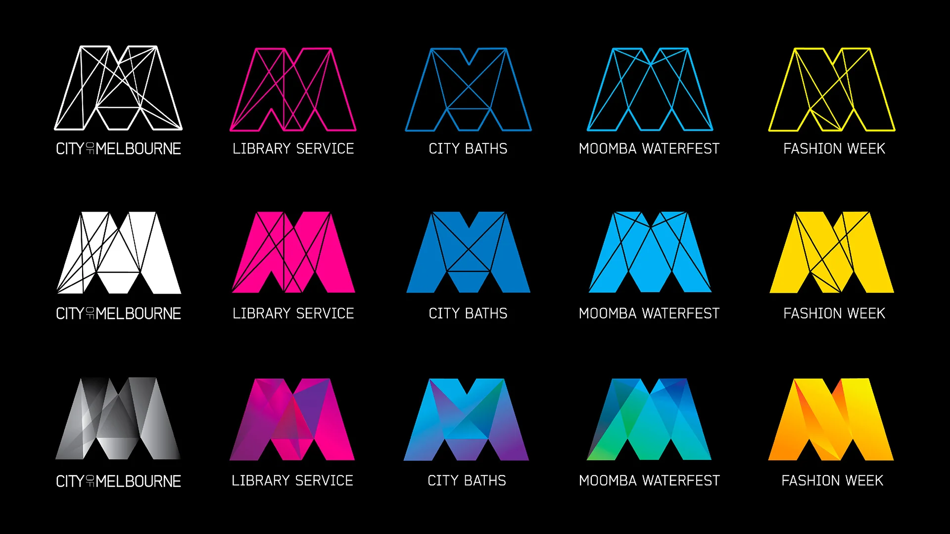
Jason Little, who had just been promoted to Creative Director at Landor, understood that Melbourne’s identity needed to reflect its unique character, boldness, and complexity. Additionally, the project had to unify a fragmented brand architecture consisting of 27 (!) sub-brands. The team’s ambition was to create something groundbreaking—a branding system like no other.
The core design team consisted of Jason Little, senior designers Sam Pemberton and Ivana Martinovic, and junior designer Jefton Sungkar.
Little was heavily influenced by the London 2012 identity:
“That approach directly influenced how we tackled the City of Melbourne project. In the early strategic phases, I presented to the client team where I felt branding was headed and what was possible for a public institution in a city known for its creativity. The 2012 Olympics work was a key reference – proof of what could happen when you break conventions and embrace the new.”
Of the four initial design directions, the team decided to develop the one featuring a dominant “M.” This concept also resonated with city officials. The goal was to represent the complexity of Melbourne—a mosaic of diverse experiences. The identity had to be flexible, adaptable to various audiences, and capable of evolving alongside the city itself.
The idea of a single letter as the brand’s core was both enticing and challenging. One city representative raised a crucial question: Are we sure no one else has an “M” like this?
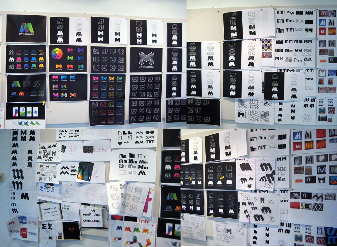
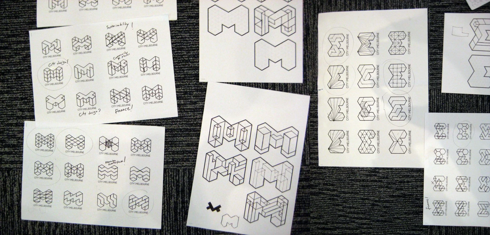
Thus began an intensive process of refining the letter’s form. Weeks were spent searching for the right “M.” The breakthrough came when Little suggested constructing the letter based on a grid system.
“Every inch of our studio was covered with ‘M’ shapes and forms – it was scary and inspiring at the same time.”
Jefton Sungkar, who initially wasn’t involved in the project, recalled sketching an idea on a bus ride home.
“When I brought it to the studio the next day, it received mixed reactions initially. However, as we developed it and explored its potential for variations, it became clear that this direction could fulfil the vision we had for representing Melbourne’s dynamic character.”
Little knew where he wanted to take the project, but some within Landor worried that the radical “M” was too far from what the client expected. They feared it could undermine the whole initiative.
“But to us, that tension—between ‘very good’ and ‘very bad’—was exactly where the magic happened. We decided to lean into the radical.”
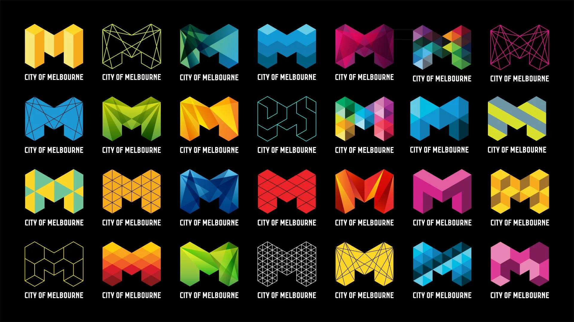
The most radical decision? To abandon a single fixed logo. Instead, the team created over 100 variations of the “M,” with Sungkar delivering new ones daily. This approach freed the identity from rigid constraints, allowing it to evolve and adapt over time.
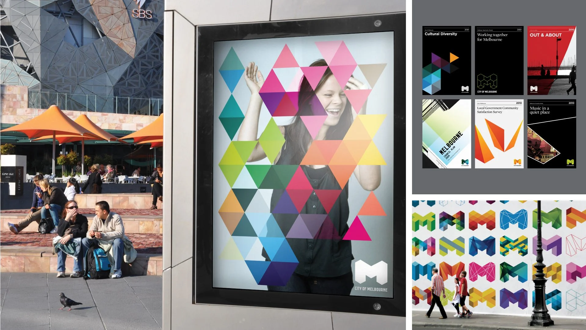
The system’s modularity proved to be its greatest strength—not just for the logo but for the entire branding ecosystem, making it incredibly effective for Melbourne’s various public institutions and promotional materials.
When I first saw this project in 2009, I was thrilled. That strange “M” and its endless variations felt fresh and bold. I assumed everyone, not just designers, would be equally excited.
I was wrong.
Jason Little recalled the intense backlash: from criticism of costs (a common reaction to publicly funded projects) to outright hostility from Australians who saw the branding as a failure. The media response was brutal.
“Whoever designed the Melbourne logo needs their eyes poked out with a wooden spoon.”
“I just discovered the new Melbourne logo was designed in Sydney. I just threw up a little.”
The creative team was frustrated, but they had to remain silent—client PR teams typically handle crisis communications.
“I remember the creative team feeling confused and disheartened by the response. Within the team, we collectively believed this was the most significant and exciting piece of branding we’d done in our careers. And within Landor as a global agency and on the client side – everyone was extremely positive and excited about the work. The initial backlash took us by surprise.”
Over time, as more branding elements were introduced and Melbourne continued rolling out the new identity, public perception shifted.
“This experience taught me an invaluable lesson that I carry to this day: trust in your vision and your team’s capability to make it reality because you simply can’t please everyone.” — Jefton Sungkar
Years later, Melbourne’s branding became an industry benchmark, inspiring countless imitations—even appearing on a Chinese boy band album cover! Initially, the design team was frustrated by the plagiarism, but their perspective changed.
“Creating something that resonated so widely – that became a source of inspiration – was actually very flattering. Design is full of self-doubt and imposter syndrome, so seeing the work take on a life of its own was a reminder that we’d done something meaningful.”
Dynamic branding didn’t become the dominant trend many had expected. Its openness and radical nature proved too demanding for both designers and audiences. However, it hasn’t disappeared—it has evolved.
“It’s rare to find a brand today that doesn’t experiment with multiple creative interpretations… That, to me, is even more exciting than what we envisioned a decade ago.” — Jason Little
