February 16, 2023
Does the Galactic Empire need rebranding or just better engineers?
Share this article
Not long ago, I saw a logo of The Galactic Empire on a wall at a friend’s house…but let’s start with some basics:
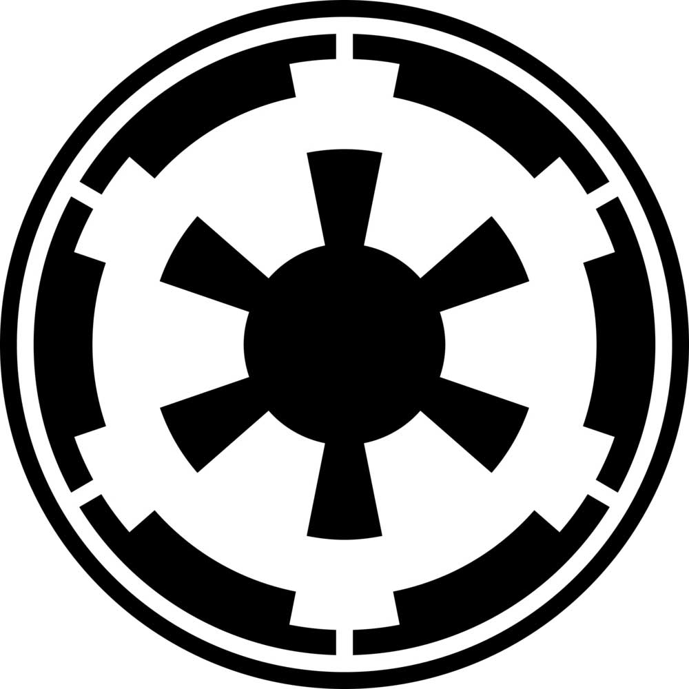
Anyway: I saw the logo of the empire and I thought: My God, after so many, many Years, it does actually NOT look like it needs to be reworked making rebranding designers work for weeks:
So, if the Galactic Empire came to us in 2023, asking for a rebranding process, I would be strongly against doing anything with this visual identification. It actually tells everyone, everywhere exactly what the company is doing: being evil. It is totalitarian, reaches everywhere and shields everyone from anything that would interfere, like these damned rebels, with their ridiculous freedom of speech idea and their disgusting leftist ideology of democracy. In the Q&A feature of the ninety-eighth issue of Star Wars Insider magazine, John Mollo revealed that he based the Imperial insignia on shapes used in 18th century fortifications. It is, then, a sign of being isolated, fortified, and closed to any changes coming from outside.
It’s all there, nothing to add, nothing do lose. Think how many brands have had to rebrand themselves over and over again because of changing trends and fashion. The Galactic Empire, as it is, does not need to change at all, and its communication strategy is still solid… and evil. And there’s more than just that. Have a look at these guys:
Source: https://www.scifimoviezone.com/StarWars5Script11.shtml
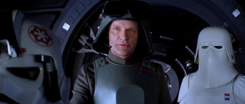
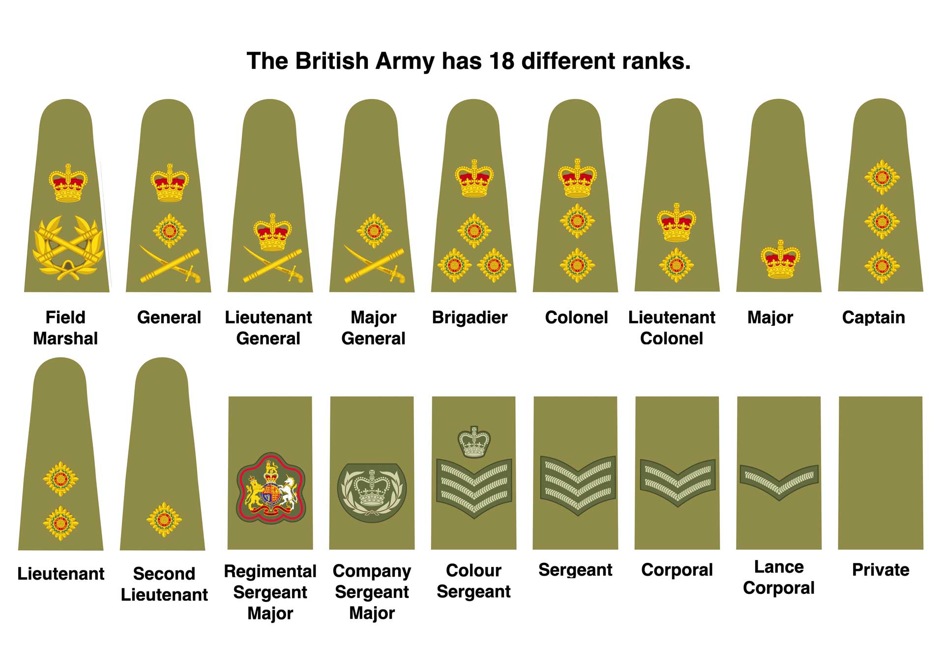
Wow, I mean, just wow. How many times have you seen military insignia that instantly tell you: Who’s the boss around here? They are highly visible, clear and don’t demand the soldiers study them for days to understand who is in charge. In combat reality, it would probably be better to make them also visible from other perspectives (you rarely need to be in front of the person in charge during combat) but the idea behind making insignia so pure and simple is really great, when compared to this, for example:
Source: https://uklandpower.com/2018/11/07/do-we-need-to-simplify-the-rank-structures-of-uk-armed-forces/
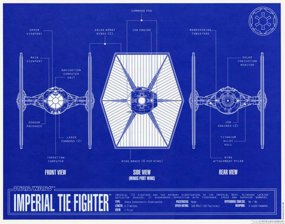
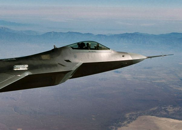
The Galactic Empire is probably also the only military force in the world that actually had brand designers interfere with military engineers when making stuff. Just look at the basic empire fighter:
Source: https://www.pinterest.co.uk/pin/238268636510897362/
It is built based on two basic geometric shapes, one of which, the sphere, was considered perfect in ancient times. The wings actually don’t need any logotype on them (which makes it cheaper), because their construction resembles the sign of the empire, as does the pilot’s front window. On top of all that, it is almost clear that the company does not need any greenwashing strategy. The Galactic Empire’s most used fighter runs on solar energy, making it much greener and cleaner than all the Californian companies taken together. On a side note: Colin James Cantwell, the designer of the original star wars vehicles, was actually born in California, so now you know why The Galactic Empire runs on solar energy 😊 Functionality wise, this design is simply horrible: The most important thing in a dogfight is the ability to see your enemy fighter design has always developed in the direction of allowing the pilot to see as much as possible. This is why modern jet fighters allow the pilot to look around as much as possible:
Source: https://qph.cf2.quoracdn.net/main-qimg-2299f2782310275ed743b99ecf3576c4-lq
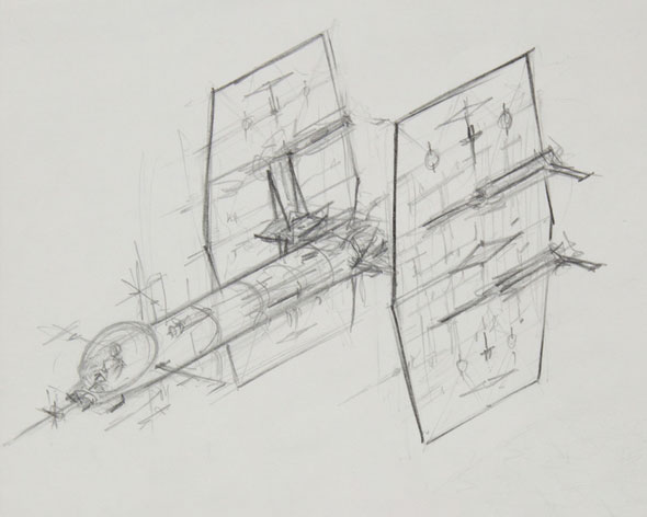
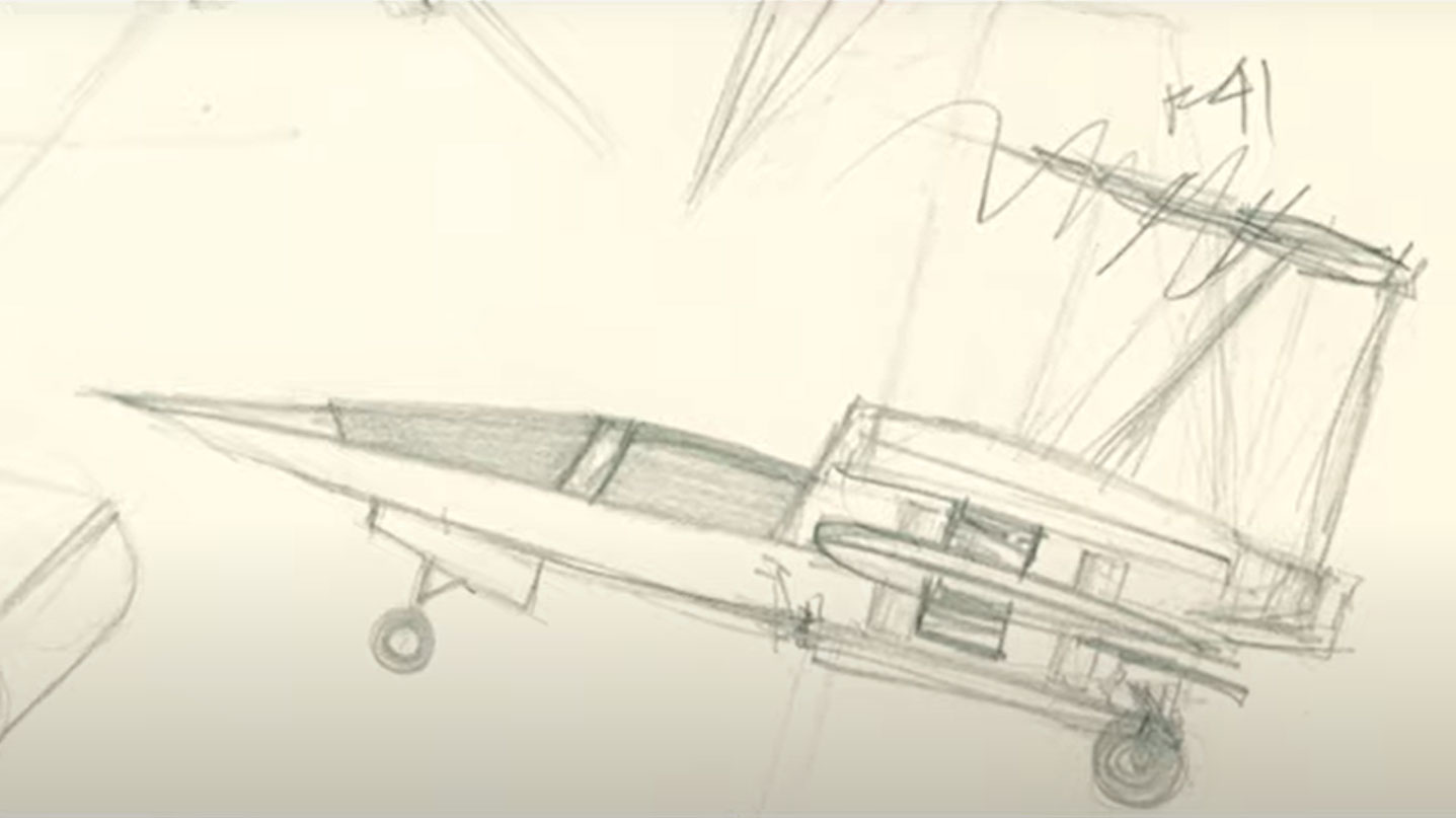
How good is the visibility in a Star Wars TIE Fighter? Well, the pilot can see what’s in front of him, that’s all. I could hardly point out any modern warfare designer that would actually agree to such a solution. In my opinion, the only explanation comes from brand strategy: we are a superpower; we overwhelm the enemy and engage only when we have 10:1 odds. We don’t really need to look around, as there are only our guys there. Still, when you’re flying a star fighter, having the ability to look around and see, even your own companions, is not such a bad idea when flying in formation. TIE fighters were designed to look cool. And they are very, very green, so the Empire must have chosen them mainly for their communication, not functionality purposes. In defence of the TF designer, we must add here that whatever he was thinking of, he was clearly aware of the visibility problem, as one of his sketches reveals:
He thought as a designer, and as a designer, he was concerned about the functionality of the designed product. We can see above that his solar fighter design was trying to escape the visibility problem. But, he eventually created something that didn’t have to fly or be that functional, as it was designed to look cool in a movie about space wars.
The more Star Wars movies you see, the more often you see fighters from space fly down to the surface of a planet to continue shooting. And here the story gets really bad, design-wise, especially with the TIE Fighter:
Source: https://www.youtube.com/watch?v=bx2C6rY8roo
The famous TIE Fighter is, aerodynamically, a disaster, and using it anywhere except in space would probably not be the best idea. Why did the empire use them? Well, Star Wars’ fans have a solid theory: Why the Empire Will Never Use X-Wings in Star Wars (https://www.cbr.com/star-wars-empire-x-wing-design-incom) They are cheap. And for a huge company, like the Galactic Empire, it is always better to get more cheap machines for their huge army than to rely on expensive stuff. Especially, when they don’t need fuel to run.
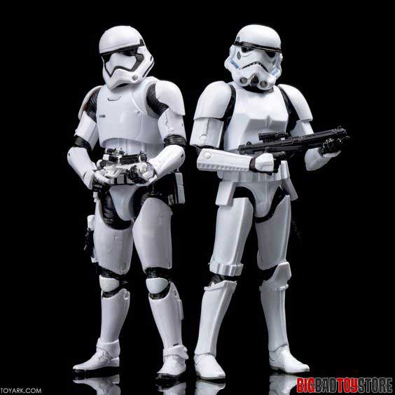
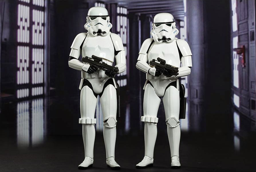
What about the stormtroopers? Visual identification seems to have won here over any sensible tactical or functional elements, which, branding tactics wise, is not really the best strategy. It probably started with the script of the 1st Star Wars movie, stating they are supposed to wear fascist white uniforms. But outside parades, white in the military usually makes sense in winter, and when the stormtroopers are deployed into battle on Hoth (just a lot of snow), it makes sense. It does not, however, make sense anywhere else… unless you want your soldiers to be visible. So, the explanation here is that the Galactic Empire does not care at all about the functionality of the uniform, as well as everyone knows they are coming, they represent the Galactic Empire, and they kick ass. On top of that, they just look cool, and then the designers came back to redesign them for episode 7 but they really didn’t change much.
Source: https://i.pinimg.com/564x/4d/8d/16/4d8d163bc99d42b39d8fe3434349c800.jpg
Why? Well, because the original stormtrooper design was simply visually stunning. And, bearing in mind we’re talking about a movie (e.g. a visual form of art) the way soldiers look is quite important for the benefit of the audience to know who’s who (bad guys wearing white makes a lot of sense after the whole historical Ku Klux Klan nightmare). It also helps a lot for the soldiers themselves to know whom not to shoot.
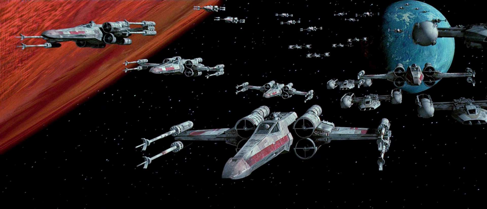
What about the Rebels? Well, when I was younger, I was completely captivated by the design of their fighters, especially the X-Wing, Y-Wing and A-Wing. It is probably the only situation in aviation history where fighters were actually constructed based on typography… On top of that; they looked absolutely amazing in the 70s and 80s, compared to what other movie designers were proposing as starfighters:
Everyone remembers the scene where the X-wings make their wings go into X position. It doesn’t make any sense function-wise, because, as there is no friction in space, changing the wing geometry or shape doesn’t really change anything, but… it makes them look more predatory, bigger, and more aggressive. So, if I was to ask why they added that, it’s simply the communication strategy of the Rebellion: we’re dangerous, we can bite back! If you look at the design, it resembles real-world combat aircraft much more than the TIE Fighter. And the story behind this is: https://www.bing.com/videos/search?q=Colin+James+Cantwell+on+x-wing+interview&view=detail&mid=AA007CEA3334B05307CFAA007CEA3334B05307CF&FORM=VIRE. Colin Cantwell designed the X-wing as his first concept. And his idea was at that time much more ‘down to Earth’, meaning his concept originated with designing an aircraft that had to take off and had wheels.
Source: https://www.youtube.com/watch?v=SyFd4bgAZPI&t=173s
It was only after George Lucas had a conversation that the ship started being redesigned, lost the wheels, and became the fighter we know. One thing, then, has not changed since the 1970s – clients always interfere a lot in the design delivered to them by concept artists!
The most important thing regarding the design is that the brands and stuff in Star Wars are not based on how functional / logical it would be for a spacecraft to have wheels. The more important question, I guess, relates to ageing. And my initial thesis is this, when the design (like in the example of the Death Star and TIE Fighter, and the Empire logo) is so simple, so geometric and so pure, when the colour scheme (for the Empire’s brand: black, white and grey) is so minimalistic, the ageing of the brand is not such a serious risk. When the designers came back to SW, creating the recent saga of episodes VII to IX, they were really conservative regarding ticking all the boxes in the rebranding checklist. The Resistance uses the brand of The Rebels, the First Order relates to the Galactic Empire’s symbolism and aesthetics in their logo. One of the reasons was to show the audience continuity (the baddies are still baddies, the goodies are still goodies). But if the symbolism had aged badly, they would have probably done much more to change the visuals. They didn’t, and hardly anyone complained. Why? Maybe, just maybe, because the brands were neatly designed and carried appropriate communications well in their initial concepts?
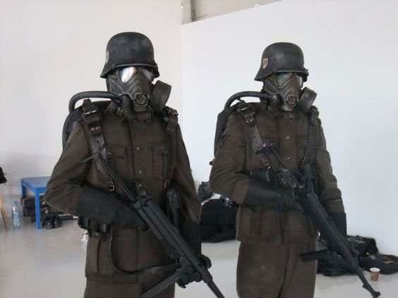
Star Wars’ designers understood, when creating their communication strategy for SW brands, that the final customer will be a person from Earth, from our world, and will need some aid in communication to allow them to see the good and bad by reference to the symbolism accepted here, not somewhere in the universe a long time ago and far away. The baddies have red lightsabers because such a colour is more recognisable as baddies. Galactic Empire uniforms. Stormtroopers, the core troops of the evil empire, resemble German stormtroopers in many ways, both from WWI and WWII.
Source: https://3.bp.blogspot.com/-NCuk07MX7fE/VFCev5YfZMI/AAAAAAAAT2w/T1HZYbm9LfQ/s1600/sw1.jpg
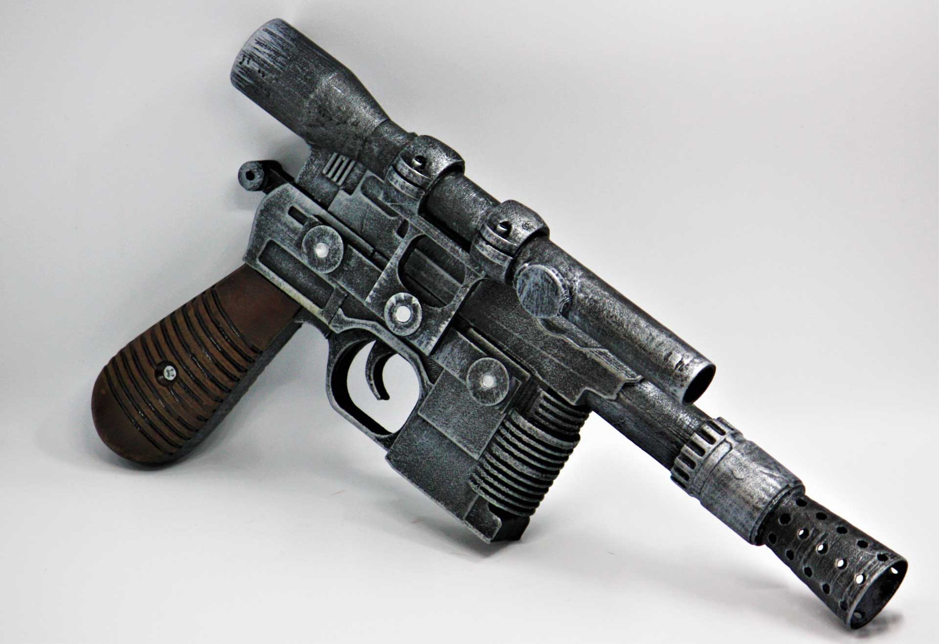
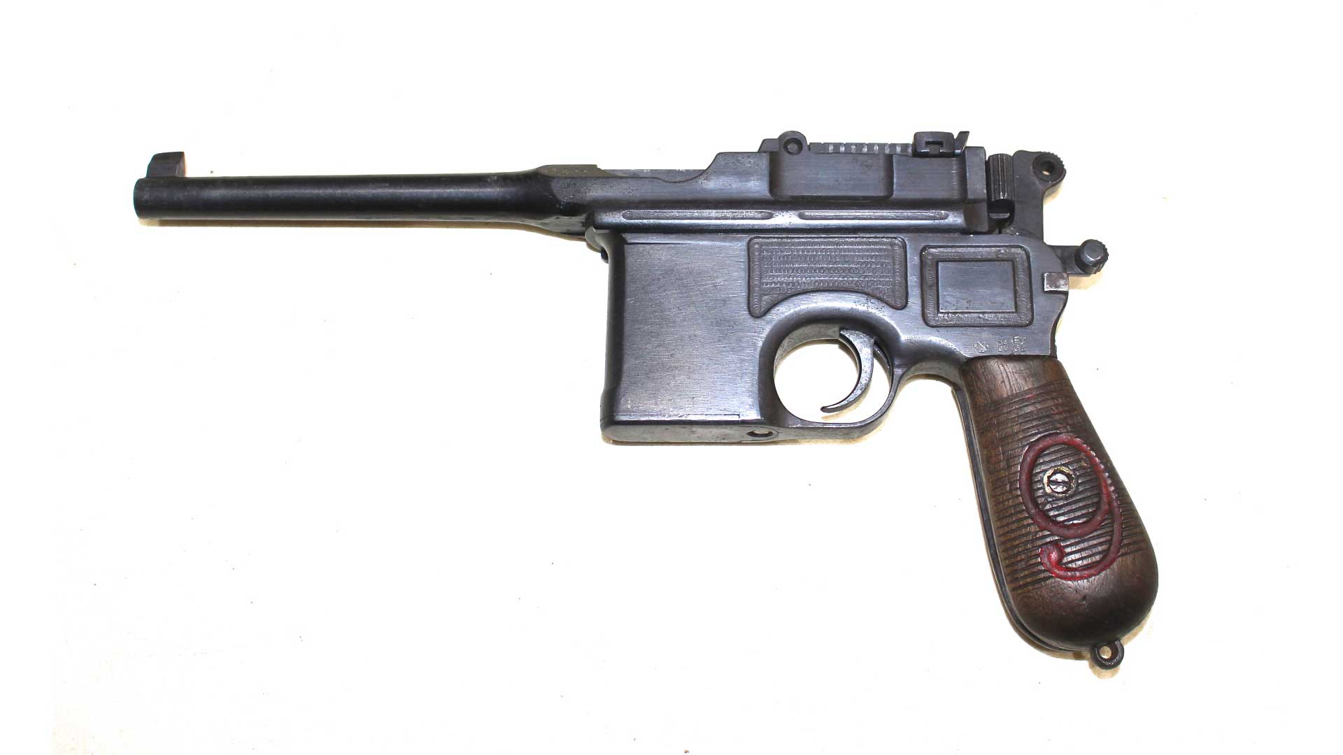
To make this even clearer, some of the weapons the soldiers use in SW are remarkably similar to weapons used by the German military during WWI and WWII. Take this pistol:
Source: https://i.pinimg.com/originals/7f/cc/fd/7fccfde9fdd9b9564fddf27ef38a13ff.jpg
Which, design-wise, strongly resembles a WWI German Mauser pistol:
Source: https://mjlmilitaria.com/wp-content/uploads/2020/12/IMG_1342.jpg
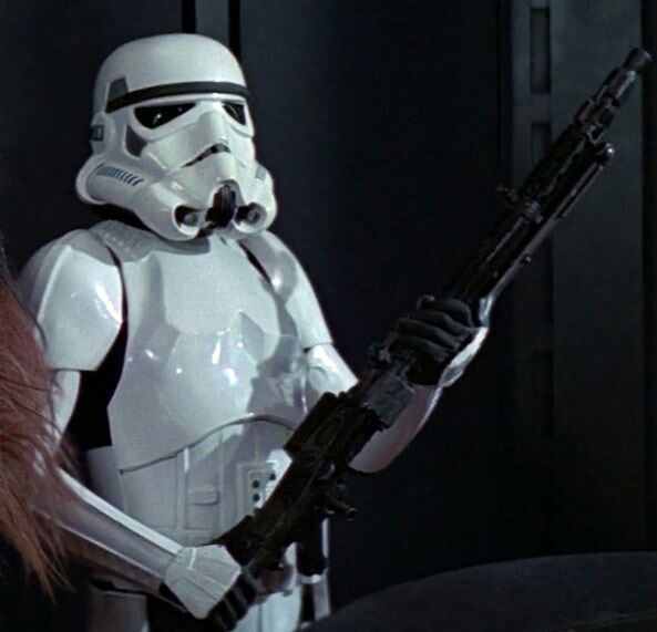
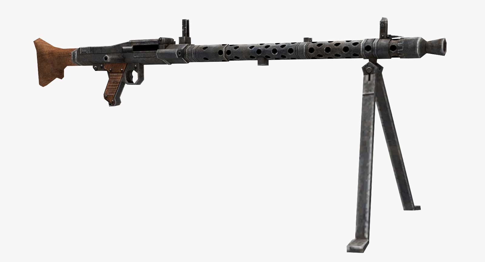
As for this stormtrooper’s heavy weapon:
Source: https://pm1.narvii.com/6351/ef0725c2062ffdd1b4a666eba987e64a285632ae_hq.
It looks very much like a German MG-34, used mainly in the early period of WW2 by the Nazi German military.
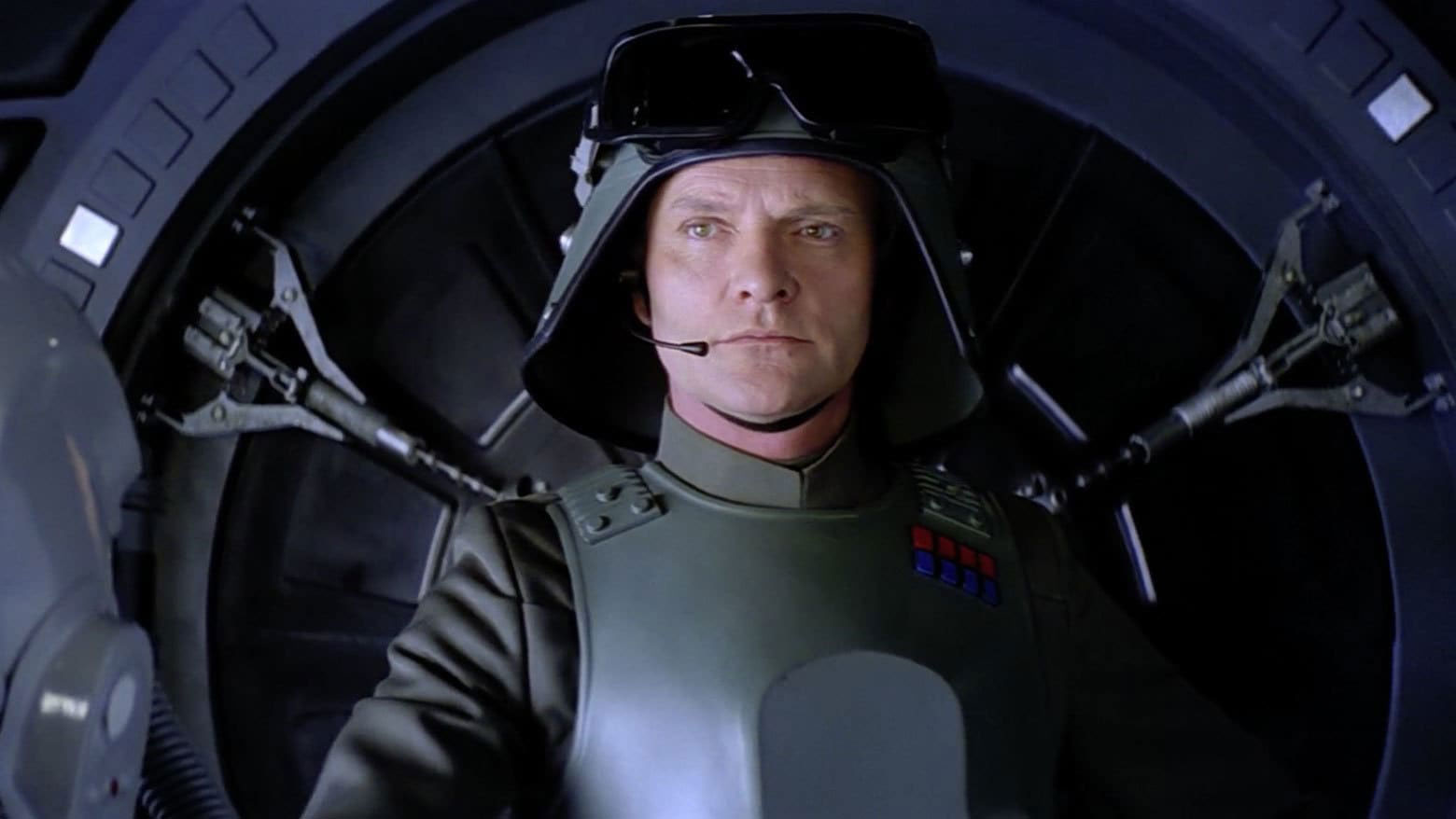
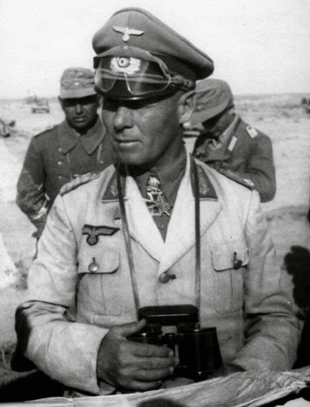
Allusions to our world are not always that evident. Take general Veers from SW episode V:
He’s one of the few successful Empire officers (successful = not strangled by Darth Vader), and we can actually see Vader being quite appreciative of this person. This reaches back to the situation of gen. Erwin Rommel, a Nazi German general, in close relationship with Adolph Hitler (who actually forced him to commit suicide in 1944), highly efficient and successful in the early part of the war, often captured by German propaganda as the guy leading (like Veers does) from the front, with goggles and binoculars.
Source: https://www.warhistoryonline.com/wp-content/uploads/2015/02/Rommel_North_Africa1.jpg
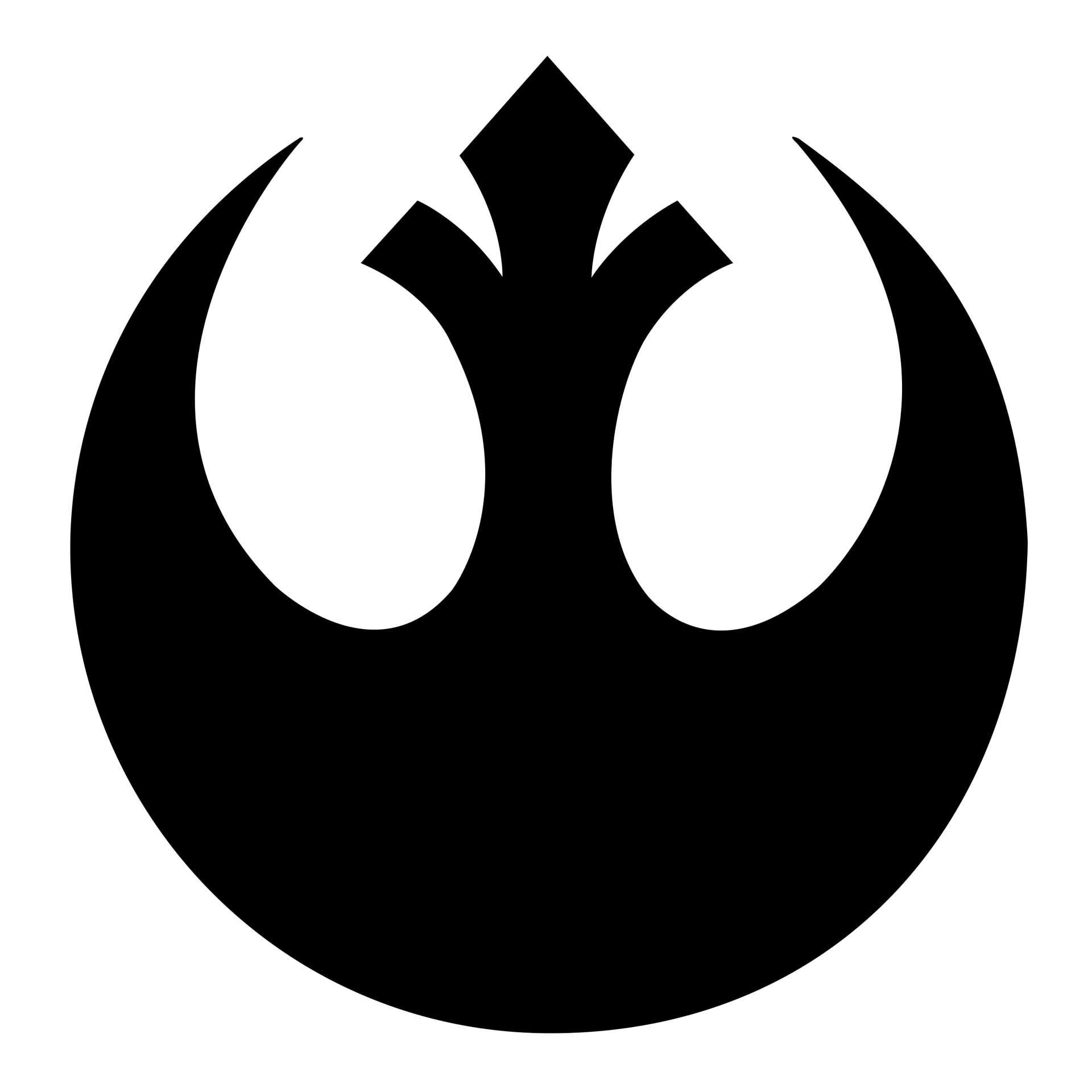
The relation to Fascism and Nazism is not accidental by any means. The Galactic Empire is an evil, totalitarian dictatorship and the way they look should make you instantly aware of that. In ‘Attack of the Clones’ (2002), a genetically perfected clone army forms into square formations that can easily be traced back to Leni Riefenstahl’s propaganda film ‘Triumph of the Will’. The Jedi are hunted and killed, hated for what they are and represent, forced to hide, resembling the horrible situation of the Jews during WWII. The Jedi of the SW universe suffer a mass genocide and are almost wiped out. And the symbolism of the Rebellion, trying to restore peace in the galaxy, serves, I believe, 2 purposes in communicating the strategy of the rebels:
Source: https://cdn.freebiesupply.com/images/large/2x/rebel-alliance-logo-png-transparent.png
The Rebels openly allude, with their emblem, to the symbol of the Jedi Order, representing the idea that The Force encompasses everything and everyone. It also resembles in symbolism a phoenix, a sign of rebirth and restoration of a lost order, more than just a rebellion against tyranny, usually represented by a raised fist.
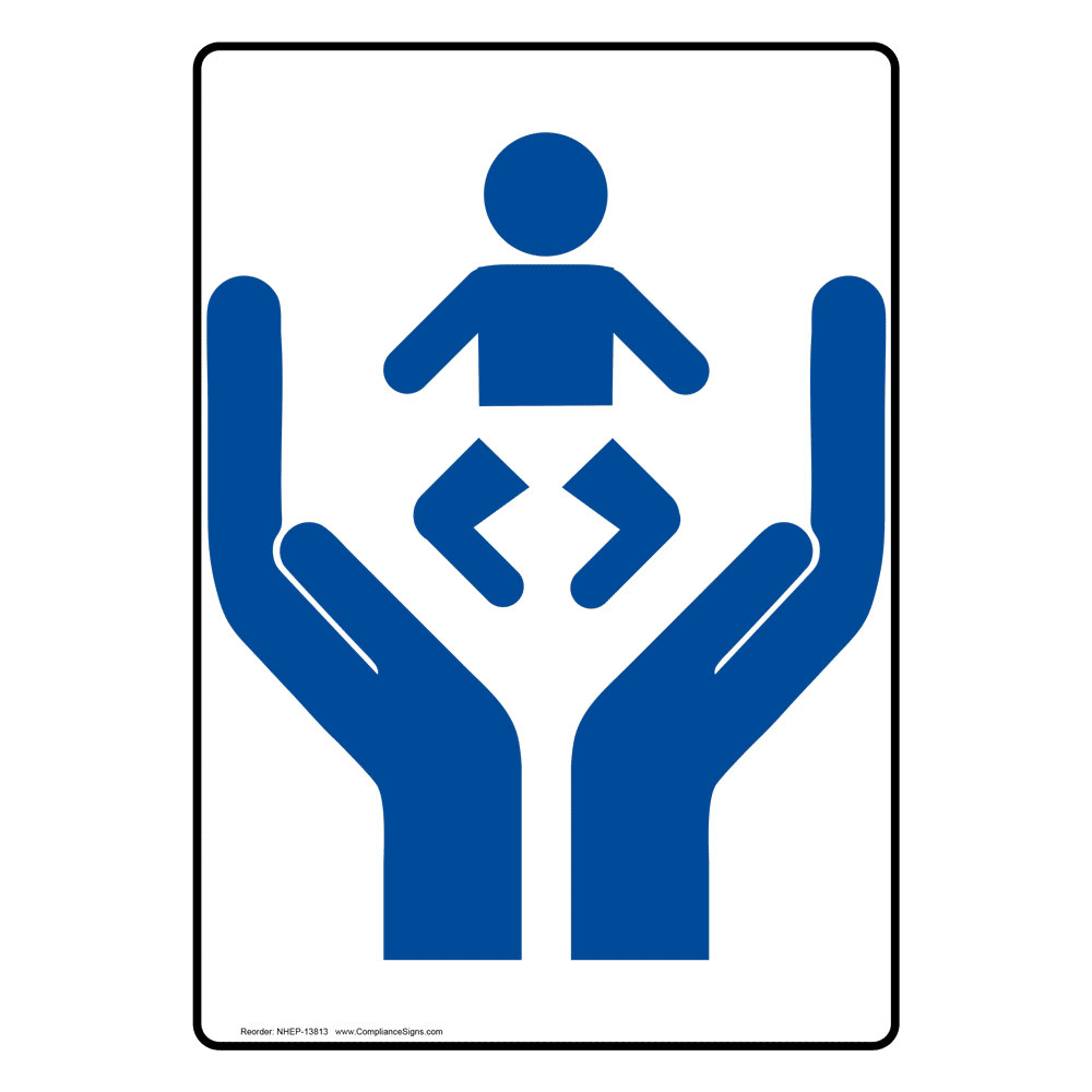
These appropriations when creating a universe where good confronts bad make a lot of sense when communication with the audience is at stake: we consider the Galactic Empire evil by the mere resemblance of their uniforms and symbols to what we culturally consider as evil: Nazism, Nazi symbolism and their uniforms. We get the idea that they are evil even before we see them destroy an entire planet in an absurdly nihilistic manifestation of power. And we instantly cling to the communication of hope given by the rebellion, promising a rebirth of society based on brand values of trust, democracy, and kindness. It could be difficult to explain exactly why, but even after many years of my initial contact with the symbol of rebellion, I still sense there is some meaning and value behind it. It is perhaps achievable, because it is simple, not overly straightforward, but meaningfully relating to the idea of care, as represented by many typical logo representations of trust and care:
Source: https://cdn0.iconfinder.com/data/icons/healthcare-medical-2/512/healthcare-512.png
This obviously does not mean that all the designs from SW are timeless and anything related to the universe will never get old. But whatever the creators of SW intended to communicate through the designs of the symbols, crafts and uniforms, they are holding back on communicating the ideas behind them. While it is understandable to argue that this is so because of their popularity and impact on culture, I’ve tried to show here that this impact might have been more successful because of the branding and careful selection of the visuals.
*The Force in the Star Wars Universe is actually related to some simple tricks that you could do if you meditate for several decades. A lot of people practising meditation in India could therefore show off with these tricks, but they don’t because, in reality, achieving superpowers is cool only if you know you have them but don’t use them at all. In ancient times, in Hinduism, levitating, using the force to make objects fly, etc., was a sign of poor taste and actually a deviation from the path to enlightenment. If you ever discover, then, that you can lift tiny rocks, well, don’t. ** In the SW universe, some dead people have the really irritating possibility to come back as shiny ghosts and talk to living people. Being a true SW fan, I should think this is cool. I have, however, some doubts regarding this aspect of the plot. The ghosts seem to appear quite randomly, sometimes telling people what to do when they don’t know what to do. Sometimes, when really almost everyone is stuck and would welcome any help, they don’t turn up. It’s not very consistent to make people believe that there is someone watching over them and then disappear for several decades, allowing the evil guys to reappear and create another deadly planet-killing weapon.
See also our articles on: cyberpunk aesthetic, road sign design and HR Giger Necronomicon.