June 22, 2026
How Scandinavian graphic design shapes modern branding?
Share this article
Scandinavian graphic design, often grouped under the broader term ‘Nordic design’, is one of the world’s most quietly powerful visual traditions. Rooted in democratic ideals and shaped by long winters and vast landscapes, this design philosophy has been refined over the course of a century of functional thinking.
It is defined by purposeful simplicity, a connection to nature, typographic clarity, and an unwavering belief that good design belongs to everyone. This tradition has left a profound mark on visual communication across the globe, influencing everything from the branding of major airlines and furniture companies to the packaging of artisan skincare products worldwide.
At Admind, we find ourselves returning to Scandinavian design principles time and again, not because they are fashionable, but because they are right for the long term. In this article, we explore what makes Scandinavian graphic design so compelling, who created it and why it continues to define the visual language of brands that aspire to be trusted rather than merely noticed.
Scandinavian graphic design has its roots in the early 20th century, but it did not emerge from a single manifesto or movement. Instead, it emerged gradually, shaped by geography, social philosophy and a series of decisive historical moments that transformed the Nordic countries’ approach to images, typography and visual communication.
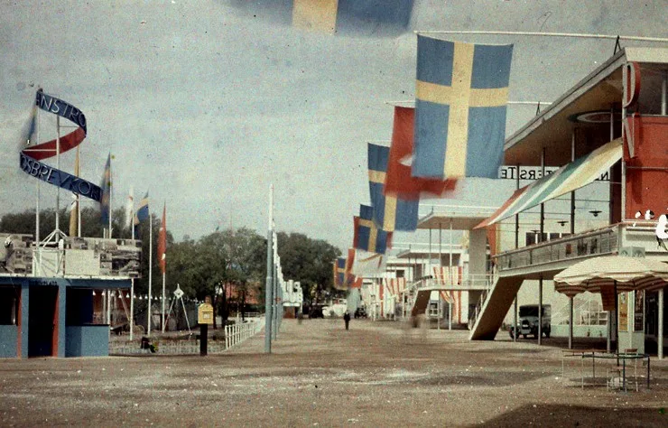
The story truly begins with the Stockholm Exhibition of 1930 – a landmark event organised by the Swedish art historian and leading advocate of socially responsible design, Gregor Paulsson. The exhibition championed Functionalism (in Swedish: funktionalismen), the philosophy that beauty and function are inseparable. The movement argued that well-designed objects should be industrially produced, affordable, and accessible to everyone, not just the wealthy. This was a radical democratic idea that gave Scandinavian design a moral core which it has never relinquished.
Gustaf W. Cronquist, Public domain, via Wikimedia Commons
At the same time, the Stockholm Exhibition introduced Scandinavian audiences to modern typography: clean sans-serif letterforms, asymmetrical layouts and generous white space, which would become the hallmarks of Nordic visual communication for decades to come.
The 1950s marked the golden age of Scandinavian design. International exhibitions, most notably ‘Design in Scandinavia‘, which toured North America between 1954 and 1957, introduced the world to a distinctive visual and material culture that was functional, beautiful and honest about its materials while also being rooted in craftsmanship yet wholly modern. The Lunning Prize, awarded annually to outstanding Scandinavian designers between 1951 and 1970, helped to establish the movement’s profile and gave it international prestige.
Over the following decades, the philosophy became more profound and diverse. While some designers pursued the purity of the functionalist ideal, others, particularly in Finland, adopted a bolder, more expressive approach, producing striking, vibrant graphic work. This creative tension between restraint and expressiveness is one of the defining characteristics of the Nordic tradition, and remains so to this day.
While Switzerland had its Müller-Brockmanns and Ruders, and Japan its Kamekuras and Tanakas, Scandinavia produced its own constellation of designer-thinkers, individuals who viewed graphic design as a social commitment as well as an aesthetic practice.
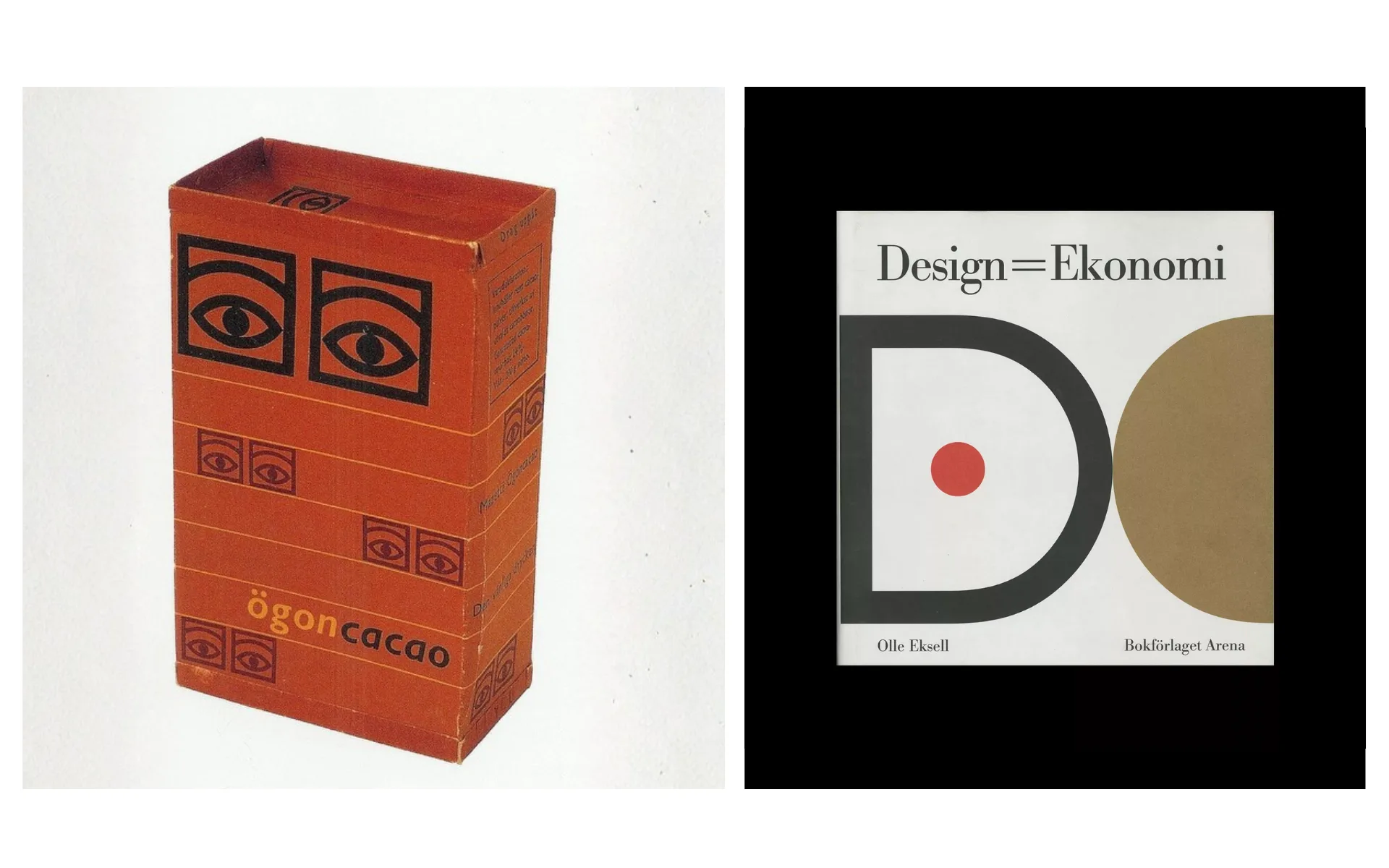
Olle Eksell is widely regarded as one of the founding fathers of modern Swedish graphic design. Born in Kopparberg in 1918, he studied illustration and graphic art in Stockholm before sailing to the United States in 1946 to continue his studies at the Art Center College of Design in Los Angeles. There, he formed a lasting friendship with Paul Rand, the American master of corporate identity.
It was this combination of American commercial modernity and Scandinavian visual sensibility that Eksell brought back to Sweden and made his own. His most celebrated work was the comprehensive brand identity he created for Mazetti chocolate (1956–1958), which was built around the iconic ‘Ögon’ (Eyes) motif – a pair of stylised eyes inspired by cocoa beans. Applied to packaging, posters, and advertising, the Ögon symbol was one of the first truly cohesive corporate identity systems in Swedish design history, and remains as striking today as it was seventy years ago.
Eksell was also a design theorist. In his 1964 book Design = Ekonomi, he made the radical argument that effective design serves aesthetic and economic purposes, a principle that Swedish industry gradually embraced. Inducted into the Alliance Graphique Internationale (AGI) in 1952, Eksell influenced the work of many Swedish designers and was awarded the honorary title of Professor by the Swedish government in 2001.
Pinterest image – Masters of graphic design
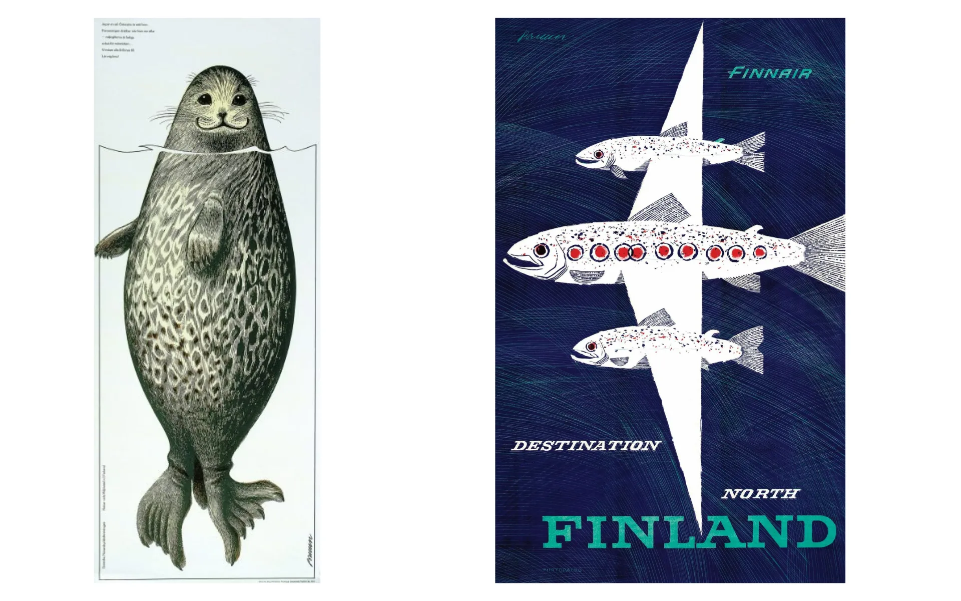
If Olle Eksell is the Swedish answer to Paul Rand, Erik Bruun is Finland’s answer to the great tradition of nature-inspired poster art. Born in 1926, Bruun studied at the Institute of Industrial Arts in Helsinki before founding his own studio in 1953. That same year, he won first prize in the inaugural Poster of the Year competition in Finland, announcing a career that would span six remarkable decades.
Bruun’s visual language was shaped by the Finnish landscape — its forests, birds, lakes and the wild creatures that inhabit them. The Saimaa ringed seal poster, created to raise awareness about an endangered species, became one of the most iconic images in Finnish design history: flat colour planes, clean outlines, emotional directness. His poster series for Finnair in the late 1950s helped define the international image of Finland at the precise moment the country was building its reputation as a design nation.
Finnair – Destination North (1950’íes) | Bruun Design
Beyond posters, Bruun designed logotypes, postage stamps, and, most remarkably, the reverse sides of the last series of Finnish Markka banknotes (1986), placing his graphic sensibility quite literally at the centre of Finnish national identity.
Denmark’s contribution to the story is embodied in Per Arnoldi – artist, designer, poster maker and, since 1980, a member of the Alliance Graphique Internationale. Arnoldi occupies a distinctive position in the Nordic tradition, working at the intersection of fine art and commercial communication. His posters are characterised by bold, reduced forms, powerful colour contrasts and a geometric clarity that owes something to both the Bauhaus and to Danish craft tradition.
What distinguishes Arnoldi is his refusal to separate the serious from the playful. His work for cultural institutions – concert halls, museums, festivals – combines formal rigour with a warmth and wit that feels distinctly Danish: functional but never cold, reduced but never austere.
His career is a useful reminder that Scandinavian graphic design, at its most vital, is not synonymous with austerity. It is synonymous with purposeful honesty — which can be expressed through bold colour just as effectively as through white space.
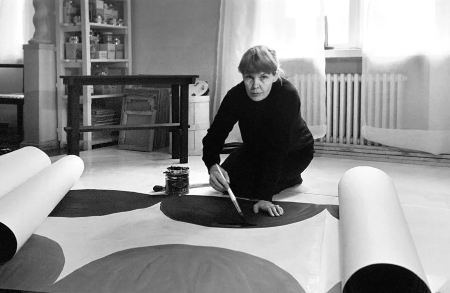
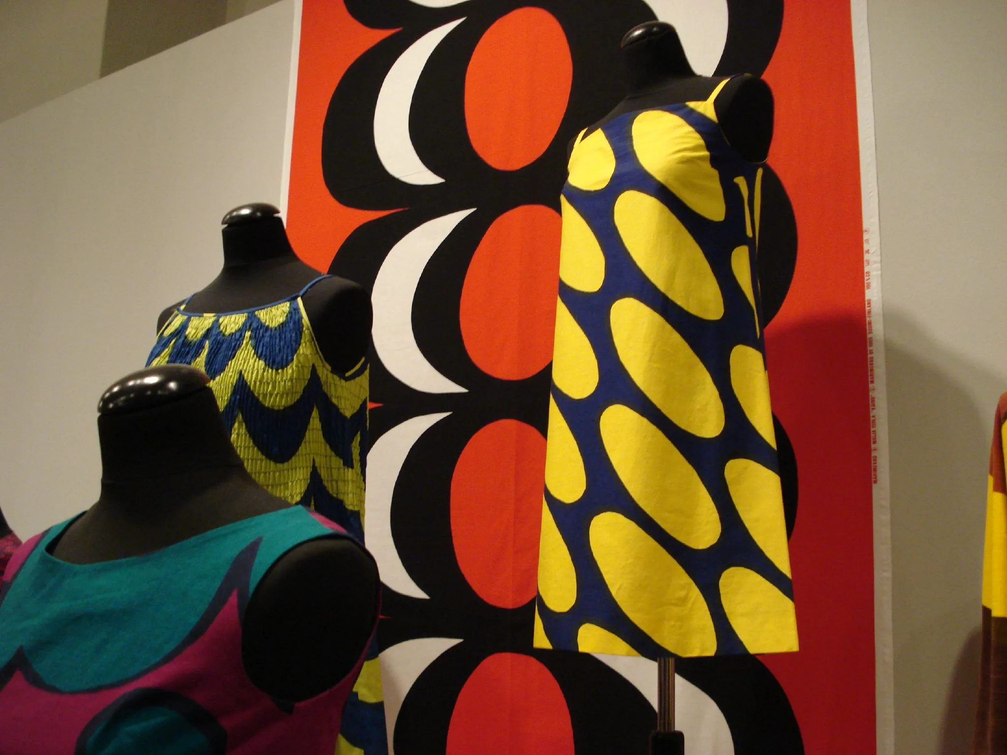
Any account of Scandinavian graphic design that focuses solely on minimalism is incomplete. Maija Isola, the Finnish textile and graphic artist, tells the other half. She created some of the most joyful and radically bold patterns of the 20th century, most notably the iconic Unikko (poppy) print for Marimekko in 1964.
Pertti Jenytin / Lehtikuva, Public domain, via Wikimedia Commons
Isola’s work challenges the assumption that Nordic design is inevitably restrained. Her large-scale prints, which are vivid in colour and rooted in folk art and the Finnish landscape, yet thoroughly modern in their graphic confidence, demonstrate that Scandinavian design has a deeply expressive tradition running parallel to the functionalist one. This duality is not a contradiction; it is precisely what makes the Nordic visual tradition so rich.
Unlike Swiss design, which produced the iconic typeface Helvetica, Scandinavian design has never produced a single iconic typeface and that is perhaps instructive. While the Swiss International Style sought a universal typographic language, the Nordic tradition has always prioritised the function of type over its formal identity. The result is a typographic sensibility defined by a set of shared values rather than a single, definitive form.
These values are legibility above all else; establishing hierarchy through proportion rather than decoration; making generous use of negative space; and a preference for sans-serif forms that feel warm, but not overly expressive. Historically, Nordic designers have used typography to serve the reader, making information accessible, rather than to signal style or sophistication.
The influence of the typographic programme at the 1930 Stockholm Exhibition is still evident today in asymmetric layouts and flush-left text, as well as the careful use of white space as a structural element rather than as emptiness. These are the tools that Scandinavian designers brought to global branding long before minimalism became fashionable.
This tradition is continued in contemporary practice by studios such as Stockholm Design Lab, whose custom typefaces for brands such as SAS are built around clarity, distinctiveness, and longevity – typefaces designed to communicate rather than impress.
The principles of Scandinavian design are not just museum artefacts. They are living tools that are used consistently across some of the world’s most recognisable brands.
No brand embodies the Scandinavian design principle of democratic accessibility more completely than IKEA. Founded in Sweden in 1943, the company has built a visual identity, consisting of a blue rectangle, a yellow oval and bold sans-serif lettering, that is instantly recognisable in more than 60 countries. However, this identity is not merely a logo; it is an expression of a philosophy.
IKEA’s design programme is rooted in what the company calls ‘Democratic Design’: the idea that good form, function, quality and sustainability should be available at an affordable price. The flat-pack product, the clear assembly instructions (designed without text to be universally legible) and the catalogue layout are all pieces of graphic design as well as industrial and retail design.
Dinkun Chen, CC BY-SA 4.0, via Wikimedia Commons
Crucially, IKEA’s visual language has remained remarkably stable over the decades. The blue and yellow of the Swedish flag, the Futura-derived typeface and the clear product photography against white backgrounds are not chosen for fashion, but for clarity and trust. This is Scandinavian design as a brand strategy: slow and steady, and built for the long term.
Scandinavian Airlines (SAS) is one of the most instructive case studies of the revival of Scandinavian design values within a corporate context. The airline established itself in the 1950s as a symbol of Scandinavian modernity and quality, but decades of corporate drift eroded this identity.
In 1998, SAS commissioned Stockholm Design Lab to rebuild its brand from the ground up. The strategy was clear: to restore the airline’s connection to the Scandinavian design principles that had made it distinctive in the 1950s. The resulting programme encompassed over 2,500 design touchpoints, including aircraft livery, hair pins, airport signage and in-flight packaging. Robin Nicholas developed a custom typeface in collaboration with Stockholm Design Lab that is clear, confident and rooted in the clean typographic tradition of Nordic functionalism.
aeroprints.com, CC BY-SA 3.0, via Wikimedia Commons
The SAS rebrand is a prime example of how Scandinavian design values: clarity, authenticity and a long-term approach, can be directly translated into brand strategy when applied with genuine understanding rather than superficial imitation.
Marimekko provides a valuable counterbalance to any discussion of Scandinavian branding. While IKEA and SAS embody Nordic restraint, Marimekko embodies Nordic expressiveness: a boldness that has earned the brand a global following.
Founded in Helsinki in 1951 by Armi Ratia, Marimekko gave designers, most notably Maija Isola, the freedom to create prints of extraordinary scale and confidence. The brand’s graphic identity follows the same logic: it is bold, clear and joyful. There is nothing minimal about a full-scale Unikko print. However, there is something deeply Nordic about the honesty of its execution: it is what it is and does not pretend to be anything else.
Yolanda Arango, CC BY-SA 2.0, via Wikimedia Commons
Marimekko’s success, particularly its global expansion in the 2010s driven by partnerships with companies including Target and Adidas, demonstrates that the Scandinavian design tradition encompasses more than just minimalism. It encompasses anything created with that particular Nordic clarity of intention: purposeful, honest and crafted with care.
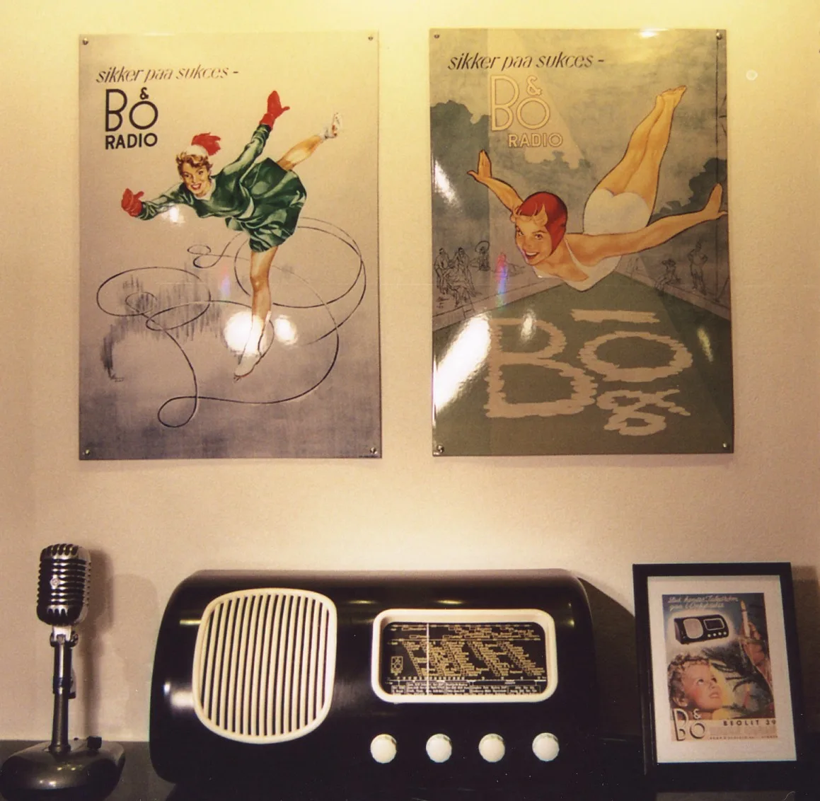
Bang & Olufsen of Denmark occupies a unique position in the luxury audio and electronics market, inseparable from its commitment to Scandinavian design values. Its products, and the visual identity that accompanies them, communicate quality through understatement rather than ostentation.
Holger.Ellgaard, CC BY-SA 3.0, via Wikimedia Commons
The B&O visual system is characterised by precision, negative space and typographic restraint, which draw the viewer’s attention entirely to the product. Advertising campaigns consistently feature the products against minimal backgrounds, allowing their form to speak for itself. This is the essence of Scandinavian design philosophy applied to the luxury sector: confidence expressed through reduction and quality signalled by the willingness to say less.
Bang & Olufsen x Fragment Collaboration | B&O
In our article on Japanese graphic design, we briefly mentioned Japandi, a design language combining Japanese and Scandinavian aesthetics. Although it is tempting to view Japandi as a recent phenomenon, born on a design blog and accelerated by the home improvement boom during the lockdowns of 2020, the term itself is new, but the dialogue it represents is not.
The connection between Japan and Scandinavia actually stretches back roughly 150 years. In the 1860s, the Danish naval lieutenant William Carstensen visited Japan shortly after the country opened up to the outside world. He published an account of his travels which helped to spark Scandinavian curiosity about Japanese aesthetics. In 1867, Japan and Denmark signed a Treaty of Friendship, establishing diplomatic and cultural ties that enabled ideas, objects, and craftsmanship to circulate between the two regions. This was the same period in which Japonisme swept through European art – the influence of ukiyo-e woodblock prints that, as we discussed in our article on Japanese design, inspired artists ranging from Monet to Toulouse-Lautrec. Scandinavia absorbed this influence, too, and it quietly fed into the region’s own emerging design consciousness.
By the time Scandinavian Functionalism was established at the 1930 Stockholm Exhibition, the region had already spent six decades in cultural conversation with Japan. The two traditions did not converge by coincidence; they had been quietly aware of one another for generations and had arrived at strikingly similar conclusions, that beauty should emerge from honesty about material and purpose, rather than being applied afterwards as decoration. The Danish concept of hygge and the Swedish lagom (“just the right amount”) are remarkably similar to the Japanese wabi-sabi and ma, despite each emerging from its own distinct philosophical and religious context.
The term ‘Japandi’ itself is genuinely recent, having been coined by design and lifestyle bloggers around 2016. It was propelled into the mainstream by the lockdowns of 2020, which sent people searching for calm, functional and materially honest homes. The term provided a marketable name for a conversation that the worlds of branding, architecture and craft have been having since the 19th century.
This distinction is important for anyone working in branding. Japandi has become one of the most visible visual languages in contemporary identity design, appearing in areas such as skincare, furniture, food packaging and digital product design. This is precisely because it isn’t a stylistic mash-up invented for a moment. It draws on two traditions that share a long-standing, genuine commitment to purposeful spaces, honest materials, and restraint as a form of confidence. Brands that understand this history use Japandi as a coherent design philosophy. Those that don’t tend to produce the same hollow imitation that we warned about earlier in this article, but with a trendier name attached.
Inevitably, the global popularity of Scandinavian aesthetics has produced a wave of imitation that misses the point. Brands across every sector have adopted the visual markers of Nordic design: white space, sans-serif typefaces, muted colour palettes and clean photography, but without the underlying philosophy that gives these design choices meaning.
True Scandinavian design minimalism is not just a style. It is an ethic. White space is not just empty decoration; it is a visual expression of a commitment to clarity. Sans-serif typefaces are not a fashion choice; they are the result of a principled belief that information should be as accessible as possible. The natural colour palette is not a trend; it is a genuine connection to the landscapes and values of the Nordic world.
Brands that adopt the aesthetics without the substance produce work that is merely quiet, rather than genuinely purposeful: designs that look Scandinavian, but do not act Scandinavian. This difference is perceptible even to audiences who cannot articulate it. As in character, authenticity in design communicates itself.
There is something both straightforward and radical about the central conviction of Scandinavian design: that good design should be accessible to all. This sounds obvious until you consider how rarely it is actually practised.
Most design traditions begin with the assumption that beauty is a reward, something you earn, can afford or deserve based on your taste. Scandinavian design, however, begins with the opposite assumption: that clarity, beauty, and functionality are the birthright of anyone who picks up a printed page, walks through an airport, or sits down at a table.
Scandinavian graphic design has contributed to global visual culture in a way that far exceeds what might be expected from a few relatively small northern countries. The principles of Scandinavian graphic design, functional clarity, democratic accessibility, typographic rigour and honesty of intention, have shaped the visual language of international brands, public communication systems and digital interfaces around the world.
The very qualities that made it radical at the 1930 Stockholm Exhibition are precisely what make it enduring: the conviction that design is a commitment, not mere decoration. A commitment to users, clarity and making the world more navigable and beautiful for everyone who encounters it.
What I find most inspiring about this tradition, and what I feel is most relevant to our work at Admind, is its refusal to separate form from responsibility. Olle Eksell wasn’t just designing a beautiful logo for a chocolate brand. He was showing that business could be conducted intelligently and with aesthetic integrity. Erik Bruun was not just designing posters. He was making the case that Finnish nature was worth protecting, and that a well-crafted image could convey this message more effectively than any pamphlet.
The lesson I keep coming back to is that the most enduring Scandinavian designs are neither the most minimal nor the most restrained. It is the most intentional. It knows why it exists. It knows who it is for. It trusts that this clarity and honesty are enough.
In our own practice, these are exactly the right questions to ask. Not: ‘How do we make this stand out?’ Rather, we ask: what does this need to say, to whom, and how can we say it in the clearest possible way?
In an increasingly noisy media environment defined by algorithmic spectacle and the constant pressure to be louder and more dramatic, the Scandinavian tradition offers something genuinely countercultural: the confidence to be quiet, clear and purposeful. At Admind, we have found that these are not limitations. They are freedoms.