June 28, 2024
The most functional city in the world: The branding of Helsinki
Share this article
A still from Jim Jarmusch’s film
In 2017, the Finnish capital decided to refresh its brand as part of a larger strategy to make Helsinki “the most functional city in the world”. The task of creating a new visual identity for the brand was given to Werklig, one of Scandinavia’s leading branding agencies. I spoke to Janne Kaitala, CEO and founder of Werklig, about the behind-the-scenes of this project.
City branding is the process of creating and managing the image of a place to raise its profile, shape public opinion and potentially attract external interest that can lead to economic and social development. Good branding also helps residents to identify with their city. It is essential that the branding strategy and the resulting visual identity are aligned with the city’s values and goals. Like car or product brands, city branding revolves around a creative idea that forms the basis of the communication strategy. A city brand is primarily about the emotions and benefits felt by residents, investors and tourists.
Source: Werkling website
You might think a project as large as city branding requires a large project team. In this case, however, Werklig’s core team consisted of just five people: a strategist/client director, a project manager, a creative director and two designers. Including those who supported the project during its implementation, the total number of people was twelve, with five representatives from the city.
I know how much large projects depend on the decision-making process, and I know that even the best-prepared brand strategy and visual identity can be undermined by a chaotic, inconsistent and prolonged approval process.
How did the project team deal with this? “The most important thing was to create an appropriate decision-making process. We set up a three-level system to involve the right people in the right places,” explains Janne Kaitala.
The first level, the preparatory group, consisted of about thirty marketing and communication specialists from various organizations in Helsinki. They participated in regular creative workshops organized by Werklig, sharing their insights and experiences while working on different approaches that emphasized the importance of strategy in building identity.
At the second level, the heads of the participants in the preparatory group evaluated the results of the first stage. “The evaluation group could only give green, yellow or red lights, but – importantly – no creative decisions were made,” Kaitala clarifies. “We met with the evaluation group three times during the process. They knew what had been done and understood the rationale behind each decision; they also recommended the final project presentation to the mayor.”
The third level was the mayor’s final approval of the first team’s work and the second team’s recommendations. “He was very satisfied with both the process and the result,” Kaitala emphasizes.
Not only did they produce an excellent project in seven months, but more importantly, they involved over a hundred city representatives in its implementation. This process, which included such a wide range of people from all over Helsinki, resulted in everyone feeling a sense of ownership and responsibility for the newly created brand.
Source: Werklig website
“We anticipated that the biggest challenge would be internal resistance to the new brand. It is important to note that at the time there were over a hundred different identities within Helsinki’s city institutions – so almost all organizations had to abandon them in favor of a new, unified identity. By working closely together, we were able to create internal brand ambassadors,” says Kaitala.
Werklig organized numerous meetings with the institutions to explain the pros and cons of the upcoming change and to present different options. This minimized the risk of resistance because the implementing organizations were involved in the process from the beginning and individual employees understood the reasons behind each element of the project.
In June 2023, Admind’s Krakow office was visited by Marcin Wolny, a designer responsible for several major place branding projects in Poland. Wolny believed that the most important element in such projects – the starting point and, ideally, the endpoint – should be a well-constructed coat of arms. As he admitted, he “created a monster” because the methodology he promoted led to numerous (sometimes poor) continuations and, worse, blind imitators (and plagiarists).
Source: Otwarte website
The Werklig designers also started their work by analyzing the coat of arms, which shows a wooden boat sailing on waves and… basically nothing else. Heraldic correctness was not important to them; nobody cared about it. The coat of arms was just an excuse to anchor the project in the past. About twenty percent of the emblem, its least important lower part, was enough to create a new identity. Some may be outraged, but for others, this amount of history, this heritage, is enough to move forward boldly. Perhaps it is enough to subtly indicate that we know and recognize the past without unnecessarily reconstructing historical symbols.
Of course, it did not come without criticism. As Kasper Strömman, a popular Finnish commentator and graphic designer, wrote on his blog: “But seriously, why abandon a five hundred year old coat of arms symbol and replace it with a fashionable colour scheme, a suggestive lower part of the coat of arms and a clumsy font?”.
In this project, it is clear that in the 21st century, recognition of a place, identification with it and the quality of its brand are not centered on a symbol rooted at least as far back as medieval knighthood and the granting of city rights by monarchs. The anachronism of such references can be particularly evident in large, diverse metropolises.
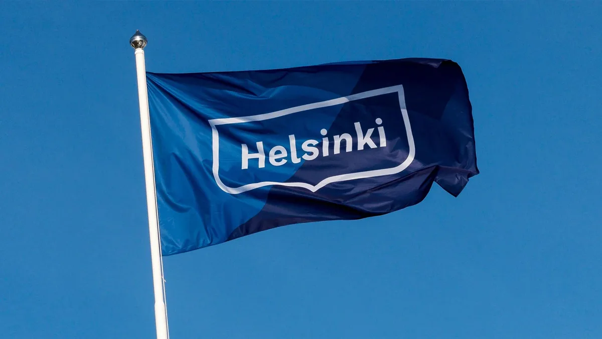
The Helsinki logo is simply a word mark enclosed in a shape. One could be outraged by its (un)banal simplicity. And then add that “my five-year-old daughter could do better”.
Source: Werklig website
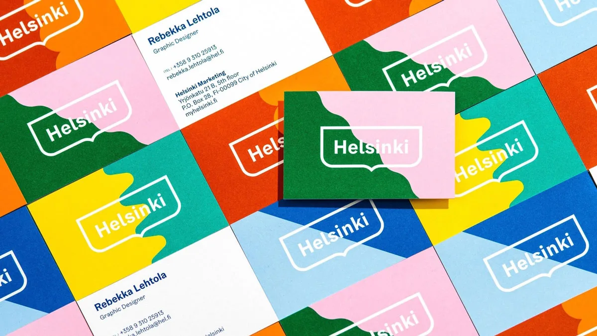
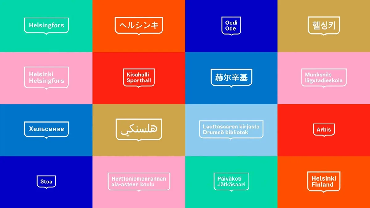
However, this branding is not about the logo. Although we are used to evaluating this element first, it is not the most important part of the system. It appears because it should, but the essence of the project’s success lies in creating branding that captures the spirit of the place, tells the story of its present, shows how the authorities want to see their city, and allows residents to connect with the brand (or at least get used to it easily). Werklig prepared a series of graphic elements that would allow the brand to be further implemented: from color schemes and patterns to the typography that is standard in such systems. The designers also developed a coherent visual narrative to represent Helsinki in photos and videos. They emphasized the importance of avoiding any filters when portraying the city, showing it as it is and focusing on its true diversity.
Nevertheless, there was controversy. “Helsinki was not ready to introduce the new branding,” comments Janne Kaitala. “The identity first appeared during the World Figure Skating Championships at the end of March 2017, but few people noticed it then. The city decided not to conduct any proactive communication or campaign to inform about the changes. At some point, our project was published by the Finnish media, which focused on the crazy color combinations and accused us of killing Helsinki’s coat of arms. For two or three weeks there was a storm on social media. Among other things, we were labeled a ‘pro-gay agency’. But the whole creative community in Finland supported us. They started to argue that our project was really solid: justified, useful and unique. Sure, it was bold, but it had to be. And entirely in keeping with what Helsinki represents.”
Source: Werklig website
When the new brand was unveiled, it was the colours that attracted the most attention.” – recalls Sara Kurki-Suonio, Assistant to the Defence Attaché at the Finnish Embassy in Poland. – “The marketing agency behind the rebrand explained that the colours represented “the green of the city’s trams” and “the pink of Suomenlinna” (a historic fortress and Unesco World Heritage site). However, it was clear to most that the mint green and ‘millennium pink’ were simply trendy at the time. So whatever controversy there was about the rebranding, it was mostly about the new colour scheme.”
Sara Kurki-Suonio, referring to the aforementioned Kasper Strömman recalls him writing that the colour palette was straight out of a 1987 shopping catalogue. “So the rebranding was accompanied by some humorous comments, but it didn’t affect my perception of the brand.” She stresses that “whenever something new is introduced, there is always criticism, but whatever resistance there was to the rebranding has long since subsided”.
“And one more thing! We did not kill the coat of arms; we reserved its use for the ceremonial purposes it was meant to serve,” Janne Kaitala adds.
The importance of city branding in everyday functioning is demonstrated by Helsinki’s design system. Simple and not overloaded, it effectively guides the user through the main principles of the brand. It gathers all the essential project elements in one place. It is functional and completely free of professional pretensions. It is simply a reflection of the brand it describes.
Source: Werklig websit
I asked Janne how he judged the project years later. “I think we are still very proud of it. To create something like that is a unique change. Many opponents of the branding have come to us personally, apologized, and admitted they were wrong. Our work for the city goes on. For example, we are still installing signes in some buildings. It is also a testament to our ability to deliver large-scale projects. We know we can do the job and that gives us a lot of confidence.”
After several years, Sara Kurki-Suonio believes the brand has perfectly integrated into the city. “When a brand feels natural and you forget about it, it does not bother you, I think that is a sign of a successful brand.”
The broad and active participation of city officials and the simplicity of the solutions used ensured that the new brand was perfectly in line with the original goal of becoming “the most functional city in the world”. If Helsinki really is what its brand says it is, then it may well be true.
This project, and in particular the way it was carried out, highlights the importance of collaboration and trust between designers and clients. Werklig emphasized a transparent decision-making process that took into account the specifics of the city’s decision-makers. (Janne mentioned that good catering might have helped too 😉 )
At Admind, we understand the importance of mutual trust in collaboration. We do everything we can to ensure that not only the result, but also the entire journey leading up to it, is a shared experience for us and our clients. And that throughout that journey, everyone feels that we are working together towards a common success.
Andrzej Leraczyk, Design Lead at Admind Branding & Communications – the largest branding agency in Central Europe. Designer, exhibition curator, and author of texts on design, branding, and music branding. Co-creator of „rzeczy: o dizajnie” the first Polish design magazine created after 1989. Co-founder of Motor Studio, which specializes in visual identification and branding. He has collaborated with the Cultural Center in Poznań, Estrada Poznańska, the City of Sopot, and the Library Development Program.