Nordic breeze
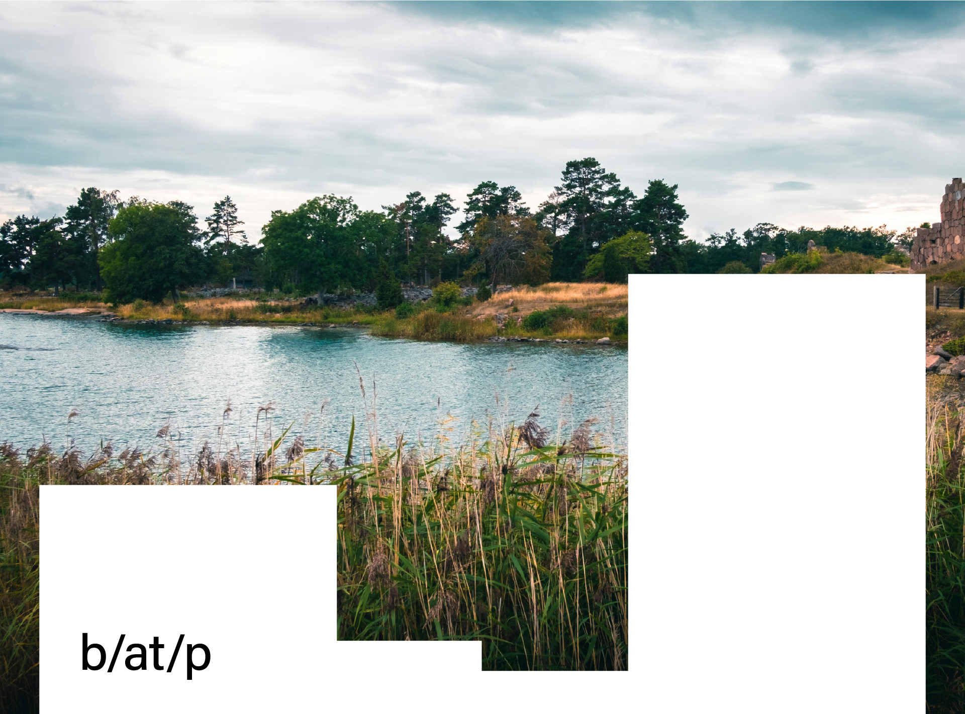
I can almost feel the cold pebbles under my feet on the beach and that distinct, damp scent of the sea. I almost hear the soft crunch of small branches breaking under my steps as I walk through the forest path. A light breeze ruffles my hair, making me squint slightly. It seems as though I can touch the soft moss growing on a piece of decayed wood while my eyes adjust to the sight of a small bay and one of the many islands appearing on the horizon. I take a deep breath, and all my senses are tuned into a soothing calmness.
Alright, perhaps I’m exaggerating a bit, but that’s how I felt looking at one of the latest branding projects from the Finnish agency Bond. They have designed what is probably the most organic, natural brand of recent months—a brand with a heartbeat of about 70 beats per minute and blood pressure likely around 120/80!
Saaristo: A name rooted in place
“Saaristo” simply means “archipelago” in Finnish, but for Finns, it also refers to a specific group of islands—the world’s largest archipelago, consisting of 40,000 islands scattered off the southwest coast of Finland between Turku and the Åland Islands. This is a place with a distinct identity, shaped not only by its geography but also by its culture. A majority of its residents (63%) speak Swedish as their first language, and parts of the archipelago are an autonomous demilitarized zone with their own parliament and government.
A logo crafted from the land itself
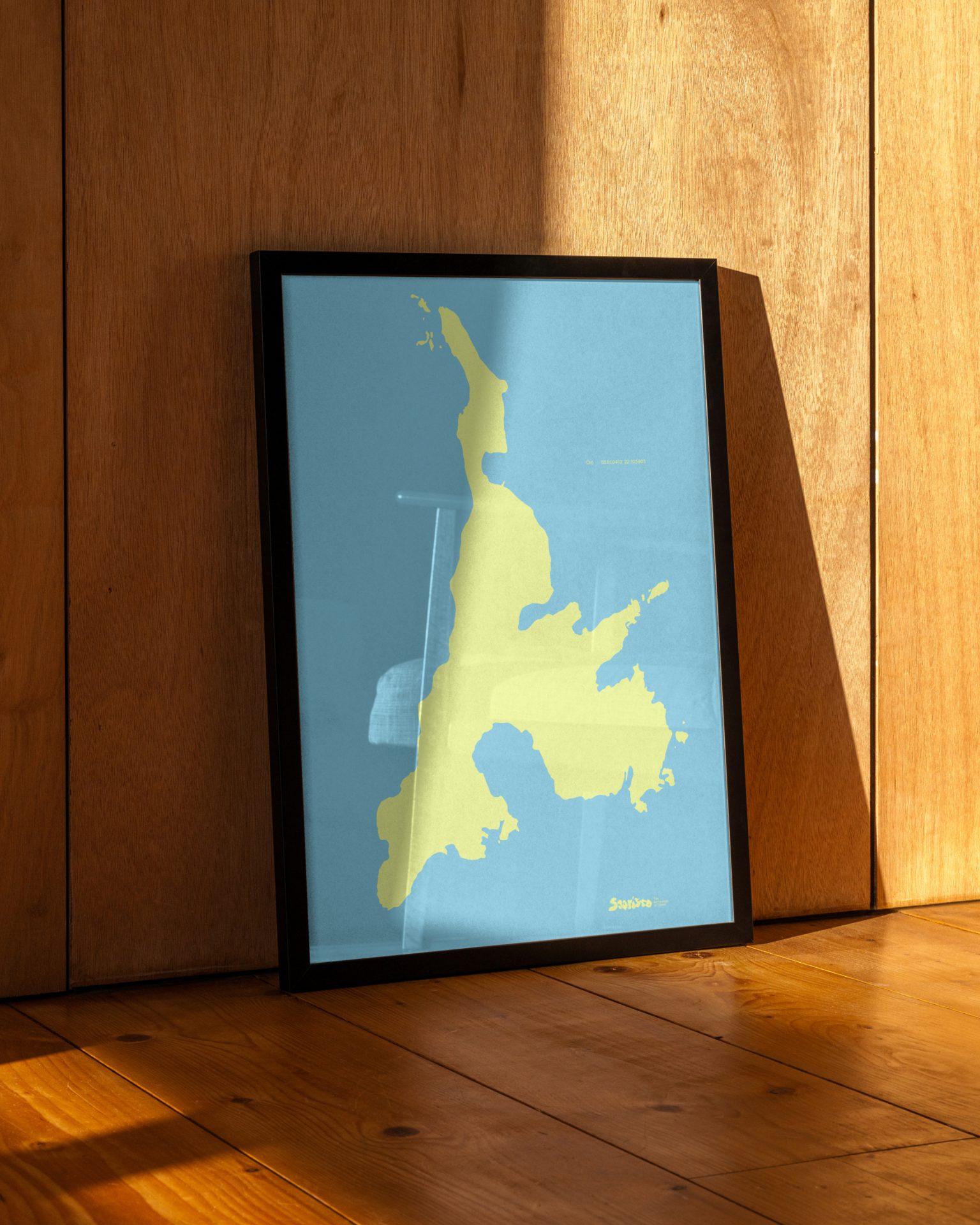
The starting point for Saaristo’s brand identity was the shapes of the islands and the idea of translating them into the typography of the logo. However, as Kasperi Salovaara (the design director behind the project) notes, geography wasn’t their initial focus. The idea emerged naturally as they examined maps of the archipelago.
“We were struck by the sheer diversity of the landscape—each island uniquely shaped, unlike any other. That’s when it clicked: with 40,000 islands, surely every letter of the alphabet could be found among them. The realization truly took hold when we stumbled upon an island that looked unmistakably like the letter ‘S.’”
Source: Bond Agency
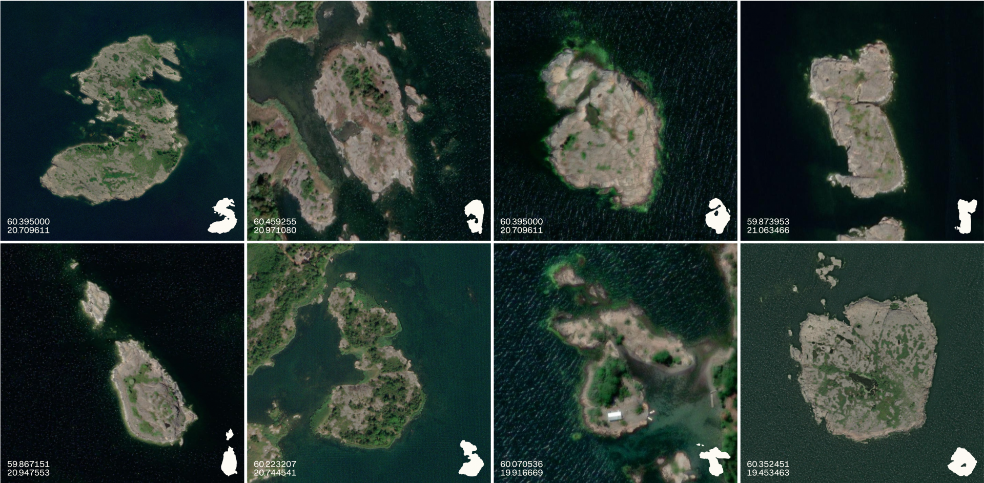
The designers spent countless hours analyzing Google Maps, searching for islands whose shapes resembled specific letters.
“One by one, we combed through the map, screenshotting and pinning potential island forms that could serve as letters. Through endless combinations and experimentation, we refined the concept until we arrived at the final version.”
At one point, the entire design process stalled when one of the selected islands mysteriously disappeared from their records. Finding this crucial piece of the brand’s visual identity took two full days, highlighting both the vastness of the archipelago and the determination of the designers.
Ultimately, both nature and design played a role in shaping the brand. The wind, sea, and ice sculpted the landscape over millions of years, while painstaking creative work transformed the contours of eight real islands into a logotype that is a direct tribute to the region’s geography and natural beauty.
Source: Bond Agency
An agile and passionate team
The strategic and creative process behind Saaristo’s identity was incredibly efficient. Bond worked with a small, six-person team:
- Kasperi Salovaara (Design Director)
- Arttu Salovaara & Väinö Leskinen (Strategists)
- Liisa Paasio (Creative Director)
- Juha-Pekka Laurila (Designer)
- Aleksi Hautamäki (Project Lead)
For projects involving local communities, decision-making can be long and exhausting, with an endless list of stakeholders slowing down progress. Surprisingly, in Saaristo’s case, only two people—the CEO and the Marketing Director—had the final say:
“Also, we did not have much time—which always helps speed up the process!” admitted Kasperi with a smile.
A personal connection to the archipelago
Choosing Bond for this project was no coincidence. Some team members have personal ties to the islands. Aleksi Hautamäki actually owns one of the islands, and Kasperi Salovaara lives in Turku, where the client is based.
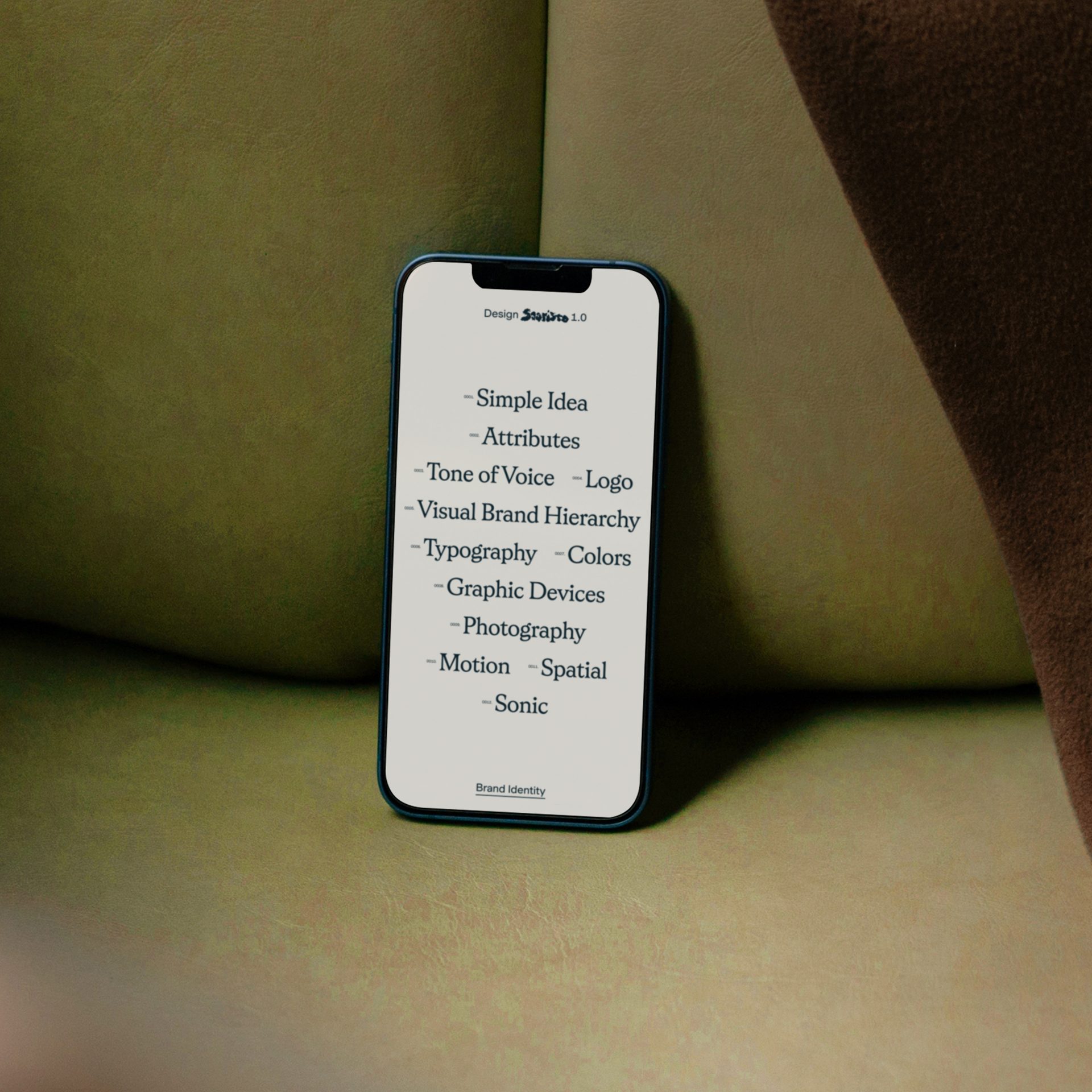
They combined their first-hand experiences with extensive interviews with local residents, tourism industry representatives, and experts. They also analyzed statistical data on tourism segmentation in the region. This holistic approach ensured the brand reflects the needs of both the local community and visitors.
Source: Bond Agency
Deeply local, naturally global
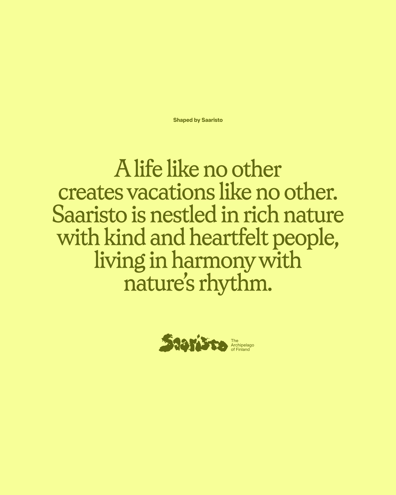
“Whether a retired German couple seeking tranquil sunsets, a local kayak crew obsessed with isolated skerries, or Japanese sauna enthusiasts, we found that all traveler categories shared one core desire: to have meaningful, life-defining moments in nature.”
With this in mind, the designers had creative freedom to develop a concept beyond traditional tourism branding. The result is a deeply local identity, but one that also carries a universal message—a brand built with conceptual design principles, yet open-ended and adaptable.
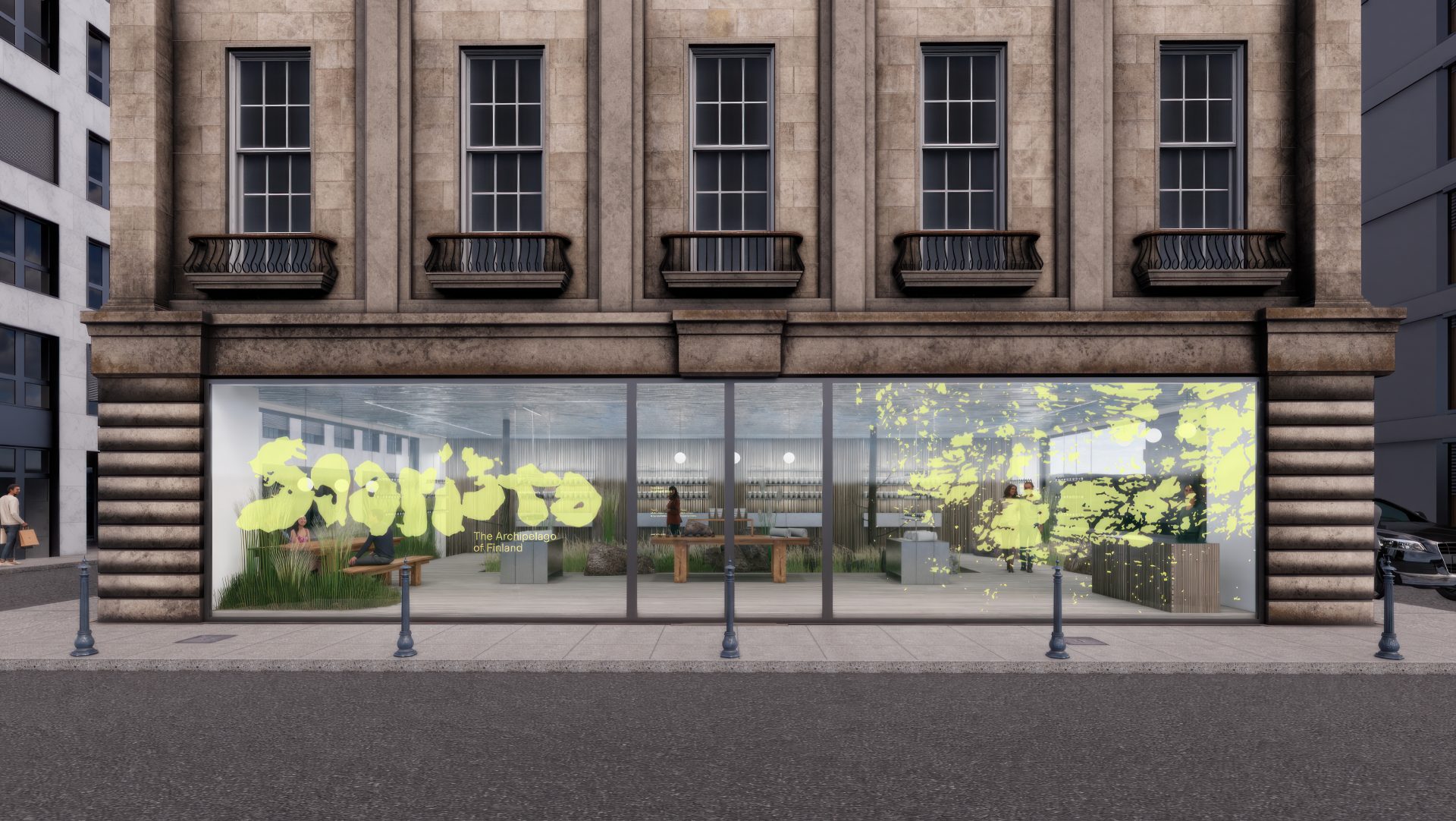
All brand elements are now complete, including the visual identity, website, video materials, and various tools to introduce Saaristo to audiences in Europe and the United States. The brand rollout is already in progress, ensuring its full presence across the islands by summer.
The art of doing nothing in Saaristo
One of the short promotional videos for the new brand features a simple, almost static scene: a close-up of a man’s face wearing a woolen cap. His blue eyes slowly open, his nose slightly red from the cold. A message appears:
“The art of doing nothing in Saaristo.”
“Our goal was to visually capture the feeling of being there—to ensure the identity felt true to the place, not like something imposed from the outside.”
And in my opinion, Bond has truly succeeded. I felt like I was there. I could feel the cold on my face. And I could almost hear someone say:
“Ole hyvä!” “Varsågod!”

