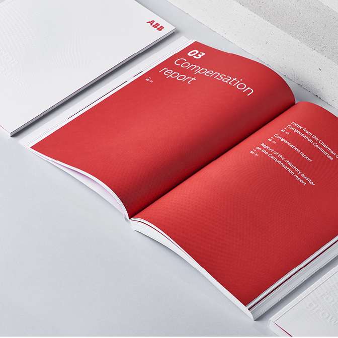
ABB – Guiding with Design
Share this article
- Filter Name
-
Client
ABB
-
Industry
Robotics, Electrification, Proces Automation
-
Awards
Red Dot Award, Creativity International Awards
Executive Summary
As ABB’s global offices continue to evolve into hybrid work environments, the company required a scalable wayfinding system that would improve spatial clarity while reflecting its human-centered culture.
The challenge was to design an intuitive signage framework for a multi-floor office campus combining collaboration zones, focus rooms and shared spaces. The system needed to support both employees and visitors, remain visually aligned with ABB’s global brand, and be adaptable for future locations.
Admind developed a modular, governance-ready wayfinding system based on real user movement patterns and layered information architecture.
The result was a clear, scalable signage framework that improved navigation, reduced friction and strengthened ABB’s human-tech brand expression.
Client & Context
ABB operates globally across electrification and automation, managing complex office environments for thousands of employees.
The new office campus was designed as a hybrid workspace integrating collaboration zones, open spaces, focus rooms and social areas. The environment combined architectural clarity with high functional diversity.
ABB required a signage system that would:
- improve intuitive navigation,
- support multi-floor spatial logic,
- align with global brand standards,
- introduce a warmer and more approachable tone within a technical environment.
This was not only a directional signage task.
It was an opportunity to embed brand culture into spatial experience.
Business Challenge
The building consisted of multiple floors with varying layouts, traffic intensity and functional clusters. Logical architectural axes did not always match natural user movement patterns.
The main challenge was to design a wayfinding system that felt intuitive regardless of prior familiarity with the space.
Without a structured approach, ABB risked:
- user confusion in high-traffic zones,
- inconsistent information hierarchy,
- increased dependency on reception points,
- fragmented signage across future locations.
The system needed to balance technical precision with human warmth.

Objectives & Success Metrics
Objectives
- Create an intuitive wayfinding system for employees and visitors.
- Establish a clear hierarchy of directional, identification and informational signage.
- Integrate ABB’s visual identity into a more human spatial language.
- Develop a scalable framework adaptable to future office locations.
Success Verification
- Improved user orientation within weeks of implementation.
- Reduced number of location-related questions at reception.
- Clear and consistent signage across all floors.
Adoption of the system as a reference model for future office upgrades.
Key Decisions
User-flow mapping vs. architectural logic only
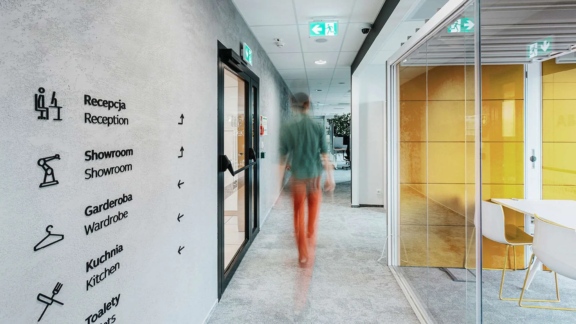
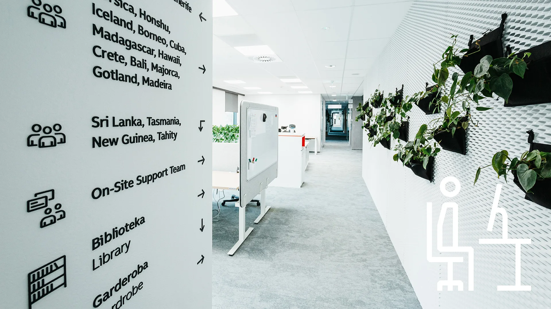
Real movement patterns were mapped to inform placement and hierarchy. Signage followed behavior, not only floor plans.
Layered information system vs. single-level signage
Three clear layers were defined: directional, room identification and informational. This reduced visual noise and increased clarity.
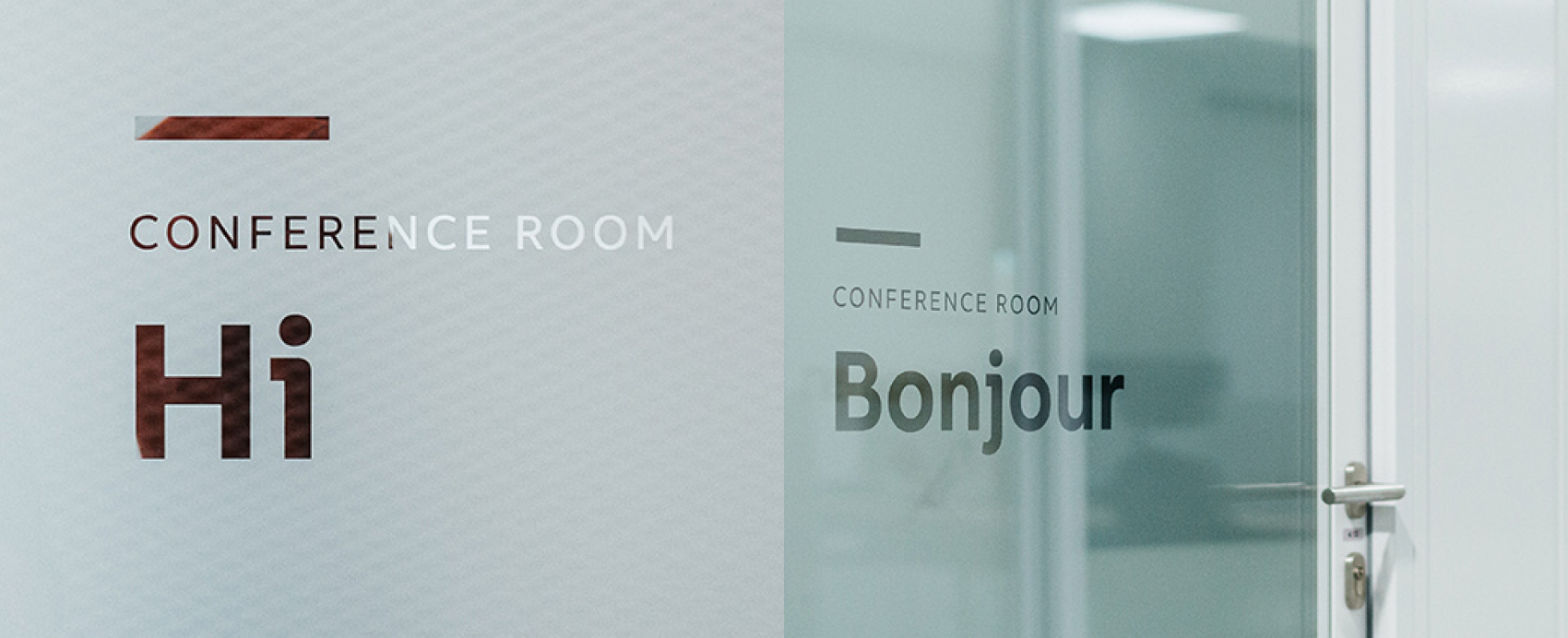
Human-tech tone vs. purely technical communication
Warm verbal accents such as “Hi”, “Bonjour”, “Ahoj” and “Cześć” were introduced to soften the environment while maintaining brand consistency.
Scalable modular system vs. location-specific design
The framework was designed for repeatability across global ABB offices.
Strategy & Insight
User journey analysis revealed that natural movement paths often diverged from architectural axes. The system therefore focused on:
- clustering rooms into functional zones,
- guiding users through intuitive visual anchors,
- reinforcing clarity through consistent typographic hierarchy.
ABB’s brand DNA is technological and precise. However, workplace experience demanded a more approachable tone. The solution combined engineering clarity with subtle human warmth.

Solution
Human-Tech Minimalism
The signage system was built on a modular structure using ABB’s primary typography and a refined iconography set inspired by engineering clarity.
Key elements included:
- minimalist directional panels,
- vertical information strips,
- transparent glass applications integrating signage into architecture,
- neutral, universally understandable icons,
- subtle color accents distinguishing functional zones.
Clarity First
Each signage type was designed for optimal legibility at defined distances. Visual hierarchy prioritized orientation over decoration.
The system avoided visual overload and complemented the architectural language rather than competing with it.
Implementation
The project included full system documentation enabling global scalability:
- production and material guidelines,
- composition and placement principles,
- icon grid and visual asset library,
- implementation manual for various spatial typologies.
This ensured consistent execution across current and future locations.
Results
The new wayfinding system delivered measurable operational improvements:
- smoother circulation across floors,
- significantly fewer navigation-related questions at reception,
- stronger spatial coherence across the campus,
- enhanced perception of order, clarity and modernity,
- establishment of a model framework for future ABB office upgrades.
Wayfinding became more than orientation.
It became a subtle carrier of ABB’s identity — precise, global and human-centered.
Learnings & Transferability
Wayfinding systems should be designed as behavioral infrastructure, not decorative overlays. Mapping real user movement improves clarity and reduces friction.
For global organizations, signage must combine governance, scalability and cultural sensitivity.
This approach works best in multi-floor corporate environments with hybrid work models and distributed global presence.
Let's talk!