February 12, 2025
Rebranding in 2024: Bold moves, big risks and lessons learned
Share this article

In 2024, some of the world’s most iconic brands took the plunge and reinvented themselves to stay relevant in an ever-changing world. Some were applauded, others… not so much. Let’s dive into the most fascinating rebrands of the year, explore why companies take this risky leap, and uncover what makes (or breaks) a rebrand.
Before diving into the most talked-about rebrands of the year, let’s start with some key terms:
Branding is the process of creating a unique identity for a company, product, or service. It encompasses elements like logos, colours, messaging, and the overall experience customers associate with the brand. Strong branding helps companies stand out, build trust, and create emotional connections with their audience.
Rebranding is a significant transformation of a company’s identity, often involving a new logo, updated visual identity, revised messaging, and even a shift in company values or positioning. Companies rebrand for various reasons—mergers, market changes, reputation management, or expansion into new industries.
Unlike a full rebrand, a brand refresh is a subtle update to an existing brand identity. It might include modernizing the logo, adjusting colours, or refining messaging to stay current without losing brand recognition. Think of it as giving a brand a fresh coat of paint rather than tearing the whole house down.
Luxury car brand Jaguar has undergone a bold transformation, unveiling a sleeker, more minimalist logo alongside its new slogan: ‘Copy Nothing’. The rebrand signals Jaguar’s shift to an all-electric range by 2025, appealing to a new generation of eco-conscious drivers.
Jakub: As an automobile enthusiast, I simply don’t like the new Jaguar logo – and it seems to be the general attitude towards it, to say the least, among my fellow petrolheads. To me, the new logo removes the brand far away from their long-standing car manufacturing tradition, and places it among more lifestyle-oriented brands, like perfumeries or fashion goods.
As a branding expert, I can see where they’re coming from. Rebranding is meant to transform company’s identity and in the Jag’s case, the transformation is comprehensive: new logo, new messaging, new brand positioning. In words of Gerry McGovern, Jaguar Land Rover Chief Creative Officer, “it’s not just about reshaping a car. It’s about redefining, and reimagining a brand”. The question remains: will the brand survive?
Michał: Jaguar’s rebranding has undeniably sparked global conversation. But beneath the buzz lies a deeper issue the brand has long faced, the struggle to stay relevant. The struggle to be “Jaguar”.
Once a symbol of high-end British craftsmanship, Jaguar built its legacy on exclusivity and aristocratic charm. The E-Type, famously called “the most beautiful car ever made” by Enzo Ferrari, embodied this prestige. Yet, as the industry shifted toward hybrids and electrics, clinging to that image became increasingly difficult. Probably pointless even?
The market lacked an extraordinary, ultra-performance electric car with Jaguar’s signature class. Enter scene: the Jaguar Type 00. The model that holds the chance to redefine Jaguar’s place in the modern car era. Following that, comes a new bold visual identity.
While the impact of this transformation remains to be seen, one thing is certain, we should look beyond reactions and try to see reasons. Behind Jaguar’s rebranding are months of expert strategy and design. So, let’s take this “branding controversy” with a grain of salt, shall we?
Funny enough, currently I’m enjoying playing Cyberpunk 2077 by CDPR, and it’s ironic to see that designers in that video game made luxury cars of the future world very similar to how Type 00 prototype looks.
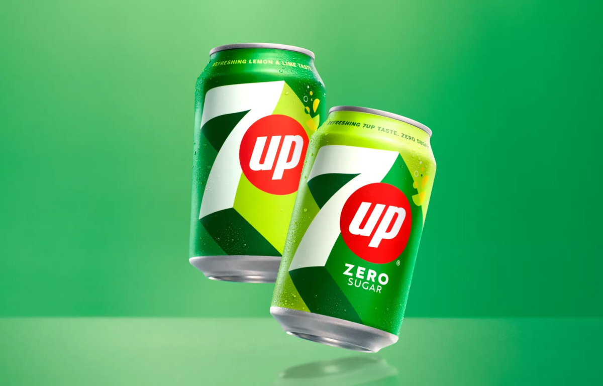
Popular lemon-lime soda 7UP has undergone a bright, retro-inspired refresh with the return of a 3D neon logo that balances nostalgia with a modern touch. The update aims to attract younger consumers while keeping longtime fans happy. The aim, says Pepsi, was to create a “bright and confident visual identity system that will resonate across cultures, regions and languages” and create “UPliftment”. The refreshed look reflects energy, positivity and a sense of fun, in line with the brand’s global positioning.
Source: Design Pepsico
Jakub: To me, the new 7UP logo screams “modern”: the long shadow of the number 7, imitating an upward movement and reflecting the “UPliftment” philosophy; the flattened, more angular font; finally, the new colour palette with fresh, vibrant, citrusy hues. At the same time, the logo has kept its basic characteristics – the big number 7 and the word “up” enclosed in a red circle – making it instantly recognizable. What is more, the company boasts that the brand refresh made it ready “to be translated across cultures, regions and languages for a unified yet localized look”. I like it!
Michał: Pepsi has already shot itself in the knee once with a rebrand that strayed too far from its roots. Nostalgia rarely fails in branding and culture. Seeing a brand embrace self-awareness, betting on being plain, bold, simple, and honest is something I always enjoy witnessing.
Staying relevant is never easy, but that doesn’t mean a brand has to reinvent itself completely. Not everyone needs to go va banque like Jaguar.
Good job, PepsiCo. That’s what’s up.
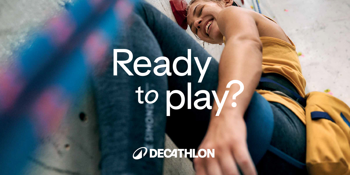
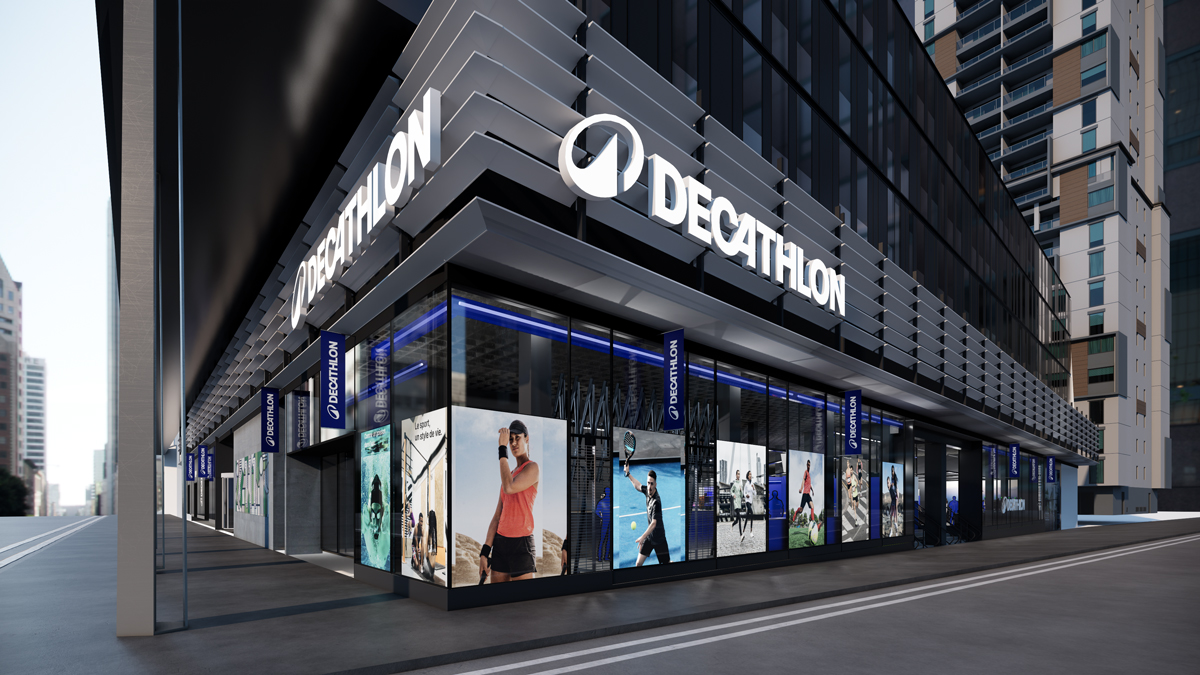
Global sports retailer Decathlon has rebranded to position itself as a true authority on sport, not just a retailer. The new identity includes a custom Decathlon Sans typeface, a modernised logo and a greater emphasis on digital engagement. But this was far more than a visual update – the French company opted for a complete transformation, redefining its strategy, design, internal culture, customer experience and product portfolio. It was a bold move to create a seamless and unified brand identity across all aspects of the business.
Source: Decathlon
Jakub: Decathlon rebranding, much like the Jaguar’s, is a comprehensive one: we’re not only getting a new logo and visual identity but more importantly redefined strategy, brand experience and brand positioning. Unlike Jaguar’s, however, the Decathlon’s makes sense: the company decided to move forward and redefine itself while staying true to its values and rich historic heritage. I especially like their new brand symbol, “L’Orbit”, which sets out to unify the internal array of Decathlon’s sports brands and position the chain among such sporting goods manufacturers as Nike or Adidas.
Michał: Jung’s archetypes in branding feel about as scientific as reading horoscopes. Then again, I do check my horoscope sometimes. And Decathlon? It has always been the Everyman of sports apparel and accessories. Nothing wrong with that. I love affordable and inclusive sporting equipment.
But here’s the thing: archetypes evolve. What’s bold, brave, funny, or universal shifts over time. Decathlon’s strategy team clearly understood that, choosing to overhaul their design system and breathe fresh air into the brand. It’s a well-executed, thoughtful update across all touchpoints. I like it. Good job, Decathlon. See you next time I need a new biking helmet.
Not all rebrands are welcomed with open arms. The Polish city of Poznań launched a new logo featuring a green shield with a stylised ‘P’ and an asterisk. The aim? To modernise the city’s visual identity. The result? A wave of backlash from locals who felt the design lacked character and connection to the city’s history.

Source: Designalley
Jakub: As someone living in Poznan for the past 8 years, I can safely say: yes, it went horribly wrong. Not only the new logo was met with enormous backlash from the city’s inhabitants, but as a result of it, the whole (already completed!) project of Poznan’s new visual identity was scratched! The logo itself was mostly criticized for being too simple, somewhat too obvious, and at the same time lacking a connection with the city’s historic heritage. To me, the new logo looks definitely more interesting than the previous one. I really like the adaptability and usability of the new design, especially the interchangeable background of the emblem part. However, for its basic form, I would probably opt for “the Poznan blue” as the background colour and work on improving the composition of the elements inside the emblem.
Michał: Poznań is the sixth-largest city in Poland. Maybe not the biggest flex, but it’s certainly not a place that can get away with branding like this. It’s not outright bad, but it’s far from great. And that’s frustrating because Brandburg Studio, the team behind this rebranding, has done outstanding work for Poznań before. Their Information System for the Poznań City? A fantastic project.
There are some strong elements here worth recognizing. The proposed design system, viewed as a whole, is solid. The idea of using the “U”-shaped crest as a container and base module for layouts is genuinely well-thought-out and praiseworthy. But then the logo itself is visually mediocre. And when you dig into the reasoning behind it, mediocre starts feeling more like outright weak.
And then there’s the primary colour choice. I’m not sure why, but when I ran a quick thought experiment “What colour represents Poznań?”, I immediately landed on blue. Maybe it’s because of Lech Poznań football club, but it just feels more fitting.
Let’s be honest: it’s not a disaster, but it’s not good either. A miss for sure, but not worthy of national ridicule. Yet, unfortunately, I’ve already seen quite a few memes dragging it through the mud.
In 2024, Figma, the collaborative design platform, unveiled a comprehensive brand refresh to reflect its evolution from a single-product company focused on designers to a multifaceted platform serving a diverse user base. The new identity features a broader colour palette, a bespoke typeface called Figma Sans, and a dynamic visual language that incorporates abstract shapes and elements of movement. This transformation aims to convey flexibility, inclusivity and the brand’s commitment to empowering creativity across disciplines.
Source: Figma blog
Jakub: A lot has changed for Figma since the last iteration of its brand was introduced in 2019. The 2024 rebranding was aimed at reflecting that change. The first thing that stands out about Figma’s new visual identity is the extensive use of various shapes, icons and forms. Paired with an extended colour palette and dynamic compositions, these elements are meant to reflect the company’s shift to a broader users and represent the diversity of individuals collaborating on projects. We also see a lot fewer cursors, which were Figma’s trademark sign – this in turn aims at highlighting the actual process of designing something; instead of cursors, we see nodes. All in all, Figma’s refreshed brand has got even more playful and colourful while leaning hard on the abstractness of brand elements and their dynamic presentation.
Michał: Figma has always felt like the hipster of tech brands. Informal in its visual comms yet still maintains the image of a top-tier professional tool. With this refresh, the design and strategy team managed to keep that same vibe.
On the technical side, there’s not much to critique. It’s Figma. You’d expect their design team to be all-star, and they delivered. But let’s talk about what stood out. First, they injected the brand with fresh pizzazz. And second, those goddamn UI-based animations? Outstanding. I like them bold. I like them funky.
A logo change is never just about the logo. Rebranding is a strategic move that companies make to stay relevant, appeal to new audiences or redefine their market position. Here are some recent examples that illustrate the different motivations behind rebranding:
Companies rebrand for a number of reasons:
When two companies merge, rebranding helps to unify their identities
Eurostar and Thalys (2023): The merger of these two rail giants led to a rebrand under the name “Eurostar”, symbolising a unified European high-speed rail network.
As consumer tastes evolve, brands must keep pace.
Pepsi (2023): Pepsi unveiled its first rebrand in 15 years, introducing a retro-inspired logo that resonates with contemporary design trends while evoking nostalgia.
When a brand faces significant negative publicity, rebranding can serve as a strategic move to rebuild its image and distance itself from past controversies.
A notable example is Philip Morris USA, which rebranded as Altria in 2003 to shift focus away from its association with tobacco products and mitigate negative perceptions.
A brand going global may need a visual refresh to resonate with international audiences.
Nokia (2023): Nokia updated its logo for the first time in 60 years to reflect its transformation into a B2B technology innovation leader and to change its perception in new markets.
Outdated branding can make a company seem irrelevant.
Johnson & Johnson (2023): The company replaced its signature cursive logo with a modern font to reflect its focus on health innovation and to align with contemporary design aesthetics.
When a company broadens its range of products or services, rebranding can help reflect this evolution and prevent limiting associations.
Dunkin’ (2019): Formerly Dunkin’ Donuts, the brand dropped “Donuts” from its name to emphasize its expanded menu, which includes coffee, sandwiches, and other beverages beyond its signature pastries. The streamlined identity helped position Dunkin’ as a modern, all-day café rather than just a donut shop.
A well-planned rebrand has the power to revitalize a company’s image, attract new customers, and strengthen its position in the market. But when executed poorly, it can backfire—leading to confusion, alienation, and even public backlash. Let’s break down the benefits and risks of rebranding.
Staying relevant – Consumer preferences evolve, and brands that fail to adapt risk becoming outdated. A fresh look helps a company stay in sync with modern aesthetics, digital trends, and shifting cultural values. Think of it as keeping up with fashion—what worked a decade ago might look stale today.
Attracting new audiences – A well-executed rebrand can reposition a company to reach different demographics. Whether it’s targeting younger consumers, expanding into global markets, or appealing to a more premium audience, a rebrand can open new doors. For example, Burberry’s modernized logo and minimalistic design helped shake off its outdated image and reestablish it as a luxury leader.
Gaining a competitive edge – In crowded industries, differentiation is key. A distinctive, fresh brand identity can set a company apart from competitors, making it more memorable and appealing to consumers. A strategic rebrand can signal innovation and forward-thinking, helping businesses break through market noise.
Generating buzz & media attention – A bold rebrand, when done right, creates excitement. It’s an opportunity for PR campaigns, social media engagement, and consumer conversations. Companies that involve their audience in the rebranding journey—teasing changes or explaining the “why” behind them—often benefit from increased engagement and positive sentiment.
Alienating loyal customers – Change can be unsettling, especially for a brand with a dedicated following. If a rebrand strays too far from what customers love, it can create confusion or resentment. The Tropicana packaging redesign disaster of 2009 is a classic example—customers didn’t recognize the new look and sales plummeted by $30 million in just two months.
High costs – A full-scale rebrand isn’t just about a new logo. It involves redesigning marketing materials, updating digital platforms, changing product packaging, and running new advertising campaigns—all of which require significant investment. For global brands, rebranding costs can run into millions of dollars, making it a high-stakes decision.
Implementation challenges – A successful rebrand requires seamless execution across all touchpoints—websites, social media, physical stores, packaging, signage, and even company culture. Poor implementation can lead to inconsistencies and a fragmented brand experience. Large companies with multiple stakeholders often struggle with this aspect.
Public backlash and reputation damage – If consumers dislike the new identity, the backlash can be swift and unforgiving. Social media makes it easier than ever for customers to voice their discontent, and brands must be prepared to respond. A classic case is GAP’s 2010 rebrand, where the company introduced a new logo, faced massive criticism, and reverted to the old design within a week—losing credibility in the process.
A rebrand can be a powerful tool for revitalizing a company’s image, but it comes with risks. To ensure success and avoid costly mistakes, brands should follow these key strategies:
Before making any changes, brands should analyze:
Customer preferences – What do current and potential customers value about the brand?
Market trends – How do competitors position themselves? What’s working and what’s outdated?
Brand perception – Conduct surveys or focus groups to understand how the public sees the brand.
Tropicana’s 2009 rebrand removed its iconic orange-with-a-straw packaging, confusing customers and leading to a $30 million sales drop. Had they conducted better consumer testing, they could have avoided this failure.
A rebrand should refresh, not erase, a brand’s identity. Companies should retain recognizable elements that customers associate with the brand.
Apple’s evolution over the years has kept its minimalist aesthetic, ensuring that changes feel natural rather than abrupt.
Involving employees, customers, and partners in the rebranding process can help create a smoother transition. Internal buy-in is critical for success.
Airbnb’s 2014 logo change was initially criticized, but because the company had clearly communicated its design philosophy (symbolizing belonging), the rebrand ultimately gained acceptance.
Before launching a new brand identity, companies should test prototypes, collect feedback, and adjust. Soft launches, limited region trials, and A/B testing can prevent costly mistakes.
When Mastercard refreshed its logo in 2016, it initially introduced the changes subtly, allowing customers to adapt before fully rolling out the new design.
A rebrand should be explained, not just announced. A well-planned PR campaign can help customers understand the changes and embrace the new identity.
Use storytelling to show the “why” behind the rebrand. Sharing behind-the-scenes insights into the design process helps customers feel more connected to the transformation.
Brands need to ensure a seamless shift across all platforms—website, social media, product packaging, signage, and advertising. A mismatched brand rollout can cause confusion and harm credibility.
When Google rebranded its parent company as Alphabet, it ensured a smooth digital transition, with clear messaging and an updated brand hierarchy.
Even the best-planned rebrands can face criticism. The key is to listen to feedback and adjust accordingly rather than stubbornly sticking to a failed idea.
GAP’s 2010 rebrand lasted only a week due to massive backlash. The company quickly reverted to its original logo after realizing customers preferred the old one.
A great rebrand isn’t just about a new logo—it’s about telling a compelling story. Whether it’s Jaguar embracing the future, 7UP playing with nostalgia, or Poznań learning the hard way that locals care deeply about their city’s image, one thing is clear: rebranding is a high-stakes game.
So, next time you see your favourite brand change its look, take a moment. Love it or hate it, there’s a strategy behind it. And if they get it wrong? Well, Twitter / X will let them know.