Energy Efficiency Movement – building a scalable brand identity
Share this article
- Filter Name
-
Client
Energy Efficiency Movement
-
Industry
Industry Associations
Executive Summary
The Energy Efficiency Movement (EEM) is a global initiative bringing together organizations committed to accelerating energy efficiency worldwide. As the initiative expanded, it needed a stronger and more structured visual identity that could work consistently across materials, digital platforms, and international communication.
Our role was to extend the existing brand system by introducing new visual components, usage rules, and a scalable design framework. The solution included the Impulse symbol, an expanded color palette, a systematic typography approach, and a modular icon system.
The result was a coherent brand identity supporting the movement’s growth and enabling consistent communication across multiple channels. The project delivered over 30 key brand assets, forming the foundation for ongoing brand development.

Client & Context
The Energy Efficiency Movement is a global industry initiative focused on accelerating the adoption of energy-efficient technologies and practices.
The movement connects organizations, experts, and decision-makers working toward a more sustainable energy future. As the initiative grew, it required a visual identity that could support communication across different platforms, partners, and international audiences while maintaining clarity and consistency.
The challenge was not to redesign the brand from scratch but to expand and systematize an existing identity so it could operate as a scalable communication system.

Business Challenge
The main challenge was to extend an existing visual identity into a coherent and scalable brand system.
While the initiative already had a logo and color palette, the brand lacked additional visual components and clear usage rules. This created limitations when producing communication materials and reduced visual consistency across channels.
As the movement expanded its activities and visibility, it became increasingly important to build a system that would:
- ensure consistent communication across materials and platforms
- strengthen the initiative’s credibility and expert positioning
- support future growth and new communication formats

Strategic Decisions
One of the key strategic decisions was not to replace the existing identity, but to build a structured design system around it.
Instead of introducing entirely new visual elements, we focused on extracting and expanding the logic already present in the brand. This included:
- developing the Impulse symbol as a visual expression of the movement’s momentum
- creating a structured color system derived from the original palette
- introducing typographic rules that improve readability and consistency
- building a modular icon system based on the geometry of the logo
This approach ensured continuity while significantly increasing the brand’s usability and scalability.

Objectives & Success Metrics
The project aimed to achieve several operational outcomes:
1. Strengthen brand coherence
Create a structured visual system that ensures consistency across all communication materials.
2. Enable scalable communication
Develop visual elements that work across digital platforms, presentations, and marketing assets.

3. Support expert positioning
Align the visual identity with the initiative’s role as a credible voice in the energy efficiency debate.
4. Provide practical design tools
Deliver assets and guidelines that enable teams to produce materials efficiently while maintaining brand consistency.
Execution
The project focused on building a functional brand system, rather than delivering isolated design assets.
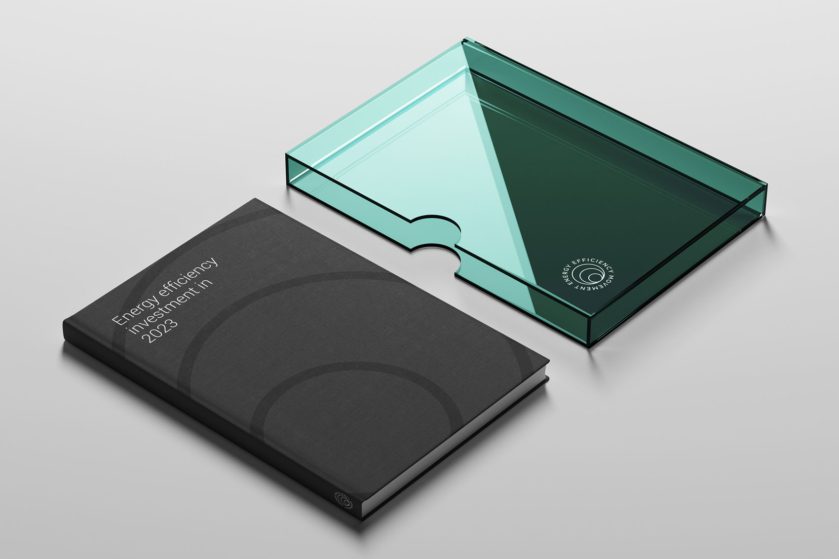
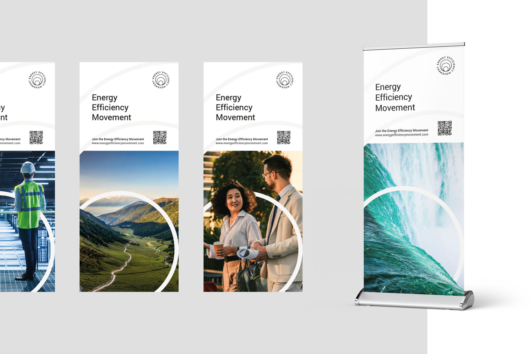
Impulse Symbol
The Impulse became a central visual element representing the spread of energy-efficient action within the movement. It symbolizes the ripple effect created by organizations collaborating to accelerate change.
The symbol was designed to work across multiple formats and materials, strengthening the brand’s visual recognition.
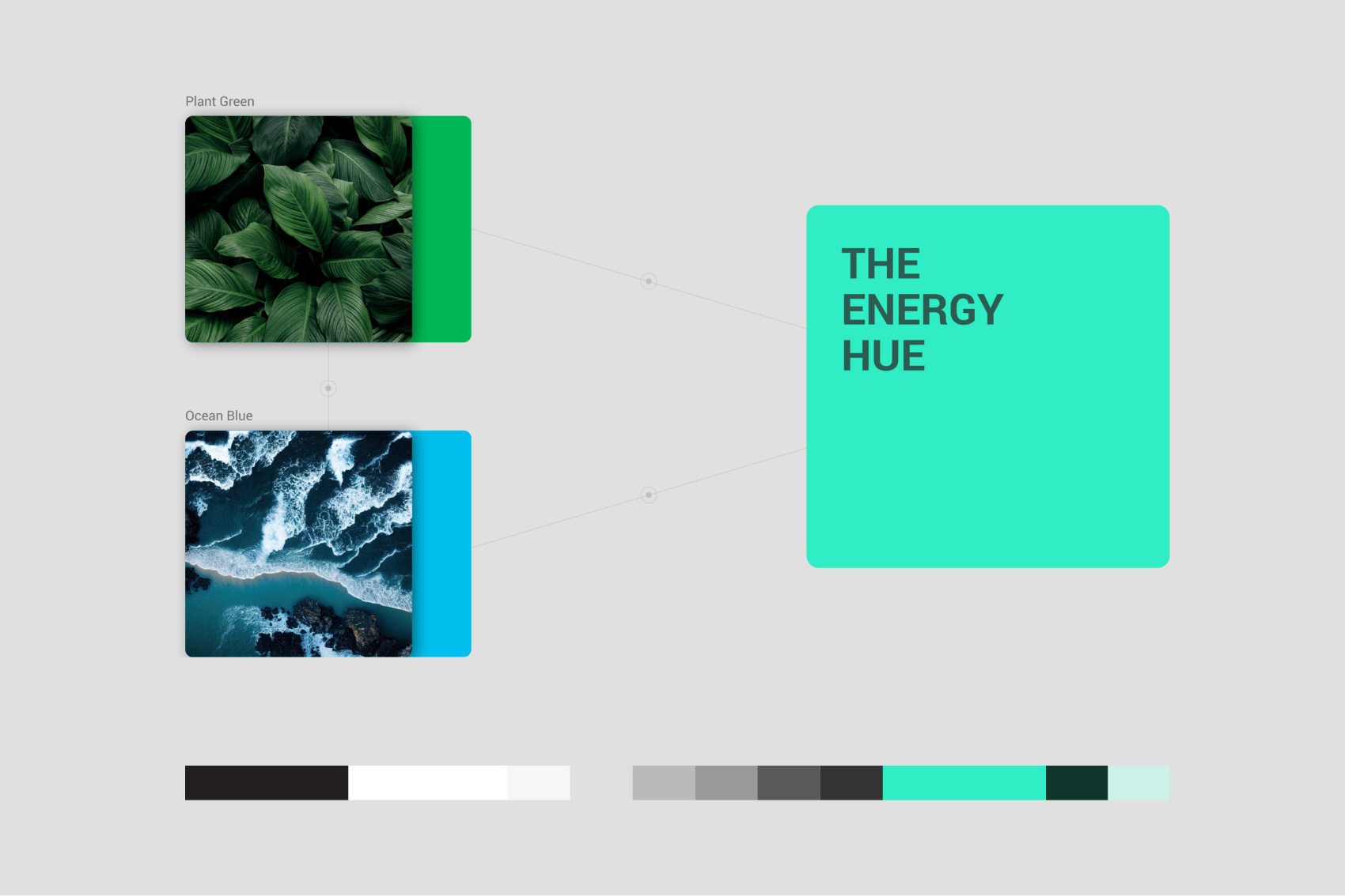
Color System
The palette builds on EEM’s original greys while introducing a complementary accent color: Energy Hue.
This new color combines green and blue tones, symbolizing the connection between natural ecosystems and global energy systems. It functions as a highlight color used to emphasize key information in charts, graphics, and communication materials.
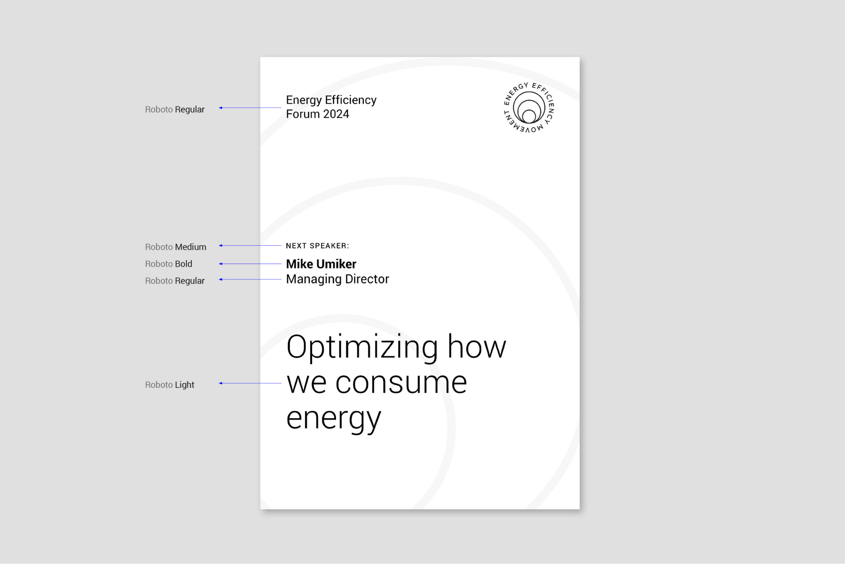
Typography
To ensure consistency in the use of the Roboto typeface, we established clear typographic rules.
Text sizes follow the Major Third scale, improving hierarchy and readability. Additional guidelines define appropriate font weights, spacing, and typographic treatments to maintain visual consistency.
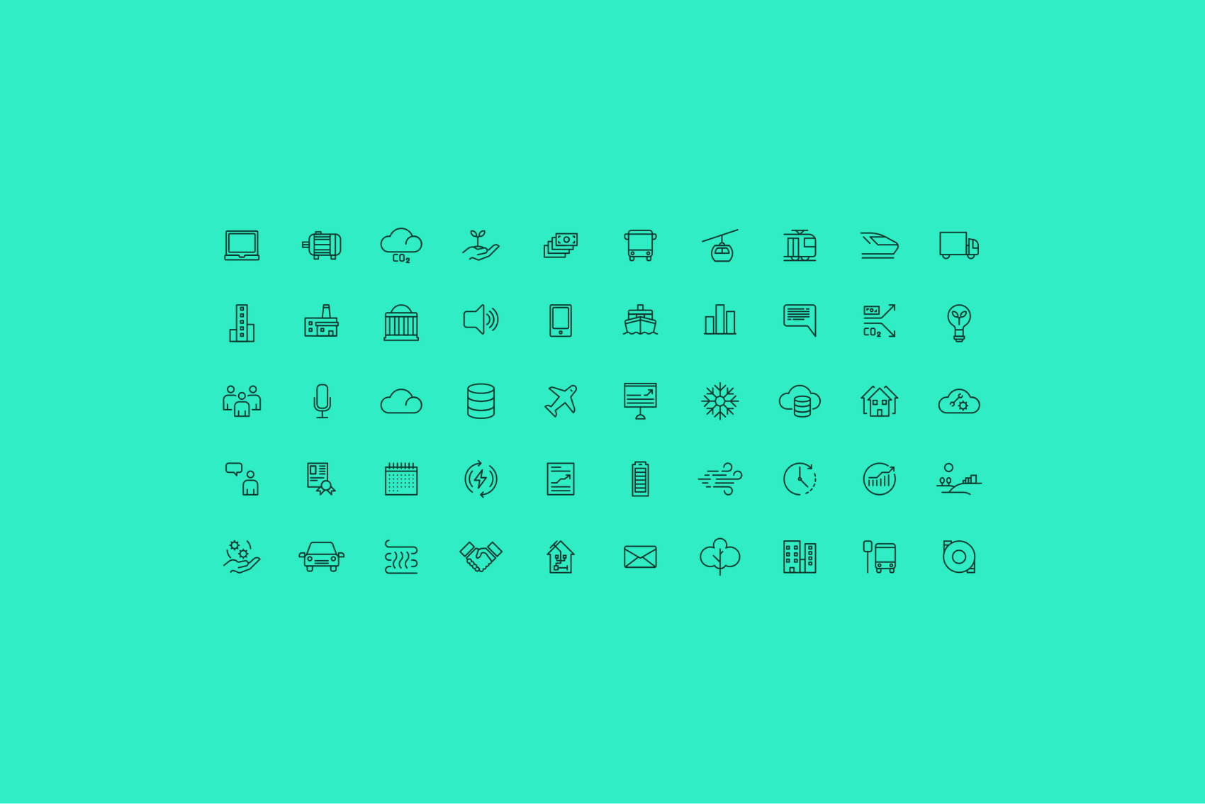
Icon System
The pictogram system was derived directly from the geometry of the EEM logo.
By analyzing its circular structure, we extracted a foundational stroke that became the building block for all icons. This allowed us to create a grid-based icon system that integrates seamlessly with the overall visual identity.
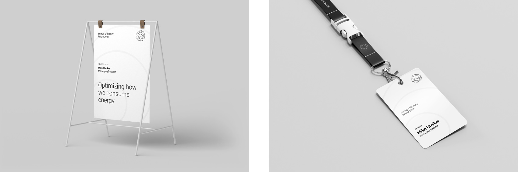
Additional Assets
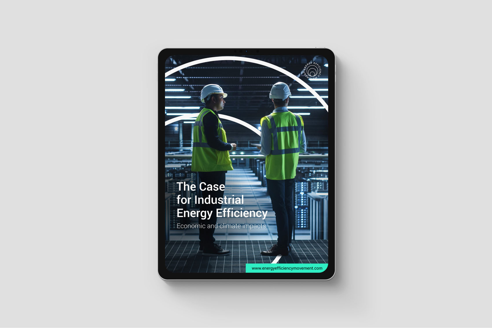
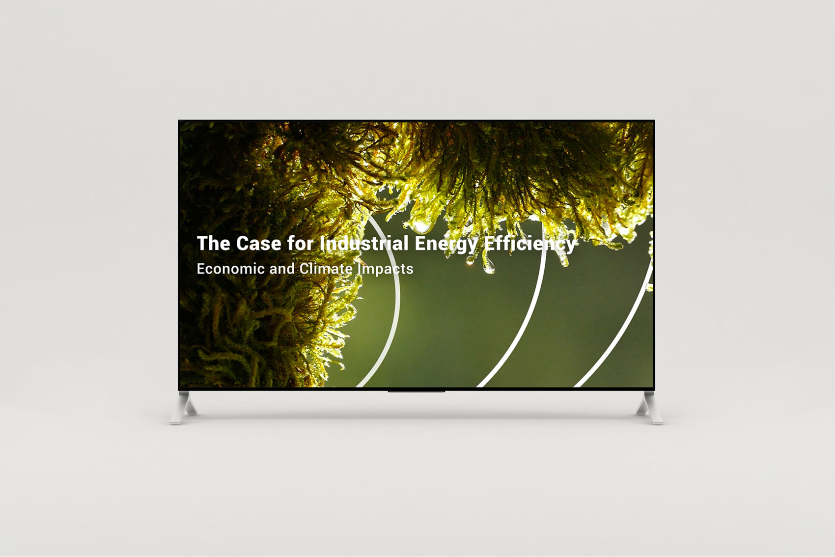
The complete system was applied to a range of communication materials, including:
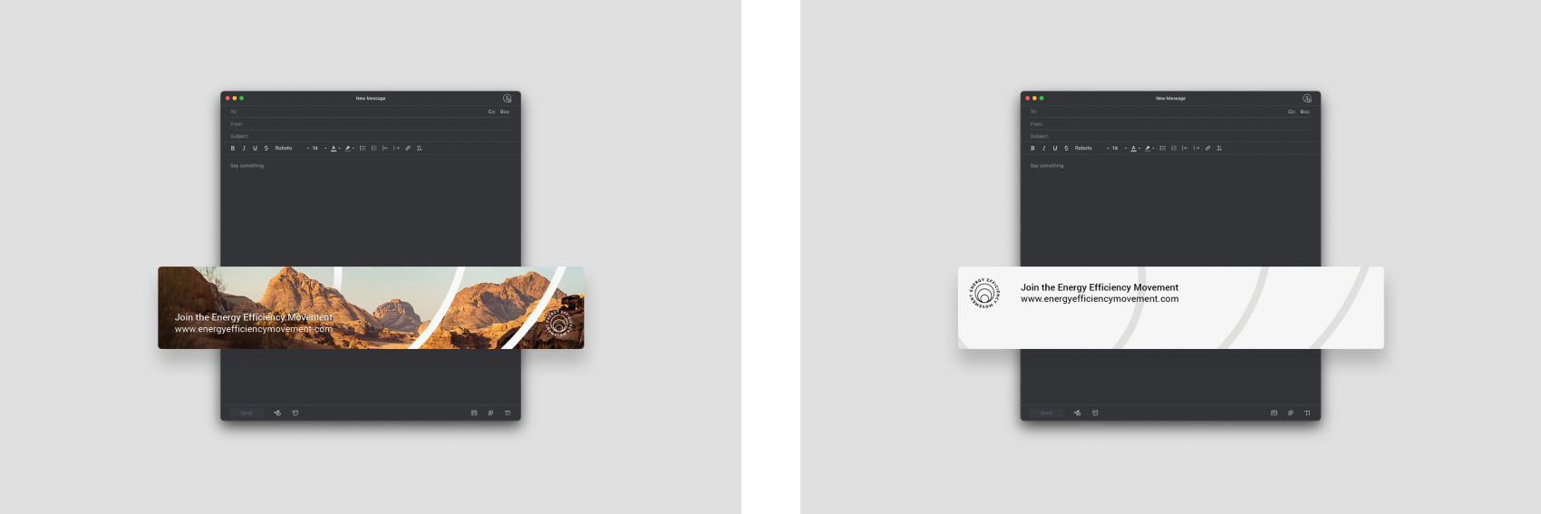
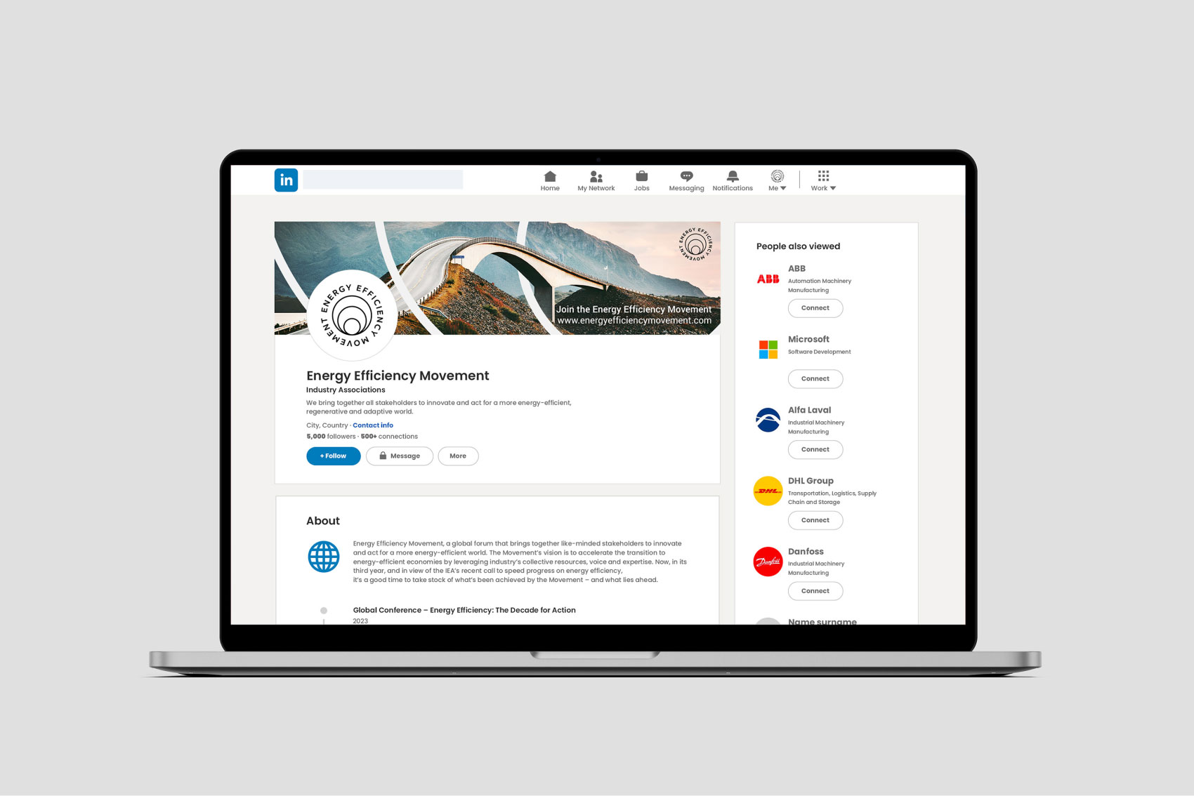
- LinkedIn banners
- email communication assets
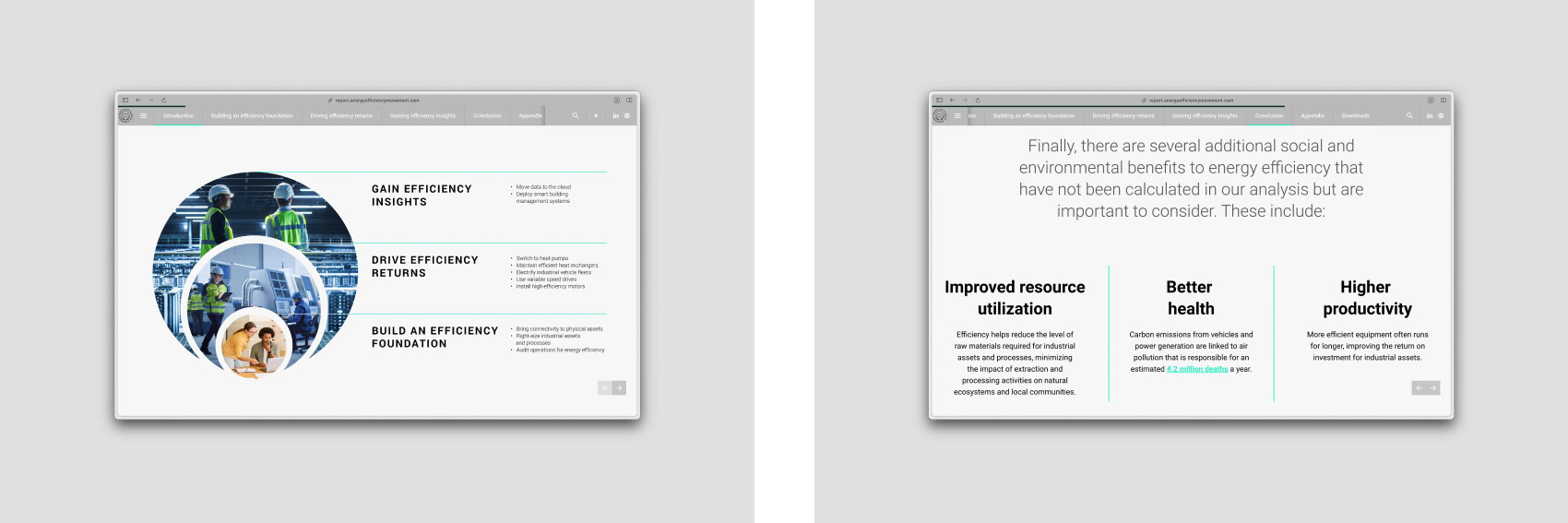
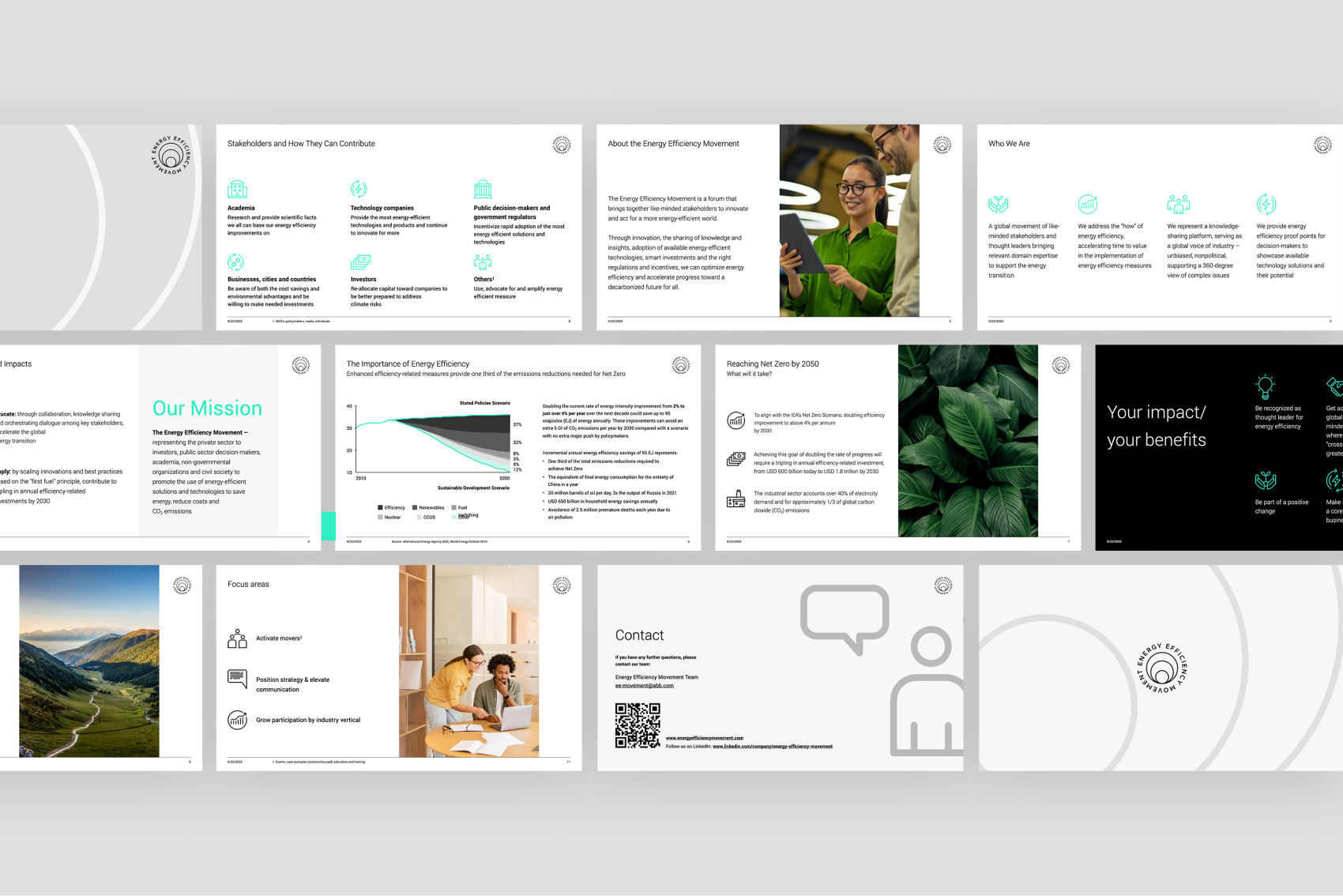
- PowerPoint presentations
In total, the project delivered over 30 brand assets, forming the foundation for the initiative’s ongoing communication.
Learnings & Transferability
Several insights emerged from the project:
Building on existing brand equity is often more effective than redesigning from scratch.
Extending the logic of the current identity preserved recognition while increasing its functionality.
Scalable design systems are essential for growing initiatives.
Movements and industry coalitions need visual frameworks that can work across many partners and communication formats.
Symbolic elements help communicate complex missions.
The Impulse concept created a simple visual metaphor for collective action and momentum.
This approach is particularly effective for industry alliances, sustainability initiatives, and multi-stakeholder organizations that require a flexible but coherent communication system.
Let's talk!