Visual identity for Admind Agency’s Reunite Days
Share this article
- Filter Name
-
Client
Admind Agency
-
Industry
Branding
Executive Summary
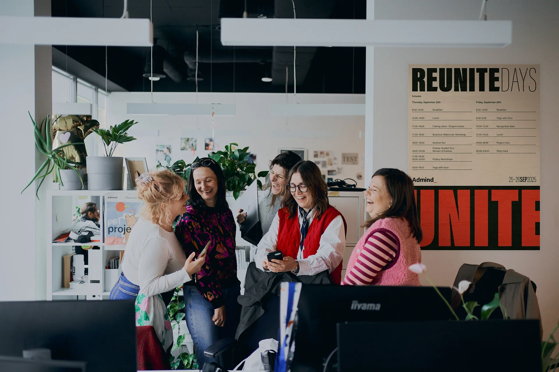
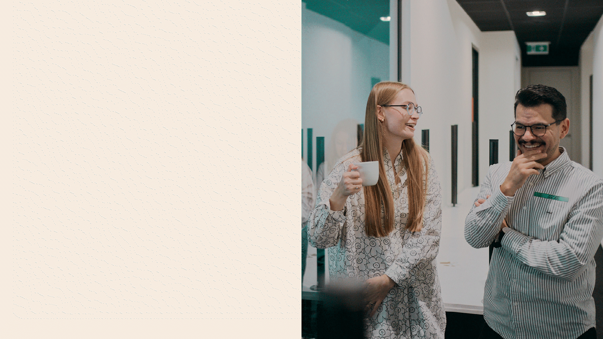
Reunite Days is Admind’s annual internal gathering bringing together a globally distributed team. In 2025, 120 people from 6 countries spent three days reconnecting, collaborating and sharing the company’s culture in one place. From a communication perspective, the scale is deceptively complex: multiple stakeholders, short timelines and a broad mix of digital and physical formats.
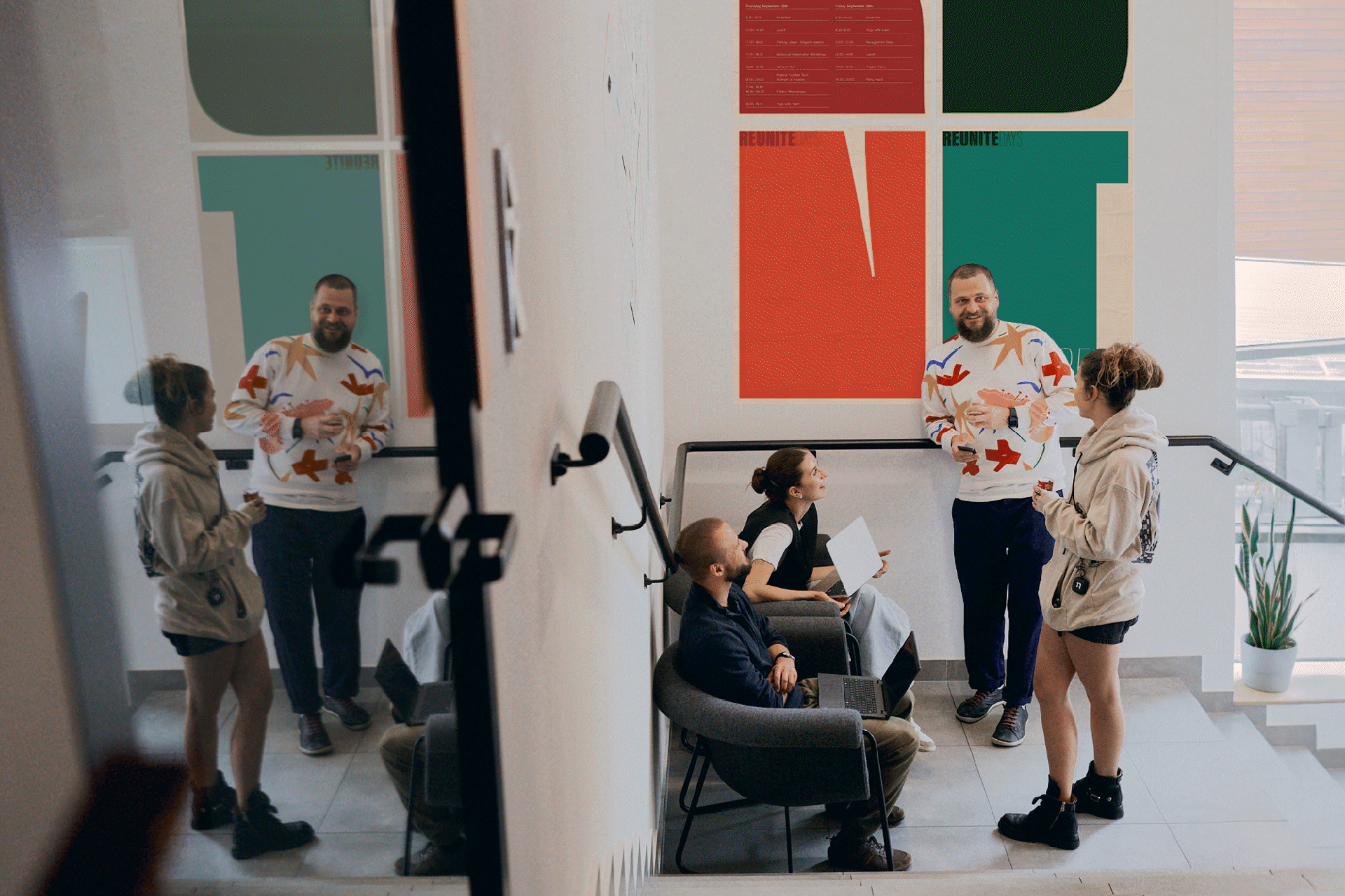
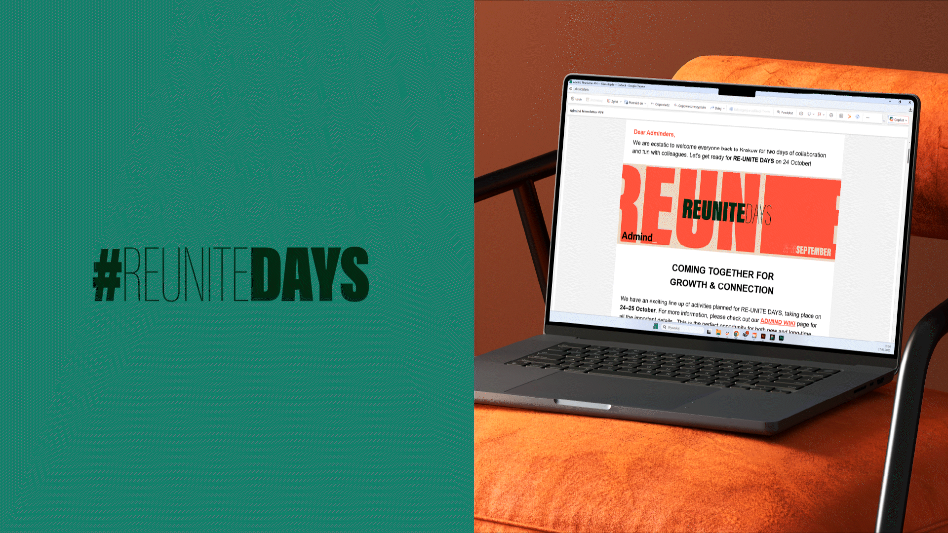
For this edition, we designed a typographic identity rooted in the Admind brand, created not as a one-off theme but as a system. Built around the idea of “REUNITE”, it was meant to work under real conditions: fast production, many contributors and constant change. The result was a flexible, recognisable framework that supported the event while quietly setting a standard for future internal initiatives.
Context
Admind operates across multiple locations and time zones, with teams collaborating in hybrid and distributed setups. Reunite Days is one of the company’s most visible internal initiatives, generating communication before, during and after the event. Although internal, the project requires the same structural thinking, governance and brand discipline as work delivered to global clients – dozens of deliverables, multiple stakeholders, and the need for clarity and consistency across channels.
Challenge
The key challenge was to create a visual system that:
- feels unmistakably Admind while expressing the idea of reconnection,
- stays coherent across a large number of formats (from micro-assets to on-site signage),
- supports fast production for different teams involved at different stages,
- avoids drifting into one-off design decisions.
Previous editions proved that varying styles year to year risked losing recognisability and increased production complexity. 2025 needed a system that could scale.

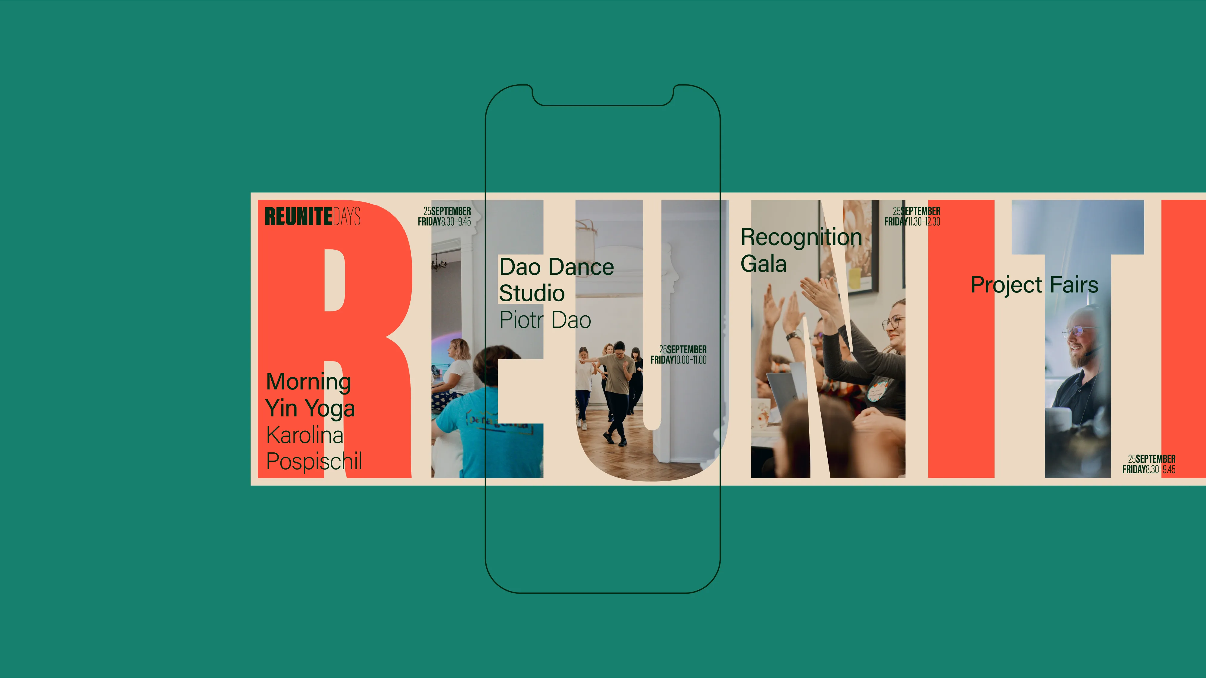
Concept
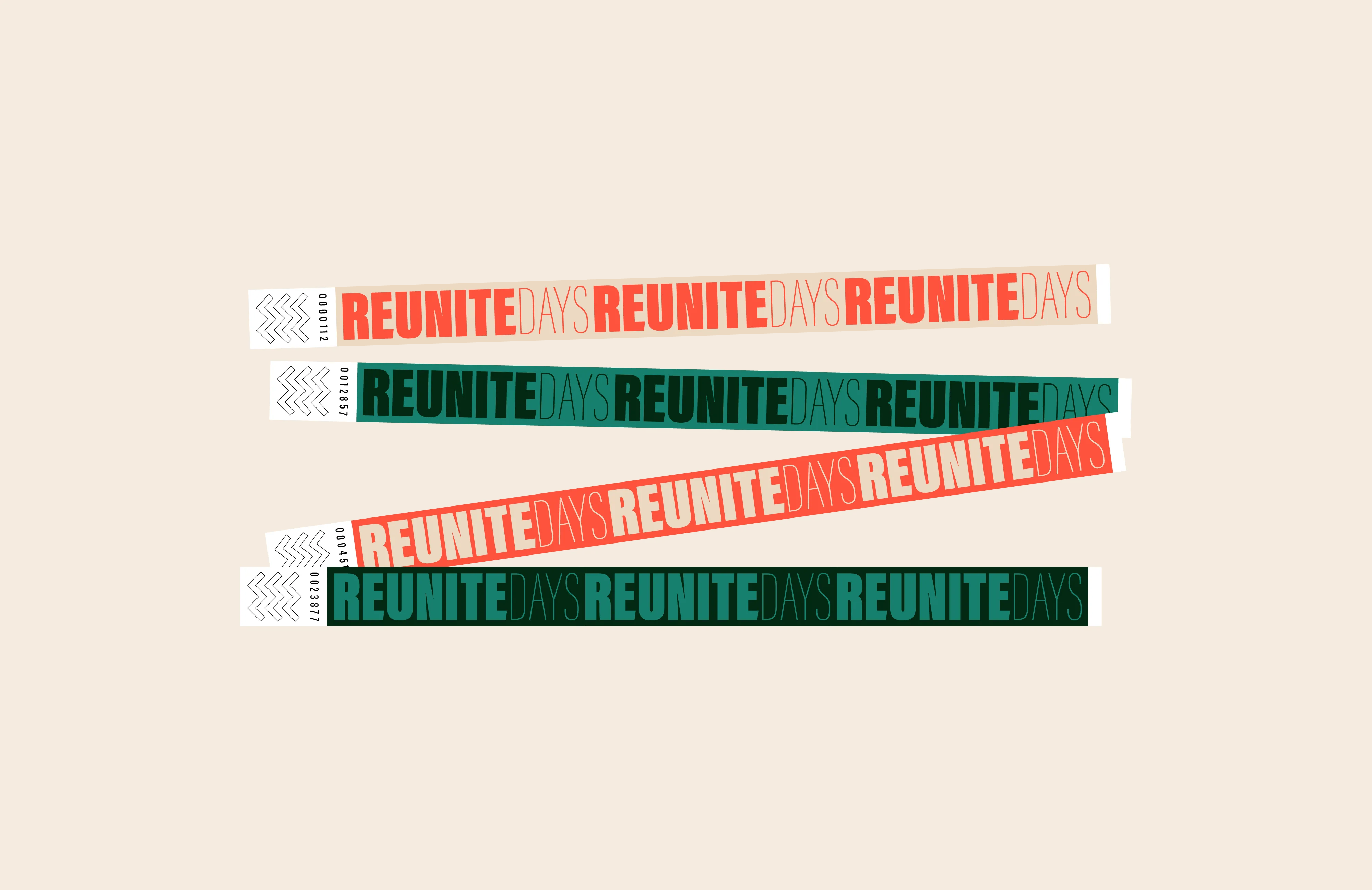
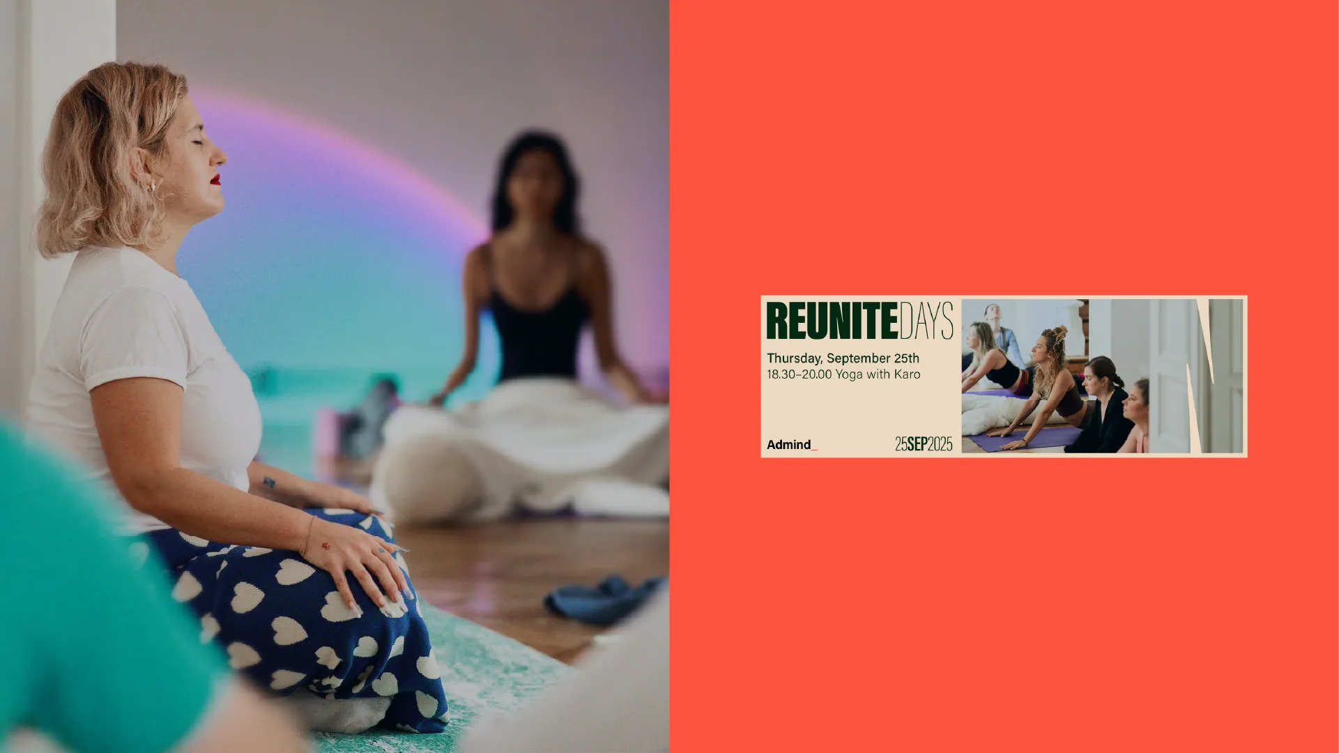
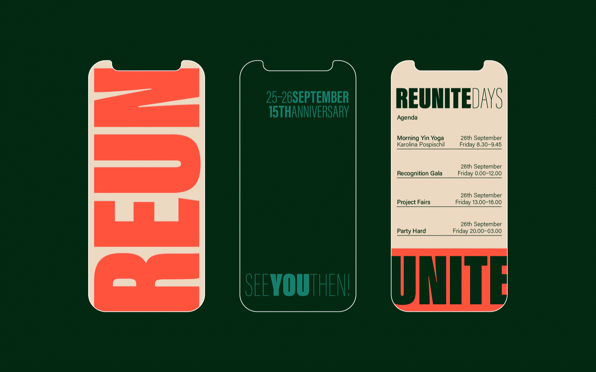
The identity centres on the word REUNITE. Letters merge, overlap and stretch into one another, creating a graphic language that translates “coming together” into a tangible design principle. Acumin Ultra Condensed became the engine of the system, allowing typography to carry both expression and structure while staying reliable across digital and print.
Execution
The solution was implemented as a clear, modular brand system:
- a defined set of typographic rules for hierarchy and contrast,
- flexible layouts adaptable to announcements, slides, merchandise, signage and environmental graphics,
- a structure designed for fast in–house production by different contributors,
- guidelines that ensured consistency without limiting creativity.
The system worked as a toolkit – not a collection of templates.
Results
The identity was applied consistently across all Reunite Days materials, despite fast turnarounds and the involvement of multiple creators. Working as a shared system rather than a set of templates, it reduced friction during production and limited the need for last-minute corrections on site.
Just as importantly, the structure proved durable. It supported communication across 120 participants from 6 countries over three intensive days, while remaining scalable and reusable for future editions. Instead of closing one event, the system established a long term visual framework for internal initiatives at Admind.
Let's talk!