FilmON Festival – Designing a scalable festival identity for inclusive storytelling
Share this article
- Filter Name
-
Client
FilmON Festival
-
Industry
Arts & Culture
Executive Summary
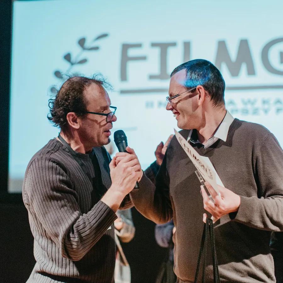
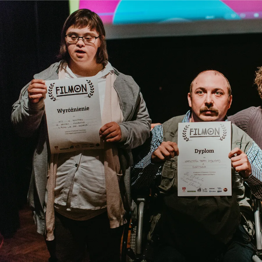
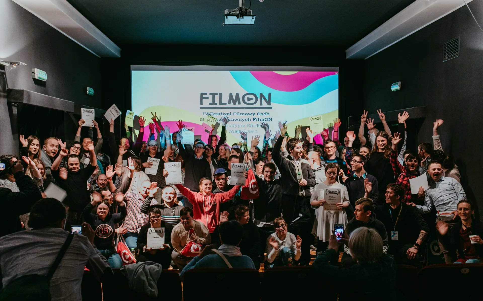
Since 2018, we have partnered with FilmON Festival — a cultural initiative where people with disabilities tell stories through film.
The challenge was to create a visual identity that remains clear and accessible across formats, while still feeling like a confident, contemporary festival.
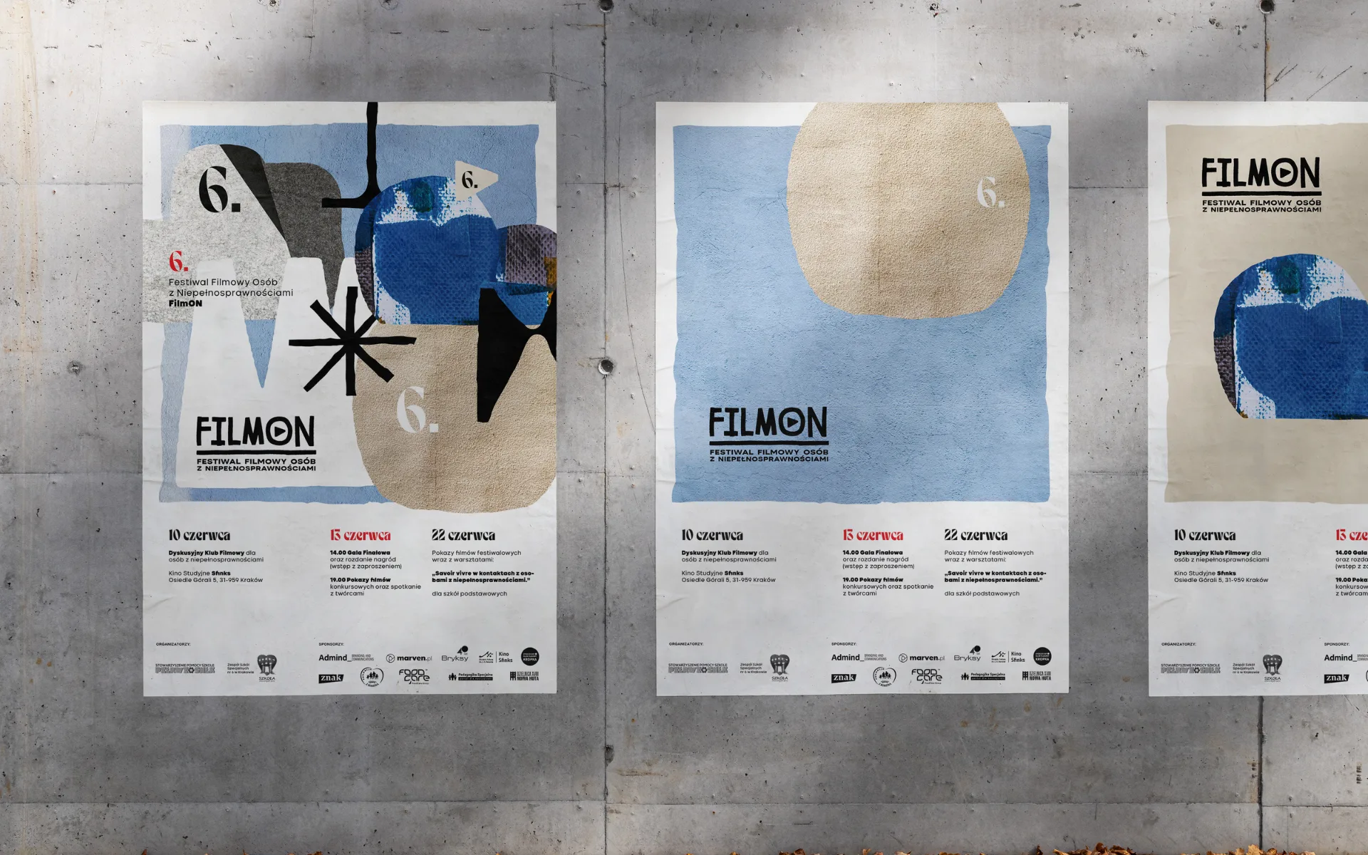
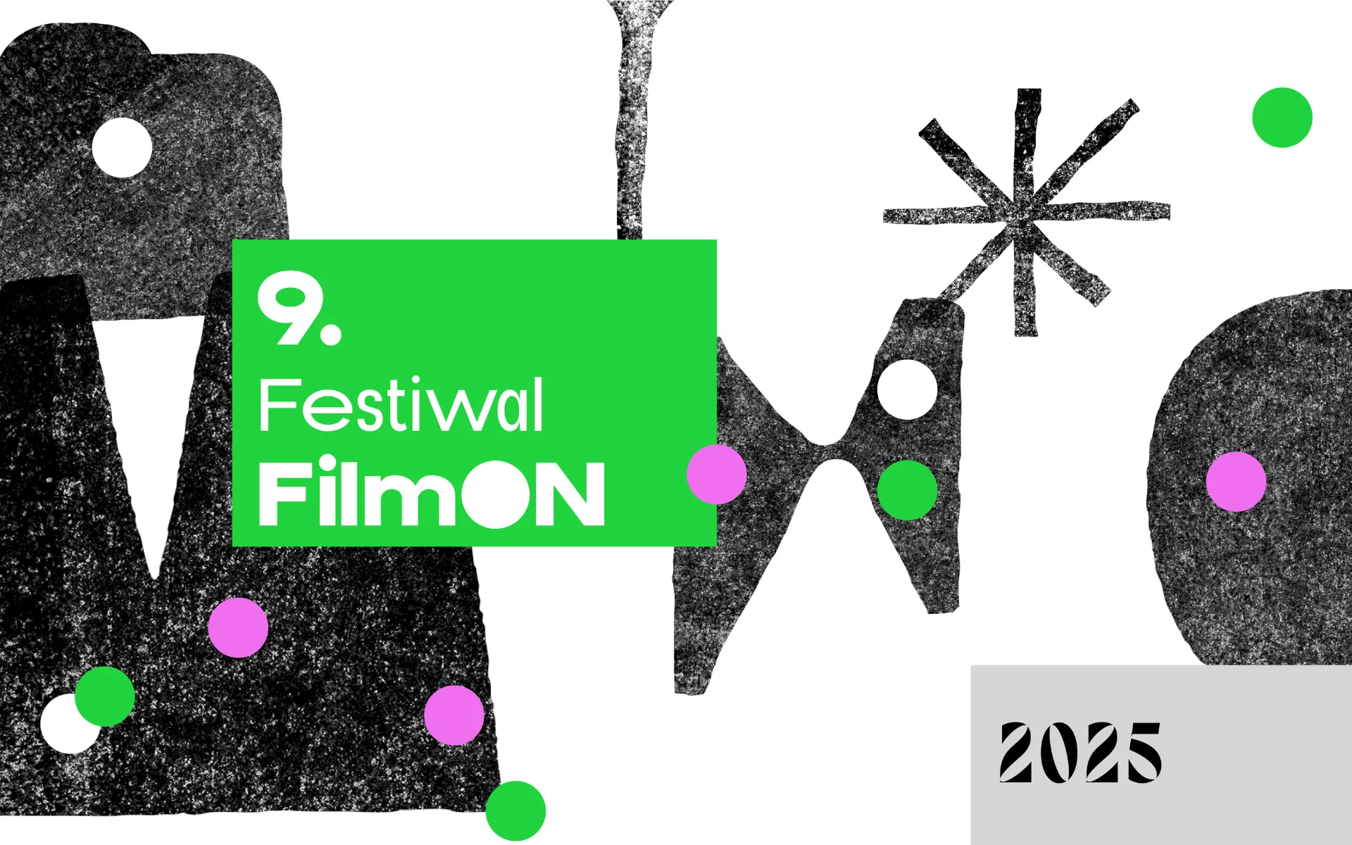
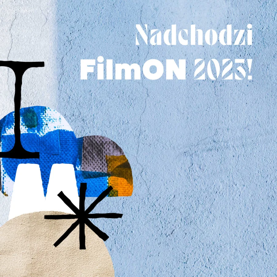
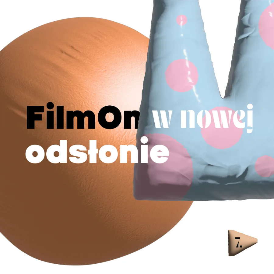
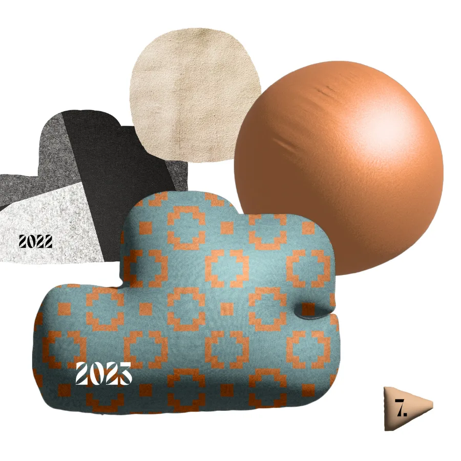
We designed a system where each edition introduces a new visual concept, built on shared principles of hierarchy, contrast, and motion.
This approach supported steady growth — from 2 film submissions in 2016 to 47 in 2022 — while increasing reach and participation across channels.
Client & Context
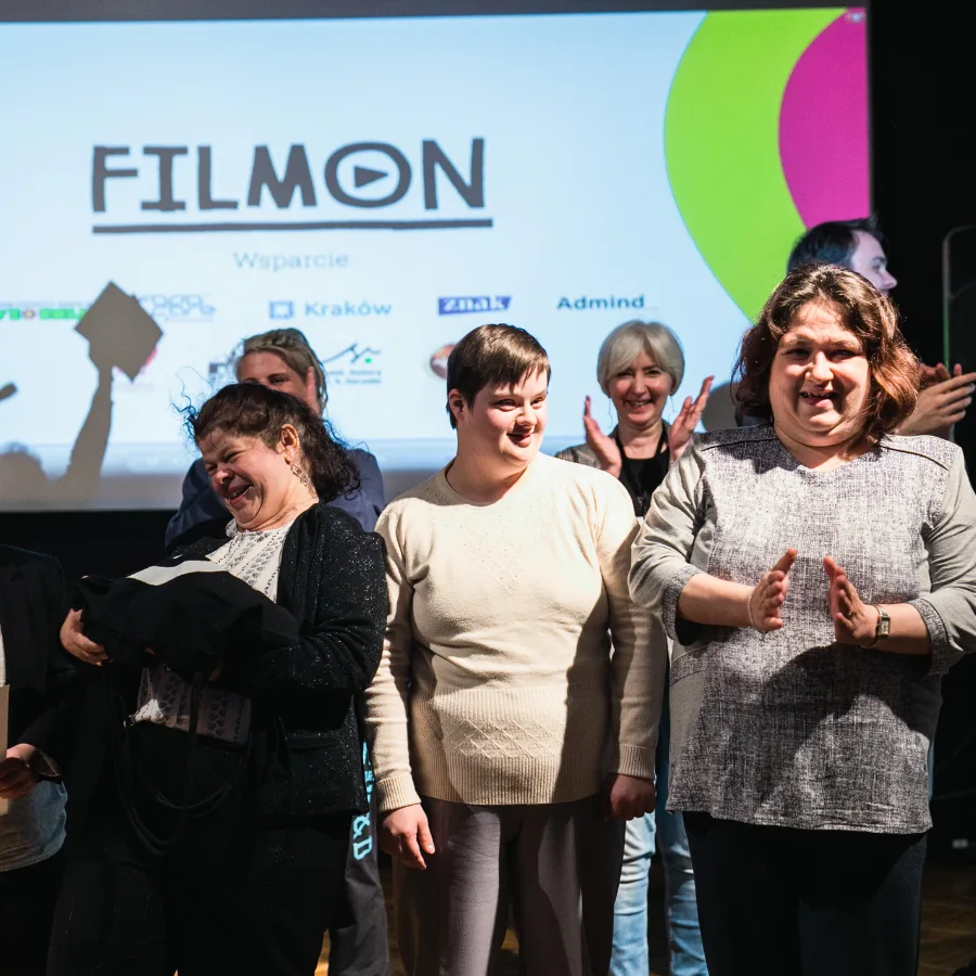
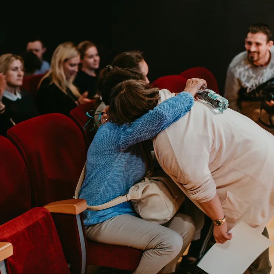
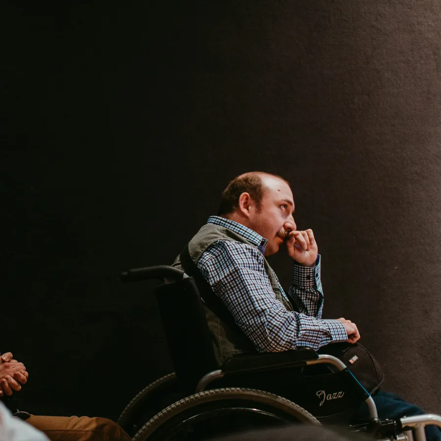
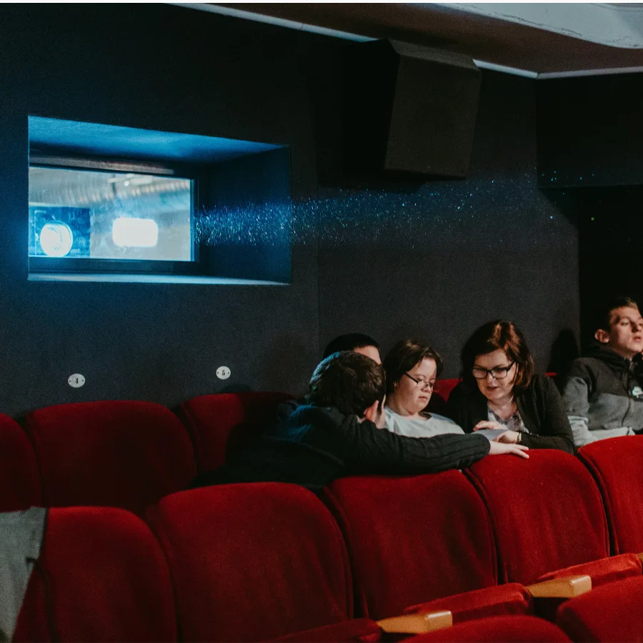
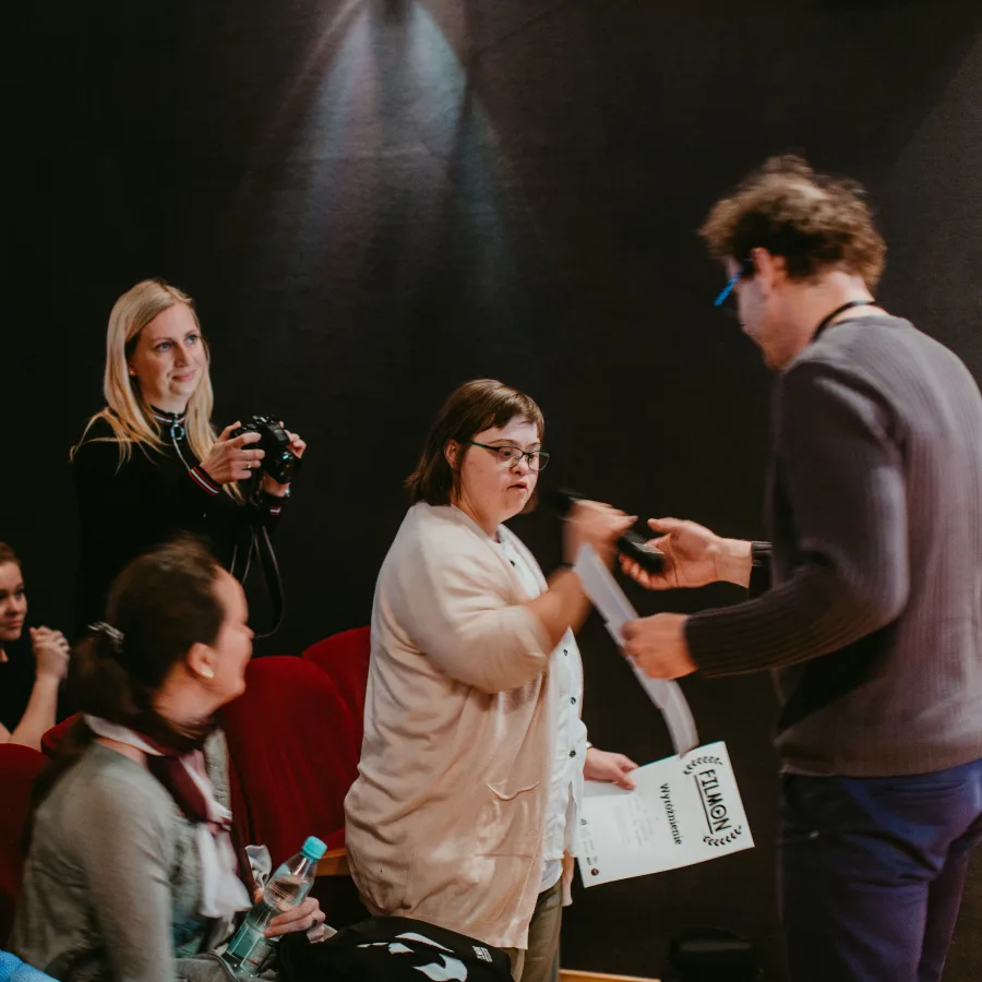
FilmON is a Polish cultural festival focused on inclusion through filmmaking.
It brings together creators with disabilities, as well as educators and caregivers who use film as a tool for expression and therapy.
The audience is intentionally broad — from schoolchildren to adults — which makes clarity, tone, and accessibility essential.
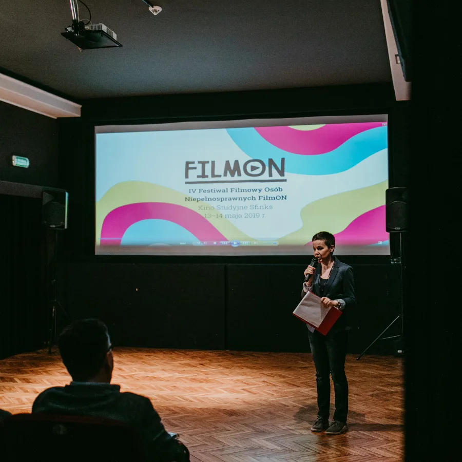
The project operates as a multi-year partnership (2018–today), covering annual editions and a full communication ecosystem: print, digital, social media, motion, and onsite experience.
Core Challenge
The main challenge was balancing clarity with expression.
Each edition introduced new content — submissions, programme updates, events — increasing the risk of inconsistency and reduced readability, especially for diverse audiences.
At the same time, purely functional communication would strip the festival of its emotional and cultural character.
The identity had to make information easy to navigate, while still creating a sense of anticipation, energy, and belonging.
Key Strategic Decisions
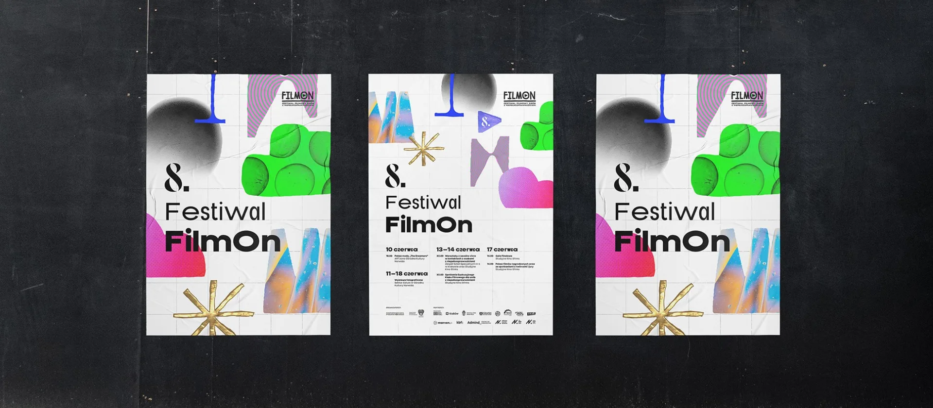
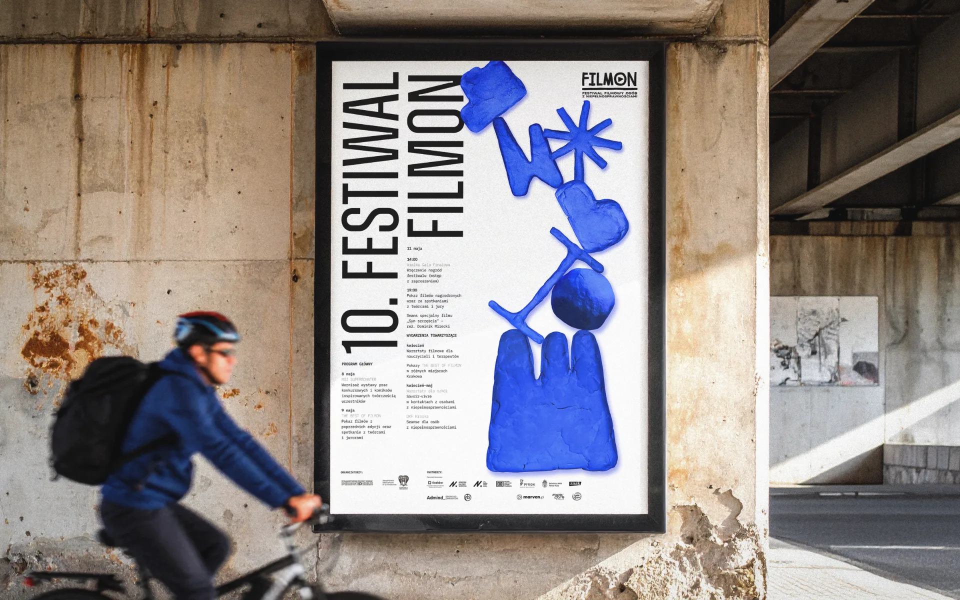
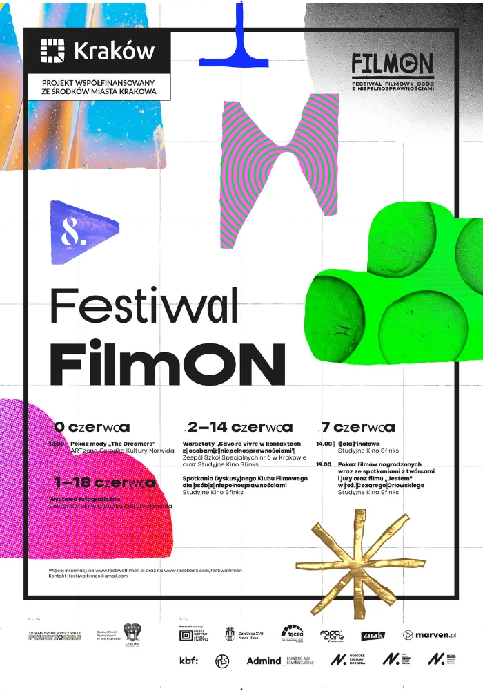
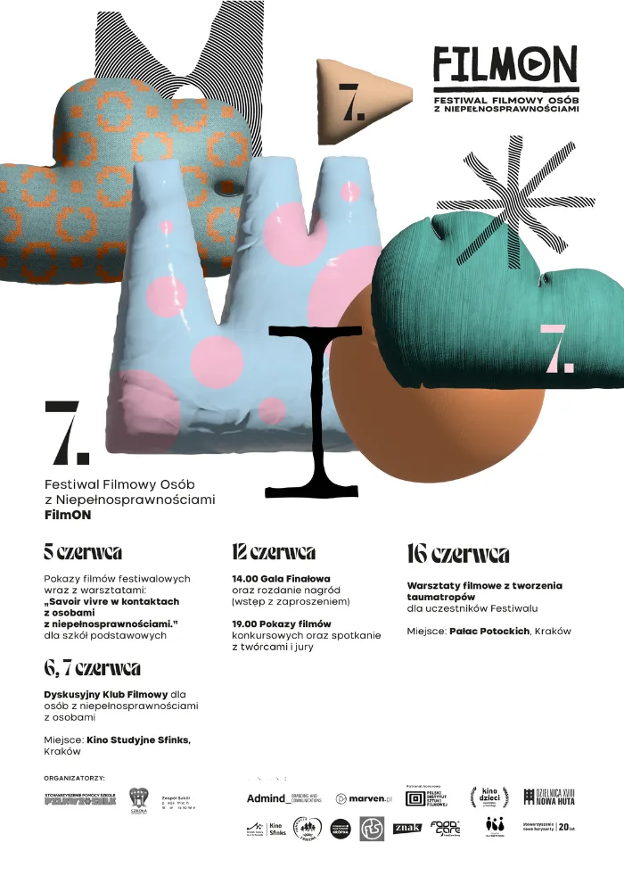
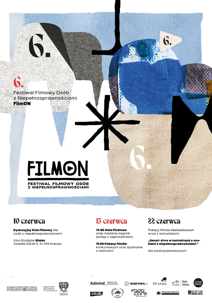
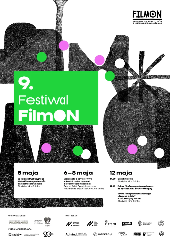
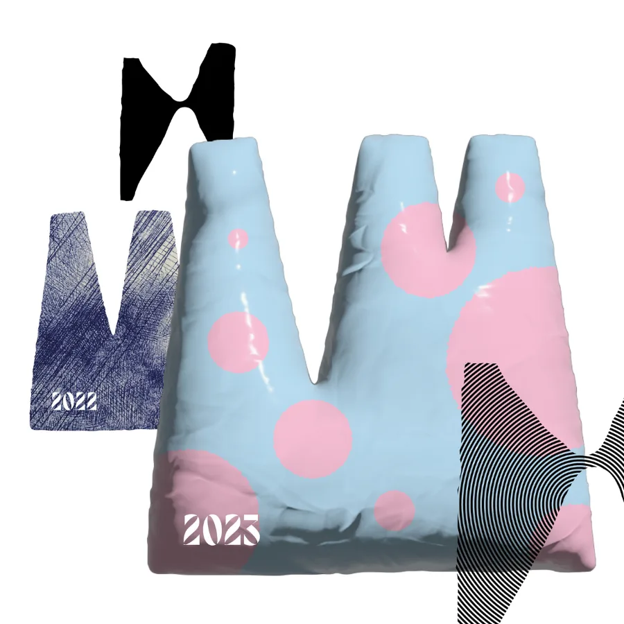
1. A new visual world each year — built on shared rules
Each edition opens a distinct visual concept, giving the festival freshness and narrative depth.
At the same time, all concepts follow a consistent logic of hierarchy, typography, and composition — ensuring recognisability and usability.
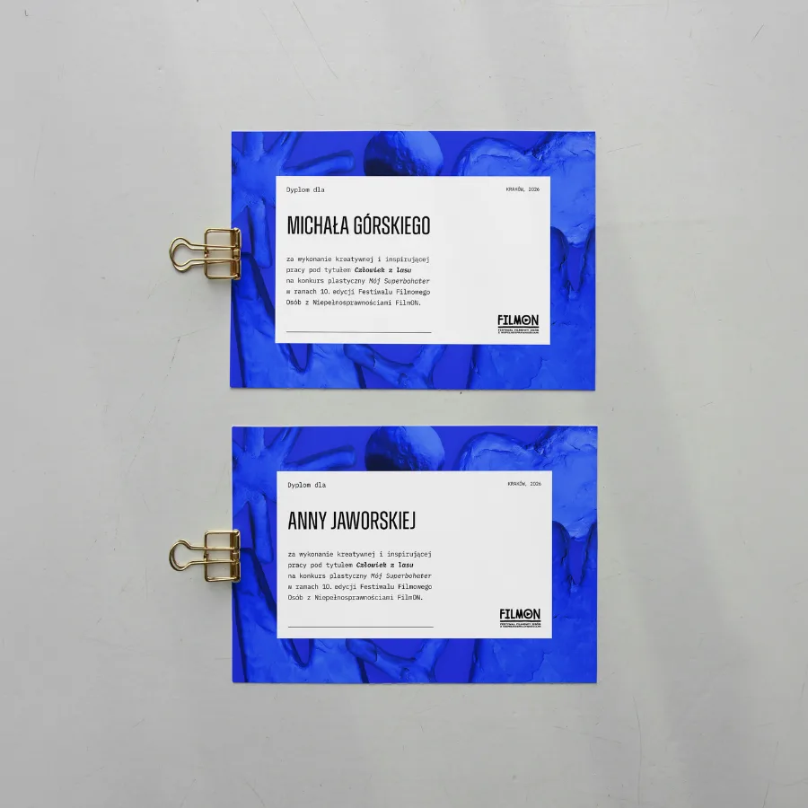
2. Accessibility embedded in design decisions
Accessibility was treated as part of the visual language — not a layer added later.
Contrast, spacing, typographic clarity, and simplified information structure became core design tools.
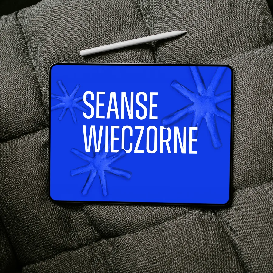
3. Motion as a native language
As a film festival, motion naturally became central to the identity.
Animations, trailers, and dynamic formats were considered from the start — not as extensions, but as primary expressions of the brand.
4. Language as part of the system
We updated the festival’s communication to reflect inclusive and respectful language:
“Film festival for disabled people” → “Film festival for people with disabilities.”
This shift aligned tone, visuals, and purpose into one coherent experience.
Objectives & Success Metrics
Objective 1: Improve clarity and participation
Success verification: consistent templates, clear communication of key dates and programme, reduced ambiguity across channels.
Objective 2: Grow reach and engagement year over year
Results (2022):
- 47 film submissions (vs 17 in 2018; 2 in 2016)
- 18,478 Facebook reach (+23.1% YoY)
- 5,604 YouTube visitors
Objective 3: Build a confident festival presence
Success verification: cohesive identity across touchpoints and increased recognisability reported by organisers.
Execution (System, not deliverables)
The identity functions as a flexible visual system rather than a fixed set of assets.
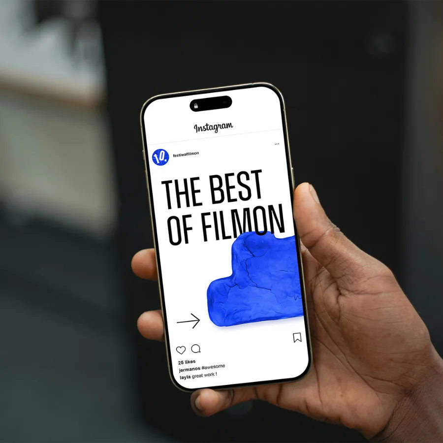
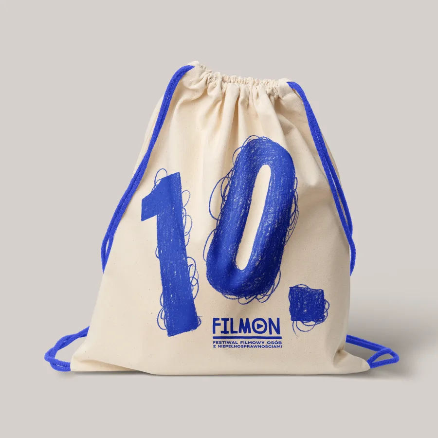
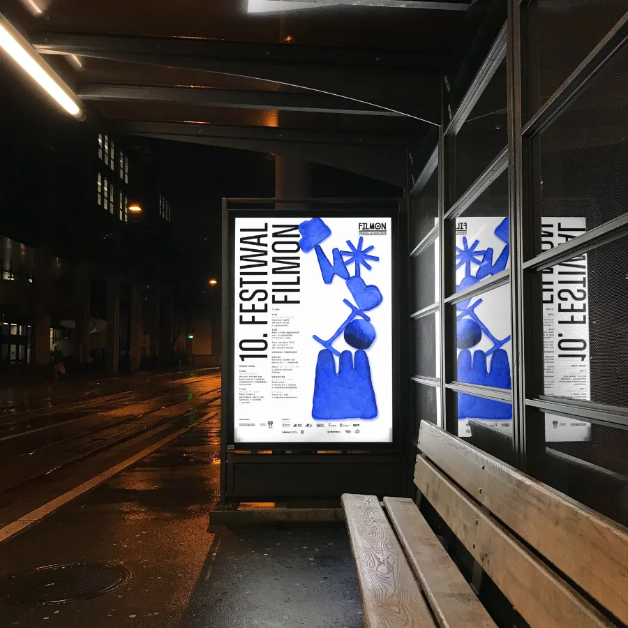
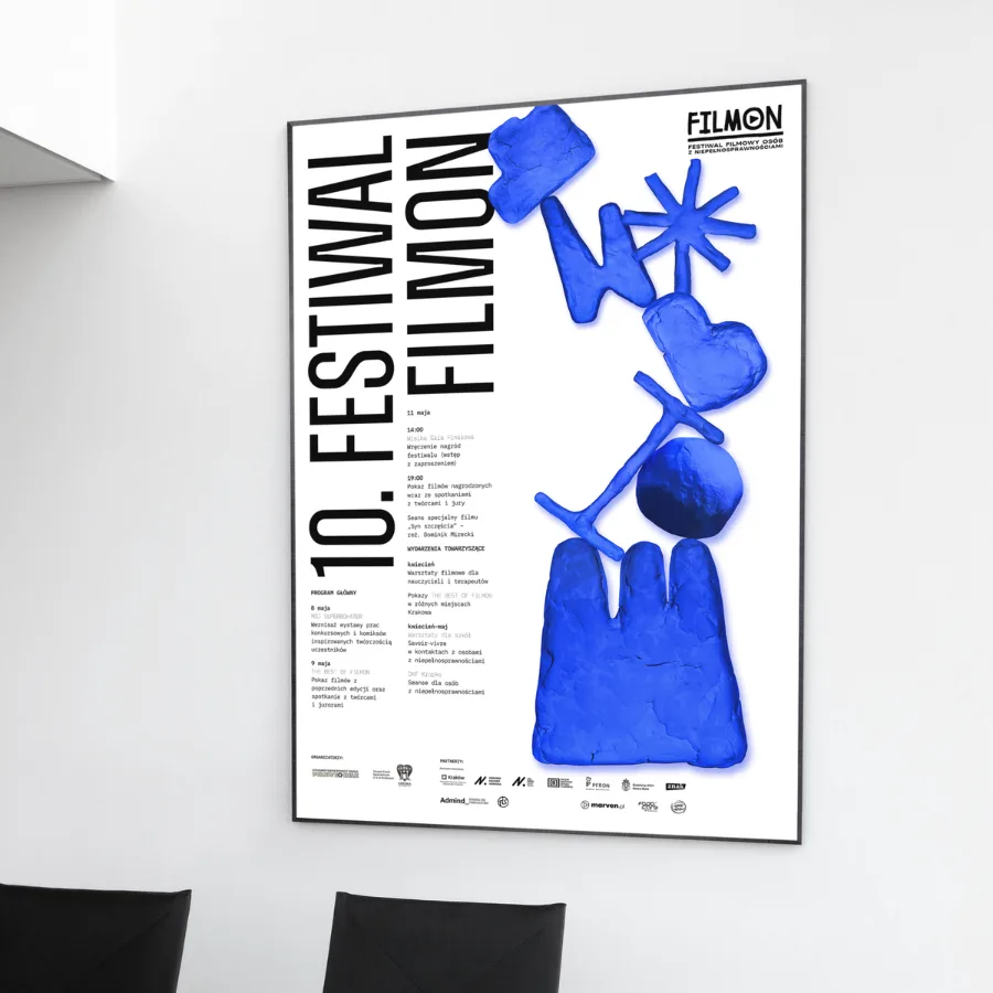
Each edition starts with a concept, which is translated into a modular visual language that scales across formats — from posters and social media to motion and onsite materials.
The system allows organisers to update content dynamically without losing consistency.
Hierarchy and composition rules ensure that even changing information remains readable and structured.
The same logic extends into motion, where animation becomes a natural continuation of the identity.
Alongside visual design, we continuously improved the festival website — simplifying navigation, refining information architecture, and supporting accessibility-focused interactions.
Beyond communication, we also supported FilmON through workshops for educators and therapists, connecting filmmaking with expressive and therapeutic practices.
Client Perspective
Learnings & Transferability
What we learned
Designing for inclusion requires both empathy and precision.
The more diverse the audience, the more important clarity, hierarchy, and consistency become.
In festival contexts, motion is not a channel — it is a primary storytelling medium.
Works well when
- The project operates in cycles (editions, seasons) and requires both freshness and consistency
- Communication combines emotional storytelling with complex, frequently changing information
- Accessibility is a core requirement, not a constraint
Let's talk!