Designing for accessibility – 3 tips from an interaction designer
Share this article

How to design for people with hearing difficulties? In this article, you will find practical tips from Marie Van Driessche that will teach you how to provide more accessible web design for hearing-impaired people.
Do you know it’s around 360 million people over the world? Here are the key tips and issues on designing for accessibility discussed by Marie Van Driessche, our guest speaker on a webinar entitled Inclusive design: designing for deaf people helps everyone.. She is an interaction designer at VPRO and an accessibility specialist who has been promoting a change of approach in inclusive design for several years. Reading this article, you will learn how to design better for deaf people, and if you do that, the rest of your audience and your brand will benefit from that too.
It’s common knowledge that people with hearing impairment communicate using sign language. However, not everyone knows that sign language is not universal! It’s different in every country. Furthermore, if a deaf person uses a written or even a spoken language, it will always be a secondary language for them. Taking into account that it is not possible to perfectly translate sign language into written language, 70% of people with hearing impairment have problems accurately understanding the context of branded content on websites.
Here is what Marie suggests to make designing more accessible:
Content written in this way will not only be more accessible and understandable for deaf people but will also make it easier to navigate the text for all visitors to the site. Using some of these tips also has a positive impact on SEO.
First of all, do you know what is the difference between closed captions and subtitles? Both are the text version of the spoken audio in a video. However, while subtitles involve translating the video’s language into an alternate language, closed captions are in the same language as the audio.
Closed captions are created to allow deaf and hearing-impaired people to experience the video, so they include background sounds and speaker changes. Subtitles assume the viewer hears the audio and as a result do not contain the background sounds or notifications for speaker changes.
What’s interesting, 80% of people who watch videos with closed captions turned on are not deaf or hard of hearing. This means that if you add such an option to your multimedia, you will benefit many viewers. Also, captions let viewers watch a video in more places. They allow you to watch a video in the library or a very noisy place.
And once again, you can boost video SEO by using captions, but you have to add the file with them separately (CC shouldn’t be hardcoded).
When you put a video of a webinar recording or an interview on your site, make sure to include a transcript as well. Some people will find it easier to read such a text than watch a long recording with captions. Not to mention, which is a common theme here, a transcript is also good for SEO.
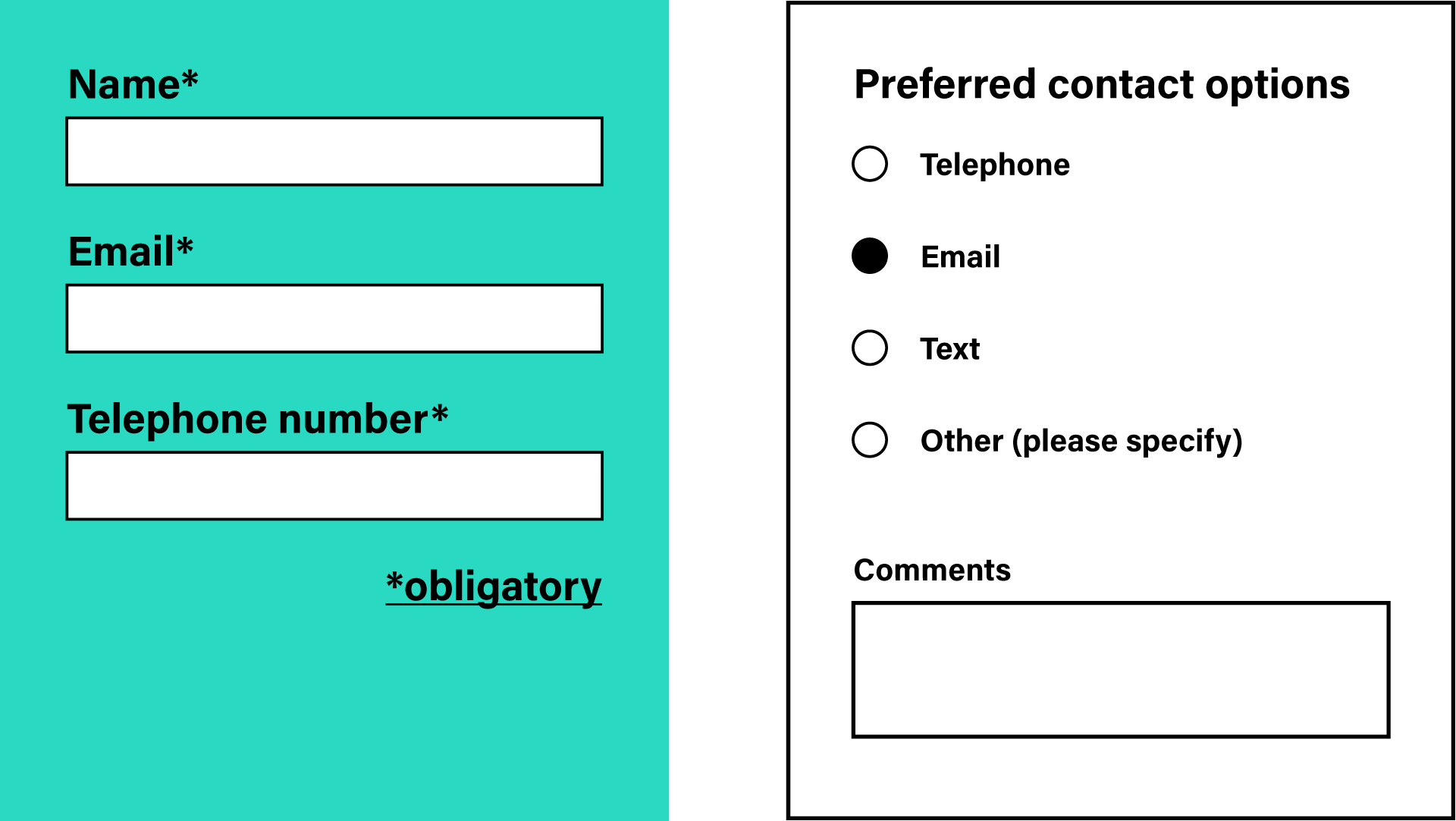
Companies and organisations use contact forms on their websites. Designing such a form that doesn’t limit accessibility for people with hearing impairments is easy. Nevertheless, we often see bad examples. Below you can see the form, which requires both an email address and a phone number. The deaf person doesn’t want a phone call, but in this case, has no choice.
The second example shows how to do it right. Users of the site can choose their preferred type of contact and, in addition, have the opportunity to leave a comment. This is great in terms of user experience and accessibility! Someone may write in the comments section that they prefer email contact because they have hearing problems, and someone else can write about what hours they can be contacted by phone. A simple design for accessibility solution with many benefits!
Finally, we have one more general but very important piece of advice for you. Designing FOR deaf people is great, but designing WITH them – even better! So, don’t only empathize with people, interact with them. If you only have the opportunity, ask hard-hearing people, how to make your content or services better accessible and invite them to design with you.
At the very end, one more benefit that comes with designing for accessibility. It fits perfectly the latest trend called “conscious branding”. More and more companies want to have an impact on the environment around them, as well as people. Profit is no longer their only goal. That’s why they engage in many diversity & inclusion initiatives that support minorities.

