’90s nostalgia – how we learned to love the unlovable?
Share this article

Until recently, it may have caused a feeling of slight embarrassment and distaste. Today, more and more designers are falling for the ’90s nostalgia.
Business was booming. With the fall of the Soviet Union, the threat of the atomic war faded. And finally, you could get a Discman that would work when jogging in your new Nike shoes. MTV – the YouTube of the ‘90s – bombed our vision with brightly coloured clips for music suddenly filled with Casio synthesizers. A secret mission was carried out in Microsoft to design Comic Sans, a font all designers would hate, and all non-designers would use almost everywhere. In design, you could pour a bucket of magenta, and add a lot of yellow, and nobody would snort with disbelief. The ‘90s were a pain to any designer’s eyes…
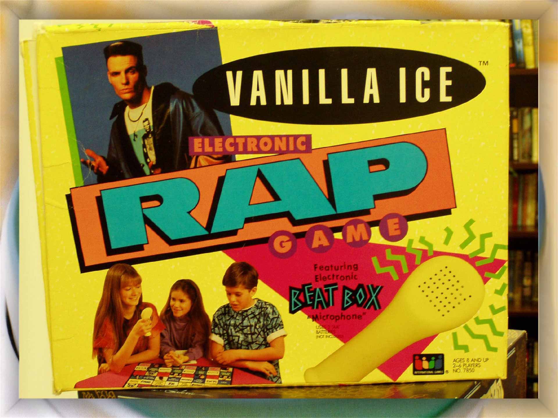
But apparently, it is much less painful for the contemporary soul. So, can we actually be feeling nostalgia for the design trends of the 1990s? Well, the question can’t have any rational answer, because, any nostalgic feeling in design trends probably defies the laws of logic, going back to the power of the strong feelings we have attached to the cultural phenomena of the era. From a different angle though, the decade of the 1990s was far too rich in cultural phenomena to be simply summed up. Or covered by a conclusion about dominance splashing contrasting colours and oversized letters. We had Anti-design, Grunge, Groovival, and Memphis still holding on, and almost everybody thought of himself as post-something. So, like any nostalgia, the flashback to the 90s can actually relate to very different things and completely different foundations of design.
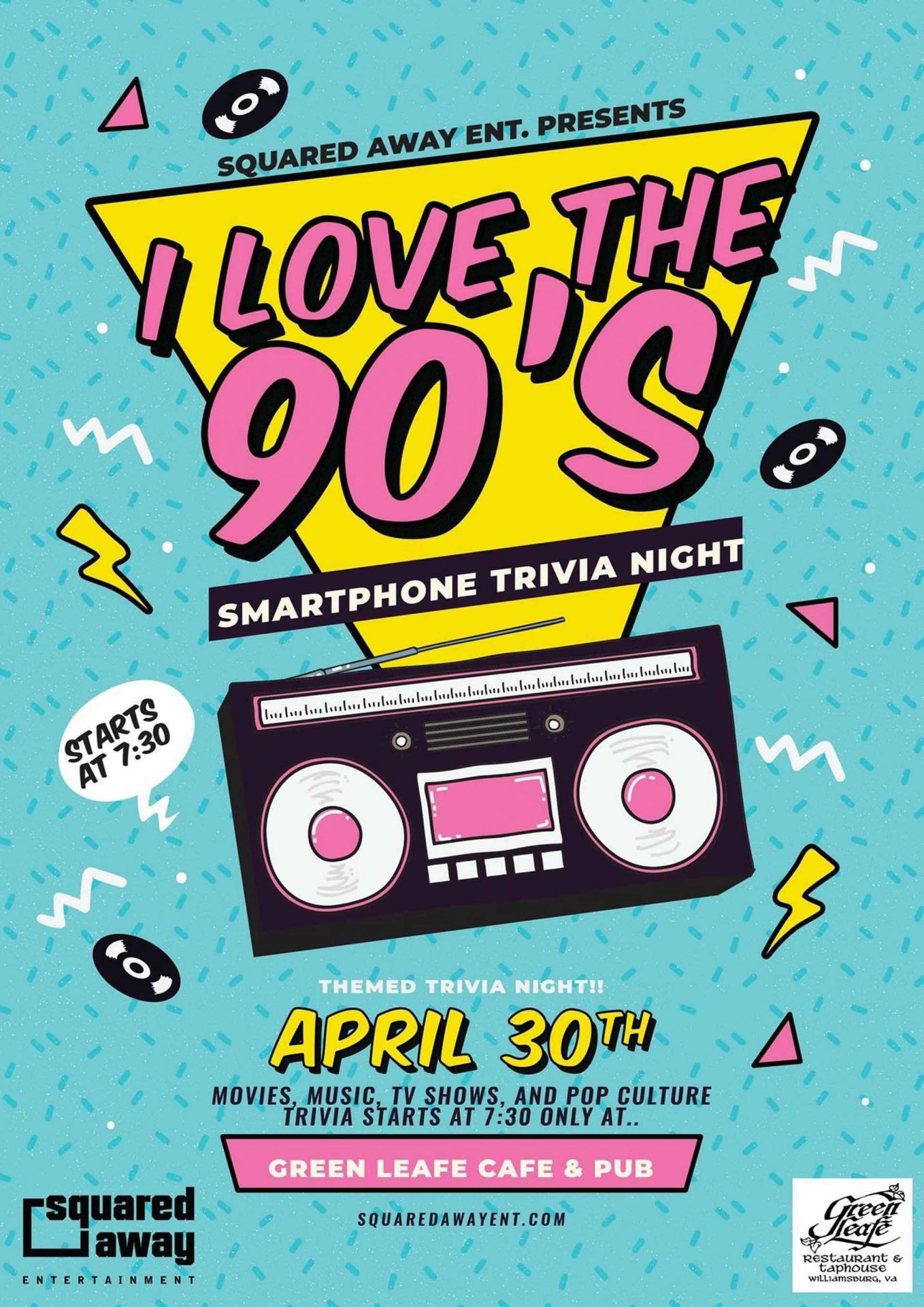
Yet, there seems to be some sort of a comeback to the 1990s, usually combining artifacts of the era with typography and a strong colour palette:
It would probably require a lot of research to find out if and why is this happening. But fortunately, we can just sit back, watch what’s happening recently, and easily jump to hasty conclusions. These will probably be impossible to rationally support, but let’s just take a long shot. We miss the colourful ’90s because we got hit really hard. Historically and culturally, whatever is happening since 2020 makes us simply more and more depressed. Apocalyptic headlines of our functional, minimalistic, and user-friendly news channels are light years away from the shared optimistic feelings of the ’90s. To a certain degree, one might argue, that culturally, things started falling apart after the ‘90s, interrupted suddenly by 9/11, millennial culture, and the horrible discovery that we are not a global village. And having reached – what an optimistic thought! After the rock-bottom of lockdown, pandemic, and war pessimism, we simply would rather pour a bucket of magenta onto our white, minimalist, and ascetic website… just because.
Nostalgia is a powerful and complex feeling. It adds emotion to seemingly distant artifacts of the past, which – quite honestly – must have had a completely different meaning and context 30 years ago. But when we get back to them now, we add a lot of emotional luggage to them and in effect, see this:
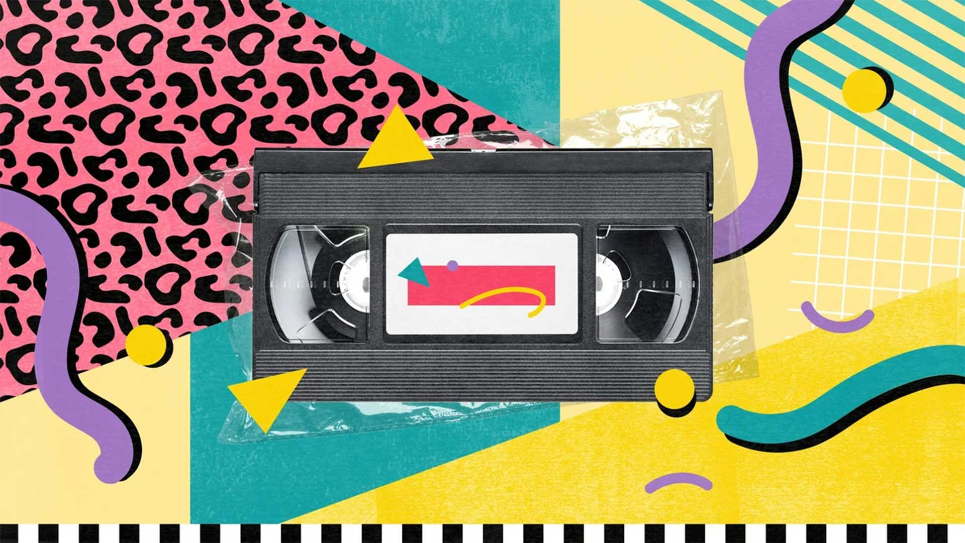
Some of us might nostalgically produce an “Ohh” sigh, instead of wondering, what the hell is going on with this background? Because those of us who still remember the ‘90s remember the VHS covers and movie posters. They nostalgically come back to the memories of the times when ‘Friends’ gags were still funny. The thing is quite obvious, we simply connect good times with that era, regardless of whatever judgment the history of design would produce regarding its aesthetics.
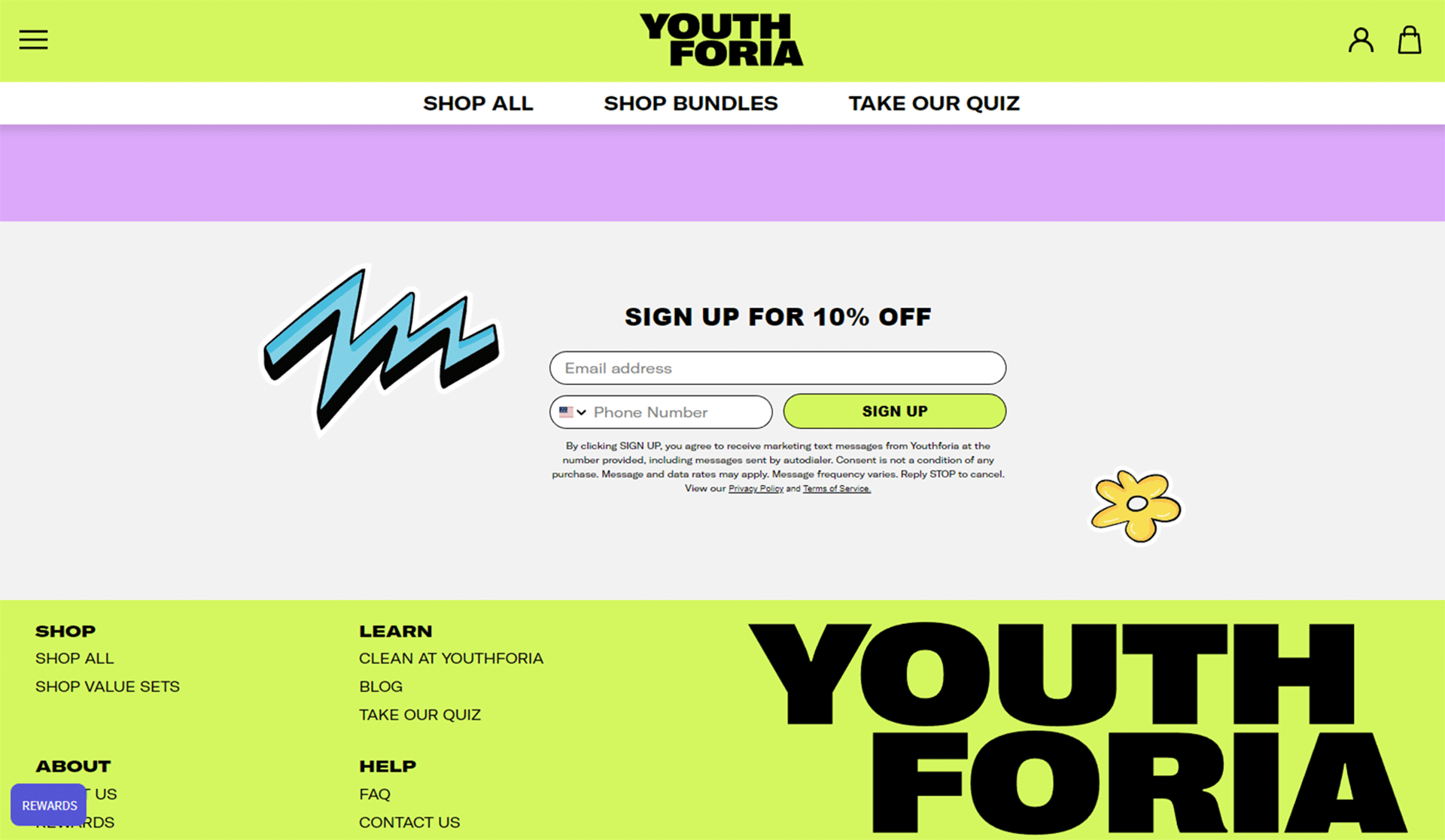
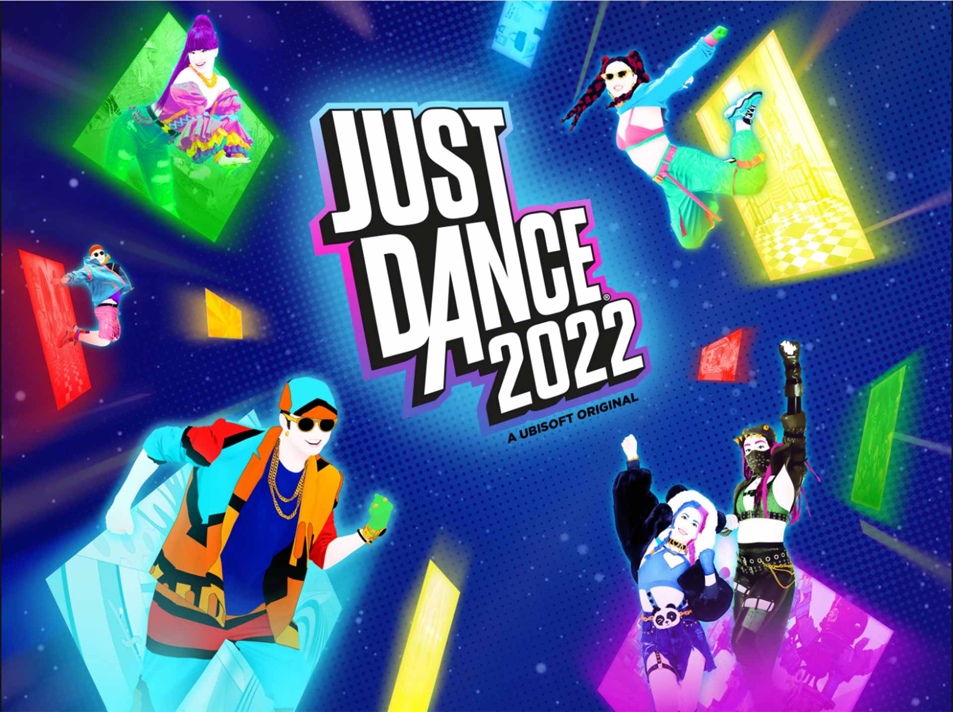
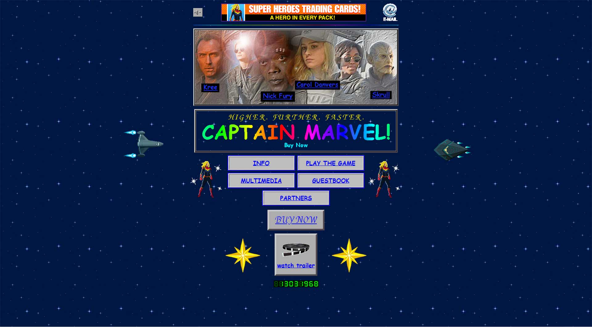
But let’s be less nostalgic for a while and think, what function could the comeback to ‘90s trends have on branding? And here, referring to ‘90s design will most likely have quite a significant effect, for no less than two reasons:
Last but not least, such a trip down the designer’s memory lane can simply be fun for the designer: “Hey, how about not making this one more minimalistic, and adding a pink cheetah pattern in the background instead?”*
Coming back to the pragmatic question: whatever element of the past design is taken up by your brand to launch a new campaign, it actually might work from a scientific perspective. According to a study from the College of Business and Economics, Washington State University, consumers tend to rate nostalgia-themed advertisements better in comparison to non-nostalgic ads**. The question could be: why? And I guess we come back to my initial suspicion: relating to 90s nostalgia makes a lot of sense in the post-pandemic context. We might not be tired of all-encompassing usability, minimalism, and pristine typography. We might simply be tired of the contemporary events and basically anything related to them. In an era, when almost everybody considers the future uncertain, possibly dangerous, this kind of nostalgic comeback may seem to offer some relief. It may be hard to believe if you simply focus on the visual side. It makes sense, however, assuming that design is, was, and will always be much more than that!
*Yes, I know it sounds bad, but sometimes, instead of overthinking, just design a pink cheetah pattern and have fun!
** The Power of Reflection: An Empirical Examination of Nostalgia Advertising Effects on JSTOR
Did you enjoy this article? Also checkout our ’80s nostalgia and Cyberpunk aesthetic essay.