May 15, 2026
10 min read
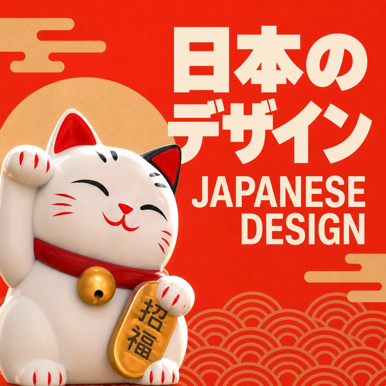
How Japanese graphic design shapes modern branding?
Share this article
Japanese graphic design, often referred to as the ‘Japanese style’, is one of the world’s most distinct and enduring visual traditions. Rooted in centuries of cultural refinement and shaped by the interplay of Eastern philosophy and Western modernism, Japanese graphic design is characterised by minimalism, symbolic depth, the masterful use of negative space and a reverence for natural forms. This design philosophy has had a profound influence on visual communication throughout the 20th and 21st centuries, and continues to inspire graphic designers, brand strategists and creative directors worldwide.
At Admind, we are deeply inspired by the principles of Japanese design, its quiet confidence, emotional restraint and ability to convey more by doing less. In this article, we explore what makes Japanese design so timeless and what continues to inspire us.
Japanese graphic design has its roots in centuries of artistic and philosophical development. It combines principles such as minimalism (kanso), negative space (ma) and imperfect beauty (wabi-sabi), as well as a deep respect for craftsmanship. Emerging as a recognised professional discipline in post-war Japan, it has since become one of the most influential design movements globally.
Japanese graphic design did not emerge from a single movement or manifesto. Instead, it evolved gradually, shaped by centuries of artistic tradition and punctuated by moments of radical reinvention. Its roots reach back to the Edo period (1603–1868), long before the term ‘graphic design’ even existed.
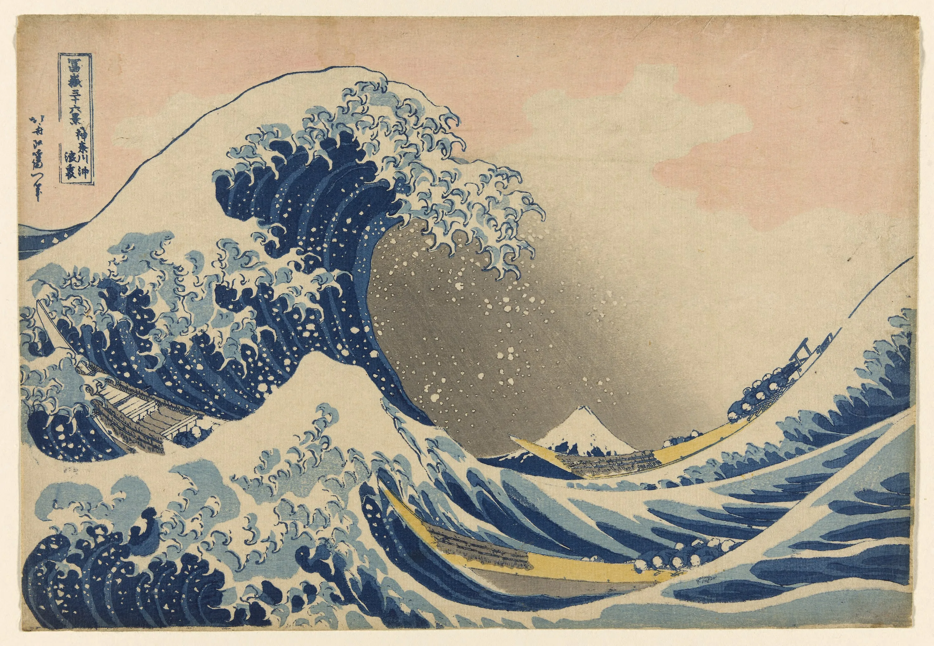
The foundation was laid by ukiyo-e woodblock prints, which depicted everyday life, kabuki theatre and landscapes. Artists such as Katsushika Hokusai and Utagawa Hiroshige did more than just create pictures; they established a visual language. Bold outlines, flat colour planes, asymmetric compositions and the expressive use of empty space were not aesthetic accidents, but deliberate choices that were deeply rooted in the Japanese worldview. Ukiyo-e had an enormous influence on Western art: Toulouse-Lautrec, Monet, and Van Gogh all drew inspiration from it. But in Japan, it remained the foundation upon which a distinctive modern design culture would flourish.
Under the Wave off Kanagawa (Kanagawa oki nami ura) | source: https://commons.wikimedia.org/
Alongside ukiyo-e, the tradition of kamon (family crests) formed a second equally important strand. These highly symmetrical, geometric emblems, which were used to identify noble households, demanded maximum clarity and recognition in a minimal form. In essence, they are some of the earliest examples of what we would today call logo design.
The decisive turn towards modern graphic design occurred during the Meiji Restoration in 1868, when Japan opened its doors to Western influence. Industrialisation, photography and modern printing transformed the visual landscape almost overnight. Designers such as Sugiura Hisui began to fuse Art Nouveau and Art Deco with traditional Japanese motifs, creating a distinctly modern commercial aesthetic. Experimental magazines such as Mavo delved into abstraction, avant-garde typography and political visual expression.
However, the true golden age arrived in the post-war decades, when Japan’s economic reconstruction gave rise to a new generation of designers, visionaries who would come to define Japanese aesthetics for the rest of the world.
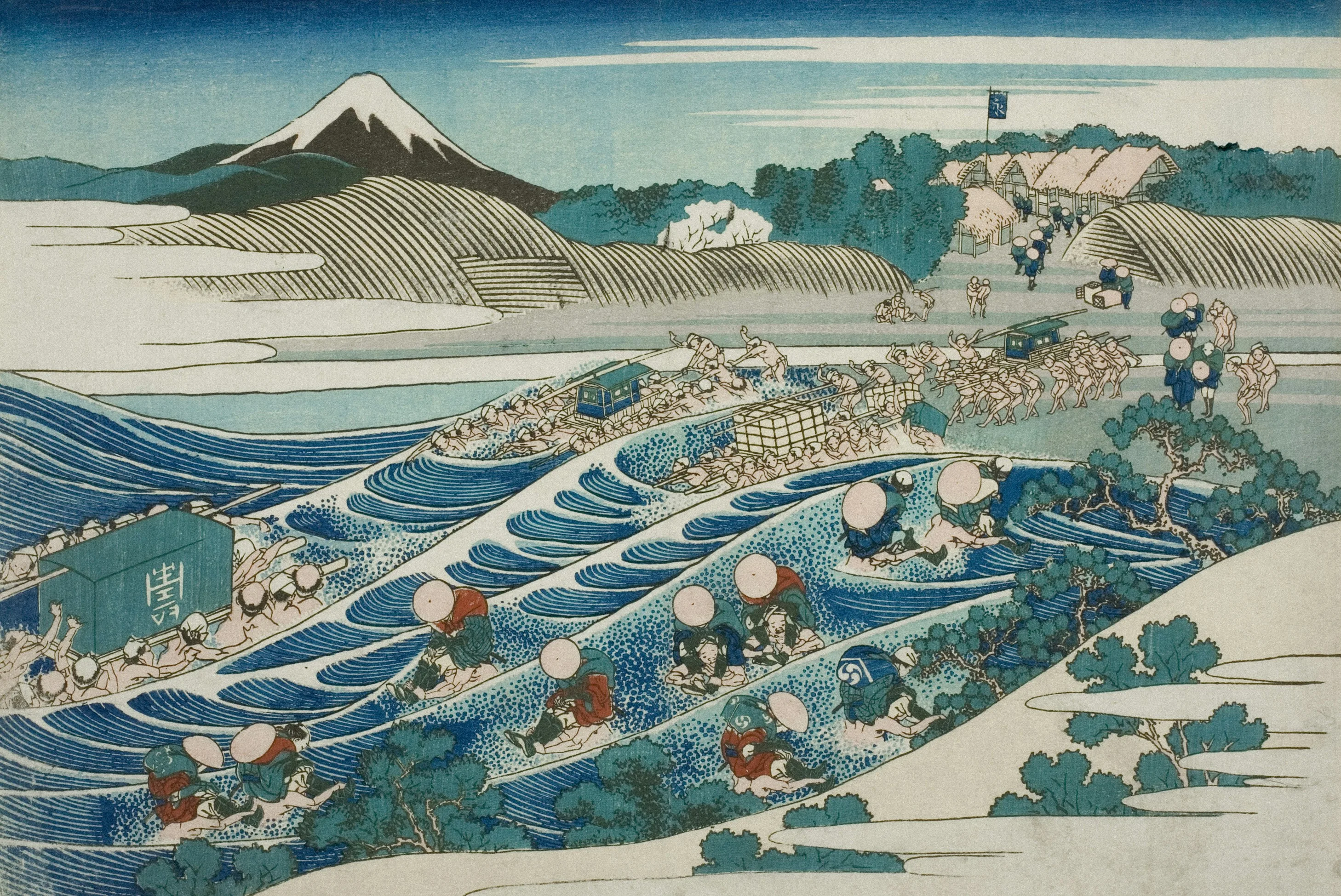
Katsushika Hokusai, Fuji from Kanaya on the Tokaido (Tokaido Kanaya no Fuji), source: unsplash.com
The pioneers of Japanese graphic design were not just craftsmen; they were also thinkers and philosophers who acted as cultural translators. Their work communicated more than just information; it expressed a worldview. Here are some of the key figures who shaped the movement.
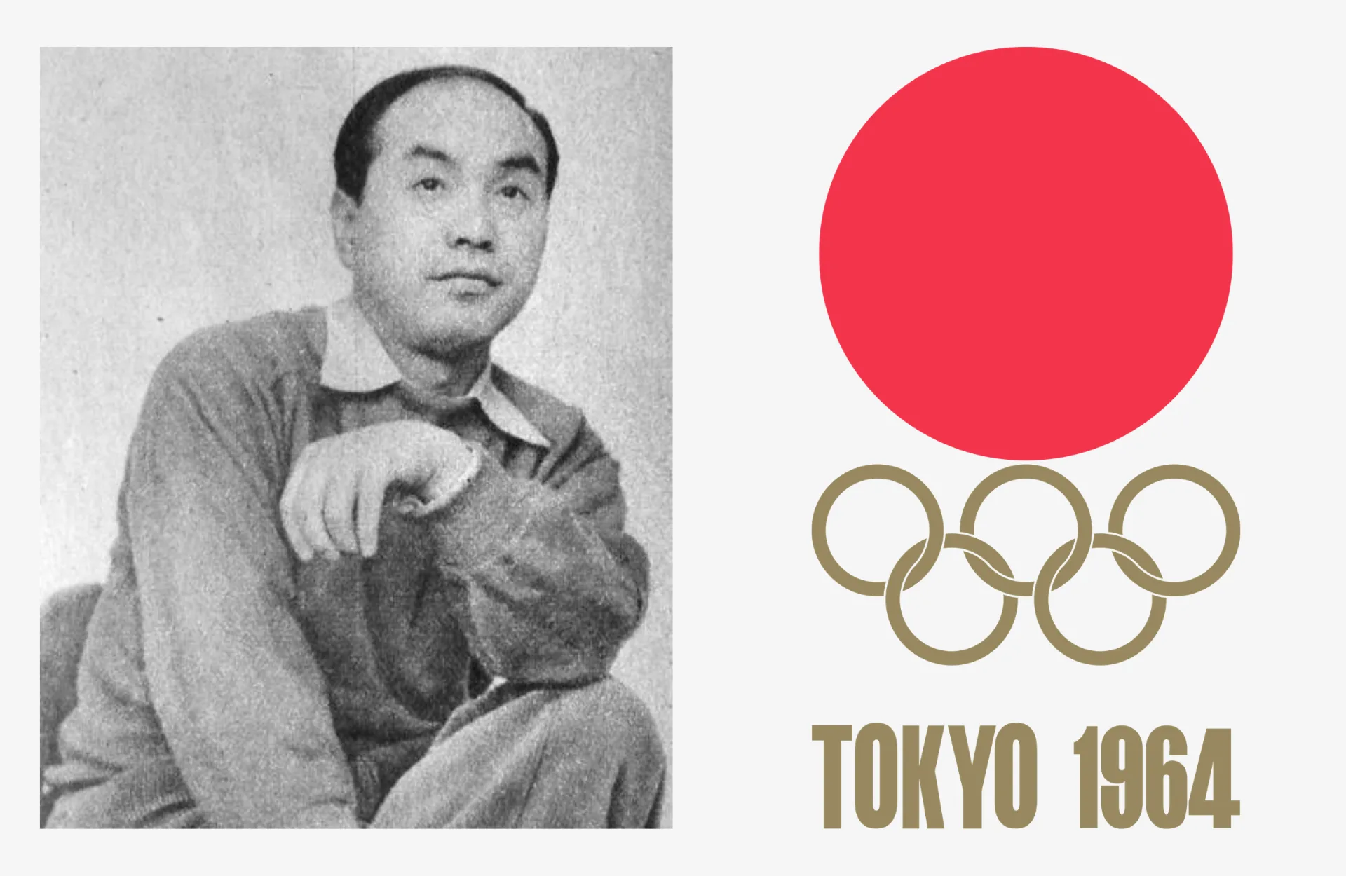
Yusaku Kamekura is widely regarded as the father of modern Japanese graphic design. His bold, circular emblem in red and gold for the 1964 Tokyo Olympics, which combined geometric rigour with traditional Japanese symbolism, announced to the world that Japan had a powerful and distinct visual voice. Kamekura co-founded the Japan Graphic Designers Association (JAGDA) and served as its first president, playing a crucial role in the professionalisation of the field. His poster designs, characterised by stark geometric compositions and minimal colour palettes, continue to set the standard for modern poster design.
Left image copyrigths: By The Asahi Shimbun Company – Asahi Graph, December 3, 1952 issue, Public Domain, Link | Right image copyrights: By Yusaku Kamekura – taken from sportslogos.net by Parutakupiu at English Wikipedia, Public Domain, Link
Ikko Tanaka was a master of Japanese design. He was a man who could combine traditional calligraphy and Bauhaus geometry to create something entirely new. His 1981 Nihon Buyo poster, which depicts a stylised kabuki figure assembled from geometric colour blocks, is arguably the most iconic image in Japanese graphic design. It is simultaneously ancient and modern, decorative and structured, and Eastern and Western.
Tanaka also created corporate identities for Seibu Department Stores, Mazda and Expo ’85, and curated the landmark 1980 exhibition ‘Japan Style’ at the Victoria and Albert Museum. He played a key role in bringing Japanese design to the world stage by distilling it, not diluting it.
Left image copyrights: Author: Ikko Tanaka (https://www.flickr.com/photos/maiabee/4027003608/, CC BY 2.0, Link) | Right image copyrights: Author: Ikko Tanaka (https://www.flickr.com/photos/maiabee/4026251811/lightbox/, CC BY 2.0, Link)
While Kamekura and Tanaka worked with discipline and structure, Tadanori Yokoo embraced chaos, provocation and psychedelic excess. His posters from the 1960s and ’70s, which were dense with imagery, text, traditional woodblock motifs and surrealist collage, were unlike anything else being produced anywhere in the world at that time. Yokoo redefined what Japanese graphic design could be. He demonstrated that his country’s aesthetic tradition was not a set of rules, but rather a source of energy that could inspire radical, subversive and highly expressive creations.
Picasso once said of Yokoo that he was ‘the Toulouse-Lautrec of Japan’. The comparison flatters both artists.
Shigeo Fukuda was a master of wit and deception. His playful yet formally precise work, which often featured optical illusions and visual paradoxes, made you look twice, and then again. His poster for a 1975 anti-war exhibition, which showed a rifle barrel curving back to face the shooter, conveyed its message with devastating economy. Fukuda showed that graphic design could be clever in a profound way, that intellectual and visual pleasure could be one and the same.
By Shigeo Fukuda – Archivi Storici Albe e Lica Steiner, Politecnico di Milano – ASAB, <a href=”https://creativecommons.org/licenses/by-sa/4.0″ title=”Creative Commons Attribution-Share Alike 4.0″>CC BY-SA 4.0</a>, <a href=”https://commons.wikimedia.org/w/index.php?curid=85112537″>Link</a>
Kenya Hara is a contemporary Japanese philosopher and designer. Since 2001, as art director for MUJI, he has built one of the world’s most recognised brand identities around a single concept: emptiness. This is not a poverty of design, but rather an openness, a design that invites the viewer to complete it and project their own meaning onto it. Hara’s concept of emptiness (虚) as a design value is a radical reinterpretation of the Japanese aesthetic tradition for the age of global branding.
Hara’s book Designing Design is essential reading for anyone who wants to understand Japanese design and design thinking at their most philosophically rigorous.
Takenobu Igarashi brought a unique approach to Japanese graphic design, treating typography as sculpture. In the 1980s, he started creating three-dimensional alphabets, letters that existed as three-dimensional objects in space, with weight, shadow and perspective. His isometric alphabets, which appeared on calendars published by MoMA New York, were technically astonishing and conceptually bold. Igarashi demonstrated that, even in a culture where written characters already possess extraordinary visual complexity, the alphabet itself could be reimagined as a design medium.
While Helvetica is considered the queen of Swiss typography, Japan’s equivalent might be Hiragino, a typeface developed by SCREEN Holdings in the 1990s which has become the default font on Apple devices worldwide. However, the story of Japanese typography is richer and more complex than any single typeface.
Japanese designers work with a unique typographic system: kanji (Chinese-derived characters), hiragana, katakana and the Latin alphabet often appear on the same page or in the same layout, requiring aesthetic decisions of extraordinary complexity. The challenge is not just readability, but also achieving harmony between systems that evolved thousands of miles apart.
Designers such as Zenpaku Suzuki and typographers at foundries such as Morisawa have dedicated their careers to solving these problems and creating type systems that balance visual consistency across scripts with cultural authenticity. The result is a typographic tradition that is invisible to most Western designers, yet absolutely fundamental to the visual coherence of modern Japanese communication.
The principles of Japanese design are not just for museums. They are living tools, and their influence is perhaps most visible in contemporary branding and advertising, both in Japan and around the world. Here are some of the most striking examples.
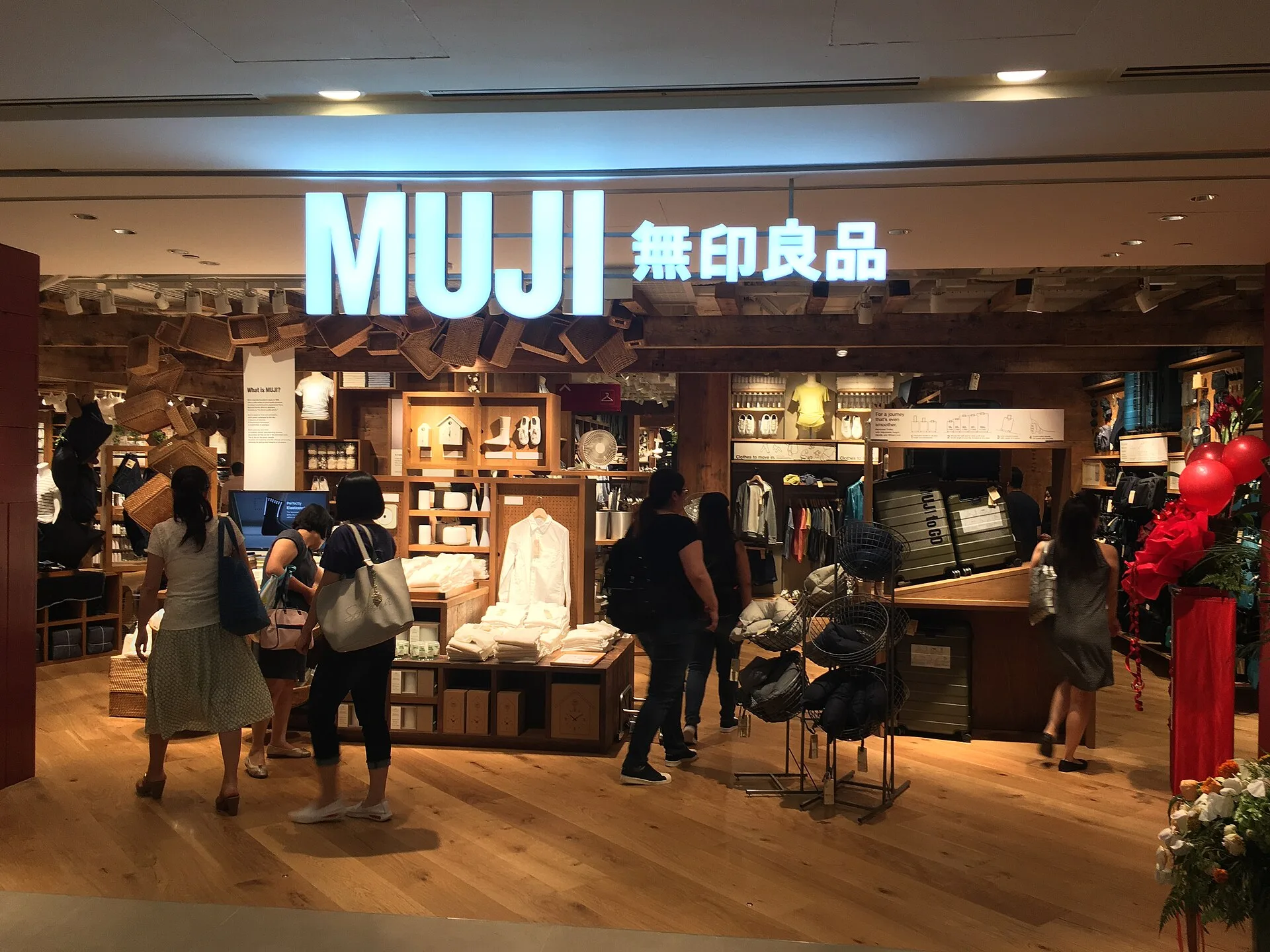
MUJI is the most radical application of Japanese design thinking to commercial identity. Its very name, ‘Mujirushi Ryōhin’, meaning ‘no-brand quality goods’, is a manifesto in itself. There is no logo on the products. No decorative details. No colour that isn’t strictly necessary. Just material, form and function.
MUJI’s art director, Kenya Hara, has described the company’s design philosophy as ‘emptiness‘: not absence, but openness. Products are designed to be completed by the user — a mattress that can also be used as a sofa and a notebook that suggests rather than prescribes. This philosophy has built a global brand with an annual revenue of over $4.4 billion — proof that, in a world of loud identities, silence can be the loudest statement of all.
By Banej – Own work, CC BY-SA 3.0, Link
While MUJI sells a philosophy of emptiness, Uniqlo sells a philosophy of kaizen: continuous improvement applied to the simplest of objects. A better T-shirt. A warmer jacket. More functional trousers. The brand’s visual identity follows the same logic: clean typography, a neutral colour scheme and no visual clutter.
Uniqlo’s LifeWear concept is essentially Japanese design thinking translated into fashion retail. Ignoring trends, it focuses on perfecting basics, and has built a ¥3.4 trillion empire in the process. The logo itself – bold red, clean sans-serif, and an asymmetric combination of Japanese and Roman type, is a masterclass in typographic tension.
Author: Kashiwa Satō – Extracted from UT2011:四四南村 X UT, enlarged its size and converted to an SVG file, Domena publiczna, Link
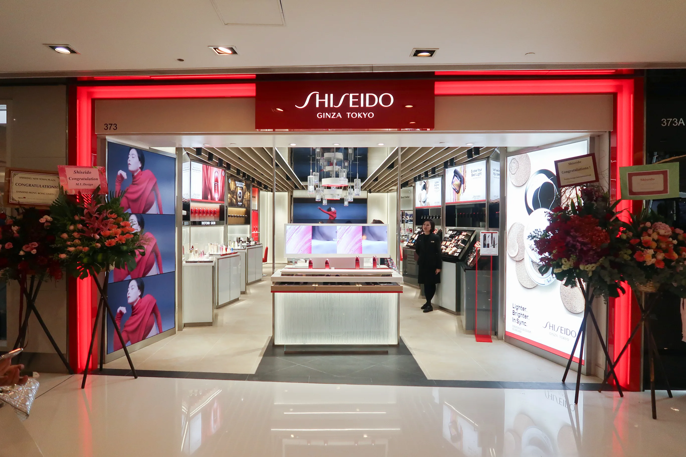
Founded in 1872, Shiseido is one of the world’s oldest cosmetics companies, and its branding has always been at the intersection of Japanese aesthetic tradition and global luxury. Its advertising campaigns typically feature soft colour palettes of pale pink, white and gold, colours that evoke natural beauty and cultural restraint. Nature-derived imagery, such as cherry blossoms, water and stone, carries symbolic meaning rather than functioning as mere decoration.
What sets Shiseido apart in contemporary advertising is its commitment to narrative depth. Rather than directly showcasing products, its campaigns tell stories of women, seasons and time that resonate emotionally before selling commercially. This is the Japanese advertising tradition of soft selling: allowing meaning to accumulate rather than demanding attention.
By Wpcpey – Own work, CC BY-SA 4.0, Link
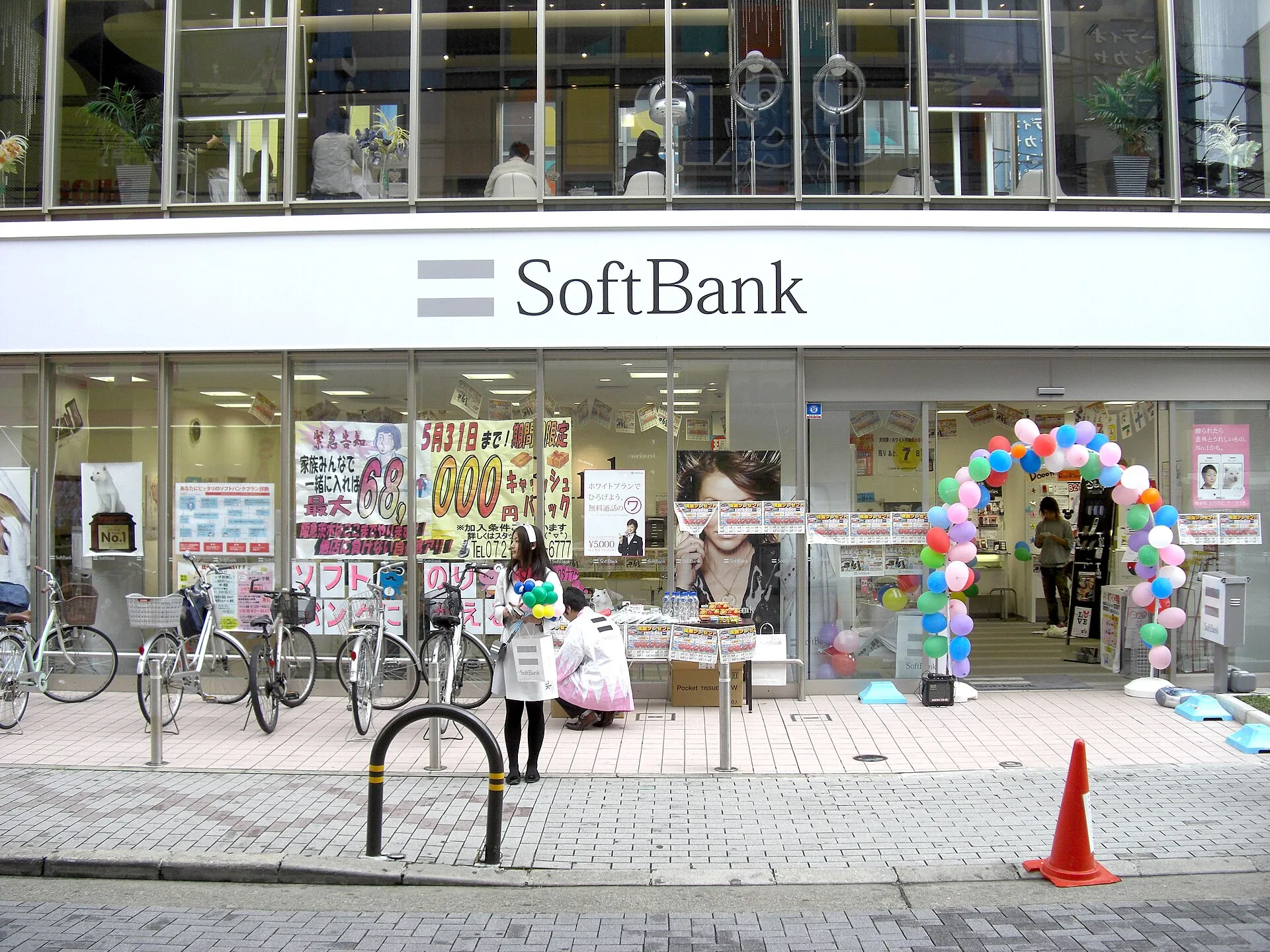
SoftBank’s long-running ‘White Family’ advertising campaign, in which a talking white dog plays the father in a family consisting of humans and animals, is one of the most recognised in Japan’s history. It is absurd, heartwarming, and completely uninterested in explaining what SoftBank actually does.
This approach exemplifies a distinctly Japanese advertising sensibility, based on the idea that emotional resonance and brand personality are more important than product messaging. Adverts focus on being memorable rather than explanatory. The campaign ran for years and generated enormous brand loyalty, not because it told people why SoftBank was good, but because it evoked an emotional response.
By User:Kirakirameister – Own work, CC BY-SA 3.0, Link
One of the most distinctive Japanese contributions to contemporary branding is the systematic use of seasonality as a visual and emotional tool. Japanese brands routinely release sakura (cherry blossom) editions in spring, including packaging, product colours and advertising imagery, which serve no purpose other than to align the brand with a culturally significant moment of beauty and transience.
This is wabi-sabi in a commercial context: the ephemeral nature of cherry blossoms and mono no aware (the pathos of things) transformed into a marketing strategy that strengthens the connection with consumers by acknowledging the passing of time. Global brands, from Starbucks to Kit Kat, have adopted this practice in Japan, and, increasingly, in other markets, too.
Perhaps the clearest sign of the contemporary influence of Japanese design is the global popularity of Japandi, a fusion of Japanese and Scandinavian aesthetics which has become one of the most prominent visual languages in contemporary branding, interior design and product identity.
Japandi combines Japanese reverence for natural materials, negative space and wabi-sabi imperfection with Scandinavian clarity of function and comfort. This is evident in skincare packaging with clear glass, minimal text and sparse logos; furniture branding with pale wood, clean lines and honest materials; and digital product design with generous white space, restrained typography and calm interaction. A 2025 review of global beer label design noted that ‘Japanese minimalism and Scandinavian abstraction are quietly defining the visual language of brands that want to appear sophisticated rather than ostentatious.’
Photo by Katja Rooke on Unsplash
However, it is worth noting a critical caveat. Many Western brands have attempted to copy Japanese aesthetics, such as white space, neutral palettes and minimal packaging, without understanding the philosophy behind them. The result is designs that look Japanese but feel hollow.
True Japanese design minimalism is not just a stylistic choice; it is an outward expression of a deep cultural and philosophical commitment to functionality over decoration, the user over the designer and the long term over the short term. Brands that adopt the aesthetics without the substance tend to produce work that is merely quiet, rather than being genuinely empty in the Japanese sense, full of potential and open to completion.
This distinction between surface and philosophical minimalism is one of the most important lessons that Japanese design can teach contemporary branding.
The global influence of Japanese design is almost paradoxical: a tradition based on restraint, locality and cultural specificity has become one of the world’s most widely adopted aesthetic systems. Walk into any design-conscious café in Warsaw, Copenhagen or São Paulo and you will see Japanese influences in the typography, negative space and relationship between objects and empty space.
However, I believe that the deeper lesson of Japanese design is philosophical rather than aesthetic. It is the idea that design is not just decoration; it is a way of making thoughts visible. Japanese masters did not simply make things look beautiful; they asked hard questions about the purpose of visual communication, its obligations to the viewer, and the responsibility of the designer. This seriousness of purpose, this belief that posters, typefaces, and brand identities are forms of moral and philosophical expression, is what makes Japanese design so inspiring.
In our own practice, we return to these questions constantly. What is this design for? What does it ask of the person who sees it? What can we remove? What must we keep? These are Japanese questions. They are also the most important questions for a designer.
Why Japanese Graphic Design Still Matters
Japanese graphic design has left an indelible mark on visual culture worldwide. It champions an approach that values clarity, symbolic depth and the expressive power of restraint. From the Edo period woodblock masters to today’s philosopher-designers, Japanese design has consistently shown that the most powerful visual statements are often the quietest.
Its influence extends far beyond Japan, shaping product design, typography, branding, fashion and digital interfaces worldwide. Japanese graphic design is more than just a historical movement; it is a living philosophy, reminding us that in design, as in life, what you leave out is often as important as what you put in.