
In the previous articles of this series, we talked about particular album covers or signs that appeared on successive albums of a given band and a banana cover album. This time, we present an interview with Tomasz Lipiński, a man who not only founded two well-known bands in Poland but also created designs for their albums.
At the beginning of May 2021, I interviewed Tomek Lipiński at his recording studio in Warsaw. Riding on an almost empty train, I wondered how to describe the person I was about to talk to. Lipinski, born in Warsaw in 1955, is an institution of Polish alternative music. The bands he founded (Brygada Kryzys and Tilt) had a huge impact not only on me. Their reception was generational.
But I wanted to talk not about music but about the covers Tomek designed and how he was influenced by his parents, talented designers and the Academy of Fine Arts, where he studied for a while. I was also going to meet the author of the cover, which made me decide to get into design.
In the beginning, there was a drawing
Music certainly dominates your life. But what came first – music or graphic design? After all, you studied at the Academy of Fine Arts for some time.
Tomek Lipiński: Certainly, there was a drawing in the beginning – firstly because you don’t need any unique accessories for that. We are talking about the second half of the 1950s and the first half of the 1960s, which is quite a distant era. Besides, my mother was a graphic artist, so I always had this small graphic instrument at hand.
In one of the old photos, I’m sitting on the couch with a pencil almost as big as me. Apparently, I’m not walking yet, because you can see the soles of my shoes are unblemished.
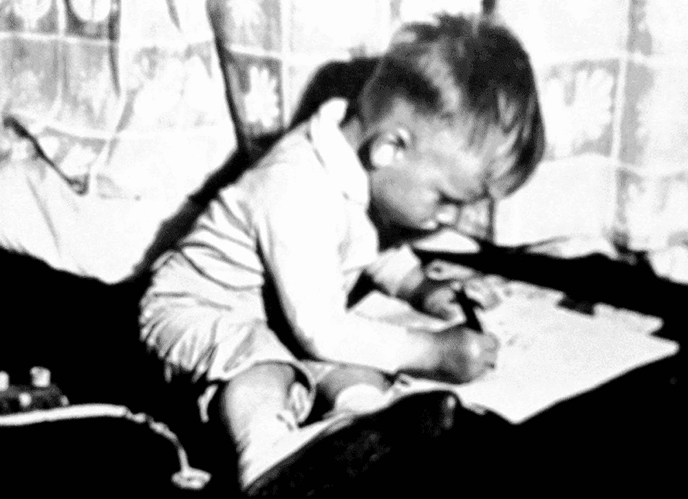
Since my mother was a graphic artist, it was also natural for me to do. I didn’t know my father until I was nine years old, but I knew he did the same. Also, my grandfather, Teodor Rawicz-Lipiński, was a painter, graphic artist, and caricaturist. His collection later became the nucleus of the Museum of Caricature, which my father founded. So from the beginning, I had no choice.
Graphics seemed an obvious choice, but I felt drawn to music; my heart went out to it. Of course, it was complicated because I didn’t have the conditions at home to learn it. We couldn’t put a piano in the house, and at that time, there were no small electronic instruments.
I taught music myself: I overheard, watched, read, and tried to play instruments. But I never stopped doing the artistic side of things – even after 1979, when I decided to try to take up music. Graphic art, in a way, grew into me. It became a part of me. I even studied at the Academy of Fine Arts in Warsaw for a while.
How do you recall your studies at the Academy? Were they meaningful in retrospect? Did they have any impact on you?
TL: We are now talking about 1977. It was not the best time for this Academy, and its level was not the highest. I found only a few interesting classes there.
When I was applying to the Academy of Fine Arts, there were rumours that Franciszek Starowieyski would run the graphics studio. It was exciting because it is nice to learn from unusual people, above average. It turned out that, unfortunately, Starowieyski was not liked by the university authorities. And at the same time the professor and the assistant, whose names I suppressed, came to classes on a bender and did not have much to say.
I quit my studies at the Academy of Fine Arts in 1977 after a few weeks and that’s when I decided to go into music. After a few unsuccessful attempts, I formed Tilt in 1979.
But you’ve managed to learn a lot about design.
TL: Design run in my blood. My mother also encouraged me to draw. I did it late at evening and at night. Because of this, I had trouble getting up for school. And during lessons, I would always draw in my notebook automatically. This automaticity helped me concentrate on what I was hearing, but it drove the teachers crazy. There was not much left of my notebooks. They were filled from the inside with drawings.
So, the artistic flair caused problems, but it was always part of my life. The pencil in my hand (as in the hands of my parents) has always been normal. After my father came into my life, I loved spending time in his studio, watching him work, and asking those questions I hadn’t yet asked my mother. In turn, they both, especially my dad liked to step into the roles of mentors and teachers. As a result, my dad taught me a lot – including everything about lettering.
Incidentally, the lettering was actually done by my mother, but she was too busy to teach me. I did, however, watch her work. If you went through old issues of “The World”, you would find characteristic vignettes and titles not from the typesetting. There was no such thing back then, so you had to draw it out with your hand, with a brush. My mother did all this. Absolute magic!
You don’t just draw, but you also have finished many digital projects.
TL: After hours, I did web graphics – I have a pretty extensive collection of such works. Incidentally, they are great for album cover design.
Black album cover design
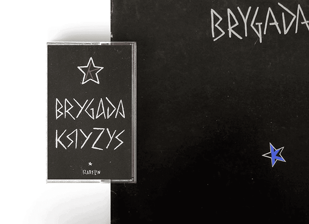
Was the artwork for Brygada Kryzys’s first album the first cover you designed?
TL: Yes, it was my first album cover design.
For me, it is one of the most essential covers. It’s one of the reasons why I decided to get into design.
TL: Fucking hell, you couldn’t have said anything better to me today! In that case, we can go now. Thank you very much, bye.
Arek Wawer (Tomek Lipinski’s manager): Upload this as an alarm clock to your phone!
TL: Yes, I will listen to it every morning if I don’t feel like getting up.
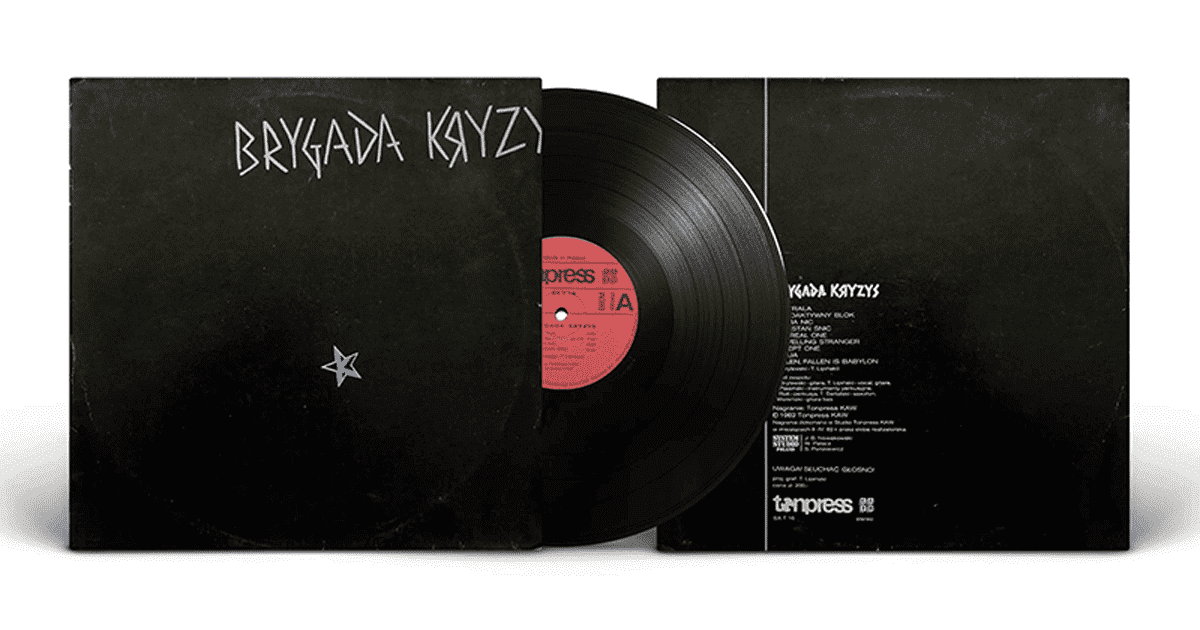
This album was not only musically groundbreaking. It turned out to be much more than just another punk band album – because it wasn’t punk! And its minimalist artwork can easily be placed in a row with, for example, the first Joy Division album. Could you tell us more about how this cover came about?
TL: We worked on this record with Tonpress (a Polish record company founded in the 1970s). One day we received a call that Tonpress wanted to show us the cover design. When we saw it, I simply doubted the project. We saw a symmetrical clown with his tongue hanging out. The cover didn’t fit in with what we were doing. It was completely off topic and out of character. And at that time, image issues were significant to us because they defined our stylistic and ideological positioning and determined our stance in this world.
We made a terrible performance there and began to speak. We accused producers of being a scandal, suppressing freedom of artistic expression, imposing foreign aesthetics, and not taking artists into account. What’s more, we told them that it was because of them that Poland looks the way it does (and that was the beginning of 1982!). Then, we even threw some papers off the desk! Tonpress employees got scared and decided that we could design the cover ourselves. So, we had to get on with it.
One evening, during a social gathering that lasted until morning due to the curfew, we decided that we would make a cover. I came up with the idea that the cover would be black, with a dirty grey logo, gloomy, because it was difficult to be different at that moment. Ideally, it should be almost non-existent. Besides, from the beginning I wanted it to be faded, hence the truncated “S”. At that time the so-called Polish packaging was at first sight different from the world’s designs (except maybe Cuban and North Korean). In Poland, everything was printed wrong or not on what was needed. Colours would run, certain colours or graphic elements were missing.
This procedure also allowed us to avoid problems we already had in the autumn of the previous year. “S” in the band’s name is runic, so we had all our materials stopped as fascist at the Czechoslovak border.
Also, when we played a concert in London in 2003, our promoter wanted to hang posters in The Polish Social and Cultural Association. They refused – this time we found out that they don’t hang communist propaganda!
Back to the project: I painted the letters in tempera, but the star had to be inserted somewhere. Since it was all so out of the blue, I randomly placed our sign. I put the project on the floor and asked a friend to toss a coin – and the coin fell where the star is now. I was still wondering what colour would go with the grey-black cover, and I thought dark blue would be OK. The colour of the evening sky, the only element of life in a dead whole.
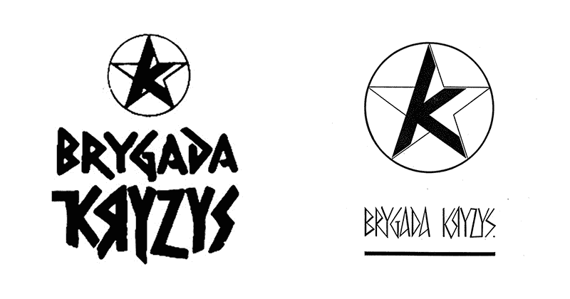
One of the elements of the cover is a distinctive sign. It is a very expressive, aggressive and bold sign with a strong emotional message. Now you could probably say it’s a strong brand.
TL: I am very proud of it.
For me, you can see in this sign the inspiration of the iconography of the leftist guerrillas of South America or the Italian Red Brigades.
TL: When it comes to aesthetics, it’s definitely right. We were fascinated by this style at the time. We were also fascinated by the early Soviet aesthetic, which draws on early constructivist posters, graphics, and stencils (stencilled letters).
The album was created in the darkest moment of martial law. Those were gloomy times, full of absurdities, which are sometimes hard to believe anymore. One of the now unimaginable elements of communist Poland was the office of censorship. I know that the censorship tried to interfere in the lyrics of songs, but I am curious if it was similar with album covers. I am asking about it because I have heard that the band’s name “did not fit” on the cover to get around possible problems with the censorship.
TL: Yes, it was a deliberate act. My train of thought was as follows: I was afraid that there would be problems with the name, and it occurred to me to cut it off and, at the same time to make something more out of it – to add value. This is because such a move provokes people to wonder what happened here and what the artist had in mind. This creates space for various interpretations, legends and fantasies.
In the 90s, a re-edition of this album was released on tape, among others. Graphically it differs slightly from the original. Were you responsible for this project? What was the reason for this change?
TL: The re-edition is indeed different from the original. The collage for the cover was done by Robert, I took care of the middle. To be honest, this project happened a bit beyond me and I wasn’t thrilled with it, if only because of the musical effects added in the new version.
Tilt
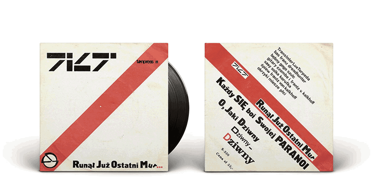
Later, the first Tilt singles appeared. The ones from 1986 seem to refer graphically to Dadaism or Soviet Constructivism. Were these really your inspirations at the time?
TL: Yes, I was very fond of these trends in art, and indeed these were my inspirations.
In the case of Tilt, I decided that the diagonal red stripe would be the dominant element in the graphics. It was a reference to the fire instructions hanging everywhere at the time. The cover was supposed to be associated with such an announcement.
I kept experimenting with the letters because, despite appearances, the arrangement of letters in the name is quite ungrateful.
But you dealt with it.
TL: Because it offers all sorts of exciting possibilities. At the time, I was interested in different alphabets and writing systems. For our second single, I designed symbols that were difficult to assign to any system. They looked like strange road or railway signs.
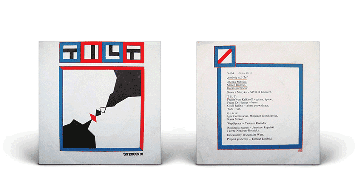
Tilt’s first album is graphically a continuation of the singles. There is a lot of typographical disobedience in the album description. The cover, in turn, is a design without coolness, showing off and sucking up to the recipient. Instead, we have a precisely constructed sign (brand) of the band and colours limited to necessary accents. Do you remember how this project was born?
TL: I wish I had it here on vinyl, as the print quality on the tape is not the best. But the vinyl will be released soon!
Still experimenting with the band’s logo, I came to such a simplification that the letters “T” were the inverses of “L” and “I” was identified with the diagonal line I mentioned earlier (it was a continuation of it). The inscription became unreadable, so I added these letters to translate the sign into Polish. Since the uppercase letters looked bad, I used lowercase letters. However, “i” and “l” looked terrible and didn’t become legible at all, so I decided to use capital letters in these cases.
However, I have taken the four colours that appear as accents from Tibetan Buddhist iconography, where all the basic mandalas have this colour arrangement. In this arrangement, the top (i.e. west) is red, the south is yellow, the north is green, and the east is blue or white.
Do you have more similar projects from that period?
TL: Not much of it survives, but I made a logo for Rock Estrada, for example. I recently saw a photo of Brygada Kryzys with that sign in the background, but I don’t have it with me.
There is also an interesting story about a project that… I didn’t do. One day, when we were practising with Brygada, a friend, a manager from Rock Estrada, visited us. He asked if I would like to design a sign for the new band. I asked what the name of the band was. When he replied that it was “Lady Pank” (with a “Pank” for “a”), we started rolling over laughing. The poor fellow unfortunately left without a design.
Going back to the signs I designed, I think it’s worth mentioning the next version of the Tilt logo, based on runes, and the Fotoness sign, inspired by the Greek alphabet.
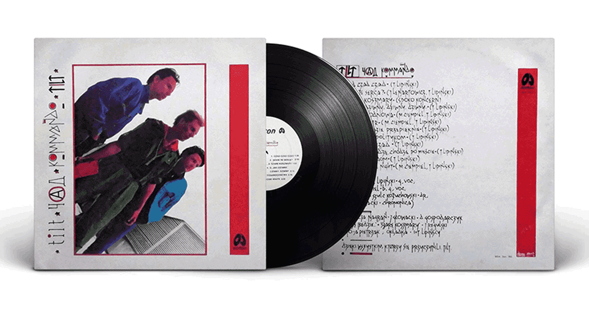
Czad kommando
On the next album by Tilt (Czad kommando) one can notice hand-drawn letters – something between runes and Cyrillic. What was the basis of this project?
TL: It’s a strange cover. I have mixed feelings about it. To be honest, I went crazy with it, but once I went crazy, I thought: “why not?”. Everything on this cover is too weird, especially the photo.
Where did the idea for such letters come from? Did you make sketches or attempts beforehand? Or did it just come out of your hand?
TL: I don’t remember how it came about that the title Czad kommando appeared anymore. As it usually happens, it occurred during conversations on the bus or in the dressing room. In such conditions, everyone is in a strange phase. They turn on each other and come up with strange ideas. “Chad” is a great word. You can write it with a Russian “cz” (the Ч sign) and put a para-anarchist “A” in the middle.
Because everything on this cover was ugly, I adapted the typography to that as well. This cover is programmatically ugly, and it was meant to be ugly.
And it worked.
TL: But the other side is not so ugly anymore. I develop the lettering there. I use a typeface I invented myself, which is a consequence of previous attempts – and which, despite its strange design, remains legible.
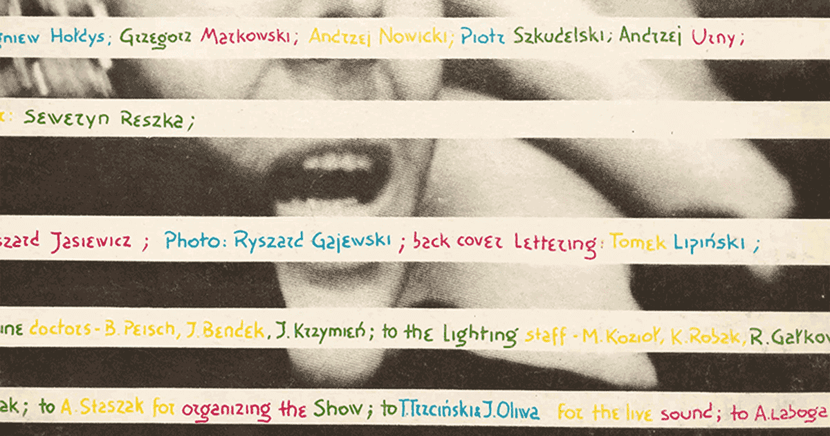
But you didn’t design only for yourself – you also created for others. I remember your letters that appeared on the cover of Perfect’s 1987 concert album.
TL: Really? No, I don’t think so.
How did it come about that you took part in this project? Perfect musically was a different world after all.
TL: I really cannot say anything about it, but thank you for rediscovering something I had completely forgotten. As you can see, I am already an old man!
Found this article interesting? I encourage you to read the others in this series: Banana Album Cover, Run the Jewels, and Mayhem Album Cover.